C H A P T E R 21
Creating Layouts
In this chapter, I will show you the different options available for controlling the layout of elements on the page. With the increased emphasis separating the semantic significance of HTML elements from their presentational impact, the role of CSS in laying out elements has become more important in HTML5. There are some very useful layout features in CSS3 and, of course, you can use the existing facility from earlier versions of CSS.
There are two proposed layout models for CSS3 that have yet to mature enough for me to cover in this chapter. The first, template layouts, allows you to create flexible to contain elements. None of the browsers implement this module, but you can experiment with the functionality through a jQuery plugin available at http://a.deveria.com/?p=236. The other new module creates flexible grids for layouts. Unfortunately, as I write this, the specification is not yet complete and there is no implementation available.
The entire area of layouts in CSS3 remains volatile. One of the layout styles that I do cover in this chapter—the flexible box model—offers excellent features, but the standard keeps changing and I have had to demonstrate the approach to layouts using browser-specific properties that were implemented against an early draft of the standard.
Given the early nature of these new features, I suggest considering using a CSS framework for creating sophisticated page layouts. I recommend Blueprint, which you can download from www.blueprintcss.org. A CSS framework may give you the functionality you require until the CSS3 layout features mature. Table 21-1 provides the summary for this chapter.


Positioning Content
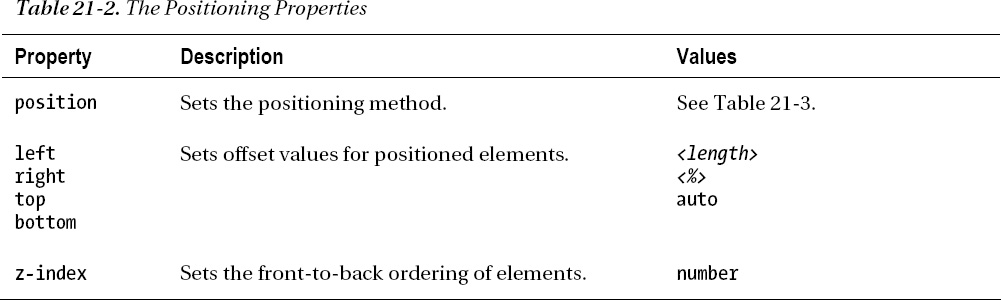
The simplest way of directing content is through positioning, which allows you to change the way that an element is laid out by the browser. Table 21-2 describes the positioning properties.
Setting the Position Type
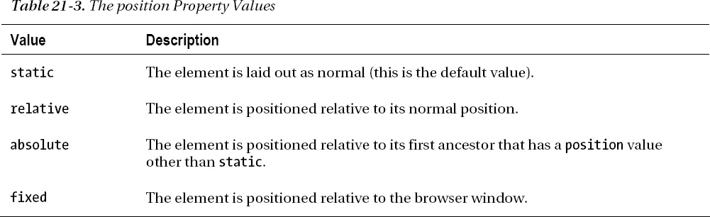
The position property sets the method by which an element is positioned. The allowed values are described in Table 21-3.
The different values for the position property specify different elements against which the element is positioned. You use the top, bottom, left, and right properties to offset the element from the element specified by the position property. Listing 21-1 demonstrates the effect of the different values.
Listing 21-1. Using the position Property
<!DOCTYPE HTML>

<html>

    <head>

        <title>Example</title>

        <meta name="author" content="Adam Freeman"/>

        <meta name="description" content="A simple example"/>

        <link rel="shortcut icon" href="favicon.ico" type="image/x-icon" />

        <style>

            img {

                top: 5px;

                left:150px;

                border: medium double black;

            }

        </style>

    </head>

    <body>

        <p>

            There are lots of different kinds of fruit - there are over 500 varieties

            of banana alone. By the time we add the countless types of apples, oranges,

            and other well-known fruit, we are faced with thousands of choices.

        </p>

        <p>

            One of the most interesting aspects of fruit is the variety available in

            each country. I live near London, in an area which is known for

            its apples.


        </p>

        <img id="banana" src="banana-small.png" alt="small banana"/>

        <p>

            When travelling in Asia, I was struck by how many different

            kinds of banana were available - many of which had unique flavours and

            which were only avaiable within a small region.

        </p>

        <p>

            <button>Static</button>

            <button>Relative</button>

            <button>Absolute</button>

            <button>Fixed</button>

        </p>

        <script>

            var buttons = document.getElementsByTagName("BUTTON");

            for (var i = 0; i < buttons.length; i++) {

                buttons[i].onclick = function(e) {

                    document.getElementById("banana").style.position =

                        e.target.innerHTML;

                };

            }

        </script>

    </body>
</html>
In this example, I have added a small script to the page that changes the value of the position property on an img element based on button presses. Notice that I have set the left property to 150px and the top property to 5px. This means that the img element will be offset by 150 pixels along the horizontal axis, and 5 pixels along the vertical axis when any position value other than static is applied. Figure 21-1 shows the transition from static (the default value) to relative.
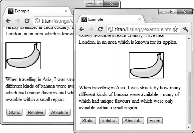
Figure 21-1. The static and relative values for the position property
The relative value applies the top, bottom, left, and right properties to position the element relative to where it would be under the static value. As you can see in the figure, the left and top values of 150px cause the img element to be moved down and to the right.
The absolute value causes the element to be positioned relative to the nearest ancestor that has a position value other than static. There is no such element in this example, which means that the element is positioned relative to the body element, as shown in Figure 21-2.
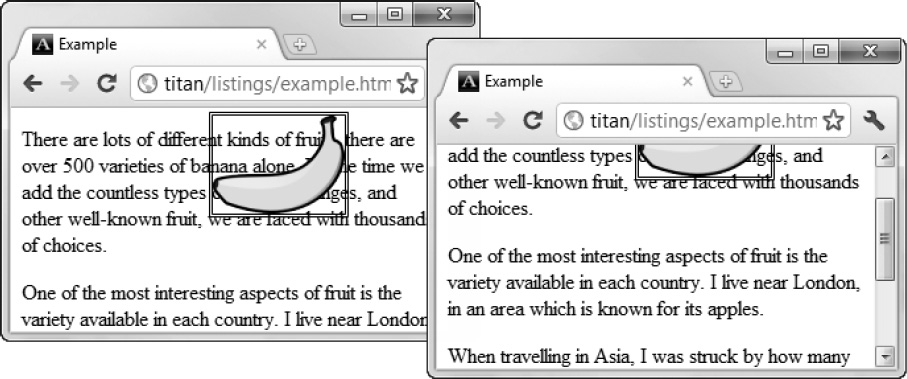
Figure 21-2. The absolute value of the position property
Notice that when I scroll the browser page, the img element moves with the rest of the content. This is in contrast to how the fixed value works, as shown in Figure 21-3.
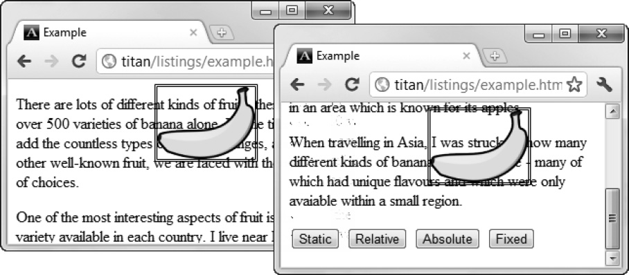
Figure 21-3. The fixed value of the position property
When you use the fixed value, the element is placed relative to the browser window. This means that the element occupies the same location, even when the rest of the content is scrolled up or down.
Setting the Z-Order
The z-index property lets you specify the front-to-back order in which elements are drawn. This property is summarized in Table 21-4.
The value for the z-index value is a number, and negative values are allowed. The smaller the value, the further to the back the element will be drawn. This property has utility only when elements overlap, as is the case in Listing 21-2.
Listing 21-2. Using the z-index Property
<!DOCTYPE HTML>

<html>

    <head>

        <title>Example</title>

        <meta name="author" content="Adam Freeman"/>

        <meta name="description" content="A simple example"/>

        <link rel="shortcut icon" href="favicon.ico" type="image/x-icon" />

        <style>

            img {

                border: medium double black;;

                background-color: lightgreay;

                position: fixed;

            }


            #banana {

                z-index: 1;

                top: 15px;

                left:150px;

            }


            #apple {

                z-index: 2;

                top: 25px;

                left:120px;

            }

        </style>

    </head>

    <body>

        <p>

            There are lots of different kinds of fruit - there are over 500 varieties

            of banana alone. By the time we add the countless types of apples, oranges,

            and other well-known fruit, we are faced with thousands of choices.

        </p>

        <p>

            One of the most interesting aspects of fruit is the variety available in

            each country. I live near London, in an area which is known for

            its apples.


        </p>
        <img id="banana" src="banana-small.png" alt="small banana"/>

        <img id="apple" src="apple.png" alt="small banana"/>

        <p>

            When travelling in Asia, I was struck by how many different

            kinds of banana were available - many of which had unique flavours and

            which were only avaiable within a small region.

        </p>

    </body>

</html>
In this example, I have created two fixed position img elements and set the top and left values so that the elements overlap. The z-index value of the img element with the id value of apple is the larger of the two values and, therefore, will be drawn over the banana image, as shown in Figure 21-4.
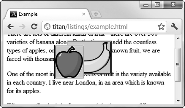
Figure 21-4. Using the z-index property
The default value for the z-index property is zero, which is why the browser has drawn the images over the p elements.
Creating Multicolumn Layouts
The multicolumn feature allows you to lay out content in multiple vertical columns, much like you would see in a newspaper. Table 21-5 describes the multicolumn properties.
Listing 21-3 shows the multicolumn layout applied to an HTML document.
Listing 21-3. Using the Multicolumn Layout
<!DOCTYPE HTML>

<html>

    <head>

        <title>Example</title>

        <meta name="author" content="Adam Freeman"/>

        <meta name="description" content="A simple example"/>

        <link rel="shortcut icon" href="favicon.ico" type="image/x-icon" />

        <style>

            p {

                column-count: 3;

                column-fill: balance;

                column-rule: medium solid black;

                column-gap: 1.5em;

            }
            img {

                float: left;

                border: medium double black;

                background-color: lightgray;

                padding: 2px;

                margin: 2px;

            }

        </style>

    </head>

    <body>

        <p>

            There are lots of different kinds of fruit - there are over 500 varieties

            of banana alone. By the time we add the countless types of apples, oranges,

            and other well-known fruit, we are faced with thousands of choices.

            <img src="apple.png" alt="apple"/>

            One of the most interesting aspects of fruit is the variety available in

            each country. I live near London, in an area which is known for

            its apples.

            <img src="banana-small.png" alt="banana"/>

            When travelling in Asia, I was struck by how many different

            kinds of banana were available - many of which had unique flavours and

            which were only avaiable within a small region.


            And, of course, there are fruits which are truely unique - I am put in mind

            of the durian, which is widely consumed in SE Asia and is known as the

            "king of fruits". The durian is largely unknown in Europe and the USA - if

            it is known at all, it is for the overwhelming smell, which is compared

            to a combination of almonds, rotten onions and gym socks.

        </p>

    </body>

</html>
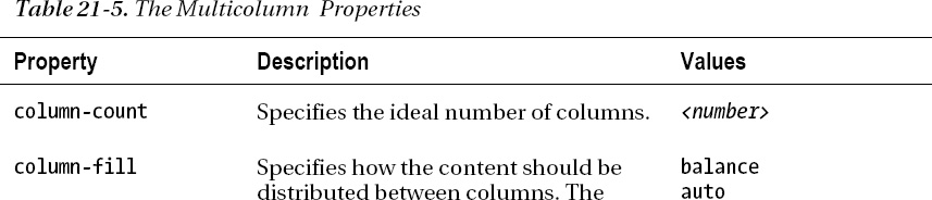
In this example, I have applied some of the multicolumn properties to a p element. This element contains a mix of text and img elements, and you can see the column effect in Figure 21-5.
Figure 21-5. A multicolumn layout
 Note The figure shows Opera, which is the only browser that supports the multicolumn layout at the time of writing. Not all of the properties are implemented, but the basic functionality is present.
As Figure 21-5 shows, the content of the p element flows from one column to the next, much as in the style of a newspaper page. I applied the float property to the img elements in this example so that the text content of the p element will flow nicely around the images. Details of the float property can be found in Chapter 20.
I used the column-count property to specify three columns in this layout. The browser will adjust the width of the columns as the window is resized to preserve the number of columns. An alternative is to specify the desired width of the columns instead, as shown in Listing 21-4.
Listing 21-4. Setting the Width of the Columns
…

<style>

    p {

        column-width: 10em;

        column-fill: balance;
        column-rule: medium solid black;

        column-gap: 1.5em;

    }


    img {

        float:left;

        border: medium double black;

        background-color: lightgray;

        padding: 2px;

        margin: 2px;

    }

</style>

…
When you apply this property, the browser preserves the specified column width by adding and removing columns to the element, as shown in Figure 21-6.
Figure 21-6. Defining columns by width, rather than count
Creating Flexible Box Layouts
The flexible box layout (also known as flexbox) is a CSS3 enhancement that adds a new value for the display property (flexbox), and defines some additional properties. The flexible layout lets you create fluid interfaces that respond well when the browser window is resized. This is done by distributing unused space in a container block among the contained elements. The specification for flexbox defines the following new properties:
As I write this, the standard for the flexible box layout remains volatile. The names of the properties and their values have recently changed. The mainstream browsers have implemented the core functionality of this feature using browser-specific properties and values, based on the previous property names.
The flexbox is a useful and important addition to CSS, and so I am going to show you the functionality based on the earlier draft of the standard and using the –webkit prefixed properties. This is not ideal, but it will give you a sense of what the flexbox does and, hopefully, leave you in a position to easily transition to the finished standard when it becomes available and widely implemented. Given the difference between the specification and the implementation, let’s start with a definition of the problem that the flexbox sets out to solve. Listing 21-5 shows a simple layout with a problem.
Listing 21-5. An HTML Document with a Layout Problem
<!DOCTYPE HTML>

<html>

    <head>

        <title>Example</title>

        <meta name="author" content="Adam Freeman"/>

        <meta name="description" content="A simple example"/>

        <link rel="shortcut icon" href="favicon.ico" type="image/x-icon" />

        <style>

            p {

                float:left;

                width: 150px;

                border: medium double black;

                background-color: lightgray;

            }

    </style>

    </head>

    <body>

        <div id="container">

            <p id="first">

                There are lots of different kinds of fruit - there are over 500 varieties

                of banana alone. By the time we add the countless types of apples,

                oranges, and other well-known fruit, we are faced with thousands

                of choices.

            </p>

            <p id="second">

                One of the most interesting aspects of fruit is the variety available in

                each country. I live near London, in an area which is known for

                its apples.

            </p>

            <p id="third">

                When travelling in Asia, I was struck by how many different kinds of
                banana were available - many of which had unique flavours and which

                were only avaiable within a small region.

            </p>

        </div>

    </body>

</html>
There are three p elements contained within a div. I want to display the p elements in a horizontal row, which is easily done using the float property (described in Chapter 20). You can see how the browser displays this HTML in Figure 21-7.
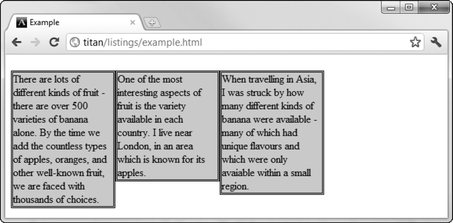
Figure 21-7. An element with undistributed empty space
The problem you can use the flexbox to solve is how you deal with the block of empty space that appears to the right of the p elements. There are several ways that you can solve this problem. For example, you could use percentage widths, but the flexbox gives you a much more fluid and elegant alternative. Table 21-6 shows the three -webkit properties that implement the core of flexbox functionality (I have omitted the –webkit prefix for brevity).

Creating a Simple Flexbox
You create a flexbox using the display property. The standard value will be flexbox, but you must use –webkit-box until the standard is completed and implemented. You tell the browser how to allocate the unused space between elements using the box-flex property. You can see the new display values and the box-flex property in Listing 21-6.
Listing 21-6. Creating a Simple Flexbox
<!DOCTYPE HTML>

<html>

    <head>

        <title>Example</title>

        <meta name="author" content="Adam Freeman"/>

        <meta name="description" content="A simple example"/>

        <link rel="shortcut icon" href="favicon.ico" type="image/x-icon" />

        <style>

            p {

                width: 150px;

                border: medium double black;

                background-color: lightgray;

                margin: 2px;

            }

            #container {

                display: -webkit-box;

            }

            #second {

               -webkit-box-flex: 1;

            }

        </style>

    </head>

    <body>

        <div id="container">

            <p id="first">

                There are lots of different kinds of fruit - there are over 500 varieties

                of banana alone. By the time we add the countless types of apples,

                oranges, and other well-known fruit, we are faced with thousands

                of choices.

            </p>

            <p id="second">

                One of the most interesting aspects of fruit is the variety available in
                each country. I live near London, in an area which is known for

                its apples.

            </p>

            <p id="third">

                When travelling in Asia, I was struck by how many different kinds of

                banana were available - many of which had unique flavours and which

                were only avaiable within a small region.

            </p>

        </div>

    </body>

</html>
The display property is applied to the flexbox container. This is the element that will have the additional space and whose contents you want to lay out flexibly. The box-flex property is applied to elements inside the flexbox container and tells the browser which elements should be flexed in size as the size of the container changes. In this case, I have selected the p element, which has an id value of second.
Tip Notice that I have removed the float property from the style declaration for the p elements. Flexbox elements cannot contain floating elements.
You can see how the browser flexes the size of the selected element in Figure 21-8.
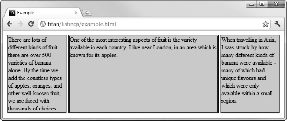
Figure 21-8. A flexing element
I have expanded the browser window in Figure 21-8, which has caused the div container to expand and the second paragraph to flex to take up the additional space. Flexing isn’t just about additional space; when I shrink the browser window, the flexing element is the one that is resized to accommodate the space loss, as shown in Figure 21-9. Notice that the elements to which the box-flex property is applied do not change in size.
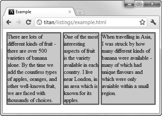
Figure 21-9. A flexing element resized to accommodate less space
Flexing Multiple Elements
You can tell the browser to flex the sizes of more than one element by applying the box-flex property. The values that you set determine the ratio that the browser will use to allocate space. Listing 21-7 shows changes to the style element of the previous example.
Listing 21-7. Creating Multiple Flex Elements
…

<style>

    p {

        width: 150px;

        border: medium double black;

        background-color: lightgray;

        margin: 2px;

    }

    #container {

        display: -webkit-box;

    }


    #first {

        -webkit-box-flex: 3;

    }


    #second {
       -webkit-box-flex: 1;

    }

</style>

…
I have applied the box-flex property to the p element with the id of first. The value of this property is 3, meaning that the browser will allocate three times of the additional space to the first element as it will to the second element. When you create ratios like this, you are referring to only the flexibility of the element. You use the ratio to allocate additional space or to reduce the size of the element, not to change its preferred size. You can see how the ratio is applied in Figure 21-10.
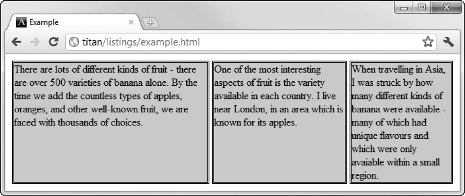
Figure 21-10. Creating a flexibility ratio
Dealing with Vertical Space
The box-align property lets you tell the browser what to do with any additional vertical space. This element is summarized in Table 21-7.
The default is to stretch the elements vertically so that they fill the space. You can see this in Figure 21-10, where the first two p elements have been sized so that there is empty space under their contents. Table 21-8 shows the allowed values for the box-align property.
Listing 21-8 shows the style element changes to apply the box-align property. Note that this property is applied to the flex container and not the content elements.
Listing 21-8. Applying the box-align Property
…

<style>

    p {

        width: 150px;

        border: medium double black;

        background-color: lightgray;

        margin: 2px;

    }

    #container {

        display: -webkit-box;

        -webkit-box-direction: reverse;

        -webkit-box-align: end;

    }

    #first {

        -webkit-box-flex: 3;

    }

    #second {

       -webkit-box-flex: 1;

    }

</style>

…
In this example, I have selected the end value, which will mean that the content elements are placed on the bottom edge of the container element, and any vertical space will be displayed above them. You can see the effect of this value in Figure 21-11.
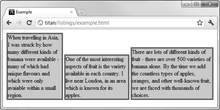
Figure 21-11. Applying the box-align property
Dealing with Maximum Sizes
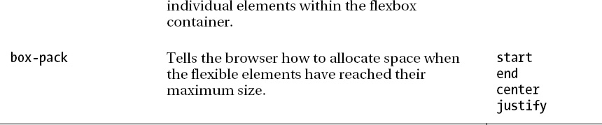
The flexbox model will respect maximum size values for content elements. The browser will flex the size of elements to fill additional space until the maximum sizes are reached. The box-pack property tells the browser what to do if all of the flexible elements have reached their maximum sizes before all of the additional space has been allocated. This property is summarized in Table 21-9.
Table 21-10 describes the allowed values for this property.
Listing 21-9 shows the box-pack property in use. Notice that I have defined max-width values for the p elements (you can learn more about the max-width in Chapter 20).
Listing 21-9. Using the box-pack Property
<!DOCTYPE HTML>

<html>

    <head>

        <title>Example</title>

        <meta name="author" content="Adam Freeman"/>

        <meta name="description" content="A simple example"/>

        <link rel="shortcut icon" href="favicon.ico" type="image/x-icon" />

<style>

    p {

        width: 150px;

        max-width: 250px;

        border: medium double black;

        background-color: lightgray;

        margin: 2px;

    }

    #container {

        display: -webkit-box;

        -webkit-box-direction: reverse;

        -webkit-box-align: end;

        -webkit-box-pack: justify;

    }

    #first {

        -webkit-box-flex: 3;

    }

    #second {

       -webkit-box-flex: 1;

    }

</style>

    </head>

    <body>

        <div id="container">

            <p id="first">

                There are lots of different kinds of fruit - there are over 500 varieties

                of banana alone. By the time we add the countless types of apples,

                oranges, and other well-known fruit, we are faced with thousands

                of choices.

            </p>

            <p id="second">
                One of the most interesting aspects of fruit is the variety available in

                each country. I live near London, in an area which is known for

                its apples.

            </p>

            <p id="third">

                When travelling in Asia, I was struck by how many different kinds of

                banana were available - many of which had unique flavours and which

                were only avaiable within a small region.

            </p>

        </div>

    </body>

</html>
You can see the effect of this property in Figure 21-12. After the flexible p elements have reached their maximum widths, the browser starts allocating the additional space between the elements. Notice that the space is only between the content elements; no space is placed before the first element or after the last.
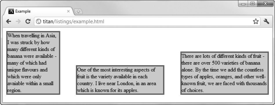
Figure 21-12. Using the box-pack property
Creating Table Layouts
For many years, the HTML table element has been widely used for laying out web pages, but the increased emphasis on the semantic significance of HTML elements makes this undesirable, and in HTML5 you must be careful only to use the table element to present tabular data (see Chapter 11 for details).
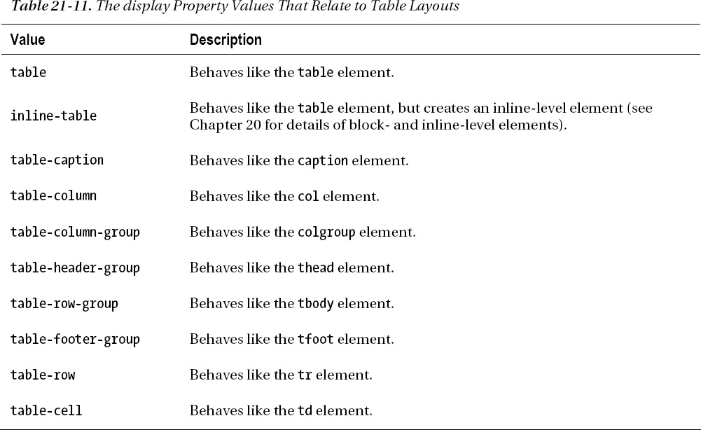
Of course, the reason that using the table element has been so popular is because it solves a very common layout problem: creating simple grids to hold content. Fortunately, you can use the CSS table layout feature to lay out your pages much as you would using the table element, but without abusing its semantic significance. You create CSS table layouts by using the display property. The values that relate to this feature are described in Table 21-11. Each of the values shown in the table corresponds to an HTML element.
The process of applying these values is demonstrated in Listing 21-10.
Listing 21-10. Creating a CSS Table Layout
<!DOCTYPE HTML>

<html>

    <head>

        <title>Example</title>

        <meta name="author" content="Adam Freeman"/>

        <meta name="description" content="A simple example"/>

        <link rel="shortcut icon" href="favicon.ico" type="image/x-icon" />

        <style>


            #table {

                display: table;

            }

            div.row {

                display: table-row;

                background-color: lightgray;

            }


            p {

                display: table-cell;
                border: thin solid black;

                padding: 15px;

                margin: 15px;

            }


            img {

                float:left;

            }


        </style>

    </head>

    <body>

        <div id="table">

            <div class="row">

                <p>

                    There are lots of different kinds of fruit - there are over 500

                    varieties of banana alone. By the time we add the countless types of

                    apples, oranges, and other well-known fruit, we are faced with

                    thousands of choices.

                </p>

                <p>

                    One of the most interesting aspects of fruit is the variety available

                    in each country. I live near London, in an area which is known for

                    its apples.

                </p>

                <p>

                    When travelling in Asia, I was struck by how many different kinds of

                    banana were available - many of which had unique flavours and which

                    were only avaiable within a small region.

                </p>

            </div>

            <div class="row">

                <p>

                    This is an apple. <img src="apple.png" alt="apple"/>

                </p>

                <p>

                    This is a banana. <img src="banana-small.png" alt="banana"/>

                </p>

                <p>

                    No picture here

                </p>

            </div>

        </div>

    </body>

</html>
You can see the effect of these values in Figure 21-13.
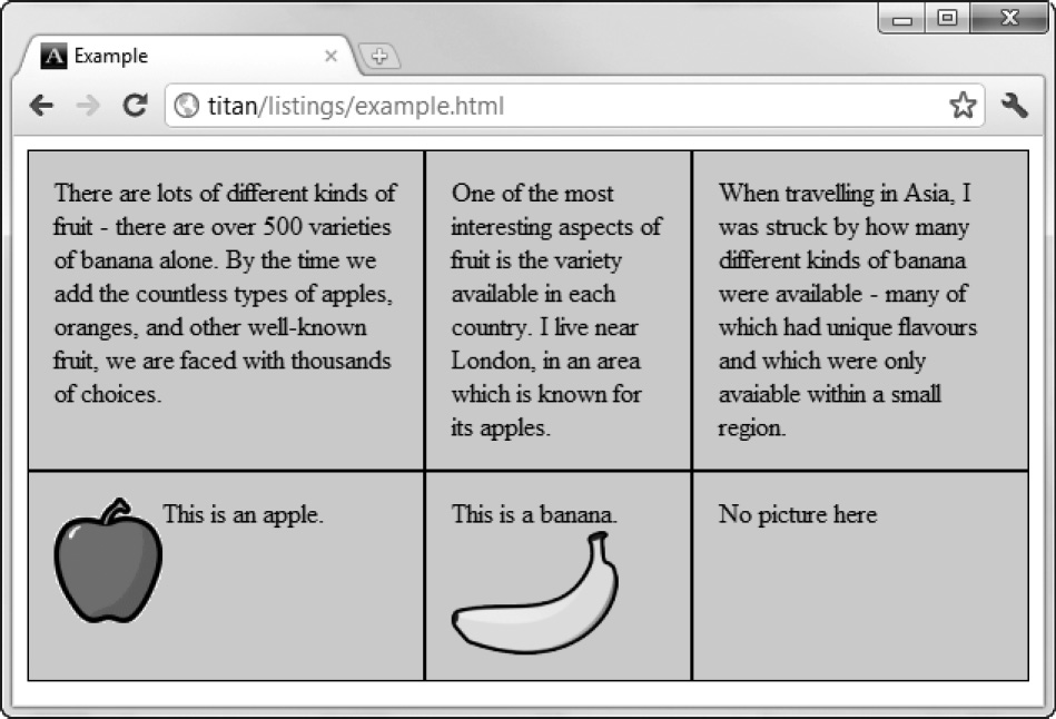
Figure 21-13. A simple CSS table layout
The behavior that table layouts are prized for is the automatic sizing of cells so that the widest or tallest content sets the size for the entire column or row. You can see this effect in Figure 21-13.
Summary
In this chapter, I have shown you the CSS features for creating layouts, ranging from the simple positioning of elements to the fluidity of the flexible box layout. I also showed you how to create table layouts without needing to abuse the table HTML element.
Layouts are an area that is receiving much attention in various CSS3 modules, but it is still early days and not all the feature sets are properly defined or implemented by the browsers. There is plenty to work within the interim (especially if you adopt a CSS layout framework), and I recommend you keep a close eye as CSS new layout modules gain acceptance.