
C H A P T E R 9
Creating and Using Custom Controls
When building screens in LightSwitch, you can present your data by using built-in controls. These controls include labels, text boxes, autocomplete boxes, and data grids. When writing more-sophisticated applications, you might want to allow users to view and enter data by using nonstandard controls. For example, you might want to allow users to enter numbers by using a slider control or to display data by using charts or graphs.
Fortunately, you’re not stuck with the default set of controls that LightSwitch provides. Because LightSwitch applications are based on Silverlight, you can choose to present your data by using any Silverlight custom control that you choose. This chapter shows you how to use Silverlight custom controls in your application, including how to perform the necessary data binding that makes everything work.
Using Custom Controls vs. Control Extensions
You may have encountered LightSwitch control extensions such as the Excel data importer control or search filter control. If so, you might wonder about the difference between a control extension and a custom control.
A control extension needs to be installed into the Visual Studio IDE and allows customized controls to be reused in multiple applications. You can create your own custom control extension, or download and install extensions that others have created.
Silverlight custom controls, on the other hand, can be used without having to install anything extra onto your machine. Creating a custom control therefore requires less work. However, you are more restricted in what you can do with a custom control. For example, group controls can be created only as an extension. RowsLayout and TableLayout are examples of group controls that you may have come across. This type of control represents a container for holding multiple child content items.
Directly Using Silverlight Controls
The easiest way to use custom controls is to set up the data items on your LightSwitch screen to directly use the UI controls in the Silverlight SDK. You can find these controls in the System.Windows.Controls namespace. Of course, you could choose to use any third-party or homegrown control. However, directly using the controls in the Silverlight SDK very quickly opens up a whole host of additional UI elements, including the following:
The biggest advantage of this technique is that you have to write only minimal code. For example, you don’t have to create an additional project, or to install a higher level of Visual Studio 2010 onto your machine. The next section demonstrates this technique by using the PasswordBox control.
The PasswordBox Control
PasswordBox is a simple control that you can use to replace the default text box control. It provides a masked password input box and replaces any text characters that you type with a series of dots.
There are two parts to using a custom control. First, you must specify a custom control for the data item that you want to use. Second, you must write code that binds the control to your underlying data.
Specifying a Control from System.Windows.Controls
To demonstrate the PasswordBox control, we’ll create a new data entry screen based on a table called users. This table contains a property called password, and the contents will be shown by using the PasswordBox control.
By default, LightSwitch displays the password value by using a text box control. In the screen designer, select the password data item and go to the properties pane (Figure 9-1). In the Appearance group, select the Custom Control option from the Control Type drop-down list.
In the General section, you’ll see a Change hyperlink next to the Custom Control text box, as shown in Figure 9-2. Click this link, and in the dialog box that appears, expand the System.Windows node. Selecting the System.Windows.Controls namespace brings up a list of all the controls that you can use. In this example, we’ll select the PasswordBox control. However, you would carry out the same process if you wanted to use one of the other controls instead.
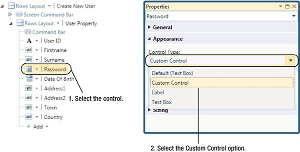
Figure 9-1. Specifying a custom control
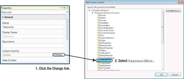
Figure 9-2. Selecting the PasswordBox control
If you can’t see the PasswordBox control, make sure that you have chosen the System.Windows DLL, as shown in Figure 9-3, rather than one of the other DLLs in the Add Custom Control dialog box.
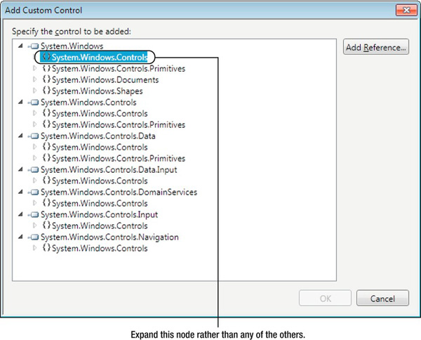
Figure 9-3. Make sure to choose the first node.
Data Binding by Using SetBinding
Now that you’ve specified a custom control, the next step is to bind it to the password property on your screen. You’ll use the SetBinding method in the screen’s activating event to do this.
In the screen designer, click the Write Code button and select the Activated event. Now enter the code as shown in Listing 9-1.
Listing 9-1. Calling the SetBinding Method
VB:


File : OfficeCentralClientUserCodeNewUser.vb


Private Sub CreateNewUser_Activated()

    Dim password As IContentItemProxy = Me.FindControl("Password")

    password.SetBinding(System.Windows.Controls.PasswordBox.PasswordProperty, "Value",

        Windows.Data.BindingMode.TwoWay)

End Sub
C#:


File : OfficeCentralClientUserCodeNewUser.cs


partial void CreateNewUser_Activated()

{

    IContentItemProxy password = this.FindControl("Password");

    password.SetBinding(System.Windows.Controls.PasswordBox.PasswordProperty, "Value",

          System.Windows.Data.BindingMode.TwoWay);

}
The code obtains a reference to the PasswordBox control by using the FindControl method. This method requires the name of the control, which you can find in the properties window, shown in Figure 9-4. Note that the property name doesn’t always match the control name, because you could add multiple instances of the password property onto your screen.
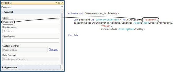
Figure 9-4. Using the FindControl method
The FindControl method returns an object of type IContentItemProxy, which is LightSwitch’s view-model object. The object’s SetBinding method performs the actual binding. This method accepts three arguments. The first argument is the dependency property that you want to bind to. In this example, the PasswordBox control exposes a dependency property called PasswordProperty. Don’t worry too much if you don’t understand what a dependency property is. This will be explained in more detail later in this chapter. For the time being, just think of this as a property that you can bind data to.
If you don’t know which dependency property to use when working against a control, IntelliSense lists all the possible choices for you. For IntelliSense to show the correct choices, you’ll need to specify the control type that you’ve used. In our example, the dependency property value is prefixed with the control type of System.Windows.Controls.PasswordBox.
The second argument is the binding path. This is the most difficult part to get right because a string value is expected, and Visual Studio provides very little guidance as to what you should enter. If you get this wrong, the data binding simply fails to work. Compile and runtime errors will not be generated, so tracing the exact cause of the error is often difficult.
The string property Value is commonly given as a binding path. This indicates that the dependency property will be bound to the object that is specified in the Data Context text box, shown in Figure 9-5. You could also choose to use the binding path StringValue rather than Value. StringValue reflects any specific formatting applied by the property, whereas Value simply returns the raw value. These property names (Value and StringValue) are public properties of Microsoft.LightSwitch.Presentation.Implementation.ContentItem.
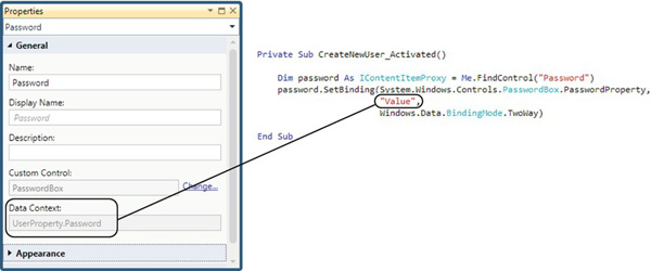
Figure 9-5. The Value data binding path will reference the Data Context text box
The final argument is the binding mode. You can supply one of three values: OneTime, OneWay, or TwoWay. OneTime updates the control from the source data when the data binding is created. OneWay updates the control from the source data when the data binding is created, and also whenever the source data changes afterward. TwoWay updates the control and source in both directions whenever either of them changes.
If you now run the application and open the screen, you’ll see that the PasswordBox is bound to the password property. In Figure 9-6, you’ll notice that the alignment doesn’t quite match those of the other text boxes. You can set the Horizontal Alignment setting to stretch, and use the other appearance settings at your disposal to format your screen as desired.
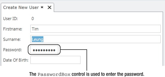
Figure 9-6. PasswordBox control as it appears onscreen
 Tip Rather than using hard-coded binding paths, you could create a helper library that exposes a set of constants. The C# class would look something like this:
public static class ContentItemProperty

{

    public const string Value = "Value";

    public const string StringValue = "StringValue";

    public const string DisplayName = "DisplayName";

    public const string Details = "Details";

    // etc.

}
The ComboBox Control
Another control that you can use from the System.Windows.Controls namespace is the Silverlight ComboBox control. This control is a useful alternative to the AutoCompleteBox. A disadvantage of the AutoCompleteBox is that items are not limited to the items that are shown in the list. Users can freely type in whatever text they choose, and if invalid data is entered, the user isn’t notified until an attempt is made to save the screen. The ComboBox control resolves this problem by limiting item selections to only those shown in the list.
Designing the Screen
Setting up a screen collection to use a ComboBox control closely resembles the technique that was used to set up the PasswordBox control. To demonstrate this technique, we’ll create a new data screen based on the orders table. A ComboBox control is added to enable a customer to be selected.
By default, LightSwitch renders the customer property as an AutoCompleteBox control. If you use the same technique as used earlier to change the AutoCompleteBox to a ComboBox, the control won’t be automatically populated with data values. Instead, a collection must be added onto the screen to populate the ComboBox with data values.
To do this, click the Add Data Item button and create a new query to return all customers. Once again, you’ll need some code in the screen activated event to perform the data binding (see Listing 9-2). Unlike the previous example, a second call to the SetBinding method has to be made to bind the ComboBox drop-down values. The binding path given is Screen.Customers. It may be interesting to know that the binding to Screen.Customers displays the ToString() value of the customer, which is governed by the Summary property on the customer entity. In the third part of the SetBinding syntax, Customers refers to the name given to the query.
Listing 9-2. Data binding a ComboBox control
VB:


File : ShipperCentralClientUserCodeNewOrder.vb


Private Sub CreateNewOrder_Activated()
    Dim comboControl As IContentItemProxy = Me.FindControl("Customer")

    comboControl.SetBinding(

          System.Windows.Controls.ComboBox.ItemsSourceProperty

        , "Screen.Customers"

        , Windows.Data.BindingMode.TwoWay

        )


    comboControl.SetBinding(

    System.Windows.Controls.ComboBox.SelectedItemProperty,

    "Screen.OrderProperty.Customer",

    Windows.Data.BindingMode.TwoWay)


End Sub


C#:


File : ShipperCentralClientUserCodeNewOrder.cs


partial void CreateNewOrder_Activated()

{

    IContentItemProxy comboControl = this.FindControl("Customer");

    comboControl.SetBinding(

        System.Windows.Controls.ComboBox.ItemsSourceProperty,

        "Screen.Customers",

        System.Windows.Data.BindingMode.TwoWay);


    comboControl.SetBinding(

        System.Windows.Controls.ComboBox.SelectedItemProperty,

        "Screen.OrderProperty.Customer",

        System.Windows.Data.BindingMode.TwoWay);

}
Now when you run the application and open the screen, the ComboBox appears as expected and allows you to select a customer.
The HyperLinkButton Control
The final control that we’ll cover in the System.Windows.Controls namespace is the HyperLinkButton control. This example explores the SetBinding method further, and explains why and how you would use a ValueConverter.
As the name suggests, the HyperLinkButton control displays a clickable link that opens up a web page. The three important attributes that you can set are as follows:
NavigateURL: The URL address that the hyperlink points toContent: The text that is displayed in the hyperlinkTargetName: This is where the hyperlink will open
Value Converters
To show you how to use this control, we’ll add a HyperLinkButton to a product screen. The text displayed on the hyperlink comes from a description field in a Product table. The hyperlink will point to a URL in the following format:
http://provslsdev.com/product.aspx?productId=8
In this URL, the number 8 serves as a placeholder and is replaced with the primary key ID of the product. A hyperlink URL needs to be constructed, and you would build this as a string. However, the HyperLinkButton control expects to be data bound to an object of type System.Uri. Something needs to convert your string URL into an object of type System.Uri, and this would be done by a value converter.
The code for a value converter called ProductID2UriConverter is shown in Listing 9-3. This class is best added into the UserCode folder in the common project. For simplicity, however, it could be added into the code file for your screen. A value converter class implements the IValueConverter interface. When writing a value converter, you need to implement the Convert and ConvertBack methods. In this example, the Convert method accepts a value argument, performs the conversion, and returns an object of type System.Uri. Because users cannot modify and update the URI the HyperLinkButton control, the ConvertBack method simply returns a null. (You could also throw a NotImplemented exception if you weren’t going to provide an actual implementation, or if it doesn’t make sense to convert back, or if the binding will always be one way.) In most other cases, you would write some code that performs the conversion in the opposite direction.
Listing 9-3. Value Converter Code
VB:

File : ShipperCentralClientUserCodeEditableProductsGrid.vb


Imports System.Windows.Data


Public Class ProductID2UriConverter

    Implements IValueConverter


    Public Function Convert(

         value As Object, targetType As System.Type

       , parameter As Object, culture As System.Globalization.CultureInfo

        ) As Object

    Implements System.Windows.Data.IValueConverter.Convert


        Return New Uri("http://provslsdev.com/product.aspx?productId=" & value.ToString())


    End Function


    Public Function ConvertBack(

    value As Object, targetType As System.Type

    , parameter As Object, culture As System.Globalization.CultureInfo

    ) As Object Implements System.Windows.Data.IValueConverter.ConvertBack


        Return Nothing

    End Function
End Class


C#:

File : ShipperCentralClientUserCodeEditableProductsGrid.cs


using System.Windows.Data;


public class ProductID2UriConverter : IValueConverter

{

    public object Convert(object value, Type targetType, object parameter,

System.Globalization.CultureInfo culture)

    {

        return new Uri(@"http://provslsdev.com/product.aspx?productId=" + value.ToString());

    }


    public object ConvertBack(object value, Type targetType, object parameter,

 System.Globalization.CultureInfo culture)

    {

        return null;

    }

}
To give another example of using a value converter, imagine that you have a slider control that expects to be bound to a decimal value. If you want to use this control with an integer value, you would need a value converter to perform the decimal-to-integer conversion, and vice versa.
As another example, you might want to bind the background color of a control to an integer value. Your data could include a priority field that stores numbers, say, from 1 to 5. If the priority is set to 1, the background color should be green. If the value is 5, the priority should be red. A value converter would allow you to convert an integer into an object of type System.Drawing.Color.
Data Binding Expressions
Now that you’ve written your value converter, you can build your screen. Create an editable grid screen based on the product table. In the same way as before, amend the Product Name content item to use a custom control. Set the custom control to be of type System.Windows.Controls.HyperlinkButton.
The HyperLinkButton control needs to have its TargetName property set. The values that you can use are identical to the standard HTML target values that you can set on a hyperlink. These values include _parent, _self, _top, and _blank. Because we want to open the link in a new window, the target value will be set to _blank. This value must be set by using a dependency property, and a local property is therefore needed to bind to this dependency property. Using the Add Data Item button, create a local string property called targetProperty.
Listing 9-4 shows the code that you would write in the Activated event to perform the data binding by using the SetBinding method.
Listing 9-4. Data Binding the HyperLinkButton Control
VB:

File : ShipperCentralClientUserCodeEditableProductsGrid.vb


Imports System.Windows.Controls
Private Sub EditableProductsGrid_Activated()

    Dim product As IContentItemProxy = Me.FindControl("ProductName")

    targetProperty = "_blank"

    Dim converter As New ProductID2UriConverter()

    product.SetBinding(HyperlinkButton.ContentProperty,

        "Value",

        BindingMode.OneWay)


    product.SetBinding(HyperlinkButton.NavigateUriProperty,

        "Details.Entity.ProductID",

        converter, BindingMode.OneWay)


    product.SetBinding(HyperlinkButton.TargetNameProperty,

        "Screen.targetProperty",

        BindingMode.OneWay)


End Sub


C#:


File : ShipperCentralClientUserCodeEditableProductsGrid.cs

using System.Windows.Controls;


partial void EditableProductsGrid_Activated()

{

    IContentItemProxy product = this.FindControl("ProductName");

    targetProperty = "_blank";

    ProductID2UriConverter converter = new ProductID2UriConverter();

    product.SetBinding(HyperlinkButton.ContentProperty,

        "Value",

        BindingMode.OneWay);


    product.SetBinding(HyperlinkButton.NavigateUriProperty,

        "Details.Entity.ProductID",

        converter,

        BindingMode.OneWay);


    product.SetBinding(HyperlinkButton.TargetNameProperty,

        "Screen.targetProperty",

        BindingMode.OneWay);


}
An important point about the preceding code is the binding path expressions that are used. Because the data context of the HyperLinkButton is set to the product name property, the ContentProperty dependency property is bound to the binding path expression Value. This means that the HyperLinkButton displays the product name.
The binding expression Details.Entity.ProductID is used for the NavigateUriProperty. The Details.Entity prefix is important because it allows you to reference the other fields in your property. Because the ProductID needs to be converted to the string URL representation, an instance of the ProductID2UriConverter is passed into the SetBinding method.
Finally, the TargetNameProperty is bound to the local targetProperty property. The value of targetProperty is set to the string value of _blank prior to the SetBinding method being called. The binding expression Screen.targetProperty is used in the SetBinding method. The Screen prefix allows you to reference other screen properties that you’ve added on your screen.
Figure 9-7 shows how the binding expressions in code relate to the data items that you see in the screen designer.
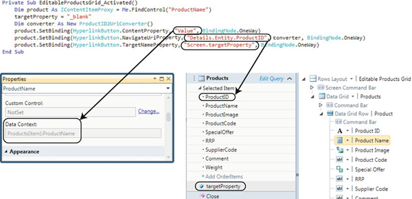
Figure 9-7. Using Details.Entity and screen objects in data binding expressions
Tip In all of the examples shown so far, the values of custom control properties are set by using the SetBinding method. This technique must be used when custom controls are contained within grids. If you’re adding custom controls onto a details screen, you can use another technique, in which you obtain a reference to the control by using the FindControl method. You can then add an event handler to handle the ControlAvailable event. This allows you to access the custom control in code and lets you set any of the property values as required. Chapter 11 demonstrates this technique by showing you how to open a report via a custom HyperlinkButton.
Creating a Custom Silverlight Class
The examples that you’ve seen so far have used the controls straight from the System.Windows.Controls namespace. If you want to create something a bit more complex, you’ll need to write your own custom control class. To do this, you’ll need to create a Silverlight class library. You can do this only if you have Visual Studio 2010 Professional or above installed. Therefore, you cannot create custom controls if you have only the stand-alone version of LightSwitch.
In the following example, you’ll learn how to create a slider control. This example is based on a table called ProductFeedback. The table contains a field called Satisfaction and enables the user to enter a satisfaction rating. This would be an integer value ranging from 0 to 100. The example highlights how you would create a custom control and shows you how to perform the data binding in XAML.
Creating a New Class and Control
In Visual Studio, create a new project using the Silverlight Class library template. If a dialog box prompts you to choose a Silverlight version, select Silverlight 4. In this example, the project will be called CentralControls.
After creating the project, choose the option to add a new item from Solution Explorer. Add a new Silverlight user control and call the file SliderControl.xaml. Drag a slider control from the toolbox onto your control. Because you want to allow users to enter values in the range of 0 to 100, set the minimum attribute to 0 and the maximum attribute to 100.
Data Binding in XAML
You’ve already seen how to bind to data by using the SetBinding method. An even simpler method is to hard-code the data bindings into the control. The advantage of doing this is that you can bind the data without having to write a single line of VB.NET or C# code.
Let’s suppose that you want to bind the contents of your control to the data context of a content item in LightSwitch. You can simply use the data binding path Value, just as before in the SetBinding example. If you use this technique to bind to specific properties on a screen, you’ll end up with a custom control that isn’t very reusable. We recommend not using anything other than Value when binding data in XAML.
Returning to the slider example, the XAML for this control is shown in Listing 9-5. This illustrates the minimum and maximum values mentioned earlier, and also the data binding syntax for the value.
Listing 9-5. RichTextBoxInternal.XAML Contents
<UserControl x:Class="CentralControls.Slider"

    xmlns="http://schemas.microsoft.com/winfx/2006/xaml/presentation"

    xmlns:x="http://schemas.microsoft.com/winfx/2006/xaml"

    xmlns:d="http://schemas.microsoft.com/expression/blend/2008"

    xmlns:mc="http://schemas.openxmlformats.org/markup-compatibility/2006"

    mc:Ignorable="d"

    d:DesignHeight="300" d:DesignWidth="400">


    <Slider Height="23" HorizontalAlignment="Left"

        Name="Slider1" VerticalAlignment="Top" Width="100"

        Value="{Binding Value, Mode=TwoWay }" Minimum="0" Maximum="100"/>


</UserControl>
Consuming the Control
Now that you’ve created your custom control, you can consume it in the same way as the earlier examples. First, you’ll need to build your custom control project.
At this point, create a new data screen based on the ProductFeedback table. Amend the Satisfaction content item to use a custom control. When the Add Custom Control dialog box appears, click the Add Reference button and browse to the Silverlight class library that you’ve created. Now set the custom control to be of type CentralControls.Slider.
When you run the application and open the screen, the slider control appears and allows you to set the satisfaction level, as shown in Figure 9-8.
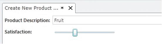
Figure 9-8. The slider control on a screen
Understanding Dependency Properties
In the first part of this chapter, you saw how to bind to a dependency property by using the SetBinding method. In this section, you’ll find out more about dependency properties and learn how to create one for yourself. We’ll create a rich text editor control to illustrate why you might want to create your own dependency property.
Introduction to Dependency Properties
Dependency properties are just like normal properties. Their values can be set and read in code just like normal properties. However, they are implemented differently by .NET and are optimized for performance in the scenarios where they are used. If you want to bind LightSwitch data to a property on a custom control, that property must be a dependency property.
Dependency properties are also used to support the use of styles and animations when writing custom Silverlight controls. They also provide change notifications, which alert your LightSwitch screen when a change is made to a custom control value.
Why Are They Called Dependency Properties?
The standard way of writing a property is to create setter and getter methods to set and retrieve the value of a private field. Additional logic can also be added to modify values during the set and get operations. In most coding scenarios, the value that you get from a property is the same as the value that is set. Dependency properties are different because private fields are not used for the underlying backing store. Instead, the value of a dependency property is determined by using a set of prioritized rules.
Let’s imagine a dependency property that relates to the background color of a control. The background color could be dependent on various factors. It could be inherited from a parent control or could be set in styles and themes. Furthermore, the control could be involved in an animation that constantly changes the background color. Given that the color can be set in multiple places, what color would be returned when you read the background color dependency property?
To determine the current value, a process called dynamic value resolution is used. This process establishes the value that takes precedence by assigning priorities to the different types of settings. In order of high to low priority, the settings are as follows:
If the control is currently being used in an animation, the background color applied by the animation takes precedence. If the control is not used in an animation, the local value is used instead. Local value refers to settings that are explicitly set in code (for example, MyCtrl.BackColor = Colors.Green) or in XAML. If a local value is not set, processing carries on down the chain until a value is found.
You can hopefully see how dependency properties are efficient in terms of their memory usage. If the value of a property is not set locally, the value is retrieved from a template or style, therefore resulting in no additional memory usage.
So dependency properties don’t hold a concrete value. Their value depends on how the property value has been set—hence the name dependency property.
Creating a Dependency Property
Having covered the theory behind dependency properties, what practical reason would you have for creating a dependency property in LightSwitch?
As you’ve seen, sharing data between LightSwitch and custom controls requires the use of a dependency property. If you want to use an existing Silverlight control and access a property that isn’t exposed through a dependency property, you’ll need to add one of your own.
As an example, let’s say that you want to create a custom control for viewing and editing rich text. The System.Windows.Controls namespace contains a RichTextBox control that you can use. Although this control has a content property that allows you to get and set the rich text shown, there isn’t a dependency property that you can bind to. You’ll therefore need to add a dependency property that gets and sets the content property that is shown.
In the CentralControls class, create a new Silverlight User Control called RichTextBoxInternal.xaml. Add a RichTextBox into your control. Listing 9-6 shows the XAML for this control.
Listing 9-6. RichTextBoxInternal.XAML Contents
<UserControl x:Class=" CentralControls.RichTextEditorInternal"

    xmlns="http://schemas.microsoft.com/winfx/2006/xaml/presentation"

    xmlns:x="http://schemas.microsoft.com/winfx/2006/xaml"

    xmlns:d="http://schemas.microsoft.com/expression/blend/2008"

    xmlns:mc="http://schemas.openxmlformats.org/markup-compatibility/2006"

    mc:Ignorable="d"

    d:DesignHeight="300" d:DesignWidth="400" HorizontalAlignment="Stretch"

VerticalAlignment="Stretch">


    <Grid x:Name="LayoutRoot" HorizontalAlignment="Stretch" VerticalAlignment="Stretch" >

        <Grid.RowDefinitions >

            <RowDefinition Height="1*"></RowDefinition>
        </Grid.RowDefinitions>

        <Grid.ColumnDefinitions >

            <ColumnDefinition Width="1*"></ColumnDefinition>

        </Grid.ColumnDefinitions>

        <RichTextBox HorizontalAlignment="Stretch" Margin="0" Name="richTextBox"

        VerticalAlignment="Stretch" />

    </Grid>

</UserControl>
Now that you’ve created the XAML for your control, there are two extra things that you need to do in code:
- Create a regular CLR .NET property that exposes the
DependencyPropertyby using theGetValueandSetValuemethods.- Register a set of
DependencyPropertiesby using the staticDependencyPropertyClass.
In the code-behind for your control, enter the code as shown in Listing 9-7.
Listing 9-7. Code-Behind for RichTextBoxInternal Control
VB:


Partial Public Class RichTextEditorInternal

    Inherits UserControl

    Public Sub New()

        InitializeComponent()

    End Sub

    Public Property Text As String

        Get

            Return MyBase.GetValue(RichTextViewerInternal.TextProperty)

        End Get

        Set(value As String)

            MyBase.SetValue(RichTextViewerInternal.TextProperty, value)

        End Set

    End Property


    Public Shared ReadOnly TextProperty As DependencyProperty =

        DependencyProperty.Register(

            "Text",

            GetType(String),

            GetType(RichTextViewerInternal),

            New PropertyMetadata(Nothing, AddressOf OnTextPropertyChanged))


    Public Shared Sub OnTextPropertyChanged(

        re As DependencyObject, e As DependencyPropertyChangedEventArgs)


        Dim richEdit As RichTextViewerInternal = DirectCast(re, RichTextViewerInternal)


        If richEdit.richTextBox.Xaml <> DirectCast(e.NewValue, String) Then

            Try

                richEdit.richTextBox.Blocks.Clear()
                If String.IsNullOrEmpty(DirectCast(e.NewValue, String)) = False Then

                    richEdit.richTextBox.Xaml = DirectCast(e.NewValue, String)

                End If

            Catch

                richEdit.richTextBox.Blocks.Clear()


                If String.IsNullOrEmpty(DirectCast(e.NewValue, String)) = False Then

                    richEdit.richTextBox.Selection.Text = DirectCast(e.NewValue, String)

                End If

            End Try

        End If

    End Sub


    Private Sub richTextBox_ContentChanged(

        sender As Object,

        e As System.Windows.Controls.ContentChangedEventArgs

        ) Handles richTextBox.ContentChanged


        Text = richTextBox.Xaml


    End Sub


End Class


C#:


public partial class RichTextEditorInternal : UserControl

{

    public RichTextEditorInternal()

    {

        InitializeComponent();

    }

    public string Text {

        get { return base.GetValue(RichTextViewerInternal.TextProperty).ToString(); }

        set { base.SetValue(RichTextViewerInternal.TextProperty, value); }

    }


    public static readonly DependencyProperty TextProperty =

        DependencyProperty.Register(

            "Text",

            typeof(string),

            typeof(RichTextViewerInternal),

            new PropertyMetadata(null, OnTextPropertyChanged));


    public static void OnTextPropertyChanged(

        DependencyObject re, DependencyPropertyChangedEventArgs e)

    {

        RichTextViewerInternal richEdit = (RichTextViewerInternal)re;


        if (richEdit.richTextBox.Xaml != (string)e.NewValue) {
            try {

                richEdit.richTextBox.Blocks.Clear();


                if (string.IsNullOrEmpty((string)e.NewValue) == false) {

                    richEdit.richTextBox.Xaml = (string)e.NewValue;

                }

            } catch {

                richEdit.richTextBox.Blocks.Clear();


                if (string.IsNullOrEmpty((string)e.NewValue) == false) {

                    richEdit.richTextBox.Selection.Text = (string)e.NewValue;

                }

            }

        }

    }


    private void richTextBox_ContentChanged(object sender,

System.Windows.Controls.ContentChangedEventArgs e)

    {

        Text = richTextBox.Xaml;

    }


}
Tip If you’re using C#, you can use code snippets in Visual Studio to help you write your dependency property. Type in propdp <tab><tab>. Visual Studio inserts the basic code that’s needed for a dependency property. You can then extend this code as required.
Code for Registering a Dependency Property
As shown in Listing 9-7, the dependency property is registered by using the following code (because we’re illustrating only the arguments to the Register method, only the C# code is shown for brevity):
public static readonly DependencyProperty TextProperty = DependencyProperty.Register(

      "Text"

    , typeof(string)

    , typeof(RichTextViewerInternal)

    , new PropertyMetadata(null, OnTextPropertyChanged)

    );
This code registers a dependency property called TextProperty. When you call the SetBinding method in your LightSwitch code, you can refer to this dependency property by using the name TextProperty. In keeping with standard .NET naming conventions, it is good practice to suffix any dependency properties that you create with the word Property.
The first argument to the Register method specifies the name of the underlying property that the dependency property exposes. In this example, we have created a standard .NET property called Text (shown in Listing 9-7). The second argument specifies the data type of the first argument (that is, the data type of the Text property).
For the third argument, you need to specify the owner type that is registering the dependency property. In the majority of cases, this will be name of the containing class (in this case, RichTextViewerInternal).
PropertyMetadata Argument
The final argument passed into the Register method is a PropertyMetadata object. This allows you to specify additional information about your dependency property. Referring back to Listing 9-7, a new PropertyMetadata object is created by using the following syntax:
new PropertyMetadata(null, OnTextPropertyChanged)
- The first argument to the
PropertyMetadataconstructor allows you to specify a default value. The default value is the final setting that is used when determining the value of a dependency property using dynamic value resolution. If you don’t want to set a default value, you can pass in null (as shown in our example).- The second argument that needs to be supplied is a value changed callback method. This is a method that gets called each time the dependency property value changes.
- In the example shown,
OnTextPropertyChangedis specified as the callback method. This is a method that we have created to update the contents of theRichTextBoxcontrol.- The
PropertyMetadataconstructor also accepts two additional optional parameters: the coerce value callback, and validation callback methods.
If you specify a coerce callback method, this method is executed first, whenever a value change is requested. You can use this to modify the specified value, and after this runs, the value changed callback method is called. As an example, you might use a coerce callback method if you wanted to create a maximum value dependency property to support the earlier slider control. The maximum value cannot be less than the minimum value. If an attempt is made to set the maximum value to less than the minimum value, the coerce callback method can be used to convert the value to be equal to the minimum value.
Finally, the validate callback method allows you to validate the value the user attempts to set. This method returns a Boolean. If you return false, an ArgumentException will be thrown.
Binding Dependency Properties to the Data Context
You’ve seen how to bind to the LightSwitch data context by specifying it in the XAML. The advantage of this is that you don’t need to write any extra data binding code in your LightSwitch screen. Let’s say that you wanted to bind the TextProperty that you’ve just created to the data context. The immediate problem is that the dependency properties that you write in code can’t be accessed in the XAML.
To get around this problem, a trick that we can use is to wrap a parent control around our custom control. The parent control acts as a conduit and exposes the XAML that enables the necessary data binding. Returning to the rich text example, we’ll create a custom control called RichTextEditor. The RichTextViewerInternal control is added onto this control. This exposes the underlying CLR Text property in the XAML. We can use this to set the data binding declaratively by specifying the binding path Value.
The XAML that is used for the RichTextEditor control is shown in Listing 9-8.
Listing 9-8. RichTextBox Parent Control
<UserControl xmlns:my="clr-namespace: CentralControls"  x:Class="

 CentralControls.RichTextViewer"

    xmlns="http://schemas.microsoft.com/winfx/2006/xaml/presentation"

    xmlns:x="http://schemas.microsoft.com/winfx/2006/xaml"

    xmlns:d="http://schemas.microsoft.com/expression/blend/2008"

    xmlns:mc="http://schemas.openxmlformats.org/markup-compatibility/2006"

    mc:Ignorable="d"

   d:DesignHeight="300" d:DesignWidth="400" HorizontalAlignment="Stretch"

 VerticalAlignment="Stretch">


    <Border BorderThickness="0" BorderBrush="Black"

        HorizontalAlignment="Stretch" VerticalAlignment="Stretch"  >

        <Grid x:Name="LayoutRoot" Background="White"

            HorizontalAlignment="Stretch" VerticalAlignment="Stretch">


            <my:RichTextViewerInternal HorizontalAlignment="Stretch" Margin="0"

                 VerticalAlignment="Stretch"  Text="{Binding Value, Mode=TwoWay}"/>


        </Grid>

    </Border>

</UserControl>
Having created this new control, you can now use it in the same way as before. However, you no longer need to write any SetBinding code in the Activated method to do the binding. As you can see, this clearly makes it much easier to consume custom controls in your LightSwitch screens.
Using Dependency Properties to Call Methods
Another practical reason for creating dependency properties is to use them as a trigger for calling methods in existing Silverlight controls.
Let’s take a look at the WebBrowser control as an example. This control is found in the System.Windows.Controls namespace. As the name suggests, the control allows you to display web pages or HTML content on a screen. Note that the control works only in LightSwitch desktop applications and won’t work in a browser application.
The WebBrowser control contains a method called Navigate. When called, this method accepts a URL argument and navigates to the URL supplied. If you were to use this control on a LightSwitch screen, how exactly would you call this method? There isn’t any easy way to reference the custom controls and to call their methods in the LightSwitch screen code. You could try using the FindControl method, which returns an IContentItemProxy, but there isn’t any way to cast this to the underlying Silverlight control. (You could write code in the ControlAvailable event of the IContentItemProxy object, but this fires only once during the life cycle of the screen.)
To solve this problem, you can create a custom control for the WebBrowser control. You can then create a dependency property that allows LightSwitch to bind a URL value to the control. In the value changed callback method, you can then write the code to call the Navigate method. Listing 9-9 and Listing 9-10 shows the XAML and .NET code that would be used.
Listing 9-9. WebBrowserControl Parent Control
<UserControl x:Class="CentralControls.WebBrowserControl"

    xmlns="http://schemas.microsoft.com/winfx/2006/xaml/presentation"

    xmlns:x="http://schemas.microsoft.com/winfx/2006/xaml"

    xmlns:d="http://schemas.microsoft.com/expression/blend/2008"

    xmlns:mc="http://schemas.openxmlformats.org/markup-compatibility/2006"

    mc:Ignorable="d"

    d:DesignHeight="300" d:DesignWidth="400">


    <Grid x:Name="LayoutRoot" Background="White"

        HorizontalAlignment="Stretch" VerticalAlignment="Stretch" >

        <WebBrowser  Name="wb1" Source="" HorizontalAlignment="Stretch"

            VerticalAlignment="Stretch" ></WebBrowser>


    </Grid>

</UserControl>
Listing 9-10. WebBrowserControl Code
VB:


Imports System.Windows

Imports System.Windows.Controls


Namespace CentralControls

    Public Partial Class WebBrowserControl

        Inherits UserControl

        Public Sub New()

            InitializeComponent()

        End Sub


        Public Property uri() As Uri

            Get

                Return DirectCast(GetValue(URIProperty), Uri)

            End Get

            Set

                SetValue(URIProperty, value)

            End Set

        End Property


        Public Shared ReadOnly URIProperty As DependencyProperty =

            DependencyProperty.Register(

                "uri",

                GetType(Uri),

                GetType(WebBrowserControl),

                New PropertyMetadata(Nothing, AddressOf OnUriPropertyChanged))


        Private Shared Sub OnUriPropertyChanged(

            re As DependencyObject, e As DependencyPropertyChangedEventArgs)
            If e.NewValue IsNot Nothing Then

                Dim wb As WebBrowserControl = DirectCast(re, WebBrowserControl)

                wb.wb1.Navigate(DirectCast(e.NewValue, Uri))

            End If

        End Sub


    End Class

End Namespace


C#:


using System.Windows;

using System.Windows.Controls;


namespace CentralControls

{

    public partial class WebBrowserControl : UserControl

    {

        public WebBrowserControl()

        {

            InitializeComponent();

        }


        public  Uri uri

        {

            get { return (Uri)GetValue(URIProperty); }

            set { SetValue(URIProperty, value); }

        }


        public static readonly DependencyProperty URIProperty =

            DependencyProperty.Register(

                "uri",

                typeof(Uri ),

                typeof(WebBrowserControl),

                new PropertyMetadata(null, OnUriPropertyChanged));


        private static void OnUriPropertyChanged(

            DependencyObject re, DependencyPropertyChangedEventArgs e)

        {


            if (e.NewValue != null)

            {

                WebBrowserControl wb = (WebBrowserControl)re;

                wb.wb1.Navigate((Uri)e.NewValue);

            }


        }


    }

}
Calling Screen Code from a Custom Control
One of the things that you might want to do is to call methods on your LightSwitch screen from your custom control. This often makes a lot of sense. Custom controls are basically just views of the data and should be as dumb as possible. In other words, custom controls should contain minimal business logic.
As an example, let’s imagine that you want to create a stylized button. Let’s say that the end user wants a green button with white text. You’d create a custom control to apply the presentation style. However, clicking the custom button should call business logic on your LightSwitch screen, rather than logic on the control itself.
To demonstrate this example, create a new custom control called CustomButton and add a standard Silverlight button. Style the button as appropriate. Listing 9-11 shows how your XAML might look. For the purposes of this example, the button calls a screen method called SaveData, which saves the data on the screen.
Listing 9-11. CustomButton
<UserControl x:Class="CentralControls.CustomButton"

    xmlns="http://schemas.microsoft.com/winfx/2006/xaml/presentation"

    xmlns:x="http://schemas.microsoft.com/winfx/2006/xaml"

    xmlns:d="http://schemas.microsoft.com/expression/blend/2008"

    xmlns:mc="http://schemas.openxmlformats.org/markup-compatibility/2006"

    mc:Ignorable="d"

    d:DesignHeight="300" d:DesignWidth="400">


    <Grid x:Name="LayoutRoot" Background="White">

        <Button Content="Button Text" Height="125" HorizontalAlignment="Left"

            Margin="34,63,0,0"  Name="CustomButton1"

            VerticalAlignment="Top" Width="295" Background="#FF1FC453"

            Click= "CustomButton_Click" />

    </Grid>

</UserControl>
Listing 9-12 shows the code that you would write in the OnClick method of your custom code to call the screen method. A reference needs to be added to the Microsoft.LightSwitch.Client.dll and Microsoft.LightSwitch.dll files. By default, these can be found in the following directory:
C:Program FilesMicrosoft Visual Studio 10.0Common7IDELightSwitch1.0Client
Listing 9-12. Code to Call a Screen Method Called SaveData
VB:


Imports Microsoft.LightSwitch.Presentation


Partial Public Class CustomButton

    Inherits UserControl


    Public Sub New()

        InitializeComponent()

    End Sub


    Private Sub CustomButton_Click(sender As System.Object, e As
 System.Windows.RoutedEventArgs)

        ' Get a reference to the LightSwitch Screen

        Dim objDataContext = DirectCast(Me.DataContext, IContentItem)

        Dim clientScreen = DirectCast(objDataContext.Screen,

Microsoft.LightSwitch.Client.IScreenObject)


        clientScreen.Details.Dispatcher.BeginInvoke(

            Sub()

                Try

                    SetEnabled(False)

                    ' Call the Method on the LightSwitch screen

                    clientScreen.Details.Commands.Item("SaveData").Execute()

                Finally

                    SetEnabled(True)

                End Try

            End Sub)


    End Sub


    Private Sub SetEnabled(value As Boolean)

        Me.Dispatcher.BeginInvoke(

            Sub()

                Me.CustomButton1.IsEnabled = value

            End Sub

        )

    End Sub


End Class


C#:


using System;

using System.Windows.Controls;

using Microsoft.LightSwitch.Presentation;


namespace CentralControlsCS

{

    public partial class CustomButton : UserControl

    {

        public CustomButton()

        {

            InitializeComponent();

        }


        private void CustomButton_Click(System.Object sender,

System.Windows.RoutedEventArgs e)

        {

            // Get a reference to the LightSwitch Screen

            var objDataContext = (IContentItem)this.DataContext;


            var clientScreen = (Microsoft.LightSwitch.Client.IScreenObject)

objDataContext.Screen;
            // Call the Method on the LightSwitch screen

            clientScreen.Details.Dispatcher.BeginInvoke(

                () => {

                    try

                    {

                        this.SetEnabled(false);

                        clientScreen.Details.Commands["SaveData"].Execute();

                    }

                    finally

                    {

                        this.SetEnabled(true);

                    }

                });

        }


        private void SetEnabled(bool value)

        {

            this.Dispatcher.BeginInvoke(() =>

            {

                this.CustomButton1.IsEnabled = value;

            });

        }


    }

}
Listing 9-13 highlights the code that is used to obtain a reference to the data context. This allows you to reference the screen, and to execute your screen method via the screen dispatcher. The code that does this is in bold in Listing 9-12. Prior to executing the screen method, the custom button is disabled by using the SetEnabled method. Enabling or disabling the button must be performed on the UI thread, and the SetEnabled method contains the code to do this.
The screen method that you call must be added via the Add Data Item dialog box in the screen designer. If you directly create a method in your code file, this method will not work. In this example, we have called the screen method SaveData. Although the code in Listing 9-12 refers to a method called SaveData, notice how the name of the method is suffixed with the word _Execute (that is, SaveData_Execute). The screen method code is also shown in Listing 9-13.
Listing 9-13. Screen Code That Is Called by the Custom Button
VB:

Private Sub SaveData_Execute()

    Me.Save()

    ' You can call some some other logic here...

    ShowMessageBox("Data Saved")

End Sub


C#:

partial void SaveData_Execute()

{

    this.Save();

    //Add additional screen logic here

    this.ShowMessageBox("Data Saved");

}
Tip In this example, we’ve hard-coded the name of the command (SaveData) into our custom control. This example can be made more reusable by passing the command name into the custom control, rather than hard-coding it. Using the techniques that you’ve learned in this chapter, you could do this by creating a dependency property. This would allow you to use the data binding mechanisms that you’ve seen to bind your custom control to the command objects in LightSwitch.
Summary
LightSwitch allows you to visualize your data by using Silverlight controls. This feature means that you're not just limited to using the standard set of controls that are provided by LightSwitch. For example, you could write your own controls to show data by using charts, slider controls, or other more-sophisticated input-entry controls. The main points covered in this chapter were as follows:
- The difference between custom controls and custom control extensions
- How to use Silverlight controls in the
System.Windows.Controlsnamespace- How to create your own custom control class
- How to data bind your custom controls
- How to create and use dependency properties
There is a difference between custom controls and custom control extensions. (Custom control extensions are covered in Chapter 10.) Custom control extensions are installed in Visual Studio and can be reused in multiple LightSwitch projects. Certain features can be implemented only by using custom control extensions, but they are more work to create. Custom controls allow you to easily use custom UI elements and are very suitable when you want to create UI controls for a specific project.
One of the simplest ways to extend the UI controls that are available to you is to directly use the controls in the System.Windows.Controls namespace.
To use a custom control, add a data item onto your screen and use the Control Type drop-down list in the properties window to select a custom control. After adding a control, you’ll need to call the SetBinding method. The SetBinding method requires a dependency property and binding path. The binding path Value specifies that the control will be bound to the data context.
When creating binding path expressions, the screen object can be used to refer to other properties on your screen. Details.Entity can be used to refer to other properties in the selected entity.
Dependency properties are the glue that enables data binding to take place between LightSwitch and custom controls. Dependency properties are just like normal properties, but they don't hold a concrete value. The value of a dependency property could come from several sources, which are all prioritized. For example, if the value of a dependency property has been set in code, this will be used. If not, the value is inherited from a parent property. And if this doesn’t exist, a default value will be used (if it has been set).
If you want to data bind to a property on a Silverlight control that hasn't been exposed through a dependency property, you can write your own. A dependency property also allows you to call other methods that are exposed by the underlying Silverlight control.
When performing data binding, data conversions will sometimes be necessary. For example, your table might contain an integer field that needs to be bound to a dependency property that expects a decimal. A value converter allows you to carry out this conversion. In this chapter, you have seen examples of how to create dependency properties and value converters.
The demonstrations of custom controls in this chapter have included slider, rich text editor, and web browser controls.