
Display Modes, View Engines, and Html Helpers
Ideally, a mobile site can have a single collection of HTML, CSS, and JavaScript files—we will refer to the three as client-side assets to keep things a little shorter—since this keeps things easier to manage and maintain. This is one of the appealing aspects of responsive web design. But sometimes this is not possible, either because the intended experience does not make sense to implement in a responsive manner, or because the targeted devices do not support the techniques. This is going to be particularly common when the goal is to support both a nice HTML 5 site with all the bells and whistles and a site for older devices that does not support modern browser features.
There are other times when splitting the client side makes sense as well, like if you want iPhone and Android to have different experiences or need to provide a special set of assets to a particularly buggy set of phones (at Match.com we have a few overrides specifically for buggy HTC Android devices). The same techniques I will show you below can help you handle all these scenarios.
As I mentioned, we use this technique in our mobile site at Match.com for doing a few overrides. More importantly, we use this technique to create a site for modern browsers and a site for less capable ones. A couple screenshots, here in Figure 6-1 should help to illustrate.
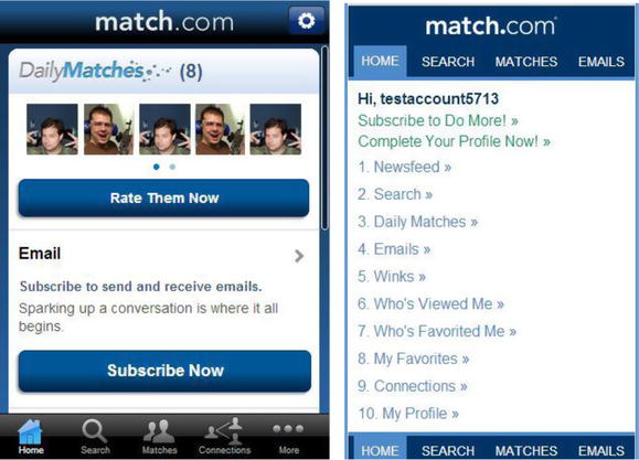
Figure 6-1. The Match.com mobile website using a smartphone (left) versus an older device (right). Note that our app normally doesn’t just include pictures of me in it. This screenshot has been slightly modified
As you can see, there is quite a difference. The site on the left uses JavaScript, CSS gradients, and touch gestures but will only work on more advanced mobile browsers. The site on the right uses no JavaScript, basic CSS, and basic HTML but will run on a wide number of browsers because of its lowest-common-denominator approach to browser support. Both are running in the same ASP.NET site. This way we can support a wide range of customers but can supply a better experience for those that have a better browser and all that from a single site.
There are four primary techniques for accomplishing this in ASP.NET MVC.
The first technique is not very flexible but it requires no work at all to implement if you are using ASP.NET MVC 4 or later. By default, mobile views can be specified with a simple file-naming convention. The second technique, using custom DisplayModes, is easy to use but is less powerful than our third option and only available in ASP.NET MVC 4 and later versions. The third, creating a custom view engine, works in all versions of ASP.NET MVC and is more complicated but provides you with the best way to get complete flexibility in your implementation. The fourth technique, using custom HtmlHelpers, is good for implementing this on a small scale, like for a single widget on a page.
Mobile Views
By default, ASP.NET MVC 4 and later allows you to create mobile-specific views through a naming convention. Let’s create a simple site and see how this works. Because this feature was released with MVC 4 and is unchanged for MVC 5, we will use the MVC 4 templates. This simple site will also serve as the basis for exploring both DisplayModes and custom view engines.
Step 1: Create an Empty ASP.NET MVC 4 or 5 Site
We start with an empty site (see Figure 6-2) because it’s the barest of all the MVC templates. We will build up the basics of what we need to have separate desktop and mobile views for a page.
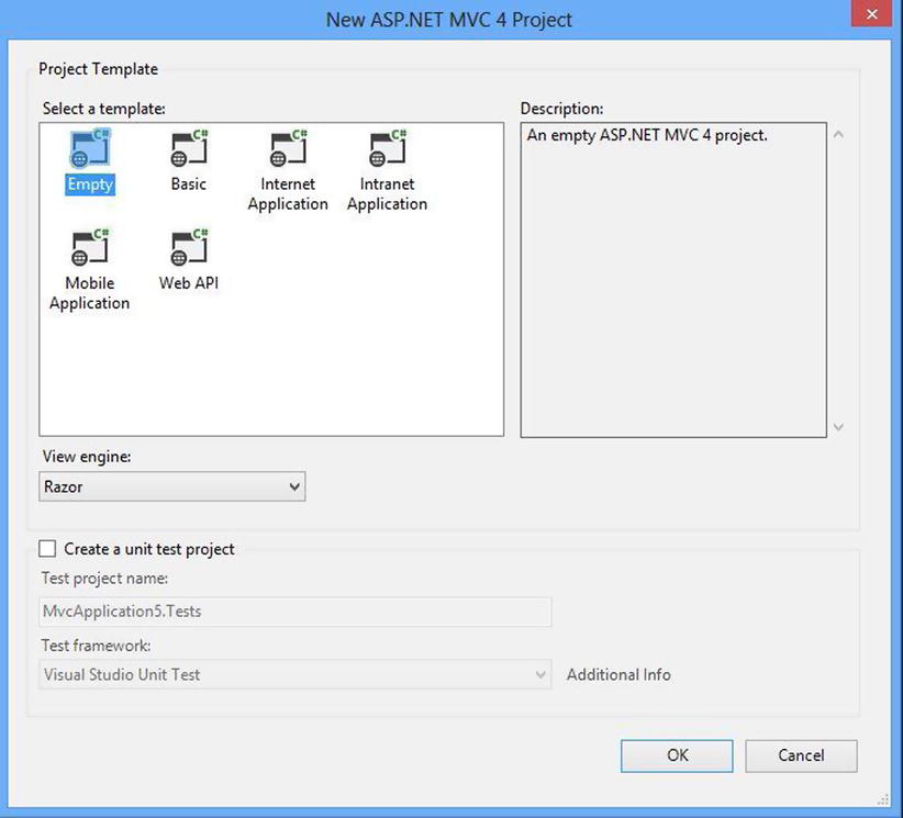
Figure 6-2. The new ASP.NET MVC project dialog. Though the dialog is a bit different for ASP.NET MVC 5, you can still use the empty template
Step 2: Create the HomeController
Next we need to start getting a page ready, so we need a controller. For those with less experience with ASP.NET MVC, the routing expects a default controller named “Home” and there is no reason to change that for our experiment. Creating the controller is particularly easy if we use the Add Controller dialog (Figure 6-3).
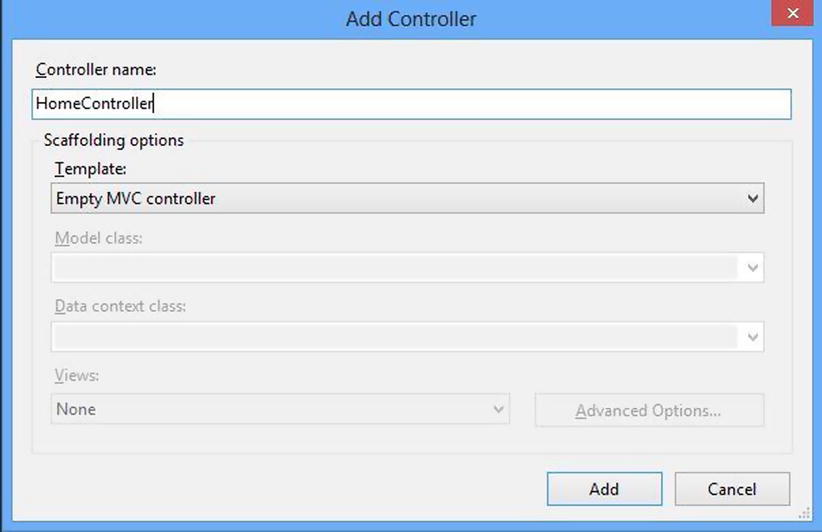
Figure 6-3. The Add Controller dialog
We will clean up the code a bit (remove some namespaces and unnecessary comments) and get the following:
using System;
using System.Web.Mvc;

namespace MobileApp.Controllers
{
  public class HomeController : Controller
  {
    public ActionResult Index()
    {
      return View();
    }
  }
}
Next we need a view. If we right-click in the action, we get the option for using the Add View dialog, which is what we want. It looks like this (see Figure 6-4).
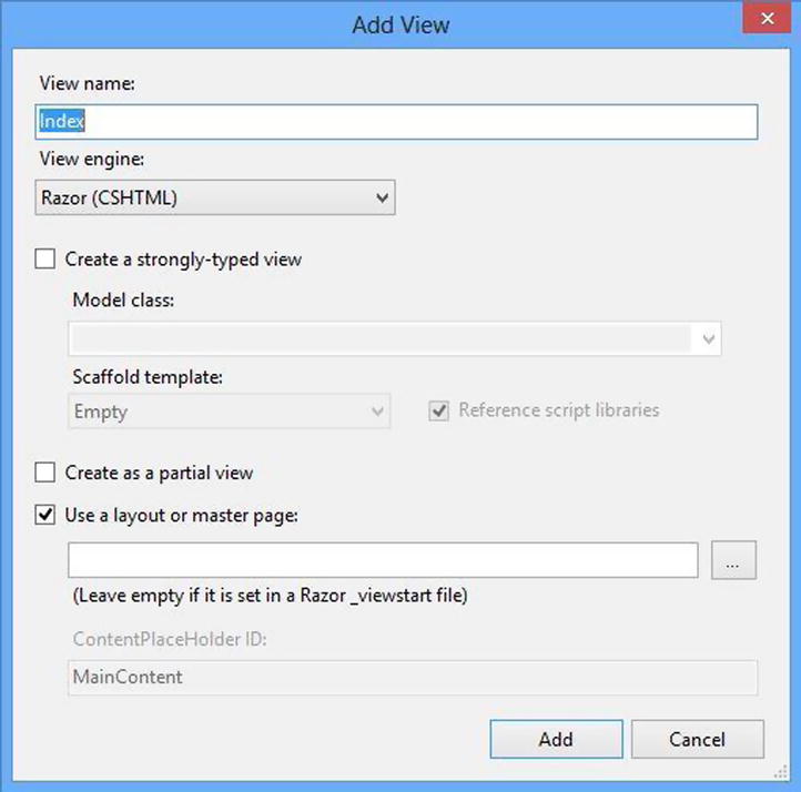
Figure 6-4. The Add View dialog
We want to create a view that will use a layout page, so the above will be fine. We will take this markup and make a few changes, to get the following:
@{
  Layout = @"∼ViewsShared\_Layout.cshtml";
  ViewBag.Title = "Default HTML";
}

<h2>Default HTML</h2>
<p id="output"></p>
<p>Lorem ipsum dolor sit amet, consectetur adipiscing elit.</p>
There are a few things to note at this point. First, we have specified a layout file that we have not yet created. We will do that next. Second, the <h2> says this is the “Default HTML”. In a few steps, we’ll be creating our “Mobile HTML”, which will override this HTML when viewing the page on a mobile device. Third, there is a <p> tag that you will use via JavaScript. This is something you’ll use later to show that you can have default and mobile JavaScript that differ with this technique.
Step 4: Create a Layout
Next we need a layout file. Since this would normally be shared between a number of files, let’s create a folder called “Shared” in the existing Views folder and put our layout file there (like the default templates). To add a layout, we use the generic “Add Item” dialog and find the “MVC 4 Layout Page,” name the file “_Layout.cshtml” and hit the “Add” button (Figure 6-5).
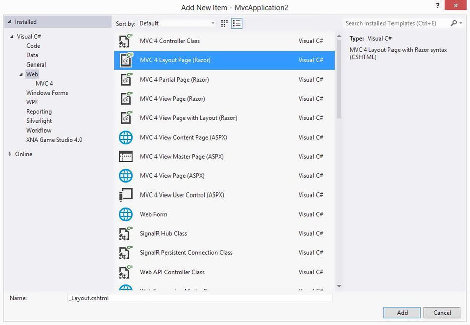
Figure 6-5. The Add Item dialog
We will keep the layout as is with the exception of two lines, which we will add to import some CSS and JavaScript. We will create these files next.
<!DOCTYPE html>

<html>
<head>
  <meta name="viewport" content="width=device-width" />
  <title>@ViewBag.Title</title>
  <link type="text/css" href="/content/style.css" rel="stylesheet" />
  <script type="text/javascript" src="/content/script.js"></script>
</head>
<body>
  <div>
    @RenderBody()
  </div>
</body>
</html>
Step 5: Create the CSS and JavaScript
We need to create the CSS and JavaScript file from the last step, so we create a directory called “Content” to store them in (like the default in the other MVC project types) and create the two files. This is the CSS that we put in the style.css file:
h2:after {
  content: 'Default CSS';
  display: block;
  font-size: .8em;
  font-weight: normal;
}
In order to show that one type of CSS is being shown rather than another (default now, mobile later), we are using the CSS content property. For those who aren’t familiar, it is a way to insert text into a page through CSS. This is only occasionally a good idea since CSS is for presentation and HTML is for content, but in this case it makes it easy to demonstrate the technique.
This is the JavaScript that we put in the script.js file:
window.onload = function () {
  var output = document.getElementById('output'),
  output.innerText = 'Default JavaScript';
}
Run what you have, and you should see Figure 6-6.
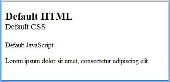
Figure 6-6. The default view of the page
Step 6: Create our Mobile Overrides
Now that we have our default view rendering for desktop browsers, let’s create mobile versions of our assets. We will name our view “Index.mobile.cshtml”. Here is the view markup:
@{
  Layout = @"∼ViewsShared\_Layout.cshtml";
  ViewBag.Title = "MobileHTML";
}

<h2>Mobile HTML</h2>
<p id="output"></p>
<p>Lorem ipsum dolor sit amet, consectetur adipiscing elit.Mobile!</p>
And this is the layout, which we will name “_Layout.mobile.cshtml.”
<!DOCTYPE html>

<html>
<head>
  <meta name="viewport" content="width=device-width" />
  <title>@ViewBag.Title</title>
  <link type="text/css" href="/content/style.mobile.css" rel="stylesheet" />
  <script type="text/javascript" src="/content/script.mobile.js"></script>
</head>
<body>
  <div>
    @RenderBody()
  </div>
</body>
</html>
The view makes a couple minor text changes so we can see the change in view. The layout page now references different CSS and JavaScript files. Our new mobile CSS file is like the last, except the content changes.
h2:after {
  content: 'Mobile CSS';
  display: block;
  font-size: .8em;
  font-weight: normal;
}
Our JavaScript file works just like the previous JavaScript file except that the string put on the page is different.
window.onload = function () {
  var output = document.getElementById('output'),
  output.innerText ='Mobile JavaScript';
}
If you change your user agent to that of an iPhone and revisit the page, you see the mobile version. In our case it would look like Figure 6-7.
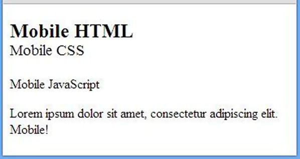
Figure 6-7. The mobile view of the page
 Note If you do mobile web development you will find yourself changing your user agent string quite often to test different scenarios. Chrome users can go to Developer Tools, hit the settings gear in the bottom right-hand corner, choose the overrides menu, and override their user agent there. There are also a number of useful Chrome extensions for doing this as well. I often use one called “User-Agent Switcher for Chrome.” Internet Explorer 10 users can open the F12 developer tools, look in the tools menu and find a menu option for changing the user agent. Firefox users will find the process for doing this requires more effort, so I would recommend using one of the many Add Ons that allow you to change it easily.
So ASP.NET MVC 4 gives you the ability to create mobile pages simply by creating alternate versions of view and layout pages that follow a simple naming convention, including “mobile” between the name of the view and the extension of the filename. No controller changes were needed. This approach requires no coding other than what I showed you above. This convention-based approach allows you to easily have different codes of all your client-side assets, HTML, CSS and JavaScript.
This handy built-in feature uses the ASP.NET’s built-in code for determining mobile devices. If this built-in functionality gets you the desktop/mobile device split that you need for your project, you do not need the other approaches. But in many cases you will need more flexibility, such as when you need to have different views for different types of mobile devices. Using the DisplayMode feature of ASP.NET gives you more.
DisplayModes
Creating custom DisplayModes gives you another level of flexibility on top of the default capabilities we saw in the last section. DisplayModes can also be used along with the previous feature so we will simply build off of the site we just created. Let’s say we wanted to show an alternate view for the Windows Phone 8. We can create overrides for all the same files we did before, except use the “filename.wp8.extension” format for all our files to stick with the naming convention. So our view (Index.wp8.cshtml) looks like this:
@{
  Layout = @"∼ViewsShared\_Layout.cshtml";
  ViewBag.Title = "WP8 HTML";
}

<h2>WP8 HTML</h2>
<p id="output"></p>
<p>Lorem ipsum dolor sit amet, consectetur adipiscing elit.Windows Phone 8!</p>
Our layout page (_Layout.wp8.cshtml) looks like this:
<!DOCTYPE html>

<html>
<head>
  <meta name="viewport" content="width=device-width" />
  <title>@ViewBag.Title</title>
  <link type="text/css" href="/content/style.wp8.css" rel="stylesheet" />
  <script type="text/javascript" src="/content/script.wp8.js"></script>
</head>
<body>
  <div>
    @RenderBody()
  </div>
</body>
</html>
Our JavaScript file (script.wp8.js) looks like this:
window.onload = function () {
  var output = document.getElementById('output'),
  output.innerText = 'WP8 JavaScript';
}
And finally, our CSS (style.wp8.css) looks like this:
h2:after {
  content: 'WP8 CSS';
  display: block;
  font-size: .8em;
  font-weight: normal;
}
Setting Up a Windows Phone 8 DisplayMode
Now that you have made the override files, you can use a DisplayMode to show them for the appropriate phones. The best time to set this up is when the application starts. Here is our global.asax.cs, with the DisplayMode setup.
public class MvcApplication : System.Web.HttpApplication
{
  protected void Application_Start()
  {
    AreaRegistration.RegisterAllAreas();

    WebApiConfig.Register(GlobalConfiguration.Configuration);
    FilterConfig.RegisterGlobalFilters(GlobalFilters.Filters);
    RouteConfig.RegisterRoutes(RouteTable.Routes);

    //The condition that specifies if the DisplayMode should be used for a given request
    Func<HttpContextBase, bool> condition = (context) => {
      return context.GetOverriddenUserAgent()
        .IndexOf("MSIE 10.0; Windows Phone 8.0", StringComparison.OrdinalIgnoreCase) >= 0;
    };

    var wp8DisplayMode = new DefaultDisplayMode("wp8");
    wp8DisplayMode.ContextCondition = condition;

    //We want this DisplayMode to evaluate first, so it is inserted at the beginning of the list.
    DisplayModeProvider.Instance.Modes.Insert(0, wp8DisplayMode);
  }
}
The first thing to notice is that a condition needs to be specified, which is done by creating a Func<HttpContextBase, bool> that returns a Boolean value based on something in HttpContext regarding whether or not the a particular Display Mode should be used. In our case we are going to make a simple user agent check. If the user agent contains “MSIE 10.0; Windows Phone 8.0”, a value of true will be returned. Otherwise, the function will return false. This check is not very robust, since an increment of either the browser version or device OS version would invalidate the code here. Our next chapter will deal in depth with parsing user agent strings and have a much better alternative, though this will do for now.
Since we have our Func, we can create our Display Mode instance, assign the condition and insert the condition into the first position of the modes used by the site. By default, an ASP.NET MVC 4 website already has two DisplayModes in the collection, the first for “mobile” (the default “mobile” feature we referenced earlier in the chapter is implemented as a Display Mode) and the second for the default view lookup. When deciding which view to render, the framework will iterate through the collection of modes in order and use the first that has a ContextCondition that returns true, so if we want our new Display Mode to ever be hit, we need to put it in the first position in the collection. Now if we render the page using a Windows Phone 8 device or spoof the user agent string, we get what you see in Figure 6-8.
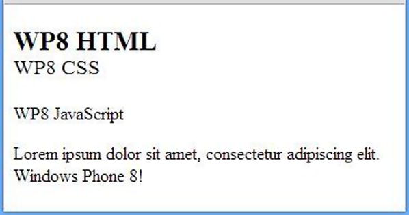
Figure 6-8. Our view customized for Windows Phone 8
So by using DisplayModes, either by using the built-in set that gives you the “filename.mobile.extension” view choice or by creating your own custom Display Mode, you can customize the markup rendered by your ASP.NET MVC site for particular devices. And when you customize the markup rendered, you can also customize the CSS and JavaScript. For many this capability will be sufficient. But if you need more control, or are not using ASP.NET MVC 4 yet, perhaps a custom view engine is a good idea.
Custom View Engine
Custom view engines can be used to get complete control over how views are selected for rendering. We will implement the same features seen above as a custom view engine but then add another feature to allow A/B testing (more on this in a bit) of views on top of the mobile capabilities that we add. We will use the same site as before so we don’t have to re-create all of those views and CSS files.
The easiest way to create our custom view engine is to inherit from the existing RazorViewEngine, like so:
using System;
using System.Web.Mvc;

namespace OurSite
{
  public class CustomViewEngine: RazorViewEngine
  {
  }
}
We can clear out the default view engines and use only our new view engine by changing the global.asax.cs application start method and remove the mobile DisplayMode that is created by default since we won’t be needing it.
public class MvcApplication : System.Web.HttpApplication
{
  protected void Application_Start()
  {
    AreaRegistration.RegisterAllAreas();

    WebApiConfig.Register(GlobalConfiguration.Configuration);
    FilterConfig.RegisterGlobalFilters(GlobalFilters.Filters);
    RouteConfig.RegisterRoutes(RouteTable.Routes);

    DisplayModeProvider.Instance.Modes.RemoveAt(0);

    ViewEngines.Engines.Clear();
    ViewEngines.Engines.Add(new CustomViewEngine());
  }
}
Since we have not yet changed our CustomViewEngine, it will work just like the built-in RazorViewEngine and our site keeps working as it was, though without the mobile DisplayMode as you can see. To customize our view engine and how it finds files, we start by overriding either the FindView or CreateView methods. We will override CreateView because FindView does a few useful things for us though this can be implemented by overriding either. Since we will override CreateView, let’s see what FindView is doing for us.
By default, views can be specified in controllers in three different ways. First, a controller can simply specify no name and the name of the method will be used.
public class HomeController : Controller
{
  public ActionResult Index()
  {
    return View();
  }
}
In this case the FindView method (which the RazorViewEngine inherits from BuildManagerViewEngine, which inherits the method from VirtualPathProviderViewEngine) will look for a view named “Index” based on the name of the method. Based on the controller name, the default location for this view would be “∼/Views/Home/Index.cshtml.”
public class HomeController : Controller
{
  public ActionResult Index()
  {
    return View("Foo");
  }
}
If a name for the view is specified as it is above, it will use this as the name of the file but continue to use the controller name for the path. The generated path for this would be “∼/Views/Home/Foo.cshtml”. If the default path lookup is insufficient, you can also specify the full path to the desired view like this:
public class HomeController : Controller
{
  public ActionResult Index()
  {
    return View("∼/Views/Custom/Foo.cshtml");
  }
}
The FindView method of the view engine takes care of this process of path building and even uses the default DisplayModes to build the path. To avoid this work, it can be easier to override the CreateView method instead. That is what we will do in this case to keep things simple.
public class CustomViewEngine: RazorViewEngine
{
  protected override IView CreateView(ControllerContext controllerContext, string viewPath, string masterPath)
  {
    return base.CreateView(controllerContext, viewPath, masterPath);
  }
}
The viewPath parameter passed into the CreateView method is the fully built path. We can interrogate and modify that and get our flexible view lookup. Assuming we go back to the plain controller with no name or path specified, viewPath will equal “∼/Views/Home/Index.cshtml”. We can start replicating the mobile file lookup functionality by making the following change to our new view engine.
public class CustomViewEngine: RazorViewEngine
{
  protected override IView CreateView(ControllerContext controllerContext, string viewPath, string masterPath)
  {
    if (controllerContext.HttpContext.GetOverriddenBrowser().IsMobileDevice)
      viewPath = viewPath.Replace(".cshtml", ".mobile.cshtml");

    return base.CreateView(controllerContext, viewPath, masterPath);
  }
}
Unfortunately, this only handles the view naming. The layout path still needs to be modified. Layout paths specified by _ViewStart pages and in view files have not yet been read so the masterPath parameter will be blank unless it is specified in the Controller, which is not something we would want to have to do in every action method. The easiest thing to do is default it here, though this removes the value of setting the Layout property in either the View or the _ViewStart file.
public class CustomViewEngine: RazorViewEngine
{
  protected override IView CreateView(ControllerContext controllerContext, string viewPath, string masterPath)
  {
    if (String.IsNullOrWhiteSpace(masterPath))
      masterPath = @"∼/Views/Shared/_Layout.cshtml";

    if (controllerContext.HttpContext.GetOverriddenBrowser().IsMobileDevice)
    {
      viewPath = viewPath.Replace(".cshtml", ".mobile.cshtml");
      masterPath = masterPath.Replace(".cshtml", ".mobile.cshtml");
    }

    return base.CreateView(controllerContext, viewPath, masterPath);
  }
}
Now mobile view files will be picked up for mobile browsers. Let’s add the ability to find views for Windows Phones. The change is relatively simple.
public class CustomViewEngine: RazorViewEngine
{
  protected override IView CreateView(ControllerContext controllerContext, string viewPath, string masterPath)
  {
    if (String.IsNullOrWhiteSpace(masterPath))
      masterPath = @"∼/Views/Shared/_Layout.cshtml";

    if (controllerContext.HttpContext.GetOverriddenUserAgent().IndexOf("MSIE 10.0;
Windows Phone 8.0", StringComparison.OrdinalIgnoreCase) >= 0)
    {
      viewPath = viewPath.Replace(".cshtml", ".wp8.cshtml");
      masterPath = masterPath.Replace(".cshtml", ".wp8.cshtml");
    }
    else if (controllerContext.HttpContext.GetOverriddenBrowser().IsMobileDevice)
    {
      viewPath = viewPath.Replace(".cshtml", ".mobile.cshtml");
      masterPath = masterPath.Replace(".cshtml", ".mobile.cshtml");
    }

    return base.CreateView(controllerContext, viewPath, masterPath);
  }
}
Though functional, this has a robustness flaw. If a Windows Phone 8 user visits a page that doesn’t have a “wp8” override file, we get a 404 because the view was not found. The “mobile” override has the same problem. We should do some basic file existence checks to make sure a file exists before we try to reference it. This makes the code a bit messier but gives you much more flexibility.
public class CustomViewEngine: RazorViewEngine
{
  protected override IView CreateView(ControllerContext controllerContext, string viewPath, string masterPath)
  {
    if (String.IsNullOrWhiteSpace(masterPath))
      masterPath = @"∼/Views/Shared/_Layout.cshtml";

    string altViewPath = String.Empty;
    string altMasterPath = String.Empty;

    if (controllerContext.HttpContext.GetOverriddenUserAgent().IndexOf("MSIE 10.0;
Windows Phone 8.0", StringComparison.OrdinalIgnoreCase) >= 0)
    {
      CheckView(viewPath, ref altViewPath, "wp8", controllerContext);
      CheckView(masterPath, ref altMasterPath, "wp8", controllerContext);
    }

    if (controllerContext.HttpContext.GetOverriddenBrowser().IsMobileDevice)
    {
      if (String.IsNullOrWhiteSpace(altViewPath))
        CheckView(viewPath, ref altViewPath, "mobile", controllerContext);
      if (String.IsNullOrWhiteSpace(altMasterPath))
        CheckView(masterPath, ref altMasterPath, "mobile", controllerContext);
    }

    if (!String.IsNullOrWhiteSpace(altViewPath))
      viewPath = altViewPath;
    if (!String.IsNullOrWhiteSpace(altMasterPath))
      masterPath = altMasterPath;

    return base.CreateView(controllerContext, viewPath, masterPath);
  }

  private void CheckView(string viewPath, ref string altPath, string skinType, ControllerContext context)
  {
    string temp = viewPath.Replace(".cshtml", String.Format(".{0}.cshtml", skinType));
    if (FileExists(context, temp))
      altPath = temp;
  }
}
Adding A/B Testing
As I said before, if we just need basic mobile skin support, creating a custom view engine to do this is overkill and no better than using the default behavior or creating custom display modes. But if we need other custom lookup logic, it can end up being easier with a custom view engine. For example, you might want to have language-specific skins as well. Or perhaps you want A/B testing too. The following example shows you how you can implement the latter.
A/B testing is the practice of showing alternative pages/flows/designs, et al. to users for research. Perhaps you want to test two landing pages to see which one gets more people to buy your product. Maybe you want to show a certain feature to small set of users to guard against risk. Implementing this kind of feature for views is relatively easy to do with a custom view engine or custom DisplayModes. Because both are pretty flexible, it’s often a toss-up to decide which to use. My general approach is to use DisplayModes when the conditional logic is simple and a custom view engine when the logic is more complex. Because A/B testing can get very complex, I will implement this with a custom view engine.
Essential to creating an A/B testing-capable view engine is the ability to determine if a view is in a test or not and if it is, what version should be used. Since this kind of question is very context-specific (how would I know what you would find useful for testing?), I will create a simple set of criteria. When a given view path comes in, it will check for a value in a test cookie called “testcookie”. If the value is “a”, the first version of the test skin will be shown. If the value is “b”, the second version will be shown. If there is no cookie, the user is not in a test, and it will pick up the default file. Here is one way to write that function.
private string GetTestVersion(ControllerContext controllerContext, string viewPath)
{
  if (viewPath == "∼/Views/Home/Index.cshtml") //The only path being tested
  {
    var testCookie = controllerContext.HttpContext.Request.Cookies["testcookie"];
    if (testCookie == null)
      return String.Empty;

    if (testCookie.Value == "a")
      return "v1";
    else
      return "v2";
  }
  else
  {
    return String.Empty;
  }
}
Next we would modify our CheckView function to also look for a test version of a file.
private void CheckView(string viewPath, ref string altPath, string skinType,string testVersion, ControllerContext context)
{
  string temp = viewPath.Replace(".cshtml", String.Format(".{0}.{1}.cshtml", skinType, testVersion));
  if (FileExists(context, temp))
  {
    altPath = temp;
    return;
  }

  temp = viewPath.Replace(".cshtml", String.Format(".{0}.cshtml", skinType));
  if (FileExists(context, temp))
    altPath = temp;
}
Our CreateView function now needs some minor changes.
protected override IView CreateView(ControllerContext controllerContext, string viewPath, string masterPath)
{
  if (String.IsNullOrWhiteSpace(masterPath))
    masterPath = @"∼/Views/Shared/_Layout.cshtml";

  string altViewPath = String.Empty;
  string altMasterPath = String.Empty;

  string testVersion = GetTestVersion(controllerContext, viewPath);

  if (controllerContext.HttpContext.GetOverriddenUserAgent().IndexOf("MSIE 10.0; Windows Phone 8.0", StringComparison.OrdinalIgnoreCase) >= 0)
  {
    CheckView(viewPath, ref altViewPath, "wp8",testVersion, controllerContext);
    CheckView(masterPath, ref altMasterPath, "wp8",String.Empty, controllerContext);
  }

  if (controllerContext.HttpContext.GetOverriddenBrowser().IsMobileDevice)
  {
    if (String.IsNullOrWhiteSpace(altViewPath))
      CheckView(viewPath, ref altViewPath, "mobile",testVersion, controllerContext);
    if (String.IsNullOrWhiteSpace(altMasterPath))
      CheckView(masterPath, ref altMasterPath, "mobile",String.Empty, controllerContext);
  }

  if (!String.IsNullOrWhiteSpace(altViewPath))
    viewPath = altViewPath;
  if (!String.IsNullOrWhiteSpace(altMasterPath))
    masterPath = altMasterPath;

  return base.CreateView(controllerContext, viewPath, masterPath);
}
We now have a custom view engine that supports multiple types of view lookups, both for devices and for A/B testing. The device detection still leaves a lot to be desired, but that discussion will have to wait till the next chapter.
HtmlHelpers
HtmlHelpers have been a part of ASP.NET MVC from the beginning and are useful for creating reusable bits of user interface. We are going to stick with our theme and build an HtmlHelper that will conditionally render some markup depending on the user agent of the browser.
The example here comes from something we made for Match.com’s mobile website. We needed to display a map to users and wanted to use Google maps but were supporting devices that Google does not support. So we used the Google maps static image API to generate an image for all devices but for supported devices wrapped the image in a link to Google Maps. We built this using an HtmlHelper so we could use it anywhere easily. Here is a very simple HtmlHelper implementation to create this map.
public static class MapHelper
{
  private static string _imageMarkup = "<img src="http://maps.googleapis.com/maps/api/staticmap?center={0}&zoom=13&size=400x300&sensor=false" />";
  private static string _jsApiMarkup = "<a href="https://maps.google.com/?q={0}">{1}</a>";

  public static MvcHtmlString Map(this HtmlHelper helper, string address)
  {
    string image = String.Format(_imageMarkup, address);

    string userAgent = helper.ViewContext.HttpContext.Request.UserAgent;
    if (userAgent.IndexOf("RIM OS", StringComparison.OrdinalIgnoreCase) >= 0)
      return MvcHtmlString.Create(image);
    else
      return MvcHtmlString.Create(String.Format(_jsApiMarkup, address, image));
  }
}
Once again, we have our rather unfortunate manual user agent string checking that we will remedy in the next chapter, but the basic idea should be straightforward. For users with “RIM OS” in their user agent string (BlackBerry devices), we just use the static image. Otherwise we still use the image but wrap it in a link to Google Maps.
Summary
In this chapter we have seen four techniques for controlling the HTML output of our site. Three techniques help us control this for full pages, one for small nuggets of markup. If we are going to control our markup and behavior in this way, we should have a robust way of interrogating browsers, and doing user agent checking as we did in the chapter is very problematic. In the next chapter we will discuss this problem and solutions for solving this on both the client and the server.