
There are three basic concepts in responsive web design, creating flexible layouts, creating flexible content, and using media queries to handle problems caused by major differences in screen size. Though flexible content is arguably much more important, flexible layouts with media queries are the poster child of responsive web design, and this is the subject of this chapter. Without a flexible layout, it’s difficult if not impossible to have flexible content. So this is a good starting point for digging into responsive web design. In the next chapter we will focus specifically on creating flexible navigation, something closely related to flexible layouts. We discussed both briefly in Chapter 1, but here we will discuss these topics in depth and give several more examples. In Chapter 5 we will discuss flexible content in depth.
To make sure that the following work on a wide range of devices, all samples were tested on the devices listed in the introduction.
Setting up a New Responsive ASP.NET MVC Site
Let’s start by setting up a responsive ASP.NET MVC site. If you create an ASP.NET MVC 4 “Internet Site” you get a site that already uses media queries to transform its layout for mobile devices. But since you are learning, you want to create a site using the “Basic” template (which I will name “RWDSample”). With this template we get a starter CSS file (/Content/Site.css) and a Layout page (/Views/Shared/_Layout.cshtml).
This site template comes with no controller classes or views, so we create a very simple home controller as follows:
using System.Web.Mvc;

namespace RWDSample.Controllers
{
  public class HomeController : Controller
  {
    public ActionResult Index()
    {
      return View();
    }
  }
}
We then create a simple view. In it we will paste the html we used in Chapter 2 to show the page width along with the necessary JavaScript. It should look like this:
@{
    ViewBag.Title = "Index";
}

<script type="text/javascript">
window.onload = function () {

  var pageWidth = document.getElementById('pageWidth'),
  pageWidth.innerHTML = window.innerWidth || document.body.clientWidth;

  window.addEventListener('resize', function () {
    pageWidth.innerHTML = window.innerWidth;
  });
}
</script>
<div>Page width: <span id="pageWidth"></span></div>
The layout contains one very useful thing by default: a viewport meta tag. It also comes with references to jQuery and Modernizr, neither of which we will need at this point. If you are following along with a new project, you can remove those.
And finally, we are going to open up the CSS file and paste in the same reset and font changes from Chapter 2 to reset the padding and margins on all elements.
html, body, div, span, applet, object, iframe,
h1, h2, h3, h4, h5, h6, p, blockquote, pre,
a, abbr, acronym, address, big, cite, code,
del, dfn, em, img, ins, kbd, q, s, samp,
small, strike, strong, sub, sup, tt, var,
b, u, i, center,
dl, dt, dd, ol, ul, li,
fieldset, form, label, legend,
table, caption, tbody, tfoot, thead, tr, th, td,
article, aside, canvas, details, embed,
figure, figcaption, footer, header, hgroup,
menu, nav, output, ruby, section, summary,
time, mark, audio, video {
  margin: 0;
  padding: 0;
}

div, span, li
{
  font-family: Helvetica;
}
If you use other ASP.NET MVC 4 templates you simply need to replace the default code and CSS with what you see above. The same goes for ASP.NET MVC 5. We are now ready to begin.
Revisiting the Three-Column Layout
Let’s start by revisiting the idea of creating a three-column layout. We need some simple HTML markup and the following should do fine.
<div id="content">
    <div class="column">This is the first...</div>
    <div class="column">This is the second...</div>
    <div class="column">This is the third...</div>
</div>
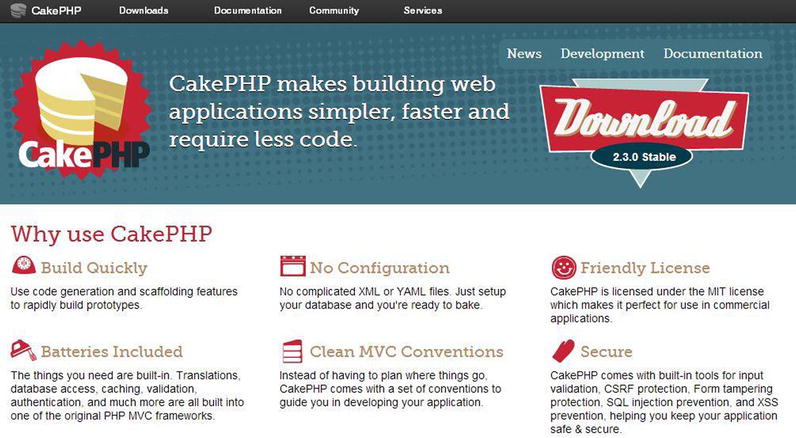
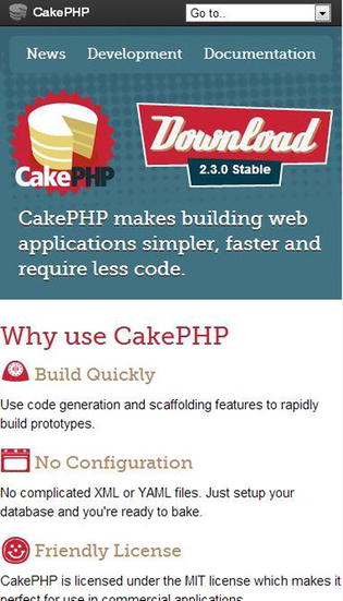
Our immediate goal is to turn the content into a responsive three-column layout that becomes a one-column layout on smaller screens. Though there are a number of options available for doing this (see Chapter 2), we will use floats because doing a layout in this manner has the broadest support in modern browsers. As an example of this approach, you can look at the CakePHP site (Figure 3-1). Sure it’s not the web framework you are using now, but it does give you a good example of a three-column responsive design.
Making Our Three-Column Layout Flexible
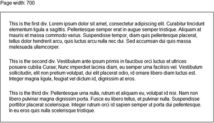
To turn our markup into a flexible three-column layout, this is all the CSS that you really need to produce the result in Figure 3-2.
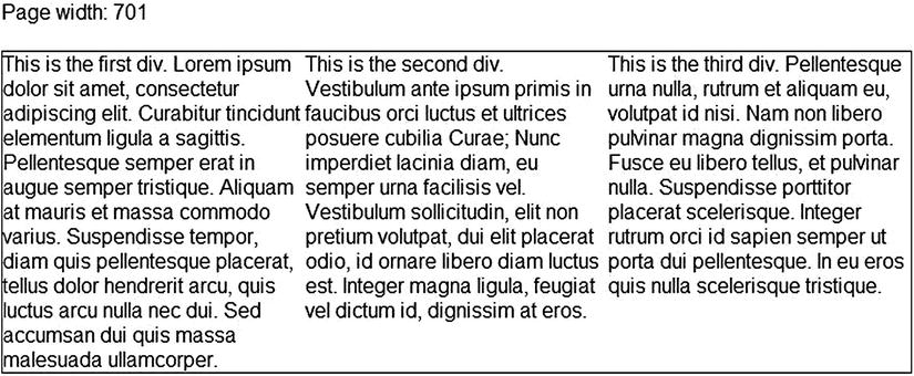
Figure 3-2. A flexible three-column layout with no margins or padding
.content {
  border: solid 1px #000;
  overflow: auto; /* keeps the floats of the columns from collapsing the parent. See Chapter 2. */
}

.column {
  float: left;
  width: 33.333333%;
}
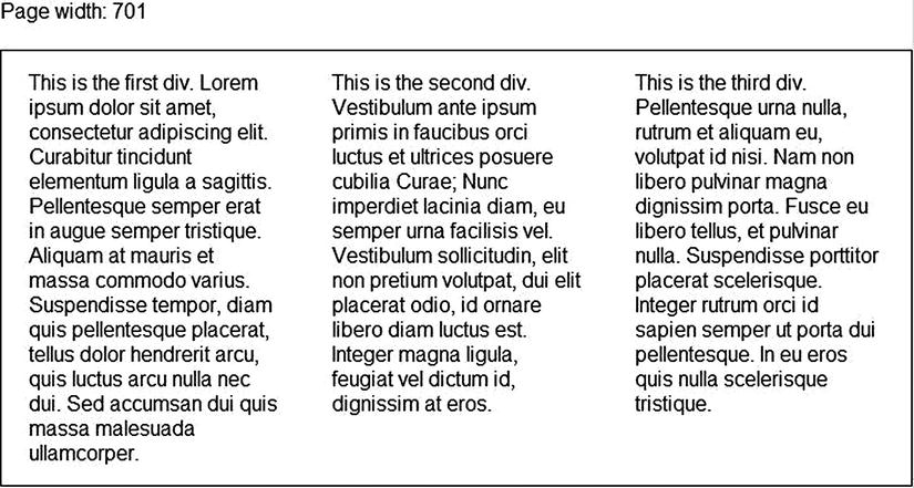
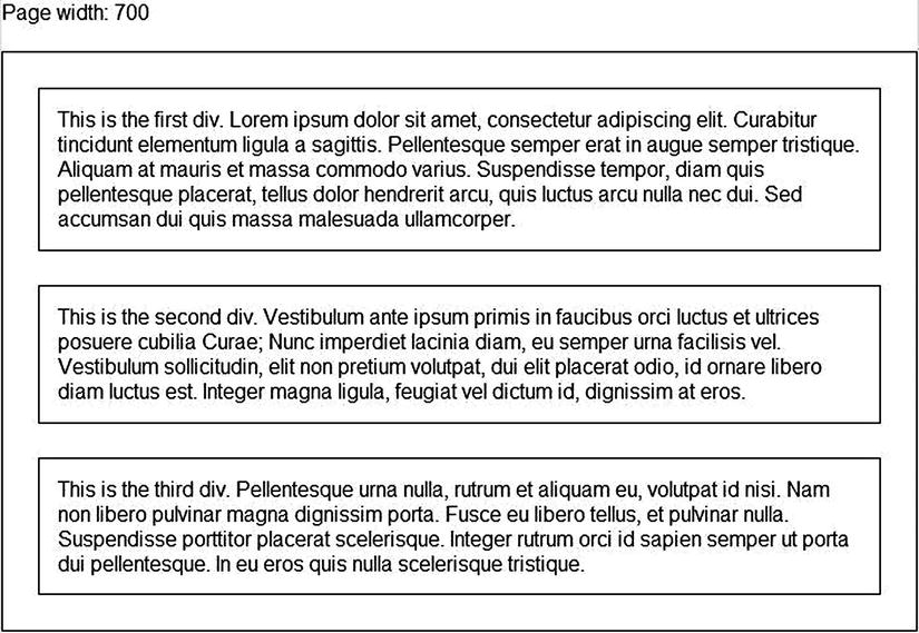
I added a border to make the size of the content clear. No matter how wide or narrow the screen, this simple CSS gives you a three-column elastic layout. The only problem is that it has serious readability issues since the text in each column has no margin or padding to separate it from the nearby column(s). Let’s keep in mind our rule about calculating width in Chapter 2 (that total width equals margins + borders + padding + content) and some margins. If we add a margin of 3 percent to each of the columns, this has to be subtracted from the width of the content. And since margin appears on both the left and right sides of the content, you have to remember to subtract it twice. The width is no longer 33.333333% but 27.333333%. You can see the results in Figure 3-3.
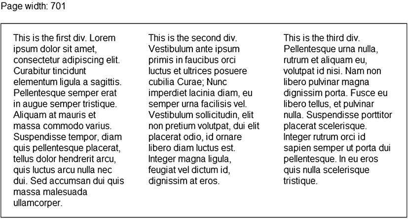
Figure 3-3. Flexible three-column layout that is much easier to read
.content {
  border: solid 1px #000;
  overflow: auto;
}

.column {
  float: left;
  margin: 15px 3%; /* the top and bottom margins don’t need to be as flexible */
  width: 27.333333%;
}
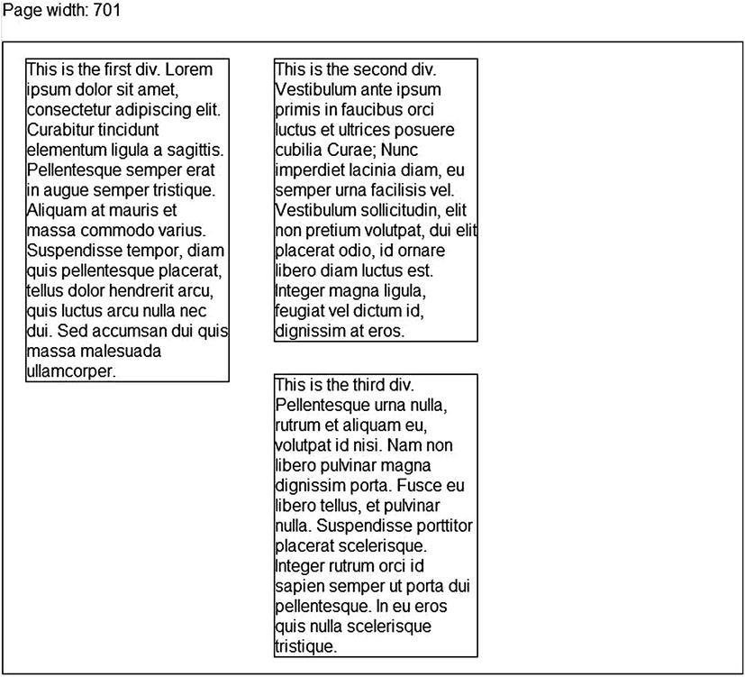
Though this is a very flexible layout, it would not look right on a smaller screen. The columns would be too narrow, and readability would be greatly compromised. To solve this, we add a media query to change the layout once the screen size gets too small. It could look like Figure 3-4:
#content {
  border: solid 1px #000;
  overflow: auto;
}

.column {
  float: left;
  margin: 15px 3%;
  width: 27.333333%;
}

@media screen and (max-width: 700px)
{
  .column {
    float: none;
    margin: 4%;
    width: 92%;
  }
}
By specifying “max-width: 700px” in my media query, I limit the CSS in the media query to only apply when the screen is 700 pixels or smaller. This width is entirely arbitrary, and any value can be chosen. Some might be tempted to design their media queries around device sizes, such as 320 pixels (iPhone in portrait orientation) or 480 pixels (iPhone 4S and previous in landscape orientation). This obviously works but I think makes the whole task generally harder because you will probably want to support devices of varying size (and if you support Android phones or tablets, you will have to). I strongly recommend sizing according to the constraints of the content, not the device. In my experience if you think device first, you end up having to write more CSS in media queries. Thinking in terms of devices is actually approaching this whole problem backward. A bit of content is sized incorrectly because the viewport is too small for that content, not because you are viewing it on a 320-pixel-wide iPhone specifically. So if you fix it for a 320-pixel-width phone, what happens when another device comes along at 340 pixels in width? What about 350 pixels in width? If you are thinking “device first,” you solve for a subset of devices. If you think “content first,” you solve for all devices.
Adding Borders
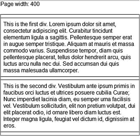
Everything so far has been rather straightforward, involving just a little basic math to calculate our percentages. Unfortunately, adding borders is a bit tricky because you can’t set border width using percentages, so you have to combine percentages and pixels. If you add a one-pixel border as seen in the following CSS, you have problems.
#content {
  border: solid 1px #000;
  overflow: auto;
}

.column {
  border: solid 1px #000; /* this will cause our design to break :( */
  float: left;
  margin: 15px 3%;
  width: 27.333333%;
}

@media screen and (max-width: 400px)
{
  .column {
    float: none;
    margin: 4%;
    width: 92%;
  }
}
If we think through our sizing, what should the total width of our three columns be? The content width, margin, and padding added together is 99.999999%, so if the viewport, for example, is sized at 960 pixels the combined width should be 959.999990 pixels. I would presume each browser might round that up or down; but since that is below the maximum width of 960 pixels, the floated columns fit fine and nothing has to wrap down to fit. But if a one-pixel border is added for each element, the total width of the three is now 965.999990 pixels (we added two pixels to each). Since that is larger than the maximum size of the container, the last element must wrap.
Fortunately, this can be solved in several ways. The easiest way to do so would be to replace the border setting with outline: solid 1px #000, which does not add to the total width of the element unlike border. The CSS outline property has good support, though it is not supported as widely as the border property (which is universally supported). If the outline is supported well enough in devices that you want to support, then this is a very easy way to solve this problem.
Another way to solve this involves using a little more math. What would happen if we set the column width to 27 percent instead of 27.333333 percent? With the margin and padding included, the total width taken up without the borders would be around 950.4 pixels, leaving us with space enough for 9.6 pixels worth of border. This is plenty of space for our six pixels of border. Unfortunately the available width depends on the width of the screen. Ninety-nine percent of 600 pixels is 594, which means right about there our design is going to break. Where exactly the layout breaks will probably depend on the browser. You could solve this by creating a new media query around that size to shrink down the columns a bit more to allow for the borders at smaller sizes: but as you can imagine, this could get messy. But it should work.
Finally, you could solve this by not using CSS borders at all but rather the “faux columns” technique discussed in Chapter 2. This technique involves an extra image download but allows you to avoid browser incompatibilities and annoying math calculations.
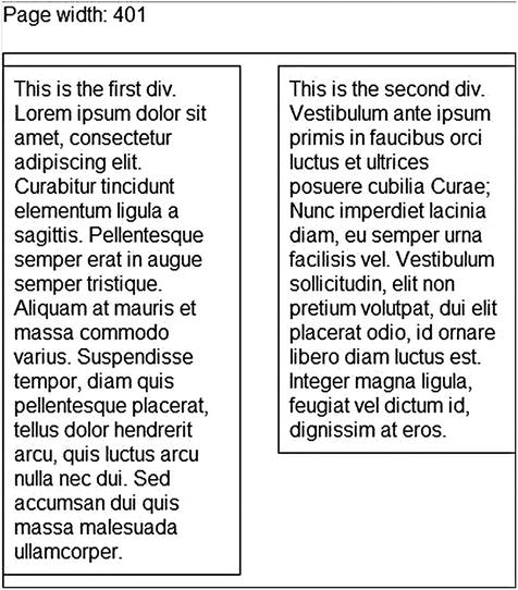
Since it has good support on mobile and is the easiest option, we will use the outline property to get the desired effect here. And because we now need a space between border and content, let’s add some padding.
#content {
  border: solid 1px #000;
  overflow: auto;
}

.column {
  outline: solid 1px #000; /* yay for easy stuff! */
  float: left;
  margin: 15px 3%;
  padding: 2%;
  width: 23.333333%; /* adding padding requires us to restrict the width */
}

@media screen and (max-width: 700px)
{
  .column {
    float: none;
    margin: 4%;
    width: 88%; /* because the padding above will still be applied, we need to shrink this too. */
  }
}
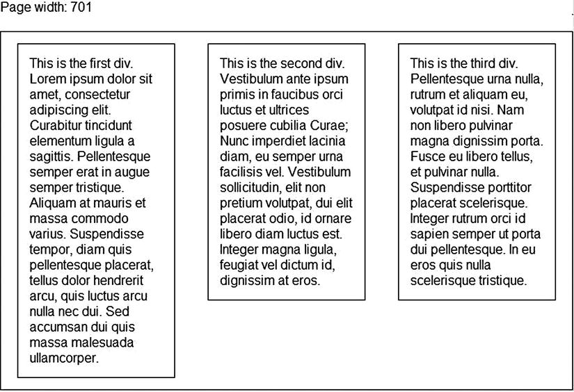
In Figure 3-6 we have our finished, flexible, and responsive three-column layout. It includes outlines to delineate the content sections and good padding and margins.
What about Older Browsers?
Responsive web design is a great technique for building sites that work for both mobile and desktop browsers. Though media queries are supported on all recent releases of popular desktop browsers and all browsers in recent smartphones, there are still older devices out there without support.
Thinking about our layout above, a mobile browser without media query support visiting the page would have a very poor experience. Because the media query makes the design usable on a smaller screen, the media query fix would not get applied if the browser does not support media queries. But if a desktop browser without support visited (such as old Internet Explorer), the experience would probably be fine since the browser window would likely be large enough. If we want the website to work on both mobile and desktop this is not acceptable because the site becomes unusable for one of the two.
Let’s turn this around and rethink our approach a bit. What if we switched the CSS around and put the CSS for making columns in the media query instead?
#content {
  border: solid 1px #000;
  overflow: auto;
}

.column {
  outline: solid 1px #000;
  float: none;
  margin: 10px 0;
  padding: 0;
  width: 100%;
}

@media screen and (min-width: 400px)
{
  .column {
    float: left;
    margin: 2%;
    padding: 2%;
    width: 25.333333%;
  }
}
In this case a browser without media query support will get a page without columns. In the case of the mobile device without media query support, you get exactly what you want. In the case of an old desktop browser, you get something that is not ideal; but it is usable, which is most important. In desktop and mobile browsers with media query support, (the vast majority), you get exactly what you want. What you are left with is an approach that is both backward-compatible and forward-compatible because it works on older systems and is exactly what you want on newer and future browsers.
Note that the switch in approach required us to change the media query from max-width to min-width, because the logic has now been reversed.
This is one form of progressive enhancement, a very useful technique. Contrary to the thinking of many, sites do not have to look the same in every browser. This used to be the status quo but it is far too much work for practically no benefit. Instead, make the site work in the older browsers and work great in the newer browsers that you want to support, even if it may look different when viewed in desktop Internet Explorer and in mobile Safari on the iPhone.
A Two-Column Layout
As you might expect, a two-column layout would follow the same principles as the three-column layout. But to keep it interesting, we will put another constraint on ourselves. We want the columns to be aligned with the outside of our content element, instead of having margins around separating them as we did above, like you see here in Figure 3-7.
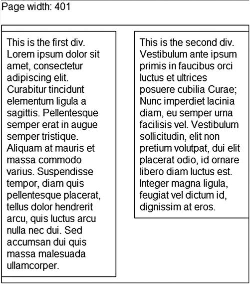
Figure 3-7. Two columns with each column aligned to the outside of the page
First we will trim down our columns to two:
<div class="content">
  <div class="column"></div>
  <div class="column"></div>
</div>
Now it is time for the CSS. Two things are in order. First, we will start with the CSS to create the two columns in large-screen mode. Second, we put in CSS to change it to a single column when the screen is 400 pixels in width or less.
.content {
  border: solid 1px #000;
  overflow: auto;
}

.column {
  outline: solid 1px #000;
  float: left;
  margin: 10px 0;
  padding: 0;
  width: 50%;
}

@media screen and (max-width: 400px)
{
  .column {
    float: none;
    width: 100%;
  }
}
This works great but we need some padding and margins and we need to add it so that the columns align with the outside. We add a padding of 2 percent to separate the text a bit from the edge of the columns. Creating the margin in the middle is a bit trickier. What we want to do is apply a margin to one of the elements but not the other to move the right column over to the right side of the #content container. We could add a class to the second column to target it specifically or we can use CSS selectors. One option would be to use the adjacent selector and put this in a media query. For those who may not be familiar with it, the adjacent selector is useful for targeting an element only when it is adjacent to another element.
.content {
  border: solid 1px #000;
  overflow: auto;
}

.column {
  outline: solid 1px #000;
  float: left;
  margin: 10px 0;
  padding: 2%;
  width: 42%;
}

/* The column on the right, because it is adjacent to the column on the left, will get this CSS setting applied. */
.column + .column {
  margin-left: 8%;
}

@media screen and (max-width: 400px)
{
  .column {
    float: none;
    width: 96%;
  }

  .column + .column {
    margin-left: 0;
  }
}
So each column has a width of 46 percent (width of 42 percent + padding of 2 percent on each side), leaving an 8 percent separation between the columns. If the column separation is too large, you can increase the width and decrease the margin on the right-most column. As you can see in Figure 3-8, this is a relatively easy way to create a two-column layout.
A Ten-Column Layout with Header and Footer
There are some sites where the subject matter might lend itself to small chunks of data instead of larger columns. This is also a good case for us to tackle because it shows us that we can push what we’ve learned to potentially ridiculous extremes. And since we have such power over our medium, we might as well abuse it for fun.
Since this is really just an extension of the same rules in the above two examples, we will add in some new factors. First, let’s use some real content to prove that this actually works. Second, in terms of layout, we want a header and footer. For large monitors, we want to support ten columns. We also want the layout to switch to five columns wide when the screen is less than 800 pixels in width, two columns wide when less than 500 pixels and one column wide at 400 pixels and lower. We will also have no max width value on the container to allow this to grow to the full width of the browser, whatever the size. Finally will also put a border and rounded corner around the items. This last bit makes things much more difficult since outline-radius is barely supported by browsers, so we have to use borders and border-radius. As you know from the discussion on borders so far, border values are specified in pixels instead of percentages, which will make this layout more difficult.
We will start with a portion of our markup.
<div class="header">
<h1>Things I Enjoy</h1>
</div>
<div class="items">
<div class="item">
<img src="∼/content/images/bacon_500.jpg" />
<p>Bacon</p>
</div>
<!-- 9 more items -->
</div>
<div class="footer">
© Eric Sowell, 2013
</div>
Because we want to assume no media query support for older browsers, we will start with a basic single-column layout. The total width of each should not be more than 100 percent, so we set a max-width of 90 percent with a margin of 5 percent on each side. This allows the content to grow to fill the screen for every variation of device size below 400 pixels (Figure 3-9).
Figure 3-9. Our page viewed on a small screen
.item {
  border: solid 1px #777;
  border-radius: 5px;
  float: left;
  margin: 0 5% 10px 5%;
  max-width: 90%;
  overflow: hidden;
  text-align: center;
}

.item img {
  margin-top: 2.5%;
  max-width: 95%;
}

.item p {
  min-height: 3em;
  text-align: center;
  font-size: .9em;
}
Now that we have this in place, we can work our way up in screen size. At 400 pixels in width, we are going to switch to two per screen, which means changing the max-width and margin for the item. This total width of 49.4 percent was determined through testing on different devices. The extra space is left in because of the border (Figure 3-10).
Figure 3-10. Our page viewed at a little over 400 pixels
@media screen and (min-width: 400px) {
  .item {
    max-width: 47.4%;
    margin: 5px 1%;
  }
}
Next we handle 500 pixels in width, which has five items across (Figure 3-11).
Figure 3-11. Our page viewed at a little over 500 pixels
@media screen and (min-width: 500px) {
  .item {
    max-width: 18.6%;
    margin: 5px .5%;
  }
}
And finally, when the screen is 800 pixels in width or wider, we switch to the ten-column layout shown in Figure 3-12.
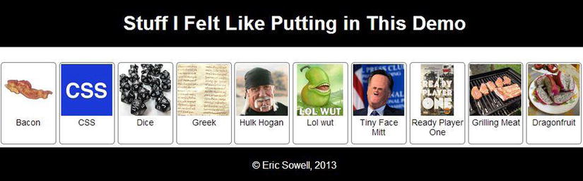
Figure 3-12. Our page viewed on a large screen
@media screen and (min-width: 800px) {
  .item {
    max-width: 9.2%;
    margin: 5px .25%;
  }
}
Because the items are floated, you need to make sure the footer has floats cleared, otherwise it would float up text to the bottom-rightmost item in the list.
.footer {
  clear: both;
}
Everything else not specified here is colors and text-alignment. If you want to see the rest you can check out the source code. See the introduction for the location.
Summary
Flexible layouts allow you to use the same site to handle multiple screen sizes. By using flexible containers and media queries, we can create two-column, three-column, ten-column, or more layouts that easily adapt to the devices that view them. Sites often need flexible navigation as well, which is something you will learn about in the next chapter.