
Native APIs, HTML5, and CSS3 on Mobile Today
Everyone is talking about HTML5 these days, and with good reason. But many web developers don’t pay much attention to the new features because they have to support older desktop browsers. Though this is understandable, it is still regrettable since good progressive enhancement and polyfilling (sometimes you can add the features to a browser if it doesn’t have the feature natively) techniques can allow you to build pages that work on newer browsers that support HTML5 and older browsers that do not. Chapters 6 and 7 give you a number of tools for implementing progressive enhancement practices: so if you are unfamiliar with the idea, go back and read those. You will see some examples of polyfills in this and the upcoming chapters.
The good news is that the modern mobile browser landscape as we defined in the introduction to this book has a surprisingly rich level of support for HTML5, especially when compared to what we usually need to support in desktop web development. So in this chapter I will give all those developers who have been ignoring HTML5 a very brief overview of what works well on mobile devices. This means we will be avoiding much of the HTML5 features that have little support; so if it appears in this chapter, you can assume it will work for most of your mobile users. And because this is an overview of a large portion of HTML5 and CSS3, every feature will be discussed very briefly. Our goal here is to be thorough in terms of support but brief in terms of explanation. Because keeping a print book updated is impossible when it comes to the constantly evolving browser landscape, I recommend using resources like caniuse.com and mobilehtml5.org when in doubt about the browser support for a particular feature.
Those who haven’t been keeping up with recent advances might be surprised as the number of vendor prefixes required to get many of the features in this chapter to work in the various browsers. They might even be wary. But in my experience there is little to worry about (though I will mention the bugs that I have found). In most cases the vendor-prefixed versions work much or exactly like their finalized counterparts, and using them is a natural part of an approach to web development that embraces progressive enhancement. That being said, prefixes are falling out of favor with browser vendors, so going forward we will probably see less of them. But to support mobile today, prefixing will be required for many features.
The year 2013 saw the release of a new mobile operating system that adds a number of features around native device access, namely Firefox OS. But even though the following features will be tested on Firefox OS, we will not be exploring all the capabilities that come with this new mobile OS. Because all apps for the OS are written in JavaScript, HTML5, and CSS3, many new device capabilities are available for this OS than for the others. But we will not be exploring these because Firefox OS has yet to become popular, and these new features aren’t supported on other mobile platforms, so it affects too few users to be overly concerned about on a general level at this point. This will likely change in the future as Mozilla has submitted proposals for these new APIs and some appear to be gaining traction.
In many of these examples you will notice a theme related to overcoming old limitations. For years we have been working around limitations in HTML and CSS by using images to do things that shouldn’t require them and by using plugins like Flash and Silverlight to give us capabilities that the browser did not. Though we still have to work around browser limitations, many of the old problems have been solved and the solutions are stable and usable in the mobile world.
This chapter is organized into three sections, native phone APIs, new capabilities and visual tools. The “Native Phone APIs” section is about interacting directly with the hardware of the device. The “New Capabilities” section is about new functional tools that you can use in your mobile websites. The visual tools section is about features that are visual in nature, including HTML5 canvas, CSS3 and SVG.
Examples of all of the following can be found in the downloadable and online source code.
There are a limited but important number of APIs available for the web developer that accesses the phone hardware. These APIs are often particularly useful for mobile devices.
The geolocation API is used to get a user’s latitude and longitude and potentially other location information like altitude or speed. Your ability to get their location is restricted first of all by their privacy settings. For example, if the device is running iOS and if Settings ➤ Privacy ➤ Location Services is turned off, an error will be thrown when their location is requested. Assuming privacy settings allow it, the user will still be prompted to see if they want to allow you to use their current location. If they respond negatively, an error is thrown. If they respond positively, an object containing their location will be passed to your success callback. You can see this below.
window.addEventListener('load', function () {

    var success = function (position) {
      alert('lat: ' + position.coords.latitude + ', long: ' + position.coords.longitude);
    };

    var error = function () {
      alert('It did not work. Do you have this capability turned off?'),
    };

    navigator.geolocation.getCurrentPosition(success, error);
});
Because errors are the browser’s normal way of knowing that the call to get a user’s location is not allowed, you should plan on always supplying both a success and error callback. Note that the call to getCurrentPosition is an asynchronous call. Depending on the device and how it chooses to determine the user’s location, the call to get location can take some time. In my experience the call can either return immediately or take as long as 30 seconds. Consider giving the user some feedback indicating that the call to get their location is pending.
Older mobile browsers did not allow the user to upload photos directly from the camera or phone storage though this was something the native SDKs allowed. For photo upload other options were necessary like emailing photos or integrations with third-party sites like Facebook. Fortunately this has recently changed and has been implemented in Android 4+, iOS6+ and BlackBerry 10.
The client-side method for accessing photos is to use the old-school file input tag even though for mobile browsers the behavior is not quite what you would expect from a desktop browser. On iOS, clicking on the input button brings up an action sheet allowing the user to take a photo with the camera or choose an existing photo from what is already saved on the device. On Android devices you get the same options but will also show any applications on the device that are registered to create/retrieve photos. This feature is nice though; in my experience you can’t assume applications will return photo data in the same format that the camera or gallery will return it, which can obviously cause issues. Other than testing on a device with as many of the common photo applications as possible, I know of no good way to handle this. You will have to be very defensive in your programming.
In terms of a basic implementation that involves a simple post with an ASP.NET MVC controller to handle it, the markup involves a normal HTML form.
<form action="/url/to/post/to" method="post" enctype="multipart/form-data">
  <input type="file" name="fileData" id="file-input" />
  <input type="submit" value="Post" />
</form>
The server side implementation could look something like this.
[HttpPost]
public ActionResult UploadPhoto()
{
  string path = Server.MapPath(@"∼/uploadspot/");

  foreach (string file in this.HttpContext.Request.Files)
  {
    var path = Server.MapPath(@"∼/uploadspot/") + "somefilenameofyourchoice.jpg";
    var hpf = Request.Files[file] as HttpPostedFileBase;
    hpf.SaveAs(path);
    return Redirect("/some/page");
  }
}
Almost inevitably, once someone finds out they can send images from the browser, they ask if a thumbnail can be shown. The answer to this is a qualified “yes.” Assuming you have an image tag on the page with an ID of “thumbnail”, you could implement this feature in this manner:
window.addEventListener('load', load);
var fileInput, thumbnail;

function load() {

  fileInput = document.getElementById('file-input'),
  thumbnail = document.getElementById('thumbnail'),

  fileInput.addEventListener('change', fileSelected);
}

function fileSelected(evt) {
  var file = evt.target.files[0];

  var reader = new FileReader();
  reader.onload = fileRead;
  reader.readAsDataURL(file);
}

function fileRead(evt) {
  imageDisplay.src = evt.target.result;
}
On the change event of the file input the file is selected and read. The relatively new to HTML5 FileReader object (for more information, I recommend this article on MDN on using files in web applications: https://developer.mozilla.org/en-US/docs/Using_files_from_web_applications) is used to read the file as a data URL, which uses the Data URI scheme, a standard format for a base64-encoded version of a file. As an example, here is a 1x1 transparent PNG encoded as a Data URI.
data:image/png;base64,iVBORw0KGgoAAAANSUhEUgAAAAEAAAABAQMAAAAl21bKAAAAA1BMVEUAAACnej3aAAAAAXRSTlMAQObYZgAAAApJREFUCB1jYAAAAAIAAc/INeUAAAAASUVORK5CYII=
This format seems to have universal support in modern mobile browsers and can be safely used in all mobile browsers that support photo uploads.
Now I need to mention a couple caveats. First of all, you can’t use the standard addEventListener method on FileReader for listening to the load event. This is not supported in the default Android browser that ships with early Android 4.x devices, so you should assign a function for the onload function on the FileReader as seen above.
Second, the method above has worked on all devices I have tested on except Samsung Galaxy S3 and S4. If a photo is taken with the camera on these devices in portrait orientation, the photo as rendered in the image tag will appear at a -90 degree angle. This happens in both Chrome and the default browser, so it is a problem with the manufacturer, not either of the browsers. Perhaps the easiest way to deal with this is to hide the thumbnail for these devices. It is unfortunate that this bug occurs on what are the best-selling Android devices.
If you need to know if the device has a connection to a network, there is an API to check. You can check a property on the window navigator or you can listen to an event. It would look like this.
window.addEventListener('load', load);

function load() {

  if (navigator.onLine)
    showOnline();
  else
    showOffline();

  window.addEventListener('online', showOnline);
  window.addEventListener('offline', showOffline);
}

function showOnline() {
  //code if online
}

function showOffline() {
  //code if offline
}
In my device testing, checking the navigator worked consistently. The online and offline events were more problematic across various browsers and devices, so use with caution.
As the world goes more mobile, the browsers we use most often have the ability to make phone calls, so phone number links to trigger a phone call can be very handy.
<a href="tel:4561234567">phone number</a>
The old standard format for e-mail links continue to work in mobile browsers.
<a href="mailto:[email protected]">email address</a>
These formats have been around quite a while and seem to have universal support. This is generally straightforward, though automatic phone number detection can be a problem. Among my test devices, no Android or Firefox OS device did automatic phone number detection though Windows Phone 7.5 and iOS both do. So, for example, the number in the following paragraph will be treated like a phone number link in both of these devices.
<p>Phone number (456) 123-4567 in the midst of text.</p>
Windows Phone 7.5 and iOS will also turn “456 123 4567” and “456-123-4567” into phone number links. iOS is even more aggressive and will apparently turn any 10-digit number into a phone number, so 4561234567 in the midst of a paragraph will be treated as a phone number. This is great for all those businesses on the Internet that don’t know how to mark up their contact pages so people can call them. This is unfortunate when one of these auto-detect algorithms picks up a number that it shouldn’t. Fortunately for us, we can turn off this automatic browser detection on iOS by adding a meta tag to the page.
<meta name="format-detection" content="telephone=no">
Unfortunately, I have found no way to turn off this detection on Windows Phone 7.5. Windows Phone 8 does not seem to exhibit the behavior. According to MSDN [http://msdn.microsoft.com/en-us/library/ie/dn265018(v=vs.85).aspx], Internet Explorer 11 allows you to use the same meta tag for Internet Explorer on the Windows Phone platform, but that hasn’t launched yet and doesn’t help with older phones. Just be aware that this is the case, and if you care that this is happening, format the number you are using differently if you can and fool the browser.
How you access maps depends on the device you are targeting. For iOS devices, assuming you want to trigger the built-in iOS maps application that comes in iOS 6, a query to maps.apple.com is what you will need to use, like this: http://maps.apple.com/?q=cupertino. This will open up the native iOS maps application on the device if the device has it installed. For older versions of iOS, Google Maps will be opened in Safari.
For Android devices, you can use the same URL as above. When clicked, Android will give you the choice to open up the maps application. You could also choose to use http://maps.google.com/?q=cupertino because that works just as well for Android, but this may not open the native Google Maps application on iOS (this may depend on iOS version and how settings are configured).
Windows Phone 7.5 will open up the native maps on the device with either of the following two types of links:
<a href="maps:Cupertino">map</a> <!--lat/long also supported -->
<a href="http://www.bing.com/maps/?where1=cupertino">map</a>
Unfortunately only the first seems to work for Windows Phone 8. If iOS and Android supported the maps value for anchor tags then we would have a nice cross-browser solution, but this isn’t the case. To get native map linking across multiple devices, you will have to conditionally render links based on device OS. Chapter 6 explains several methods for conditional rendering, so check there for ideas on how to implement this.
With newer browsers comes newer functionality. In this section we go over what we can do with HTML and JavaScript that we couldn’t do just a few years ago.
Web sockets allow the browser and server to create a two-way socket connection. Normally the web works on a request/response, disconnected model. With web sockets this model is changed. Using web sockets would look something like this:
var connection = new WebSocket('ws://yoursite.com/websocketendpoint'),
connection.onopen = function () {
  connection.send('connection opened'),
};

connection.onmessage = function (evt) {
  console.log('Message from server:', evt.data);
};
But most will not be using web sockets directly. Web sockets in the mobile space still have modest support so it’s usually advisable to use web sockets and some other technique, such as long-polling (this involves leaving a connection open with the server, which it completes whenever a message needs to be sent). There is also a server-side component as well. To solve the need for downgrade support and server-side support, I would recommend using SignalR. SignalR gives you what you need in both cases and is very easy to use. Here is how you would create a simple page that uses SignalR.
First, install SignalR through Nuget. A search for “SignalR” should be sufficient or you can type the following into the Nuget Package Manager Console:
PM> Install-Package Microsoft.AspNet.SignalR
Second, create a page in the website that contains the following script references, in this order. The location of your files for the first two may vary for your site. The version of the files may also be different. Check and see what you got when you installed SignalR. The last script tag needs to be left as-is.
<script src="∼/content/jquery-1-9-0.js"></script>
<script src="∼/scripts/jquery.signalR-1.1.3.js"></script>
<script src="∼/signalr/hubs"></script>
Third, create a SignalR endpoint. Here is a very minimal implementation.
using Microsoft.AspNet.SignalR;

namespace MobileMvcSamples.SignalR
{
  public class SampleSignalRConnection : PersistentConnection
  {
    protected override System.Threading.Tasks.Task OnConnected(IRequest request, string connectionId)
    {
      Connection.Send(connectionId, "You are now connected.");

      return base.OnConnected(request, connectionId);
    }

    protected override System.Threading.Tasks.Task OnReceived(IRequest request, string connectionId, string data)
    {
      Connection.Broadcast(data);
      return base.OnReceived(request, connectionId, data);
    }
  }
}
Fourth, register the endpoint in your global.asax.cs file in Application_Start before any of the MVC registration. If you do not put it before, your SignalR endpoint will likely not work.
RouteTable.Routes.MapConnection<SampleSignalRConnection>("sample", "/signalr/connect");
RouteTable.Routes.MapHubs();
You are now able to use SignalR in your site. Here is a simple example that lets multiple people send messages to each other on the same page.
<input placeholder="Put a message here." id="message" />

<button id="send">send</button>

<p style="border-top: solid 1px #CCC; padding-top: 20px;">Messages sent/received:</p>

<ol id="messages">
</ol>

<script>
  $(document).ready(function () {

    var sendButton = $('#send'),
    var input = $('#message'),

    var connection = $.connection('/signalr/connect'),
    connection.start();

    connection.received(function (response) {
      $('#messages').append('<li>' + response + '</li>'),
    });

    $('#send').click(function () {
      connection.send(input.val());
      input.val(''),
    });

  });
</script>
Let’s discuss this sample just a bit. The first thing that a page needs to do before using web sockets with SignalR is to create a connection with the server. In this case we setup the connection endpoint URL as “/signalr/connect”, so connecting looks like this.
var connection = $.connection('/signalr/connect'),
connection.start();
After a connection is established, messages can be sent
connection.send('this is a message'),
or received.
connection.received(function (response) {
  //do something with the response
});
In the case of our example above, we read the value out of the input tag on the page and send that to the server. All messages that the server sends back are appended to the ordered list element. The interesting thing about this approach is not that we are sending messages to the server but that the server is sending messages to the browser. So if two people were to visit this page and one was to send a message, the message would get sent from the server to both. This kind of two-way communication can be very useful and leveraged to update a client real-time as events happen on a server.
But this is just the proverbial tip of the iceberg for both web sockets and SignalR. For more information, I recommend finding a dedicated book on the subject.
As for device support, iOS 4.2+, Android 4+ in Chrome, BlackBerry 10, Kindle Fire HD, and Windows Phone 8 all support web sockets. But using a tool like SignalR to mimic the behavior on other devices can often mitigate any reasons for avoiding this feature of HTML5.
On a final note, to use web sockets with ASP.NET you will need IIS 8 or later, which starts with Windows 8 and Windows Server 2012. The web socket protocol is not supported on IIS versions below this.
The new web storage features of HTML5 are available on all our modern smartphone browsers. These features allow you to store state on the client. Unlike cookies, this state is not sent on requests to the server. This state is kept on the client at all times unless you pull the data out and explicitly send it to the server. The amount of data you are allowed to store in web storage differs between the browsers though the allowable space should be at least 2.5 megabytes.
Web storage comes in two types, local storage and session storage. Data saved in local storage is kept on the device until the data is erased, which happen if the user clears their browser’s cookies and data or if you delete it through code. Session storage data is kept until the browser session expires. So for example, if you store something in session storage and they close their browser window and come back, that data will no longer be there.
Both storage options store strings, not objects. If you have an object to store, serialize it to a string and store it then deserialize it when you retrieve it. The APIs for both look like this.
localStorage.setItem('localStorageKey', 'foo'), //Add the value to storage
var itemInStorage = localStorage.getItem('localStorageKey') //Retrieve the value from storage
localStorage.removeItem('localStorageKey'), //Remove the value from storage

sessionStorage.setItem('sessionStorageKey', '42'),
var itemInSessionStorage = sessionStorage.getItem('sessionStorageKey')
sessionStorage.removeItem('sessionStorageKey'),

//Here is an example using an object.
var obj = { name: 'Bob' };
localStorage.setItem('objectkey',JSON.stringify(obj));
var retrievedObj =JSON.parse(localStorage.getItem('objectkey'));
localStorage.removeItem('objectkey'),
As a final note, iOS users browsing with the private browsing setting on for Safari will not be able to store data in web storage. Attempts to store data will raise a “QUOTA_EXCEEDED_ERR”, the same error that would be raised if you reached the maximum storage allowed on the device. Other than handling this error, I know of no way of knowing if a user has private browsing turned on. If your use of web storage is critical to the function of your web application, consider falling back to cookies or to holding data in memory if you can.
The Offline Web Applications feature of HTML5 adds another level of caching for the browser. This level of caching lies between the browser and normal HTTP caching (see Chapter 8 for more details on HTTP caching). By using this feature, you can cache a page and all its image, JavaScript, CSS, web font and other client-side assets in the browser, and the user can continue to use the assets even when offline.
You trigger this offline cache by setting a manifest file for a page, which you specify in the HTML tag like this:
<html manifest="/content/cache.appcache">
The manifest file specified tells the browser what to cache. The page itself is always cached, but you can specify in the manifest file if the linked CSS, JavaScript and other static files are to be pulled from the cache or from the network. Here is a sample manifest file.
CACHE MANIFEST
#version 11

CACHE:
/content/appcache/test.css
/content/appcache/your.js

NETWORK:
/content/appcache/test2.css
The first thing to note is that the file must begin with the words “CACHE MANIFEST”. The next line is a comment and is optional (more on that in a bit). The CACHE and NETWORK sections are optional sections (there are a few more) and specify what files are to be put in the cache and which are to be retrieved over the network respectively.
How all this works can be a bit tricky. Let’s say we have the above manifest specified for a page. When the page is requested by a browser that supports the Offline Web Application feature, it creates a cache for the files and downloads the files specified in the CACHE section. The next time the page is requested, the browser will not request the page but will check to see if the manifest has changed. If the manifest has changed, the browser will display what it has in the cache but will begin downloading a new version of the page and all assets specified in the CACHE section of the manifest. The browser does not reload the page with the newly retrieved cache assets. It will show those the next time the page is reloaded. Of course it will always download test2.css because it is contained in the NETWORK section.
Here is where the comment can be very useful. Let’s say you have deployed your offline web app and people are using it but you need to update your test.css file. You make the changes to the file and then find that nobody has the new copy of your CSS file. Why? Because the browser will never download a new copy of the cached assets until it sees that the manifest itself has changed. This is where the version comment comes in handy. Bump the version up a number, and the browsers will see that the manifest has changed and will download a new copy of the files.
Fortunately the browsers give you some control over how this works via JavaScript. There are events on the window.applicationCache object that you can attach to so you can see in code what is happening with the application cache, like when it is checking for a new manifest, when it doesn’t find one, when it does, as each asset is downloaded and when the new cache is ready. At that point you can choose to refresh the page with the new assets, though you might want to consider asking the user before doing so just in case they were in the middle of using your offline page.
If any of the cached assets failed to download, the application cache for the page will remain unchanged and the user will be able to continue on their merry way. If you find that your page is not changing even after changing the manifest, look for errors in download. This feature can be a bit annoying for the developer but it makes a great deal of sense for the user. Assuming they downloaded a working offline app, this feature protects their working environment when there are download issues, keeping them productive.
The Chrome developer tools are very useful when debugging application cache issues. They can show you all of the cached assets and write to the console anytime an application cache event fires, so it gives you excellent visibility into the workings of the cache. You can also go to chrome://appcache-internals/ where it will list all application caches saved in the browser. I have found the remove button handy many times as I’ve debugged issues.
Here is one final gotcha when it comes to using manifest files with ASP.NET and IIS, which is that IIS does not yet know how to handle .appcache files by default. But this is easily solved. Open the web.config in the root of your ASP.NET MVC project and add these two nodes to the staticContent section of system.webServer. If staticContent isn’t specified yet, do so.
<configuration>
  <system.webServer>
    <staticContent>
      <remove fileExtension=".appcache"/>
      <mimeMap fileExtension=".appcache" mimeType="text/cache-manifest"/>
    </staticContent>
  </system.webServer>
</configuration>
This should make application cache work locally. If you are deploying to Azure, you need to mark the build action on the .appcache as “Content”, otherwise the file may not be pushed.
Mobile browsers have excellent support for this feature. In our device test set, all of our browsers except that of Windows Phone 7.5 support this feature. That is a very brief introduction to offline web applications. If this has made you curious, I recommend checking out the HTML5 rocks website on this subject [http://www.html5rocks.com/en/features/offline] to help you learn more about the features and difficulties that come with using this feature.
JavaScript in the browser is single-threaded, and in most cases this is OK. But in the cases when it isn’t, this is where HTML5 web workers come in very handy as they give you the ability to run a task in the background. Web workers have to be in a separate file and a simple one would look like this.
self.onmessage = function(event) {
  this.times = 0;

  setInterval(function() {

      var text = 'Hi! I have said this ' + this.times + ' time(s) before.';
      this.times++;

      self.postMessage({ message: text });
  },
  500);
};
This is a complete web worker script. Web workers execute in a different global context than the window and are referenced with “self” as you can see in the sample above. Here is how a page might use this worker.
var worker = new Worker('/content/webworkers/webworker.js'),
worker.postMessage(''), //no value is necessary but an argument is required for wp8 only
worker.addEventListener('message', function(event) {
  //do something with the message, which will be contained in event.data;
});
The worker is an instance of a Worker object, which requires a JavaScript file to specify what the worker is to be doing. The contents of that file are what you saw above. The page communicates to the worker by calling postMessage and at that point the worker will begin. As I’ve coded it above, the worker uses postMessage to send a message back to the calling window every 500 milliseconds. When the message is received on the window thread, it executes in that context.
Web workers are available for iOS 5+ and Android 4+, Windows Phone 8, Kindle Fire HD and BlackBerry 10.
The browser history object has been around quite a while, but in the last few years it has gained some new capabilities. In the days of yore, those who wanted to manipulate the browser history probably did so through updating the hash. For example, if you do this on a page
window.location.hash = 'foo';
you now have #foo appended to your URL and a step has been added into the browser history, so if the user hits his back button, he will go back to the page without the #foo appended to the end of the URL. This is very handy, but wouldn’t it be nice to just change the URL itself?
Yes it would, and the new improvements are here to do just that. You can choose to change the URL without adding a step in the browser history by using the history.replaceState API. It looks like this:
history.replaceState({}, null, '/this/is/the/new/url'),
Related is the version of the API that changes the URL but adds a step in the browser history. It looks like this:
history.pushState({}, null, '/this/is/another/new/url'),
Both methods have two parameters before the new URL is passed. The first is state you could pass, the second would be the title, but I find that neither work consistently. Support for this API is rather sketchy on mobile because Android dropped support during versions 3.0-4.1, even taking only the last parameter into account. This API is very useful if you need history within a single page, but be prepared to handle a lack of support or use a polyfill like history.js [https://github.com/browserstate/history.js/] to smooth over the browser incompatibilities.
Native audio and video are important additions to HTML5 and have universal support in modern mobile browsers. We spent some time with the video element in Chapter 5, as you may recall. The primary issue when it comes to both audio and video is that of format. The HTML5 specification does not define the allowable formats, and browser makers have each gone their own way. As of yet, there is still no universally accepted video format so the content provider will have to deliver videos in various formats. Generally H.264, WebM, and Theora will work. There are more audio formats supported including Ogg Vorbis, MP3, WAV, and WebM as well. For a list of supported formats across various browsers, see MDN [https://developer.mozilla.org/en-US/docs/HTML/Supported_media_formats].
Both tags have an easy mechanism for supplying multiple formats. Here is an example of a video tag:
<video>
  <source src="foo.webm" type="video/webm">
  <source src="foo.mp4" type="video/mp4">
  <source src="foo.ogv" type="video/ogg">
  <p>Your browser does not support HTML5 video.</p>
</video>
An audio tag with multiple formats would look similar.
<audio>
  <source src="foo.wav" type="audio/wav">
  <source src="foo.mpg" type="audio/mpeg">
  <p>Your browser does not support HTML5 audio.</p>
</audio>
In both cases the browsers select from the available sources, from top-to-bottom and choose the first supported format. If the tag is not supported by the browser at all, it will show the other source nested within the tag. Otherwise it will be hidden.
HTML5 specifies a number of new semantic tags, like article, aside, section, nav, header, and footer. These don’t give you greater capabilities per se but do help you write more expressive, semantic markup. If you are worried about using supporting browsers that do not support these elements, you can use the HTML5 shim script to add support through JavaScript [https://code.google.com/p/html5shim/]. Modernizr also provides this same support. But this should not be required in any of our test browsers.
Along with our new functional tools we have a new set of visual tools. Due to the visual nature of the selection, most of these tools are innovations in CSS.
One long-standing limitation in web development has been the dearth of available typefaces on the web. HTML and CSS has always been limited to the fonts installed on the machine, not on the server. And since Windows, Mac, and Linux have always had a different set of default fonts, web developers have been very limited in what they could use. Of course workarounds were developed, chiefly the use of images to replace text on the web, which was a hassle and less SEO friendly than plain text. This is no longer necessary. You can now use web fonts.
Web fonts allow you in CSS to specify a font to download to the browser. You use the @font-face CSS at-rule to specify the font, like this.
@font-face {
  font-family: Gentium;
  src: url(   '/content/webfonts/web/GentiumPlus-R.woff') format('woff'),
    url('/content/webfonts/GentiumPlus-R.ttf') format('truetype'),
}
After this point you can use the font family name specified in the @font-face rule in your CSS as you would any other font.
Alternatively, instead of using web fonts directly you can use online font providers. Two popular choices are Typekit (https://typekit.com/) and Google Fonts (http://www.google.com/fonts). I have used the former on a number of projects, and it has worked great. Before you can a font on the Web, you have to obtain the right to use the font or find a font with an open-use policy. These font providers can be useful for finding a variety of usable fonts if you have trouble finding one for yourself.
Web font capabilities also allow the use of icon fonts. By using fonts instead of images for icons, you get scaling without degradation and more control over styling. If you want to see a good example of using icon fonts, check out http://fontello.com/. They allow you to easily create your own custom font for use in your websites and even provide the CSS you need as a part of the download.
Web fonts are well supported on mobile. In our standard device test set, only Android 2.1 and Windows Phone 7.5 couldn’t handle the fonts.
Transitions are a new feature added to CSS3 that allows you to specify how a CSS property is to transition from one value to another over time. For example, people have been using the pseudo-class “:hover” to change the visual state of DOM elements for a while. If you had a button with the ID of “click-me”, you could use it like this:
#click-me:hover {
  background-color: #000;
  color: #FFF;
}
This changes the background color of the button to black and the color of the text to white. But what if you didn’t want the transition between the default state and the hover state to be immediate? Without CSS-based transitions, you would probably use a JavaScript timer to change the value over time to get you the effect that you want. CSS transitions make this much easier. For example, if you change the CSS just a bit, you get this effect without having to resort to JavaScript.
#click-me {
  -webkit-transition: all .3s ease-in-out;
  -moz-transition: all .3s ease-in-out;
  -o-transition: all .3s ease-in-out;
  transition: all .3s ease-in-out;
}

#click-me:hover {
  background-color: #000;
  color: #FFF;
}
Though I added four new CSS properties, only one is really going to be applied by a browser and the rest are just to cover our bases for browsers with prefixed implementations. If we take the standard property, “transition: all .3s ease-in-out” as our example, this line says that all the CSS properties are to be transitioned if another style rule is applied (like hover), the transition is to last .3 seconds and the browser is to ease the transition in and out, so that it would transition more slowly at the beginning and end and would change the fastest in the middle.
Note that the transition is specified as a default state. This allows multiple states to apply to an element and all share the same transition rule. A transition rule can be targeted at a single CSS property, simply by changing the rule to something like this: transition: color .3s ease-in-out. As you might expect, not all CSS properties can be transitioned. MDN has a nice list if you are curious about seeing which can be transitioned [https://developer.mozilla.org/en-US/docs/Web/CSS/CSS_animated_properties]. As a rule of thumb, if the property is numeric (including color properties, which are numeric even if they don’t seem to be), it can probably be transitioned.
Animations are another feature added to CSS3 that gives you much greater control over transitioning CSS properties from one state to another. CSS animations use keyframes to specify how an element is to change over time. Here is an example:
@-webkit-keyframes changify {
  0% {
    margin-left: 0;
  }
  50% {
    margin-top: 150px;
  }
  100% {
    margin-left: 250px;
  }
}

@keyframes changify {
  0% {
    margin-left: 0;
  }
  50% {
    margin-top: 150px;
  }
  100% {
    margin-left: 250px;
  }
}

.custom-animation {
  border: solid 1px #000;
  padding: 10px;

  -webkit-animation-name: changify;
  -webkit-animation-duration: 1s;
  -webkit-animation-iteration-count: infinite;
  -webkit-animation-direction: alternate;

  animation-name: changify;
  animation-duration: 1s;
  animation-iteration-count: infinite;
  animation-direction: alternate;
}
The above animation moves the element down, back up and to the right over a period of one second, rewinds itself and starts over again. For this to work well, you will need to specify -webkit-, -moz- and -ms- prefixing for both the keyframes and the animation properties. I only specified the webkit prefixes above as an example.
You have to be careful when it comes to browser support. Android 2.x, iOS 4, and the original Kindle Fire all have buggy implementations, and the animation doesn’t work at all on Windows Phone 7.5.
Have you ever wanted to skew, rotate, or scale an element on a page? If you have, CSS transformations are here for you. The allow you to do all three easily through CSS. And if you use all the vendor prefixes (-o-, -ms-, -webkit- and -firefox-), they work across our entire device test suite. Here is some sample CSS without the prefixes. Given four divs
<div class="div1">
  This is a box.
</div>
<div class="div2">
  This is a box.
</div>
<div class="div3">
  This is a box.
</div>
<div class="div4">
  This is a box.
</div>
with some simple styling plus these transformations, you get what you see in Figure 9-1.
.div1 {
  transform: rotate(90deg);
}

.div2 {
  transform: skew(-25deg);
}

.div3 {
  transform: scale(0.5);
}

.div4 {
  transform: rotate(90deg) skew(-25deg) scale(1.2);
}
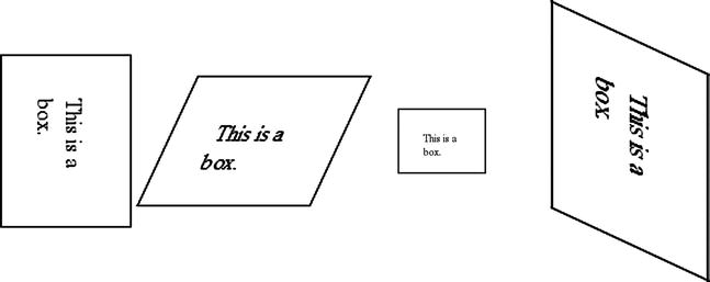
Figure 9-1. Transformations, either singly or combined, applied to some divs
With the appropriate vendor prefixes (-moz-, -webkit-, -o- and -ms- in this case), the CSS rules work against our entire test device set.
Another visual tool you get with CSS3 is the ability to create gradients in CSS. This can be a huge timesaver. A few years ago we would have had to create images for this. Take, for example, these squares in Figure 9-2.

Figure 9-2. The top gradient is a linear gradient, the bottom a radial gradient
The CSS for both of these is as follows.
.linear {
  border: solid 1px #000;
  height: 150px;
  width: 150px;

  background: -moz-linear-gradient(top, rgba(30,87,153,1) 0%, rgba(125,185,232,1) 100%);
  background: -o-linear-gradient(top, rgba(30,87,153,1) 0%,rgba(125,185,232,1) 100%);
  background: -webkit-gradient(linear, left top, left bottom, color-stop(0%,rgba(30,87,153,1)),
    color-stop(100%,rgba(125,185,232,1)));
  background: -webkit-linear-gradient(top, rgba(30,87,153,1) 0%,rgba(125,185,232,1) 100%);
  background: linear-gradient(to bottom, rgba(30,87,153,1) 0%,rgba(125,185,232,1) 100%);
  filter: progid:DXImageTransform.Microsoft.gradient( startColorstr='#1e5799', endColorstr='#7db9e8',
    GradientType=0 );
}

.radial {
  border: solid 1px #000;
  height: 150px;
  width: 150px;

  background: -moz-radial-gradient(center, ellipse cover,  rgba(21,61,107,1) 0%, rgba(137,204,255,0.28) 100%);
  background: -webkit-gradient(radial, center center, 0px, center center, 100%, color-stop(0%,rgba(21,61,107,1)),
    color-stop(100%,rgba(137,204,255,0.28)));
  background: -webkit-radial-gradient(center, ellipse cover,  rgba(21,61,107,1) 0%,rgba(137,204,255,0.28) 100%);
  background: -o-radial-gradient(center, ellipse cover,  rgba(21,61,107,1) 0%,rgba(137,204,255,0.28) 100%);
  background: radial-gradient(ellipse at center,  rgba(21,61,107,1) 0%,rgba(137,204,255,0.28) 100%);
  filter: progid:DXImageTransform.Microsoft.gradient( startColorstr='#153d6b',
    endColorstr='#4789ccff',GradientType=1 ); /* IE6-9 fallback on horizontal gradient */
}
An understandable first impression of this CSS would be that this is clearly too much CSS to generate a simple gradient. You can only consistently get cross-browser gradients if you use a gamut of browser-specific prefixes (the standards-compliant property is in bold). If you do so, you can reliably get linear gradients for all common desktop browsers and our standard device set. You can reliably get radial gradients for all but Internet Explorer 6-9 and early Android browsers.
If you look closely at the different variations you will also notice that the specification for each is different. Webkit even changed its format along the way so two different formats are required to get fullest support. Because life is too short and learning all of these variations is of little value, I recommend using a tool to generate them. I use “The Ultimate CSS Gradient Generator” from ColorZilla [http://www.colorzilla.com/gradient-editor/] because setting up a gradient is easy and the tool is free.
Creating the effect of a shadow also used to be something we would accomplish with images instead of CSS. Fortunately this is now a solved problem for mobile. Shadows in CSS come in two forms, text shadows and box shadows. Apply the following CSS to some text, and you will see what is in Figure 9-3.
.text-shadowing {
  font-family: Helvetica, Verdana, sans-serif;
  font-size: 2em;
  text-shadow: 5px 20px 5px #000;
}
Figure 9-3. Basic text shadows applied to a paragraph
Shadows for DOM elements are just as easily applied, as you can see in Figure 9-4.
.box-shadowing {
  border: solid 1px #000;
  box-shadow: 2px 10px 15px rgba(150, 150, 150, 1);
  height: 100px;
  width: 100px;
}

Figure 9-4. Basic box shadow applied to a div
In the case of both types of shadows, the first pixel value sets the horizontal offset for the shadow, the second the vertical offset, the third the blur radius (0 produces a hard line at the edge, higher values increase the blur) and the fourth the color of the shadow. Box shadows support another parameter, that of inset, to apply the shadow inside the element.
I recommend including the -webkit- prefix for box shadows, otherwise older webkit-based browsers (iOS and Android) will not display the shadow. With that prefix box shadows are supported universally in our test device set with the exception of Windows Phone 7.5.
Another common reason to create images for website designs was to get rounded corners for DOM elements. You can achieve the same effect with the new CSS border radius property. If you apply the following CSS, you get the image in Figure 9-5.
.round-me {
  border: solid 1px #000;
  border-radius: 15px;
  height: 100px;
  width: 100px;
}

Figure 9-5. An example of border radius
The CSS border radius property is supported on all of our target test devices.
There are now two ways to manage opacity in plain CSS, the use of the opacity property and the use of RGBA. Though both can create a translucent element in a page, they do it very differently, so one will apply in some cases and not in the other. Let’s start with some HTML.
<div class="container">
  <div class="other">
      behind
  </div>
  <div class="main-element">
      This is a box.
  </div>
</div>
Here I am going to use CSS to position one element behind another, and we will turn the element on top translucent. Here is the example using opacity.
.container {
  position: relative;
}

.other {
    background-color: #F00;
    border: solid 1px #000;
    padding: 15px;
    position: absolute;
    width: 200px;
    top: 30px;
    z-index: 1;
}

.main-element {
    background-color: #FFF;
    border: solid 1px #000;
    height: 100px;
    left: 35px;
    opacity: .4;
    position: absolute;
    top: 0;
    width: 100px;
    z-index: 10;
}
With this you see the image in Figure 9-6.
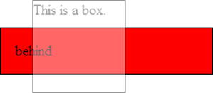
Figure 9-6. The whole div is translucent because we are using the opacity property
Opacity values range from 0 to 1, with 0 being completely transparent and 1 being completely opaque. The important thing to note that will contrast this with RGBA is that everything about the overlying element is translucent, background color, text, and border. If you remove the opacity and change the background color to the following, you see the image in Figure 9-7.
background-color: rgba(255, 255, 255, .5);
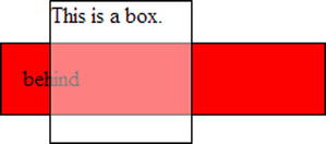
Figure 9-7. Only the background is translucent because the color is only applied to the background
RGBA uses a different notation for color than the usual hexadecimal notation, although it is the same color specification. The last value expresses the alpha value for the color and corresponds to the opacity property above in effect and in specifying the values. Note that in this case the text and border are completely opaque and only the background color is translucent because only the background color is translucent, not the whole element.
Both RGBA and Opacity are supported by all of our test devices.
Sometimes it can be helpful to layer background images to achieve a certain design for a page. Fortunately, multiple background images can now be specified for an element. Here is an example:
.background-me {
  background-image: url('/content/svg/circle.svg'),
    url('/content/images/bacon_100.jpg'),
    url('/content/images/hogan_100.jpg'),
  background-position: top left, bottom right, bottom left;
  background-repeat: no-repeat;

  border: solid 1px #000;
  height: 200px;
  width: 200px;
}
Note that the background images are comma-delimited, as are the instructions on where these images are to appear. Though it is unlikely that you will need to create a background that is a combination of a red circle, a piece of bacon, and a recursively mustached Hulk Hogan, the point is that you can quite easily do so with the multiple-background feature of CSS. Figure 9-8 actually looks like the following in a browser:

Figure 9-8. An example of using multiple background images in a single div
Browsers that support SVG (see below for more on what SVG is and what devices support it) can use SVG files alongside images for multiple backgrounds. This CSS background feature is supported by all of our test devices.
The canvas element in HTML5 is an incredibly capable visual tool and my personal favorite addition to come with HTML5 and CSS3. Canvas is named perfectly, as it gives you canvas upon which you can paint anything you can think of, assuming you also have the JavaScript skills to implement it. It all starts with a simple HTML element.
<canvas id="the-canvas">
</canvas>
Canvas is painting is entirely done in JavaScript. Here is a sample script that draws a few shapes.
window.onload = function () {

  var canvas = document.getElementById('the-canvas'),
  var context = canvas.getContext('2d'),

  //This draws a polygon
  context.beginPath();
  context.moveTo(10, 10);
  context.lineTo(50, 10);
  context.lineTo(60, 20);
  context.lineTo(5, 80);
  context.lineTo(30, 30);
  context.closePath();

  context.strokeStyle = '#000';
  context.stroke();

  context.fillStyle = '#F00';
  context.fill();

  //This draws a circle
  context.beginPath();
  context.arc(100, 100, 35, 0, Math.PI * 2);

  context.fillStyle = '#00F';
  context.fill();

  //This draws a rectangle
  context.beginPath();
  context.fillStyle = '#0F0';
  context.fillRect(200, 20, 50, 50);
}
This script draws what you see in Figure 9-9.
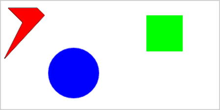
Figure 9-9. Some sample HTML5 canvas drawing
The canvas is an incredibly capable and sometimes complex feature of HTML5. There are several books dedicated to drawing on canvas and with good cause. If you want to see a more practical example of using canvas, you will see a useful example in Chapter 10 of this book.
The canvas element is supported by all of our test devices.
Unlike everything else in this chapter, SVG is neither HTML, CSS, nor JavaScript. SVG stands for “Scalable Vector Graphics” and is another standard altogether. SVG provides a lightweight, XML-based way of drawing vector shapes. Here is a sample of SVG that draws a red circle.
<svg xmlns="http://www.w3.org/2000/svg" height="100" width="100">
  <circle r="50" cx="50" cy="50" fill="#F00" />
</svg>
SVG can both the inlined into a page with HTML content or referenced in an external file, though support for external SVG is a bit better than inline. Vector images created in SVG can often be smaller than their raster jpg and png counterparts. As you might imagine, more complex shapes will make for much more complex SVG markup. If the devices you support also support SVG, consider using this often overlooked standard. Unfortunately Android 2.x does not support SVG, so this will be a problem for most mobile sites since Android 2.x devices are still common.
Summary
Our most common smartphone browsers are more capable than many would assume. The oldest mobile operating systems we tested on here, Android 2.1 and iOS 4, are surprisingly capable. In some cases a visual feature can be used even though it isn’t necessary, and older browsers simply won’t see the visual upgrade. This is often an appropriate approach. As for functionality, sometimes it will be best to turn off a feature for devices that don’t support the technology. Native photo upload is a good example. For browsers that support it, the feature can really make our sites more usable. For those who don’t, we can use techniques like what we saw in Chapter 6 to conditionally hide the newer features.
But as you can see from above, in many cases this will not be necessary. The mobile Web is more advanced than most think.