
Device and Feature Detection
In an ideal world we could always return the same HTML, CSS and JavaScript for any given page on our website. In the real world differences in capabilities and browser bugs will often necessitate some sort of client-side asset split. For example, JavaScript for doing photo uploads in the browser makes sense for recent iPhones and Android devices because they support the feature but not for older devices. Or perhaps you wish to use a feature of CSS for some devices and not others because of buggy support. In the last chapter we discussed how to do this. We saw that we could use custom View Engines, Display Modes, and HtmlHelpers to generate HTML for specific devices. And if you control the HTML, you control what CSS and JavaScript gets included. In this chapter you will learn how to do this intelligently, including learning techniques related to device and feature detection and discussions on where each one is useful.
When web browsers make requests, one of the HTTP headers passed to the web server is the “User-Agent” header, which is a string to identify to the server what kind of device is making that particular request. As an example of what you might see for a user agent, here is a very common one (at least for now), that of an iPhone running iOS 6.1.3.
Mozilla/5.0 (iPhone; CPU iPhone OS 6_1_3 like Mac OS X) AppleWebKit/536.26 (KHTML, like Gecko) Version/6.0 Mobile/10B329 Safari/8536.25.
In most mobile device detection, usually only a small portion of the user agent string is actually important. In this case, we would likely only need “iPhone OS 6_1_3” since it tells us that it is an iOS phone (as opposed to an iOS tablet) and the exact version of the operating system. This might seem like it would be a relatively straightforward process but this hope is completely misplaced because the variety of possible user agents is astounding. For example, every week Match.com’s mobile websites (this does not take into account desktop browser user agents) get visited by thousands of distinct user agents. This includes new devices, as well as devices that have been around for years. If we take into account only the devices that hit our most advanced mobile site (which means iOS 4+ and Android 2.2+), we still get several thousand distinct user agents.
That being said, at this point certain user agents clearly dominate the pack. Sixty-two percent of our users fall into the top ten user agents (six iOS 6.x user agents, one iOS 5.1.1 and three Android 4.1.2 variants). The top thirty user agents make up 73 percent of our traffic, followed by a long tail of differing user agents. About 1,600 of the user agents were unique. Here are a few more samples.
- Droid Razr -Mozilla/5.0 (Linux; U; Android 4.1.2; en-us; DROID RAZR Build/9.8.2O-72_VZW-16) AppleWebKit/534.30 (KHTML, like Gecko) Version/4.0 Mobile Safari/534.30
- Galaxy SIII -Mozilla/5.0 (Linux; U; Android 4.1.2; en-us; SCH-I535 Build/JZO54K) AppleWebKit/534.30 (KHTML, like Gecko) Version/4.0 Mobile Safari/534.30
- HTC Droid Incredible 2 -Mozilla/5.0 (Linux; U; Android 2.3.4; en-us; pcdadr6350 Build/GRJ22) AppleWebKit/533.1 (KHTML, like Gecko) Version/4.0 Mobile Safari/533.1
- BlackBerry Bold Touch -Mozilla/5.0 (BlackBerry; U; BlackBerry 9930; en-US) AppleWebKit/534.11+ (KHTML, like Gecko) Version/7.1.0.755 Mobile Safari/534.11+
- Nokia Windows Phone 7 -Mozilla/5.0 (compatible; MSIE 9.0; Windows Phone OS 7.5; Trident/5.0; IEMobile/9.0; NOKIA; Lumia 900)
- Nokia Windows Phone 8 -Mozilla/5.0 (compatible; MSIE 10.0; Windows Phone 8.0; Trident/6.0; IEMobile/10.0; ARM; Touch; NOKIA; Lumia 920)
- Samsung Convoy 2 -Opera/9.80 (BREW; Opera Mini/6.0.3/27.2314; U; en) Presto/2.8.119 320X240 Samsung SCH-U485
Given the plethora of user agents and the difficulty of not only parsing the user agents in a consistent way but also of gleaning useful device information from them, perhaps leveraging someone else’s work to do this would be wise.
Parsing User Agent Strings with WURFL
Fortunately a number of projects exist that make parsing user agents and gleaning device information a more reasonable task than doing it by hand. There are several useful options, including Device Atlas (https://deviceatlas.com/) and the device detection solution by 51degrees (http://51degrees.mobi/), but I have used the WURFL project extensively and will explain how it works here.
WURFL stands for “Wireless Universal Resource File” and has both library and data components that make it easy to look up information about devices and their capabilities from user agent strings. WURFL has both an open-source and commercial component and is owned by scientiamobile (http://www.scientiamobile.com/). The open-source resources are available on Sourceforge (http://wurfl.sourceforge.net/) and include both data and libraries/code for using WURFL with .NET (available via Nuget), PHP, or Java. There is also a commercially licensed library for C++. The freely downloadable data is often several months behind but those who buy a commercial license can get weekly updates to the database.
As of right now the database has 621 different fields for each device. Few developers will need anything more than just a few fields and some are relevant for newer phones only, and others only for older phones. For example, the fields about capabilities include “canvas_support,” “css_gradient,” “cookie_support,” “gif_animated,” and “https_support”. You will also get other fields about the device, such as “resolution_height,” “resolution_width,” “device_os,” “device_os_version,” “mobile_browser” and “model_name.”
To show you how easy it is to use WURFL, let’s create a simple site and use WURFL for parsing our user agent strings. First I create a new ASP.NET MVC 4 project, call it WURFLSample and use the “Internet Application” template to help us get started quickly (see Figure 7-1).
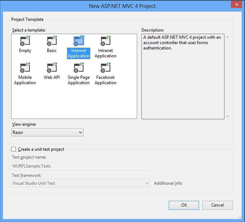
Figure 7-1. Project created with the “Internet Application” template
The Internet Application template is responsive (see Figure 1-5), so we can shrink our browser window to a small size like we would see on a mobile device and it sizes itself appropriately (see Figure 7-2).
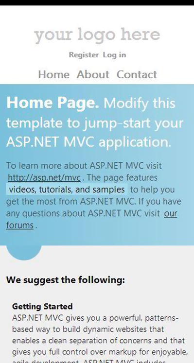
Figure 7-2. The Internet Application template viewed on a small screen
If you are using Visual Studio 2013, choose the MVC project template. You will have a similar setup. What we will do is create two alternative view files to the home page, one for older smartphones and one for newer smartphones. This means that we will want to know both the device OS and the version. You may recall from Chapter 6 that at Match.com we split devices into the large categories of more advanced devices and devices with more basic capabilities. We call these groups “super” (for “superphone”) and “basic” respectively. The basic views are for devices that either have limited capabilities or are rare/old enough that keeping them on the super views is not worth the work. These views use very basic HTML and CSS and use no JavaScript. The super skins are where the vast majority of our mobile traffic goes, which includes Android 2.2+ and iOS 4+ (as of May 2013) and leverage a lot of browser features only available on new phones.
Implementing this feature without using something like WURFL would be tedious and error-prone. If we were just checking the operating system, a simple check for “Android” and “iPhone” in the user agent string would be simple enough and cover you for most users (the tiny variations in user agents strings can be maddening though). But we want to also pay attention to version, which WURFL already parses out for us. So we will start by creating our two new mobile views, which we will call “Index.basic.cshtml” and “Index.super.cshtml”, based on the grouping mentioned above. To simplify things, we’ll also clear out the content of the files and each will have one HTML tag, which will say “Default view!” for the default page, “Basic view!” for the basic view and “Super view!” for the super view. Now the homepage of the site will look like Figure 7-3.
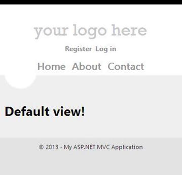
Figure 7-3. The default view
We will implement this feature using the DisplayMode feature of ASP.NET MVC 4. This DisplayMode feature allows you to easily return different HTML for different types of devices. All you need is a way to determine what to return and you supply a lambda expression for the context condition (see Chapter 6 for more information about this). We will use WURFL in the context condition of the DisplayMode because it makes parsing user agent strings easy. First let’s get WURFL setup. Open solution explorer, right-click on “References” and choose “Manage Nuget Packages…” Find WURFL through an online search like you see in Figure 7-4.
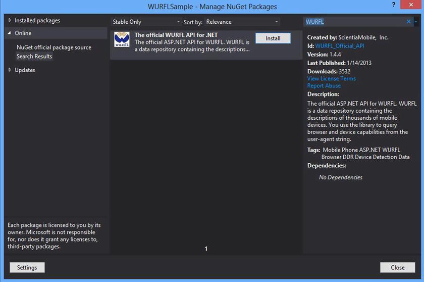
Figure 7-4. Finding WURFL in the Nuget package manager
Hit the “Install” button, accept the terms and WURFL will be added to your project, which includes both the data (now residing in a zip file in the site’s App_Data folder) and the .NET library for reading the data. Because the data set is large and takes a while to load (several seconds on my machine), it is best to load it once at the start of the application and just reference a single instance. It could look something like this:
using System;
using System.Web.Http;
using System.Web.Mvc;
using System.Web.Optimization;
using System.Web.Routing;
using WURFL;
using WURFL.Config;

namespace WURFLSample
{
  public class MvcApplication : System.Web.HttpApplication
  {
    private static IWURFLManager _wurflManager;

    protected void Application_Start()
    {
      AreaRegistration.RegisterAllAreas();

      WebApiConfig.Register(GlobalConfiguration.Configuration);
      FilterConfig.RegisterGlobalFilters(GlobalFilters.Filters);
      RouteConfig.RegisterRoutes(RouteTable.Routes);
      BundleConfig.RegisterBundles(BundleTable.Bundles);
      AuthConfig.RegisterAuth();

      string wurflDataPath = Server.MapPath(@"∼/App_Data/wurfl-latest.zip");
      var configurer = new InMemoryConfigurer().MainFile(wurflDataPath);
      _wurflManager = WURFLManagerBuilder.Build(configurer);
    }
  }
}
Now that WURFL is configured, we can setup our DisplayModes. This is how you could query WURFL and pick the supported devices.
var superMode = new DefaultDisplayMode("super");
superMode.ContextCondition = (context) =>
{
  IDevice device = _wurflManager.GetDeviceForRequest(context.Request.UserAgent);
  string deviceOS = device.GetCapability("device_os").ToLower();
  string versionString = device.GetCapability("device_os_version");

  Version version = new Version();
  Version.TryParse(versionString, out version);

  bool isSupportedAndroid = deviceOS == "android"&&version >= new Version("2.2");
  bool isSupportediOS = deviceOS == "ios"&&version >= new Version("4.0");

  if (isSupportedAndroid || isSupportediOS)
    return true;
  else
    return false;
};
The basic DisplayMode would be very similar. Only the name and conditions would change.
var basicMode = new DefaultDisplayMode("basic");
basicMode.ContextCondition = (context) =>
{
  IDevice device = _wurflManager.GetDeviceForRequest(context.GetOverriddenUserAgent());
  string deviceOS = device.GetCapability("device_os").ToLower();
  string versionString = device.GetCapability("device_os_version");

  Version version = new Version();
  Version.TryParse(versionString, out version);

  bool isSupportedAndroid = deviceOS == "android"&&version < new Version("2.2");
  bool isSupportediOS = deviceOS == "ios"&&version < new Version("4.0");

  if (isSupportedAndroid || isSupportediOS)
    return true;
  else
    return false;
};
Both would then be inserted into the DisplayModeProvider.
DisplayModeProvider.Instance.Modes.Insert(0, basicMode);
DisplayModeProvider.Instance.Modes.Insert(0, superMode);
At this point everything would be setup. So if you were browser with an iPhone using iOS6, you would see the screenshot on the left in Figure 7-5. If browsing with an iPhone using iOS 3, you would see the screenshot on the right.
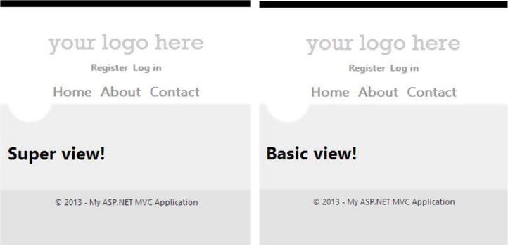
Figure 7-5. Super and basic views
When we used this at Match.com, we also found it helpful to gather this WURFL data into a class. There are a number of things about this that we found advantageous. First, this abstracts WURFL away from the rest of our code (just in case we want to change later). Second, this gives us a place to add other properties that we can infer from those retrieved from WURFL. For example, we have a property called “HasHardwareBack” that returns true for Android that we use to hide some back buttons in our app (since they aren’t needed). When we start supporting Windows Phone on our super skins, we can add them in as well. Third, we put a ToJson() method on the object to convert it to JSON, which we embed in the page so that our client-side JavaScript has access to the same set of capabilities. Let’s see how we can set all this up.
First we need our DeviceInfo object. Here is a fairly basic one. You would obviously replace the properties with the things from WURFL that you cared to use.
using System;
using System.Web.Script.Serialization;

namespace WURFLSample
{
  public class DeviceInfo
  {
    public string DeviceOS { get; set; }
    public Version DeviceOSVersion { get; set; }
    public string ModelName { get; set; }
    public string UserAgent { get; set; }
    public bool IsTablet { get; set; }
    public bool HasCookieSupport { get; set; }

    public bool HasHardwareBack
    {
      get
      {
        if (this.DeviceOS == "Android")
          return true;
        else
          return false;
      }
    }

    public string ToJson()
    {
      var data = new
      {
        deviceOS = this.DeviceOS,
        deviceOSVersion = this.DeviceOSVersion.ToString(),
        modelName = this.ModelName,
        isTablet = this.IsTablet,
        hasHardwareBack = this.HasHardwareBack,
        hasCookieSupport = this.HasCookieSupport
      };

      var serializer = new JavaScriptSerializer();
      var json = serializer.Serialize(data);
      return json;
    }
  }
}
Second, we need to gather that info on every request. On good way of doing that is to build up our DeviceInfo object on BeginRequest.
protected void Application_BeginRequest(object sender, EventArgs e)
{
  var context = new HttpContextWrapper(Context);
  IDevice device = _wurflManager.GetDeviceForRequest(context.GetOverriddenUserAgent());

  var deviceInfo = new DeviceInfo();
  deviceInfo.DeviceOS = device.GetCapability("device_os");
  deviceInfo.ModelName = device.GetCapability("model_name");
  deviceInfo.UserAgent = context.GetOverriddenUserAgent();

  //To avoid parsing failures for non-string types, we leverage TryParse
  bool hasCookieSupport = false;
  string strHasCookieSupport = device.GetCapability("cookie_support");
  Boolean.TryParse(strHasCookieSupport, out hasCookieSupport);
  deviceInfo.HasCookieSupport = hasCookieSupport;

  bool isTablet = false;
  string strIsTablet = device.GetCapability("is_tablet");
  Boolean.TryParse(strIsTablet, out isTablet);
  deviceInfo.IsTablet = isTablet;

  //Version class requires major.minor, so we make sure we get good info out of WURFL.
  string rawDeviceOSVersion = device.GetCapability("device_os_version");
  if (String.IsNullOrEmpty(rawDeviceOSVersion) == true) //default major
    rawDeviceOSVersion = "0";
  if (rawDeviceOSVersion.Contains(".") == false) //default minor
    rawDeviceOSVersion += ".0";
  deviceInfo.DeviceOSVersion = new Version(rawDeviceOSVersion);

  context.Items["DeviceInfo"] = deviceInfo;
}
So now any server-side logic has access to the device info. If we want to expose this to our view files, we can do so quite easily. I would do this by creating a custom Controller base class and have our site’s controllers derive from this.
public class CustomBaseController : Controller
{
  protected override void OnActionExecuting(ActionExecutingContext filterContext)
  {
    ViewBag.DeviceInfo = filterContext.HttpContext.Items["DeviceInfo"];

    base.OnActionExecuting(filterContext);
  }
}
Note that the DeviceInfo object is now added to the ViewBag. This means that we can output this in our _Layout.cshtml file by changing the body tag like so:
<bodydata-device-info="@ViewBag.DeviceInfo.ToJson()">
Now we can grab that device info in JavaScript and use it if needed (we use a little jQuery here which is not necessary):
var data = $('body').data('deviceInfo'),
console.log('mobile os', data.deviceOS);
All of that should get you started with device detection. It has its strengths and weaknesses, which we will discuss later in this chapter. For now, let’s move on to another useful type of detection.
Though device detection based on user agents will often make a lot of sense, there are a number of cases where feature detection is a better route. Feature detection involves using JavaScript in the browser to determine if the browser supports a feature; its primary benefit is that it is by design a forward-compatible approach. As new browsers come out, they generally just add new features instead of take away, so a site that uses feature detection can have functionality/visuals that get revealed gradually as people update their browsers. A simple script to do feature detection would be the following, which checks to see if the browser supports WebGL.
<script>
  window.onload = function () {
    if (!window.WebGLRenderingContext) {
      //WebGL is not supported :(
      //Hide the WebGL widget or perhaps show a message
    }
    else {
      //WebGL IS SUPPORTED! :)
      //Unleash the awesome
    }
  }
</script>
In most cases mobile browsers do not support WebGL, so at this point the negative case will be the normal on mobile devices. But as time goes on, WebGL support will likely grow and users on the supported browsers will get the experience your WebGL feature is coded for.
If you do a lot of feature detection, writing these scripts might get tedious. Fortunately there is a very popular open-source library that collects feature detection scripts called Modernizr (http://modernizr.com/) that can be very helpful. Modernizr supports a very large list of feature detections, and you can use the entire list on your site or, alternatively, you can pick and choose to generate a custom Modernizr build (see Figure 7-6).
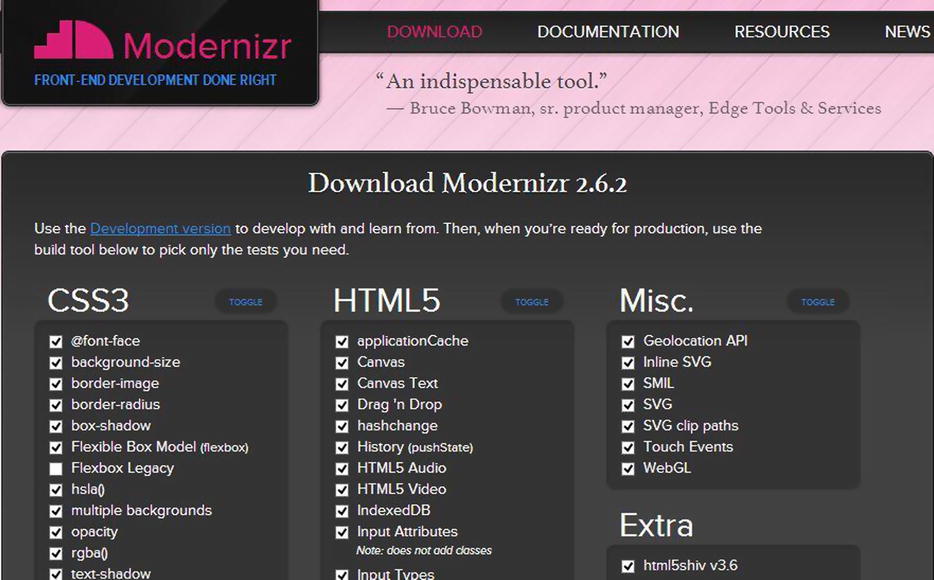
Figure 7-6. Creating a custom Modernizr build
When in use, Modernizr takes an interesting approach for specifying whether or not a feature is supported. The following is a screenshot (Figure 7-7) of a page on which I put a small Modernizr script.
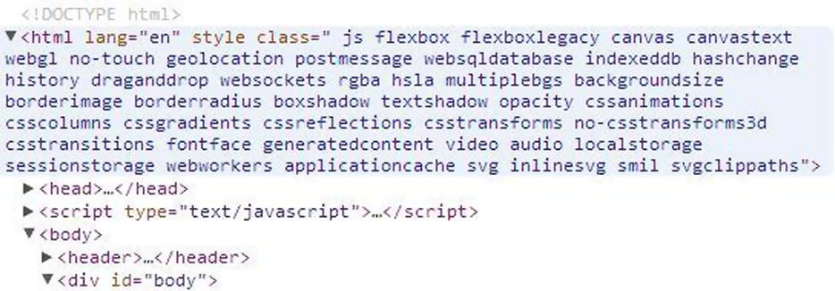
Figure 7-7. Modernizr in action on a page
When the page is loaded, Modernizr performs its feature checking and adds classes to the HTML tag specifying whether or not the feature in the Modernizr build is supported. If it is supported, the name of the feature will be listed as a class (such as “applicationcache”) and if it is not, “no-“ will be prepended (such as “no-touch”). In this case I am using Chrome and almost everything is supported. Now scripts or CSS on the page can look for these classes and choose hide/show parts of the page or turn functionality off/on, of course depending on the individual situation.
To keep this from being a bit nebulous, let’s create a very simple scenario to show how this would work.
Let’s say you need to perform an action where geolocation would be useful but you are not sure that every browser that hits your site will support the feature. For those that do, you will use the JavaScript geolocation api to request the user’s location. For those that do not, you will show a field on the page that collects their postal code like this.
<div class="postal">
  <label>Postal Code: </label><input type="text" id="postal" />
</div>
Because you are using Modernizr, a class will be added to the HTML element of the page, either “geolocation” or “no-geolocation” depending on the browser. All you need to hide the field is a little CSS.
.geolocation .postal {
  display: none;
}
These same feature detections can be referenced in JavaScript as well like this:
if (Modernizr.geolocation) {
  console.log('hey, you have geolocation capabilities!'),
}
There are numerous other ways this can be used. For example, let’s say you create a site that can be used offline because of applicationcache. You might want to message the user telling them about this functionality but you might want to know if their browser supports it. By using feature detection you can tell those with modern browsers that they can open the site offline and those that do not that they could get this if they had a better browser/device.
Another good example would be to use feature detection to determine if the browser has touch capabilities. Touch can often be used to create a very distinctive form of interaction for the user, but you may need to have your webpage work one way for those who have touch-supporting browsers and another way for those who do not.
Those are just a few examples. For more discussion on doing feature detection, I would recommend both Dive Into HTML5’s discussion [http://diveintohtml5.info/detect.html], which is general in scope and good, as well as MDN’s article [http://diveintohtml5.info/detect.html], which focuses more on detecting DOM and CSS support.
Device Detection versus Feature Detection
Though I have heard some argue that you should always use feature detection and never device detection, this sets up a false dichotomy and is definitely a flawed assertion for several reasons.
First, feature detection relies on JavaScript to function, and this is not always going to be possible. Some people browse without JavaScript turned on (though I cannot imagine doing this, some people use the Web this way) but more importantly, many older mobile browsers do not support JavaScript at all.
Second, feature detection requires returning client-side assets to the browser before optimizing for capabilities, which means most bandwidth optimizations are ruled out. However, if you detect that the device visiting the site has no JavaScript support based on device capabilities, you can give them a lighter page, which is better for your bandwidth bill and will run faster on their device.
Third, not all feature set decisions on mobile can be made simply based on the existence of features. On the Match.com mobile website, we have a few features disabled for iOS 4.0 because the JavaScript engine in that OS was very slow. It had the features to do what we want, but it lacked the power to do them well. Feature detection will not solve this for you.
Fourth, feature detection alone may not help you avoid some browser bugs. Mobile browser bugs (much more common than I expected) will often be uncatchable by feature detection. Though the feature may exist, it may be broken.
But on the other hand, doing device detection based on user agents will put you in a constant battle to keep up-to-date. This is regrettable but sometimes necessary given the situation. Ultimately the answer to the question of device detection versus feature detection ends up with the most common but unsatisfying answer of all: it depends. In reality, device detection versus feature detection is a false dichotomy. Both techniques can be used beneficially.
Device detection also runs the risk of being wrong. Let’s say you are using device detection to determine if a user has canvas support for his browser. As long as your database is always up-to-date and the parsing capabilities of your user-agent parsing library are never wrong, you can use device detection with confidence. But keeping the libraries up to date is a constant effort and you can never be sure that the library you are using is correct 100 percent of the time. Because of these reasons, in this case client-side feature detection is often the better choice.
Summary
Device and feature detection is a very important part of the world of mobile web development. Device detection involves interrogating user agents and making server-side decisions about what assets are returned with the web request. Feature detection involves using JavaScript on the client to determine if a feature is supported. This is a powerful technique as long as the user has JavaScript running on their web browser. But both can be used to customize the experience for the users of your website.