
Now we have reached our discussion on flexible content, perhaps the most important part of a responsive web design. If the content of your website does not work well on a wide range of devices, having flexible layout and navigation is of little value. After all, layout and navigation exist to present the content of your site.
Once again, techniques for being responsive are advancing, so what you see here should be considered a starting place or a way to get you thinking, not the only way of making the content of your site responsive. Unlike before, we will be primarily concerned with flexibility in two different ways, both flexibility of size on screen (like before) but also size in bytes transferred in the case of images. It is easy to create a responsive design for a site that delivers the same content to both mobile and desktop. Unfortunately, this often means that you will be delivering more to the mobile device than it actually needs, which is bad for devices with slower bandwidths. So now you’ll learn about flexible content and see how you can solve this problem.
In order to support mobile, some sites remove content because dealing with mobile can sometimes be difficult. I consider this to be cheating. If something can be cut to streamline for mobile, consider cutting it for desktop as well, since it is obviously not that important. Mobile users don’t expect to visit a site on mobile and lose functionality or content. Responsive web design is about making the same content work on both mobile and desktop, so we will avoid all techniques that remove content to make mobile “work,” because that’s not making mobile work as it should. So when I say flexible content, I don’t mean that we should remove content. We should make it adapt.
The quickest way to cut the bandwidth requirements of our mobile sites may be to remove content; but as I said above, this is usually a bad idea. Because many people only access the web on a mobile device, removing content on mobile may keep some who visit the site from ever seeing the content they need. You can’t assume that the visitor to your site will use a desktop in conjunction with their mobile device while using your site. You can’t even assume that they own one. Instead, whenever possible, keep the same content and make it flexible but watch the bandwidth usage. Most of this chapter is centered around flexible content in terms of fitting everything on any screen, but the section on flexible images will also cover ways to save the visitor to your site from downloading too much.
In this chapter, we’ll break up common content into different types of content. The first, easiest, and most important will be text followed by tables, video, and images.
Flexible Text
Text on the web has always been flexible and is the easiest type of content to deal with in a responsive manner. As the container of a text changes size, text conveniently and automatically breaks between words causing wrapping, which allows text to adapt well to different screen sizes. And unlike some other content types, in most cases we will want to show the same text to mobile and desktop users because text is bandwidth-friendly. But this doesn’t mean we should ignore text while thinking responsively. Let’s start by setting up some ground rules on how text sizing works on the Web and then move on to how best to tweak it.
The default font size for mobile and desktop browsers is 16 pixels. Confirming this is easy. I created a page to show off the following markup and tried it on every device and browser I could find. The result can be seen in Figure 5-1.
<h1>Font size not set</h1>
<h1 style="font-size: 32px;">Font size set to 32px</h1>

<h2>Font size not set</h2>
<h2 style="font-size: 24px;">Font size set to 24px</h2>

<p>Font size not set.</p>
<p style="font-size: 16px;">Font size set to 16px.</p>
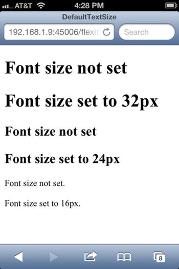
Figure 5-1. My default text size test page viewed on an iPhone 4S running iOS 6
The test is fairly straightforward. If the text sizes for any of those three elements that had no CSS ever differed from those that did, then that browser would not default to the specified size. But they all did, so until a browser comes out that changes this, we can make the following three assumptions: default text is sized at 16 pixels, h2 tags are sized at 1.5 times the size of default text, and h1 tags are sized as two times the size of default text. So by default, all the browsers size text according to a set of standard proportions. As we change the size of the text we will maintain these ratios, though you can always change them for your own sites.
Table 5-1. Default Browser Font Sizes
Tag |
Default Size |
|---|---|
| h1 | 32 pixels |
| h2 | 24 pixels |
| h3 | 19 pixels |
| h4 | 16 pixels |
| h5 | 13 pixels |
| P | 16 pixels |
Next let’s discuss a different unit of measurement, one that we should generally be using when sizing text instead of pixels, and that is the “em”. The em is a better measurement for thinking about text. Unlike pixels, it is a relative unit of measurement. Applying a value of 1.1em to the font size of an element increases the size by 10 percent, whatever the starting font size is. This means that em-sized elements can depend on the sizes of other elements. This will give us some nice abilities that we will exploit below. I also bring this up at this point because it’s a unit that web designers generally prefer and, if we reinterpret our data above, actually makes for easier numbers. Let’s talk about that a bit more.
Historically the em comes from printing, where an em as a unit of measure is equal to the width of the capital letter M in any given typeface. When it comes to browsers, 1 em is equal to the default font size of the browser. So in our examples above, the default size of a p element is 1 em, an h2 element is 1.5 ems and an h1 element 2 ems. When expressed in ems, the pattern of the sizes is more obvious but that’s not surprising because typography geeks are more likely to talk in ems and not in pixels. Given the “coincidence” here, I presume that this was something the browser makers thought as well.
Because ems are generally the preferred unit for designers and because they express proportions better, we will use ems instead of pixels in all our discussions about sizing text.
Another interesting side effect of using ems is that nested elements with em measurement are compounded. Let me explain what I mean. Let’s say you have the following bit of HTML.
<p style="font-size: 1.2em;">This is a paragraph</p>

<div style="font-size: 1.2em;">
  <p style="font-size: 1.2em;">This paragraph is nested.</p>
</div>
Is the first paragraph the same font size as the second paragraph? No. The first paragraph is about 19 pixels in size, the second is about 23 pixels in size. The second is larger because it also picks up the font size increase of its parent div. The first paragraph is 20 percent larger than the default font size, the font size for the second increased by 20 percent because of the parent div and then increased 20 percent again by its own font setting.
As you may guess, this can lead to problems if you don’t pay close attention to how you nest and size your HTML. But it’s also a very valuable tool. If you want to change the text size of a given page and make everything just a bit bigger, you could change the styling for every HTML tag on the page or you could add a style rule to change the font size of the body tag to 1.1 ems and bump up the size all tags in one easy change by 10 percent. This is a very powerful tool and something we will come back to momentarily.
The nesting capability of ems can be either a blessing or a curse, depending on how you structure your HTML and CSS. Even though ems are great for sizing text, the negative side effect I mention led to the development of the rem, which stands for “root em”. If an element is sized with a rem instead of an em, the proportional size expressed in the em is sized in relation to the root of the document, the html tag. In other words, if we take our previous example and change the nested paragraph to use a rem, the size of the first paragraph and the second are now the same.
<p style="font-size: 1.2em;">This is a paragraph</p>

<div style="font-size: 1.2em;">
  <p style="font-size: 1.2rem;">This paragraph is nested.</p>
</div>
Using rems gives you the benefit of ems but makes it harder for you to accidentally change font sizes by nesting elements. Desktop browser support is good (IE 9+, Chrome, Firefox, Opera, Safari) but mobile browser support is ubiquitous in modern smartphones, so it can be safely used.
Font size across mobile devices is remarkably consistent. Unfortunately line height (often called “leading”, referring to the strips of lead between lines of text in printing presses) has no such uniformity. Just for a few examples, IE 10 on Windows 8 defaults to around 18.4 pixels, Android-based browsers (including Kindle browsers), Firefox OS and Opera around 19.2 pixels, Windows Phone 7 around 21.44 pixels, and iOS around 20.8 pixels.
It would be very reasonable to wonder why these (seemingly) strange decimal numbers were chosen. But if we convert the pixel sizes to ems, some of them seem less arbitrary. Android browsers have a default line height of 1.2 ems and iOS browsers have a default line height of 1.3 ems. Internet Explorer seems to work a bit differently though, with line heights of 1.15 ems for version 10 (desktop) and 1.34 for version 7 and 8 on the phone. We are left with the sizes in Table 5-2.
Table 5-2. Default Line Heights for Mobile Browsers
Browser |
Pixels |
Ems |
|---|---|---|
| Windows Phone 7, 8 | 21.44 px | 1.34 em |
| iOS | 20.8 px | 1.3 em |
| Android, Firefox OS, Opera | 19.2 px | 1.2 em |
| Desktop IE 10 on Windows 8 | 18.4 px | 1.15 em |
Fortunately all of these browsers can be made consistent by a little CSS. Decide on the size you like, and set it with the CSS line-height property.
Responsive Text
Now that we have the core ideas in our mind, we can now think responsively and see how hard it is to style flexibly with text. Let’s take a simple example, exemplified by Figure 5-2. The HTML for it is straightforward.
<h1>Lorem ipsum dolor sit amet</h1>
<p>Lorem ipsum dolor sit amet, consectetur adipiscing elit. Nullam vel justo eros...</p>
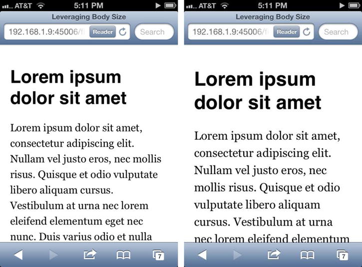
Figure 5-2. Sizing text with media queries
The CSS is as follows. The media query is missing from the first shot in Figure 5-2.
h1 {
  font-family: Helvetica, sans-serif;
  font-size: 2em;
}

p {
  font-family: Georgia, serif;
  font-size: 1.2em;
  line-height: 1.5em;
}

@media screen and (max-width: 400px) {
  body {
    font-size: 1.1em;
  }
}
Regardless of whether you would prefer the text to be smaller or larger on the phone, the technique is the same. Note that only the font size of the body was changed, but the heading and the paragraph both increased. The cascading effect of our em-based sizing makes it easy to change the size of all the text, larger or smaller, just by changing one element in a media query.
Flexible text is easy; flexible tables are hard. There are a number of techniques, all of which have their drawbacks. It may be the case that several of these will work for you, in which case you have multiple techniques you can use. Let’s start with what already works well with tables and what doesn’t and follow it up with some techniques to solve these problems.
First of all, there is a level of flexibility built into HTML tables. Unless explicit widths are set on columns, tables will flex without any special treatment, at least up to a point. In order to accommodate smaller screens, tables will insert line breaks between words in table cells causing the text to wrap (just as browsers insert line breaks when a line of text in a paragraph gets too long), stretching the table vertically. Once line breaks can no longer be added to make a table narrower, the table will stop shrinking. If that is larger than the size of your flexible layout, the table will break it. For example, let’s say you have a flexible layout that normally sizes just fine on an iPhone in portrait mode, which is 320 pixels wide. In this case the user can scroll vertically but not horizontally, because the width is 320 pixels and the browser knows that the user can’t scroll horizontally because the content is the size of the device viewport. Now you add a table that is too large that (we will assume in our hypothetical case) will render at a minimum width of 500 pixels. Now your flexible layout that was 320 pixels is actually 500 pixels in width, and the user will have to scroll both horizontally and vertically to see all of the content. This is obviously not ideal. We need a better way.
A very simple way to make your table scroll within the width of the window is to wrap it in a div and set overflow: auto on the div. Though the data on the right side of the table might initially be hidden, this technique allows the user to scroll the table horizontally to see the whole thing. The simplicity of this technique is its strongpoint. This works great unless you want to support Android 2.x, which doesn’t support scrolling an element in this way. You also have to be okay with the unsightly scrollbars that will appear on a desktop browser if the browser window is too small. Android 2.x is still quite popular at this time, so this technique really suffers. But perhaps in a few years this will no longer be the case.
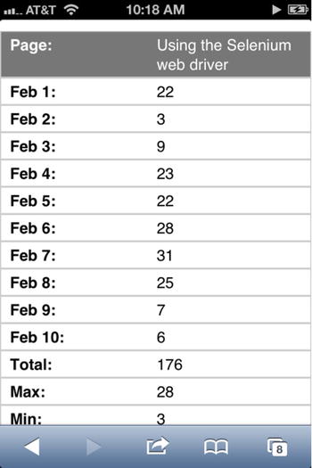
If the table is too large to fit on mobile devices, we can de-table the table by changing its layout. There are several techniques for doing this, although the result from all of them looks like Figure 5-3.
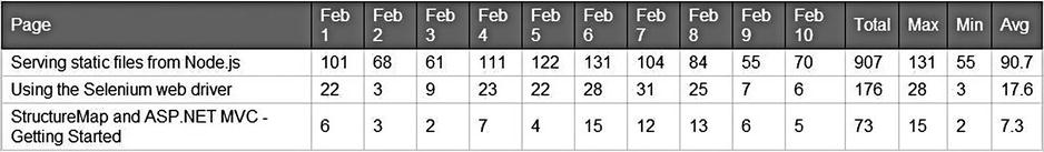
There are essentially two problems to solve here. First, the table elements have to have their default layout changed to something other than the default you get with HTML tables. Second, we want to get the column names from the header and put them to the left of the values as labels. Because I have three data rows and one row of header, this is going to be a difficult one to solve cleanly.
The first approach I tried is by Aaron Gustafson [http://blog.easy-designs.net/archives/2013/02/02/responsive-tables/]. To solve the first problem, he changes the tbody, tr, and td tags to display: block and hides the header. To solve the second problem, he repeats the header names in data attributes on the table cells and uses CSS to pull that out and display it when the media query kicks in. The table would look something like this:
<tbody>
  <tr>
    <td data-title="Page">Serving static files from Node.js</td>
    <td data-title="Feb 1">101</td>
    <td data-title="Feb 2">68</td>
    <td data-title="Feb 3">61</td>
    <td data-title="Feb 4">111</td>
    <td data-title="Feb 5">122</td>
    <td data-title="Feb 6">131</td>
    ...
The media query for de-tableing would look something like the following. I’ve highlighted the most important bits.
@media screen and (max-width: 960px) {
  thead {
    display: none;
  }

  tbody, tr, td {
    display: block;
  }

  td {
    padding-left: 50%;
  }

  td:first-child {
    background-color: #777;
    color: #FFF;
  }

  td:before {
    content: attr(data-title) ': ';
    display: inline-block;
    font-weight: bold;
    left: 10px;
    margin-right: 15px;
    position: absolute;
  }

  tr {
    margin-top: 15px;
  }
}
This is a very clever technique, though it has two flaws that we should mention. First, it doesn’t work in Windows Phone 7.5. Traffic for this device is quite low, so this won’t bother some people; however, it would be better to have a solution that worked for that device. Second, the extra data elements significantly expand the size of the table and repetition of content leads to maintenance annoyance though server or client-side templating can make this easier. This is a workable solution, but perhaps we can find an improvement.
A variation on this same display:block pattern can be found on CSS Tricks, a site run by Chris Coyier [http://css-tricks.com/examples/ResponsiveTables/responsive.php]. His approach put the labels for the data in the CSS. This is a selection from the CSS to implement this.
td:before {
  position: absolute;
  left: 0;
  padding-left: 10px;
}

td:nth-of-type(1):before { content: 'Page'; }
td:nth-of-type(2):before { content: 'Feb 1'; }
td:nth-of-type(3):before { content: 'Feb 2'; }
td:nth-of-type(4):before { content: 'Feb 3'; }
td:nth-of-type(5):before { content: 'Feb 4'; }
td:nth-of-type(6):before { content: 'Feb 5'; }
td:nth-of-type(7):before { content: 'Feb 6'; }
td:nth-of-type(8):before { content: 'Feb 7'; }
td:nth-of-type(9):before { content: 'Feb 8'; }
td:nth-of-type(10):before { content: 'Feb 9'; }
td:nth-of-type(11):before { content: 'Feb 10'; }
td:nth-of-type(12):before { content: 'Total'; }
td:nth-of-type(13):before { content: 'Max'; }
td:nth-of-type(14):before { content: 'Min'; }
td:nth-of-type(15):before { content: 'Avg'; }
One advantage that this approach has over the other is that it avoids messing up the DOM for this new display. It also cuts down on the duplication, so the label data is only duplicated once (the original data being in the header and the duplicated data in the CSS). However, now you have to keep your CSS in sync with your table data. Some may prefer this approach though I like it less. And it also doesn’t work on Windows Phone 7.5.
Before we spend more time on the labels, let’s solve the display issue with Internet Explorer. Moving everything to display: block did not work, so we will try something else. As it turns out, floating works great. As far as I can see, this works across all modern mobile browsers.
@media screen and (max-width: 960px) {

  td {
    float: left;
    padding: 8px 2% 8px 50%;
    position: relative;
    width: 48%;
  }
}
Space on the left is made for the labels, which we will come back to shortly. But as you can see, now that we learned how floats work (see Chapter 2 if you skipped it), this is a relatively straightforward approach.
Now back to the label problem. The issue here is that HTML and CSS don’t really solve this problem, at least not elegantly. This is a new technique that the browsers are not ready for, and when this happens often the best approach is to use JavaScript. Our goal is to have a plain HTML table that would work responsively that has no duplicate label information. Here is the full implementation, starting with the HTML.
<table>
  <thead>
    <tr>
      <td>Page</td>
      <td>Feb 1</td>
      <td>Feb 2</td>
      <td>Feb 3</td>
      <td>Feb 4</td>
      <td>Feb 5</td>
      <td>Feb 6</td>
      <td>Feb 7</td>
      <td>Feb 8</td>
      <td>Feb 9</td>
      <td>Feb 10</td>
      <td>Total</td>
      <td>Max</td>
      <td>Min</td>
      <td>Avg</td>
    </tr>
  </thead>
  <tbody>
    <tr>
      <td>Serving static files from Node.js</td>
      <td>101</td>
      <td>68</td>
      <td>61</td>
      <td>111</td>
      ...
As you can see, the DOM is nice and clean. No extraneous attributes. Next comes the CSS.
td {
  border: solid 1px #CCC;
  padding: 3px 8px;
}

thead td {
  background-color: #777;
  outline: solid 1px #000;
  color: #FFF;
}

@media screen and (max-width: 960px) {
  td:first-child {
    background-color: #777;
    color: #FFF;
  }

  tr:nth-of-type(odd) {
    background-color: #eee;
  }

  thead {
    display: none;
  }

  td {
    float: left;
    padding: 8px 2% 8px 50%;
    position: relative;
    width: 48%;
  }

  td:before {
    content: attr(data-title) ': ';
    font-weight: bold;
    position: absolute;
    left: 0;
    padding-left: 10px;
  }
}
This CSS is a mixture of Gustafson’s and my own so that it will work in Windows Phone 7.5. The primary difference between my approach and those above that makes this work is that the previous approaches changed the CSS display attribute of the cells, which doesn’t work on Windows Phone 7.5. However, floats work nicely, so we use those to change the layout of the table. We solve the duplicate data problem with a script script (which uses a little jQuery, as you can see) that will dynamically add the data attributes when the page is loaded.
<script>
  $(document).ready(function () {

    var headerCells = $('thead td'),
    var dataCells = $('tbody td'),

    var i, labelIteration = 0, labelIterationMaxLength = headerCells.length;
    for (i = 0; i < dataCells.length; i++) {
      $(dataCells[i]).attr('data-title', headerCells[labelIteration].innerText);

      labelIteration++;
      if (labelIteration == labelIterationMaxLength)
        labelIteration = 0;
    }

  });
</script>
Assuming there aren’t any row or column spans, this seems to work pretty well. Of course there is a JavaScript dependency at this point, which some might not be comfortable with. This new approach gives you the same result on a small screen that we saw in Figure 5-3 above, though with the added bonus that it now works on Windows Phone 7.5.
If you are okay with a JavaScript dependency, another choice to consider is using the FooTable library [http://themergency.com/footable/]. It also supports Windows Phone 7.5, which is a small bonus. This approach solves the problem by keeping the table format initially but collapsing the data, which you can drill down into. For example, here in Figure 5-4 is the same table we saw above using FooTable.
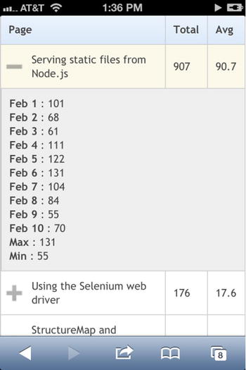
Figure 5-4. Using FooTable to make my tables more flexible
Frankly, there is no elegant way of solving this problem at this point. I have given you several options and there are more options/experiments out on the web for handling tables. As I said in the introduction, this is an area of web development that certainly needs to evolve and will over time.
Flexible Video
When I think of video on the web, I generally group usage into two categories: either you are embedding video directly into your site (like using the video tag) or you are including an iframe to a site like YouTube or Vimeo.
Because of the history of video on the web, it is important to note that if you want video to work on mobile, you can never use Flash or Silverlight as your only mechanism for delivering video. Support is either inconsistent or nonexistent, depending on the device. Your only cross-platform way to embed video across modern devices is to use HTML5 video. However, you can consider using Flash or Silverlight with an HTML5 video fallback. If that route makes sense for you, take a look at MediaElement.js [http://mediaelementjs.com/].
HTML5 Video
Let’s start with the first case, that of using the HTML5 video element. I find that the HTML5 video is inconsistently flexible. I recorded a video and converted it to various video formats and the video was 568 pixels in width by default. To test this, I used the following.
<video controls src="/content/video/sample-video.webm">
  <source src="/content/video/sample-video.mp4" type="video/mp4" />
  <source src="/content/video/sample-video.ogg" type="video/ogg" />
</video>
Default Behavior
I applied no CSS to the element, so what I saw is default behavior. The results were inconsistent and unexpected. All iOS versions tested (5, 6, and 7) and Windows Phone 7 and 8 resized the element to fit snugly within my content area, even though I gave it no instructions to do so and went full-screen when the video started playing.
The new webkit-based Opera on Android 4.1 kept the video element at the expected size (568 pixels) when the page was loaded (it all did not fit on the screen) but switched to full-screen mode when playing.
Opera classic on Android 4.1 kept the video element at the expected size when the page was loaded and played it at that same size, with the rightmost portion of the video playing offscreen.
Firefox on Android 4.1 and Firefox OS both showed the video element as a rectangle with rounded edges and a play button. The size of this element was a fixed size taking up somewhere around 250 and 300 pixels. When the play button was hit, the video played without going full screen and played at the expected 568 pixels, so a good portion of the video was off the screen.
Chrome on Android 4.1 displayed the video element at around 80 percent of the width of the window. When the video was played, the element grew to 568 pixels.
The Android browser on Android 4.1 displayed the video element at around 150 pixels. When played, the page was zoomed out so the whole video could be seen on the screen. When finished, it did not zoom back to its original state.
The Android browser on my Android 2.3.5 LG P930 displayed the video element at around 150 pixels like the newer Android but switched into full-screen mode when running the video. When finished, the browser returned by the video element was rendered at the full 568 pixels.
Setting Max-width: 100 Percent
Instead of relying on the default behavior, I decided to use a little CSS and applied a max-width value of 100 percent to the video element on the page. The results were drastically different (and better). There was no change in behavior for Windows Phone or iOS, but their default behavior worked great, anyway.
The video element on the webkit-based Opera on Android 4.1 fit perfectly within the viewport and switched to fullscreen when viewing the video.
Opera classic on Android 4.1 fit perfectly within the viewport and played in the viewport.
Firefox on Android 4.1 and Firefox OS showed the same oddly sized rounded rectangle for the element but when played the video played snugly within the viewport.
The behavior on Chrome for Android 4.1 did not change.
The Android browser on Android 4.1 still displayed the video element at around 150 pixels; but when it played, the video fit snugly in the viewport, and there was no zooming.
The Android browser on my Android 2.3.5 LG P930 displayed the same behavior as before except when the video ended, the video element was fit snugly within the viewport.
Is It That Easy?
Apparently, yes, it is that easy. Setting a max-width of 100 percent on a video tag gets you relatively uniform behavior, at least in terms of the element sizing. There are still some differences, but they are relatively minor.
The other case we need to handle is video embedding. YouTube will certainly be the most popular video type to embed, but Vimeo is common as well, so we will discuss both. Both of these use iframes for the content, so we need to discuss our options in getting these to be flexible for us.
The following is an example from YouTube followed by an example from Vimeo.
<iframe style="width: 420px; height:315px;"
  src="//www.youtube.com/embed/Hq2KXudEjkI"
  frameborder="0"
  allowfullscreen>
</iframe>

<iframe src=http://player.vimeo.com/video/69553622
  style="width: 500px; height: 281px;"
  frameborder="0"
  webkitAllowFullScreen
  mozallowfullscreen
  allowFullScreen>
</iframe>
As you can see, in both cases the iframes that the sites give you to embed have explicit height and width values in their styling. You could change that, but it would be nice to have a way of doing this universally. Here are a few options.
Setting Max-width: 100 Percent
The same trick we used with the video tag works surprisingly well on embedded video iframes. Vimeo did not work on all of my test devices (no support for Windows Phone 7.5) but YouTube did, so there is a problem with Vimeo’s implementation. In all my test devices except the browser on Android 2 the max-width: 100 percent setting worked. In that case the iframe rendered at the size specified on the iframe rather than following the max-width rule. Another problem is that I changed the style on the iframe to do this, and you may not want to enforce that when videos are embedded in whatever site you are working on. Of course, you could set the max-width at 100 percent in an external style sheet, but that would target all iframes, which may not work for you.
Android 2 is still very common, so this approach may not be acceptable to everyone. Perhaps you should try something else.
Change the Dimensions with a Script
Another technique that works on all of my devices, including Android 2, is to resize the iframe with JavaScript. The sample code below was taken from CSS Tricks [http://css-tricks.com/NetMag/FluidWidthVideo/Article-FluidWidthVideo.php], so thanks to Chris Coyier for posting this. Here is the script, taken as-is from the site. Of course a sample of this is included in this book’s sample code as well.
// Find all YouTube and Vimeo videos
var $allVideos = $("iframe[src^='http://www.youtube.com'],
  iframe[src^='http://player.vimeo.com']"),

  // The element that is fluid width
  $fluidEl = $("body");

// Figure out and save aspect ratio for each video
$allVideos.each(function () {

  $(this).data('aspectRatio', this.height / this.width)

    // and remove the hard coded width/height
    .removeAttr('height')
    .removeAttr('width'),
});

// When the window is resized
$(window).resize(function () {

  var newWidth = $fluidEl.width();

  // Resize all videos according to their own aspect ratio
  $allVideos.each(function () {

    var $el = $(this);
    $el
      .width(newWidth)
      .height(newWidth * $el.data('aspectRatio'));

  });

  // Kick off one resize to fix all videos on page load
}).resize();
Though this requires JavaScript, it is the most consistent approach I have found to having nice responsive video embeds. Another nice option is the FitVids [http://fitvidsjs.com/] library (which Coyier also worked on) if you would rather embed a library that has multiple contributors and is probably kept up to date more than this script.
So flexible video has its challenges but overall is handled rather easily.
We will end this chapter with a discussion of flexible images, a problem that is solved easily unless you want it solved well. First let’s identify the problems and then start with the easy approaches since they will work fine in many cases.
The Problems
There are three major issues when it comes to responsive images. First, how do you size images when screen sizes can vary from mobile to desktop? Let’s say you have a picture of a dog on your blog in portrait orientation that is 1,000 by 1,333 pixels in size. Everyone obviously wants to see this picture of your dog but your blog is responsive and the page might be 320 pixels wide or over 1,000. You could shrink the image to where it is less than 320 pixels wide so it fits well on mobile devices, but now it won’t be as nice for your desktop users because they want to see as much detail about your dog as possible. Or you could keep it at its original size but your nice 320-pixel responsive width will be messed up because it will stretch to be the size of your largest piece of content, which in this case would be your loveable dog. What you need is a flexible way to resize that image so that both mobile devices and desktop browsers can view that image in a way that fits their context. In other words, size for different devices is the first problem.
The second problem is resolution. This is a problem for viewing devices of all types, but we will use the iPhone as our example here. The original iPhone was 320 by 480 pixels in resolution. So the screen was 320 hardware pixels wide and 480 hardware pixels high. In CSS, the screen was also 320 by 480 pixels. So if you loaded an image of your dog that was 200 pixels square, those pixels would fit very nicely. The iPhone 4 came out with a display was exactly twice that many pixels, 640 by 960 pixels. But, and this is the tricky part, the browser size in CSS remained 320 by 480 pixels. They maintained the same size in CSS to avoid breaking the browser but now everything needed to actually be increased in size so that the site would look basically the same on both devices, albeit with a better resolution. Things that are natively rendered by the browser, like text and borders, scale up without any issues. But images are problematic. What happens when you take an image that was 200 pixels square and have the browser increase that image to 400 hardware pixels square? You get artifacts and fuzzy images. And moving from a 200 pixel square to a 400 pixel square does not double the number of pixels but quadruples the number of pixels. So the browser has to scale that image up and in the process we get less than ideal images on the web, even though this is caused by the device screens getting better, not worse. So our second problem is getting images to work across different resolutions.
Our third problem is the issue of bandwidth. If you solve the resolution problem by always using higher resolution images and shrinking them down (we will talk about this technique below) in the browser, low-resolution devices are now downloading more data than they need. This obviously affects performance but also might cause problems for those who have to pay for their bandwidth. You may have uploaded a nice, high-resolution photo of your dog, but someone on his or her cheap Android device that has a low-resolution screen may now have to pay too much money to see your dog. So our third problem to solve is the bandwidth issue.
Solving for Image Size
The first issue is solved easily with CSS, though how you solve it will depend on how you are using the images. Let’s say you have an image as a part of your content, something simple like this.
<img src="my-dog.jpg" alt="my awesome dog." />
This image is like that above, 1,000 by 1,333 pixels. If you want this to scale to fit its containing DOM element, you can give it the following CSS, and it will shrink when its container shrinks.
img {
  max-width: 100%;
}
If you are redoing the design of your blog and are making it responsive, this may be all you need to keep all your content images from messing up your nice responsive layout.
Background images, more often used in the design rather than the content, can be handled similarly.
.element-with-fancy-background {
  background-image: url(my-dog.jpg);
  -moz-background-size: 100%;
  -o-background-size: 100%;
  -webkit-background-size: 100%;
  background-size: 100%;
  background-repeat: no-repeat;
}
Because background size support is newer to many browsers, I would recommend using the vendor-prefixed version with the normal CSS property. But with the vendor prefixes, this is supported by all modern smartphone browsers. By using these two simple image-sizing techniques, we get easy control over our images and make them flexible.
Solving for Resolution and Bandwidth
Though the first problem is easy to solve, the second two are not. To move toward solving these issues, we need to know what we can know about the devices and will start there. Can we know the resolution of a device? Yes, most of the time, but with inconsistent methods. Let’s take this one group of phones at a time.
The resolution of a browser running webkit can be determined by using the non-standard -webkit-min-device-pixel-ratio and -webkit-max-device-pixel-ratio media queries. For example, the iPhones with retina screens have a device pixel ratio of 2. The Galaxy SIII running Chrome or the default browser also reports a 2. The webkit-based version of Opera for Android also supports this media query.
@media screen and (-webkit-min-device-pixel-ratio: 2) {
  //whatever CSS you need for higher resolution devices
}
Firefox uses the more standards compliant resolution media query. My Geeksphone Keon running Firefox OS matches both of these two media queries.
@media (min-resolution: 159dpi) and (max-width: 160dpi) {
  //css
}

@media (min-resolution: 1dppx) and (max-resolution: 2dppx) {
  //css
}
 Note Device/pixel ratio refers to the number of actual physical device pixels that make up each CSS pixel. In other words, a retina iPhone device is 640 actual pixels in width but the browser treats the screen as if it is 320 pixels in width, so it has a device/pixel ratio of 2. Non-retina devices are both 320 device pixels across in size and 320 pixels in width in CSS, so they have a device/pixel ratio of 1.
DPI, or dots-per-inch, refers to the number of pixels within the space of an inch on the screen. Going back to our iPhones, a device with a retina screen has 326 pixels per inch, so is 326 DPI. Non-retina iPhones are 163 DPI.
The first media query measures in terms of dots per inch, the second in terms of device pixel ratio. In terms of resolution, we can say that this device is not a high-resolution device. However, Firefox on the Galaxy SIII reports 320dpi and a 3dpr, so it is high-resolution. Note that this is a higher than what Chrome and the default browser report on the same device. Older versions of Opera on Android supported both of these versions of the resolution media query though the newer versions that are webkit-based only support the device pixel ratio media query above.
Windows Phone 7.5 and 8 only support the resolution media query for dpi but both are broken. They always display 96 dpi, though most (all?) newer Windows Phone 8 devices have higher-resolution screens.
All this means that we can know through media queries if the devices our users are using have high-resolution screens, unless they are using Windows Phone. But unless things change radically for Windows Phone, chances are that your users are not using those devices. You will just need to just make a choice and serve either low- or high-resolution images to these devices. As for the others, even though we may have to use two media queries to know the resolution, but we can know it.
So how do we use this information? Here’s an example of how we would use this for background images. Let’s say we have a div like this one.
<div class="my-dog-page">
</div>
The following CSS could be used to set the background image for that div appropriately.
.my-dog-page {
  background-image: url(dog-background-low-res.jpg);
  background-repeat: no-repeat;
  min-height: 264px;
  min-width: 200px;
}

@media (min-resolution: 2dppx) {
  .my-dog-page {
    background-image: url(dog-background.jpg);
  }
}

@media (-webkit-min-device-pixel-ratio: 2) {
  .my-dog-page {
    background-image: url(dog-background.jpg);
  }
}
Because background images are only downloaded when a CSS rule is applied, devices with low device/pixel ratios or don’t support these media queries will only download the low-resolution image. That is the good news. Unfortunately devices that do apply the media queries will download both the low-resolution and the high-resolution images because both rules applied.
Of course you might be wondering what to do for something that is supposed to be responsive and work across a variety of screen sizes. To do that you can just add in another media query, perhaps like this one.
@media (min-width: 450px) {
  .my-dog-page {
    background-image: url(dog-background-medium.jpg);
    min-height: 594px;
    min-width: 450px;
  }
}
You can also mix media queries and combine page width with resolution to get even finer-grained control over your sizes and resolutions and perhaps even solve the problem of downloading both low and high resolution images completely.
I have taken this approach to certain types of images and it has worked well. This kind of approach works best for images that are used in the design of a page. Perhaps you have images for the menu options or use image backgrounds for sections of the page. What this doesn’t work as well for is what I would call “content images.” These are usually image tags in a page, perhaps in an article or as a piece of messaging. Though you could use this approach for image tags in a page to hide/show the appropriate image tag, this would be a bad idea. If the browser sees multiple image tags it will download them all, even if it shows only one of them based on your media queries. This would be very detrimental for the performance of your page and is not very bandwidth friendly. This is where the proposed picture element and PictureFill can be of use.
The Picture Element and Picturefill
There is a working draft of a proposed picture element being considered by the W3C [http://www.w3.org/TR/html-picture-element/] that would be very helpful in solving the content image problem. There is another addition in draft status for supplying a source set attribute for images [http://www.w3.org/html/wg/drafts/srcset/w3c-srcset/] that can be used with it (though it can be used separately as well) to give you even more flexibility. Here is some sample markup taken from the W3C page on the picture element that combines these proposed features.
<picture width="500" height="500">
  <source media="(min-width: 45em)" srcset="large-1.jpg 1x, large-2.jpg 2x">
  <source media="(min-width: 18em)" srcset="med-1.jpg 1x, med-2.jpg 2x">
  <source srcset="small-1.jpg 1x, small-2.jpg 2x">
  <img src="small-1.jpg" alt="">
  <p>Accessible text</p>
</picture>
This should remind you of the video element, where multiple possible sources are specified, because it is the same idea. But it has a twist in that media query syntax can be used to drive which source is to be used. It also allows you to specify lower- versus higher-resolution images images with the 1x and 2x markers, the idea being that the browser can determine the best size and resolution to use and download only that image. Unfortunately, this is yet to be supported on any mobile browsers.
Fortunately, a polyfill exists that allows you to have the capabilities of the picture element today. It is called Picturefill [https://github.com/scottjehl/picturefill]. Here’s how you would use it. First, download the library and reference it in the page like this.
<script src="/scripts/picturefill.js"></script>
Then setup the element that will serve as your picture element stand-in.
<span data-picture data-alt="Me as a horse">
  <span data-src="/content/picturefill/horseman-small-low-res.jpg"></span>
  <span data-src="/content/picturefill/horseman-small.jpg"
    data-media="(min-width: 320px) and (min-resolution: 2dppx)"></span>
  <span data-src="/content/picturefill/horseman-small.jpg"
    data-media="(min-width: 320px) and (-webkit-min-device-pixel-ratio: 2)"></span>
  <span data-src="/content/picturefill/horseman-medium.jpg"
    data-media="(min-width: 400px)"></span>
  <span data-src="/content/picturefill/horseman-full.jpg"
    data-media="(min-width: 800px)"></span>

  <noscript>
    <img src="/content/picturefill/horseman-small.jpg" alt="Me as a horse">
  </noscript>
</span>
Figure 5-5 is what this looks like on my iPhone and in Chrome.
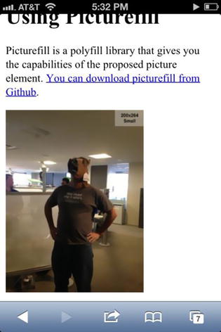
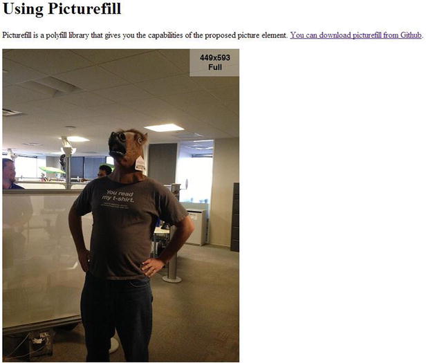
Figure 5-5. Using Picturefill to control which image is rendered to a page. I can neither confirm nor deny if that’s me with a horse’s head
The iPhone is using the small, high-resolution photo. Chrome is using the large photo. But if I view this on and iPhone 3G or a Windows Phone, I will see the small low-resolution photo because none of the other media queries apply and upgrade the image.
Another option that you have for this is to provide cropped images for smaller devices. In this example I could have supplied a cropped photo for the small image to focus more on the horse head. In cases where the shrinking the image obscures the content, this can be valuable.
How Practical Is All This?
One of the things that I like about responsive web design is that it is very practical. Though it adds some difficulties, it ends up solving more problems than it creates. But I think we have to ask how practical flexible images are for an application. If it wasn’t obvious before, the sample for using resolution-based media queries with background images required three separate images and the Picturefill implementation above required four. This requires work and we need to ask if it is worth the effort.
In general, I tend to think the first is generally worth the effort and the second is only sometimes. In the case of images used for design elements on a page, it often makes sense to do this extra work because designs don’t usually change that often, so a one-time cost of duplicating images and taking the time to write the extra media queries makes sense. This will save your users bandwidth and speed up the initial download of your website, both of which are important.
As far as Picturefill is concerned, there are a few things to consider. First, how often does the content change so that you would have to keep generating new images? If we are talking about a copy image on a web page that won’t change often, then the Picturefill option makes sense. But what if I am writing a blog post? Should I create multiple copies of every image and write and test the queries to make sure it all works? I am quite busy and have no patience for this, notwithstanding the fact that not that many people read my blog anyway. The cost/benefit ratio seems more balanced toward cost. But if I were a newspaper website, for example, I think this would be different. If they have a responsive site, they may get a great deal of benefit out of doing the work and may have the staff to handle doing the extra work. So I think it’s a matter of context and purpose. But if you have time and need the capability, you can create flexible images today.
Summary
Along with flexible layouts and navigation, flexible content is possible today. Responsive web design is a practical way to make your content work across multiple devices and desktop computers. Flexible text is easy to accomplish, but we need to start thinking in terms of ems instead of pixels. Flexible tables are still problematic but possible, and I showed you several options. Expect more options to come out of the web community; but what you see here should get you started. Flexible video is also quite possible, whether you are using video directly or embedding from other sites. Flexible images are easy to do but difficult to do well, yet browsers today support most of what you need to either make this work yourself, or you can use libraries like Picturefill to make it easier.
But what if you run into a problem? What if you have to support older browsers or you discover browser bugs that you find difficult to get around? That’s what the next chapter is about. You can use display modes, view engines, and HTML helpers to give you the ability to adapt what you render to the devices and give you further control.