
We now turn to a different branch of remote user research: automated research, also known as unmoderated or asynchronous research. Unlike moderated research, automated research does not involve any direct interaction or conversation between the researcher and the participants; instead, you use online tools and services to collect information from users automatically from the Web. You can conduct automated research to get feedback from a large number of participants about behavior on a specific set of tasks. The majority of automated research is performed on live Web sites, since most automated research tools track Web interaction, but other tools have users interacting with static images or performing conceptual tasks, like card sorts and games, which can give you different kinds of feedback.
If that all sounds like jargon, think about automated research as “task-specific Web analytics.” Automated research is similar to Web analytics in that it tracks the behavior of large, statistically significant samples, but it differs in that you give participants tasks or exercises to complete to look at the data through a less general lens than standard Web analytics. With Google Analytics, for instance, you can see how long people spent on different pages of your site or the average time spent on a page, but you have no idea why. With automated remote research, you use a tool that puts the users’ behavior in the context of a certain task, such as “creating an account.” The kinds of log data you get are similar, but since they’re specific to a task, the findings are more targeted.
In this chapter, we’ll talk about how automated studies are structured, what different kinds of automated research there are, how to recruit a large number of users to participate, and how to design the tasks.
The centerpiece of moderated research was the testing session: everything you did was to ensure that things went smoothly while you observed and spoke with the users. In an automated study, you don’t interact with users at all, so the study’s entire emphasis is on the way you set up everything.
Generally, the structure of an automated study looks something like this:
Choose an automated research method based on what you want to find out.
Select the tool or service that best supports your research goals.
Design a set of tasks or prompts for the user to complete with that tool.
Recruit a pool of potential participants.
Send email invitations to valid recruits.
Repeat steps 4 and 5 until user quotas are met.
Analyze the results and pay out the incentives.
For an automated study, you’ll recruit many more people than you would for a moderated study. We’ve done automated card sorts with as few as 25 users, but a lot of researchers are drawn to automated research because of how easy it is to recruit a large, statistically significant sample, and for those purposes, you’ll probably want something closer to 100 or more.
The Web recruiting methods we discussed in Chapter 3 still largely apply. On top of the screening questions, the recruiting form or screener you use will need to ask for the respondents’ consent to be contacted by email, as well as the respondents’ email addresses; real names and phone numbers won’t be necessary. As responses come in, you’ll send out emails to all qualified users; some automated research tools have built-in email recruiting to help you manage who’s responded to the study.
Not everyone who receives the recruiting email will complete the study, so you’ll probably have to send out several rounds of invitations. You won’t have to be standing by to contact users live, as you ideally would in a moderated study, but the greater number of users means you’ll have to wait longer, and if your Web site doesn’t have a ton of traffic, recruiting the way you would for a moderated study may not be feasible. Using this approach will help to keep your recruiting criteria broad and your recruiting screener short (remember, you won’t have to ask for a phone number or name), but most importantly, you need to come up with an incentive scheme that will bring in a lot of users without breaking the bank.
Offering $75 to each of your 100+ participants isn’t necessary, mercifully. Two options are to either offer a very small incentive (~$5) to all participants or to offer a 1-in-10 chance of receiving a standard $75 incentive. (There’s no reason it has to be 1-in-10; that’s just what’s worked for us.) We usually go with the latter simply because it’s less of a pain to manage and deliver 10 payments than 100. However, guaranteeing a small amount of money like $5 is often more effective than saying “Every 10th respondent earns $75.” In online research, anything that seems like a shady contest or promotion sends people running for the hills. As always, you can offer whatever merchandise or in-house discount incentive you have on hand, if you think people will be interested. You’ll need to keep a close eye on the number of invites you send out so that you can stay true to your word about the reward rate. You also need to spell out that the recruiting screener is not the automated study itself.
Are there any alternatives if do-it-yourself Web recruiting isn’t an option? Again, we advise against resorting to the ever-tempting bastion of eager fake participants that is craigslist, but sometimes that’s the only way. Recruiting from a list of your email contacts and mailing lists is still possible, but since you’re sending out so many more invites, you’ll risk running through your incentives even more quickly than you would for a moderated study. Also, you probably won’t be able to get “first-time” impressions this way, unless you’re testing a prototype. And then there are market research recruiting companies, and some automated research companies like UserZoom and Keynote offer panel recruiting services with their tool, which are pools of general-purpose standby users who get paid to do automated studies—in other words, professional research participants who get paid to fabricate opinions all the time. As with any indiscriminate recruiting method, these participants may not care about your product or service at all, and in our experience, they tend to care more about getting paid than they do about giving reasoned, deliberate feedback. We wouldn’t recommend using such services. If you can recruit from your Web site, you should.
Automated research encompasses many different methods, which are fragmented across a mess of different tools. It’s common to have different methods in a single study; you might have users answer a few survey questions and then perform some tasks. Each method has different dimensions (see Figure 6-1). You can gather feedback that’s opinion based (i.e., market research) or behavioral, open-ended or closed-ended, concrete or abstract, qualitative or quantitative.
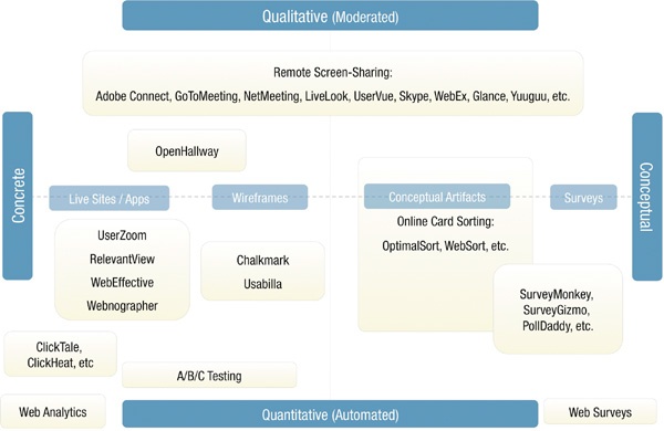
Figure 6-1. Various dimensions of automated research. The Concrete/Conceptual axis indicates how close user tasks represent actual behavior on a completed interface, while the Qualitative/Quantitative axis is more or less synonymous with whether or not the research is moderated or automated.
Now we’ll discuss the three different methods you’re most likely to encounter: task elicitation, card sorting, and surveys. Even though we address the three methods separately, we’ll use case studies to illustrate the ways you can adjust, combine, and tailor different methods to suit your needs. While these three alone don’t cover all automated research, they constitute a large portion of the automated research that’s currently done, and they are nicely distributed among the various axes described previously. We’ll also throw in a list of other various methods that are out there.
Task elicitation refers to automated tools that prompt users to perform a task and then record the users’ behavior in response. It’s the standard method of collecting behavioral data about a specific task on a Web site. An example would be a tool that asks, “Suppose you were looking to buy an ACME Googlydooter. Where on this page would you click to find information about the Googlydooter?” It then records where on the Web site the user clicks.
There are many variations on this type of tool: some prompt you to click on a part of the screen and then record the click; some prompt you to perform a task and then record your behavior as you navigate through and interact with the Web site; some ask you to manually indicate when you’ve accomplished or abandoned a task; and so on. If you want to learn how users interact with some part of your Web site, task elicitation is the way to go. It’s a flexible way of getting a specific answer to common usability issues, such as the following:
Can users perform a certain task on the Web site?
Do they have difficulty performing the task?
How many people abandon the task, and where?
What’s the most common path users take through the interface to complete a task?
Where do users go to perform the task, and where do they expect to go?
Do users know where to find the relevant links/info in the interface to be able to complete a certain task?
Fundamentally, designing a task elicitation study is about asking the users to do something on your site, simple as that. There are different ways to design the prompts, however, and plenty of common mistakes to avoid.
When writing a task, you want to be absolutely clear about what the users should do. If you want your study to have a shred of validity, you must not lead the users with the task prompt. It’s really easy to do this by accident; we know, because we’ve messed it up before. In a study we conducted for UCSF Medical Center using the automated service UserZoom (see Figure 6-2), we gave users the following prompt:
“For this task, please assume that your child has been successfully treated for a brain aneurysm. (A brain aneurysm is a balloon- or bubble-like growth usually located on an artery at the base of the brain.) It is time to make a follow-up appointment. Your task is to find the phone number for returning pediatric cerebrovascular patients to call for an appointment.”
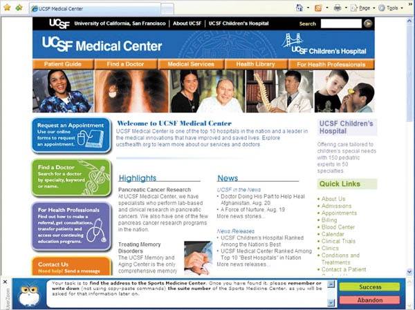
Figure 6-2. UserZoom screenshot from our UCSF study. User instructions are persistently displayed in a browser bar at the bottom of the screen.
Our big mistake here was in supplying the users with the exact term “pediatric cerebrovascular.” Since UserZoom employs a “browser bar” that frames the Web page while users go about this task—and since “pediatric cerebrovascular” isn’t easy to spell—it’s likely that a portion of the users in the study copied the term from the browser bar directly into the Web site’s search bar or used their browser’s Find feature to locate those two exact words, making the task artificially easy. Testing the accuracy of the search engine was part of the study goals, and so giving users the exact spelling ruined any chance of getting data on how the search engine was failing to return results for common misspellings. Furthermore, our prompt also implicitly informed users that there is a special line for pediatric cerebrovascular patients to call, which would likely prevent many of them from attempting different ways to make an appointment.
It’s easy to assume that the more precise you are, the more valid the task will be, but actually you need to design tasks using prompts that will suit the users’ way of thinking about the task. The more general the phrasing of the question, the broader the nature of the answer will be. Let’s tweak that erroneous last sentence in the previous example, to illustrate three different levels of specificity that accomplish three different goals. Starting with the most general:
“Your task is to find the information you’d use to schedule a follow-up appointment.”
By keeping the task as open-ended as possible, you could see whether users attempt different methods of scheduling an appointment, including email or contact form. By using a follow-up multiple-choice question like “What kind of information did you find?” you can then determine what percentages of users even look for a phone number to begin with (a growing concern in the Internet age). Here’s another possibility:
With this phrasing, you’d be able to get at questions like this: Do users know there are patient-specific numbers? What percentage of all visitors (including the ones who aren’t aware of it) are able to find the special number? Here’s a third variation:
“Your task is to find the phone number provided for parents of children who have undergone brain surgery to schedule a follow-up appointment.”
This question communicates the task without giving users any special terms that would make the task easier. You’d be able to determine how easy the task is for people who know there is a special number to call but don’t necessarily know where on the Web site to find it.
As you can see, the information you disclose when you ask the users to do something has a huge impact on the sort of information you’ll get from the findings, so pay attention.
Since, as we’ve mentioned, automated methods suffer from a dearth of rich context—you know where people click but can’t be sure why—you should try to get at your goals from many different qualitative and quantitative angles. You can ask open-ended questions addressing how the users felt about the task immediately after performing it, or you can ask closed-ended questions having the users rate the difficulty of the task. You can also verify that the users’ completed the task successfully with a “quiz” question. If you take that approach, you’ll need to inform the users in advance that they will be required to write down the info they find to be able to answer the question later. (Some tools like RelevantView allow the users to go back into the interface to look for the answer, and the time spent doing this is noted.)
We took many of these approaches in our UCSF study. Users were prompted to indicate that they were finished with their task by clicking either a “Success” or “Abandon” button. After each task, the users were asked a single multiple-choice question to verify the task success. (For the previous question, it was “Please select the phone number you would call as a returning patient to contact the Center.”) Next, we provided a Likert scale (rate from 1 to 7) for users to reply to the following question:
Then we provided more Likert scales to indicate agreement or disagreement with the following statements:
It was clear how to start searching.
Finding the correct phone number was easy.
I felt satisfied with my results at the end of this task.
Doing this task increased my confidence in the UCSF Medical Center.
This task took a reasonable amount of time to complete.
After those questions, we asked an open-ended follow-up question: “If you have answered 1, 2, or 3 in any of the statements, please explain why.” The purpose of this question was to get a close sense of the users’ perspectives on any negative experiences they might have had. (Some tools have branching-logic capabilities, so you would be able to present the follow-up question automatically to whoever answers 1, 2, or 3.)
Finally, we offered a list of “Check all that apply” statements:
I didn’t experience any problems.
Finding the information took too much time.
The information presented was not clear.
The information presented was incomplete.
It was difficult to know what steps or path to take to take to find the correct information.
The information, options, or menus were difficult to understand.
I didn’t find the information in the place I was expecting to find it.
The links were unclear.
Links didn’t take me to the information/section I was expecting.
I couldn’t figure out what to search for.
I had trouble spelling or typing something I wanted to search for.
Other (open-ended response).
In this way, we used many different means to get at the same issue, instead of being completely in the dark about why users clicked where they clicked.
Note
SAMPLE OPEN-ENDED RESPONSES
Here are some examples of comments we received in response to the open-ended questions to the pediatric cerebrovascular appointment question:
“I could not find the specialty in the pulldown menu on the appt. section.”
“Too much text to read—I’m interested in making an appointment, not reading a book.”
“Since I couldn’t set an appt. by specialty, I thought that I might look for the facility— the opportunity was not there.”
“Of the numbers provided, all at the bottom of the page, none were specific to a children’s hospital.”
“In the end, I’d rather call the main desk than fish around this page—no doubt both will be equally frustrating.”
“I didn’t finish the task because I felt like I had exhausted all my options.”
“Could not find the information under ‘appointments.’ Tried searching, even though I would not do that in real life. I would give up immediately and call the main hospital number, or any number for that matter, to get someone on the phone and ask.”
These comments give you an idea of how users feel about the task with some specificity, giving you some context to their behavior. (Not all comments are helpful, however, and as always, you should be wary of self-reported feedback.)
Case Study: Club Med and Beaches.com Competitive Analysis
by Carol Farnsworth
Carol Farnsworth, Senior Director of Customer Experience for Keynote Systems (makers of the automated usability tool WebEffective), has been conducting user research for over 10 years, recently focusing on Web usability research. Carol taught usability methods and testing courses at Stanford University, serving as a faculty member in the Information/Web Technology department. She holds professional affiliations with the Usability Professionals Association, BayCHI, and AeA.
On behalf of Club Med, I conducted a task-based automated competitive study comparing the Club Med and Beaches sites, using Keynote’s WebEffective tool. I chose this methodology because I wanted to study user behaviors in their natural setting. I also wanted a large sample size, unlimited geographic reach, the ability to segment the data, and limited group influence or moderator bias. Because of the expense of development, few clients want to implement a new Web site design until statistically significant numbers of their customers and prospects have interacted with prototype designs.
The goals of the study were to understand the relative strengths and weaknesses of the Club Med and Beaches sites, and to use the findings to improve the Club Med site and increase the conversion rate.
SETUP
The Club Med vs. Beaches study was a between-groups study where panelists completed four tasks on one of the two sites (see Figure 6-3). One hundred panelists were recruited for the study from a third-party market research firm, each meeting the following criteria:
Had a prior vacation at an all-inclusive resort
Have children under 18
Equal gender mix
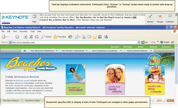
Figure 6-3. An example task given to participants: finding and researching the Negril resort in Jamaica.
STUDY TASKS
Introduction and Background Questions
Task 1: Homepage evaluation
Task 2: Find a resort (open browsing)
Task 3: Find a specific resort (directed browsing)
Task 4: Booking process
Wrap-up
Here’s an example of one of the tasks and follow-up questions for Task 3: Find a specific resort (directed browsing):
Now assume that you had narrowed your decision to a specific resort in the Caribbean and you want to find out what activities the resort offers. Use the Club
Republic AND research the activities that it offers.
Click “Answer” when you are finished.
We asked the participants if they were successful to obtain self-reported success:
Were you able to find the activities available at the Punta Cana resort? [Yes/No/I’m not sure]
Also, if the participant reached one of two URLs, WebEffective indicated a task success, displaying a message:
Congratulations! You have successfully completed this task. Please click “continue” to proceed.
Med site to find the Punta Cana resort in the Dominican We subsequently asked several closed-and open-ended questions, including
While trying to complete this task, how satisfied were you with your experience on the Beaches site? [Rate 1 to 7; 1 = Not at all satisfied, 7 = Extremely satisfied]
What aspects of the Beaches site, if any, did you NOT like while looking for activities for a specific resort? [Text response]
Which of the following problems or frustrations, if any, did you encounter while trying to find activities for a specific resort? [Check all that apply: Difficult to click around between activities./Difficult to navigate the site./Site was slow./Layout was confusing./Site errors, pages not loading./Too much clutter on the pages./Too many steps required to find a specific resort./Font was difficult to read./Not enough details about the activities offered./I did not encounter any problems or frustrations./Other: ________]
What aspects of the Club Med site, if any, did you find particularly helpful or useful while looking for activities offered for a specific resort? [Text response]
How difficult or easy was it to find activities offered for a specific resort on the Club Med site? [Rate 1 to 7; 1 = Extremely difficult, 7 = Extremely easy]
Overall, how would you rate your experience on the Club Med site?
Table 6-1.
 http://www.flickr.com/photos/rosenfeldmedia/4286398477/
1
2
3
4
5
6
7
Difficult to use the site
Easy to use the site
Not at all organized
Very organized
Frustrating experience
Enjoyable experience
Pages loaded slowly
Pages loaded quickly
Now that you have spent more time exploring the site, how likely are you to:
Table 6-2.
http://www.flickr.com/photos/rosenfeldmedia/4287138692/Definitely will NOT
Definitely will
1
2
3
4
5
6
7
Return to the Club Med site in the future
Recommend the Club Med site to your friends and family
Book a vacation on the Club Med site
DATA GATHERING
The panel vendor sent study invitations to recruit participants, and the researcher monitored the completion rate. The study closed automatically when the desired number of completed studies was reached. We read the free-response comments to double-check the quality of responses.
ANALYSIS AND REPORTING
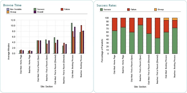
To analyze the data, I used WebEffective’s online reporting tools, which provided views of the key metrics, task success rates, and browse times (see Figure 6-4 and Figure 6-5). This included analyses of
Qualitative and quantitative feedback associated with the tasks
Behavioral data using clickstreams, which showed navigational paths; client actions, such as hovering, scrolling, clicking, and entering data into form fields; and behavioral data, such as total time on task, page load time, and number of pages visited
Attitudes, preferences, and motivations of target users
Overall satisfaction, organization, and frustration for each site
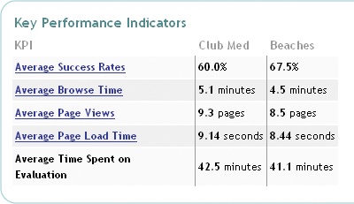
Figure 6-4. Key performance indicators, including success rate, browse time, and page views. The Beaches site unambiguously comes out on top here.
I later provided recommendations for improving the customer experience, based on best practices and user feedback.
More users failed and had more difficulty with the directed task “Find a specific resort” than with the other tasks. Users spent the most time completing the booking process task.
When looking for a resort, most users on the Club Med homepage started browsing by drilling immediately into a specific resort or by starting the booking process, whereas on Beaches they started browsing all resorts, thereby providing some initial high-level comparisons.
74% felt the Beaches homepage gave them a good understanding of what the site had to offer, compared to 64% on Club Med.
62% found the amount of information on the Beaches homepage appealing, compared to 38% on Club Med.
On the other hand, aspects of the Club Med homepage that users liked were the following:
The photos: 70% found them appealing vs. 50% on Beaches.
The special offers listed: 62% found them appealing vs. 36% on Beaches.
On the Club Med site, over half of the users first clicked on a specific village to begin looking for a resort, while most of the remaining users went to the booking tool or used the Village Finder (see Figure 6-6).
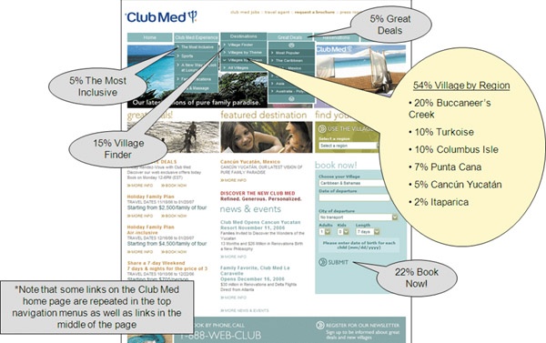
Figure 6-6. The majority of users began the task by clicking on a specific village on the Club Med site.
In comparison, very few users went straight to a specific resort on the Beaches homepage; instead, many went to browse the whole collection first (see Figure 6-7).
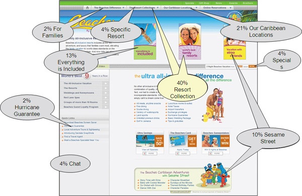
Figure 6-7. On the Beaches site, by contrast, people tended to click on the resort collections instead of specific villages.
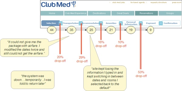
Finally, while 65% of the Club Med visitors self-reported success, only 20% actually completed the booking process. The behavioral data collected by WebEffective while participants were interacting with the site showed us how many visitors dropped off at each stage (see Figure 6-8).
Some automated research tools, including WebEffective, provide the ability to trigger questions whenever a study participant drops off a defined process (e.g., shopping cart checkout, site registration, or loan application), which helps us understand why they dropped off. This trigger capability emulates moderated methods, where you’d be capturing users’ thoughts within the context of the ongoing task.
Remote automated user research doesn’t replace other methods, but with its large sample sizes, geographic reach, globalization, and quick setup time, it’s valuable on its own merits.
Remote Card Sorting[4]
Card sorts have been around since long before computers. You give participants a stack of randomly shuffled cards, each with an item written on it, and then ask the participants to sort the cards into groups that make sense to them. The idea is to get a sense of how users naturally categorize different concepts so that you can structure your interface’s categorization scheme correspondingly.
In contrast to task elicitation, card sorting occupies the conceptual end of the research spectrum but still traditionally falls into the category of UX research. You perform a card sort when you want to understand how to categorize or organize a set of elements, an issue often related to the design of an interface’s information architecture (IA). Some common examples of questions that can be addressed by card sorting include:
There are two kinds of card sorts: closed sorts, in which users sort the cards into categories that you’ve defined in advance, and open sorts, in which users come up with their own categories to sort the cards into. Closed sorts are useful when you have an existing IA or content categorization and need to figure out how to categorize a bunch of different elements. You can also use multiple sorts to compare different IA schemes. Open sorts are good for gathering insights about IA design or content categorization.
The main challenge of designing an open sort is properly choosing the content you’re trying to sort out. If you just throw in a bunch of items that have nothing to do with one another, the results will be all over the place. All the items need to be on what Donna Spencer calls the same “level” of content: they all need to be related in some very broad sense, like “potential categories” or “page names” or “things you can do with the interface.”
We recommend not including any more than 50 items at the most, and even 30 can be a lot for complicated sorts. The longer the task, the greater the chance that your remote participants will get bored and distracted and either drop out or do a rush job. To keep the number down, include only the most representative items; if you’re positive that Items B–E would be sorted the same way as Item A, you don’t need to include Items B–E.
Items should be given self-explanatory names. The user shouldn’t require any special knowledge to understand what these names mean. (Some tools, like WebSort, will allow you to include a more detailed description of each item with a mouse rollover, but that’ll make the sort take longer, and you should reduce the number of items to compensate. See Figure 6-9.) Make sure not to inadvertently create associations between items with the way you name the items. For example, if two of the items have the same brand names (ACME Googlydooter and ACME Figgisfiddis) or shared words (matchstick, matchlock) in the title, you might want to delete them to prevent the users from grouping them together based solely on similarity of title.
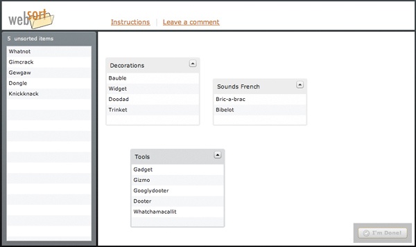
Figure 6-9. The online card sorting tool WebSort. Participants can simply drag cards onto the field on the right to create groups and add cards to them.
If your tool allows, it’s good to set a minimum number of groups that the users are allowed to make to prevent lazy or smart-alecky users from separating items into two piles like “Good” or “Bad.” It helps if you warn them against vague and lazy categories like this in the introduction to your study.
In addition to designing the cards, a closed sort will additionally require you to come up with the categories you’re asking your users to sort into. In many cases this will be easy. If you’re trying to sort content into a handful of existing pages, for example, you can just use the names of the pages as the category names. Sometimes your sections make for awkward card sorting category titles—for example, if you have the sections “Products,” “Services,” “About,” and “Help,” these titles may be slightly vague to users who aren’t seeing them in the context of a Web site. In that case, you may want to inform the users beforehand what each category is meant to represent—in this case, sections on a Web site.
Even though most of the card sorting services out there (OptimalSort, WebSort) are set up for fully automated testing, nothing says you can’t moderate your card sorts. It can be extremely useful to hear users talk through their card sorting tasks as they perform them so that you understand the users’ thought processes for coming up with the categories. And you can always mix and match approaches; for instance, you could do 5 moderated and 50 automated card sorts, as we did in the following case study.
If you decide to go automated-only, be sure to encourage your users to make written comments so that you get as much of that valuable qualitative context as possible. Just like task elicitation, card sort tools usually provide some way for users to comment on their task either before or during the session.
Case Study: Product Category Card Sort
Fellow Bolt | Peters researcher Alana Pechon provided the source material for this case study.
In 2008 we conducted an automated card sort for a large communications hardware company, Polycom. We set out to determine where users would place a new product in the existing IA. The study consisted of a combination of both remote moderated and remote automated card sorting exercises.
To conduct the card sort, we used the Web card sorting tool OptimalSort. This study consisted of 5 moderated and 50 automated card sorting exercises, completed at the participants’ own pace.
For client confidentiality purposes, we’re not able to share the results in full detail; here we’ll focus mainly on the method.
RECRUITING
Participants were recruited using a short screener linked from several pages within the Polycom Web site. For the automated phase of the study, we offered visitors a 1-in-10 chance of receiving a $75 Amazon gift certificate in exchange for participating in the study, whereas all moderated users were offered the $75 Amazon gift certificate. The following data were gathered from each recruiting survey respondent: name, email address, job title, organization, size of their organization, affiliation with Polycom, reason for visiting the Web site, and Polycom product familiarity. From moderated participants, we also gathered phone numbers.
We invited respondents with an emphasis on prospective and current Polycom customers.
METHODS
The first phase of the study consisted of five one-on-one usability interviews, each lasting between 35 minutes and one hour. Testing was conducted remotely from Bolt | Peters headquarters in San Francisco, California. Users’ screen movements and commentaries were digitally captured.
The second phase of the study was an automated open card sort exercise, completed online by 50 users. Testing was conducted remotely, with users participating from their own workstations and working at their own pace. Participants were given a selection of generalized product descriptions and asked to organize these descriptions into groups that made sense to them. They were also asked to comment on their task afterward. The raw results were then exported from OptimalSort and uploaded to the free online tool Card Sort Cluster Analysis Tool 1.0 to produce a similarity matrix, which measured how often cards were placed together and could be used to show averages of groupings (see Figure 6-10).
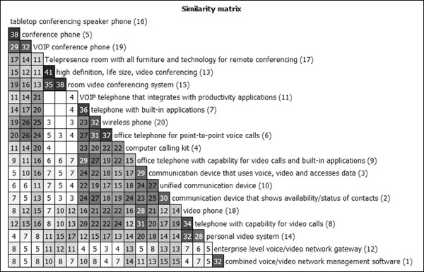
Figure 6-10. Similarity matrix generated by Card Sort Cluster Analysis Tool, which illustrates the affinity groups into which participants sorted the cards.
RESULTS
Overall, we found that users did not think about products in terms of what they could do, but rather how and where they would be able to use these products. They categorized products based on the contexts or scenarios in which the products would be used. Will this be used in an individual’s office? In a conference room? Does this belong in a rack room or a communications closet? How many people will be using this at a time, and where in our office will they be? As more than one user explained during the moderated portion of the study, when they search for a product, their initial thoughts about the product were not organized around the technology it employed, but who would use it. This point of view was reflected over and over in the categorizations, as users organized their groups not according to the feature set or technology of a product, but the context in which they imagine it will be used. Several open-ended comments also illustrated this ambivalence.
Being extremely accustomed to the existing Polycom IA, users accordingly titled their categories similarly to the existing IA. However, the items in the various groups did not follow the Web site’s classification scheme, and in some cases the items contradicted their labels and conformed to the “context categorization” scheme described earlier, in spite of the labeling.
Based on these results, we recommended that in the long run the IA should be overhauled to reflect the products’ manner of usage rather than their functionality, following the categories we uncovered in the card sort.
We would be remiss if we didn’t at least mention surveys, which are a huge part of the research world; however, it’s market research, not UX research. Surveys can ask abstract or concrete questions, but they are strictly nonbehavioral, unless you happen to be curious about the way people interact with surveys.
Why do people do survey studies? One reason is that they’re so easy. Designing questions is usually as easy as writing a few sentences. If you’re recruiting from your Web site using a screener, you can just insert the questions directly into the screener, bypassing the entire step of sending invites to prospective participants. And surveys are great for getting a quick read on user preferences (“What do you think of the colors on the site?”), demographics (“How many rabbits do you own?”), psychographics (“What do you want to accomplish in life?”), or new ideas for your interface, which are more reliable now that you’re working with a larger sample size.
We personally like to mix in a few survey questions into our automated behavioral studies, just to segment and cross-tabulate the users (although you could also accomplish that through the recruiting screener) and to be able to have something to say about both user behaviors and opinions. But we’re not gonna lie and pretend that we’re experts on designing surveys; we’re UX researchers.
One very important thing we can urge you not to do, however, is rely on surveys to address issues that should be addressed in a behavioral study. Don’t ask, for instance:
“Where did you have the most trouble using the site?”
“How would you improve the login process?”
“Would you describe the site as ‘user-friendly’?”
If you do ask such questions, you will fail. Instead, add a task-elicitation component to the study to get behavioral feedback and use opinion-based stuff only to shed light on the behavioral findings. What users want and what they think they want are two very separate things. Don’t try to figure out how to improve the functionality and interaction design of your site by just asking users what they think. We’re begging you.
Some of the other automated research methods out there are:
Web analytics. While monitoring your Web traffic and stats is technically a form of automated research, it’s extremely blunt and usually can’t be used to address specific design questions with any clarity. At any rate, it’s obviously a good idea to use services like Google Analytics to answer certain broad questions about your site, such as what sites users are coming from and where they’re going, where they arrive on your page, where they leave, what parts of your site are most popular, how your traffic has progressed over time, and so on. Good luck trying to use analytics to answer anything more specific than that.
Multivariate testing. Multivariate testing services work with your Web site’s content to serve different versions of the same page to visitors to determine which version performs best. (Back in the day, when it was called “A/B testing,” people offered only two versions of the Web site, but researchers discovered that two wasn’t enough for useful feedback.) Multivariate testing services usually offer ways to parcel your content and design into 5–10 blocks, serving up different combinations of those blocks and then running an automated test along a set of predetermined metrics (usually clickthrough rates).
Online diaries and ethnographies. Services like QualVu and Revelation are offering tools that enable users to maintain regular diaries (both written and video-based) about their experiences with a particular brand, product, or interface. These are generally used for market research, but there’s no reason you couldn’t use these tools to prompt users to interact with a product in front of a camera. The downside is that these interactions would be entirely (and by definition) automated, which makes it more likely users may veer off into giving opinion feedback, and makes it impossible to probe further on interesting issues as they come up.
Annotation. Annotation tools allow users to leave feedback by placing written notes on a static image of the interface, allowing them to comment directly on a design. This has most often been used for “concept testing,” a market research approach. Some variations of annotation, like the now-defunct MindCanvas’s “Sticky” tool, also allow you to design the notes yourself, constraining the users to a limited set of possible comments: “This is good,” “This is confusing,” “I hate this,” etc.
Input tracking. Input tracking refers to tools that make recordings of user mouse movements and keyboard input. This approach is sort of like a zoomed-in version of analytics, in the sense that you can get a very close and exact record of what a user is doing on the site, but without any specificity about task context, user intent, or who the user is. In combination with a task elicitation tool, the input tracking could be informative, but since most input tracking tools are anonymized, there’s currently no easy way to correlate the input tracking results with the task elicitation results.
Game-based elicitation. Not sure if anyone uses this approach anymore; it was a big part of MindCanvas’s methods. (By the way, yes, we miss MindCanvas.) “Game-based elicitation” is a blanket term for any tool that takes a simple conceptual exercise and turns it into a task with artificial constraints or rules to get users more engaged. Examples include “Divide the Dollar,” in which users divide a limited amount of pretend money among a set of items of their choosing as a way of indicating their preference for them, and Revelation’s “Help Mabel,” in which users answer questions posed by an imaginary grandmother named Mabel. We haven’t been able to find much evidence that you necessarily get better results just by putting things into a game, but for those of you who are bored with Likert scales, there it is.
In contrast with moderated techniques, which are more or less the same no matter what screen sharing tool you use, the functionality of the automated research tools you use has a huge impact on the type of info you’re able to gather. Will you be able to conduct competitive research? Can you test prototypes? Can you export your findings? How will the results be visualized? Does it come in different languages? Can you combine different methods using the same tool? Are there integrated recruiting tools? What will it cost?
In this chapter, we tried to be as general as possible about our methods to suit a wide range of tools, but sooner or later you’re going to have to choose one. Since tools come and go very quickly, we’ve decided to bracket off all the information about research tools into its own chapter. If you’re looking to learn about the different tools (currently) available, skip ahead to Chapter 8, or you can always check http://remoteusability.com for the latest. Otherwise, read on.
Automated research is effective for gathering large-scale, quantitative feedback to address targeted usability issues.
Automated methods are not a cheap replacement for moderated methods; they have totally different purposes.
Live recruiting methods still work, but you will have to do more of it, and send out several rounds of invitations. When recruiting for an automated study, it’s standard to offer lower incentives.
Task elicitation is the most prevalent form of automated usability research. Remote card sorting is good for solving organization and categorization issues. Surveys are mostly an opinion-based research format and don’t capture behavior well.
When possible, gather both quantitative and qualitative data in the same study.
Your choice of tool or service matters a lot; see Chapter 8 for a guide to currently existing tools.
[4] Thanks to Donna Spencer, author of Card Sorting, for her input in this radically condensed primer.