
As we’ve mentioned, one great thing about remote research is its ability to capture people doing real tasks on their actual home or office computers. And the ease and low cost of recording the research sessions digitally allow you to use video editing software for lots of purposes. These aspects of remote research can help streamline analysis, make new observations based on the users’ native computing environment, and create a more complete picture of the people who use your product.
In this chapter, we’ll focus on what’s new and what’s different when analyzing and presenting the findings of remote studies, both moderated and automated.
The core task of analyzing and collecting data from a remote moderated study isn’t much different from an ordinary in-person study; you’re still trying to observe user behavior. The differences have mostly to do with what you can glean from the users’ native environments and how you can best extract and synthesize all the recorded data.
We strongly recommend talking to users who are using the computers they’d be using for precisely the tasks you’re testing. It gives you the opportunity to observe the users’ computer environment—all the programs, open windows, layout, Web sites, and other stuff happening on the desktop—which we like to call the technological ecosystem (see Figure 7-1). For you ethnographers and UX practitioners out there, this is the remote research equivalent of “usage context,” and it’s important for the same reason: it gives you a detailed look at how people organize and use different Web sites, programs, and files together to get things done. As Brian Beaver mentioned in Chapter 1, tasks like online comparison-shopping are rarely performed in a vacuum. Web browser tabs, notes, and physical brochures may be used in conjunction with any given commercial Web site to help users compare and research products.
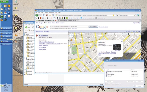
Figure 7-1. Here is a typical user desktop. Multiple open windows, tabs, shortcuts, taskbar items, and desktop files are discernable at a glance.
Insights may come from anywhere on the users’ screens, but a handful of areas deserve especially close attention because they’re often related to tasks that users perform on their computers: Web bookmarks, the desktop, and the Web browser configuration. First, the bookmarks: how many are there? How are they organized? Are they organized? Do users have bookmarks for Web sites similar or related to your interface? You can have the users explain these details to you, as well as which bookmarks they visit most frequently, and what purposes they use them for. You could even ask users to visit some relevant bookmarks, if time allows. You should also look to bookmarks for insights on information architecture. Users frequently bookmark pages deep within a site, which can indicate that content there might be important to investigate in later analysis. (It could also mean they don’t know how to use bookmarks.)
Correspondingly, desktops are a great way of seeing what users do offline. You can see the shortcuts, program links, and files they’ve stowed for easy access. You can get hints about their information gathering and organizing habits. Is their desktop hopelessly cluttered or spotlessly tidy? Are there particular types of files lying around—PDFs, Word documents, shortcuts? The files are also sometimes clues to the types of files they use or tasks that they perform most often.
Even the look and feel of the desktop can offer unexpected human touches. Desktop wallpapers and themes, while perhaps not helpful for understanding behavior, can at least give you the sense that you’re talking to a real live person, and promoting empathy is usually a good thing.
Particularly with the rise of customizable browsers like Firefox, the Web browser has become another point of interest. Often, when recruiting users live, you’ll find that they have a few Web sites already open. If they haven’t already closed them down for privacy’s sake (as you instructed earlier), you should pay attention to their relation to the users’ tasks, whether or not (and how often) the users switch between them, and which tabs get the majority of their attention. It’s often tough for Web designers to anticipate how their site will be used with other sites. In Brian’s example in Chapter 1, the observation that users heavily relied on third-party review sites alongside the SonyStyle site to evaluate products holistically was a major finding.
You may find that your users have restrictions and quirks about their computer usage as a result of their computing environment. Most commonly, you’ll find that computers at corporate institutions have limitations on email, IM, Web access, downloading, and software installation, and it’s good to know exactly how users work around these limitations (as long as it’s allowed, and you can still get screen sharing up and running!). Financial and government institutions often have loads of security restrictions, while medical institutions may have lots of safeguards in place to enforce confidentiality of patient information. Particularly while testing internationally, you’ll want to see if Internet connection speed affects what kinds of sites users are able to visit and whether they’re using it in a public space (e.g., the “PC Bang” Internet cafes that are popular in Asia). Paying attention to computer restrictions is of particular interest for studies of niche user groups, especially if such restrictions are an issue that will affect a broad segment of the interface’s intended audience.
Aside from the stuff that’s on the participants’ computers, you can get a hint of the physical environments and artifacts that people use along with their computers sometimes. Hundreds of users have described to us the notebooks, binders, and PDAs they use to store their dozens of login usernames and passwords, and some have told us about the way they print out information (bills, receipts, directions, travel plans, personal health research, etc.) for later reference. In one study for a car insurance Web site, we had one user physically get up from his desk in the middle of the session to check the vehicle identification number (VIN) on his truck, which he needed in order to fill out a form on the site.
Note
THINGS WE’VE NOTICED BEFORE
Following are some things we’ve noticed in people’s technological ecosystems that have led to interesting discussions and insights:
Ingenious methods of storing login names and passwords. Some users kept them on a piece of paper beside their desk; others had them stored in Word documents; others wrote them out in their bookmarks, right next to the Web URL.
Offers to take us on a guided tour of the research libraries in their My Documents folder on their laptops, which they preferred over using the company intranet or public drives. Seeing user-developed taxonomies showed us how users would label items on the site if they had the chance.
Screen resolutions. A group of graphic designers using design software had set their screen resolutions extremely high, a very important consideration in interface design.
Plug-in usage. Online shoppers—who were not otherwise technologically savvy—had the latest Firefox plug-ins for automatically filling out e-commerce forms.
To-do lists. During one interview, a mother looking up information to care for her sick child referred to a to-do list on her desktop, which ended up revealing to us how the Web site she was visiting was just one component of a complex workflow of managing phone calls, emails, and appointments.
Making highlight clips of research sessions is a road-tested and effective way to show off your findings. You take 5- to 20-second snippets of video from each of your research sessions and compile them into a 3- or 4-minute video that illustrates a theme. Most people use basic programs like iMovie or Windows Movie Maker for this; we’ve found Sony Vegas to be a good (though not flawless) tool. There’s also Final Cut and Adobe Premiere for the savvier moviemakers.
We’re not going to teach you how to use each of those tools; that’s crazy talk. Just spend some time in the tutorial. Mostly, it should just amount to dragging video segments into a timeline and cropping them. A few tips about editing videos for remote research, however:
Be conscious of your editing choices. Since most of what you’ll see in a session recording is the user’s desktop, which is static much of the time, it’s possible to cut out superfluous gaps and pauses in the video without making it appear jumpy, as it would if you edited out footage of a live person. That makes it very easy to mislead people, which you don’t want to do. Be careful that your edits don’t affect the meaning and integrity of the video; for example, if cutting out parts of a clip make it appear that the user is having a much easier time with a task than he/she actually did, then don’t do it, or use a video effect (like a fade-out/fade-in, or cross-dissolve) to make the edit clearly apparent.
Sometimes video recordings of your sessions come out damaged, corrupted, or otherwise unplayable. This usually happens when the computer processor gets overburdened while the video file is being created. Sometimes there will be no video or audio, or it won’t open at all. The best way to prevent this problem is to avoid doing too many things on your computer while the video is being rendered out at the end of your session and to make sure your computer has plenty of RAM so that opening other programs will interfere less with the render process. If you end up with a damaged video anyway, there are a couple of steps you can take. First, try opening the video in different media players. VLC is a versatile, open source player, and RealPlayer covers some of VLC’s blind spots (RealMedia files, FLV files). Video editing programs like Sony Vegas and Final Cut also have good compatibility. If that doesn’t work, find a video converter program that can take one video file and convert it to another. And remember to back up the videos before repairing them.
Pixellate, blur, or mask any private information that appears onscreen, using your video editing software’s “mask” tools. This information includes users’ credit card information, home addresses, email addresses, and so on. This will require some knowledge of Final Cut Pro or iMovie ’09.
If parts of the conversation are distorted or garbled, make subtitles. Make sure the subtitles don’t block any portion of the screen that’s important for understanding what’s happening.
The way you visualize and analyze the findings has mostly to do with the tools provided by the online automated service you use. We’ll cover many of these tools in the next chapter.
What’s important to remember is that automated research doesn’t necessarily have to involve any high-level statistical analysis. Large-scale quantitative data are attractive to number crunchers, but we want to caution you again that “science-y” research won’t necessarily inspire new designs or help you refine and improve your interface. In most cases, automated analysis comes down to a common-sense comparison of numbers, followed by a lot of hard, exhaustive thinking about why the numbers came out that way.
Here we’ll get into methods of digging through your data to get the basic insights that will add a quantitative dimension to your qualitative findings.
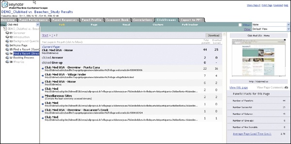
Three popular metrics for evaluating quantitative user performance on a task are success rate, time on task (i.e., how long users take to complete the task), and the “first click”—where different users clicked to perform a particular task. All three metrics address the fundamental question of whether a particular task is intuitive, and with a well-crafted question, you can usually get an answer you’re looking for just by glancing at the report generated by your automated research tool (see Figure 7-2 and Figure 7-3). Any automated tool worth its salt will provide a simple way of presenting these metrics in a graph, spreadsheet, or clickmap (an image of the interface overlaid with a graphical layer that indicates where users clicked).
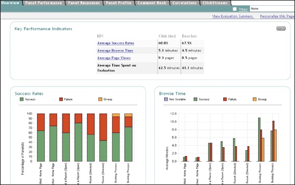
Figure 7-2. WebEffective’s “Key Performance Indicators,” including average success rates, time-on-task, and page views.
Other interesting metrics to examine include the most common paths taken to accomplish a task, back button usage (if the automated tool can track it), page views, and the drop-off rate for a particular task (what proportion of users abandon the task and at what point). About the drop-off rate: be careful that abandoning the task isn’t confused with abandoning the study. Some tools keep track of this, but some don’t, so just make sure that the results don’t include abandoned studies.
You can get deeper into the data by using a spreadsheet’s basic functions, if the automated tool doesn’t handle it for you already. There’s cross-tabulation, or evaluating one metric in light of another: “Of all users who clicked on the login button first, 80% were able to successfully log in.” You can also take the average and standard deviation of certain metrics for purposes of synthesis, but be careful that this doesn’t obscure any of the subtle points about the data. If you note that the average time on task is 2 minutes, make sure that this is consistent across all relevant user segments as well. (It might take most people 1.5 minutes, but older users 6 minutes.)
You shouldn’t necessarily limit yourself just to the data you’ve collected for one particular study. If you are doing a follow-up study on an interface you’ve tested before, consider including the same tasks as previous studies, to form a basis of comparison. If the success rate on a task differs significantly from the success rate on the same task in a previous study, you should obviously look for the reason.
Qualitative feedback can also be used to indicate and define the themes that come out of your research. By loading open-ended responses into a spreadsheet or word document and running them through a word analyzer, which displays the most frequently occurring words, you can get a rough idea of some of the issues that are on users’ minds. Some tools have built-in functionality that does this for you. If more than half of the users address a particular issue (“navigation,” “search,” etc.), you’re probably on to something major; even a quarter will probably still be pretty interesting. Due to typos, the tally won’t be exact, but qualitative data can be used to guide your insight into user motivations. The same goes for the closed-ended subjective task ratings: they’re opinion-based but can point toward interesting behaviors.
And how about Web analytics? Without the use of explicit task elicitation, analytics are trickier to use because there’s no explicit context for user behaviors. You can say, “90% of all visitors click on the green button,” but you can never be certain why. The greatest strength of analytics tools is that they track information persistently so that you can see how traffic evolves over a span of time; even less than task elicitation methods, though, you have no idea why anything is happening. We encourage using analytics tools for monitoring high-level things like traffic volume, where your traffic is coming from (in terms of both physical location and Web referral), what pages users land on, what pages are most popular, how long users are on your site, and popular search terms. But you should stop short of drawing assumptions about the users’ motivations and performance based solely on analytics data. On the other hand, analytics combined with task elicitation can guide you to where you should pay attention. If there’s a discrepancy between your study findings and the Web site’s analytics (“80% of study participants clicked on the green button, but only 40% of our general Web audience does”), it could mean that the task design was flawed, the target audience of the study differs from that of the main audience, or that there’s an unforeseen issue altogether.
Card Sorting[5]
As mentioned in Chapter 6, card sorting comes in two major varieties: open sort and closed sort. Closed sorts are pretty straightforward and only require you to break down which categories were most favored by the users. With multiple user segments, you’ll obviously want to identify where the segments sorted differently. See Figure 7-4 for sample card sort results.
Open sorts take longer to analyze and interpret because users create their own categories, and the degree of consistency in open sort categories can vary between users and with larger groups. There are tools to help perform automatic cluster analysis on card sorts (see the card sort case study in Chapter 6), but you may have to analyze by hand. If you start with a clear idea of how to analyze and group the findings, though, your analysis shouldn’t take longer than a few hours of tedious data wrangling—fewer if you drink a few Red Bulls first.
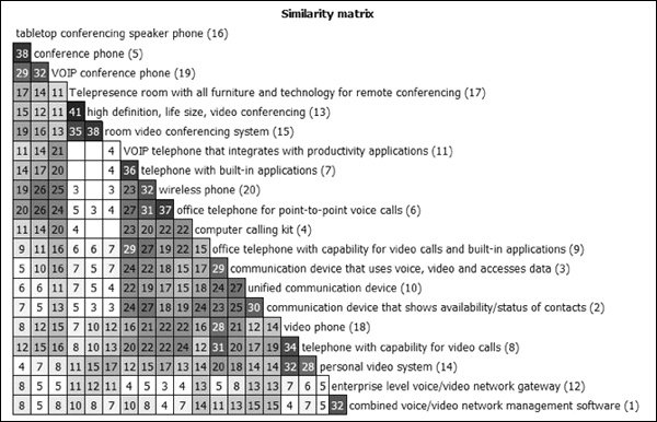
Figure 7-4. Card sort results placed into a similarity matrix with the Card Sort Cluster Analysis Tool.
First, load the raw results into a spreadsheet; most online tools will allow you to export the results to Excel. You’ll be performing a kind of meta-card-sort on your card sort results. Go through the first few categories, grouping related or redundant categories into higher-order ones. For example, let’s say one of the cards is “Hammer”: if one user categorizes it as “Tools,” another user as “Appliances,” and a third as “Hardware,” you might just label them all as “Tools.” From then on, you’d be able to sort anything that fits into any of those three categories as “Tools,” adjusting or renaming the category as you go along.
Be flexible. If you see that someone categorized “Fork” as a “Tool” later, you might want to broaden the category to “Implements.” Or you might see a more reasonable categorization scheme further down the line, which means you’ll have to backtrack a bit. If you create a quick numerical code for each category (“1–Tools,” “2–Appliances,” “3–Decorations,” etc.), you can quickly go down the spreadsheet and tag each entry with a number.
If you’re using a tool that allows for open-ended user comments (which we do recommend), it’s good to skim through at least a few dozen to see if there’s any helpful information that might help you refine the categories. When all’s said and done, you should have a rough sense of what the major categories are, and each item in the spreadsheet will be coded in one of the categories. At this point, using the categories you’ve made, you’ll be able to treat the results just like a closed sort. It’s good to get someone else to verify your groupings, just to be thorough.
Interpreting card sorts, especially open sorts, is inherently subjective and will require you to draw on common sense and UX experience and know-how. Donna Spencer describes a study in which most users created about 20 categories on average; the designers took this result to mean that their IA should have 20 navigation categories. Naturally, you, as a shrewd UX practitioner, would know that navigations should generally be compact, so you’d collapse those 20 categories into more general categories.
As before, we refer you to Donna Spencer’s book, Card Sorting, for anything more complicated than this.
So, here’s the thing. Surveys are practically by definition used to capture self-reported user opinions and preferences, not behaviors, which means that they fall into the realm of market research and not UX research. To the extent that surveys can help provide context to other research findings, they can be interesting sources of insight, but parsing large-scale self-reported opinion data is beyond the scope of this book—and so, we move on.
After you complete your research sessions and analysis, there are steps you can take before, during, and after the formal presentation of the findings to make sure your remote research findings are put to good use. If you took the time and effort to conduct user research on your own behalf to learn what users want out of your interface, then we salute you. You’re in a good position to draw insight and inspiration from your research, since you saw it all firsthand. But if you’re conducting your research on behalf of other people, you have the challenge of articulating your findings to people who may or may not understand, care about, or want to hear them. These people may look just like your otherwise-friendly colleagues, bosses, and clients, but don’t be fooled! Research findings can be hijacked in a million ways, and it’s up to you to stop that from happening.
Information by itself accomplishes nothing. If you don’t organize, present, and follow through on the findings of your research, making sure that the right people hear and understand them, you run the risk of being ignored, and you might as well never have conducted the research at all. The right videos and presentation, on the other hand, can inform and inspire your audience, which is what it takes to really get things done. The usual report-plus-hour-long-presentation is simply not that effective. Think of it this way: if you’re handed a brochure plainly stating a few ways to eat better and exercise more, there’s a chance you might follow them, but you’re not going to get fired up to do it. Most likely you’ll think, “Well, duh,” and then do nothing. But when you read a story about someone like you who made a few simple adjustments to his/her life to eat better and exercise more, you might say to yourself, “Yeah, I can do that.”
In the following section, we’ll focus on what you can offer besides the typical bullet-point report to communicate your findings usefully.
The last thing you want to do is present to a roomful of people who are hearing about the research project for the first time. You’ll spend minute after dreadful minute scrambling to explain basic things about the methodology that should have been explained in advance. The easiest way to prevent this situation is to keep everyone in the loop as the research is ongoing, so they can become familiar with what the study is about and why you’re doing it.
It’s good to send out summaries of each day’s testing results to any and all stakeholders who are willing to read them, with the caveat that the testing is still in progress, and findings may change later. The summaries may contain the following information:
The number of users tested that day
The number of users left to be tested
Possible themes or areas of interest indicated by the research so far
The remaining testing schedule (to entice more people to observe sessions)
Any updates or information relating to the testing procedure
Additionally, if you have raw videos of the sessions and it’s okay to make them available to the stakeholders (i.e., the videos don’t need to be edited for privacy reasons, etc.), go ahead and share them. We find that linking to the raw videos from a Web page is the easiest way to do that, although file delivery services (RapidShare, YouSendIt, MediaFire, MegaUpload, NetLoad, FileFactory, etc.), and FTP can work as well.
If you have the time, sending along drafts and early versions of your report as they’re completed to allow attendees to raise questions and concerns early can be good for getting a reading on what the stakeholders’ concerns are in advance. Do everything you can to keep from getting mired in small quarrels during the presentation.
One of your challenges will be to convey the findings to the people in such a way that your users are real people and not faceless abstractions. When you’re dealing with a set of users whose faces you can’t see, it’s easy to abstract them—“User #3 did this, User #7 did that”—but, of course, this isn’t what you want. Aside from the standard highlight clips and quotes, there are lots of little ways to keep the emphasis on the users while presenting your findings. Having an image to pair with each user helps enormously. At the end of the research sessions (or in a follow-up email after the studies have concluded), consider asking users for pictures. Better yet, you can even request that the users take their own pictures in their computing environment, or along with the interface being tested.
In a recent study we conducted for a major consumer electronics manufacturer, we had our participants send us pictures of themselves along with the piece of hardware they were looking to replace. Lots of users have webcams or digital cameras and are more than happy to oblige. Keep in mind that the usual privacy and consent rules apply here (see Chapter 4). The pictures can be inserted into the highlight videos in a picture-in-picture or side-by-side format so that the images are juxtaposed with the behaviors (see Figure 7-5).
Besides making each user stand out, you can also try to visualize the “big picture” ideas that define the themes of the study. Nothing does this better than well-edited highlight clips, but that’s not necessarily your only option. With all the data you collect throughout a remote research project, there are many possibilities for slicing and dicing your information. Tagging users with various behaviors and habits can have two good purposes: it can be a simple way to categorize and characterize the users with just a few keywords, and it can also be aggregated to produce tag clouds using online tag cloud generators (Wordle, the ManyEyes double word tool, TagCrowd), which can visually highlight heavily recurring themes and give a quick at-a-glance overview of what the study was about (see Figure 7-6). You can also try seeing what comes up when you run your verbatim notes through there. It can make a fun slide or endnote to your presentation. Even the data from the live recruiting extract can be illuminating, providing a snapshot of the users who filled out your screener.
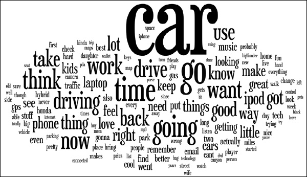
Figure 7-6. A tag cloud generated from our 2008 automotive study (see Chapter 9).
Even if you design the perfect study, you don’t want your findings to rely solely on the results of your automated research because you run a little risk of insufficient context. There are always a hundred good reasons why users chose to click a link, abandon a task, or sort a card into a category, and even their self-reported comments may not tell the whole story.
Attendees are likely to be curious about the specific numbers, so those should be part of the whole package of deliverables. Quantitative data are good for lending support to an argument, but you should not always be tempted to rely on graphs and charts to make your biggest points. You should present automated findings in conjunction with other corroborating (or contradictory) qualitative data. So if you have a chart demonstrating that 70% of users tended to click on the login button first, also include some qualitative behavior or feedback that sheds light on this behavior (e.g., video of users trying and failing to click on other things first, or comments like “I thought I wouldn’t be able to do anything on the site until I logged in”).
Note
PRESENTING REMOTELY
Many of the tools that you use to see users’ screens and communicate with them (like GoToMeeting) are actually designed for remote presentation and collaboration purposes, so naturally, you can use them to present your study findings. This capability is particularly useful if the reason you’re doing remote research is to involve stakeholders who are geographically distant. With most current screen sharing solutions, it’s difficult to show videos to observers, so instead of playing the highlight clips on your own screen, have the observers set up the highlight clips on their own computers, to play on your cue. (This is much easier if all the observers are in the same room and can watch the videos on a projection or large screen.)
Card sorting expert Donna Spencer mentions that rather than presenting findings and then making recommendations based on those findings, she likes to do things the reverse way. With a dry erase board, she’ll focus on sketching out and talking through possible design solutions step by step, citing the study results as needed to justify various decisions. This way, she says, you can focus on the design process itself, and synthesize a lot of the information, instead of spending time translating raw data and speculating about context.
UX luminary Jared Spool forgoes recommendations altogether. Instead, he’ll present the findings and then allow the meeting attendees to draw their own inferences as he moderates the discussion to prevent it from getting bogged down in false or misguided assumptions. The idea there is to allow people to arrive at their own conclusions rather than be told that “X-finding requires Y-redesign,” which increases their understanding and conviction in the research.
Our honorable foreword author (and president of Adaptive Path) Peter Merholz says that design is the best presentation for research data. He believes that if you’re not creating concrete design ideas as part of conducting the research, and presenting those design directions, sketches, and concepts at the end of the research, you’re simply wasting your time.
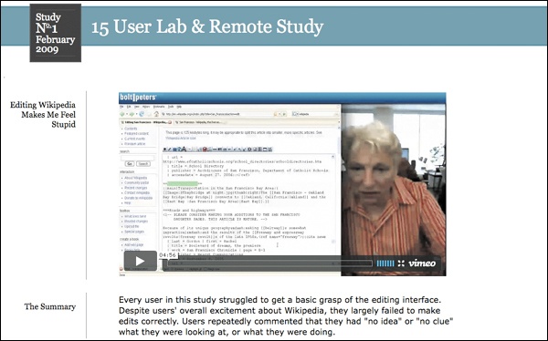
For typical studies, we usually take a middle approach between these three. We like to give a detailed walkthrough of the themes and recurring user behaviors of the study, with the major ideas illustrated by highlight video clips and simple, clean PowerPoint slides. These slides and clips are usually summarized with a user quote or short title that makes the problem relatable to anyone: “Users feel stupid when they try to edit the page,” or “Nobody knows what the widget does.” We also compile a more detailed document of findings, quotes, and usability issues, to appease developers and others who want a long list of details and minutia to mull over later.
Naturally, the details of this approach depend on the type of project we’ve been hired to do. If it’s a large-scale, high-risk project, we document things more exhaustively. If it’s a low-budget usability review, we stick to quick bullet points and go light on videos. If it’s research that’s intended to inspire a design, we’ll forgo specific recommendations and instead produce pen-and-ink design sketches, photographs, longer videos, and presentations that attempt to tell a complete story about what roles the interface plays in users’ lives.
Clearly, there’s an endless number of ways to present findings. Whichever you take, you should have in mind the general principles you’re trying to communicate. A humble usability study on a certain widget or element in your interface may not require much thought, but if you’re testing anything of significant complexity, you want to get at how that part of the interface, and the problems and behaviors you’ve uncovered, relate to your big-picture goals as a team/company/country/basement tinkerer in Montana.
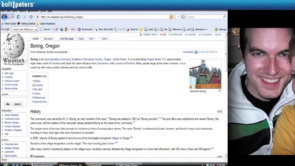
After the curtain falls on the study, you have one more thing to do: make the findings as easy as possible for the designers and decision makers to refer to as they begin the redesign process. By putting up a Web site from which clients can quickly and easily download the project materials at their leisure, you can make it easy for people to access your findings and to share these findings with other people on their team or within their company, which can only help your cause. If you have some heavy-duty user consent to share the session videos publicly, you could even post them to sites like YouTube or Vimeo (as was the case for a study we did for Wikipedia in early 2009; see Figure 7-7), thereby adding to a body of knowledge that can benefit UX researchers all over the dang place. (That’s a big privacy issue, though, so be sure you’re playing by all the applicable privacy and consent rules.)
We want to end this chapter about analysis and reporting—which is about effectively showing people the value of your research—by commenting on a bit of conventional wisdom that’s come up in the UX and interaction design communities recently. There’s an idea going around that UX research isn’t necessary, because some of the most famous interface design companies out there—we’re looking at you, Apple and 37signals—have famously claimed that they “don’t do research.” (An Apple saying goes, “We conduct user research on one user, and his name is Steve.”) This idea intrigues us because, to be honest, we actually do believe that “genius” design and personal vision should trump user opinions in the design process.
However, we need to make a few things clear: first of all, companies like Apple do conduct research; they just don’t call it research. Releasing a product in frequent iterations, as Apple is notorious for, is actually an audacious form of remote and field research, on a massive scale. The mountains of reviews, public attention, complaints, crash reports, customer support issues, and feedback Apple collects (not to mention the Apple retail outlets, which are petri dishes of user behavior) all constitute a wealth of behavioral- and opinion-based data. The same goes for Web sites and services that launch in “beta” for long periods of time: the logs, analytics, and customer feedback are nothing more than open-ended, real-world automated research.
There’s absolutely nothing wrong with this approach, but it does presuppose that you’ll have a built-in audience to test it on in the first place, and that what you’re offering (like a first-generation iPod) is a good enough product in its own right that you’ll be able to accomplish your business goals in spite of any other usability flaws it might have. Those are very big Ifs; you’d basically have to be, say, Apple to pull it off.
Marty Neumeier, author of The Designful Company, writes that the key to knowing when to ignore users is to see the difference between good and weird, and just plain weird. He contrasts Herman Miller’s Aeron chair with yogurt shampoo as two products that performed questionably with research, but in which stakeholders chose to move forward despite the known issues. In the case of the Aeron chair, opinions varied about the look of the chair, but everyone said it was comfortable; you could get past how it looked. Yogurt shampoo, on the other hand, was bad on all cylinders; people didn’t want any part of it.
Finally, just because you might not need to do research doesn’t mean that you shouldn’t or that you wouldn’t benefit enormously from it. That’s why lots of successful, innovative, and design-minded companies like Google and IBM have relied extensively on both genius and UX research to conceive, develop, and improve their products. User research is valuable in designing universe-transforming things only to the extent that you’re willing to look for the unexpected, the risky, and occasionally, the sweaty and uncomfortable.
And let’s not forget that Apple has made plenty of duds, too. Anyone remember the Newton?
When analyzing session recordings, pay attention to users’ computing environment: bookmarks, browser tabs, other open windows, etc.
Highlight clips should be edited with attention to editing transparency, user privacy, and intelligibility.
Analysis of task elicitation studies is usually enabled by the tool; common metrics are success rate, time-on-task, and first click.
Card sort analysis is somewhat subjective and can be time-consuming. Use statistical analysis software tools to speed things along.
To make your results come across in a presentation, don’t just throw everything into a written report—use summaries, highlight clips, screenshots and user images, data charts (for automated studies), sketches and mockups, and simple PowerPoint slides.
User research isn’t the only way to inspire design, and it’s not always necessary, but with good, ambitious research goals, it can hardly fail to benefit you.
[5] Some of the following discussion is informed by discussions with Donna Spencer and her book, Card Sorting (Rosenfeld Media, 2009).