When we think of HTML and CSS, we often think “static.” JavaScript much more commonly comes to mind when thinking of interactions or animations. CSS, however, includes several features that allow for manipulation of elements as a result of user interaction. In this chapter, we will look at how we can respond to user interaction using CSS and how to support those interactions using animations and transitions.
User Interaction Response
One of the most commonly used ways of responding to user interaction in CSS is by using the pseudo elements :hover, :focus, and :active.
The pseudo element :hover matches when an element is interacted with using a pointing device – most commonly, when the user hovers with the mouse over the element1 such as a link or button. This can be used to give the user a visual indication that the element can be interacted with.
The :focus pseudo class is triggered when an element receives focus, such as when tabbed to using the keyboard or being clicked. Often overlooked, focus is important as it gives a visual indicator to the user as to which element they are currently interacting with or about to interact with. Changing border styles on an input field when it is in focus will tell the user which field they are about to type in, which is incredibly helpful in orienting the user as to where in the page they are currently at. Not all elements can natively receive focus. Outside of some exceptions such as the video element, buttons, anchor tags, and form items like input and select are the only elements that can receive focus without adding a tabindex attribute to the element.
The :active pseudo element triggers when an element is being activated such as a button being pressed or a link being clicked. A change in button style, such as removing a shadow when a physical button is being pressed, reflects real-world expectations of the action of depressing a physical button. Although a user might not be able to articulate why, small interactions such as this will make the interaction feel more natural to the user.
 Accessibility and Focus
Most browsers will have default behavior around elements when focus is applied. If squashing the default behavior, some visual indication of focus needs to be reapplied so that a user can visually distinguish the element that is in focus from other elements.2 Furthermore, focus should not change the context, functionality, meaning, or operability.3,4
From the interaction, a response can then be set such as changing the element’s looks, size, or even position. Adding a transition to a visual change, if the animation is informative of the change about to take place, will help the user understand the change being applied. When expanding an accordion for example, animating the opening of the accordion section will help the user stay oriented to where they are in the page especially since content below will be moved to a different location, possibly outside the viewport.
When responding to a CSS-triggered event such as hover, focus, or active, it is much more maintainable to keep the associated transition in CSS as well rather than to use JavaScript. This allows both the trigger and the reaction to stay together and for their association to remain clear and evident. This helps keep visual instructions within the style sheets.
Transform

Transform Matrix
Transform Functions
Function | Description | Dimension |
|---|---|---|
matrix() | Shorthand for matrix3d(). See the earlier description. Takes six parameters. | 2D |
matrix3d() | Linear transformation and translation over three dimensions. See the earlier matrix description. Takes 16 values. | 3D |
translate(tx, ty) | Translation by the vector, where x is the first translation value and y is the second. To individually manipulate the x- or y-axis, translateX(tx) and translateY(ty) can be used. | 2D |
translate3d(tx, ty, tz) | Same as translate() but on three dimensions. TranslateZ(tz) can be used to translate the element on the z index. This tz value cannot be a percentage, it must be a length. | 3D |
scale(sx, sy) | Scaling vector, where x scales the height and y scales the width and initial value is 1. To scale the height or width independently, scaleX(sx) and scaleY(sy) can be used. | 2D |
scale3d() | Same as scale() but on three dimensions. ScaleZ(tz) can be used to translate the element on the z index. | 3D |
rotate(∠) | Rotates the element from the point of transform-origin by the angle provided. | 2D |
rotate3d(x, y, z, a) | Rotates an element around a fixed axis in three-dimensional space, where x, y, and z describe the axis of rotation and a describes the angle of rotation. | 3D |
skew(∠x, ∠y) | Distorts an element by the provided angle on the x- and y-axes. To skew the element by axis, skewX(∠x) and skewY(∠y) can be used. | 2D |
perspective(z) | Gives perspective to three-dimensional elements where 0 is the default. When z is increased, the element becomes larger, and when it is decreased, the element shrinks. | 3D |
Transitions
When the styles for an element are changed, transitions allow for the shift from initial state to the new state to be visually smooth. As its name implies, the transition property controls the visual aspect of how values change from one state to another over time.
Transition Property Shorthand Syntax
Transition Property Values
Value Name | Behavior | Initial Value |
|---|---|---|
transition -property | Defines the property the transition will affect | all |
transition -duration | Defines how long the transition will take to complete | 0s |
transition -timing -function | Defines the acceleration curb for how the values get applied during the transition | ease |
transition -delay | Defines the delay period before the transition starts | 0s |
HTML for Transition Example
CSS for Transition Example

Animation Code Output Over Time
Transitions can be a great way to help guide the user through an application by enhancing the relationship between elements when an action is performed. To achieve this goal, however, the animation should be informative, focused, and expressive.6 Animations should last between 200 and 500 milliseconds with smaller, less complex animation, or when on a smaller screen, in the 200–300 millisecond range.7
Keyframe Animations
Keyframes HTML
Keyframes CSS

Animation Code Output Over Time
Background-color , border-color, color, border radius, and scale are only defined at 0 and 100% and are therefore interpolated. The element will rotate to the specified degree at each percent. Even though 100% does not specify a rotation degree, at the end of the animation, the element will set its rotation to what ever is set on the element, or 0.
Animation Property
Animation Property Values
Value Name | Behavior | Initial Value |
|---|---|---|
animation-name | Defines the keyframe at-rule the animation will use | none |
animation-duration | Defines how long the animation will take to complete | 0s |
animation-timing -function | Defines the acceleration curb for how the values get applied during the animation | ease |
animation-delay | Defines the delay period before the animation starts | 0s |
animation-iteration -count | Defines the number of times the animation will play | 1 |
animation-direction | Defines whether the animation should play forward, backward, or toggle forward and backward | normal |
animation-fill-mode | Defines how styles are applied to the target before and after animation completes | none |
Another property that can be used with animation is animation-play-state which allows the developer to pause and start an animation. When resumed, the animation will restart where it was paused rather than the beginning of the sequence. The default value for animation-play-state is running. It needs to be defined individually as its own property, however, and is not part of the animation shorthand described in Listing 6-4. Giving the user the ability to pause an animation, especially if the animation is not necessary to understanding the content or the state of the application, can radically improve the usability of the application. When considering an auto-advancing carousel, for example, adding the ability to pause the auto-incrementation of panels will allow the user to control the speed at which they view the content.
Animation End Event HTML and JavaScript
Animation End Event CSS
When the element is “closed” or hidden, first a class with the exit animation is added. Once the animation ends, the animationend event listener is triggered and only then can the display property value be changed to none. The same can be achieved with transitions using the transitionend event listener. Adding and removing classes, rather than handling the close animation in JavaScript, helps keep display-related logic in the CSS style sheet, increasing maintainability and keeping separation of concerns.
Timing Functions
Whether creating a transition or an animation, a common value to define is the timing function. It determines the speed at which values change over the time it takes for the animation to complete. Timing can help make the animation feel more natural and reflect physical world interactions more closely. When animating a bouncing ball, one would expect the ball to accelerate after hitting the ground. If the animation was linear, and the ball always moved at the same speed, the animation would seem off. There are two specific types of timing functions available.
Easing Functions
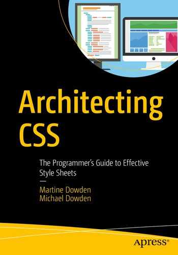
Easing functions define smooth transitions based on the Bézier curve, named after the French engineer Pierre Bézier. The curve is parametric,8 and the cubic variant is defined by four points: P0, P1, P2, and P3. P0 and P3 define the beginning and end of the curve, respectively. P1 and P2 represent the control points which give the curve its shape. Each point is defined by (x, y) coordinates.
The CSS cubic-bezier predefines P0 and P3 at fixed points of (0, 0) and (1, 1) representing the initial and final states of the animation. Left to be defined are P1 and P2 whose x values need to remain in a [0, 1] range, while the y values may exist outside of the bounding box.
The CSS function looks as follows: cubic-bezier(x1, y1, x2, y2).
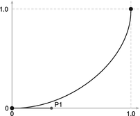
Named Easing Functions9
Name | Formula | Curve |
|---|---|---|
linear | cubic-bezier(0.0, 0.0, 1.0, 1.0) |
|
ease | cubic-bezier(0.25, 0.1, 0.25, 1.0) |
|
ease-in | cubic-bezier(0.42, 0.0, 1.0, 1.0) |
|
ease-in-out | cubic-bezier(0.42, 0.0, 0.58, 1.0) |
|
ease-out | cubic-bezier(0.42, 0.0, 0.58, 1.0) |
|

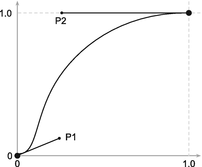

To create bouncing effects, either or both y values should be set outside the [0, 1] range . For this, a custom function needs to be written such as in the following function: cubic-bezier(0, 0.71, 0.64, 1.23).

Sample Bounce Curve
Stepping Functions
Named Stepping Functions10
Name | Function | Steps |
|---|---|---|
step-start | steps(1, start) |
|
step-end | steps(1, end) |
|
jump-start | steps(3, jump-start) |
|
jump-end | steps(3, jump-end) |
|
jump-none | step(3, jump-none) |
|
jump-both | step(3, jump-both) |
|


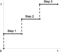


When applied, the code and output would be as in Listings 6-9 and 6-10 and Figure 6-5.
jump-start Sample Code CSS
jump-start Sample Code CSS

Jump-Start Output
Notice how the animation is already partially started. Because jump-start is used, the initial state of width 0 and color white is skipped and the animation starts with the container at a width of 20% of final state width. If jump-end had been used, the container would have started at a width of 0, but never reached a width of 100%. The container would only have a width of 80% when the animation ended.
 Accessibility and Timing
When considering timing, it is important to make sure that the content does not flash more than three times in a one-second period. This is to prevent the induction of seizures due to photosensitivity in users.11
Performance Considerations
When considering the effects of animations on performance, not all animations are created equal. Animations that cause layout changes or the view to be repainted are particularly taxing.12 For example, changes to height, width, or position affect layout and cause elements on the page to be repositioned. Properties that cause the view to repaint include color, background-position, and visibility. Animations affecting layout and paint will be less performant than those that don’t.
Generally, for best performance, using the transform property is the best way to go as it can lean on the GPU. Whenever possible, it is best to try and stick to animation using opacity, translate, rotate, and scale.13
Sparse use – It should only be used when it is actually needed. The browser already attempts to optimize everything. Unnecessary use will actually slow down the page.
Only on when needed – Should be turned on before the animation will trigger and then turned off again to free up browser resources being used for optimization.
Enough time – Optimization is time-consuming; therefore, will-change needs to be applied to the element with enough time to take effect before the animation is set to begin.14
Summary
This chapter covered transition, animations, and their differences as well as the functions used to change the timing of how animations and transforms are applied. Also covered were performance and accessibility considerations when dealing with animations. Chapter 7 will go over preprocessors and their architecture considerations and benefits.