Chapter 10. Additional Examples
By now you have learned about color theory, color psychology, and how to avoid common pitfalls when working with colors in data visualizations and data stories. In this chapter, we’ll tell some stories with data and demonstrate how color can help our audience understand the key insights. Let’s go ahead and start our journey of data storytelling. We will review some different scenarios that will help you apply some of the concepts we’ve covered in the book.
Using Colors Found in Nature
What should we add to our salad menu? Let’s imagine that we are working for a global restaurant chain that is focused on making salads. Those in charge of maintaining the restaurant menu asked you to find out which of these two ingredients they should add to their menu as a salad topping: oranges or grapes (Figure 10-1).

Figure 10-1. An orange and some purple grapes
To answer this question, we gathered data from Google Trends—exploring and comparing the popularity of the search terms orange and grape.
Google Trends provides access to a largely unfiltered sample of actual search requests made to Google. It’s anonymized (no one is personally identified), categorized (determining the topic for a search query), and aggregated (grouped together).
The data set provides us with a breakdown by region to demonstrate where these terms were searched for more frequently between the years 2017 and 2022, globally. Table 10-1 presents the raw data available for six countries along with the popularity of the search terms.
| Country | Orange | Grape |
|---|---|---|
| Vietnam | 29% | 71% |
| Thailand | 98% | 2% |
| Portugal | 84% | 16% |
| Brazil | 63% | 37% |
| Greece | 74% | 26% |
| United States | 57% | 43% |
If we were to put this data into a data visualization tool—in our case, we’re using Tableau—our default settings would likely look like Figure 10-2.

Figure 10-2. Stacked bar chart showing the popularity of ingredients by country using the default settings of Tableau, a data visualization tool
You’ll notice that the default colors that were chosen for the ingredients are not very intuitive. Grapes were given the color orange and oranges were provided with the color blue. This is because our computers are simply not smart enough to identify these dimensions as fruit and therefore assign more intuitive colors to them. This actually might end up confusing everyone.
One great fact that we can leverage for our color selection here is that oranges tend to be the color orange, and grapes tend to be purple (unless you’re thinking of green grapes). This helps us decide which colors to use in our data visualization.
Using a color picker tool (like in Canva), we can go back to Figure 10-1 and identify two good colors to use in our visualization. We identified the HEX value #ecb01d for oranges and the HEX value #9a8099 for grapes (Figure 10-3).

Figure 10-3. Oranges and grapes along with the HEX values for the key colors
Following is an updated data visualization that portrays the popularity of these ingredients in the six countries that we are focused on (Figure 10-4). We updated the colors to be more intuitive for the data we are working with and included labels on the bars to allow us to declutter and remove the color legend that we had initially. Additionally, we added a white divider line between the bars to provide another breakup of the two ingredients.
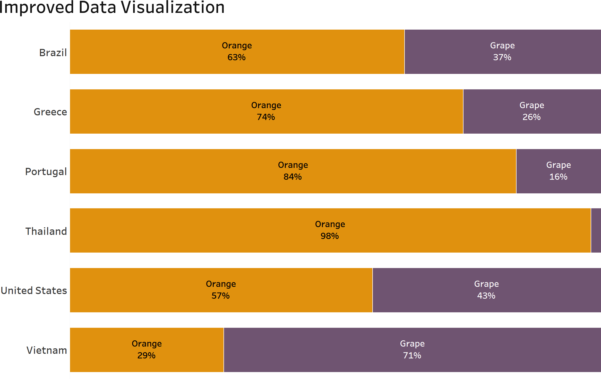
Figure 10-4. Bar chart showing ingredient popularity across countries with updated use of color
This insight can be taken into consideration when deciding which ingredients to add to restaurant menus across the world.
Using Color to Focus Your Audience
When you need to highlight an important item, a bright color can help it stand out. Gray is your best friend for the supporting data, or you can use a muted color for the “not as important” data points.
For example, take a look at the bar chart in Figure 10-5, which shows us the average number of air passengers by carrier name. If we wanted to focus in on JetBlue, we can color it blue and the rest of the bars light gray; this helps the audience focus on the specific bar.
This use of color immediately makes your audience focus on the blue line—it stands out from the rest of the bars.

Figure 10-5. Bar chart showing the average number of air passengers by carrier name, highlighting JetBlue Airways1
Another example of using brighter colors to draw the attention of your audience is displayed in Figure 10-6. The chart depicts product profitability by state and uses red to focus on the one unprofitable state across the country—Texas. The other states are colored with a neutral color, blue. The audience immediately knows to focus in on Texas and will likely ask questions as to why this state has low profitability rates.

Figure 10-6. Filled map view showing product profitability by state using the color red to focus on the one unprofitable state across the country: Texas
Designing for a Color Vision Deficiency Audience
If you know that there are members in your audience who have color vision deficiency or color blindness, you must take some extra steps to ensure that they will be able to effectively consume the information you present to them.
In this example, we are using a data set that highlights the relationship between the outdoor temperature and number of cricket chirps. There’s a theory that you might be able to count cricket chirps to estimate temperature:2
temperature in degrees Fahrenheit = number of chirps in 15 seconds + 37
Table 10-2 illustrates raw data that can be found on the pay-per-click expo website.3
| Temperature (Fahrenheit) | Number of chirps (in 15 seconds) | Total crickets |
|---|---|---|
| 57 | 18 | 2 |
| 28 | 20 | 5 |
| 64 | 21 | 10 |
| 65 | 23 | 15 |
| 68 | 27 | 6 |
| 71 | 30 | 8 |
| 74 | 34 | 10 |
| 77 | 39 | 15 |
| 20 | 10 | 10 |
| 24 | 8 | 8 |
| 25 | 7 | 7 |
| 58 | 5 | 2 |
| 71 | 2 | 10 |
| 74 | 14 | 5 |
| 77 | 30 | 7 |
| 20 | 34 | 8 |
| 24 | 26 | 3 |
| 25 | 16 | 4 |
| 58 | 8 | 2 |
| 71 | 12 | 1 |
Take a look at the chart in Figure 10-7 that demonstrates the relationship between air temperature and number of cricket chirps. The size of the circles is determined by the total number of crickets. The colors used here are green and red, with green depicting the majority of chirps and red being used to highlight three specific data points.

Figure 10-7. Scatter plot that demonstrates the relationship between air temperature and number of cricket chirps
If you do not have color blindness, you can probably identify the three red circles fairly easily. Figure 10-8, instead, displays them with numbers associated near them.

Figure 10-8. Adjusted scatter plot now showing the three specific data points of focus
We can use a tool called Coblis, a color blindness simulator, which allows you to upload a photo and see how this visual would be seen by someone with color blindness. Can you still spot the red circles as quickly as you did the first time (Figure 10-9)?

Figure 10-9. Scatter plot demonstrating the relationship between air temperature and number of cricket chirps as it would appear to someone with color blindness
Let’s discuss an alternative to the visual that will be better suited for an audience that might experience color blindness.
Using the color gray for supporting data, and a bright blue for the three data points that we want to highlight, it becomes easier for our audience to distinguish between the circles in the scatter plot (Figure 10-10).

Figure 10-10. Previous scatter plot showing the three specific data points of focus now in blue and gray versus red and green
Now let’s upload this image to our color blindness simulator to see the difference (Figure 10-11).
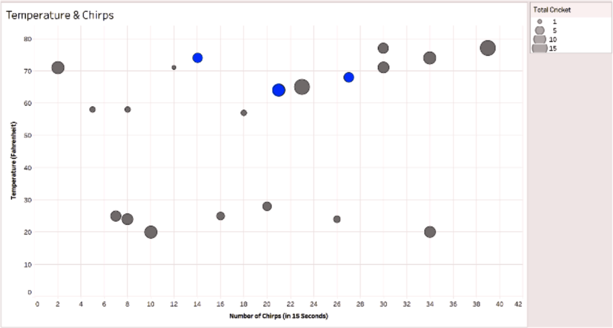
Figure 10-11. The color-blind version of the image with updated colors
You’ll notice that there are hardly any differences between the two charts. This is great news! We have designed a visual that can be interpreted in the same way by our audience, even if they have trouble seeing different colors. This is also a better option for printing data visualizations in black and white (Figure 10-12).
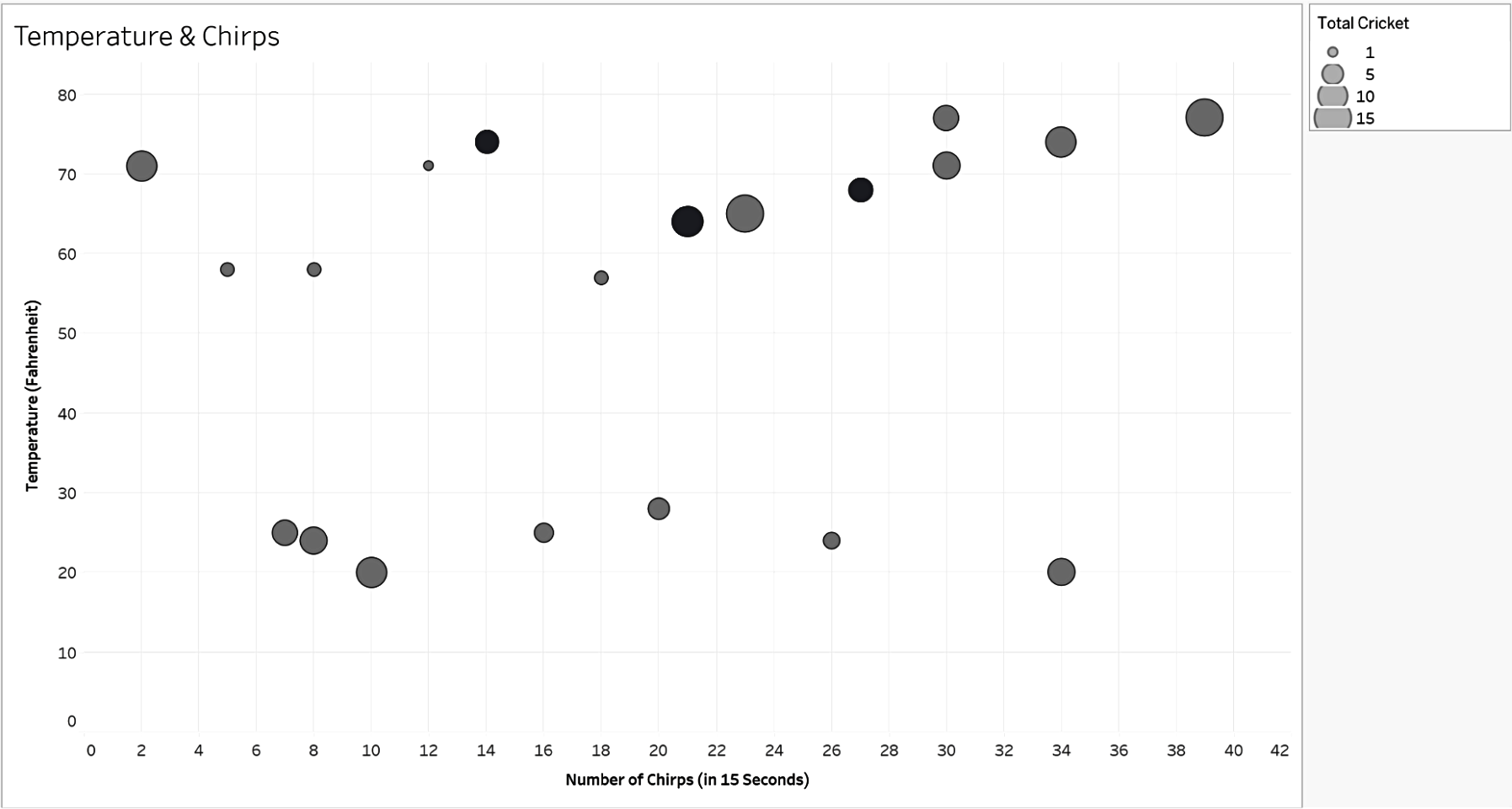
Figure 10-12. Previous scatter plot with updated colors in a grayscale mode view
The differences between the circles are still visible due to the darker shade of gray that is displayed.
Color Illusions
We discussed a few color illusions in the book, including the blue and gold dress, and the gray square that appears to change saturation when placed on a gradient background. Color illusions are images where surrounding colors trick the human eye into an incorrect interpretation of color. Let’s review a few more examples of color illusions to consider when designing data visualizations.
All of the color illusions discussed here demonstrate how easy it is for the human eye to be “tricked” into seeing something that isn’t there. This shows how important it is to be intentional with our use of color in data visualizations, and the colors used for our backgrounds.
Adelson’s Checker Shadow Illusion
Adelson’s checker shadow illusion (published by Edward H. Adelson) depicts something hard to believe (Figure 10-13). The square marked B looks much lighter than square A, due to the “shadow” being cast upon it. However, the color on both squares is the same shade of gray. If you don’t believe me, use any eyedropper tool or print/cut the squares to verify that both square A and square B are precisely the same. I used a color picker in Canva to identify the HEX values for each square.

Figure 10-13. Adelson’s checker shadow illusion4
You can see the HEX values for both squares are exactly the same!
Color Cube Illusion
Take a look at the squares marked A, B, and C in Figure 10-14. Can you believe that they all have the same color? Use any color picker, graphic program, or simply cover the remainder with your hand to see for yourself. You can even create a little telescope with your hand and look at each of the squares individually to see they are all the same color!

Figure 10-14. Colored cube on a black and white checkered background5
White and Gray? Maybe Not!
When we look at the surface color of the A and B parts in Figure 10-15, they look different; one appears to be white and the other gray. However, they are exactly the same! Just use a finger to cover the place where both parts meet and you’ll see.

Figure 10-15. Two panels that appear to be different colors6
Colorful Spheres (Or Are They?)
A color contrast optical illusion makes it look like the balls in Figure 10-16 are different colors. In reality, they are all the same color and shading. I couldn’t believe it at first, either—you can try to isolate each one by either using your hands to cover the image or looking really closely at the sphere in an isolated manner.

Figure 10-16. A dozen spheres with multicolored stripes that run over them7
Figure 10-17 is the same image without the lines going across them to show you the difference.

Figure 10-17. A dozen spheres on a multicolored striped background after removing the stripes from the spheres8
Colorful Dogs
Take a look at the two images of dogs in Figure 10-18: do they look different? They are the same! At first glance, one might look yellow and the other blue, but they are completely the same in color.

Figure 10-18. Image of the same-colored dogs on a diverging yellowish-green to blue background9
To make it clearer for you to view, we’ve taken the background away from the dogs. Do they look the same now (Figure 10-19)?

Figure 10-19. Image of the same-colored dogs after removing the background10
They only looked different because of the gradient background.
It’s important to keep these optical illusions in mind when designing your data visualization, as they can impact interpretation.
1 Image credit: “2021/W16: Monthly Air Passengers in America,” data.world, last accessed November 7, 2022, https://oreil.ly/XJf65.
2 Peggy LeMone, “Measuring Temperature Using Crickets,” GLOBE Scientists’ Blog, October 5, 2007, https://oreil.ly/NKUqq.
3 “5 Scatter Plot Examples to Get You Started with Data Visualization,” PPCexpo, https://oreil.ly/jmOK9.
4 Image credit: Jan Adamovic, “Color Illusions and Color Blind Tests,” last accessed, November 7, 2022, https://oreil.ly/ZtoVm.
5 Adamovic, “Color Illusions.”
6 Adamovic, “Color Illusions.”
7 Image credit: Phil Plait, “Another Brain-Frying Optical Illusion: What Color Are These Spheres?” SYFY Wire, June 17, 2019, https://oreil.ly/2bXLW.
8 Image credit: Plait, “Another Brain-Frying Optical Illusion.”
9 Image credit: Kyle Hill, “5 Optical Illusions That Show You Why Your Brain Messes with the Dress,” Nerdist, February 28, 2015, https://oreil.ly/kyfRo.
10 Hill, “5 Optical Illusions That Show You Why Your Brain Messes with the Dress.”