
Snap-Together Visualization: A User Interface for Coordinating Visualizations via Relational Schemata
Chris North and Ben Shneiderman, Human-Computer Interaction Lab & Department of Computer Science, University of Maryland, College Park, MD 20742 USA, http://www.cs.umd.edu/hcil. E-mail address: [email protected], [email protected]
ABSTRACT
Multiple coordinated visualizations enable users to rapidly explore complex information. However, users often need unforeseen combinations of coordinated visualizations that are appropriate for their data. Snap-Together Visualization enables data users to rapidly and dynamically mix and match visualizations and coordinations to construct custom exploration interfaces without programming. Snap’s conceptual model is based on the relational database model. Users load relations into visualizations then coordinate them based on the relational joins between them. Users can create different types of coordinations such as: brushing, drill down, overview and detail view, and synchronized scrolling. Visualization developers can make their independent visualizations snap-able with a simple API.Evaluation of Snap revealed benefits, cognitive issues, and usability concerns. Data savvy users were very capable and thrilled to rapidly construct powerful coordinated visualizations. A snapped overview and detail-view coordination improved user performance by 30–80%, depending on task.
1 INTRODUCTION
In exploring information, two or more coordinated visualizations are often required to adequately display and browse the data [BWK00]. For example. Microsoft’s Windows Explorer employs 3 visualizations to browse hierarchical file systems: an outliner view of the folders, a tabular view of the files in the selected folder, and a quick view of details of the selected file. In Spotfire [AW95]. a commercial scatterplot visualization tool, selecting a record in the plot displays its attribute values in a web browser
While these combinations of coordinated views are very helpful for some tasks, what about other combinations? What if, in Windows Explorer, users want to view their folders as a scatterplot instead of an outliner? Then they could quickly spot large old folders, and select them to see contents in the tabular view. If browsing a census database, why can’t users click on a state in a Spotfire visualization to display its counties in a Treemap [Shn92] visualization? (See Figure 1)
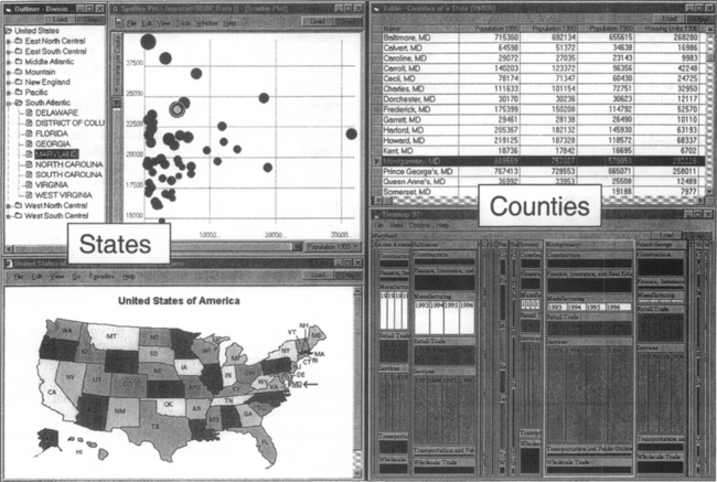
Figure 1 A coordinated visualization environment for exploring Census data of U.S. states and counties, dynamically constructed using Snap-Together Visualization. Users can explore states from nominal, geographic, and numeric perspectives using the outliner, map, and scatter plot. Selecting a state displays detailed county and industry information for that state in the table and Treemap on the right. Selecting Maryland on the map reveals a fairly high ranking in Per Capita Income in the plot, and immediately reveals in the Treemap that the Services industry in Montgomery County is responsible for a major portion of that income.
These alternate combinations typically require custom development. In our lab. researchers stumble over this problem often, and must constantly re-implement coordinations between new unforeseen combinations of views. Unfortunately, this is a poor solution to the problem. Even with good component-based design, these hard-coded combinations are inflexible and difficult to construct.
A lightweight mechanism is needed to allow end-users to easily “snap” individual visualizations together into custom combinations. These combinations can exploit simple relationships in the data to support browsing. This must not be a toolkit that requires programming, but a user interface.
Specifically, users should be able to choose and coordinate visualizations so that: selecting or navigating to a data item in one view causes another view to select or navigate to corresponding items or load and display data related to that item The “load” capability is particularly potent. For example, users can drill down through hierarchical levels in a database using different visualizations at each level, as in the states and counties example.
1.1 Related Work
Systems for information visualization via multiple coordinated views can be classified by their level of flexibility in data, views, and coordinations:
1. Data: users can load their own different data sets into the visualizations.
2. Views: users can choose different sets of visualizations as appropriate for the data.
3. Coordinations: users can choose different types of coordinations between pairs of views as needed for exploring or navigating relationships in the data.
Level 0 systems are not intended for flexibility. For example, Windows Explorer always displays the same data set (the hard drive file structure), with the same views and coordinations.
Most visualization tools are level 1. flexible for data but not views or coordinations. For example, the Treemap tool can load and display any hierarchical data set of users’ choosing, but remains constant in its pair of views (the treemap view and the details pane) and the coordination between them (selecting a node in the treemap displays associated data in the details pane).
Level 2 systems include flexibility in choice of views. For example, systems such as Datadesk [Vel88). SAS JMP. EDV/ Advizor [EW95], and Spotfire, can display a single data table in many different types of views of users’ choosing such as scatter plots or bar charts. All the views are coordinated for brushing-and-linking [BC87]. allowing users to relate data points across views. When users paint points in one view, the system automatically paints the corresponding points in the other views in the same manner. This approach is useful for statistical data analysis.
In databases, Visage [RLS96] extends the brushing coordination to multiple tables by brushing across relational joins. However, users cannot establish a different type of coordination between two views with these systems.
Level 3 systems include flexibility in the coordinations between views. The Apple Dylan programming environment [DP95] lets users choose which pairs of views to coordinate. Users browse hierarchical object-oriented programs by splitting and linking frames so that selecting a folder in one frame displays its contents in the other frame (e.g. generalized Windows Explorer). Spreadsheet Visualization [CBR97] arranges many small 3D views as cells in a 2D grid. Then, users can select a whole row or column of views to synchronize their 3D navigation.
Devise [LRB97] allows users to select some different types of coordinations between views. Users can synchronize panning and zooming of plots with common axes, and establish set operations between views so that data in one view can be combined with data in another.
In scientific visualization, data-flow systems such as ConMan [Hae88], AVS. and IBM Data Explorer, also employ a form of dynamic linking, but for a different purpose. Users link a variety of modules to create custom data processing and viewing pipelines, much like pipes on the Unix command line. Linkwinds [JBO94] extends the data-flow model for data filtering. Upstream widgets can filter the data that is displayed downstream.
Multiple coordinated visualization approaches have become an important and diverse topic. For a comprehensive review of many systems, see [Nor00].
2 SNAP TOGETHER VISUALIZATION
Snap-Together Visualization enables data users to rapidly and dynamically mix and match visualizations and coordinations to construct custom exploration interfaces without programming. Snap is flexible in data, views and coordinations. Snap focuses on (a) interconnecting the visualization tools created by researchers and developers in the field to (b) construct coordinated browsers for rapid exploration and navigation of data and relationships.
2.1 Model
Snap’s conceptual model is based on the relational database model. To explore a database, users can construct interfaces composed of coordinated visualizations based on the database schema. Users load relations into visualizations then coordinate the visualizations based on the join relationships between their relations. There is a direct correspondence between relational concepts and Snap concepts: (see also Figure 2)
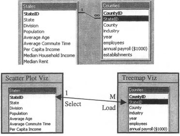
Figure 2 : Top: A schema diagram for a database of Census information for U.S. states and counties (using Microsoft Access). Bottom: The data tables are loaded into visualizations and coordinated according to the join relationship between them. This example models a drill-down interface for States to Counties.
| Relational Concept | Snap Concern | |
| Relation | = | Visualization |
| Tuple | = | Item in a visualization |
| Primary key | = | Item ID |
| Join | = | Coordination |
Hence, a graph of coordinations between visualizations corresponds to the graph of joins between the relations in the database schema diagram. This was inspired in part by RMM [ISB95], a system for constructing web site navigational structure from underlying relational databases. In RMM, database relationships correspond to hyperlinks, whereas, in Snap they correspond to coordinations.
2.2 Relations into Visualizations
When using Snap, users first load relations into visualizations. In Snap, a visualization displays a single relation. Generally, each tuple is depicted as an individual item in the visualization. For example, a scatter plot displays each tuple as a dot using 2 of its attributes as the coordinates. A table displays each tuple as a row.
Visualizations typically allow users to select a tuple, navigate to a tuple, or somehow indicate interest in a tuple. We will call these primary-key actions, because the tuples can be identified by their primary-key values. Users initiate the action via input, and the visualization responds with visual feedback. For example, users might select a tuple in a scatter plot by clicking on or mousing over the dot, and the system might respond by highlighting the dot in yellow. We extend this slightly to enable primary-key actions to be invoked programmatically. For example, the Snap system can also select a tuple in the scatter plot to cause the same yellow-highlight visual feedback as if the user had clicked on the dot. Hence, we can model primary-key actions as unary functions that take a tuple’s primary-key value as argument: e.g. Viz. Select(<id>). Each visualization publishes the set of actions it supports to Snap.
Visualizations also have a foreign-key action that is managed by Snap: the Load action queries the visualization’s original relation for tuples that are joined (by a foreign key) to the tuple given as the argument (primary key) and loads them into the visualization.
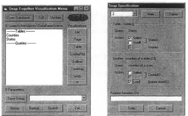
In the Snap user interface, users load relations into visualizations using the Snap Main Menu (Figure 3). It displays a menu of the tables and queries in the database and a menu of the available visualization tools.
2.3 Coordinating Visualizations
After loading relations into visualizauons. users can then coordinate the visualizations (’snap them together”). When coordinating a pair of visualizations, users choose the actions in each view to coordinate. A Snap coordination tightly couples the actions between the two visualizations on tuples related by the join between the relations. Users coordinate the visualizations based on the join relationships between their relations. There are 4 cases:
1. One-to-One: This is a primary-key to primary-key relationship. Users coordinate a primary-key action in one view to a primary-key action in the other. Then, when users invoke the former action on a tuple in the former view, the system automatically invokes the latter action on the corresponding tuple in the latter view, and vice versa.
This is often used to relate different perspectives on a single relation. For example, in Figure 1 different projections of the States table are displayed in a scatter plot and a map. Coordinating the select action in the plot to the select action in the map creates a brushing-and-linking coordination. When users click on Maryland in either view, it will also be highlighted in the other view.
2. One-to-Many: This is a primary-key to foreign-key relationship. Therefore, users can coordinate a primary-key action in the view on the One side of the relationship with a foreign-key action on the Many side. (See Figure 2)
This relationship indicates a hierarchical relationship between the relations. For example, in Figure 1 the States are displayed in a scatter plot and Counties in a Treemap. Coordinating the select action in the plot to the Load action in the Treemap creates a drill-down coordination. Clicking on Maryland in the plot loads and displays only Maryland’s counties in the Treemap.
3. Many-to-Many: This relationship is generally composed of 2 one-to-many relationships. Therefore, users employ the one-to-many case in the desired direction.
4. No relationship: If the schema has no relationship between the relations, then there is no coordination between the views However, if users desire coordination based on more complex or indirect relationships, then it is probably possible to modify the schema with queries to specify the desired relationships with standard joins. Hence, with Snap, advanced coordination is simply a data-relationship representation problem rather than a custom user-interface programming problem.
Snap coordinations are bi-directional, so that either action triggers the other. Users can also chain coordinations end-to-end. For example, users can establish brushing across three views.
In the Snap user interface, users coordinate a pair of visualizations by dragging the Snap button from one to the other (similar to [JB094] and [DP95]). This displays the Snap Specification dialog (Figure 3). Users select the primary-key or foreign-key actions for each visualization to coordinate. After construction, users can save a set of coordinated views as a group for later reuse or sharing.
2.4 Common Coordinations with Snap
With Snap, users can quickly construct common coordinations, such as:
• Brushing-and-linking: (Figure 1: outliner, plot, map) Join relationship: one-to-one
Coordinated actions: select in Vizl and select in Viz2 Usage: Selecting an item in one view highlights the corresponding item in another view. Typically used to identify like items when a set of items is displayed in different views for different contexts.
• Overview and detail view. (Figure 4)
Figure 4 A textual interface for browsing Census information about the U.S. states. Using Snap, an overview is easily added to the scrolling report.
Coordinated actions: select in Viz1 and scroll in Viz2 Usage: Selecting an item in the overview scrolls (or more generally navigates) the detail view to the details of that item. Items are represented visually smaller in the overview than in the detail view. Allows direct access to details, and provides context for details.
• Drill-down: (Figure 1. plot and table)
Join relationship: one-to-many
Coordinated actions: select in Viz1 and load in Viz2 Usage: Selecting an item in one view loads related items into another view. This enables exploring very large-scale data, by displaying aggregates in one view and the contents of a selected aggregate in another view (FNP99). For example. 1 million ‘stars’ may be too much for single plot. Instead, break it down into 1000 ‘galaxies’, each with 1000 stars. Then display one plot of galaxies and one of stars with a drill-down coordination between them.
Coordinated actions: scroll in Viz1 and scroll in Viz2
Usage: Scrolling through a list of tuples in one view also scrolls to corresponding items in another view.
Coordinated actions select in Viz1 and load in Viz2
Usage: Selecting a tuple in a graphical view loads and displays additional details of that tuple in an adjacent textual view. This uses load as a primary-key action.
2.5 Snap API
Snap’s model of a visualization is intentionally simple. Snap is designed to be open and easy for researchers and developers to make their independent visualizations snap-able. Therefore. Snap minimizes impact on visualization implementation. Snap uses a simple API (application programming interface) to communicate with visualizations. This is analogous to API’s in modem window-management systems for utilities such as cut-and-paste or drag-and-drop. We propose the Snap API as a similar standard, that can be easily added to a visualization tool by its developers, enabling users to immediately snap it with many other visualizations. This greatly increases the value and usefulness of the tool for little cost.
To be snap-able, a visualization must support this API:
• Load method. When users load a relation into the visualization. Snap must be able to send the data to the visualization via file, memory, or ODBC, which ever is convenient for the tool. A translation routine may be needed to translate the relational structures to those used by the tool.
• Methods and events for each primary-key action: When users invoke actions, the visualization must fire an event to Snap. Likewise. Snap must be able to invoke actions in the visualization. The pnmary key value of the tuple acted on is passed The visualization developer determines what actions it supports. Select is recommended as a minimum.
Other than these few hooks, visualizations remain independent software programs, maintaining their own data structures, etc. For example, Spotfire. a commercial software package, was integrated using its existing API and a 10-line VB wrapper to translate the communication calls.
Snap is currently implemented in the Windows platform. It uses COM for communication in the API and ODBC for database access. We have used Snap with MS Access and Oracle databases.
2.6 Scenarios
Snap is useful for rapidly constructing visualization interfaces for many different types of information. As the following examples illustrate, Snap makes information visualization capabilities immediately accessible and applicable for users.
2.6.1 Web-Site Logs
Recently, we have been interested in visualizing data from web logs [HS99], a database containing information about users’ visits to a web site. In this scenario, we are interested in discovering what internet pages are referring many users, via hyperlinks, to specific pages on our lab’s web site. A user interface to explore this database can be quickly constructed with Snap (see Figure 5)

Figure 5 This visualization environment for explonng web-site log data was quickly constructed using Snap. The outliner, Treemap, and web browser at the top form a site browser for the HCIL web site. The scatter plot and browser at the bottom display pages that refer readers to the site. This example reveals that Human Factors International referred 110 readers to the HCIL home page that month.
First, a user interface to explore specific pages on our site is needed. Opening a table of the pages and their URLs into an outliner displays a hierarchical view of the site. A web-browser visualization (MS Internet Explorer) can be used with URL data values to display the actual web pages. Snapping the outliner to a web-browser, by coordinating the outliner’s select action to the browser’s load action, creates a rapid site browser. Clicking on a page in the hierarchy displays the page in the browser (top of Figure 5).
Now. visualizations to discover referring pages are added. A table of hits to our site is aggregated by the referring and referenced pages and loaded into a scatter plot. There is a one-to-many relationship between the pages table and the hits table. The outliner is coordinated to the plot with select and load actions respectively. The plot displays the referrers as a histogram, with referrer name on the X-axis and number of hits referred on the Y-axis. Similar to the outliner. the plot is also coordinated to a web browser to view the actual referring pages (bottom of Figure 5).
Now. selecting our home page in the outliner displays that page in the browser and the distribution of referrers to it in the plot. Selecting a high-ranking referrer in the plot reveals the Human Factors International page in the other browser. Exploring reveals other pages that send many users to our home page, including Ben Shneiderman’s page, the Department page, and Yahoo’s HCI institutes page. Selecting our Visible Human project page in the outliner shows nearly 1000 hits from the National Library of Medicine page. Selecting to open this page indeed reveals a prominent link to our page. Naturally, lab members explored to discover referrer patterns to their personal pages.
2.6.2 Photo Libraries
For a research project on user interfaces for browsing personal photo libraries, we have been using Snap to explore many interface variations. Our lab has accumulated a database of scanned photos of lab members and activities spanning 10 years. It includes annotations such as members’ names, dates, locations, and other information.
In Figure 6, a thumbnail browser shows a collection of a few hundred photos. The scatter plot displays a time line of the photos, with date on the X-axis and members’ names on the Y. Vertical stripes of dots represent group events, pictures of many members on the same date. The large stripe in the middle is many photos from the 1992 Open House. Selecting a photo from winter ‘89 displays the full-size photo from a ski trip, a list of names of members in the photo, and details of photo attributes.
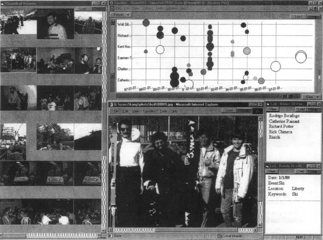
Figure 6 Exploring a photo library with Snap. The user has displayed a collection of photos in a thumbnail browser to quickly overview many photos and in a scatter plot to see trends on a time line. These are coordinated to a web browser to display the full-resolution picture of a photo when selected. Additional text views display names of people in the picture and other details.
Other interface variations include locating photos by members’ names or locations, selecting a person in a photo to find other pictures of that person, etc.
3 EMPIRICAL EVALUATION
To determine if Snap’s model and user interface are usable and beneficial, it is important to empirically evaluate the two phases of using Snap:
1. Construction: First, can users successfully construct coordinated exploration interfaces by snapping visualizations together?
2. Operation: Second, can users then operate the coordinated interfaces constructed with Snap to explore information beneficially?
This section presents a summary of these two studies. For more details, see [Nor00]. Little work has been done to evaluate systems for coordination. [CS94] and [SSS86] indicate performance advantages at operation level for the drill-down type of coordination (e.g. level 1 systems). We are not aware of studies on coordination construction (level 3 systems).
3.1 Usability of Coordination Construction
The goal of the first study is to determine how difficult it is for relatively novice users to learn Snap and construct coordinated interfaces, in terms of success rate and time to completion This study reveals cognitive trouble spots in the construction process and identifies potential Snap user interface improvements
3.1.1 Procedure
We worked with 6 subjects on a one-on-one basis. Three of the subjects were data analysts or statisticians at the U.S. Bureau of the Census. The other three were programmers.
Subjects were first trained on using Snap-Together Visualization. At the time of this study, the Snap user interface did not have capability for users to easily create projections, join queries, etc. Hence, subjects were also trained on using Microsoft Access to manipulate the database, schema and queries.
Testing consisted of 3 exercises. Subjects were asked to construct coordinated exploration interfaces according to three provided specifications: two were printed screenshots (a simple one identical to Figure 4, and a more difficult one similar to Figure 1), and one a description of the task that the constructed interface should support. The database consisted of census data of the U.S. states and counties.
3.1.2 Results
Overall, subjects easily grasped the concept of coordinating views. All the subjects completed the training in 30–45 minutes, and were able to complete all three exercises. They accomplished each exercise in 2–15 minutes, depending on the difficulty. Much of this time was absorbed by window management (see [KS97] for a review of potential solutions) and Access. Subjects had very little previous experience with Access and database concepts.
As to subjects’ general reaction to Snap-Together Visualization, we were impressed by their level of excitement. The subjects were quick to learn the concepts and usage, and were very capable to construct their own coordinated interfaces. Several stated that they had a gratifying sense of satisfaction and power in being able to both (a) so quickly snap powerful exploration environments together, and (b) with just a single click effect exploration across several visualizations and see the many parts operate as a whole. They commented that it made exploration seem effortless, especially in comparison to standard tools.
To our surprise, the data analysts performed better than the programmers did. During the training, they were already trying variations of snaps, exploring the data, and pointing out various anomalies in the data. After finishing the exercises, these subjects each stayed for an additional hour to play. All the Census subjects expressed desire to use Snap-Together tools in their work. In fact, a collaborative effort is underway.
An important result was the creativity and variation evident in the subjects’ solutions to the 3rt exercise. Subjects designed interfaces that made sense to their perspective on the data. They used a mixture of visualizations and coordinations. For example, while one subject used scatterplots. another subject augmented this design with lists for state and county names. The subject stated that this would help to see which state and county was currently selected in the scatterplots. and allow for accessing states by name. Another subject who preferred to see the numerical values used tabular visualizations with sorting
3.1.3 User Interface
Understanding the basic underlying model of Snap was critical. However, the Snap user interface apparently did not reflect this model well due to disparity between the schema management (Access), the Snap main menu, and the Snap Specification dialog. For example, to add a projection of a table as an overview visualization to an interface, users had to generate the query in Access, load it into a visualization using the Snap main menu, and coordinate it to other views using the Snap Specification dialog. In addition, users sometimes forgot which visualizations were currently coordinated. A ‘debug’ mode to show how coordination propagates between visualizations would have been helpful.
These problems might be solved by redesigning the Snap interface around a single direct-manipulation visual overview that merged the schema diagram with a visualization-coordination graph diagram. This diagram could be used for schema management, simple querying and loading into visualizations, and coordination specification and ‘debugging’. In addition, the need to create quenes by hand could be eliminated for common simple situations. For example, for projections users could simply select the desired attributes and drag them directly to a visualization. Snap could also generate queries for foreign-key loads automatically. These enhancements would likely reduce users’ training and construction time significantly. We are already working on this.
3.2 Usability of Coordination Operation
The goal of the second study is to measure the magnitude of the benefit of using views coordinated with Snap over alternatives: independent views or a single view. Benefit is measured in terms of user task times and subjective satisfaction for browsing large information spaces. This study reveals whether the visual feedback across views is distracting or disorienting for users.
While there are many possibilities, this study examines an overview-and-detail-view coordination constructed with Snap. If there is a benefit over the single view, then what is the important factor causing improved performance? Is it (a) the information displayed in the overview, or (b) the coordination between the overview and detail view?
3.2.1 Procedure
18 subjects used 3 different interfaces for browsing Census state population statistics. They performed 9 different browsing tasks, ranging from easy to difficult. The 3 interfaces were: (similar to Figure 4)
3.2.2 Results
On average. Snapped-Views achieves an 80% speedup over Detail-Only for easy tasks and 30–50% for difficult tasks, both significant. The Independent-Views interface results in a nearly binary pattern. For easy tasks, where only information in the overview is needed to accomplish the task. Independent-Views performs on par with Snapped-Views. Whereas, in difficult tasks, where subjects needed to access the details. Independent-Views is as bad as Detail-Only. Hence, when access to details is important, coordination is critical.
In fact, Snapped-View’s performance times for lookup tasks are in the same extremely fast range as overview-only tasks. Whereas, Independent-View’s times drop to Detail-Only level performance. When looking up details, perhaps the most common task, coordination especially excels.
In subjective satisfaction, Snapped-Views gains rankings twice as high (significant) as Detail-Only and Independent-Views. Independent-Views average 20% higher than Detail-Only. Users reported they were not distracted by the coordination, but in fact expected that functionality. We believe these results indicate that the Snap capability is indeed beneficial, wanted, and sorely needed.
3.3 Combined Analysis
Together, these studies indicate the breakpoint at which time savings during data exploration surpass interface construction time. The 2nd study used the same interface constructed in the I” study. The time cost of constructing the interface was 2–5 minutes, while it saved 0.5–1.5 minutes over the Detail-Only interface for more difficult tasks. Hence, after a few tasks, users are already reaping savings with snapping their own interface. Of course, it is difficult to factor in learning time and effects of sharing snapped interfaces. Nevertheless, this simple analysis is revealing. Customized information visualization is within the grasp of novice users.
4 CONCLUSIONS and FUTURE WORK
Snap-Together Visualization introduces four novel contributions:
(a) Conceptual model: a relational model for visualization coordination, based on coupling actions across joins.
(b) User interface: a user interface that enables end users to construct custom coordinated visualization environments, based on the conceptual model, allowing flexibility in data, views, and coordinations.
(c) Architecture: an open architecture based on a simple API that enables visualization developers to easily snap-enable their visualizations.
(d) Evaluation: data savvy users were very capable at constructing coordinated visualization environments of their own using the model and interface. Users of a constructed interface obtained 30–80% performance speedup for many browsing tasks.
Snap has already proven useful in a variety of applications, including: West Group case law. Census Bureau and GIS data analysis, Maryland State Highway Administration accident data, research projects on personal photo libraries, web logs, mailing lists and technical-report databases.
Continued research is needed to explore alternate user interfaces for coordination overviews, strategies for aggregation and history keeping, multi-way coordination, window management, coordination guidelines, and more.
5 ACKNOWLEDGMENTS
This research was partially supported by funding from West Group and the U.S. Bureau of the Census
REFERENCES
Ahlberg, C., Wistrand, E., IVEE: An Information Visualization and Exploration Environment. Proc. IEEE Information Visualization ’95. 1995:66–73.
May Baldonado, M., Woodruff, A., Kuchinsky, A., Guidelines for using multiple views in information visualization. Proc. ACM Advanced Visual Interfaces ’00, 2000.
Becker, R., Cleveland, W. Brushing scatterplots. Technometrics. 1987; 29(2):127–142.
Chi, E. H., Barry, P., Riedl, J., Konstan, J., A spreadsheet approach to information visualization. Proc. IEEE Information Visualization ’97. 1997:17–24.
Chimera, R., Shneiderman B., “An exploratory evaluation of three interfaces for browsing large hierarchical tables of contents”, ACM Transactions on Information Systems, 12(4), pp. 383–406, (Oct. 94).
June Dumas, J., Parsons, P. Discovering the way programmers think about new programming environments. Communications of the ACM. 1995; 38(6):45–56.
Eick, S., Wills, G. High Interaction Graphics. Euro. Journal of Operations Research. 1995; #81:445–459.
Fredrikson, A., North, C., Plaisant, C., Shneiderman, B., Temporal, geographical and categorical aggregations viewed through coordinated displays. Proc. ACM CIKM ’99 Workshop on New Paradigms in Info Vis and Manip., 1999.
Haeberli, P., ConMan: a visual programming language for interactive graphics. Proc. ACM SigGraph ’88. 1988:103–111.
Hochheiser, H., Shneiderman, B., Understanding patterns of user visits to web sites: interactive starfield visualizations of WWW log data. Proceedings ASIS ’99 Annual Conference, 1999.
August Isakowitz, T., Stohr, E., Balasubramanian, P. RMM: a methodology for structured hypermedia design. Communications of the ACM. 1995; 38(8):34–44.
April Jacobson, A., Berkin, A., Orton, M. LinkWinds: interactive scientific data analysis and visualization. Communications of the ACM. 1994; 37(4):43–52.
March Kandogan, E., Shneiderman, B., Elastic Windows: evaluation of multi-window operations. Proc. ACM CHI’97. 1997:250–257.
Livny, M., Ramakrishnan, R., Beyer, K., Chen, G., Donjerkovic, D., Lawande, S., Myllymaki, J., Wenger, K., DEVise: integrated querying and visual exploration of large datasets. Proc. ACM SIGMOD’97. 1997:301–312.
Spring North, C., Snap-Together Visualization forthcoming. University of Maryland, Computer Science Dept. Doctoral Dissertatio. 2000;
October Roth, S., Lucas, P., Senn, J., Gomberg, C., Burks, M., Stroffolino, P., Kolojejchick, J., Dunmire, C. Visage: a user interface environment for exploring information. In: Proc. Information Visualization. New York: IEEE; 1996:3–12.
Jan. Shneiderman, B. Tree visualization with treemaps: a 2-d space-filling approach. ACM Transactions on Graphics. 1992; 11(1):92–99.
March Shneiderman, B., Shafer, P., Simon, R., Weldon, L. Display strategies for program browsing: concepts and an experiment. IEEE Software. 1986; 3(3):7–15.