Inventing discovery tools: combining information visualization with data mining†
Ben Shneiderman*1, 1Department of Computer Science, University of Maryland, College Park, Maryland, U.S.A. E-mail address: [email protected]
*Correspondence: Ben Shneiderman, Department of Computer Science, Human-Computer Interaction Laboratory, Institute for Advanced Computer Studies, and Institute for Systems Research, University of Maryland, College Park, MD 20742 U.S.A.
Abstract
The growing use of information visualization tools and data mining algorithms stems from two separate lines of research. Information visualization researchers believe in the importance of giving users an overview and insight into the data distributions, while data mining researchers believe that statistical algorithms and machine learning can be relied on to find the interesting patterns. This paper discusses two issues that influence design of discovery tools: statistical algorithms vs visual data presentation, and hypothesis testing vs exploratory data analysis. The paper claims that a combined approach could lead to novel discovery tools that preserve user control, enable more effective exploration, and promote responsibility.
Introduction
Genomics researchers, financial analysts, and social scientists hunt for patterns in vast data warehouses using increasingly powerful software tools. These tools are based on emerging concepts such as knowledge discovery, data mining, and information visualization. They also employ specialized methods such as neural networks, decisions trees, principal components analysis, and a hundred others.
Computers have made it possible to conduct complex statistical analyses that would have been prohibitive to carry out in the past. However, the dangers of using complex computer software grow when user comprehension and control are diminished. Therefore, it seems useful to reflect on the underlying philosophy and appropriateness of the diverse methods that have been proposed. This could lead to a better understanding of when to use given tools and methods, as well as contribute to the invention of new discovery tools and refinement of existing ones.
Each tool conveys an outlook about the importance of human initiative and control as contrasted with machine intelligence and power.1 The conclusion deals with the central issue of responsibility for failures and successes. Many issues influence design of discovery tools, but this paper focuses on two: statistical algorithms vs visual data presentation and hypothesis testing vs exploratory data analysis
Statistical algorithms vs visual data presentation
Karly efforts to summarize data generated means, medians, standard deviations, and ranges. These numbers were helpful because their compactness, relative to the full data set, and their clarity supported understanding, comparisons, and decision making. Summary statistics appealed to the rational thinkers who were attracted to the objective nature of data comparisons that avoided human subjectivity. However, they also hid interesting features such as whether distributions were uniform, normal, skewed, bi-modal, or distorted by outliers. A remedy to these problems was the presentation of data as a visual plot so interesting features could be seen by a human researcher.
The invention of times-series plots and statistical graphics for economic data is usually attributed to William Playfair (1759–1823) who published The Commercial and Political Atlas in 1786 in London. Visual presentations can be very powerful in revealing trends, highlighting outliers, showing clusters, and exposing gaps. Visual presentations can give users a richer sense of what is happening in the data and suggest possible directions for further study. Visual presentations speak to the intuitive side and the sense-making spirit that is part of exploration. Of course, visual presentations have their limitations in terms of dealing with large data sets, occlusion of data, disorientation, and misinterpretation.
By early in the 20th century statistical approaches, encouraged by the Age of Rationalism, became prevalent in many scientific domains. Ronald Fisher (1890–1962) developed modern statistical methods for experimental designs related to his extensive agricultural studies. His development of analysis of variance for design of factorial experiments2 helped advance scientific research in many fields.3 His approaches are still widely used in cognitive psychology and have influenced most experimental sciences.
The appearance of computers heightened the importance of this issue. Computers can be used to carry out far more complex statistical algorithms and they can also be used to generate rich visual, animated, and user-controlled displays. Typical presentation of statistical data mining results is by brief summary tables, induced rules, or decision trees. Typical visual data presentations show data-rich histograms, scattergrams, heatmaps, treemaps, dendrograms, parallel coordinates, etc. in multiple coordinated windows that support user-controlled exploration with dynamic queries for filtering (Figure 1). Comparative studies of statistical summaries and visual presentations demonstrate the importance of user familiarity and training with each approach and the influence of specific tasks. Of course, statistical summaries and visual presentations can both be misleading or confusing.

Figure 1 Spotfire (www.spotfire.com) display of chemical elements showing the strong correlation between ionization energy and electronegativity, and two dramatic outliers: radon and helium.
An example may help clarify the distinction. Promoters of statistical methods may use linear correlation coefficients to detect relationships between variables, which works wonderfully when there is a linear relationship between variables and when the data is free from anomalies. However, if the relationship is quadratic (or exponential, sinusoidal, etc.) a linear algorithm may fail to detect the relationship. Similarly if there are data collection problems that add outliers or if there are discontinuities over the range (e.g. freezing or boiling points of water), then linear correlation may fail. A visual presentation is more likely to help researchers find such phenomena and suggest richer hypotheses.
Hypothesis testing vs exploratory data analysis
Fisher’s approach not only promoted statistical methods over visual presentations, but also strongly endorsed theory-driven hypothesis-testing research over casual observation and exploratory data analysis. This philosophical strand goes back to Francis Bacon (1551–1626) and later to John Herschel’s 1830 A Preliminary Discourse on the Study of Natural Philosophy. They are usually credited with influencing modern notions of scientific methods based on rules of induction and the hypothetico-deductive method. Believers in scientific methods typically see controlled experiments as the fast path to progress, even though its use of the reductionist approach to test one variable at a time can be disconcertingly slow. Fisher’s invention of factorial experiments helped make controlled experimentation more efficient.
Advocates of the reductionist approach and controlled experimentation argue that large benefits come when researchers are forced to clearly state their hypotheses in advance of data collection. This enables them to limit the number of independent variables and to measure a small number of dependent variables. They believe that the courageous act of stating hypotheses in advance sharpens thinking, leads to more parsimonious data collection, and encourages precise measurement. Their goals are to understand causal relationships, to produce replicable results, and to emerge with generalizable insights. Critics complain that the reductionist approach, with its laboratory conditions to ensure control, is too far removed from reality (not situated and therefore stripped of context) and therefore may ignore important variables that effect outcomes. They also argue that by forcing researchers to state an initial hypothesis, their observation will be biased towards finding evidence to support their hypothesis and will ignore interesting phenomena that are not related to their dependent variables.
On the other side of this interesting debate are advocates of exploratory data analysis who believe that great gains can be made by collecting voluminous data sets and then searching for interesting patterns. They contend that statistical analyses and machine learning techniques have matured enough to reveal complex relationships that were not anticipated by researchers. They believe that a priori hypotheses limit research and are no longer needed because of the capacity of computers to collect and analyze voluminous data. Skeptics worry that any given set of data, no matter how large, may still be a special case, thereby undermining the generalizability of the results. They also question whether detection of strong statistical relationships can ever lead to an understanding of cause and effect. They declare that correlation does not imply causation.
Once again, an example may clarify this issue. If a semiconductor fabrication facility is generating a high rate of failures, promoters of hypothesis testing might list the possible causes, such as contaminants, excessive heat, or too rapid cooling. They might seek evidence to support these hypotheses and maybe conduct trial runs with the equipment to see if they could regenerate the problem. Promoters of exploratory data analysis might want to collect existing data from the past year of production under differing conditions and then run data mining tools against these data sets to discover correlates of high rates of failure. Of course, an experienced supervisor may blend these approaches, gathering exploratory hypotheses from the existing data and then conducting confirmatory tests.
The new paradigms
The emergence of the computer has shaken the methodological edifice. Complex statistical calculations and animated visualizations become feasible. Elaborate controlled experiments can be run hundreds of times and exploratory data analysis has become widespread. Devotees of hypothesis-testing have new tools to collect data and prove their hypotheses. T-tests and analysis of variance (ANOVA) have been joined by linear and nonlinear regression, complex forecasting methods, and discriminant analysis.
Those who believe in exploratory data analysis methods have even more new tools such as neural networks, rule induction, a hundred forms of automated clustering, and even more machine learning methods. These are often covered in the rapidly growing academic discipline of data mining.4,5 Witten and Frank6 define data mining as ‘the extraction of implicit, previously unknown, and potentially useful information from data’. They caution that ‘exaggerated reports appear of the secrets that can be uncovered by setting learning algorithms loose on oceans of data. But there is no magic in machine learning, no hidden power, no alchemy. Instead there is an identifiable body of simple and practical techniques that can often extract useful information from raw data’.
Similarly, those who believe in data or information visualization are having a great time as the computer enables rapid display of large data sets with rich user control panels to support exploration.7 Users can manipulate up to a million data items with 100-ms update of displays that present color-coded, size-coded markers for each item. With the right coding, human pre-attentive perceptual skills enable users to recognize patterns, spot outliers, identify gaps, and find clusters in a few hundred milliseconds. When data sets grow past a million items and cannot be easily seen on a computer display, users can extract relevant subsets, aggregate data into meaningful units, or randomly sample to create a manageable data set.
The commercial success of tools such as SAS JMP (www.sas.com), SPSS Diamond (www.spss.com), and Spotfire (www.spotfire.com) (Figure 1), especially for pharmaceutical drug discovery and genomic data analysis, demonstrate the attraction of visualization. Other notable products include Inxight’s Eureka (www.inxight.com) for multidimensional tabular data and Visual Insights’ eBizinsights (www.visualinsights.com) for web log visualization.
Spence8 characterizes information visualization with this vignette: ‘You are the owner of some numerical data which, you feel, is hiding some fundamental relation … you then glance at some visual presentation of that data and exclaim ‘Ah ha! - now I understand”. But Spence also cautions that ‘information visualization is characterized by so many beautiful images that there is a danger of adopting a ‘Gee Whiz’ approach to its presentation’.
A spectrum of discovery tools
The happy resolution to these debates is to take the best insights from both extremes and create novel discovery tools for many different users and many different domains. Skilled problem solvers often combine observation at early stages, which leads to hypothesis-testing experiments. Alternatively they may have a precise hypothesis, but if they are careful observers during a controlled experiment, they may spot anomalies that lead to new hypotheses. Skilled problem solvers often combine statistical tests and visual presentation. A visual presentation of data may identify two clusters whose separate analysis can lead to useful results when a combined analysis would fail. Similarly, a visual presentation might show a parabola, which indicates a quadratic relationship between variables, but no relationship would be found if a linear correlation test were applied. Devotees of statistical methods often find that presenting their results visually helps to explain them and suggests further statistical tests.
The process of combining statistical methods with visualization tools will take some time because of the conflicting philosophies of the promoters. The famed statistician John Tukey (1915–2000) quickly recognized the power of combined approaches:9 ‘As yet I know of no person or group that is taking nearly adequate, advantage of the graphical potentialities of the computer … In exploration they are going to be the data analyst’s greatest single resource’. The combined strength of visual data mining would enrich both approaches and enable more successful solutions.10 However, most books on data mining have only brief discussion of information visualization and vice versa. Some researchers have begun to implement interactive visual approaches to data mining11–13 and a collection of papers has recently appeared.14
Accelerating the process of combining hypothesis testing with exploratory data analysis15 will also bring substantial benefits. New statistical tests and metrics for uniformity of distributions, outlier-ness, or cluster-ness will be helpful, especially if visual interfaces enable users to examine the distributions rapidly, change some parameters and get fresh metrics and corresponding visualizations.
Case studies of combining visualization with data mining
One way to combine visual techniques with automated data mining is to provide support tools for users with both components. Users can then explore data with direct manipulation user interfaces that control information visualization components and apply statistical tests when something interesting appears. Alternatively, they can use data mining as a first pass and then examine the results visually.
Direct manipulation strategies with user-controlled visualizations start with visual presentation of the world of action, which includes the objects of interest and the actions. Early examples included air traffic control and video games. In graphical user interfaces, direct manipulation means dragging files to folders or to the trashcan for deletion. Rapid incremental and reversible actions encourage exploration and provide continuous feedback so users can see what they are doing. Good examples are moving or resizing a window. Modern applications of direct manipulation principles have led to information visualization tools that show hundreds of thousands of items on the screen at once. Sliders, check boxes, and radio buttons allow users to filter items dynamically with updates in less than 100 ms.
Early information visualizations included the Dynamic Queries HomeFinder (Figure 2) which allowed users to select from a database of 1100 homes using sliders on home price, number of bedrooms, and distance from markers, plus buttons for other features such as fireplaces, central air conditioning, etc.16,17

Figure 2 Dynamic Queries HomeFinder with sliders to control the display of markers indicating homes for sale. Users can specify distances to markers, bedrooms, cost, type of house and features.16
This led to the FilmFinder18 and then the successful commercial product, Spotfire (Figure 1). One Spotfire feature is the View Tip that uses statistical data mining methods to suggest interesting pair-wise relationships by using linear correlation coefficients (Figure 3). The ViewTip might be improved by giving more user control over the specification of interesting-ness that ranks the outcomes.

Figure 3 Spotfire View Tip panel with ranking of possible 2-dimensional scatter plots in descending order by the strength of linear correlation. Here the strong correlation in baseball statistics is shown between Career At Bats and Career Hits. Notice the single outlier in the upper right corner, representing Pete Rose’s long successful career.
While some users may be interested in high linear correlation coefficients, others may be interested in low correlation coefficients, or might prefer rankings by quadratic, exponential, sinusoidal or other correlations. Other choices might be to rank distributions by existing metrics such as skewness (negative or positive) or outlier-ness.19 New metrics for degree of uniformity, cluster-ness, or gap-ness are excellent candidates for research. We are in the process of building a control panel that allows users to specify the distributions they are seeking by adjusting sliders and seeing how the rankings shift. Five algorithms have been written for 1-dimensional data and one for 2-dimensional data, but more will be prepared soon (Figure 4).
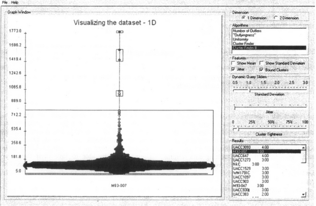
Figure 4 Prototype panel to enable user specification of 1-dimensional distnbution requirements. User has chosen the Cluster Finder II algorithm that ranks all distributions according to the number of identifiable clusters, while allowing users to specify Cluster Tightness with a slider (Implemented by Kartik Parija and Jaime Spacco).
A second case study is our work with time-series pattern finding.20 Current tools for stock market or genomic expression data from DNA microarrays rely on clustering in multidimensional space, but a more user-controlled specification tool might enable analysts to carefully specify what they want.21 Our efforts to build a tool, TimeSearcher, have relied on query specification by drawing boxes to indicate what ranges of values are desired for each time period (Figure 5). It has more of the spirit of hypothesis testing. While this takes somewhat greater effort, it gives users greater control over the query results. Users can move the boxes around in a direct manipulation style and immediately see the new set of results. The opportunity for rapid exploration is dramatic and users can immediately see where matches are frequent and where they are rare.

Figure 5 TimeSearcher allows users to specify ranges for time-series data and immediately see the result set. In this case two timeboxes have been drawn and five of the 224 stocks match this pattern.21
Conclusion and Recommendations
Computational tools for discovery, such as data mining and information visualization have advanced dramatically in recent years. Unfortunately, these tools have been developed by largely separate communities with different philosophies. Data mining and machine learning researchers tend to believe in the power of their statistical methods to identify interesting patterns without human intervention. Information visualization researchers tend to believe in the importance of user control by domain experts to produce useful visual presentations that provide unanticipated insights.
Recommendation 1: integrate data mining and information visualization to invent discovery tools. By adding visualization to data mining (such as presenting scattergrams to accompany induced rules), users will develop a deeper understanding of their data. By adding data mining to visualization (such as the Spotfire View Tip), users will be able to specify what they seek. Both communities of researchers emphasize exploratory data analysis over hypothesis testing. A middle ground of enabling users to structure their exploratory data analysis by applying their domain knowledge (such as limiting data mining algorithms to specific range values) may also be a source of innovative tools.
Recommendation 2: allow users to specify what they are seeking and what they find interesting. By allowing data mining and information visualization users to constrain and direct their tools, they may produce more rapid innovation. As in the Spotfire View Tip example, users could be given a control panel to indicate what kind of correlations or outliers they are looking for. As users test their hypotheses against the data, they find dead ends and discover new possibilities. Since discovery is a process, not a point event, keeping a history of user actions has a high payoff. Users should be able to save their state (data items and control panel settings), back up to previous states, and send their history to others.
Recommendation 3: recognize that users are situated in a social context. Researchers and practitioners rarely work alone. They need to gather data from multiple sources, consult with domain experts, pass on partial results to others, and then present their findings to colleagues and decision makers. Successful tools enable users to exchange data, ask for consultations from peers and mentors, and report results to others conveniently.
Recommendation 4: respect human responsibility when designing discovery tools. If tools are comprehensible, predictable and controllable, then users can develop mastery over their tools and experience satisfaction in accomplishing their work. They want to be able to take pride in their successes and they should be responsible for their failures. When tools become too complex or unpredictable, users will avoid their use because the tools are out of their control. Users often perform better when they understand and control what the computer
If complex statistical algorithms or visual presentations are not well understood by users they cannot act on the results with confidence. The author believes that visibility of the statistical processes and outcomes minimizes the danger of misinterpretation and incorrect results. Comprehension of the algorithms behind the visualizations and the implications of layout encourage effective usage that leads to successful discovery.
Acknowledgments
Thanks to Mary Czerwinski, Lindley Darden, Harry Hochheiser, Jenny Preece, and Ian Witten for comments on drafts.
References
1. Weizenbaum, J. Computer Power and Human Reason: From Judgment to Colculation. W. H. Freeman and Co.; 1976.
2. Fisher, RA. The Design of Experiments, 9th edition. San Francisco, CA: Macmillan; 1971.
3. Montgomery, D. Design and Analysis of Experiments, 3rd edn. New York: Wiley; 1991.
4. Fayyad U, Piatetsky-Shapiro G, Smyth P, Uthurusamy R, eds. Advances in Knowledge Discovery and Data Mining. New York: MIT Press, 1996.
5. Han, J, Kamber, M. Data Mining: Concepts and Techniques. Cambridge, MA: Morgan Kaufmann Publishers; 2000.
6. Witten, I, Frank, E. Data Mining: Practical Machine Learning Tools and Techniques with Java Implementations. San Francisco: Morgan Kaufmann Publishers; 2000.
7. Card S, Mackinlay J, Shneiderman B, eds. Readings in Information Visualization: Using Vision to Think. San Francisco: Morgan Kaufmann Publishers, 1999.
8. Spence, R. Information Visualization. San Francisco, CA: Addison-Wesley; 2001.
9. Available at: http://stat/bell-labs. com/who/tukey/memo/techtools/html. Tukey, J. The technical tools of statistics. American Statistician. 1965; 19:23–28.
10. Westphal, C, Blaxton, T. Data Mining Solutions: Methods and Tools for Solving Real-World Problems. Essex, England: John Wiley & Sons; 1999.
11. Hinneburg, A, Keim, D, Wawryniuk, M. HD-Eye: Visual mining of high-dimensional data. IEEE Computer Graphics and Applications. 1999; 19:22–31.
12. Ankerst, M, Ester, M, Kriegel, H-P. Towards an effective cooperation of the user and the computer for classification. In: Proceedings of 6th ACM SIGKDD International Conference on Knowledge Discovery and Data Mining. New York: ACM; 2000:179–188.
13. Ware, M, Frank, E, Holmes, G, Hall, M, Witten, IH. Interactive machine learning: Letting users build classifiers. International Journal of Human-Computer Studies. 2001; 55:281–292.
14. Fayyad U, Grinstein GG, Wierse A, eds. Information Visualization in Data Mining and Knowledge Discovery. New York: Morgan Kaufmann Publishers, 2002.
15. Tukey, J. Exploratory Data Analysis. San Francisco: Addison-Wesley; 1977.
16. Williamson, C, Shneiderman, B. The Dynamic HomeFinder: Evaluating dynamic queries in a real-estate information exploration system. In: Proceedings of ACM SIGIR’92 Conference. Reading, MA: ACM Press; 1992:338–346.
17. Shneiderman, B. Dynamic queries for visual information seeking. IEEE Software. 1994; 11:70–77.
18. Ahlberg, C, Shneiderman, B. Visual Information Seeking: Tight coupling of dynamic query filters with starfield displays. In: Proceedings of ACM CHI ’94 Human Factors in Computing Systems. New York: ACM Press; 1994:313–317.
19. Barnett, V, Lewis, T. Outliers in Statistical Data, 3rd edn. New York: John Wiley & Son Ltd; 1994.
20. Bradley, E. Time-series analysis. In: Berthold M, Hand E, eds. Intelligent Data Analysis: An Introduction. Chichester: Springer, 1999.
21. Hochheiser, H, Shneiderman, B. Interactive exploration of time-series data. In: Proc. Discovery Science. Berlin: Springer; 2001.
22. Koenemann, J, Belkin, N. A case for interaction: A study of interactive information retrieval behavior and effectiveness. In: Proceedings of CHI ’96 Human Factors in Computing Systems. Berlin: ACM Press; 1996:205–212.
†Keynote for Discovery Science 2001 Conference, November 25–28, 2001, Washington, DC.