LifeLines: Using Visualization to Enhance Navigation and Analysis of Patient Records
Catherine Plaisant, PhD, Richard Mushlin, PhD*, Aaron Snyder, MD**, Jia Li, Dan Heller and Ben Shneiderman, PhD, Human-Computer Interaction Laboratory, University of Maryland Institute for Advanced Computer Studies
LifeLines provide a general visualization environment for personal histories. We explore its use for clinical patient records. A Java user interface is described, which presents a one-screen overview of a computerized patient record using timelines. Problems, diagnoses, test results or medications can be represented as dots or horizontal lines. Zooming provides more details; line color and thickness illustrate relationships or significance. The visual display acts as a giant menu, giving direct access to the data.
INTRODUCTION
Computerized medical records pose tremendous problems to system developers. Infrastructure and privacy issues need to be resolved before physicians can even start using the records. Non-intrusive hardware might be required for physicians to do their work (i.e. interview patients) away from their desks and cumbersome workstations. But all the efforts to solve such problems will only succeed if appropriate attention is also given to the design of the user interface [1]. Long lists to scroll, endless menus to navigate and lengthy dialogs can lead to user rejection. But techniques are being developed to summarize, filter and present large amounts of information [2], leading us to believe that rapid access to needed data is possible with careful design.
While more attention is now put on developing standards for gathering medical records, still too little effort is devoted to designing appropriate visualization and navigation techniques for presenting and exploring personal history records. One possible, intuitive, approach to visualizing histories is to use graphical time series [3]. The consistent, linear time scale facilitates making comparisons and relationships between the quantities displayed. Data can be graphed on the timeline to show time evolution of quantitative data. Highly interactive interfaces turn the display into a meaningfully structured menu with direct access to whatever data is needed to review a patient record.
RELATED WORK
The use of overviews or summaries has been well studied: the Summary Time-Oriented Record, a pure text flowchart, was found helpful in an arthritis clinic [4]. Summary visualization software for intensive care data includes notions of filtering, severity scaling, and details on demand [5]. Tufte [6] describes timelines as a frequent and powerful form of graphic design, and presents many examples. A design using timelines for medical records was proposed by Powsner and Tufte [7], who developed a graphical summary using a table of individual plots of test results and treatment data. A few projects have proposed interactive personal histories. The TeleMed project [8] uses icons on a web timeline to summarize patient records. Cousin and Khan [9] have explored in depth the use of timelines and the problem of aggregation for drug data.
Our work on the visualization of personal histories started with a project with the Maryland Department of Juvenile Justice (DJJ). We developed LifeLines to represent youth records (including, cases, placements, worker assignments and reviews) [10]. LifeLines were designed to 1) present a personal history overview on a single screen, 2) provide direct access to all detailed information from the overview with one or two clicks of the mouse, and 3) make critical information or alerts visible at the overview level.
An experiment was conducted to study the benefits of such a graphical interface [11]. Thirty-six participants used a static version of either LifeLines or a tabular representation to answer questions about a database of personal history information. Results suggest that, overall, the LifeLines representation led to much faster response times (up to 50% faster), primarily for questions that involved interval comparisons and inter-categorical connections. A post-experimental memory test led to significantly (p < .004) higher recall with LifeLines. Finally, simple interaction techniques were proposed to enhance LifeLines’ ability to deal with precise dates, attribute coding, and overlaps.
EXPLORING LIFELINES
Background
In our first exploration of LifeLines for medical records [3][10] we drew paper mockups of colorful series of timelines for consultations, medical conditions, documents, hospitalizations and medications. Each physician was assigned a different color, tying documents and medications to the originating physician. Icons were used for discrete events like consultation letters or tests; lines depicted continuous episodes such as conditions or hospital stays.
In 1997, collaboration was started between IBM Research and the University of Maryland to design and build a web prototype of LifeLines for computerized patient records. Our basis for modeling the record was a newly operational clinical information system at Kaiser Permanente Colorado [12]. We are now working closely with Kaiser’s physicians to test our prototype using real data. This paper reports on our progress, and demonstrates how LifeLines can be useful in presenting a structured patient chart, and how it can facilitate navigation and analysis of the computerized medical record.
Description of the LifeLines display
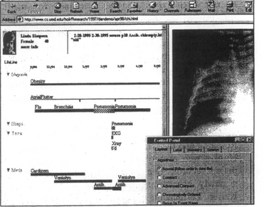
In LifeLines, the medical record is summarized as a set of lines and events on a zoom-able timeline. Figure 1 shows an example based on a real record. The display shows data spanning about 6 months. The current date (frozen as mid February for demonstration purposes) is on the right side of the display, indicated by a thin vertical line. Aspects of the record are grouped in facets: problems, allergies, diagnosis, labs, imaging, medications, immunizations, etc. At the top, problems are shown as lines. When a problem becomes inactive the line stops (e.g. “smoker”). Color can be used to indicate severity or type (e.g. the migraine and seizure problems are red’ because their status is marked as “alert”. Severe allergies are red as well.)

Figure 1 This patient has several problems and has been in the office about every two weeks. The elements seen as particularly significant, the severe headaches, the seizure disorder, and the multiple severe drug allergies are easily spotted because they are marked in red† in the interface. Temporal relationships and links across different sections of the record are made apparent (e.g., the temporal coincidence between the constipation and the closely preceding admin- istration of meperidine is suspicious.
Similar diagnoses are grouped on common lines. The “migraine headache” lines show all dates where a migraine headache diagnosis was rendered. Two lab results are shown. One stands out in red since its status was abnormal. Series of similar labs would be grouped together on a line. Drug class has been used to group medications, with each mark representing a prescription date.
The first glance at the LifeLines display tells that this patient has several problems and has been in the office about every two weeks. It shows a series of concurrent problems and multiple medications. The elements seen as particularly significant, the severe headaches, the seizure disorder, and the multiple severe drug allergies are easily spotted because they are marked in red†. One can glance down from the headache line to the diagnosis section and see that the diagnosis of migraine headache was made soon after the problem presented, and review the evolution of its treatment. Correlation and its absence can be sought by scanning vertically and horizontally. For instance, it is suspicious that the constipation in 2/98 was closely preceded by a meperidine injection. After noticing that the Dilantin prescription has been continued, one can assess whether a blood level check that has not been done for several months is indicated at this time.
The patient whose record is shown in Figure 1 is quite sick and has had many clinical encounters. For comparison, imagine a healthy woman coming for a routine heath maintenance examination. A glance at her ten-year LifeLines display might reveal that this patient had a sparse record with only a few red events. The test facet might show that the last mammography was done five years ago, that Pap smears were done regularly, and that one of them was abnormal but was immediately followed by a normal Pap. Immunizations could be reviewed as well. This overall analysis could be done at a glance, while it might have taken several screens to gather this information across multiple sections of a traditional computerized record.
Dynamics and overall user interface description
Static visualizations such as the screen shown in Figure 1 can be enhanced by an interactive interface. The current prototype of Lifelines is implemented in Java and runs on the Internet.
Details on demand
All events visible on the display form a giant menu giving rapid access to detailed information (triggered by a double click on the event.) The detailed information appears in a separate page covering part of the display or optimally in tiled windows on the side (Figure 2.) In many cases, reviewing a long label containing simple text information might be sufficient (e.g. to read the ordering physician’s name or the drug dosage). As users move their cursor over an event on a LifeLine, the long label of the event appears in the upper textbox next to the patient’s general information (which gives age, gender, possibly a photo, etc.)
Zooming
Zooming in and out (or in this case “rescaling”) can be done either by using the zoom-and-pan slider at the bottom of the display, or by clicking on the background of the image near the events that should end-up in the center of the zoomed image. A right-button click on the background zooms out again. Zooming in and out reveals different levels of detail.
Highlighting relationships
In addition to the implicit vertical and horizontal relationships, searches can be performed on the entire record, highlighting all parts of the record that match. In Figure 3, a simple text search for “migraine” was performed. Highlighted are all the drugs whose indication was migraine, all complaints explained by the diagnosis migraine, etc.

Figure 3 Here, a search for migraine selected al the events containing migraine in their description: complaints whose explanation were migraine, drugs whose indication was migraine, etc
Note the top facets, problems, allergies, and diagnosis have been closed, leaving only their “silhouettes”. The silhouette of diagnosis shows that many visits were related to the migraine. More complex relationships could be computed and selected from menus or query forms (e.g. show all events linked to a given insurance claim.)
Coding attributes
Control panels are available to setup the mapping of the main display attributes (label, color and line thickness) to the data attributes. The most obvious choice is to map severity or status to color and use red to show alerts or severe events. Drugs can be color coded by indication or by class. On the other hand, an administrator might chose to map cost or payment status to the color attribute, and map severity to the size of the line.
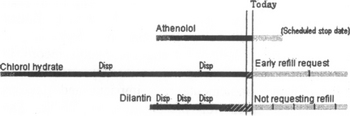
In the example of Figure 1, color and size are not used very much, mainly because we explored in this example how an existing, “real-life”, computerized record could be displayed with LifeLines. Although this particular patient did not exhibit large variations in the display-mapped data attributes, a variety of useful mappings can be configured. For example, many drugs have a predictable range of dosage, and this data attribute makes effective use of the line thickness. Problems may vary in severity and be shown by lines of varying size, reserving color for other attributes such as body system. Prescription management might benefit from information about a prescription’s expected duration (derived from dosage and number of refills.) LifeLines could easily represent the expected end of the medication supply, or calculate the approximate refill request date if several refills are authorized. Figure 4 depicts the details of the dispense cycle for three prescriptions. Actual refills requested by the patient are shown in the past, while estimates are shown in the future following the “today” line. Using LifeLines it becomes possible to see when refills are being requested on time, too soon, or too late, using red to highlight possible overuse or under-use.
Outlining
Simple records of mostly healthy patients can fit easily in a small part of the display. But crowding problems arise when the time span, the number of facets, lines and events increases significantly. Zooming and summarization mostly takes care of the horizontal crowding, but vertical crowding remains a challenge to provide a global overview of the record. To address this problem, facets can be opened and closed in an outliner fashion. A closed facet only reveals the “silhouette” of the record (i.e. compacted lines with no Jabels, but color is preserved). Those silhouettes are useful to estimate the volume and type of information available and to guide users to the most important parts of the record. For example when the test facet is closed, one can still spot the presence and location of red dots. Bringing the cursor on a dot reveals its label, while a double click brings the detail in the detail window on the right. Opening and closing facets allows the user to dedicate screen space to the subjectively interesting topics, while maintaining access to, and more importantly, awareness of, the silhouetted information. For complex records, a hierarchy of facets may be needed, along with an optimization strategy for closing facets to get screen space. In all cases, offering users control panels to indicate their preferences is important.
Summarizing
Another way to deal with large records is to allow summarization of the events. Our architecture allows a set of events within a facet to be recursively aggregated and replaced with summary events. For example a series of athenolol prescriptions can be aggregated in a simple event, while series of athenolol and propanolol can be aggregated as beta-blockers (Figure 5).

DATA ARCHITECTURE
We developed a general information architecture for personal history data [13]. Our focus was on medical patient records, but the design is applicable as well to other, simpler domains such as juvenile justice or personal resumes. Our model of personal history data groups events into aggregates that are contained in facets. Explicit and implicit links enable the representation of arbitrary relationships across events and aggregates. Data attributes such as severity, status, cost, dosage, etc., can be mapped to visual attributes such as label, color and line thickness. Data administrators set default profiles, while end-users have powerful controls over the display contents and personalized mapping of data attributes to display attributes to fit their tasks. For prototyping purposes the data is stored in an Access database, while the attribute mapping control panel generates the runtime data used by the LifeLines Java applet.
CONCLUSION
We have designed and implemented a visualization technique called LifeLines, and have begun testing it on real clinical data. Using the familiar metaphor of timelines, LifeLines takes advantage of our ability to visually analyze information-abundant displays, and facilitates access to the details in the record. We believe that such an interface can have a significant influence on the usability and overall impact of electronic medical records.
There are implications as well for the form of the medical record. The modern paper medical record revolves around progress notes. The progress note collects the details of the clinical situation at hand, coordinates those details temporally and causally, and gives commentary on both data and conclusions. If the computerized record increases access to details, then textual collections of data, such as review of systems, may become less useful. If LifeLines adds a clear and accessible view of temporal and causal relationships, then the main task left for the progress note might be to provide commentary. If so, then a computerized patient record using LifeLines may inspire, and perhaps require, a different role and format for progress notes.
Acknowledgements
We greatly appreciate the support provided by IBM through its Shared University Research program, and NSF (IRI 96–15534). We greatly thank Anne Rose for her contribution to the early designs of LifeLines, and John Karat for making the collaboration with IBM a reality.
Contact information
Catherine Plaisant, HCIL, UMIACS, A.V. Williams building, University of Maryland, College Park, MD 20742, [email protected].
HCIL URL: www.es.umd.edu/heil.
References
1. Dewey, J. D., Manning, P., Brandt, S. Acceptance of direct physician access to a computer based patient record in a managed care setting. In: Proc. 17th Symposium on Computer Applications in Medical Care. AMIA; 1993:79–83.
2. Card Stuart, Mackinlay Jock, Shneiderman Ben, eds. Readings in Information Visualization: Using Vision to Think. Washington DC: Morgan Kaufmann Publishers, 1998.
3. Plaisant, P., Rose, A. Exploring LifeLines to Visualize Patient records. In: Poster summary in 1996 American Medical Informatics Association Annual Fall Symposium. AMIA; 1996:884.
4. Whiting-O’Keefe, Q. E., Simbork, D. W., Epstein, W. V., Warger, A. A Computerized summary medical record system can provide more information than the standard medical record. JAMA. 1985; 254:1185–1192.
5. November 24 Factor, M., Gelernter, D. H., Kolb, C. E., Miller, P. L., Sittig, D. F. Real-time data fusion in the intensive care unit. IEEE Computer. 1991; 45–54.
6. Tufte, E. R. The Visual Display of Quantitative Information. Bethesda MD: Graphics Press; 1983.
7. Aug 6 Powsner, S. M., Tufte, E. R. Graphical summary of patient status. The Lancet. 1994; 344:386–389.
8. (Aug. 97) Kilman, D., Forslund, D. An international collaboratory based on virtual patient records. Comm. of the ACM. 1997; Vol. 40(8):111–117.
9. Cousins, S., Kahn, M. The visual display of temporal information. Artificial Intelligence in Medicine. 1991; 3:341–357.
10. Plaisant, C., Milash, B., Rose, A., Widoff, S., Shneiderman, B. LifeLines: Visualizing Personal Histories. In: Proc. of Human-Factors in Computing Systems, CHI’ 96. Cheshire, Connecticut: ACM; 1996.
11. (to appear) Lindwarm, D., Rose, A., Plaisant, C., Norman, K. Viewing personal history records: A comparison of tabular format and graphical presentation using LifeLines. Behaviour & Information Technology. 1998.
12. (accepted for presentation at TEPR, San Antonio, TX, May 9–16, 1998) Rose, J. R., Gapinski, M., Lum, A., Pote, J., Hushka, G., The Rocky Mountain Kaiser Permanente Clinical Information System, a computerized ambulatory electronic health record in large scale: strategy, vision, functionality, architecture, management, implementation, impact, and lessons learned, 1998.
13. (to appear, 1998) Plaisant, C., Shneiderman, B., Mushlin, R. An information architecture to support the visualization of personal histories. International Journal of Information Processing and Management. 1998.