
Data exploration is generally performed by presenting a meaningful synthesis of its distribution—it could be through a sequence of graphs, by describing it with a set of numerical parameters, or by approximating it with simple functions. Now let's explore different possibilities, and how to accomplish them with different tools in the SciPy stack.
The type of graph depends on the type of variable (categorical, quantitative, or dates).
When our data is described in terms of categorical variables, we often use pie charts or bar graphs to represent it. For example, we access the Consumer Complaint Database from the Consumer Financial Protection Bureau, at http://catalog.data.gov/dataset/consumer-complaint-database. The database was created in February 2014 to contain complaints received by the Bureau about financial products and services. In its updated version in March of the same year, it consisted of almost 300,000 complaints acquired since November 2011:
In [1]: import numpy as np, pandas as pd, matplotlib.pyplot as plt
In [2]: data = pd.read_csv("Consumer_Complaints.csv",
   ...:                     low_memory=False, parse_dates=[8,9])
In [3]: data.head()
Out[3]:
   Complaint ID                  Product
0       1015754          Debt collection
1       1015827          Debt collection
2       1016131          Debt collection
3       1015974  Bank account or service
4       1015831  Bank account or service

                        Sub-product
0  Other (phone, health club, etc.)
1                               NaN
2                           Medical
3                  Checking account
4                  Checking account

                                   Issue
0  Cont'd attempts collect debt not owed
1    Improper contact or sharing of info
2        Disclosure verification of debt
3  Problems caused by my funds being low
4  Problems caused by my funds being low

                              Sub-issue State  ZIP code
0                         Debt was paid    NY     11433
1     Contacted me after I asked not to    VT      5446
2  Right to dispute notice not received    TX     77511
3                                   NaN    FL     32162
4                                   NaN    TX     77584

  Submitted via Date received Date sent to company
0           Web    2014-09-05           2014-09-05
1           Web    2014-09-05           2014-09-05
2           Web    2014-09-05           2014-09-05
3           Web    2014-09-05           2014-09-05
4           Web    2014-09-05           2014-09-05

                                             Company
0                     Enhanced Recovery Company, LLC
1                     Southwest Credit Systems, L.P.
2                      Expert Global Solutions, Inc.
3  FNIS (Fidelity National Information Services, ...
4                                     JPMorgan Chase

                  Company response Timely response?
0  Closed with non-monetary relief              Yes
1                      In progress              Yes
2                      In progress              Yes
3          Closed with explanation              Yes
4          Closed with explanation              Yes

  Consumer disputed?
0                NaN
1                NaN
2                NaN
3                NaN
4                NaN
Tip
We downloaded the database in the simplest format they offer, a comma-separated-value file. We do so from pandas with the command read_csv. If we want to download the database in other formats (JSON, excel, and so on), we only need to adjust the reading command accordingly:
>>> pandas.read_csv("Consumer_Complaints.csv")    # CSV
>>> pandas.read_json("Consumer_Complaints.json")  # JSON
>>> pandas.read_excel("Consumer_Complaints.xls")  # XLS
Even more amazingly so, it is possible to retrieve the data online (no need to save it to our computer), if we know its URL:
>>> url1 = "https://data.consumerfinance.gov/api/views"
>>> url2 = "/x94z-ydhh/rows.csv?accessType=DOWNLOAD"
>>> url = url1 + url2
>>> data = pd.read_csv(url)
If the database contains trivial data, the parser might get confused with the corresponding dtype. In that case, we request the parser to try and resolve that situation, at the expense of using more memory resources. We do so by including the optional Boolean flag low_memory=False, as was the case in our running example.
Also, note how we specified parse_dates=True. An initial exploration of the file with the data showed that both the eighth and ninth columns represent dates. The library pandas has great capability to manipulate those without resorting to complicated str operations, and thus we indicate to the reader to transform those columns to the proper format. This will ease our treatment of the data later on.
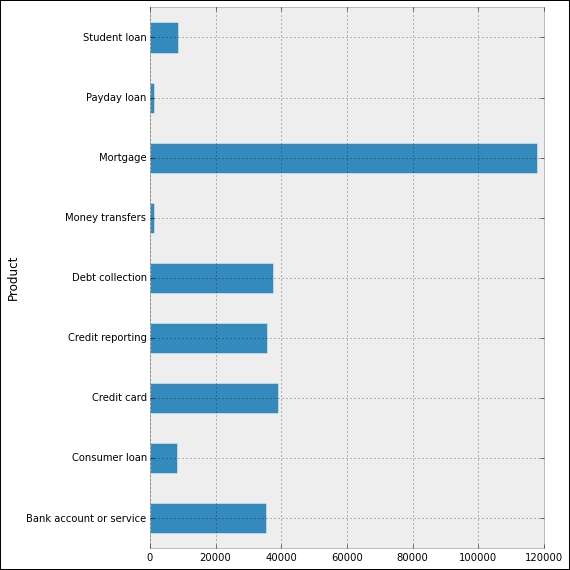
Now let's present a bar plot indicating how many of these different complaints per company are on each Product:
In [4]: data.groupby('Product').size()
Out[4]:
Product
Bank account or service     35442
Consumer loan                8187
Credit card                 39114
Credit reporting            35761
Debt collection             37737
Money transfers              1341
Mortgage                   118037
Payday loan                  1228
Student loan                 8659
dtype: int64
In [5]: _.plot(kind='barh');
   ...: plt.tight_layout();
   ...: plt.show()
This gives us the following interesting horizontal bar plot, showing the volume of complaints for each different product, from November 2011 to September 2014:
Note
The groupby method on pandas dataframes is equivalent to GROUP BY in SQL. For a complete explanation of all SQL commands and their equivalent dataframe methods in pandas, there is a great resource online at http://pandas.pydata.org/pandas-docs/stable/comparison_with_sql.html.
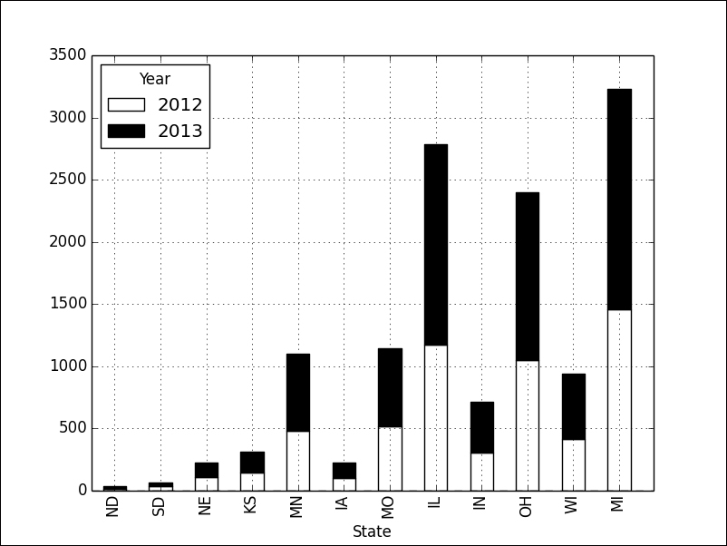
Another informative bar plot is achieved by stacking the bars properly. For instance, if we focus on complaints about mortgages in the Midwest during the years 2012 and 2013, we could issue the following commands:
In [6]: midwest = ['ND', 'SD', 'NE', 'KS', 'MN', 'IA',
                   'MO', 'IL', 'IN', 'OH', 'WI', 'MI']
In [7]: df = data[data.Product == 'Mortgage'];
   ...: df['Year'] = df['Date received'].map(lambda t: t.year);
   ...: df = df.groupby(['State','Year']).size();
   ...: df[midwest].unstack().ix[:, 2012:2013]
Out[7]:
Year   2012  2013
State
ND       14    20
SD       33    34
NE      109   120
KS      146   169
MN      478   626
IA       99   125
MO      519   627
IL     1176  1609
IN      306   412
OH     1047  1354
WI      418   523
MI     1457  1774
In [8]: _.plot(kind="bar", stacked=True, colormap='Greys');
   ...: plt.show()
The graph clearly illustrates how the year 2013 gave rise to a much higher volume of complaints in these states:
We may be inclined to think, in view of the previous graphs, that in every state or territory of the United States, mortgages are the number one complaint. A pie chart showing the volumes of complaints per product in Puerto Rico alone, from November 2011 until September 2014, tells us differently:
In [9]: data[data.State=='PR'].groupby('Product').size()
Out[9]:
Product
Bank account or service     81
Consumer loan               20
Credit card                149
Credit reporting           139
Debt collection             62
Mortgage                   110
Student loan                11
Name: Company, dtype: int64
In [10]: _.plot(kind='pie', shadow=True, autopct="%1.1f%%");
   ....: plt.axis('equal');
   ....: plt.tight_layout();
   ....: plt.show()
The diagram illustrates how credit cards and credit reports are the main source for complaints on these islands:

For quantitative variables, we employ a histogram. In the previous section, we saw an example of the construction of a histogram from 10,000 throws of four dice. In this section, we produce another histogram from within pandas. In this case, we would like to present a histogram that analyzes the ratio of daily complaints about credit cards against the daily complaints on mortgages:
In [11]: df = data.groupby(['Date received', 'Product']).size();
   ....: df = df.unstack()
In [12]: ratios = df['Mortgage'] / df['Credit card']
In [13]: ratios.hist(bins=50);
   ....: plt.show()
The resulting graph indicates, for instance, that there are a few days in which the number of complaints on mortgages is about 12 times the number of complaints on credit cards. It also shows that the most frequent situation is that of days in which the number of complaints on mortgages roughly triplicates the number of credit card complaints:

For variables measured at intervals over time, we employ a time plot. The library pandas handles these beautifully. For instance, to observe the amount of daily complaints received from January 1, 2012 to December 31, 2013, we issue the following command:
In [14]: ts = data.groupby('Date received').size();
   ....: ts = ts['2012':'2013'];
   ....: ts.plot();
   ....: plt.ylabel('Daily complaints');
   ....: plt.show()
Note both the oscillating nature of the graph, as well as the slight upward trend in complaints during this period. We also observe what looks like a few outliers—one in March 2012, a few more in between May and June of the same year, and a few more in January and February 2013:

We request the usual parameters for each dataset:
- Mean (arithmetic, geometric or harmonic) and median to measure the center of the data
- Quartiles, variance, standard deviation, or standard error of the mean, to measure the spread of the data
- Central moments, skewness, and kurtosis to measure the degree of symmetry in the distribution of the data
- Mode to find the most common values in the data
- Trimmed versions of the previous parameters, to better describe the distribution of the data reducing the effect of outliers
A good way to present some of the preceding information is by means of the five-number summary, or with a boxplot.
Let's illustrate how to achieve these basic measurements both in pandas (left columns) and with the scipy.stats libraries (right columns):
In [15]: ts.describe()                 In [16]: import scipy.stats
Out[15]:
count     731.000000                   In [17]: scipy.stats.describe(ts)
mean      247.333789                   Out[17]:
std       147.02033                    (731,
min         9.000000                   (9, 628),
25%       101.000000                    247.33378932968537,
50%       267.000000                    21614.97884301858,
75%       364.000000                    0.012578861206579875,
max       628.000000                    -1.1717653990872499)
dtype: float64
This second output presents us with count (731 = 366 + 365), minimum and maximum values (min=9, max=628), arithmetic mean (247), unbiased variance (21614), biased skewness (0.0126), and biased kurtosis (-1.1718).
Other computations of parameters, with both pandas (mode and standard deviation) and scipy.stats (standard error of the mean and trimmed variance of all values between 50 and 600):
In [18]: ts.mode()               In [20]: scipy.stats.sem(ts)
Out[18]:                         Out[20]: 5.4377435122312807
0    59
dtype: int64                     In [21]: scipy.stats.tvar(ts, [50, 600])
                                 Out[21]: 17602.318623850999
In [19]: ts.std()
Out[19]: 147.02033479426774
Tip
For a complete description of all statistical functions in the scipy.stats library, the best reference is the official documentation at http://docs.scipy.org/doc/scipy/reference/stats.html.
It is possible to ignore NaN values in the computations of parameters. Most dataframe and series methods in pandas do that automatically. If a different behavior is required, we have the ability to substitute those NaN values for anything we deem appropriate. For instance, if we wanted any of the previous computations to take into account all dates and not only the ones registered, we could impose a value of zero complaints in those events. We do so with the method dataframe.fillna(0).
With the library scipy.stats, if we want to ignore NaN values in an array, we use the same routines appending the keyword nan before their name:
>>> scipy.stats.nanmedian(ts)
267.0
In any case, the time series we computed shows absolutely no NaNs—there were at least nine daily financial complaints each single day in the years 2012 and 2013.
Going back to complaints about mortgages on the Midwest, to illustrate the power of boxplots, we are going to inquire in to the number of monthly complaints about mortgages in the year 2013, in each of those states:
In [22]: in_midwest = data.State.map(lambda t: t in midwest);
   ....: mortgages = data.Product == 'Mortgage';
   ....: in_2013 =data['Date received'].map(lambda t: t.year==2013);
   ....: df = data[mortgages & in_2013 & in_midwest];
   ....: df['month'] = df['Date received'].map(lambda t: t.month);
   ....: df = df.groupby(['month', 'State']).size();
   ....: df.unstack()
Out[22]:
State  IA   IL  IN  KS   MI  MN  MO  ND  NE   OH  SD  WI
month
1      11  220  40  12  183  99  91   3  13  163   5  58
2      14  160  37  16  180  45  47   2  12  120 NaN  37
3       7  138  43  18  184  52  57   3  11  131   5  50
4      14  148  33  19  185  55  52   2  14  104   3  48
5      14  128  44  16  172  63  57   2   8  109   3  43
6      20  136  47  13  164  51  47 NaN  13  116   7  52
7       5  127  30  16  130  57  62   2  11  127   5  39
8      11  133  32  15  155  64  55 NaN   8  120   1  51
9      10  121  24  16   99  31  55 NaN   8  109 NaN  37
10      9   96  35  12  119  50  37   3  10   83 NaN  35
11      4  104  22  10   96  22  39   2   6   82   3  32
12      6   98  25   6  107  37  28   1   6   90   2  41
In [23]: _.boxplot();
   ....: plt.show()
This boxplot illustrates how, among the states in the Midwest—Illinois, Ohio, and Michigan have the largest amount of monthly complaints on mortgages. In the case of Michigan (MI), for example, the corresponding boxplot indicates that the spread goes from 96 to 185 monthly complaints. The median number of monthly complaints in that state is about 160. The first and third quartiles are, respectively, 116 and 180:

A violin plot is a boxplot with a rotated kernel density estimation on each side. This shows the probability density of the data at different values. We can obtain these plots with the graphical routine violinplot from the statsmodels submodule graphics.boxplots. Let's illustrate this kind of plot with the same data as before:
In [24]: from statsmodels.graphics.boxplots import violinplot
In [25]: df = df.unstack().fillna(0)
In [26]: violinplot(df.values, labels=df.columns);
   ....: plt.show()

To express the relationship between two quantitative variables, we resort to three techniques:
- A scatterplot to visually identify that relationship
- The computation of a correlation coefficient that expresses how likely that relationship is to be formulated by a linear function
- A regression function as a means to predict the value of one of the variables with respect to the other
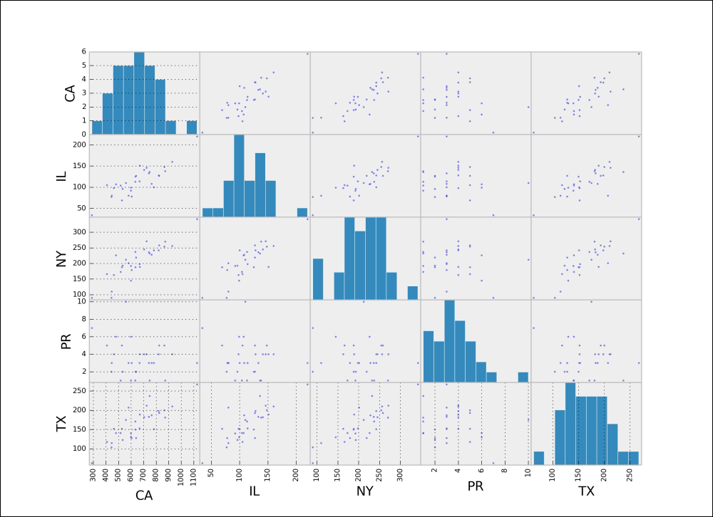
For example, we are going to try to find any relation among the number of complaints on mortgages among four populous states—Illinois, New York, Texas, and California—and the territory of Puerto Rico. We will compare the number of complaints in each month from December 2011 to September 2014:
In [27]: from pandas.tools.plotting import scatter_matrix
In [28]: def year_month(t):
   ....:     return t.tsrftime("%Y%m")
   ....:
In [29]: states = ['PR', 'IL', 'NY', 'TX', 'CA'];
   ....: states = data.State.map(lambda t: t in states);
   ....: df = data[states & mortgages];
   ....: df['month'] = df['Date received'].map(year_month);
   ....: df.groupby(['month', 'State']).size().unstack()
Out[29]:
State      CA   IL   NY  PR   TX
month
2011/12   288   34   90   7   63
2012/01   444   77   90   2  104
2012/02   446   80  110   3  115
2012/03   605   78  179   3  128
2012/04   527   69  188   5  152
2012/05   782  100  242   3  151
2012/06   700  107  204 NaN  153
2012/07   668  114  198   3  153
2012/08   764  108  228   3  187
2012/09   599   92  192   1  140
2012/10   635  125  188   2  150
2012/11   599   99  145   6  130
2012/12   640  127  219   2  128
2013/01  1126  220  342   3  267
2013/02   928  160  256   4  210
2013/03   872  138  270   1  181
2013/04   865  148  254   5  200
2013/05   820  128  242   4  198
2013/06   748  136  232   1  237
2013/07   824  127  258   5  193
2013/08   742  133  236   3  183
2013/09   578  121  203 NaN  178
2013/10   533   96  193   2  123
2013/11   517  104  173   1  141
2013/12   463   98  163   4  152
2014/01   580   80  201   3  207
2014/02   670  151  189   4  189
2014/03   704  141  245   4  182
2014/04   724  146  271   4  212
2014/05   559  110  212  10  175
2014/06   480  107  226   6  141
2014/07   634  113  237   1  171
2014/08   408  105  166   5  118
2014/09     1  NaN    1 NaN    1
In [30]: df = _.dropna();
   ....: scatter_matrix(df);
   ....: plt.show()
This gives the following matrix of scatter plots between the data of each pair of states, and the histogram of the same data for each state:
For a grid of scatter plots with confidence ellipses added, we can use the routine scatter_ellipse from the graphics module graphics.plot_grids of the package statsmodels:
In [31]: from statsmodels.graphics.plot_grids import scatter_ellipse
In [32]: scatter_ellipse(df, varnames=df.columns);
   ....: plt.show()

Note how each image comes with an extra piece of information. This is the corresponding correlation coefficient of the two variables (Pearson's, in this case). Data that appears to be almost perfectly aligned gets a correlation coefficient very close to 1 in the absolute value. We can obtain all these coefficients as the pandas dataframe method corr as well:
In [33]: df.corr(method="pearson")
Out[33]:
State        CA        IL        NY        PR        TX
State
CA     1.000000  0.844015  0.874480 -0.210216  0.831462
IL     0.844015  1.000000  0.818283 -0.141212  0.805006
NY     0.874480  0.818283  1.000000 -0.114270  0.837508
PR    -0.210216 -0.141212 -0.114270  1.000000 -0.107182
TX     0.831462  0.805006  0.837508 -0.107182  1.000000
Tip
Besides the standard Pearson correlation coefficients, this method allows us to compute Kendall Tau for ordinal data (kendall) or Spearman rank-order (spearman):
In the module scipy.stats, we also have routines for the computation of these correlation coefficients.
pearsonrfor Pearson's correlation coefficient and the p-value for testing noncorrelationspearmanrfor the Spearman rank-order correlation coefficient and the p-value to test for noncorrelationkendalltaufor Kendall's taupointbiserialfor the point biserial correlation coefficient and the associated p-value
Another possibility of visually displaying the correlation is by means of color grids. The graphic routine plot_corr from the submodule statsmodels.graphics.correlation gets the job done:
In [34]: from statsmodels.graphics.correlation import plot_corr
In [35]: plot_corr(df.corr(method='spearman'),
   ....:           xnames=df.columns.tolist());
   ....: plt.show()

The largest correlation happens between the states of New York and California (0.874480). We will use the data corresponding to these two states for our subsequent examples in the next section.
Scatter plots helped us identify situations where the data could potentially be related by a functional relationship. This allows us to formulate a rule to predict the value of a variable knowing the other. When we suspect that such a formula exists, we want to find a good approximation to it.
We follow in this chapter the jargon of statisticians and data analysts, so rather than referring to this as an approximation, we will call it a regression. We also append an adjective indicating the kind of formula we seek. That way, we refer to linear regression if the function is linear, polynomial regression if it is a polynomial, and so on. Also, regressions do not necessarily involve only one variable in terms of another single variable. We thus differentiate between single-variable regression and multiple regression. Let's explore different settings for regression, and how to address them from the SciPy stack.
In any given case, we can employ the tools we learned during our exploration of approximation and interpolation in the least-squares sense, in Chapters 1, Numerical Linear Algebra, and Chapter 2, Interpolation and Approximation. There are many tools in the two libraries scipy.stack and statsmodels, as well as in the toolkit scikit-learn to perform this operation and associated analysis:
- A basic routine to compute ordinary least-square regression lines,
linregress, in thescipy.statslibrary. - The class
LinearRegressionfrom thescikit-learntoolkit, atsklearn.linear_model. - A set of different regression routines in the
statsmodellibraries, with the assistance of thepatsypackage.
Let's start with the simplest method via linregress in the scipy.stats library. We want to explore the almost-linear relationship between the number of monthly complaints on mortgages in the states of California and New York:
In [36]: x, y = df[['NY', 'CA']].T.values
In [37]: slope,intercept,r,p,std_err = scipy.stats.linregress(x,y);
   ....: print "Formula: CA = {0} + {1}*NY".format(intercept, slope)
Formula: CA = 65.7706648926 + 2.82130682025*NY

In [38]: df[['NY', 'CA']].plot(kind='scatter', x='NY', y='CA');
   ....: xspan = np.linspace(x.min(), x.max());
   ....: plt.plot(xspan, intercept + slope * xspan, 'r-', lw=2);
   ....: plt.show()

This is exactly the same result we obtain by using LinearRegression from the scikit-learn toolkit:
In [39]: from sklearn.linear_model import LinearRegression
In [40]: model = LinearRegression()
In [41]: x = np.resize(x, (x.size, 1))
In [42]: model.fit(x, y)
Out[42]: LinearRegression(copy_X=True, fit_intercept=True,
   ....:                  normalize=False)
In [43]: model.intercept_
Out[43]: 65.770664892647233
In [44]: model.coef_
Out[44]: array([ 2.82130682])
For a more advanced treatment of this ordinary least-square regression line, offering more informative plots and summaries, we use the routine ols from statsmodels, and some of its awesome plotting utilities:
In [45]: import statsmodels.api as sm;
   ....: from statsmodels.formula.api import ols
In [46]: model = ols("CA ~ NY", data=df).fit()
In [47]: print model.summary2()
                Results: Ordinary least squares
  ==========================================================
  Model:                OLS    AIC:                 366.3982
  Dependent Variable:   CA     BIC:                 369.2662
  No. Observations:     31     Log-Likelihood:      -181.20
  Df Model:             1      F-statistic:         94.26
  Df Residuals:         29     Prob (F-statistic):  1.29e-10
  R-squared:            0.765  Scale:               7473.2
  Adj. R-squared:       0.757
  ----------------------------------------------------------
             Coef.  Std.Err.   t    P>|t|   [0.025   0.975]
  ----------------------------------------------------------
  Intercept 65.7707  62.2894 1.0559 0.2997 -61.6254 193.1667
  NY         2.8213   0.2906 9.7085 0.0000   2.2270   3.4157
  ----------------------------------------------------------
  Omnibus:            1.502      Durbin-Watson:        0.921
  Prob(Omnibus):      0.472      Jarque-Bera (JB):     1.158
  Skew:               -0.465     Prob(JB):             0.560
  Kurtosis:           2.823      Condition No.:        860
  ==========================================================
Tip
An interesting method to express the fact that we would like to obtain a formula of the variable CA with respect to the variable NY: CA ~ NY. This comfortable syntax is possible thanks to the library patsy that takes care of making all the pertinent interpretations and handling the corresponding data behind the scenes.
The fit can be visualized with the graphic routine plot_fit from the submodule statsmodels.graphics.regressionplots:
In [48]: from statsmodels.graphics.regressionplots import plot_fit
In [49]: plot_fit(model, 'NY');
   ....: plt.show()

Let's also illustrate how to perform multiple linear regression with statsmodels. For the following example, we are going to gather the number of complaints during the year 2013 on three products that we suspect are related. We will try to find a formula that approximates the overall number of mortgage complaints as a function of the number of complaints on both credit cards and student loans:
In [50]: products = ['Student loan', 'Credit card', 'Mortgage'];
   ....: products = data.Product.map(lambda t: t in products);
   ....: df = data[products & in_2013];
   ....: df = df.groupby(['State', 'Product']).size()
   ....: df = df.unstack().dropna()
In [51]: X = df[['Credit card', 'Student loan']];
   ....: X = sm.add_constant(X);
   ....: y = df['Mortgage']
In [52]: model = sm.OLS(y, X).fit();
   ....: print model.summary2()
                  Results: Ordinary least squares
  ===============================================================
  Model:                OLS       AIC:                 827.7591
  Dependent Variable:   Mortgage  BIC:                 833.7811
  No. Observations:     55        Log-Likelihood:      -410.88
  Df Model:             2         F-statistic:         286.6
  Df Residuals:         52        Prob (F-statistic):  8.30e-29
  R-squared:            0.917     Scale:               1.9086e+05
  Adj. R-squared:       0.914
  ---------------------------------------------------------------
                Coef.  Std.Err.    t    P>|t|    [0.025   0.975]
  ---------------------------------------------------------------
  const         2.1214  77.3360  0.0274 0.9782 -153.0648 157.3075
  Credit card   6.0196   0.5020 11.9903 0.0000    5.0121   7.0270
  Student loan -9.9299   2.5666 -3.8688 0.0003  -15.0802  -4.7796
  ---------------------------------------------------------------
  Omnibus:             20.251      Durbin-Watson:         1.808
  Prob(Omnibus):       0.000       Jarque-Bera (JB):      130.259
  Skew:                -0.399      Prob(JB):              0.000
  Kurtosis:            10.497      Condition No.:         544
  ===============================================================
Note the value of r-squared, so close to 1. This indicates that a linear formula has been computed and the corresponding model fits the data well. We can now produce a visualization that shows it:
In [53]: from mpl_toolkits.mplot3d import Axes3D
In [54]: xspan = np.linspace(X['Credit card'].min(),
   ....:                     X['Credit card'].max());
   ....: yspan = np.linspace(X['Student loan'].min(),
   ....:                     X['Student loan'].max());
   ....: xspan, yspan = np.meshgrid(xspan, yspan);
   ....: Z = model.params[0] + model.params[1] * xspan +
   ....:     model.params[2] * yspan;
   ....: resid = model.resid
In [55]: fig = plt.figure(figsize=(8, 8));
   ....: ax = Axes3D(fig, azim=-100, elev=15);
   ....: surf = ax.plot_surface(xspan, yspan, Z, cmap=plt.cm.Greys,
   ....:                        alpha=0.6, linewidth=0);
   ....: ax.scatter(X[resid>=0]['Credit card'],
   ....:            X[resid>=0]['Student loan'],
   ....:            y[resid >=0],
   ....:            color = 'black', alpha=1.0, facecolor='white');
   ....: ax.scatter(X[resid<0]['Credit card'],
   ....:            X[resid<0]['Student loan'],
   ....:            y[resid<0],
   ....:            color='black', alpha=1.0);
   ....: ax.set_xlabel('Credit cards');
   ....: ax.set_ylabel('Student loans');
   ....: ax.set_zlabel('Mortgages');
   ....: plt.show()
The corresponding diagram shows data points above the plane in white and points below the plane in black. The intensity of the plane is determined by the corresponding predicted values for the number of mortgage complaints (brighter areas equal low residuals and darker areas equal to high residuals).

In the case of linear regression for large datasets—more than 100,000 samples—optimal algorithms use stochastic gradient descent (SGD) regression learning with different loss functions and penalties. We can access these with the class SGDregressor in sklearn.linear_model.
In the general case of multiple linear regression, if no emphasis is to be made on a particular set of variables, we employ ridge regression. We do so through the class sklearn.linear_model.Ridge in the scikit-learn toolkit.
Ridge regression is basically an ordinary least-squares algorithm with an extra penalty imposed on the size of the coefficients involved. It is comparable in performance to ordinary least-squares too, since they both have roughly the same complexity.
In any given multiple linear regression, if we acknowledge that only a few variables have a strong impact over the overall regression, the preferred methods are Least Absolute Shrinkage and Selection Operator (LASSO) and Elastic Net. We choose lasso when the number of samples is much larger than the number of variables, and we seek a sparse formula where most of the coefficients associated to non-important variables are zero.
Elastic net is always the algorithm of choice when the number of variables is close to, or larger than, the number of samples.
Both methods can be implemented through scikit-learn—the classes sklearn.linear_model.lasso and sklearn.linear_model.ElasticNet.
Support vector regression is another powerful algorithm based upon the premise that a subset of the training data has a strong effect on the overall set of variables. An advantage of this method for unbalanced problems is that, by simply changing a kernel function in the algorithm as our decision function, we are able to access different kinds of regression (not only linear!). It is not a good choice when we have more variables than samples, though.
In the scipy-learn toolkit, we have two different classes that implement variations of this algorithm: svm.SCV and svm.NuSVC. A simplified variation of svm.SVC with linear kernel can be called with the class svm.LinearSVC.
When everything else fails, we have a few algorithms that combine the power of several base estimators. These algorithms are classified in two large families:
For an in-detail description of these methods, examples, and implementation through the scikit-learn toolkit, refer to the official documentation at http://scikit-learn.org/stable/modules/ensemble.html.
The subfield of time series modeling and analysis is also very rich. This kind of data arises in many processes, ranging from corporate business/industry metrics (economic forecasting, stock market analysis, utility studies, and many more), to biological processes (epidemiological dynamics, population studies, and many more). The idea behind modeling and analysis lies in the fact that data taken over time might have some underlying structure, and tracking that trend is desirable for prediction purposes, for instance.
We employ a
Box-Jenkins model (also known as the
Autoregressive Integrated Moving Average model, or ARIMA in short) to relate the present value of a series to past values and past prediction errors. In the package statsmodels, we have implementations through the following classes in the submodule statsmodels.tsa:
- To describe an autoregressive model AR(p), we use the class
ar_model.AR, or equivalently,arima_model.AR. - To describe an autoregressive Moving Average model ARMA(p,q) we employ the class
arima_model.ARMA. There is an implementation of the Kalman filter to aid with ARIMA models. We call this code withkalmanf.kalmanfilter.KalmanFilter(again, in thestatsmodels.tsasubmodule). - For the general ARIMA model ARIMA(p,d,q), we use the classes
arima_model.ARIMA.Tip
There are different classes of models that can be used to predict a time series from its own history—regression models that use lags and differences, random walk models, exponential smoothing models, and seasonal adjustment. In reality, all of these types of models are special cases of the Box-Jenkins models.
One basic example will suffice. Recall the time series we created by gathering all daily complaints in the years 2013 and 2014. From its plot, it is clear that our time series ts is not seasonal and not stationary (there is that slight upward trend). The series is too spiky for a comfortable analysis. We proceed to resample it weekly, prior to applying any description. We use, for this task, the resample method for the pandas time series:
In [56]: ts = ts.resample('W')
In [57]: ts.plot();
   ....: plt.show()

A first or second difference is used to detrend it—this indicates that we must use an ARIMA(p,d,q) model with d=1 or d=2 to describe it.
Let's compute and visualize the first differences series ts[date] - ts[date-1]:
In [58]: ts_1st_diff = ts.diff(periods=1)[1:]
In [59]: ts_1st_diff.plot(marker='o');
   ....: plt.show()

It indeed looks like a stationary series. We will thus choose d=1 for our ARIMA model. Next, is the visualization of the correlograms of this new time series. We have two methods to perform this task: a basic autocorrelation and lag plot from pandas and a set of more sophisticated correlograms from statsmodels.api.graphics.tsa:
In [60]: from pandas.tools.plotting import autocorrelation_plot,
   ....:                                   lag_plot
In [61]: autocorrelation_plot(ts_1st_diff);
   ....: plt.show()
This gives us the following figure, showing the correlation of the data with itself at varying time lags (from 0 to 1000 days, in this case). The solid black line corresponds to the 95 percent confidence band, and the dashed line to the 99 percent confidence band:

In the case of a nonrandom time series, one or more of the autocorrelations will be significantly nonzero. Note that, in our case, this plot is a good case for randomness.
The lag plot reinforces this view:
In [62]: lag_plot(ts_1st_diff, lag=1);
   ....: plt.axis('equal');
   ....: plt.show()
In this case, we have chosen a lag plot of one day, which shows neither symmetry nor significant structure:

The statsmodels libraries excel in the treatment of time series through its submodules tsa and api.graphics.tsa. For example, to perform an autocorrelation as before, but this time restricting the lags to 40, we issue sm.graphics.tsa.plot_acf. We can use the following command:
In [63]: fig = plt.figure();
   ....: ax1 = fig.add_subplot(211);
   ....: ax2 = fig.add_subplot(212);
   ....: sm.graphics.tsa.plot_acf(ts_1st_diff, lags=40,
   ....:                          alpha=0.05, ax=ax1);
   ....: sm.graphics.tsa.plot_pacf(ts_1st_diff, lags=40,
   ....:                           alpha=0.05, ax=ax2);
   ....: plt.show()
This is a different way to present the autocorrelation function but in a way that is equally effective. Notice how we have control over the confidence band. Our choice of alpha determines its meaning—in this case, for example, by choosing alpha=0.05, we have imposed a 95 percent confidence band.

To present the corresponding values to the computed autocorrelations, we use the routines acf and pacf from the submodule statsmodels.tsa.stattools:
In [64]: from statsmodels.tsa.stattools import acf, pacf
In [65]: acf(ts_1st_diff, nlags=40)
Out[65]:
array([ 1.        , -0.38636166, -0.16209701,  0.13397057,
       -0.0555708 ,  0.05048394, -0.0407119 , -0.02082811,
        0.0040006 ,  0.02907198,  0.04330283, -0.02011055,
       -0.01537464, -0.02978855,  0.04849505,  0.01825439,
       -0.02593023, -0.07966487,  0.02102888,  0.10951272,
       -0.10171504, -0.00645926,  0.03973507,  0.03865624,
       -0.12395291,  0.03391616,  0.07447618, -0.02474901,
       -0.01742892, -0.02676263, -0.00276295,  0.03135769,
        0.0155686 , -0.09556651,  0.07881427,  0.04804349,
       -0.03797063, -0.05942366,  0.03913402, -0.00854744, -
        0.03463874])
In [66]: pacf(ts_1st_diff, nlags=40)
Out[66]:
array([ 1.        , -0.39007667, -0.37436812, -0.13265923,
       -0.14290863, -0.00457552, -0.05168091, -0.05241386,
       -0.07909324, -0.01776889,  0.06631977,  0.07931566,
        0.0567529 , -0.02606054,  0.02271939,  0.05509316,
        0.06013166, -0.09309867, -0.11283787,  0.03704051,
       -0.06223677, -0.05993707, -0.03659954,  0.07764279,
       -0.16189567, -0.11602938,  0.00638008,  0.09157757,
        0.04046057, -0.04838127, -0.08806197, -0.02527639,
        0.06392126, -0.13768596,  0.00641743,  0.11618549,
        0.12550781, -0.14070774, -0.05995693, -0.0024937 ,
       -0.0905665 ])
In view of the correlograms computed previously, we have a MA(1) signature; there is a single negative spike in the ACF plot, and a decay pattern (from below) in the PACF plot. A sensible choice of parameters for the ARIMA model is then p=0, q=1, and d=1 (this corresponds to a simple exponential smoothing model, possibly with a constant term added). Let's then proceed with the model description and further forecasting, with this choice:
In [67]: from statsmodels.tsa import arima_model
In [68]: model = arima_model.ARIMA(ts, order=(0,1,1)).fit()
While running, this code informs us of several details of its implementation:
RUNNING THE L-BFGS-B CODE

           * * *

Machine precision = 2.220D-16
 N =            2     M =           12
 This problem is unconstrained.

At X0         0 variables are exactly at the bounds

At iterate    0    f=  5.56183D+02    |proj g|=  2.27373D+00

At iterate    5    f=  5.55942D+02    |proj g|=  1.74759D-01

At iterate   10    f=  5.55940D+02    |proj g|=  0.00000D+00

           * * *

Tit   = total number of iterations
Tnf   = total number of function evaluations
Tnint = total number of segments explored during Cauchy searches
Skip  = number of BFGS updates skipped
Nact  = number of active bounds at final generalized Cauchy point
Projg = norm of the final projected gradient
F     = final function value

           * * *

   N    Tit     Tnf  Tnint  Skip  Nact     Projg        F
    2     10     12      1     0     0   0.000D+00   5.559D+02
  F =   555.940373727761

CONVERGENCE: NORM_OF_PROJECTED_GRADIENT_<=_PGTOL

 Cauchy                time 0.000E+00 seconds.
 Subspace minimization time 0.000E+00 seconds.
 Line search           time 0.000E+00 seconds.

 Total User time 0.000E+00 seconds.
The method fit of the class arima_model.ARIMA creates a new class in statsmodels.tsa, arima_model_ARIMAResults, that holds all the information we need, and a few methods to extract it:
In [69]: print model.summary()

Let's observe the correlograms of the residuals. We can compute those values using the method resid of the object model:
In [70]: residuals = model.resid
In [71]: fig = plt.figure();
   ....: ax1 = fig.add_subplot(211);
   ....: ax2 = fig.add_subplot(212);
   ....: sm.graphics.tsa.plot_acf(residuals, lags=40,
   ....:                          alpha=0.05, ax=ax1);
   ....: ax1.set_title('Autocorrelation of the residuals of the ARIMA(0,1,1) model');
   ....: sm.graphics.tsa.plot_pacf(residuals, lags=40,
   ....:                           alpha=0.05, ax=ax2);
   ....: ax2.set_title('Partial Autocorrelation of the residuals of the ARIMA(0,1,1) model');
   ....: plt.show()

These plots suggest that we chose a good model. It only remains to produce a forecast using it. For this, we employ the method predict in the object model. For instance, a prediction for the first weeks in the year 2014, performed by considering all data since October 2013, could be performed as follows:
In [72]: np.where((ts.index.year==2013) & (ts.index.month==10))
Out[72]: (array([92, 93, 94, 95]),)
In [73]: prediction = model.predict(start=92, end='1/15/2014')
In [74]: prediction['10/2013':].plot(lw=2, label='forecast');
   ....: ts_1st_diff['9/2013':].plot(style='--', color='red',
   ....:                  label='True data (first differences)');
   ....: plt.legend();
   ....: plt.show()
This gives us the following forecast:
