
Salesforce puts a lot of effort into its desktop and mobile based UIs. These declarative UIs are the first to see advancements, such as the ability to embed reporting charts. These standard user interfaces are also the primary method by which your subscribers will customize your application's appearance. Furthermore, the UI will evolve with Salesforce's frequent updates. In some cases, new features are available to your users, even without you updating your application.
Tip
In general, aspects of your application that had already leveraged the standard UI in Salesforce Classic will just work fine in Lightning Experience without change, and will also automatically adopt the new look and feel. However, if you have utilized Visualforce extensively, and/or used unsupported features such as JavaScript Custom Buttons, you will have to make some changes. Carefully test and explore your application in Lightning Experience to understand what changes you need to make. In the next chapter, we will explore some key aspects of this transition and balancing the two technologies.
In general, you should ensure that for all the objects in your application, you make the best use of the standard UI by ensuring that your packaged layouts are highly polished, and make use of every last drop of the declarative features. It is even worth considering this practice for those objects that might be typically accessed through Visualforce or Lightning-based custom UIs.
Considering the standard UI as a kind of primary or default UI also ensures that the validation in your Domain classes is complete, which ensures that it is not possible to enter invalid data regardless of how that data is entered—custom UI, standard UI, or API.
Ensure that you apply the same UI review processes you undertook on your custom UIs to the standard UI layouts. Take care to review field labels, sections, button names, and general layout while also looking for options to add more related information through report charts or embedding custom UIs, as described later in this chapter. Also, consider making use of record types and different layouts to help reduce the number of fields that a user has to enter.
Tip
Keep in mind that Salesforce layouts packaged in your application are not upgradable, as they can be edited by the subscriber. So, no matter what improvements you make to your layouts in subsequent releases, these will only be available to new customers, and not to those who are upgrading to newer versions of the application. New aspects to layouts are typically expressed in your install/upgrade documentation.
You can override the Salesforce standard UI for the following actions: Accept, Tab, Clone, Delete, Edit, List, New, and View for an object with your own Visualforce pages, completely replacing the standard UI pages. This will also appear in LEX.
Tip
When overriding the View action, it is also possible to specify a Lightning Page (or FlexiPage as it is also known) through the Lightning App Builder tool (under Setup). In this case the Visualforce page you assign will only show within Salesforce Classic, and the Lightning Page will then show in LEX.
Be aware that, if you take this option, you're taking on the responsibility of not only ensuring that new fields added to the your application are added to such pages but also that new platform features of the standard UI appear in your page as Salesforce evolves the platform. So, be sure to review the standard UI page functionality before making the decision to package and override for the applicable action and also consider a hybrid approach described in the next subsection.
If you decide to build a custom UI, the best way to keep inline is to use the Salesforce provided standard UI components. In Visualforce these are available in the apex namespace. In Lightning you can leverage the components in the lightning namespace. In either case you can style custom UI HTML elements with the Lightning Design System.
Using Salesforce-provided components is not however a complete solution; for example, Chatter does not automatically appear on pages unless a developer enables it. Another significant consideration is that custom fields or related lists subscribers added to your objects need special consideration in your page code to ensure that these are surfaced, through the use of the Field Sets and the apex:relatedList component, for example.
Finally, note that, although the Custom Object Action overrides (defined by you) can be packaged, they are nonupgradable, so changes will not apply to existing subscribers. Also, the subscriber can remove them post-installation if they prefer to access the custom object through the standard UI, so this is another reason to make sure that you consider the standard UI for all of your objects as a standard practice.
Tip
As an alternative to overriding an existing standard action, consider creating Custom Buttons, placing them on the object's Detail page and/or List View layouts, and naming the button something like Enhanced Edit or Enhanced New. Custom Buttons are available in both Salesforce Classic and LEX standard UIs to invoke Visualforce pages. However, they do not support Lightning-based custom UIs you build. To invoke a Lightning Component from the standard UI in LEX, you can either embed it in the Lightning Record Page layout (as shown in Chapter 6, Application Domain Layer) or utilize Lightning Component Actions (discussed in Chapter 9, Lightning).
Unless your user experience is such that it is entirely different from that offered by the standard UIs, always try to retain as much of the standard UIs as you can. The platform provides a number of ways to do this, which we will be exploring through this chapter and the next. In this section we will explore ways to embed in specific regions of the standard UI parts of a custom UI and vice versa.
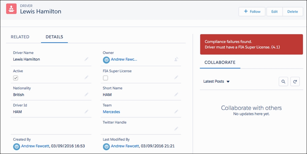
In Chapter 6, Application Domain Layer, we looked at a Lightning Component which can be placed on the Lightning Record Page layout. This approach only applies to LEX, and also provides some additional benefits such as being able to listen to events LEX fires as users in-line edit the record details. This approach currently only applies when viewing the record details.
The following screenshot is a reminder of what the Compliance Verification component looked like when placed on the LEX standard UI:
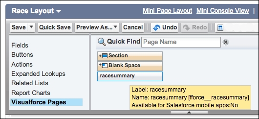
Let's now look at an example on how to customize the standard UI that applies both to Salesforce Classic and LEX. By embedding a Visualforce page in detail Page Layout as shown in the following screenshot for the Race object. Page Layouts are leveraged in both Salesforce Classic and LEX.
The following Visualforce page uses the $User.UIThemeDisplayed
global variable to style the page accordingly. It reuses the Extension Controller from the previous chapter:
<apex:page standardController="Race__c"extensions="RaceSummaryController" action="{!loadSummary}">
<apex:slds/>
<apex:outputPanel
rendered="{!$User.UIThemeDisplayed == 'Theme3'}">
<apex:pageBlock>
<apex:pageBlockTable value="{!Summary}" var="summaryRow">
<apex:column value="{!summaryRow.Position}">
<apex:facet name="header">Position</apex:facet>
</apex:column>
<apex:column value="{!summaryRow.Driver}">
<apex:facet name="header">Driver</apex:facet>
</apex:column>
<apex:column value="{!summaryRow.Team}">
<apex:facet name="header">Team</apex:facet>
</apex:column>
<apex:column value="{!summaryRow.Car}">
<apex:facet name="header">Car</apex:facet>
</apex:column>
</apex:pageBlockTable>
</apex:pageBlock>
</apex:outputPanel>
<apex:outputPanel
rendered="{!$User.UIThemeDisplayed == 'Theme4d'}">
<div class="slds">
<table
class="slds-table slds-table--bordered
slds-table--cell-buffer">
<thead>
<tr class="slds-text-title--caps">
<th scope="col">
<div
class="slds-truncate"title="Position">Position</div>
</th>
<th scope="col">
<div class="slds-truncate"title="Driver">Driver</div>
</th>
<th scope="col">
<div class="slds-truncate"title="Team">Team</div>
</th>
<th scope="col">
<div class="slds-truncate"title="Car">Car</div>
</th>
</tr>
</thead>
<tbody>
<apex:repeat value="{!Summary}" var="summaryRow">
<tr>
<th scope="row"data-label="Position">
<div
class="slds-truncate">{!summaryRow.Position}</div>
</th>
<td data-label="Driver">
<div class="slds-truncate">{!summaryRow.Driver}</div>
</td>
<td data-label="Team">
<div class="slds-truncate">{!summaryRow.Team}</div>
</td>
<td data-label="Car">
<div class="slds-truncate">{!summaryRow.Car}</div>
</td>
</tr>
</apex:repeat>
</tbody>
</table>
</div>
</apex:outputPanel>
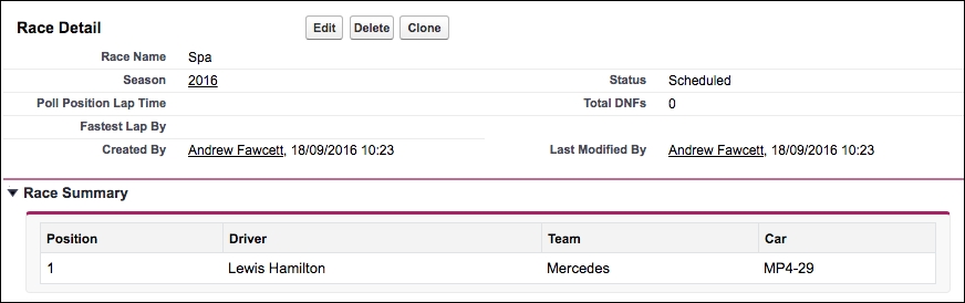
</apex:page>As the page uses StandardController, it appears in the layout editor and can be positioned on the layout:
You can then drag and drop it into an existing or new section on the layout. The result will look something like the following screenshot in Salesforce Classic:
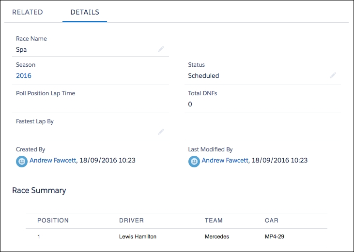
In Salesforce LEX the page looks like the following screenshot:
Tip
When in Salesforce Classic, this approach only applies to the layouts when users are viewing records. You can, however, provide a means for users to edit the information through such Visualforce pages even though they are rendered on the view page for the record. There is, however, no way to refresh the main page when you do so. While the width of the Visualforce page will adjust automatically, the height is fixed, so be sure to set accordingly to common data volumes. Unlike Salesforce Classic, users in Salesforce LEX will see embedded Visualforce pages in layouts when creating and editing records as well as viewing them. Ensure that your pages expect these scenarios in LEX, for example, the StandardController.getId method will return null in a record create scenario, your code should handle this accordingly.
Depending on the custom UI technology you use, there are different options to embed the standard UI page layout. Note that when you do this, any embedded Visualforce pages are also included.
For Salesforce Classic, the apex:detail tag can be used on a Visualforce page to render most of the look and feel of the standard UI; note that it is not automatically restyled when the page is shown in LEX. The component is not very granular; for example, you cannot add your own buttons alongside the standard buttons it renders. This means that your page buttons need to be rendered elsewhere on the page, making the UI look inconsistent and confusing. In addition, this component only renders a read-only view of the record layout. In most cases, the hybrid approach described earlier in the chapter provides a better solution to most requirements like this.
For Salesforce LEX, the force:recordEdit and force:recordView components support both record editing and viewing within custom UIs built using Lightning Components. In contrast to the apex:detail component in Visualforce, action buttons are not rendered. The developer is responsible for informing the component when to save the details by firing the recordSave
Lightning Event. The component responds with the onSaveSuccess event when the record is saved successfully.
The previous sections described a way to embed custom UIs within the standard UIs as a means of extending the Salesforce UIs with your own application functionality. The following sections outline the further options available in Salesforce Classic and LEX respectively. Some features exist in both, others have been re-envisioned in LEX through the ability to embed and invoke Lightning Components from different areas.
Visualforce is not only a powerful way to create entirely new pages for your application, but also augments the Salesforce user interface in multiple places. As we've seen so far, you can use it to extend the standard UI layouts and Custom Buttons. Here is a list of platform areas that accept Visualforce pages:
- Layout sections
- Custom Buttons
- Custom Tabs
- Custom Tab Splash page
- Chatter Custom Publisher Actions
- Sidebar component
- Dashboard component
- Force.com sites
Profiles and Permission Sets also reference Visualforce pages; users must be given access to a page before they can use it from these areas.
The following is a list of platform areas that accept Lightning Components:
- Record Pages
- Home Pages
- Lightning Tabs and Pages
- Lightning Component Actions
- Lightning Experience Utility Bar
- Lighting App Builder
- Lightning Community and Community Builder
- Lightning Out for Visualforce
- Lightning Out for Any App
In Chapter 6, Application Domain Layer, we explored adding the Verify Compliance Lightning Component to Record Pages. In the next chapter, we will build some new Lightning Components to allow us to take a closer look at some of the other areas in the preceding list. You should also refer to the Lightning Developer Guide for full details.