
A pie chart is a circle—or pie—that is sliced. Each slice is identified using a different color and/or label. The size or angle of the slice represents that item or category's proportion to the whole. Pie charts are best at showing part-to-whole relationships when there aren't too many slices. Bar charts are great and popular alternatives to pie charts.
In this recipe, we will create a pie chart that shows the top five endorsements in 2014, sliced by sport.
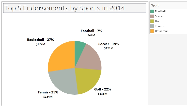
To follow this recipe, open B05527_01 – STARTER.twbx. Use the worksheet called Pie, and connect to the Top Athlete Salaries (Global Sport Finances) data source.

The following are the steps to create a pie chart:
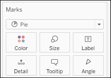
- Change the mark type to Pie in the Marks card.
- From Measures, drag Endorsements $ to Angle in the Marks card.
- From Dimensions, drag Sport to Color in the Marks card.
- Right-click on Sport pill in the Color property in the Marks card and select Filter….
- In the Top tab, select By field: Top and
5by Sum of Endorsement $.
- Right-click on Sport pill in the Color in the Marks card and select Sort.
- Filter Ascending by Sum of Endorsement $.

- From Measures, drag Endorsements $ to Label in the Marks card.
- Right-click on SUM(Endorsements $) pill in the Label property in the Marks card. Select Quick table calculation, and then Percent of total.

- From Measures, drag Endorsements $ again to the Label in the Marks card.
- Click on Label in the Marks card, and select the ellipsis button under Label Appearance to modify the style of the text.

- Change the format of the label to show the following, and click OK when done.

Tableau comes with a built-in mark called Pie. When you switch the mark to a Pie, a new property appears under the Marks card called Angle.
To create a pie chart, simply change the mark to a Pie. Drag a measure to Angle, and a discrete field to Color.
Often a pie chart is accompanied by a label containing what the pie is, and what percentage of the pie that slice is. Percent of Total is a readily available Quick Table Calculation.

To add this as a label, you need to add a measure to the Label in Marks card first. This will initially display the actual values of that measure. Once added, you can right-click on this measure and select Quick Table Calculation. This should expand the readily available quick table calculations, which would include Percent of Total.
Pie charts often get a bad reputation in the visual analytics world. One reason is because humans can't naturally compare angles (or pie slices) easily, especially if the pie slices are pretty close in size. Bar charts are often more effective in showing the difference in magnitudes, because all we need to look at are the edges.
Note
If you are interested, you can check out the world's most accurate pie chart. Word of warning however, you have to have humor to continue (credit to Damien Foley's blog site): http://bit.ly/accuratepiechart.
I think part of the issue is also abuse. Sometimes there is a tendency to overuse pie charts in presentations—especially the 3D tilted, exploded ones. Comparing angles is hard enough, tilting and exploding the pies do not help clarify the numbers.
Note
Word of wisdom: the slices of the pie in a pie chart must sum up to 100%. Wisdom is learning from other's mistakes http://bit.ly/best-pie-chart-ever.
However, pie charts can be effective in showing what proportion of the whole is allocated to something. I think pie charts have their place in the visual analytics and reporting world. Just like any other tools in your toolset, we just need to use them in the right place, right time.