
A dual axis chart is a chart that uses two axes for two different measures. This chart is useful when two measures have different types or ranges (for example, monetary value and percentage), or if the two measures need to be displayed differently (for example, one as a bar and one as a line).
In this recipe, we will create a dual axis chart, also often referred to as a combo chart.

To follow this recipe, open B05527_02 – STARTER.twbx. Use the worksheet called Combo Chart Dual Axis, and connect to the Player Stats (NBA Players Regular Season 2009) data source.

The following are the steps to create a combo chart (dual axis chart):
- From Dimensions, drag Team Name to the Filters shelf.
- Under the General tab, check Suns.
- From Dimensions, drag Year to the Filters shelf.
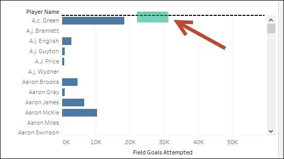
- Under the General tab, choose 2009.
- From Dimensions, drag League to the Filters shelf.
- Under the General tab, check N for NBA.
- If it doesn't exist yet, create a calculated field called
Player Name, and provide the following formula that concatenates[First Name]and[Last Name]:
- From Dimensions, drag Player Name to the Rows shelf.
- From Measures, drag Field Goals Attempted to the Columns shelf. This creates a horizontal axis for your view.
- From Measures, drag Field Goals Made to the opposite side of the Field Goals Attempted axis. Do not let go of the mouse until you see the dashed line or the arrow icon.
- This creates another axis opposite to the Field Goals Attempted axis.
- Click on the SUM(Field Goals Attempted) field in the Columns shelf to activate its Marks card. Change the mark for this field to Bar.
- Adjust the Bar size that represents SUM(Field Goals Attempted) so that it is narrower.
- Click on the SUM(Field Goals Made) field in the Columns shelf to activate its Marks card. Change the mark for this field to Gantt.
- Right-click on the Field Goals Made axis, and select Synchronize Axis.

- Right-click on the Field Goals Made axis, and uncheck Show Header.
- Right-click on the Field Goals Attempted axis and choose Edit Axis. Change the Title to
Field Goals Attempted. Close the window when done.
Dual axis charts, as the name implies, allow for two axes in the chart. In Tableau, this can be done by dragging a second measure to the opposite of the first measure's axis. You will know when to release the field when you see the dashed line on the opposite side of the existing axis appear.
In this recipe, we started with the Field Goals Attempted measure. With one measure, Tableau creates a bar chart by default. When placed in the Columns shelf, Tableau creates a horizontal axis at the bottom of the view.
To create a dual axis chart, the second measure, in this case the Field Goals Made, is dragged onto the top of the view until the dashed line visual cue appears. When the field is dropped, the second axis is added.
With dual axis, Tableau maintains each measure's individual Marks card. In addition to this, another Marks card called All is introduced, which will affect all the marks in the view. Since the measures have their own Marks cards, each measure can use a different mark, a different color, a different sizing scheme, and so on. Dual axis charts can be very powerful charts because of their flexibility.
From a visual perspective, a dual axis chart will exhibit a fused pill appearance. Instead of two individual pills, a dual axis chart will be fused at the center—the center has straight edges instead of rounded ends.
The dual axis chart is a premium chart. This chart is powerful because it allows you to have two different mark types, as well as different axis ranges and different sizing configuration if you so need it. If you want to have one measure as a bar, another as a line, dual axis can help. If you want a percentage and an absolute in the same graph, a dual axis can help. A shared axis may make the mark for the percentage unit look like a flat line because of the discrepancy in values, but the dual axis will preserve the relative comparison.
When comparing measures that have comparable values, like sales and profit, you may want to consider synchronizing the axes. Otherwise, the view may give the perception that there are very high profits (sometimes higher than sales!), and this would be misleading.

Another thing to note is that in Tableau, every green pill beside a non-dual axis field will have a dual axis menu option.
