
Tree maps represent part-to-whole and hierarchical relationships using a series of rectangles. The sizes and colors of rectangles will vary based on the values they represent. Typically, the larger rectangles, or rectangles with most concentrated colors, depict the highest values.
In this recipe, we will represent the 2015 world population as a tree map.

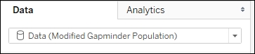
To follow this recipe, open B05527_01 – STARTER.twbx. Use the worksheet called Tree Map, and connect to the Data (Modified Gapminder Population) data source.
The following are the steps to create the population tree map:
- From Dimensions, drag Year to the Filter shelf. This will open a new window for the filtering options.
- Under the General tab, while Select from list radio button option is selected, type 2015 in the search text box to find this value from the list of years, and check it.

- From Measures, drag Population to Size in the Marks card.
- From Dimensions, drag Region to Color in the Marks card.
- From Dimensions, drag Country to Text in the Marks card.
- From Measures, drag Population to Text in the Marks card.
- Click on the drop-down arrow beside the color legend card and choose Edit colors….
- Choose the Color Blind 10 palette and click on Assign Palette. Click on OK when done.
- Click on Label in the Marks card, and select the ellipsis button under Label Appearance to modify the style of the text.
- Adjust the label so Country is shown with a larger font, and population appears underneath it with a smaller font.
A tree map allows us to present a part-to-whole relationship, just like a pie chart, but by subdividing a rectangle into smaller areas rather than subdividing a circle into different angled slices.
In Tableau, when you place a measure onto Size and a dimension onto either Color, Label, or Detail—or any combination thereof—the rectangle is broken down into smaller rectangles.

In this scenario, Tableau actually automatically assigns the Square mark. Although under Marks you will see Automatic, the icon refers to a Square. If you leave this as Automatic, or change the Mark explicitly to Square, you will get the same tree map.
Pie charts get a bad reputation because angles and slices are not easy to compare. Bubble charts are also hard to compare, because it is also hard to compare diameters and circumferences. Guess what, tree maps also fall into this same category. It is also not easy nor natural for us humans to discern and compare one area to another. Can we tell how much bigger or smaller one rectangle is compared to another? However, as with the other charts, with the right intent, audience, and story, this could be an effective chart—either by itself, or as a complementary chart to another.