
Histograms are graphs that plot frequency distribution of data.
In this recipe, we will create a histogram that will visualize what the most common heights and weights are of NBA players, based on a 2014 NBA player's stats data source.

To follow this recipe, open B05527_02 – STARTER.twbx. Use the worksheet called Histogram, and connect to the Player Stats (NBA Players Regular Season 2009) data source.

The following are the steps to create the histogram in this recipe:
- Under Measures, right-click on Height (in) and select Create and then Bins….
- Set the bin size to
5, and click OK when done. This will create a new discrete field called Height (in) (bin) under the Dimensions section of the side bar.
- Under Dimensions, right-click on Height (in) (bin) and select Aliases....
- Change the alias values of the Member items to the following. To edit the alias, simply click on the Value (Alias) field and that field will become editable.

- Create another bin for Weight (lbs) under Measures. Set this size to
10. This will create a new discrete field called Weight (lbs) (bin) under the Dimensions section of the side bar. - From Dimensions, drag Year to the Filters shelf and filter to 2009.
- From Dimensions, drag League to the Filters shelf, and filter to N.

- From Dimensions, drag Height (in) (bin) to Columns.
- From Dimensions, drag Weight (lbs) (bin) to Columns, to the right of Height (in) (bin).
- From Dimensions, right-click and drag Player ID to Rows. This will open up a new window showing all possible values that can be added.
- Choose CNTD(Player ID), which means the number of unique players.
- Right-click on the highest marks in the 75-79 lbs and 80-84 lbs bins, and choose Annotate and then Mark. Display the height, weight, and # of NBA players in these highest marks, as show here:

Tableau supports the creation of histograms. Histograms are charts that show frequency distribution of data and are best when data can be broken down into clear groups.
The first step is typically to create the bin first. This can be done by right-clicking the measure you want to bin, and selecting Create and then Bins…. When you do this, Tableau will suggest a bin size based on your data set.

Once you click OK, a new dimension field gets created. This field also gets its own icon that looks like a small histogram with normal distribution to signify a bin data type.

Once the bin is created, this bin field can be placed in either Rows or Columns. To display the frequency distribution, typically we place a count or a count distinct of another dimension in the other shelf.
However, we can definitely place other aggregations and these may give us different insights about our data. For example, in the following screenshot, I have placed AVG(Points) and AVG(Three Pts Made) alongside CNT(Player ID).
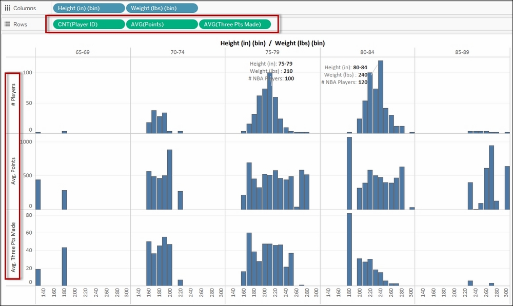
At a glance, this tells me that taller players tend to not make as many successful three-point shots compared to shorter players. We are measuring not just the number of players based on their height and weight buckets, but also the average points and three points they make.
When you do a quick Google search on histogram, the images that you find will look a little bit different than the histogram we create in Tableau by default. Histograms from the search engine typically have the bars touching. This is because histograms use continuous variables in the axis. Tableau implements histograms a little bit differently. Notice that when you created the bin, the new bin field gets placed in the dimension, and the icon is blue—meaning it is discrete. Because it is discrete, in Tableau, it produces headers, not a continuous axis, when placed onto either Rows or Columns. This also means that, by default, there will be gaps between the bars. You can however make your Tableau histogram look similar to a typical histogram, by altering the size of the bars manually and making them wider until the edges touch.