
A shared axis chart in Tableau is a chart that shares one axis among multiple measures. This chart can be used when the measures have similarly ranged values, and can be presented using one mark and one scale.
In this recipe, we will compare field goals made vs field goals attempted by Phoenix Suns players in the NBA 2009 season by using a shared axis chart.

To follow this recipe, open B05527_02 – STARTER.twbx. Use the worksheet called Shared Axis, and connect to the Player Stats (NBA Players Regular Season 2009) data source.

The following are the steps to create a shared axis chart:
- From Dimensions, drag Team Name to the Filters shelf.
- Under the General tab, check Suns.
- From Dimensions, drag Year to the Filters shelf.
- Under the General tab, choose 2009.
- From Dimensions, drag League to the Filters shelf.
- Under the General tab, check N for NBA.
- If it doesn't exist yet, create a calculated field called
Player Name, and provide the following formula that concatenates[First Name]and[Last Name]:
- From Dimensions, drag Player Name to the Rows shelf.
- From Measures, drag Field Goals Made to the Columns shelf. This creates a horizontal axis for your view.
- From Measures, drag Field Goals Attempted to the horizontal axis created by the Field Goals Made measure. Do not let go of the mouse until you see the double ruler icon appear on top of the axis.

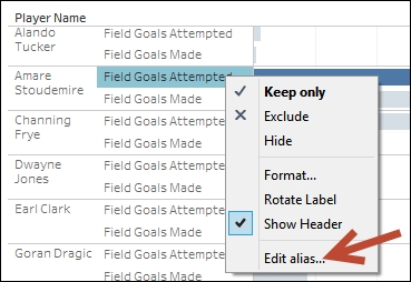
- Right-click on the Field Goals Attempted field header in your view, and Edit alias. Change the alias to Attempted.
- Right-click on the Field Goals Made field header in your view, and Edit alias. Change the alias to Made.
- Manually drag the Made field header and move it to before the Attempted field.
- Control drag the Measure Names field in your Rows shelf to the Color shelf.
- Click on the drop-down arrow beside the color legend and choose Edit colors….
- Change the colors of your bar. Assign a red color to Made, and gray to Attempted. Close the edit box when done.
A shared axis chart, as the name implies, is a chart that shares the same axis with multiple measures. One way to do this in Tableau is by dragging another measure to an existing measure's axis.
In this recipe, we started by creating a bar chart with the measure Field Goals Made. Field Goals Made is a continuous measure, thus creates an axis when placed onto the Columns shelf.
To share the axis this field has created with other measures, the other measures simply need to be dropped on top of the existing axis. When another measure is dragged on top of the existing axis, a faint double ruler icon appears on the axis. When you see this, release the mouse button and drop the field onto the view.
Once a second measure is added to the chart, there are a few things that happen:
- The original measure field gets replaced with Measure Values (green pill).
- Measure Names (blue pill) gets placed on the opposite shelf. This provides a column that shows the actual measure the mark represents.
- Measure Names (blue pill) gets placed in the Filters shelf. This would select the measures that have been dragged onto the same axis.
- A Measure Values shelf appears, which contains the measures that have been dragged onto the same axis.

If you want more than two measures to share the same axis, simply keep on dragging the measures onto the existing axis, or add the measures directly to the Measure Values shelf.
A shared axis chart is useful when you want to show multiple measures in the same graph. You can use a shared axis chart when you want to display the different measures using the same mark, and using the same range in axis. This is important to note, because when you change the mark in a shared axis chart, you change the mark for all the measures. A change in axis (range, size, and format) also affects all the measures in the graph.