
A bullet chart allows us to visualize progress in a small, concise graph. This chart borrows from thermometers and progress bars, and is typically used to show goals vs actuals.
In this recipe, we will create a bullet chart that shows the comparison between field goals attempted and field goals made by Phoenix Suns players in the NBA 2009 season.

To follow this recipe, open B05527_02 – STARTER.twbx. Use the worksheet called Bullet Chart, and connect to the Player Stats (NBA Players Regular Season 2009) data source.

The following are the steps to create a bullet chart:
- From Dimensions, drag Team Name to the Filters shelf.
- Under the General tab, check Suns.
- From Dimensions, drag Year to the Filters shelf.
- Under the General tab, choose 2009.
- From Dimensions, drag League to the Filters shelf.
- Under the General tab, check N for NBA.
- If it doesn't exist yet, create a calculated field called Player Name, and provide the following formula that concatenates First Name and Last Name:

See Appendix A, Calculated Fields Primer for more details on creating calculated fields
- From Dimensions, drag Player Name to the Rows shelf.
- From Measures, drag Field Goals Attempted to the Columns shelf. This creates a bar chart by default.
- From Measures, drag Field Goals Made to Details in the Marks card.
- Click on the Analytics tab in the side bar to activate it.
- Drag the Reference Line onto your view, and choose Cell.

- In the Line section, for Value: choose SUM(Field Goals Made) and use the default aggregation of Average. Set Label: to None.

- Click on Size in the Marks card to adjust the bar chart to be narrower so that the reference line stands out more. Slide the control to the left to make the bar narrower.
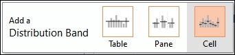
- From the Analytics tab, drag Distribution Band to your view and choose Cell.
- Set the following values for the distribution band:
- For Computation Value, use Percentages, and provide the values 60, 80, 100
- For Formatting, use Gray Very Light for Fill, and check the Fill Below checkbox

- Go to the Format menu, and choose Lines. This will show a formatting side bar.
- Under the tabs Sheet, Rows and Columns, set the Grid Lines to None. Close the formatting side bar when done.

Bullet charts are simple, concise graphs that are packed with information. These charts are great for tracking progress.
Bullet charts are composed of a bar chart, a reference line, and a reference band. In this recipe, we started by creating a bar chart using the Field Goals Attempted measure.
Before we added our reference line, Field Goals Made, we added it first to the Details card. The reason for this is because in order to be able to use this in a reference line, it needed to already be in our view—on any of the shelves or any of the cards. Otherwise, you will not see this in the Value dropdown.

The final piece is the distribution band. Although it looks like it is simply an aesthetic addition, it does in fact display additional information. Stephen Few calls this the Quantitative Scale, which typically color codes certain sections or ranges in the bullet chart. In our case, we used this to indicate 60%, 80%, and 100% of the average sum of goals.

The additional options are Percentiles, Quantiles, and Standard Deviation. In the configuration box, you can also choose the type of aggregation to use with the measure.
There was a time when radial gauges in dashboards were all the rage. The inherent problem with these dashboards was gauges took up a lot of space, and they weren't very clear in communicating the information. Stephen Few mentioned this in his books and blogs.
Note
Check out this article called Business Gauges—BI vendors just don't get it: https://www.perceptualedge.com/blog/?p=102
Stephen Few coined the word bullet chart as an alternative graph to these gauges. It is meant to be a very compact chart, and every element is meant to communicate a number. Stephen Few mentions that its linear and no-frills design provides a rich display of data in a small space, which is essential on a dashboard.
Note
Stephen Few's bullet chart specification can be found at https://www.perceptualedge.com/articles/misc/Bullet_Graph_Design_Spec.pdf.
In this recipe, we have manually created the bullet chart by starting with a bar chart, and then adding reference lines. Another way to create bullet charts in Tableau is by selecting all the dimensions and measures you want to graph, and selecting the bullet chart icon in Show Me. The only challenge with this approach is that Tableau will pick which measure goes on the bar and which measure goes on the reference line. If the selection turned out to be the incorrect selection, you can simply right-click on the axis and choose to swap the reference lines.

If you need to remove any reference lines, you can right-click on the axis as well, and choose to remove the reference line.