
A donut chart, like a pie chart, shows part-to-whole relationships. And like a traditional donut (the sweet, edible kind), it has a hole in the middle.
In this recipe, we will create a donut chart that shows the breakdown of Hollywood's top movies from 2007-2011 by genre.

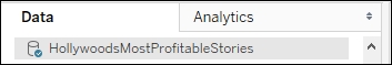
To follow this recipe, open B05527_02 – STARTER.twbx. Use the worksheet called Donut, and connect to the HollywoodMostProfitableStories data source.
The following are the steps to create a donut chart:
- Change the mark type to Pie in the Marks card.
- From Measures, drag Worldwide Gross Amount to Angle in the Marks card.
- From Dimensions, drag Genre to Color in the Marks card.
- To make the pie easier to view, set the chart to show as Entire View from the toolbar.

- Right-click on the Genre pill in the Color in the Marks card and select Sort….
- Sort the slices by the Sum of the Worldwide Gross Amount in Ascending order.

- From Dimensions, drag Genre to Label in the Marks card.
- From Measures, drag Worldwide Gross Amount to Label in the Marks card.
- Right-click on the SUM(Worldwide Gross Amount) pill in the Label property in the Marks card. Select Quick table calculation, and then Percent of total.

- From Measures, drag Worldwide Gross Amount again to the Label in the Marks card.
- Click on Label in the Marks card, and select the ellipsis button under Label Appearance to modify the style of the text.
- Change the format of the label to show the following, and click OK when done.

- Right-click and drag Number of Records from Measures onto the Rows shelf, and choose MIN(Number of Records).
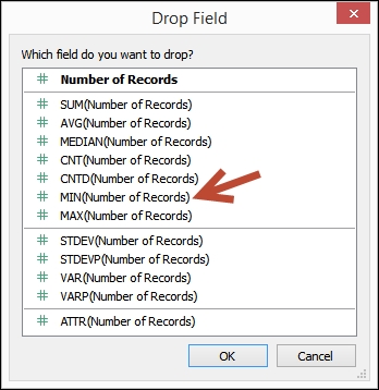
- Right-click and drag Number of Records again from Measures onto the Rows shelf, and choose MIN(Number of Records). Note this should be the second instance of this pill in the Rows shelf.
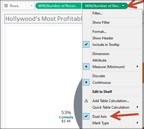
- Right-click on the second MIN(Number of Records) in the Rows shelf, and select Dual Axis.
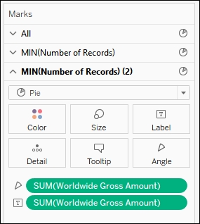
- Select the second MIN(Number of Records) pill in Rows to activate its Marks card.
- Click on the Size in the Marks card and adjust to make the pie smaller.
- Remove Genre from the Color in the Marks card. This creates just a whole circle and leaves the total Worldwide Gross Amount as a label in the center of the circle.
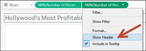
- Right-click on both MIN(Number of Records) pills in Rows and uncheck Show Header for both.
Donut charts are not available natively in Tableau. Donut charts, however, can be simulated by overlapping two pies together. One of the pies will be the regular pie chart, and the other pie will be a smaller version of it without the slices.
To create a donut chart in Tableau, we can start by creating a regular pie chart in Tableau. After this is created, we have to force an axis on the pie chart (I know this doesn't make sense, but bear with me for a little bit). We can use the Number of Records measure to create this axis, which is a Tableau auto-generated measure field. When you right-click and drag this measure on any of the shelves, we can choose any of the aggregated measures presented. We choose MIN, for minimum, in our recipe.
Once we have one axis, we can create our dual axis chart. We can simply duplicate the existing axis by copying the MIN(Number of Records) a second time in the Rows shelf. From here, we can choose the Dual Axis option on the second MIN(Number of Records) pill.

Once we have the two axes, these are the next steps:
- Make one of the pies smaller so that the outer slices will be more evident
- Remove the slices from the smaller pie so it appears as a solid circle
- Add a label to the smaller pie, such as the total value of the measure
Donut charts could technically be layered, that is, have a donut inside a donut if you wanted to show multiple series of data. For our purposes, we are sticking with a pie on the outside and a hole on the inside since this can be achieved in Tableau using a dual axis graph. Layered donut charts can also be quite confusing to look at and understand.
If you have read Stephen Few's books, you may be scratching your head as to why you would even bother with a donut chart. Stephen Few considers donut charts as one of the no-no charts, and for good reason. If we cannot easily tell angles, how much better will we be at telling it if we take out the center hole? We will be worse, and it will be a much harder chart to read!
There are definitely better alternatives to donut charts. However, sometimes this is what is asked of us. We can pick our battles. Instead of fighting for the "right" graph every time, we can slowly show the benefits of using different types of charts. The company may or may not eventually appreciate other graphs that convey the message more clearly. Adopting best practices takes time, and sometimes also requires a culture shift.
- Please refer to the Creating a pie chart recipe in Chapter 1, Basic Charts
- Please refer to the Creating a combo chart (dual axis) recipe in this chapter