
Unit charts, also referred to as pictogram charts, display each unit of measure as a single mark or symbol. While other types of charts may be more effective and less cluttered, unit charts may create more engagement because of the images and visuals used.
In this recipe, we will create a unit chart that shows all the medals that were won by Canada in the Summer Olympics from 1896-2008.

To follow this recipe, open B05527_02 – STARTER.twbx. Use the worksheet called Unit Chart, and connect to the ALL MEDALISTS (Summer_Olympic_medallists_1896-2008) data source.

The following are the steps to create a unit chart:
- From Dimensions, drag NOC to the Filters shelf and filter to CAN.
- From Dimensions, drag Edition to Rows.
- From Dimensions, drag City to Rows, to the right of Edition.
- Create a calculated field called # of Medals. This field should be fixed to Edition and NOC so that it is not affected by the data fields (pills) used in the view.

- From Dimensions, drag # of Medals to Rows, to the right of City. By default, this creates a bar chart.
- Right-click on the SUM(# of Medals) in Rows, and select Discrete to display it as text instead of a bar chart.
- Change the mark of the view to Circle.
- From Dimensions, drag Athlete to Details. This will create a circle for each athlete who won a medal.
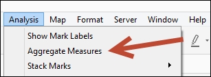
- Click the Analysis menu and uncheck Aggregate Measures.

- From Dimensions, drag Medal to Color.
- Click on the drop-down arrow beside the color legend again. This time choose Edit colors….
- Choose colors that closely resemble Gold, Silver, and Bronze. Click OK when done.
- Using the Color property in the Marks card, manually re-order the medal colors by dragging the names in the correct order. Gold should be at the top, followed by Silver, and then Bronze.
To create a unit chart in Tableau, there are a couple of crucial steps. First, the mark has to be something that can represent distinct, discrete units—a shape, a circle, a square. Second, the marks have to be disaggregated. This can be done by going to the Analysis top menu and unchecking Aggregate Measures.
In this recipe, we are displaying Canada's medals for the Summer Olympics. To do this, we started off by displaying all the dimensions we want displayed as text columns—Edition, City, and Number of Medals. Number of Medals by default produces a bar chart with an axis. To convert this to a text field, we can simply select Discrete.
The main step involve changing the mark type to Circle so that each discrete unit can be represented as a circle mark. We also added Athlete to Detail, which forces each athlete to have their own circle mark. When we disaggregate the measures, each athlete will be represented multiple times if that athlete has won more than one medal.
Other mark types can technically work, for example a bar, but this mark has to be further broken down by placing something in Detail, as well as disaggregating the measure.
Each mark in a unit chart can also represent a number of individual units. In Tableau, we can use the table calculation function INDEX() in combination with integer division based on the number of units you want represented to help chunk the items.
In this recipe, for example, if we wanted to display one circle for units of five medals, we can use the following formula:

The INDEX() function creates a sequential number for each item in the window. The formula uses INDEX() computed across the table, and checks if this number is within five before it returns a number divisible by five.
Let's walk through this. For example if there are six medals, we expect two circles—one for the first five, the other for the remaining one. INT(WINDOW_SUM(SUM([Number of Records]))/5) is INT(6/5), therefore 1.
|
INDEX() |
INDEX() - 1 |
Condition |
Result |
Resulting Value |
|---|---|---|---|---|
|
1 |
0 |
0 <= (6/5)? |
True |
Circle for value 5 |
|
2 |
1 |
1 <= (6/5)? |
True |
Circle for value 10 |
|
3 |
2 |
2 <= (6/5)? |
False | |
|
4 |
3 |
3 <= (6/5)? |
False | |
|
5 |
4 |
4 <= (6/5)? |
False | |
|
6 |
5 |
5 <= (6/5)? |
False |
To change this to n units, where n is your preferred unit number, you simply need to replace the denominator with n in the IF statement, and the multiplier with n in the action block.
We will need to display the result of this calculated field in the Columns shelf, and still need to disaggregate the measures. What you will get will be similar to the following:

What we have is a chart that has a circle for every 1-5 medals. Of course you can make adjustments if you want to have different marks or icons showing half units, quarter units, and so on.
There may be other charts that may convey information more clearly than unit charts. The trouble with unit charts is that you cannot tell the measures right away. Attentive processing—or focus—is required to fully understand and compare. Unit charts, however, may be effective charts depending on the audience and purpose. These charts may be used to pique the interest or engage an audience. To help increase the clarity of the charts, we can use common, understandable symbols and label the units each symbol represents.