
Waterfall charts look like bar charts, but these specifically show the aggregated effect of a series of positive and negative values. The final bar represents the net value of all the preceding values. Waterfall charts can be useful when the history as well as the final net value is important to be shown. This can be applied, for example, to showing beginning and ending inventory numbers, and showing how the ending inventory number came to be.
In this recipe, we will use the waterfall chart to show cumulative changes in profit for Furniture in the Superstore data set.

To follow this recipe, open B05527_02 – STARTER.twbx. Use the worksheet called Waterfall, and connect to the Orders (Sample – Superstore) data source.

The following are the steps to create a waterfall chart:
- From Dimensions, drag Category to the Filters shelf.
- In the next windows, under the General tab, select Furniture.
- From Dimensions, drag Order Date to the Filters shelf.
- When prompted on what to filter, choose Years.
- In the next windows, under the General tab, select 2013.
- From Dimensions, drag Order Date to the Columns shelf.
- Right-click on Order Date in the Columns shelf and choose discrete month. Discrete month is the third menu item after Show Missing Values.

- Change the mark type to Gantt.
- Create a calculated field called Negative Profit, which is just the negative equivalent of the Profit field. This is needed to size the Gantt chart.

- From Measures, drag Profit to the Rows shelf.
- Right-click on the Profit pill in the Rows shelf. Go to Quick Table Calculation and select Running Total.
- From Measures, drag Negative Profit to Size in the Marks card.
- Create another calculated field called Profit/Loss, which will describe the status of a sale based on profit. The formula is as follows:

- Drag the newly created Profit/Loss calculated field to Color in the Marks card.
- Right-click on the color legend and select Edit Color…. Change the color so that red represents loss, and blue represents profit. Feel free to replace this with your color preference.
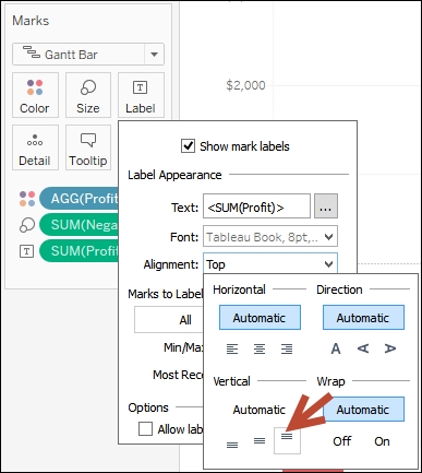
- From Measures, drag Profit to Label.
- Click on Label in the Marks card, and choose Top for Vertical Alignment.
- Go to the Analysis menu item. Expand Totals and select Show Row Grand Totals.
- Go to the Format menu, and choose Shading. This will show a formatting side bar.
- Under the Sheet tab, change the background color for Grand Total to be light brown. Feel free to replace this with a color of your choice.
- Go to the Format menu, and choose Borders. This will show a formatting side bar.
- Under the Sheet tab, change the border for Grand Total to be a thicker, darker line. Feel free to replace this with a line style of your choice. Close the formatting side bar when done.
- Change title of color legend to show Profit or Loss. You can do this by right-clicking on the top-right corner of the legend box and selecting Edit Title….
A waterfall chart shows the cumulative results of positive and negative values over a series. In our recipe, we are showing how profits for Furniture grow or shrink over time.
There is no native waterfall chart in Tableau. We can create this by using a Gantt mark.
We start by filtering our view for only 2013. We drag discrete month across the columns, and drag Profit measure onto rows. By default, Tableau will create a time series line graph for these fields. We care about the cumulative effects of profit, so we can add the Quick Table Calculation for Running Total.
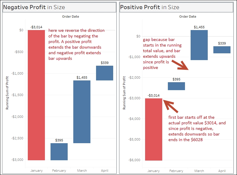
Next we change the mark type to Gantt, which makes the mark look like a series of underlines. In order to add the actual size of the bar, we use a calculated field called Negative Profit, which is simply the negative value of the profit. The reason we need to negate the field is because if we don't, the Gantt bar will start at the profit value, and then extend the bar downwards if the value is positive and extend the bar upwards if the value is negative.
Once all the fields are set up with the Gantt mark, the Running Total for the SUM(Profit) on the column, and Negative Profit for the size of the Gantt, you should now see that each succeeding bar show the cumulative effect of all the previous profits.
Lastly, we add the total bar by simply selecting the Analysis menu and choosing Totals and Show Row Grand Totals. By default, this shows as the last column, but you can also choose to show row Totals to the Left starting in Tableau v9.2.
The Model Systems Knowledge Translation Center (MSKTC) has a good short document that describes what waterfall charts are, and when they are useful. You can find the document at http://bit.ly/waterfallcharts.