
A population pyramid is a chart that shows population distribution by age and gender. Age is typically distributed using five-year age groups. The youngest groups are located at the base and the oldest groups at the top. Population pyramids can indicate how slow or fast the population ages, and can also be used to forecast how the population will change in the future.
In this recipe, we will create British Columbia's population pyramid from 1986 to 2041.

To follow this recipe, open B05527_02 – STARTER.twbx. Use the worksheet called Population Pyramid, and connect to the BC Population Projection data source.

The following are the steps to create a population pyramid:
- From Dimensions, drag Age Bracket to the Rows shelf.
- Hover over the Age Bracket column header until you see a sort icon, and click on the sort icon. Click on the sort icon twice to sort the Age Bracket values descending.
- Right-click on Total value for Age Bracket and select Exclude.
- Manually drag the <1 header for Age Bracket so that it is the last value. This should be placed after the value 01-04.

- Create a calculated field called Female that returns the Population value if the gender is female.

- From Measures, drag the newly created Female calculated field to the Columns shelf. This creates a bar chart that represents the female population.
- Using the Marks card for Female, click on Color and change the color of the bars to pink. Feel free to change this color to a color of your choice.
- Create a calculated field called Male that returns the Population value if the gender is male. You will need to check the value of Gender and return the population if the value is M. Use the formula for the Female calculated as reference.
- From Measures, drag Male to the Columns shelf, to the right of the Female pill.
- Using the Marks card for Male, click on Color and change the color of the bars to blue. Feel free to change this color to a color of your choice.
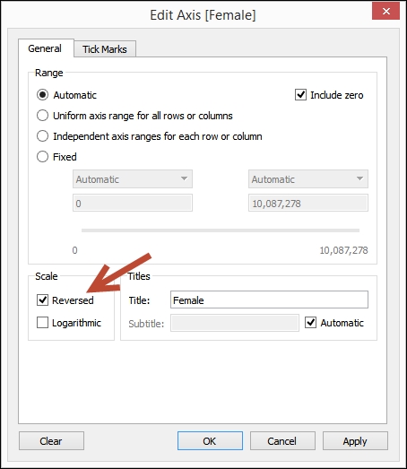
- Right-click on the axis for the Female, and select Edit Axis.
- Under Scale, select Reversed. Click OK when done.

- Double-click on the worksheet title, and using the Insert dropdown, add the Page Name to the worksheet title.

- From Dimensions, drag Year to Pages.
- Using the Year play control, click on the forward arrow to play.

The population pyramid is meant to show the population distribution by gender. It is described in Wikipedia as a back-to-back histogram, where one histogram shows the age distribution for males and the other shows for females.
As far as Tableau is concerned, depending on the data set, this can simply be two bar charts. The first bar chart needs to have its axis reversed, so that the 0 value of the axis touches the zero value of the second axis.
Reversing the axis in Tableau is actually straightforward. You simply need to right-click on the axis to edit the axis, and select Reversed under Scale.
In this chart, we can also take advantage of the Pages shelf. When we drop the Year dimension onto this shelf, a play control shows up. This allows us to see the animated changes of the population pyramid from 1986-2041.
It is interesting to note that a population pyramid, as the name suggests, typically looks like a pyramid. The older age bands at the upper section of the chart exhibit shorter bars than the younger ones. In British Columbia, however, you can see that based on the 2041 projected population, it looks like a pear, not a pyramid, with the longest bars for those in their 40s to 60s. Currently, this shape is indicative of a constrictive population pyramid, which means the population is both aging and shrinking. For BC, what this means is its population is getting older. While lifespan is getting longer, there aren't more births. This definitely has a substantial impact on economy and sustainability, but that discussion is for another book. It's just very interesting to see how population has changed over the years.
Note
Population Education has a good short article on different types of population pyramids at https://www.populationeducation.org/content/what-are-different-types-population-pyramids.
If you are interested in seeing how the world population has changed and what the impact is, there is an interesting article called The World Reshaped that can be found at http://www.economist.com/news/21631911-end-population-pyramid-world-reshaped.
- Please refer to the Creating a bar chart recipe in Chapter 1, Basic Charts