
One of the ways to add interactivity to Tableau dashboards is by adding actions. Tableau supports three actions, and one of them is a filter action. A filter action enables one view to narrow down the information shown in other views, either in the same dashboard or different dashboards.
In this recipe, we will use one of the sheets in our dashboard to filter all other sheets in the dashboard.

To follow this recipe, open B05527_04 – STARTER.twbx. We will use the following worksheets:
- Floods by Country
- Floods by Cause
- Flood Damage

The following are the steps to create the dashboard in this recipe:
- At the bottom of your Tableau design area are sheet tabs. There are three tabs with plus signs, which allow you to create a new sheet, dashboard and story point respectively. Click on the middle icon with the grid to create a new dashboard.

- When in the dashboard design area, the sidebar becomes a Dashboard bar, showing the available worksheets and other dashboard components.
- Check the Show dashboard title checkbox, located at the bottom of the Objects section. This will show the dashboard title text box in the dashboard.

- Change the dashboard title to show the following:

- Right-click on the dashboard title, and select Format Title. Choose a light gray background to the title.
- If needed, adjust the height of dashboard title so the whole text is visible.
- Under the Objects section, ensure that Tiled is selected and not Floating.
- Under the Sheets section in the Dashboard tab, drag the related worksheets onto the dashboard:
- Drag Floods by Country. By default, when Tiled is selected, this will occupy the whole dashboard space.
- Drag the Flood Damage worksheet and place it below Floods by Country. When you drag it, you will notice certain areas will get shaded. Release your mouse only when the shaded area is underneath the Floods by Country worksheet.
- Drag Floods by Cause to the right of Floods by Country and above Flood Damage.

- Increase the width of Fatalities by Country so it is wider than the Floods by Cause worksheet.
- Remove the Duration and Damage (USD) color legends by clicking on the X mark.

- Set the Dead color legend to Floating. You can do this by selecting the color legend, which will show the legend's gray border. Click on the drop-down arrow in the top-right corner, and select Floating. Selecting the Floating option will take the legend out of the grid and allow it to be layered on top of other items in the dashboard.

- Place the Dead color legend closer to the Fatalities by Country map worksheet, closer to the bottom-left area so it does not cover any countries in the map.

- Change the title of the Year of Began filter to
Choose a date range. To do this:- Click on the Year of Began filter to show the gray border
- Click on the drop-down menu in the top-right corner
- Select Edit Title and make the changes
- Change the scope of the date filter to all worksheets in the dashboard.
- Click on the dropdown of the filter, and choose Apply to Worksheets, and then Selected Worksheets.

- Click the All on dashboard button in the Apply Filter to Worksheets window that appears. Click on OK when done.

- Click on the dropdown of the filter, and choose Apply to Worksheets, and then Selected Worksheets.
- Format the filter to have light gray shading using the same color as the dashboard title. You can do this by selecting the filter, and clicking on the drop-down arrow in the top-right corner. From here, you can choose Format Filters. You can change the shading from the formatting sidebar that appears.
- Click on the dropdown of the date filter, and choose Float. Place the filter in the top-right corner of the dashboard, beside the dashboard title.

- Click on the Floods by Country worksheet, and click on the funnel icon that appears in the top-right corner. This enables the map to filter all the worksheets in the dashboard.

- Change the dashboard name to
Flood Dashboard. You can double-click on the dashboard tab, and rename from there. - Test the dashboard. Use the presentation mode (or press F7) to see what the end users will see. Click on countries in the map and/or change the date range in the filter. Confirm that the rest of the worksheets are filtered by that country.
Dashboards in Tableau allow multiple worksheets to be put together, so provide a more comprehensive view of the insights you are trying to provide. Dashboards also allow additional interactivity between the worksheets, and even other dashboards, using what are called actions. There are three types of action—Filter, Highlight, and URL.
In this recipe, we simply used the Filter action, using the quick icon that is made available within the worksheet's options. This icon was introduced in Tableau V9.2.
We can also enable this option by using the drop-down arrow and selecting Use as Filter.
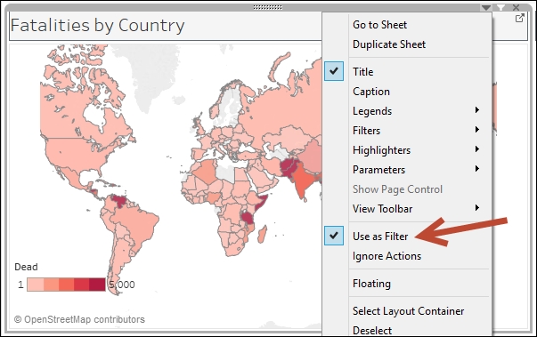
When a sheet is enabled as a filter, Tableau auto-generates a filter action which filters all other worksheets in the dashboard using the values that were selected in the sheet.

Under the covers, the following are the settings for the auto-generated filter action:

Notice that the source and target are the current dashboard. The filter happens on Select, which triggers the action when the consumer of the dashboard clicks on a label or mark from the source sheet. The fields that are used for filtering are all fields that are common among the worksheets.
There are two other options under Run action on:, which are Hover and Menu. Hover triggers the action when the mouse pointer is moved over a label or mark, while the Menu shows a hyperlink after a label or mark is clicked. We will see these other options in action in later recipes.
Adding filter actions is a great way to make Tableau dashboards more interactive. It allows the user of the dashboard to focus on specific items by narrowing down other views and only retaining values based on what they selected. It also encourages the end users to explore the data sets more, and see how each of the graphs vary based on how they filter them.
We can create the filter actions manually by going to the Dashboard menu, and selecting Actions.

When setting up the action, the target can be a different dashboard altogether.
When setting up actions that allow your end users to jump from one dashboard to another, ensure you provide a way to go back to the previous dashboard. This can be done by creating another filter action, and reversing the source and destination dashboards.
Pay attention to the source and target item icons.
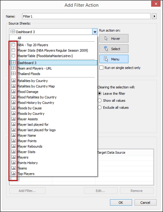
Typically, we target dashboards instead of individual sheets. In addition, when we target an individual sheet that is not in the dashboard, the action would take them to that specific worksheet. This may create a confusing effect especially if the look and feel of the dashboard is different from that individual sheet's.
We have used a mix of Tiled and Floating components in this exercise. Tiled makes all the components (worksheets, containers, legends, filters, and so on) occupy a single layer in a grid. All of these components together occupy 100% of the dashboard space. When components are tiled, there is no control over the position or size of the items.

Floating allows these layers to overlap each other, and either be placed on the front or at the back of any sheet. Floating is great if you want to have more control over the design of your dashboards, especially if you are following more stringent constraints on sizing, such as needing to print the dashboard on letter or legal paper, or targeting specific devices.

Floating is also great for placing legends, parameters, and filters nearer the views they refer to. By default, these components are placed on the right-hand section of the dashboard. However, this placement may be disruptive if the view they relate to is not within the proximity of the control.
In this recipe, we also made use of filters (not filter action, but filter control). When you add a filter to the dashboard, it is possible to change the scope of that filter to affect not only the worksheet it belongs to, but other worksheets as well.
As can be seen in the screenshot, the Apply to Worksheets menu shows four options:
- Only This Worksheet
- Selected Worksheets
- All Using This Data Source
- All Using Related Data Sources
These options illustrate how flexible filters can be. It is possible for one filter to affect multiple selected sheets, or even all sheets that share the same data source. In Tableau V10, the option All Using Related Data Sources was introduced, which allows the filter to work across different data sources. This is a very welcome addition, as this simplifies filtering in dashboards. In previous versions, the only ways to filter across different data sources were either using filter actions or creating parameters and calculated fields in all related sheets.