
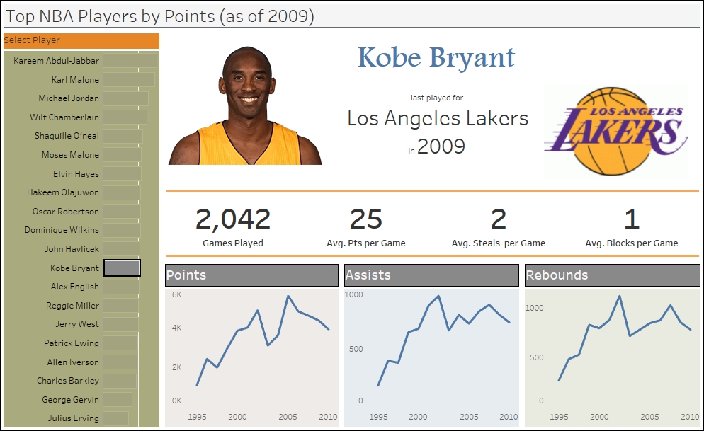
Infographics is a shortened term for information graphics, which is a way to visualize data using a lot of graphics and is designed to make the make the visual more graphic and eye-catching. Tableau has the components to add more visual elements to a dashboard and making it look more like the typical infographic.
In this recipe, we will create an infographic-like dashboard that incorporates free form images and text.
To follow this recipe, open B05527_04 – STARTER.twbx. We will use the following worksheets:
- Top Players
- Player Points
- Player Assists
- Player Rebounds
- Player Name
- Player Stats
- Player last played for
- Player last played for logo

The following are the steps to create the dashboard in this recipe:
- Create a new dashboard.
- Check the Show dashboard title checkbox. This will show the dashboard title text box in the dashboard.
- Change the dashboard title to
Top NBA Players by Points (as of 2009). - Ensure that Tiled is selected under the Objects section.
- Drag the Top Players worksheet to your dashboard. By default, this will occupy the whole space of the dashboard.
- From the Objects section, drag a Blank object to the right of the Top Players worksheet. Adjust the width of the Blank object so that it occupies about 75% of the space.

- Drag the Player Stats worksheet and place it below the Blank space, to the right of the Top Players worksheet.
- Click on the dropdown of the Player Stats worksheet. Under Fit, choose Entire View.

- Under Objects, drag Horizontal (which is a layout container) and place it underneath the Player Stats worksheet, to the right of the Top Players worksheet.
- Under Objects, drag another Blank. Place it underneath the Horizontal Layout Container.

- Hide the title for Player Stats. To do this, you can right-click on the Player Stats title, and choose Hide Title.
- Drag the following player worksheets:
- Drag the Player Points worksheet and place it on the Horizontal layout container. By default, it will occupy all the space in that layout container.
- Drag the Player Rebounds worksheet and place it to the right of the Player Points worksheet.
- Drag the Player Assists worksheet and place it in the middle of the Player Points and Player Rebounds worksheets.

- Remove all the filters that were added to the right hand side of the dashboard. You can do this by selecting the respective filters, and clicking on the X mark.
- Under Objects, select Floating.
- Add the following as floating objects. A screenshot of the expected layout is provided as well:
- Add a web page to top. Leave URL as blank for now. We will add the URL action later.
- Drag Player Name to the right of the Blank web page.
- Drag Player last played for, and place it below the Player Name worksheet.
- Drag Player last played for to the right of Player Name and Player last played for.

- Click on the Dashboard menu, and select Actions.
- Add a URL action with the following settings:
- Change the Name to
Player Image - Change the Run action on: to Select
- Set the URL to <Image>

- Change the Name to
- Test to ensure that the image is showing properly. Click on any player name, and the image of that player should show up.

- Click on the Top Players worksheet to select it. Click on the dropdown on the top-right corner, and under Fit, choose Entire View.
- Drag another Blank object and place it underneath the Top Players worksheet. Line up this Blank object to the other Blank object under the Player Points row.

- Change dashboard name to
Top NBA Players by Points.
Creating an infographic-like dashboard in Tableau can be quite involved. Often times, this task will encompass creating multiple worksheets with individual components or pieces of information, and putting these all together creatively so that the design elements flow according to the infographic design.
What we have done in this recipe is a fairly simplistic take on the infographic possibility with Tableau, but it should give you a clearer idea of how to do it. If you check the individual worksheets we used, many of them have single pieces of information. For example, one worksheet contained only the name of the player. Another worksheet contained only the logo of the team that player last played with.
Just a word of caution. The URL cannot come from a secondary data source, in the case of blended data sources. The URL information has to be from the primary data source.