
Map layers can change the way maps look in Tableau. There are map layers that change the style of the map to use either a light, normal, or dark background. There are also data layers that overlay additional information, such as place names or population, on top of the existing map.
In this recipe, we will add coastline, state/province borders, and household growth layers to the default map that comes with Tableau:
To follow this recipe, open B05527_05 – STARTER.twbx. Use the worksheet called Map Data Layers, and connect to the States (catsvsdogs) data source:

Here are the steps to add more layers to the default Tableau map:
- Right-click on the Location field under Dimensions.
- Go to Geographic Role and select State/Province:

- Double-click Location. Latitude (generated) is automatically placed in Rows and Longitude (generated) is automatically placed in Columns. The Location pill is also automatically placed in the Details property.
- Under the Marks card, click on the dropdown and change the mark to Shape:

- From Measures, drag the calculated field Percentage to Shape in the Marks card.
- Click on the top-right drop-down arrow of the Shape legend and assign the following shapes from the Bars palette. To assign, click on a value on the left Select Data Item column, and then click on the appropriate icon you want to assign from the right column.
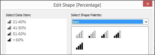
- In this recipe, no shaded bars are assigned to 21-40%, and four shaded bars is assigned to > 60%.
- Click OK when done.
- Click on Size in the Marks card and move the slider to the right to make the icons on the map a little bit bigger.
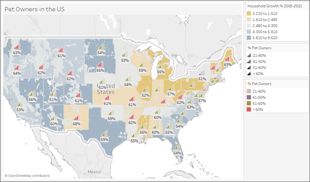
- From Measures, drag the calculated field Percentage to Color in the Marks card.
- From Measures, drag the field Percentage of households with pets to Label in the Marks card.
- Go to the Map menu and select Map Layers:

- In the Map Layers sidebar that appears, do the following:
- Under Map Layers, check Coastline and State/Province Borders
- Under Data Layer, select Housing Units Growth % 2016-2021
- Under Data Layer, use the color palette Orange-Blue Diverging
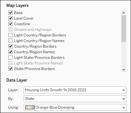
- Close the Map Layers sidebar when done.
The default Tableau map comes with additional map and data layers. The data layers, however, are only available for US-related data.
To add the map and data layers, you simply need to go render the map in your view first, and then go to the Map menu and select Map Layers. The Map Layers pane will temporarily replace the data side bar.
The Map Layer allows additional information to be visualized onto the map, such as country/region names and borders:

Like the map layers, the data layers add more encoding onto the map, such as population or income information for US locations:

If you need data layers specific to your location or map, you may need to access your own GIS server that serves these extra map and data layers.