
Trend lines are typically added to charts to visualize general patterns or movement. An upward trend suggests the two variables being used on the axes are directly proportional, meaning as one value goes up, the other one tends to go up. A downward trend may suggest an inverse relationship between the variables, meaning as one value goes up, the other one goes down.
In this recipe, we will add trend lines for the CO2 emissions of Canada, China, and United States:

To follow this recipe, open B05527_06 – STARTER.twbx. Use the worksheet called Trend Line, and connect to the CO2 (Worldbank) data source:

Here are the steps to create the CO2 emission trends lines:
- From Dimensions, drag Country Name to the Filters shelf.
- In the Filters window, choose Canada, China and United States.
- From Dimensions, drag Country Name to Columns.
- From Dimensions, right-click and drag Year DT to the Columns shelf, to the right of Country Name. Choose continuous month (that is, MONTH(Year DT), which has a green calendar icon beside it).
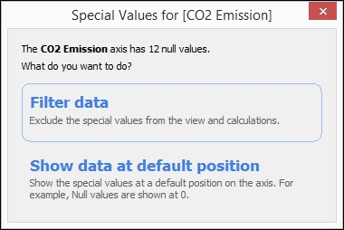
- From Measures, drag CO2 Emission to Rows.
- Click on the null indicator that appears on the bottom-right of the view, and select Filter data:
- On the side bar, click on the Analytics tab to activate it.
- Under Model, drag Trend Line from the Analytics tab and drop it on the Linear placeholder:

- Hover over one of the trend lines to see additional information on the trend line R-Squared and P-value:

Tableau's Analytics pane provides a quick way to add trend lines to your view. When you drag the Trend Line from the Analytics pane, you will be prompted for the type of trend line: Linear, Logarithmic, Exponential, or Polynomial:

To be able to add trend lines, you need to have two axes that can be interpreted as numeric. Otherwise, the Trend Line option is disabled. Dates can be interpreted as numeric so trend lines are generally available for time series graphs.
Once the trend line is in place, you can right-click on the trend line to further edit it, or to describe the trend line or the model:

The trend line description shows the P-value, the Equation, and the Coefficients:

The trend model description box shows the values that were considered for the trend line, and also the significance of the trend model via the p-value:

More detailed descriptions of the terms and values can be found in the Tableau online documentation at http://bit.ly/tableau-trendline-model.
When you edit the trend line, you can change the model type, as well as add/remove trend line colors, confidence bands, and recalculated fields for highlighted/selected data points:

The different types of trend lines supported by Tableau are tabulated here. Descriptions of different trend lines are based on a Microsoft Office article about choosing the best trend lines (http://bit.ly/msoffice-choosing-trendlines) and the formulas are from Tableau's online documentation (http://bit.ly/tableau-trendlines):
|
Type |
Description |
Formula |
|---|---|---|
|
Linear |
Used with simple linear data sets, and typically shows values are increasing or decreasing at a steady rate. |
Y = b0 + b1 * X + e |
|
Logarithmic |
A best-fit curved line that is most useful when the rate of change in the data increases or decreases quickly and then levels out. |
Y = b0 + b1 * ln(X) + e |
|
Exponential |
A curved line that is most useful when data values rise or fall at increasing rates. |
Y = e ^ (b0 + b1 * X + e) |
|
Polynomial |
A curved line that is used when data fluctuates. The order of the polynomial can be determined by the number of fluctuations in the data. |
Y = b0 + b1 * X + b2 * X^2 + … + e |
The preceding description is taken from Microsoft Office: Choosing the Best Trendline for your Data.
According to the Tableau online documentation, regardless of the type you choose:
Each trend line in the view visually represents a linear regression statistical model