
4
Building the Data Model
In this chapter, you are now going to create a coherent and intelligent data model. Creating a data model is primarily the process of creating necessary relationships between the different data sources that are leveraged in your model.
Self-service BI would not be possible without a functional data model. Historically, BI projects focused on building data models could take months and even years to develop when working within the rigid structure and constraints of a corporate business intelligence environment. Unfortunately, studies show that about 50 percent of all enterprise BI projects fail. These projects fail because the costs are often too high; these projects can cost anywhere from hundreds of thousands of dollars to millions of dollars due to the costs associated with the infrastructure, licensing, and labor. Another reason for the low success rate is that the business and end users often won’t see any results for many months and can grow frustrated with the lack of visibility in key business areas. These longer project timelines are a result of the time it takes to work through the gathering of requirements, architecting a complex data model, and cleaning up the original data sources. For the enterprise BI projects that do make it all the way to completion, they will often not deliver on promised deliverables and lack the components needed to perform the analytical tasks requested by the business.
Fortunately, Power BI Desktop removes all of the barriers that have resulted in the high failure rate of traditional enterprise BI projects. Power BI Desktop provides you with a much more agile approach to building your data model. Therefore, project completion is measured in days not months or years, the cost is exponentially cheaper, and any missing components can easily be added as needed. The topics detailed in this chapter are as follows:
- Organizing data with a star schema
- Building relationships
- Working with complex relationships
- Usability enhancements
- Improving data model performance
Power BI Desktop and the self-service agile approach greatly improve the success of BI projects and this is due to the flexibility of Power BI. Power BI allows you to easily and quickly create meaningful relationships with the different tables that have been imported into your data model. In this section, you will learn how to build relationships in Power BI Desktop.
Organizing data with a star schema
We have worked with consultants who have spent their entire career building data models specifically designed for reporting and analytical purposes. These same consultants would tell you that you are always learning new ways to model data based on business requirements, technology enhancements, and the data. Building a data model is much more an art than it is a science.
However, you don’t need 20 years of data modeling experience to be successful in Power BI. You just need to understand the fundamentals of the star schema.
The star schema is a way of modeling data that is designed specifically for making it easier to build reports and retrieve analytical value from your data. The star schema way of designing your data model makes the entire model easier to understand and work with. The star schema method of modeling is part of a much broader topic called dimensional modeling. Dimensional modeling has two main types of tables; those tables are facts and dimensions.
Simply put, facts are events you want to measure. This can be the sale of goods, a student attending a class, an interaction with a member, or any other type of event that you need to measure. The type of event you want to measure can vary wildly across business units and industries.
On the other hand, dimensions are what describe your facts (events). If a company made five million in sales, you might ask for what year, what country, which products, or which salesperson. Each of these critically important questions about the data tells us exactly what type of dimension (descriptive) tables we need to build into our model. Here, we identified four separate dimension tables:
- Date (year)
- Geography (country)
- Employee (salesperson)
- Products (product)
The model that is used throughout this book represents a dimensional model with a fact and multiple dimension tables. When you look at the model view, the tables can appear to be in the shape of a star, hence where the term “star schema” comes from.
In this section, we briefly discussed dimensional modeling and the star schema. A deeper dive is outside the scope of this book but keep these ideas in mind as you progress through the remainder of this book and start building your own data models!
Building relationships
A relationship in Power BI simply defines how different tables are related to one another. For example, your customer table may be related to your sales table on the customer key column. You could argue that the building of relationships is the most important aspect of Power BI Desktop. It is this process, the building of relationships, that makes everything else work like magic in Power BI. The automatic filtering of visuals and reports, the ease with which you can author measures with Data Analysis Expressions (DAX), and the ability to quickly connect disparate data sources are all made possible through properly built relationships in the data model.
Sometimes, Power BI Desktop will create the relationships for you automatically. It is important to verify these auto-detected relationships to ensure accuracy.
There are a few characteristics of relationships that you should be aware of, which will be discussed in this section:
- Auto-detected relationships
- There may be only one active relationship between two tables
- There may be an unlimited number of inactive relationships between two tables
- Relationships may only be built on a single column, not multiple columns
- Relationships automatically filter from the one side of the relationship to the many side
Now, to examine some of the key elements of relationships in Power BI, open up the pbix file Chapter 4 - Building the Data Model.pbix found in your class files:
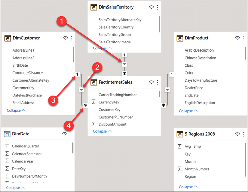
Figure 4.1: Reviewing relationships
Following the numbering, let’s take a closer look at each of the four items highlighted in the preceding Figure 4.1:
- Relationship: The line between two tables represents that a relationship exists.
- Direction: The arrow indicates in which direction filtering will occur.
- One side: The
1indicates the DimCustomer table as the one side of the relationship. This means the key from the one side of the relationship is always unique in that table. - Many side: The
*indicates that the FactInternetSales table is the many side of the relationship. The key will appear in the sales table for each transaction; therefore, the key appears many times.
The first thing you should do after importing data is to verify that all auto-detected relationships have been created correctly. From the Home ribbon, select Manage relationships, as seen in Figure 4.2. When in the Report view, Manage relationships will appear on the Modeling ribbon. When in the Data view, Manage relationships appears on the Table tools ribbon, and when in the Model view, Manage relationships appears on the Home ribbon:
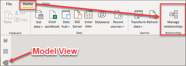
Figure 4.2: Launch the Manage relationships editor
This will open up the Manage relationships editor. The relationship editor is one of two places where you will go to create new relationships and edit or delete existing relationships. In this demo, the relationship editor will be used to verify the relationships that were automatically created by Power BI Desktop.
Figure 4.3 provides a view of the Manage relationships editor:
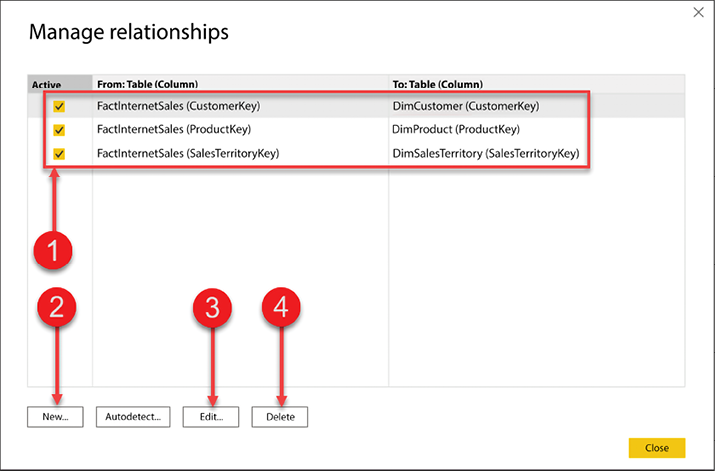
Figure 4.3: Manage relationships editor
Let’s break down the editor using the numbered figure:
- Current relationships in the data model
- Create a new relationship
- Edit an existing relationship
- Delete a relationship
First, you need to verify auto-detected relationships. In Figure 4.3, the top half of the relationship editor gives you a quick and easy way to see what tables have relationships between them, what columns the relationships have been created on, and if the relationship is an active relationship. We will discuss active and inactive relationships later in this chapter.
Take a look at Figure 4.4; you will see that there are currently three relationships, and all three relationships are currently active:
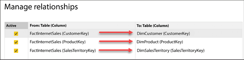
Figure 4.4: Verifying relationships
The first row in Figure 4.4 displays the relationship between the FactInternetSales table and the DimCustomer table. The relationship between these two tables was created automatically by Power BI on the CustomerKey column from each table. In this scenario, Power BI has correctly chosen the correct column names. However, if the relationship was created in error, then you would need to edit that relationship.
Now, let’s take a look at how to edit an existing relationship.
Editing relationships
In this example, you will edit the relationship between FactInternetSales and DimCustomer. To edit an existing relationship, select that relationship and then click on Edit...:
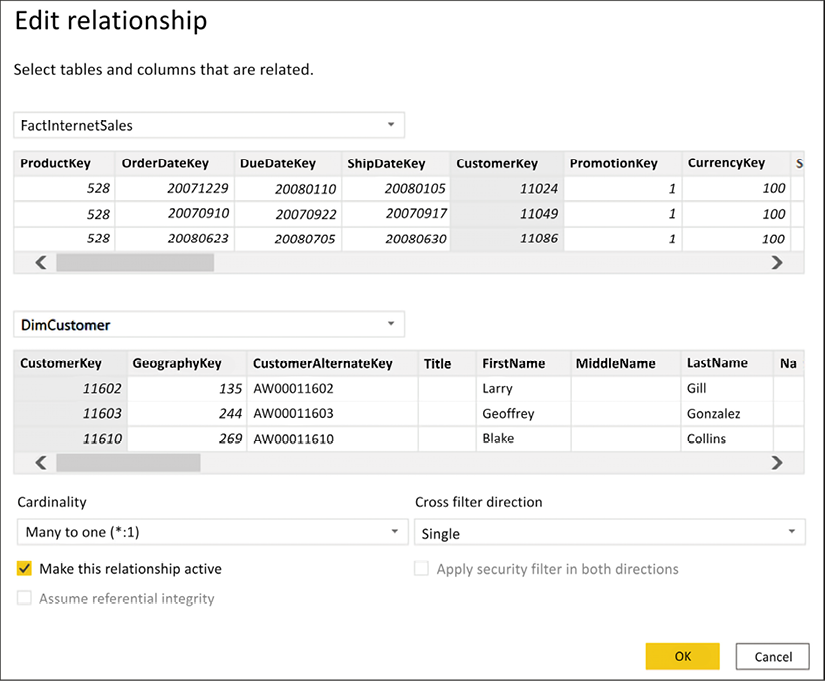
Figure 4.5: Editing a relationship
Once you select Edit... you will receive a new dialog box; this is the Edit relationship editor. In this view, you will see how to change an existing relationship, how to change a relationship to active or inactive, and the cardinality of the current relationship; this is also where you can change the Cross filter direction:
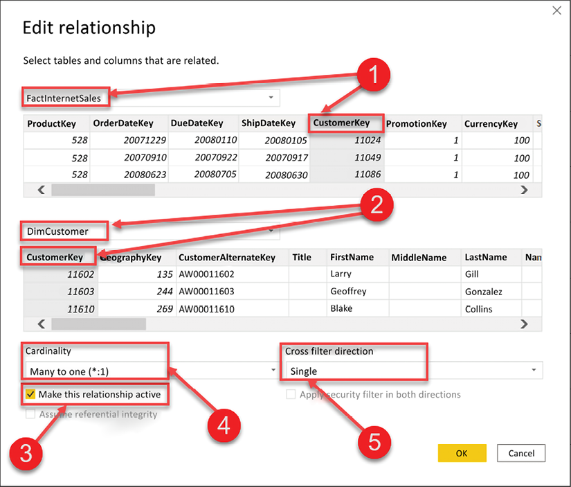
Figure 4.6: Editing a relationship
There are five numbered items we will review from Figure 4.6:
- This identifies the FactInternetSales table and the column that the relationship was built on, CustomerKey.
- This identifies the DimCustomer table and the column that the relationship was built on, also CustomerKey.
- This checkbox identifies whether the relationship is active or inactive.
- This is the current cardinality between the two tables. Here, we see that there is a many-to-one relationship between FactInternetSales and DimCustomer. Power BI does an excellent job of identifying the correct cardinality, but it is important to always verify that the cardinality is correct.
- The cross-filter direction can be Single or Both. The one side of a relationship always filters the many side of the relationship, and this is the default behavior in Power BI. The cross-filter option allows you to change this behavior. Cross-filtering will be discussed later in this chapter.
If you need to change an existing relationship, then you would do that in the relationship editor seen in Figure 4.6. To change the column that a relationship has been created on, simply select a different column. It is important to point out that a relationship between two tables may only be created on a single column. Therefore, if you have a relationship that needs to be defined on multiple columns, also known as a composite key, then you would need to first combine those keys into a single column before creating your relationship. You saw how to combine columns in Chapter 3, Data Transformation Strategies.
Creating a new relationship
In the previous section, you saw how to verify existing relationships, and even how to edit them. In this section, you are going to learn how to create a new relationship. There are six tables in the data model thus far, and Power BI automatically created a relationship for all the tables, except for two. Let’s begin by creating a relationship between the FactInternetSales and DimDate tables.
The FactInternetSales table stores three different dates: OrderDate, ShipDate, and DueDate. There can be only one active relationship between tables in Power BI, and all filtering occurs through the active relationship. In other words, which date do you want to see your total sales, profit, and profit margin calculations on? If it’s OrderDate, then your relationship will be on the OrderDate column from the FactInternetSales table to the FullDateAlternateKey column in the DimDate table. To create a new relationship, open Manage relationships from the Home ribbon.
Now, let’s create a relationship from the OrderDate column in FactInternetSales to the FullDateAlternateKey column in DimDate. With the Manage relationships editor open, click on New... to open the Create relationship editor:

Figure 4.7: Creating a new relationship
Complete the following steps to create a new relationship:
- Select FactInternetSales from the list of tables in the dropdown.
- Select OrderDate from the list of columns; use the scroll bar to scroll all the way to the right.
- Select DimDate from the next drop-down list.
- Select FullDateAlternateKey from the list of columns.
- Cardinality, Cross filter direction, and whether the relationship is active or inactive are updated automatically by Power BI; remember to always verify these items.
- Click OK to close the editor.
Now, let’s take a look at creating the relationship on the date key rather than the Date column.
Creating a relationship on the date key
The astute reader may have noticed that the previous demo used the actual date columns from each table instead of the date keys. This is because most Power BI models will not contain a date key. However, if you are retrieving your data from a relational database or data warehouse, then a date key will most likely exist on both tables, and the relationship can be created on the date key.
In data modeling, we generally store dates as integer values. More specifically, you can store the date as a smart key, for example, 20200706. This type of integer value is called a smart key because the date is stored as an integer, but you can still derive the date from the integer value. For example, the first four characters are the year, the next two represent the month, and the final two represent the day number of the month. Storing your dates as integer values is a best practice and will help save space in the model.
In Figure 4.8, you see an example of creating a relationship on the date keys in each table:

Figure 4.8: Creating a new relationship using the date keys
The date table in the Power BI data model is important for developing time intelligence calculations. When you define your relationship on the date key, rather than the date column, it is important to also mark your date table as a date table! If this step is not performed, some built-in time intelligence functions may not work as expected.
Time intelligence is discussed in further detail in Chapter 5, Leveraging DAX.
At the time of writing, marking a table as a date table can only be accomplished in the Report view or Data view. There are two ways to mark a table as a date table. First, you can right-click on the date table and choose Mark as date table | Mark as date table:
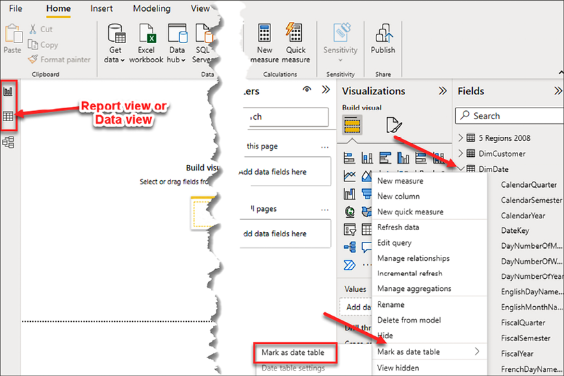
Figure 4.9: Mark as date table
Secondly, you can select the date table; go to the Table tools ribbon and select Mark as date table:
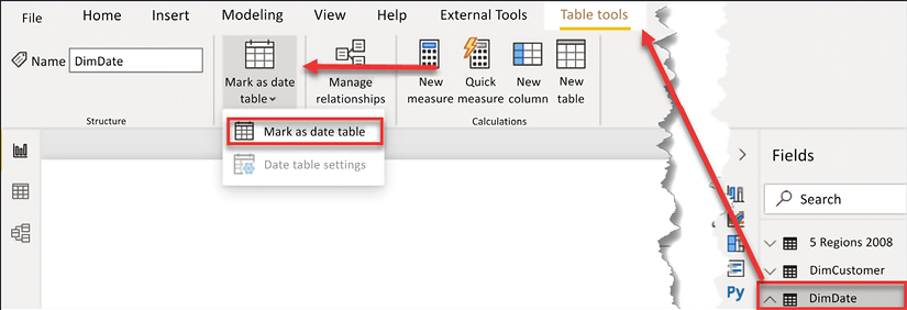
Figure 4.10: Mark as date table, alternate method
Once Mark as date table is selected, you will then be prompted to select the Date column from your date table:
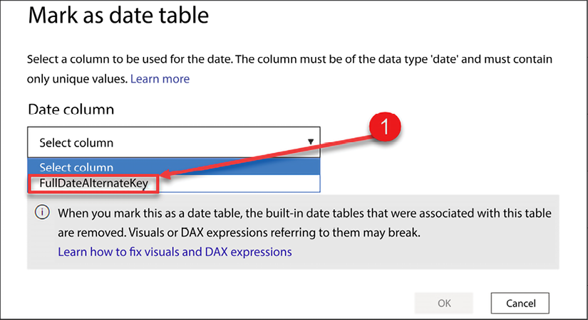
Figure 4.11: Select valid date column from date table
Power BI will automatically limit the list of available options to columns that are set to a date type and have only unique values.
There is one other important thing to note on this configuration screen: the built-in date tables that were associated with this table are removed. In the background, Power BI creates a hidden date table for each field that has a date or date/time field. Depending on the number of date fields in your data model, this can create a lot of extra objects and will consume more memory in your data model! As a best practice, we recommend disabling this functionality. We’ll cover this process in the next section.
Disabling automatically created date tables
As mentioned previously, Power BI automatically creates hidden date tables for each date or date/time field in your data model. The date tables created by Power BI can be disabled from the Options menu. This functionality is automatically enabled on your current Power BI file and will be enabled on future files. Therefore, you will need to disable the auto date/time capability in two separate locations from the Options menu.
To open the Options menu, in Power BI Desktop, go to File | Options and Settings | Options. Once the Options window has been opened, complete the following steps, as seen in Figure 4.12:
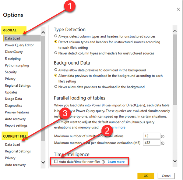
Figure 4.12: Disable automatically created hidden date tables
- Under GLOBAL, choose Data Load.
- Uncheck Auto date/time for new files.
- Under CURRENT FILE, choose Data Load and uncheck Auto date/time.
In this section, you learned how to verify automatically created relationships and how to create new relationships in Power BI Desktop. In the next section, you will learn about working with complex relationships.
Working with complex relationships
There are many complex scenarios that need to be addressed when building a data model, and Power BI is no different in this regard. In this section, you will learn how to handle many-to-many relationships and role-playing tables in Power BI.
Many-to-many relationships
Before we discuss how to build a relationship between two tables that have a many-to-many relationship, let’s discuss specifically what a many-to-many relationship is. A many-to-many relationship is when multiple rows in one table are associated with multiple rows in another table. An example of a many-to-many relationship can be observed in the relationship between products and customers. A product can be sold to many customers; likewise, a customer can purchase many products. This relationship between products and customers is a many-to-many relationship. In a one-to-many relationship, a relationship can be created directly between the two tables. However, in a many-to-many relationship, an indirect relationship is often created through a bridge table. This section will focus on how to set up a many-to-many relationship and how to gain analytical value from such relationships!
A more common example of a many-to-many relationship is when you have two separate fact tables that share a similar key. For example, if you have a FactSales table and a FactReturns table, both tables may contain a product key. From an analytical perspective, how do you now build a report that shows your sales and returns by year, by customer, or by store? The simple answer is, you drill across both tables using your dimension tables. A deep dive into the star schema is outside the scope of this book; however, it is very common for a Power BI data model to have multiple fact tables that have many-to-many relationships between them.
To learn more about many-to-many relationships, take a look at the following Microsoft link: https://learn.microsoft.com/en-us/power-bi/guidance/relationships-many-to-many.
In the previous section, you learned how to create a relationship between two tables that had a one-to-many relationship. Immediately, once a one-to-many relationship has been defined in your data model, filtering occurs automatically. This adds a tremendous amount of value to Power BI. However, the analytical value achieved through many-to-many relationships does not happen automatically and requires an extra step. Let’s take a look at filtering in general and then how to effectively develop many-to-many relationships in Power BI.
Filtering behavior
Before you can learn how to handle many-to-many relationships in Power BI, you must first understand the basic behavior of filtering. Filtering will be discussed in more detail in the next chapter, but now let’s take a minor detour to explain how filtering works in this context. In Figure 4.13, the total SalesAmount of all transactions is $29,358,677.22. The visual you see in Figure 4.13 is simply the sum of the column SalesAmount from the FactInternetSales table:
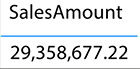
Figure 4.13: Total unfiltered SalesAmount
To view the total SalesAmount for all transactions broken down by country, all you would need to do is simply add the SalesTerritoryCountry column from the DimSalesTerritory table. This behavior in Power BI is awesome, and this is automatic filtering at work. Take a look at Figure 4.14:
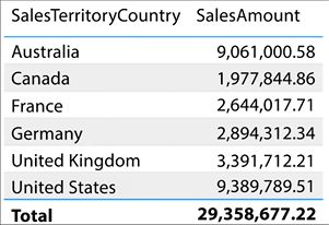
Figure 4.14: SalesAmount filtered by Country
Please note that this only works because a valid relationship exists between the FactInternetSales and DimSalesTerritory tables. If a relationship had not been created, or if the relationship created was invalid, then you would get entirely different results and they would be confusing. Let’s take a look at what would happen if no relationship had previously existed.
In Figure 4.15, the SalesTerritoryCountry has been removed and replaced with the Temperature Range column from the 5 Regions 2008 table:
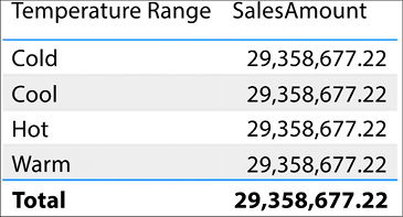
Figure 4.15: Replacing Country with Temperature Range
Notice how the total sales amount is repeated for each temperature range. This behavior indicates that the 5 Regions 2008 table is unable to filter the FactInternetSales table. This inability to filter can happen for a number of different reasons:
- Because a relationship does not exist between the tables
- Because an existing relationship is invalid
- Because an existing relationship does not allow the filtering to pass through an intermediate table
If you see the repeated value behavior demonstrated in Figure 4.15, then go back to the relationship view and verify that all relationships have been created and are valid.
Cross-filtering direction
Now that you understand the basics of automatic filtering in Power BI, let’s take a look at an example of a many-to-many relationship. In this data model, DimProduct and DimCustomer have a many-to-many relationship. A product can be sold to many customers. For example, bread can be sold to Jessica, Kim, and Tyrone. A customer can purchase many products. Kim could purchase bread, milk, and cheese.
A bridge table can be used to store the relationship between two tables that have a many-to-many relationship, just like tools you have worked with in the past.
The relationship between DimProduct and DimCustomer is stored in the FactInternetSales table. The FactInternetSales table is a large, many-to-many bridge table:
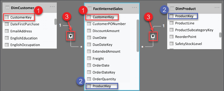
Figure 4.16: Relationship between DimCustomer and FactInternetSales
Figure 4.16 shows the relationship between these two tables; see the following explanation for the numbered points:
- The relationship between DimCustomer and FactInternetSales
- The relationship between DimProduct and FactInternetSales
- The cross-filter direction is set to single
The following report in Figure 4.17, displays the total sales, total transactions, and customer count for each product:
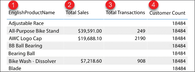
Figure 4.17: Customer count for each product
Let’s take a closer look at Figure 4.17, and note the numbered points:
- EnglishProductName from the
DimProducttable - Total Sales is the
SUMof theSalesAmountcolumn from theFactInternetSalestable - Total Transactions is the
COUNTof associated rows from theFactInternetSalestable - Customer Count is the
COUNTof theCustomerKeycolumn from theDimCustomertable
Total Sales and Total Transactions are returning the correct results for each product. Customer Count is returning the same value for all products (18,484). This is due to the way that filtering works. The calculations for Total Sales and Total Transactions are derived from columns or rows that come from the FactInternetSales table. The Product table has a one-to-many relationship with Internet Sales, and therefore filtering occurs automatically. This explains why those two calculations are being filtered properly, but it does not explain why the count of customers is returning the same repeated value for all products, not entirely anyway.
Let’s take another look at the relationship between DimProduct and DimCustomer. Notice in Figure 4.18 that the relationship between these two tables flows through the FactInternetSales table. This is because they have a many-to-many relationship. In this scenario, the table FactInternetSales is acting as a large, many-to-many bridge table. DimProduct filters FactInternetSales. DimCustomer also filters FactInternetSales, and FactInternetSales is currently unable to filter the customer table:
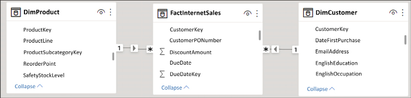
Figure 4.18: Filtering behavior in Power BI
The repeated value for customer count occurs because FactInternetSales is unable to filter the DimCustomer table. DimProduct filters FactInternetSales, and a list of transactions are returned for each product. Unfortunately, the filtering does not pass from FactInternetSales to DimCustomer. This is because FactInternetSales is on the many side of the relationship with DimCustomer. Therefore, when our calculation performs a count on the customer key, the table is not filtered and the calculation sees every customer key in the DimCustomer table (18,484).
Do you remember the cross-filter direction property that was briefly covered earlier in this chapter? That little property is there to provide many-to-many support. By simply enabling cross-filtering in both directions, the FactInternetSales table will be able to filter the customer table and the customer count will work.
Enabling filtering from the many side of a relationship
To enable cross-filtering, open the relationship editor. Remember, the Manage relationships option can be found from the Report view, Data view, or Model view from different ribbons as discussed at the beginning of this chapter. When in Report view, Manage relationships will appear on the Modeling ribbon, when in Data view, Manage relationships appears on the Table tools ribbon, and when in Model view, Manage relationships appears on the Home ribbon.
See Figure 4.19 for a refresher on where to find it:
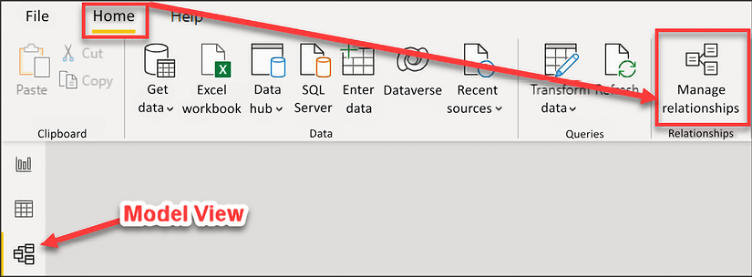
Figure 4.19: Open the relationship editor
Select the relationship between FactInternetSales and DimCustomer, and then click Edit. Once the relationship editor has launched, change the Cross filter direction from Single to Both:
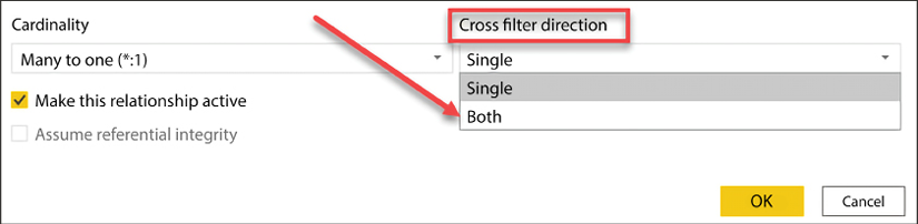
Figure 4.20: Enabling cross-filtering
Back in the Report view, you will now see the correct Customer Count for each product, as shown in Figure 4.21:
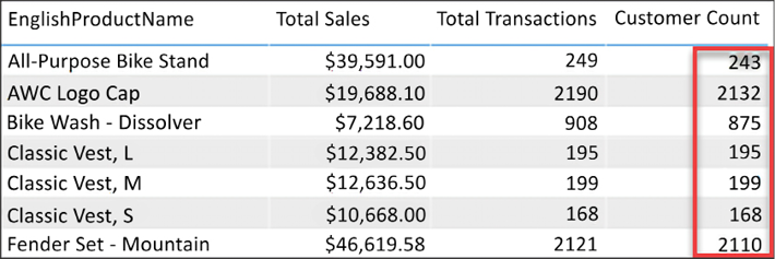
Figure 4.21: Customer Count for each product
As a best practice, it is not recommended to enable cross-filtering in your data model. Cross-filtering can cause ambiguity in your results and can cause some time intelligence functions to not function properly; the date table must have a contiguous range of dates and therefore cannot be filtered by other tables. Use the Data Analysis Expression language when possible to return the results seen in Figure 4.21. DAX is discussed in Chapter 5, Leveraging DAX.
Now that you have learned how to handle many-to-many relationships in Power BI Desktop, let’s take a look at how to handle another type of complex relationship. In this section, you will learn what role-playing tables are and how to handle them in Power BI Desktop.
Role-playing tables
A role-playing table is a table that can play multiple roles, which helps to reduce data redundancy. Most often, a date table is a role-playing table. For example, the FactInternetSales table has three dates to track the processing of an order. There is the Order Date, Ship Date, and Due Date and, without role-playing tables, you would need to have three separate date tables instead of just one. The additional tables take up valuable resources, such as memory, as well as adding an extra layer of administrative upkeep.
Each of these dates is very important to different people and different departments within an organization. For example, the finance department may wish to see total sales and profit by the date that a product was purchased, the order date. However, your shipping department may wish to see product quantity based on the ship date. How do you accommodate requests from different departments in a single data model?
One of the things I loved about working with SQL Server Analysis Services multidimensional mode was the ease with which it handled role-playing tables; perhaps you also come from a background where you have worked with tools that had built-in support for role-playing tables. Unfortunately, role-playing tables are not natively supported in Power BI; this is because all filtering in Power BI occurs through the active relationship and you can only have one active relationship between two tables.
There are generally two ways you can handle role-playing tables in Power BI:
- Import the table multiple times and create an active relationship for each table
- Use DAX and inactive relationships to create calculations that show calculations by different dates
The first way, and the method we will show here, is importing the table multiple times. Yes, this means that it will take up more resources. The data model will have three date tables, one table to support each date in the FactInternetSales table. Each date table will have a single active relationship to the FactInternetSales table.
Some of the benefits of importing the table multiple times are as follows:
- It is easier to train and acclimate end users with the data model. For example, if you want to see sales and profit by the ship date, then you would simply use the date attributes from the ship date table in your reports.
- Most of your DAX measures will work across all date tables, so there is no need to create new measures. The exception here is your time intelligence calculations; they will need to be rebuilt for each date table.
- The analytical value of putting different dates in a matrix. For example, sales ordered and sales shipped by date. For clarification, see Figure 4.22:
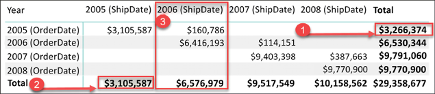
Figure 4.22: Sales by ShipDate and OrderDate
In Figure 4.22 you can observe the analytical benefit of having a shipping date table and an order date table in the same data model. In this example, the total sales are being displayed in a matrix visual with the year from the order date table on the rows and the year from the shipping date table on the columns:
- The value of
$3,266,374is the number of total sales that were made in the year2005. - The value of
$3,105,587is the number of total sales that were shipped in the year2005. - If you take a look at the column
2006 (ShipDate), you will notice that$6,576,979of sales shipped in2006. Upon closer inspection,$160,786of what shipped in2006was actually ordered in2005and the remaining$6,416,193was ordered in2006.
Some of the cons of importing the table multiples times are:
- Resources: Additional memory and space will be used.
- Administrative changes: Any modifications made to one table will need to be repeated for all tables, as these tables are not linked. For example, if you create a hierarchy in one table, then you would need to create a hierarchy in all date tables.
- Time Intelligence: Time intelligence calculations will need to be rewritten for each date table.
The report in Figure 4.23 shows total sales and total transactions by year, but which year? Is this the year that a product was purchased or the year a product was shipped? The active relationship is on the order date, so the report is displaying the results based on when the product was purchased:
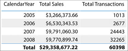
Figure 4.23: Total sales and total transactions by year
The previous visualization is correct but it is ambiguous. To remove any uncertainty from our reports, the data model can be further improved by renaming columns. In the next section, you will learn how to make small changes in your data model so that the visuals are more specific.
Importing the date table
In this section, we are going to import a date table to support the analysis of data based on when an order shipped. From the Get data option, select Excel and open the AdventureWorksDW Excel file; the file can be found in the directory location Microsoft-Power-BI-Start-Guide-Second-Edition-mainData Sources.
Next, select DimDate from the list of tables, and then click Load as seen in Figure 4.24:
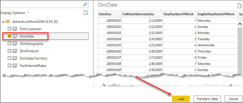
Figure 4.24: Importing DimDate into Power BI
Now that the data has been imported, the next step is creating a valid relationship. Open Manage relationships from either the Home or Modeling ribbon, depending on which view you are currently in. From the relationship editor, click New to create a new relationship. For a reminder on how to create a new relationship, refer to Figure 4.7. Complete the following steps:
- Select FactInternetSales from the drop-down list
- Select the ShipDate column; use the scroll bar to scroll all the way to the right
- Select DimDate (2) from the drop-down list
- Select the FullDateAlternateKey column
- Click OK to close the Create relationship window
I took the liberty of changing the table and column names here, for clarity. You will learn how to rename tables and columns in the following Usability enhancements section. DimDate has been renamed Date (Order). DimDate (2) has been renamed Date (Ship).
The data model now has two date tables, each with an active relationship to the FactInternetSales table. If you wish to see sales by Order Year, then you would bring in the year column from the Order Date table, and if you wish to see sales by the Ship Year, then you would bring in the year column from the Ship Date table; see Figure 4.25:

Figure 4.25: Displaying the ship year column
Importing the same table multiple times is the easiest solution to implement for new users to Power BI because this method doesn’t require writing any DAX. This method is easy to explain to end users and allows you to reuse most of your existing DAX calculations.
The alternative method is to create inactive relationships and then create new calculations (measures) using the DAX language. This method of leveraging inactive relationships can become overwhelming from an administrative point of view. Imagine having to create copies of the existing measures in the data model for each relationship between two tables. In the current data model, FactInternetSales stores three dates, and this would possibly mean having to create and maintain three copies of each measure, one to support each date.
In this section, you learned about role-playing tables; this is an important request in most models. Now let’s take a look at other usability enhancements that can improve your data model.
Usability enhancements
Usability enhancements are those enhancements that can significantly improve the overall user experience when interacting with the data model. In order to ensure a successful handoff and adoption of the work you have done, it is important to not overlook these rather basic improvements.
In this section, we are going to cover the following usability enhancements:
- Hiding tables and columns
- Renaming tables and columns
- Changing the default summarization property
- Displaying one column but sorting by another
- Setting the data category of fields
- Creating hierarchies
Let’s begin by considering how to hide tables and columns.
Hiding tables and columns
Some tables are available in the data model simply in a support capacity and would never be used in a report. For example, you may have a table to support many-to-many relationships, weighted allocation, or even dynamic security. Likewise, some columns are necessary for creating relationships in the data model but would not add any analytical value to the reports. Tables or columns that will not be used for reporting purposes should be hidden from the Report view to reduce complexity and improve the user experience.
To hide a column or table, simply right-click on the object you wish to hide, and then select Hide in report view. If you are in the Report view already, the available option will simply say Hide.
Navigate to the Model view, find the FactInternetSales table, and right-click on CurrencyKey, then select Hide in report view as seen in Figure 4.26:
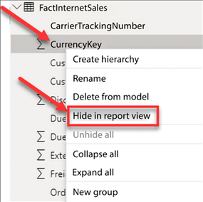
Figure 4.26: Select Hide in report view
Columns that are hidden are still visible in the data and model views. Hidden columns will have a visibility icon that appears to the right of the column name, as seen in Figure 4.27:
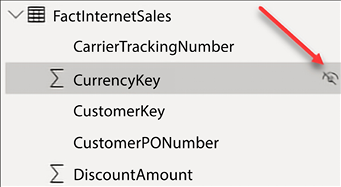
Figure 4.27: Hidden columns
Next, go to each table and hide all remaining key columns, except for FullDateAlternateKey.
When working in the Model view, you can multi-select columns by holding down the Ctrl key while selecting columns. Therefore, you can select all columns that need to be hidden first, then hide them all in a single action.
Renaming tables and columns
The renaming of tables and columns is an important step in making your data model easy to use. Different departments often have different terms for the same entity, therefore it is important to consider multiple departments when renaming objects. For example, you may have a column with a list of customer names and you decide to name this column Customer. However, the sales team may have named that column Prospect or Client, or any number of other terms. Remember to keep your end users and consumers of your reports in mind when renaming tables and columns.
You may rename tables or columns in the Report, Data, or Model view. Navigate to the Model view and right-click on FactInternetSales, then select Rename, as seen in Figure 4.28. Rename the table Internet Sales:
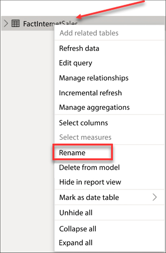
Figure 4.28: Renaming FactInternetSales
Next, rename the remaining tables, removing the Dim prefix and adding spaces where applicable. The table below is provided for reference:
|
Original names |
New name |
|
FactInternetSales |
Internet Sales |
|
DimDate |
Date (Order) |
|
DimDate (2) |
Date (Ship) |
|
DimProduct |
Product |
|
DimCustomer |
Customer |
|
DimSalesTerritory |
Sales Territory |
|
5 Regions 2008 |
Temperature |
The next step is necessary, but could be a somewhat tedious process. If you come from a programming or development background, then you will be used to eliminating spaces in table and column names. End users and consumers of reports will expect to see spaces and, for that reason, it is recommended to add spaces where applicable. Spaces need to be added to any column that is visible, not hidden, in the Report view. To rename a column, right-click on it and then select Rename. In Figure 4.29, spaces have been added to CarrierTrackingNumber and CustomerPONumber:
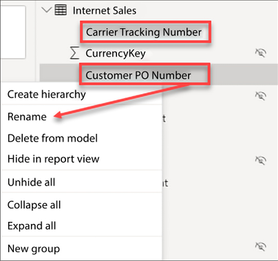
Figure 4.29: Renaming columns
Complete the following steps to rename the rest of your columns:
- Repeat this process of adding spaces for the remaining columns in each table
- Rename
FullDateAlternateKeyto simplyDate
Renaming columns is a simple yet effective step for improving user experience! Now, let’s take a look at another important usability enhancement for your data model, changing the default summarization on numeric columns.
Using the Power Query Editor, you may be able to automate the process of renaming your columns in Power BI. Here is a quick YouTube video outlining this process: https://youtu.be/GF5S2ktPTB0.
Default summarization
By default, Power BI assigns a default summarization to numeric columns that do not have a relationship or appear on the one side of a relationship. This default summarization is usually a sum operation. Columns that have been assigned a default summarization are denoted by Power BI with a Sigma symbol (∑), as seen in the Report view. This default summarization behavior can be observed in the Temperature table. In Figure 4.30, the columns Avg Temp and Month Number have been assigned a default summarization by Power BI:
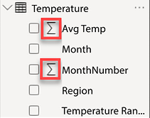
Figure 4.30: Default aggregations assigned to columns
This automatic assignment of default summarizations has pros and cons. The benefit is that fields like Sales Amount or Total Cost will be automatically aggregated when they are added to a visual in a report, thus making the report building process a little easier. The downside is that very commonly, a data model will contain numeric columns that are descriptive in nature and it could cause confusion for report developers in Power BI when these columns are automatically aggregated when added to a report. The columns identified in Figure 4.30 are descriptive attributes that help to explain the data; these columns should not be aggregated. Take a look at the following screenshot:
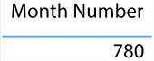
Figure 4.31: Sum of months from the Temperature table
In Figure 4.31, the Month Number column from the Temperature table has been added to a table visual, and the expected behavior is to see a distinct list of the month numbers (1, 2, 3, 4, 5, 6, 7, 8, 9, 10, 11, 12). Instead of returning a distinct list, the report returns a sum of all records from the Month Number column in the Temperature table resulting in a final value of 780. Fortunately, the default aggregation can be changed. See Figure 4.32 and the accompanying steps:
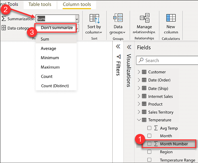
Figure 4.32: Adjust the default summarization
Let’s take a look at the numbered items in Figure 4.32 to learn how to change the default summarization:
- Expand the Temperature table and select the Month Number column. Make sure to click on the column name here, not the checkbox. Once the column has been selected, the Column tools ribbon will appear across the top of Power BI Desktop.
- Select the Column tools ribbon.
- Click the dropdown for Summarization and select Don’t summarize.
Repeat the above process for each column in your data model that has been assigned a default aggregation but should not be summarized.
Columns that are in tables on the one side of a relationship will automatically have a default summarization of Don't summarize! Take a look at the date table and you will notice that each of the numeric columns, like Calendar Year and Month Number, have a default summarization of Don't summarize. This is yet another benefit of properly defining relationships in Power BI.
Now that you have learned how to update the default summarization, let’s take a look at yet another important usability enhancement. In this section, you will learn how to configure columns in your data model so that the data is properly sorted in visualizations.
How to display one column but sort by another
Oftentimes, you want to display the name of one column but sort by another. For example, the month name is sorted alphabetically when added to a report visual; see Figure 4.33:
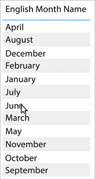
Figure 4.33: Month names sorted alphabetically when added to a report visual
The desired behavior is for the month to be sorted chronologically instead. Therefore, the report should display the month name but sort by the month number of the year. Take a look at the numbered items in Figure 4.34 and the accompanying steps:
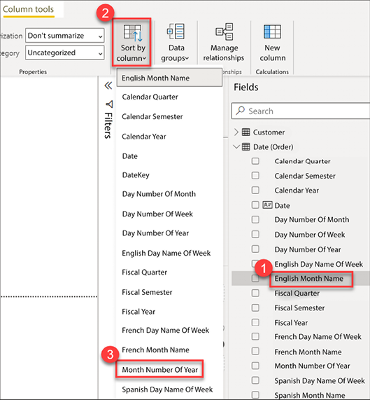
Figure 4.34: Changing the sort order of a column
In order to change the sort order of a column, complete the following steps:
- Expand the Date table and select English Month Name, as seen in Figure 4.34
- Select the Column tools ribbon
- Click the dropdown for Sort by column and select Month Number Of Year
In this section, you learned how to reorder the values of a column, this will be very helpful and is a very common request. Now, let’s take a look at how to categorize columns to further improve the report consumer experience.
Data categorization
Power BI makes some assumptions about your columns based on data types, column names, and relationships in the data model. These assumptions are used in the Report view when building visualizations to improve your default experience with the tool. Once you start building visualizations, you will notice that Power BI selects different types of visuals for different columns; this is by design. Power BI also decides column placement within the fields section of a visual—you will learn more about the creation of visuals in Chapter 6, Visualizing Data. As you saw previously in this chapter, when Power BI detects a column that has numeric values on the many side of a relationship, a default aggregation is assigned. Power BI assumes you will want to aggregate that data, and will automatically place these numeric columns into the Values area of a report visual.
The classification of data allows you to improve the user experience, as well as improving accuracy. There are thirteen different options available for data categorization at the time of writing.
Figure 4.35 provides a full list of the data categories available in Power BI:
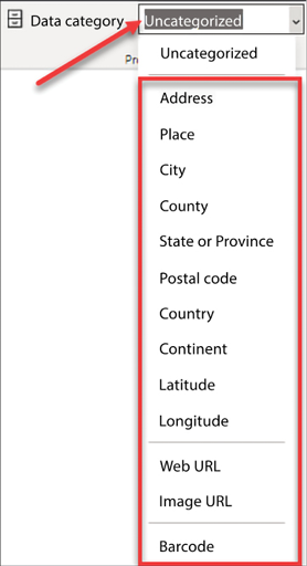
Figure 4.35: Options for data categorization
The most common use for data categorization is the classification of geographical data. When geographical data is added to a map, Bing maps may have to make some assumptions about how to map that data. This can sometimes cause inaccurate results. However, through data classification, you can reduce and possibly eliminate inaccurate results.
One extremely useful method is combining multiple address columns (City, State) into a single column, and assigning the new column a data categorization of Place. See the following blog post for more tips on mapping geographical data: https://tinyurl.com/pbiqs-categoryplace.
To update a column’s data category, see Figure 4.36:
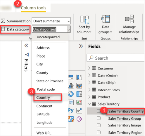
Figure 4.36: Modifying the data category
Take the following steps to complete this process:
- Expand the Sales Territory table and select Sales Territory Country
- Select the Column tools ribbon
- Click the dropdown for Data category and select Country
Explicitly classifying each of the geographical columns in your data model will help Bing Maps to properly map your data correctly. When geographical classifications are not used, it is much more likely that data could be incorrectly mapped. The blog previously mentioned in this chapter shows data that was incorrectly mapped by Bing Maps and how proper classification of data solved the mapping issue.
Creating hierarchies
Predefining hierarchies can provide several key benefits. Some of those benefits are listed here:
- Hierarchies organize attributes and show relationships in the data
- Hierarchies allow easy drag-and-drop interactivity
- Hierarchies add significant analytical value to the visualization layer through drilling down and rolling up data, as necessary
Hierarchies store information about relationships in the data that users may not have otherwise known. Imagine working for a client in the telecommunication industry with Base Transceiver Stations (BTSes) and sectors. Without clear direction from the client, how would you know which came first, the BTS or the sector? Did a BTS contain multiple sectors, or did a sector contain multiple BTSes? Once a hierarchy is added to the data model, you will no longer have to worry about remembering the relationship because the relationship was stored in the hierarchy. Here is a list of common hierarchies:
- Category | Subcategory | Product
- Country | State | City
- Year | Quarter | Month | Day
In order to create a new hierarchy, consider Figure 4.37:
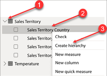
Figure 4.37: Create a new hierarchy
To create a hierarchy, complete the numbered steps:
- Expand the Sales Territory table.
- Right-click on the Sales Territory Country column.
- Select Create hierarchy.
A new hierarchy has been created with a single column and given a default name of Sales Territory Country Hierarchy. Right-click on the hierarchy created and rename it Sales Territory Drilldown. The next step is to add additional columns/attributes to the hierarchy:
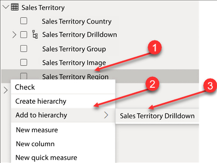
Figure 4.38: Adding columns/attributes to the hierarchy
Complete the following steps as seen in Figure 4.38:
- Within the Sales Territory table, right-click on Sales Territory Region.
- Click on Add to hierarchy.
- Select Sales Territory Drilldown.
- Repeat steps 1-3 for Sales Territory Group.
The completed hierarchy can be seen in Figure 4.39. However, the order of the attributes is incorrect; the order should be Sales Territory Group | Sales Territory Country | Sales Territory Region:
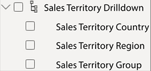
Figure 4.39: Completed hierarchy
To correct the order of the attributes, go to the model view:
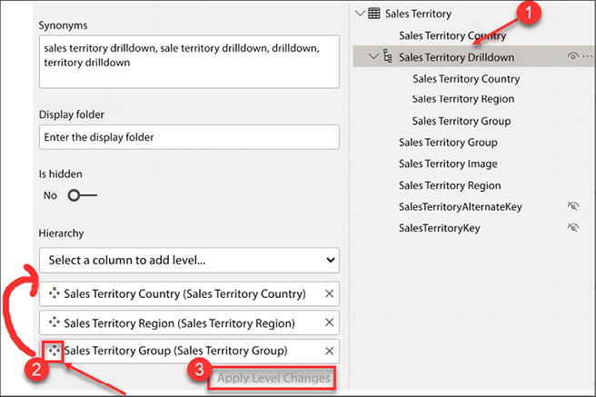
Figure 4.40: Reordering a hierarchy
- From the model view, select the Sales Territory Drilldown from the Sales Territory table.
- From the Properties pane, drag and drop the Sales Territory Group to the top of the hierarchy.
- Click Apply Level Changes.
In Figure 4.41 you can see the correctly arranged hierarchy:
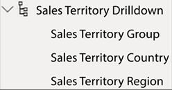
Figure 4.41: Completed Sales Territory hierarchy
In this section, you learned how many small but effective modifications can be leveraged to improve the readability and effectiveness of the data model. These necessary usability enhancements help to improve the user experience by making the model intelligent and easier to understand.
Now let’s transition to discussing some considerations for data model performance.
Improving data model performance
Data model performance can be measured in two ways within Power BI, query performance and processing performance. Query performance is how quickly results are returned by visualizations and reports. Processing performance is a measure of how long it takes to perform a data refresh on the underlying dataset. Data model performance as a whole is very important and the Power BI developer should always be aware of how design decisions may affect performance today or in the future. A deep dive into performance is out of the scope of this book, but an overview is provided here.
Query performance
As you learned in Chapter 2, Connecting to Data, there are multiple ways that you can connect to data in Power BI. For example, you can import data, use DirectQuery, use a live connection, or you can use a combination of import and direct queries with the composite model.
Data model design methodologies
Data models in Power BI are specifically designed for the purpose of extracting analytical value out of data to make informed business decisions. Therefore, the data should be modeled in such a way as to effectively and efficiently report data. In Power BI, there are three types of data models that commonly appear and those are flat models, star schemas, and snowflake schemas.
A flat or completely denormalized model is where the entire data model is a single table with no supporting tables. Therefore, all your measurable items and all the descriptive attributes are in the same table. This model is very common and is a result of a lot of Excel users importing data directly into Power BI from their Excel worksheets. This method is highly inefficient and has several drawbacks:
- A flat model does not scale well; as the number of records in the table increases, the data model will consume significantly more resources due to the repetitiveness of data and the number of columns.
- A flat model is not flexible and does not hold up well to future changes.
- A flat model is not intelligent, simply meaning it’s not easily understandable.
- Time series analysis calculations like Year to Date and Year over Year are much more difficult to author.
The next type of model is a star schema. This method was discussed earlier in this chapter and we will review it in this section for completeness. The star schema is the preferred way to model data in Power BI. The term star schema is derived from dimensional modeling. Dimensional modeling is the way enterprises and organizations have been designing their analytical data warehouses for over 30 years. A star schema has two types of tables, fact tables and dimension tables. The reason these data models are called star schemas is that the dimension tables surround the fact table and appear to represent a star. See Figure 4.42:
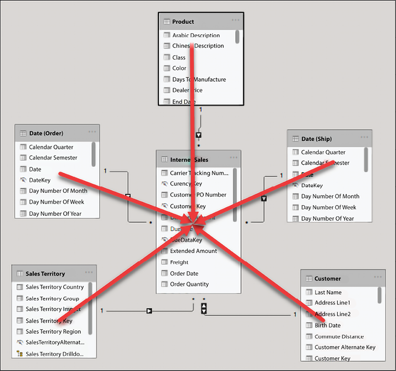
Figure 4.42: Star schema
Fact tables store metrics, the measurable items in your data model like sales, tax amount, duration of a phone call, and so on… A dimension table stores descriptive attributes that help you to explain your metrics. In a dimension table, related attributes are stored in their own separate and distinct table. For example, product name, color, size, weight, and other product-related columns would be stored in a product table.
Taking the time to build a star schema in Power BI Desktop has several advantages; please note that the following list is not a comprehensive list of all the advantages of a star schema:
- The data model is scalable, meaning it will be flexible to grow as more data is added
- The data model is flexible and additional tables can more easily be integrated into the existing data model to support analytical requirements as they arise
- Star schemas are intelligent and easily understandable
- Star schemas make time intelligence calculations easy to implement
The final type of data model I’d like to mention here is a snowflake schema, a visual depiction of this model more closely resembles a snowflake than a star. In dimensional modeling, most data models begin as star schemas but may evolve over time into snowflake schemas to support more advanced analytical requirements. A simple example of a snowflake schema would be if the product dimension were broken out into multiple tables like product category, product subcategory, and product.
Importing data
Importing data is the most common method of connecting to data for Power BI models, storing the data in memory. This method is highly efficient for query performance due to the fact that all queries are answered from an in-memory cache, which provides unmatched analytical performance! Models that contain imported data historically require very little to no performance tuning, especially for smaller data models.
DirectQuery
As discussed in Chapter 2, Connecting to Data, another method for connecting to data is DirectQuery. DirectQuery, unfortunately, has historically performed very poorly when it comes to query performance. DirectQuery is most commonly used when the dataset that needs to be analyzed is too large to import into Power BI.
Aggregations
Creating aggregations in Power BI provides a powerful mechanism for improving query performance. Aggregations can be used with imported or DirectQuery models, for massive performance gains!
Effectively implementing aggregations requires an understanding of the data and understanding how end users will generally query the data. With this knowledge, an aggregated table can be designed and used to answer a large number of user requests, rather than the original table storing many more rows of data.
Let’s look at a hypothetical example: imagine a transaction table that has 100 million rows of data for the last year. If most visualizations will be performing counts and sums by date, then an aggregation can be built that returns total sales and total transactions grouped by date. In this scenario, the aggregate table would return 365 rows of data, 1 row for each day in the last year instead of the original 100-million-row transaction table. In most data models, it is unlikely that the date alone would suffice to answer most queries from end user requests. Therefore, additional attributes may need to be added to the aggregate table, for example, maybe adding the geography key is the missing ingredient. The aggregate table would now be total sales and total transactions grouped by date and geography. This would of course increase the size of the table significantly, depending on how many unique records exist in your geography table, but it would still be significantly smaller than your original transactional table and likely small enough to import the aggregated data into Power BI.
The steps for effective implementation of aggregations would not fit within the scope of this book; however, to learn more about aggregations, take a look at the following blog by Shabnam Watson: https://shabnamwatson.wordpress.com/2019/11/21/aggregations-in-power-bi/.
Now let’s take a look at data modeling considerations for improving processing performance.
Processing performance
Imported datasets must go through a data refresh operation to load the most recent data into the data model. In today’s “data-driven culture,” organizations want more data and they want it faster than ever before. If a dataset takes hours to refresh, then you would be limited in how often you can refresh the dataset. On the other hand, if a dataset only takes minutes to refresh, you can refresh it more often throughout the day, providing richer insights and more time-sensitive access to the underlying data.
Query folding
As you learned previously in this book, query folding is the process of pushing work back to the underlying data source. Query folding is very important when the underlying data source supports query folding. A relational database like Microsoft SQL Server is one example of a data source that supports query folding. Pushing the work back to SQL Server can significantly improve the processing performance of a data model.
Incremental refresh
Historically, refreshing a data model in Power BI requires that all data be refreshed. Therefore, if a data model contains five years of data, then all five years of data and the associated rows would be refreshed each time a refresh occurs. As you can imagine, this can require a lot of overhead. What if a data refresh operation could take less than a minute, instead of hours?
I have seen the process of incremental refresh reduce data refresh operations from hours to only minutes. This is because incremental refresh does not reprocess all the data in the model. Instead, only the most recent data is loaded, while not touching the historical data. This would include new records or records that have been updated.
Further reading: Implementation of incremental refresh is outside the scope of this book; however, you can learn more about incremental refresh by taking a look at the following blog: https://docs.microsoft.com/en-us/power-bi/admin/service-premium-incremental-refresh.
Best practices
There are a few recommended best practices that can help speed up data refresh operations. This is by no means a comprehensive list, but this list provides you with a starting point for building data models:
- Only import necessary columns for reporting; remove all other columns from your model.
- Likewise, only import necessary rows of data; filter out data that is not needed.
- Try to avoid highly unique columns; they have low compression and take up valuable resources.
- Disable Auto date/time for new files; see Figure 4.12.
- Create new columns in the Power Query Editor, rather than in DAX, when possible.
Summary
In this chapter, you learned that data models in Power BI Desktop should be understandable and designed for scalability and flexibility. You learned how to create new relationships and edit existing relationships. You also learned about how to handle and model complex relationships like many-to-many and role-playing tables. This chapter discussed the importance of usability enhancements like sorting columns, adjusting default summarization, data categorization, and hiding and renaming columns and tables. Finally, the chapter ended with a short discussion on performance considerations for querying and processing your data model. You are now prepared and ready to start building data models in Power BI Desktop!
These data relationships, combined with simple yet critical usability enhancements, allow you to build a data model that is both coherent and intelligent. Historically, business intelligence projects have cost significant resources in terms of time and money. With Power BI Desktop and through a self-service approach to BI, you now have the tools necessary to build your own BI project within hours and immediately extract value from that model to make informed business decisions.
In the next chapter, you will learn about how to leverage data analysis expressions to further extend the analytical capabilities of your data model.
Join our community on Discord
Join our community’s Discord space for discussions with the authors and other readers:
