7
Digital Storytelling with Power BI
In the previous chapter, you learned how to explore many of the readily available visuals within Power BI and how they can showcase your data. With the assistance of cross-highlighting and cross-filtering, you can also make the visuals work with each other—but there is so much more than just simple drag-and-drop reporting within Power BI. Power BI has several useful storytelling features. Alongside the different visuals, Power BI has a set of features that can tie together not only individual charts and graphs, but that can also allow users to navigate through multiple pages to discover exactly the level of detail they want from the data. Using these features, you can weave together the data in a way that allows interactivity far beyond what has already been seen. This allows users to take control of how they will view your Power BI report. If they just want to take a quick glance at a summary view of the data, they can; but if they wish to dive deeper, you can offer multiple paths to take. This chapter will investigate the following digital storytelling features:
- Configuring drill through
- Capturing report views with bookmarks
- Combining object visibility with bookmarks
- Report pages as tooltips
- Page navigation
When using these features, there are many different approaches that can be taken. You will be looking at them in their most basic forms, but they can flourish when you use your imagination. The idea of digital storytelling has become extremely popular, which will more than likely foster even more features for the future of Power BI, so keep an eye out!
For this chapter, you will be using the completed Power BI file from Chapter 6, Visualizing Data. If you have not completed this on your own, you can open a completed version, located at Microsoft-Power-BI-Start-Guide-Third-Edition-mainCompleted ExamplesChapter 6 - Visualizing Data.pbix. It is recommended that, upon opening this file, you immediately use the Save As option and name the report Chapter 7 - Digital Storytelling with Power BI. By doing this, you can preserve your work from chapter to chapter.
Possibly the most fundamental method for empowering digital storytelling is providing report consumers with the ability to tie multiple report pages to the same context; in Power BI, this is accomplished by using drill through.
Configuring drill through
In Chapter 6, Visualizing Data, you saw the power of filtering to allow a single visual to provide many different views of the data. For instance, a bar chart showing all sales could also show sales by year if cross-filtered by a date slicer. You also saw how the filter pane could be applied to visuals on a single page or across the entire report. Up to this point, those were the only two options available. The drill through feature allows users to navigate from one report visual to another report page while maintaining the filter context of the visual.
A common example of the use of drill through is going from a summary to a detail page. A summary page may contain several visualizations for sales data all aggregated at the country level. One of those could be a pie chart showing total sales broken down by country. While this can be useful, many users will want access to more detailed information, such as all the sales that happened in a particular country. A drill through filter will allow users to right-click on a slice of the pie chart, possibly representing the United States, and drill through to a detail report showing a table of sales that are now filtered to the United States.
While right-click drill through is effective, it is not obvious to the user that it’s available. An alternative would be to configure a button for drill though which adds a very clear, visible drill through path. This allows users to quickly move from summary to detail and back to summary without ever needing to open the Filters pane. With the right configuration, drill through is a powerful data exploration tool.
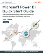
Drill through filters are applied at the page level only and are configured in the Fields section of the Visualizations pane; they cannot be applied at the visualization or report level. The Drill through section has three options to configure:
- Cross-report: Drill through to another report in the same Power BI workspace or app when deployed to the Power BI service. There are a few special considerations with this scenario, like the drill through table and column names matching in both reports and the data in each field being case-sensitive.
- Keep all filters: When enabled, all filter context from the source visual in addition to the fields listed in the field bucket will be applied. When disabled, only fields listed in the Drill through field bucket will be applied as filters.
- Add drill-through fields here: Fields added to this bucket will automatically be enabled for drill through any time they are present in a visualization on any other page within the same report.
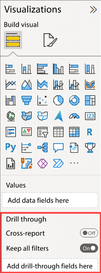
Figure 7.1: Drill through settings on the Visualizations pane
Let’s explore an example by copying some of the visuals created previously, in Chapter 6, Visualizing Data, and moving them into new pages, leveraging the Drill through filter option.
Let’s look at setting up an example. Note that the Cross-report and Keep all filters options should be set to Off and On respectively, as shown in Figure 7.1, then take the following steps:
- Create two new report pages: the first one should be called Summary and the second Drill Through.
- Navigate to the Summary report page and add a Stacked column chart visual. Move and resize the visual to take up the right half of the Report canvas.
- From the Fields pane, drag the Profit measure from the Internet Sales table to the Y-axis bucket.
- From the Fields pane, drag Region Drilldown from the Geography table to the X-axis bucket.
- From the Fields pane, drag Year from the Date (Order) table to the Legend bucket:
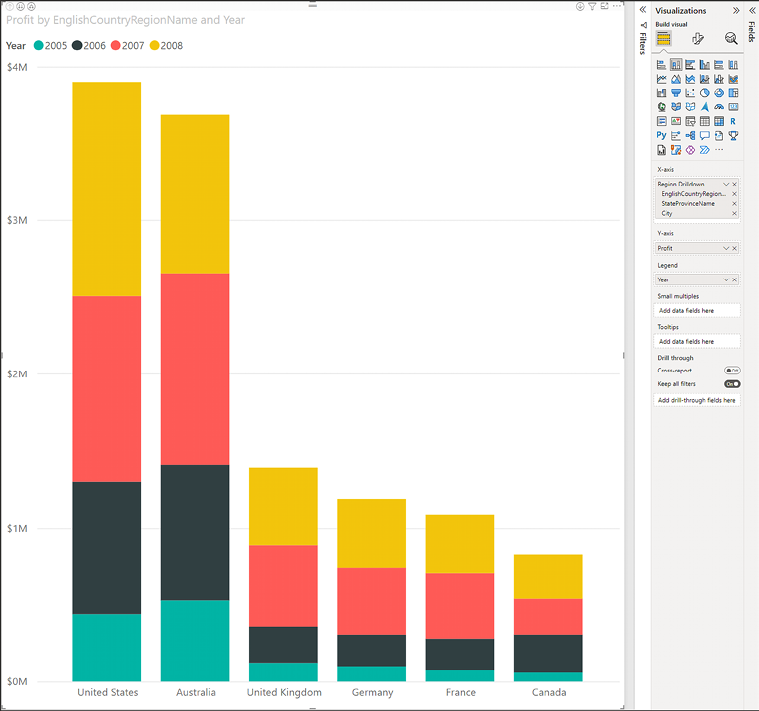
Figure 7.2: Bar chart displaying profit by country and year
- Next, navigate to the Drill Through page. Add a Table visual. Move and resize the visual to take up the left third of the Report page, but leave a small amount of space above the visual, approximately 1/16 the height of the report page.
- From the Fields pane, drag the following fields to the Columns bucket:
- StateProvinceName from the Geography table
- City from the Geography table
- Year from the Date (Order) table
- Profit from the Internet Sales table
- Next, add a Map visual to take up the right two-thirds of the Report page.
- From the Fields pane, drag City from the Geography table to the Location bucket.
- From the Fields pane, drag the Profit measure from the Internet Sales table to the Bubble size bucket.
- Finally, populate the Drill through fields by dragging EnglishCountryRegionName from the Geography table to the Drill through fields bucket:
Figure 7.3: Map with a country on the drill through fields enabling the back button
When placing a field into the Drill through bucket, you will notice that a backward arrow image is automatically added to the page in the upper left-hand corner. This is simply an image that has been set with an action to go back to the previous page. By selecting the image, you will find that there are quite a few familiar format settings available in the Format section.
One of the more common settings to change is the Line color option under Icon, which will allow the selection of a color to make the back arrow more visible:
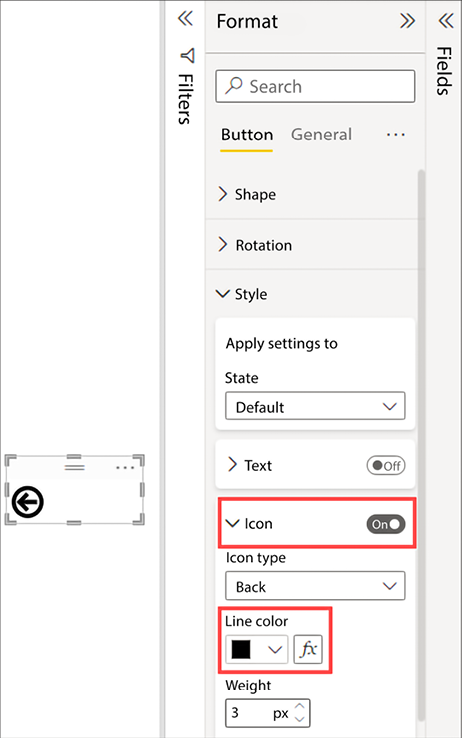
Figure 7.4: Back arrow with line color set to black
Everything is set for this example to demonstrate how Drill through works. Proceed by taking the following steps:
- Navigate to the Summary page. Right-click the 2008 section for United States. There is now an option called Drill through. Hovering the mouse over this new option will present a list of available drill through reports. In this scenario, only one option exists. It is important to note that you can have as many drill through reports as you desire. Click the Drill through option:
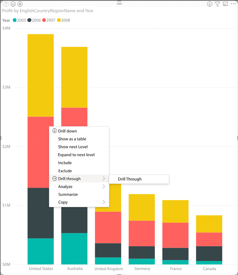
Figure 7.5: Right-click menu showing the reports available for drill through
- Upon left-clicking the Drill through option, you will be taken to the corresponding Drill Through page. Notice both visuals have been filtered by the value of United States, and because the Keep all filters option is turned on, they are also filtered to the context of only 2008.
Had the Keep all filters option been turned off, the visuals would be displaying only the United States, but all years:
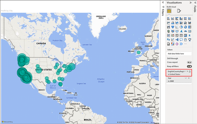
Figure 7.6: United States filter applied after performing drill through from the bar chart on the Summary page
As you can see, using drill through in this scenario allows you to dive deeper into sales records for a specific country, in a specific year. If you were to navigate back to the Summary page (using the page navigation or holding down Ctrl while clicking the back button in the top-left corner of the canvas) and make a different selection, those new filters would take effect on these two visuals. Thus, you can see that now you have two report pages that interact with each other. As more and more pages are added to the report, users will always have the option to drill through to this report page with whatever filters they have chosen, provided the visual uses the EnglishCountryRegionName field.
Drill through provides users with an ad hoc path to data exploration, allowing them to choose when and where to go deeper. There will be times when a more curated storytelling experience is required, and that is accomplished using bookmarks.
Capturing report views with bookmarks
Cross-filtering, cross-highlighting, and drill through filters make a big impact on how users consume data in Power BI reports. Sometimes, though, you may want to ensure that users see the data in a very specific way that will truly show its impact, satisfy report requirements, or simply provide alternative views of the data.
You can guide report consumers in a very interactive way using bookmarks and showing or hiding visualizations in the Selection pane. Using these options, you can make better use of the available canvas on each report page and still make it feel as if users have many choices as to how they will view the data.
The Bookmarks feature allows report creators to capture the view of a Report page. Bookmarks will save the current state of all filters, slicers, in-focus items, sorting, and spotlight visuals (more on that feature later in this section) on a page at the time when the bookmark is created. This allows users to return to the captured state by simply selecting the bookmark in question.
To begin working with bookmarks, navigate to the View ribbon and select Bookmarks from the Show panes section. You will see a new pane present itself to the left of the Visualizations pane:

Figure 7.7: Showing the Bookmarks pane
Because you have not created any bookmarks, the only option available is Add. First, let’s bring in a couple more visuals to the Summary page:
- First, copy an existing visual to the Summary page. Navigate to the Trend Data report page. Select Line chart, which shows Total Sales and Prior Year Sales. Press Ctrl + C on the keyboard or click the Copy button from the Home ribbon.
- Navigate to the Summary page. Press Ctrl + V on the keyboard or click the Paste button from the Home ribbon. Move and resize the visual as you see fit, leaving a small amount of space to add a filter.
- Next, add a Slicer to the Summary page using the Age Breakdown field from the
Customertable. Optionally, display the slicer as a series of buttons by navigating to the Format area for the slicer and changing the Orientation property to Horizontal within the Slicer settings on the Visual sub-pane section:
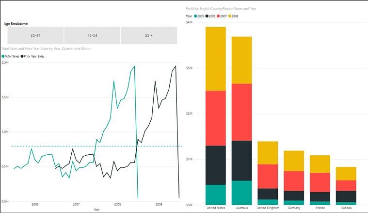
Figure 7.8: Summary page with line chart and slicer added
The slicer will filter both the Bar and Line chart without any additional work by leveraging Power BI’s cross-filtering functionality. While it’s not required, setting the filter to a series of buttons allows a consumer to more easily identify what filter context has been applied to this page of the report.
With the visuals in place, you can start to create bookmarks. There are a couple of different approaches that can be adopted. The first option you will look at is simply filtering the data to a specific state and then selecting the Add option inside the Bookmarks pane. Select the 35-44 option from the slicer to filter the Summary page. Creating a bookmark for this really isn’t impactful because this is something that users can do by themselves with a visual slicer, but you can use some of the other features in combination with this to create a specialized view of the data—for instance, the Spotlight option.
Select the ellipsis in the upper right-hand corner of the Stacked column chart visual and choose the Spotlight option, which will fade all other visuals on the page. Spotlight is useful for drawing attention and focus to a single visual while keeping the remainder of the report page visible, so users can gather context for the data.
Now select the Add option inside of the Bookmarks pane and rename the bookmark as Spotlight Column 35-44. To rename the bookmark, select the ellipsis to the right of the newly created bookmark. You will see the Rename option, along with many others, as shown in Figure 7.9:
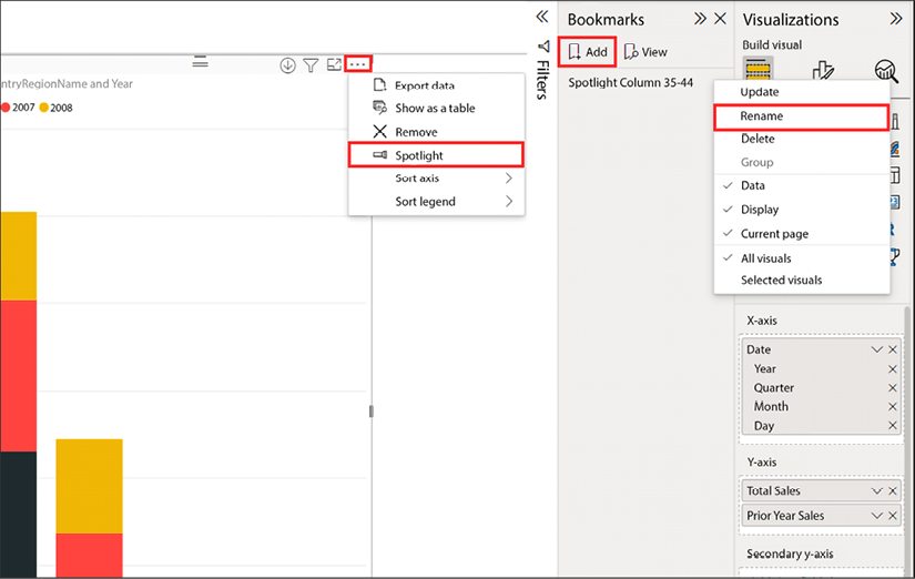
Figure 7.9: Spotlight option on the bar chart visual in addition to the Add and Rename bookmark options
Below is a short description of how each of the options on the options menu affects the bookmark:
- Update: Overwrite the bookmark settings with the current state of the page. To update a bookmark, do not click the name of the bookmark as Power BI will switch to that bookmark, resetting the state of the report. Set the report to the desired state and only then click the ellipsis next to the desired bookmark, and select Update.
- Rename: Change the name of the bookmark.
- Delete: Remove a bookmark.
- Data: When enabled, the bookmark retains the current state of the Filters pane and the selection of any visuals (slicer selection, visual highlighting, the selection of a section on a bar chart, and so on).
- Display: When enabled, the bookmark retains visual properties, such as the spotlight feature and the visibility.
- Current page: When enabled, selecting a bookmark automatically takes the user to the page where the bookmark was created and applies the data and display settings according to the bookmark. When disabled, a bookmark will only function when the user is already on the page from which the bookmark was created. This option effectively disables a bookmark unless you are on the page the bookmark references.
- All visuals: When selected, all visuals on the page, both visible and hidden, are part of the bookmark.
- Selected visuals: When selected, only the visuals that are selected, whether visible or hidden, when the bookmark is created or updated will be stored.
As you can see from these options, there are many different behaviors that can be controlled with bookmarks.
Now let’s look at how bookmarks can be used:
- Click any area in the Report canvas or surrounding area where there are no visuals. This will deselect all visuals and the bookmark.
- Switch the Slicer visual to 45-54 and once again use the Spotlight feature on the Stacked column chart, and create another bookmark called Spotlight Column 45-54.
- Add a third bookmark following the same steps but pointing to the 55+ option within the Slicer. This one should be called Spotlight Column 55+.
Users can now open the Bookmark pane and choose to view whichever bookmark they would like very easily.
An additional way to view bookmarks is in a slideshow style. Just to the right of the Add button is an option labeled View that will bring up some new icons at the bottom of the Report page. A forward and back arrow allows you to move through all the available bookmarks and tell a tailored story about the data. Also, while in this mode, all of the visuals are still completely available to be interacted with. To exit, simply choose the X icon next to the arrows at the bottom or the Exit option within the Bookmarks pane. The order of bookmarks can be very important when using the slideshow view. The order can be changed by simply dragging and dropping the bookmarks into the desired order:
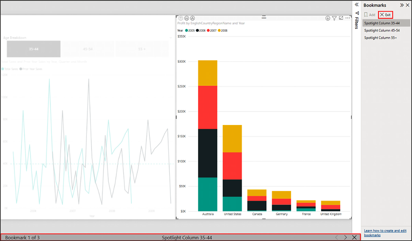
Figure 7.10: Options for exiting the Bookmarks view
You have already seen many ways to use bookmarks, but there are still more. Another fantastic way to guide your audience to these tailored views of the data is by using images or buttons to link to bookmarks. To get a better understanding of how to accomplish this, let’s look at the Selection pane.
Combining object visibility with bookmarks
The Selection pane provides a list of all objects on the current page and allows you to show or hide visuals. This is useful if a slicer or visual is needed for cross-filtering but is not needed for analysis. It is also useful to reuse the same Report page for the same data but use different visuals when you are pressed for space. The following section will demonstrate how to maximize your use of space when visualizing data in different ways.
Bookmarking alternate views of the same data
Some users may want to see sales by country figures as a bar chart, and others may want to see them as a table. If there is not enough room for both visuals, the default answer may be to create a new page. However, it can be cumbersome to recreate and maintain the same exact filters on multiple pages. An alternative solution would be to put both visuals on the same page and dynamically show or hide them based on a user selection of “chart” or “table.”
Let’s look at how this scenario could be implemented:
- On the View ribbon, click the Selection option in the Show Panes section. The Selection pane appears adjacent to the Bookmarks pane.
- Navigate to the Summary page and create a duplicate of the Stacked column chart. This can be done by selecting the chart and pressing Ctrl + C then Ctrl + V, or using the Copy and Paste buttons on the Home ribbon.
- With the duplicate visual selected, change it to a Table visual. Move it so that it lies directly on top of the column chart. Initially, it will look a little chaotic. You will see that this new visual is showing up in the Selection pane. In my example, it is called Table:
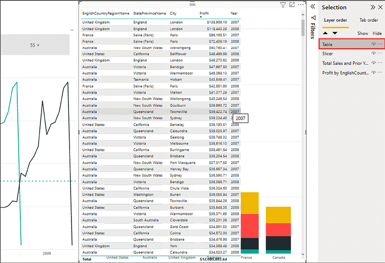
Figure 7.11: Table and bar chart displayed on top of each other
- Just to the right of this object, inside of the Selection pane, you will see an eye icon.
- Click the eye icon. You will see that the table visual disappears from the canvas—it is still part of the Report page but has been hidden.
- Add a new bookmark and name it Chart View. Also, for this new Chart View bookmark, ensure that the Data option is not selected. The goal is to bookmark only the visual selection, not the data selection:

Figure 7.12: Chart View bookmark with data selection settings removed from the bookmark
Using the knowledge from the example you just completed, create one final bookmark that shows the table but hides the Stacked column chart. Call this bookmark Table View and be sure to remove the data selection from the bookmark options:
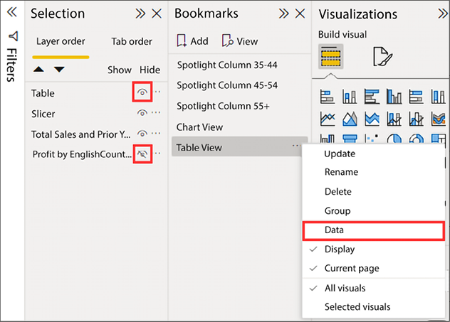
Figure 7.13: Table View bookmark settings
You can now see two different ways of displaying the same data within the same Report page, making efficient use of the available space. With the current report configuration, users need to open the Bookmarks pane to move between the Table View and Chart View bookmarks. While this is functional, it is not user-friendly. Adding a button to the report that automatically selects the appropriate bookmark is a great way to make the bookmark experience more approachable.
Using buttons to select bookmarks
Buttons can provide users with an even easier method for switching between bookmarks. To add buttons to your report, take the following steps:
- While on the Summary page of the report, navigate to the Insert ribbon and click the Image button in the Elements section. This will launch a file browser to select an image file.
- Navigate to the directory
Power-BI-Start-Guide-Third-Edition-mainData Sourcesand select theChart.pngimage to add it to the canvas. In the Format section of the Visualizations pane, turn the Title property On, name the image Chart Button, then turn the Title property Off. This will help distinguish between the buttons in the Selection pane but not display the title on the image in the report:
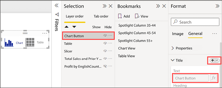
Figure 7.14: Title disabled on the Chart Button
- Repeat this process to add
Table.pngand change the title to Table Button. - To the best of your ability, stack the images on top of each other. You may need to reduce the size of other visualizations to allow space for the images.
Now it’s time to turn these images into buttons the user can press to toggle between the Chart View and Table View bookmarks. This requires a couple of quick updates to the Chart View and Table View bookmarks.
- Begin by selecting the Chart View bookmark and then hiding the Table Button image in the Selection pane. Select the ellipsis for the Chart View bookmark and choose the Update option. Now make the same change on the Table View bookmark, selecting the Table View bookmark, hiding the Chart Button image, and choosing the Update option from the bookmark’s ellipsis.
The last piece that will tie all this together is to assign an action to the appropriate image within the bookmarks. An action will allow users to click on the Chart Button image, visible on the Chart View bookmark, and be taken to the Table View bookmark, giving the appearance of a toggle switch. Similarly, the Table Button image, visible on the Table View bookmark, will take the user to the Chart View bookmark again, giving the appearance of toggling to the other view.
- While the Table View bookmark is selected, highlight the Table Button image in the Selection pane. The Visualizations pane will change to Format. Locate and expand the Action properties. Change the toggle to On, select Bookmark from the Type dropdown, and select Chart View from the Bookmark dropdown, as shown in Figure 7.15:
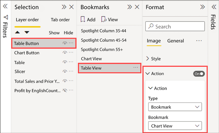
Figure 7.15: Turning an image into a button by creating an action that navigates to the Chart View bookmark
Now, when a user clicks on the Table Button image they will be taken to the Chart View bookmark, making a static image feel like an interactive button. In order to experience this behavior while developing the report, just hold the Ctrl key on the keyboard and left-click the image, and you will be taken to the Chart View bookmark. When the report is deployed to the Power BI service, users will not need to hold Ctrl while clicking the button to interact with it. They will simply left-click the image.
To finish this example, make the same changes to the Chart View bookmark and set the Chart Button image to have an Action that will navigate back to the Table View bookmark.
Using the Bookmark navigator
Creating buttons to navigate between bookmarks provides a great amount of flexibility to a report developer but comes at the cost of development time and complexity. Imagine needing to add additional bookmarks to this page. A stacked button approach would no longer work as it does with the chart/table toggle. This would require an update to the report to separate the existing buttons, create the new bookmark, create a new button, then size and space the buttons appropriately. This would need to be repeated each time an additional bookmark is required. Thankfully, there is a better way!
From the Insert tab on the ribbon, press the Buttons dropdown located in the Elements section. At the bottom of the list, expand Navigator and select Bookmark navigator. The bookmark navigator is added to the page and looks very similar to a slicer. Notice all the existing bookmarks are visible, saving time from having to set up buttons for each bookmark. As new bookmarks are created, they will be added to the bookmark navigator automatically.
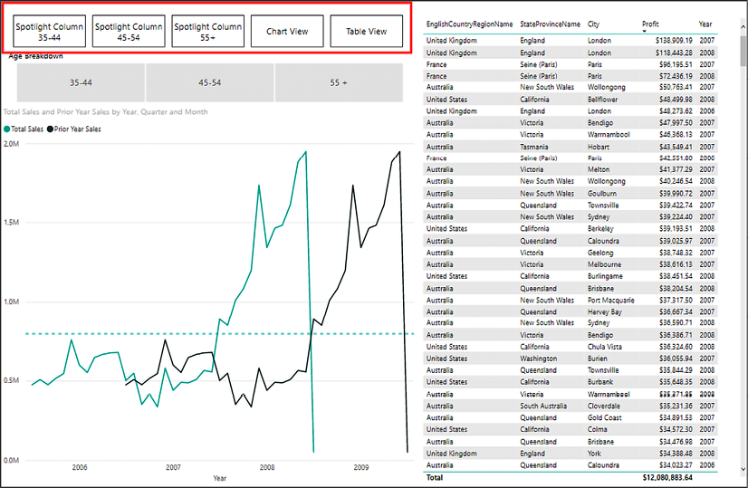
Figure 7.16: Report containing the bookmark navigator
Thinking back to the navigation buttons we created earlier in this chapter, you will recall there were only two. One for the chart view and one for the table view. However, by default, all the bookmarks are shown. To limit the bookmarks displayed you will first need to create bookmark groups.
From the Bookmarks pane select both the Chart View and Table View bookmarks by selecting the Chart View bookmark, and then, while holding the Ctrl key, click the Table View bookmark. Next, right-click and select the Group option. Optionally, rename the group to something more useful, like Visualization Toggle.
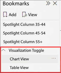
Figure 7.17: The newly created Visualization Toggle bookmark group
For the purpose of this exercise there is no need to create additional groups for the spotlight bookmarks, but those could be grouped together as well for a more clean and consistent report. So far, there is nothing special about the group other than to help organize the development environment and possibly aid a user who is navigating bookmarks using the Bookmarks pane. These groups do serve one additional purpose with the bookmark navigator.
Select the bookmark navigator on the report canvas. Locate the Bookmarks setting in the Format pane and choose the Visualization Toggle group from the dropdown. Notice now that the bookmark navigator only displays the bookmarks included in the Visualization Toggle group. By renaming, reordering, adding, or removing bookmarks from this group the navigator will automatically be updated.
As with many items in Power BI, there are a variety of visual formatting options, including changing the shape from rectangles, modifying the button font, switching from a horizontal to vertical grid layout, and many more. This is an incredibly useful feature that will no doubt save time and aid in creating well organized reports.
Hopefully, with these examples you can start to see the depth of what can be achieved by using the Selection and Bookmarks panes for digital storytelling.
Guiding report consumers through visualizations is helpful, but sometimes switching to a different report page with a completely different view of the data removes the user from their workflow. In cases where more detail is required but you would like to keep users in their workflow, you can enhance the built-in tooltips by displaying a report page as a tooltip.
Report pages as tooltips
Tooltips are another useful feature that allows a user to see precise information about a piece of a visual while moving the mouse around the Report canvas. While the formatting options discussed in the previous chapter can display value labels on a visual, sometimes that can cause a report to become too cluttered or a visual may just be too small to display a label. Tooltips solve this problem by allowing a user to see the label information for only the data point they hover the mouse over. But what if those tooltips could display even more information and provide even greater insight? Thankfully, Power BI comes through on this front by allowing you to specify a report page as a tooltip for a visual.
Power BI includes a few different important options for tooltip visuals. First, to use a visual for a tooltip, you must create a report page and tell Power BI that the page will be used as a tooltip. While any page can be a tooltip, report pages are large and are often too big to be an effective tooltip, so Power BI has a special canvas size specifically for use in tooltips. Finally, you can set a specific report page to display as the tooltip for each visual or allow Power BI to intelligently choose the appropriate page (if multiple pages are defined as tooltips).
Let’s continue using the Summary page and build a visual tooltip to see how this functionality works:
- Add a new page to the report and name the page Tooltip. Right-click on the page name and select Hide page since users will not be navigating to this page directly.
- From the Visualizations pane, change to the Format section. Expand the Page information properties and change the Allow use as tooltip toggle setting to On.
Expand the Canvas settings properties and change Type to Tooltip if it did not change automatically:
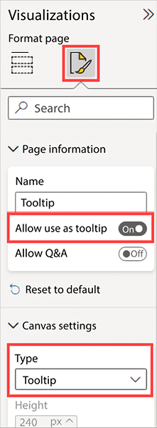
Figure 7.18: Format options to turn the report page into a tooltip and change the size to tooltip dimensions
- Power BI may scale the canvas to fit the screen. When we change Type to Tooltip it may not look like the canvas is much smaller if the scaling is set to Fit to page. To change the size of the canvas, navigate to the View ribbon, then locate the Page view option in the Scale to fit section and change it to Actual size or Fit to page as you desire.
- On the top half of the canvas, create a Card visual using the
Profitmeasure from theInternet Salestable. - On the bottom half of the canvas, create a Pie chart visual using
Temperature Rangefrom theTemperaturetable as the Legend and theProfitmeasure from theInternet Salestable as the Values. - To make the visual filter based on location, click anywhere on the blank canvas to deselect any visuals, and add EnglishCountryRegionName to the tooltip fields bucket on the Visualizations pane. Setting Keep all filters to On will operate similar to drill through filters, thereby retaining and applying all the source filters to the tooltip.
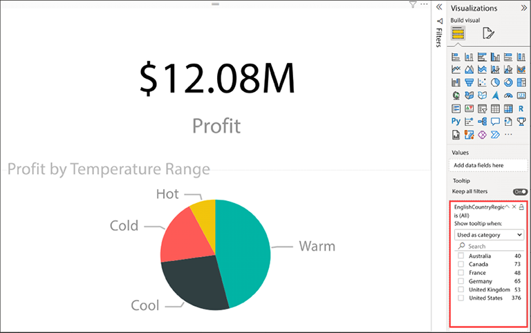
Figure 7.19: Enabling the tooltip page as an option any time the EnglishCountryRegionName field is used in a visualization
- Next, return to the Summary page of the report. Select Stacked column chart. In the Visualizations pane, navigate to the General section. Locate the Tooltips properties and select Report page for the Type property and Tooltip for the Page property.
Now, when hovering the mouse over a column in the chart, the visual tooltip we just created should appear and the country will be passed in as a filter to the tooltip:
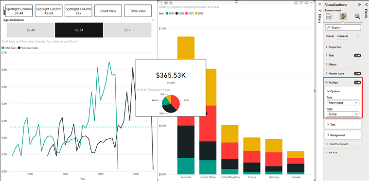
Figure 7.20: Setting the tooltip on a visualization to a report page
Many of the settings on a tooltip can be changed to provide more relevant information to users, but visual tooltips offer a powerful way to extend the tooltip functionality. By creating small pages of visuals and leveraging filters, you can provide a vast amount of additional data and insight that just cannot be matched by the default tooltips.
Using the Page navigator
So far, we have seen how to navigate between pages using drill through, weave through a report with bookmarks, and see additional details using tooltips. Now, let’s explore how you can enhance the most common and basic method for navigating a report: pages. In Power BI Desktop, the pages display lines the bottom of the report canvas. In the Power BI service, pages are displayed in a list on the left side of the screen. What if a user’s eyes never had to leave the report canvas? They could focus on the report, navigation to the relevant pages would be on each page, and in the case of Power BI Desktop, there would be no hidden pages to confuse the user. Of course, this can be accomplished using buttons, but the same issue arises that we saw with bookmarks earlier in this chapter. Creating additional pages means a lot of manual work to keep things updated and organized. This is where the page navigator comes into the picture.
The page navigator operates almost exactly like the bookmark navigator except it displays pages as the name suggests. To see this in action, navigate to one of the existing report pages, such as the Slicers page. From the Insert tab of the ribbon, select the Buttons dropdown in the Elements section. Expand the Navigator option and select Page navigator. Make some space for the page navigator by moving the Temperature Range and Sales Territory Drilldown slicers down and reducing the width of the page navigator.
Many of the same formatting options from the slicer visual and bookmark navigator are available on the page navigator. These include, but are not limited to, the shape of the buttons, the layout (which has been changed to a two-row grid as seen in Figure 7.21 below for better readability), and font style. Two important settings are found in the Pages section. The first, Show hidden pages, determines if hidden pages are displayed in the navigation. By default, this option is set to On. The second, Show tooltip pages, determines if pages marked as tooltips are shown in the navigation. By default, this option is set to Off, which makes sense as tooltips generally need another visual to set their context. Note that when switching pages using the page navigator, a button to navigate back to the prior page is not added automatically. However, with a small amount of work you can easily add a back button or replicate the page navigator on each page.
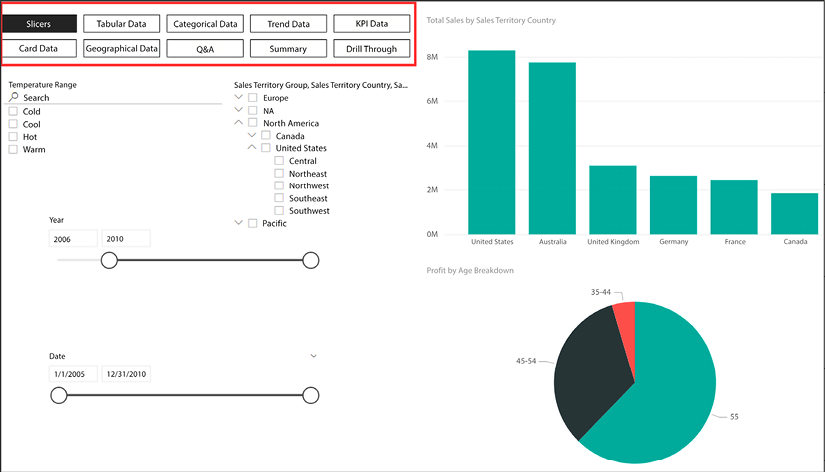
Figure 7.21: The Slicers page with the newly added page navigator in a two-row grid
With the page navigator in place, users now have an easily accessible, curated way to move between report pages. This allows developers to tell a better story by showing report consumers exactly which pages they should consider next rather than looking through a list of pages, some of which may be hidden or irrelevant to the current page’s context.
Summary
Being able to use the features discussed in this chapter effectively will turn interactive reports into dynamic digital storytelling tools. Report developers have a wide variety of tools at their disposal to tell exciting stories from using space more efficiently by creating toggles, empowering users to drill through to gain detail-level insights, adding value by enhancing the built-in tooltips, or calling out important views with bookmarks. In the next chapter, you will see how to take this completed Power BI report and share it with others.
Join our community on Discord
Join our community’s Discord space for discussions with the authors and other readers:
