
A tabbed interface is an effective way to organize your Enterprise Titanium app. With their rising prevalence in smart phones and well designed, compelling UI/UX consumer applications, the expectation level for UI-rich Enterprise application is increasing among Enterprise users. Your average Enterprise user is now starting to expect a richer experience than provided in a traditional tabbed interface.
This recipe demonstrates how to create a unique cross-platform experience using the Metro Style Tab Control for your Enterprise app. This control allows you to use the tabbed interaction pattern in a compelling new way while still meeting your branding or organizational styling requirements.
This recipe walks through the process of creating a Metro Style Tab Control to organize your app's navigation. The Tab Control is designed to be easily configured to meet your corporate branding and display requirements.
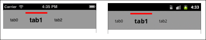
The next example shows a simple 3-tab navigator at the top of our cross-platform app. The following sections will walk you through the process of creating this sample, and demonstrate how to configure the control to meet your specific needs.
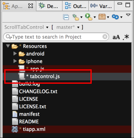
Once you've added the tabcontrol.js file to your project, you need to use require to import the module into your code, as the following snippet demonstrates:
//Create our application namespace
var my = {
  tabControl : require('tabcontrol')
};To demonstrate the Metro Style Tab Control, create a Ti.UI.Window to attach this custom control with three tabs.
var win = Ti.UI.createWindow({
  backgroundColor:'#fff',title:"Tab Control Example",
  fullscreen:false, navBarHidden:true
});When creating the Tab Control, you need a tabSettings object and an array of tabs. The tabSettings object contains all the properties needed to create the Tab Control. The tabs are then added to the control. When creating the tabSettings object, you can use any valid Ti.UI.ScrollView properties as the Tab Control provides a wrapper around the Titanium native Ti.UI.ScrollView.
The tabSettings object also has a Tab Control-specific object called selectedCue. The selectedCue object contains the selectedBackgroundColor and backgroundColor properties. The selectedBackgroundColor property is the color used to provide a visual cue when the tab is selected. The backgroundColor property is the default background color used for the visual cue area.
var tabSettings = {
  top:0, //Position the control a top of win
  selectedCue : {
    selectedBackgroundColor:'red',
    backgroundColor:'transparent',
  }
};You define all of the tabs in the Tab Control at the time of creation. For this example, we will first create an empty array, and then push each Tab Definition into the array.
var tabs = [];//Create tab collection
A Tab Definition
has two main parts, the Tab and the Label sections. In the Tab section, you can use any parameter that is valid, when creating a Ti.UI.View object. Any additional parameters will be considered custom properties of the Tab object and will be available once the Tab Control has been added to the Ti.UI.Window.
In the Label section, you can use any parameter that is valid, when creating a Ti.UI.Label object. The Label section also has a tab-specific property called selectedFont. The selectedFont object has the same properties as the Ti.UI.Label font object, but is only applied when the tab has been selected. The next sample is used to demonstrate an increase in the font size and weight.
var tab0 = {
  Tab : {
    left:1, width:75, height:50
  },
  Label :{
    text:'tab0',
    selectedFont:{
      fontSize:22, fontWeight:'bold'
    },
    font:{
      fontSize:14
    }
  }
};
tabs.push(tab0); //Add tab to collection
To complete this recipe, add tab1 and tab2 using the same pattern as demonstrated earlier.
The next step in the recipe is to call the createTabStrip method, providing our settings object, and array of tabs. This method returns an instance of the custom tab control that is then added to the example's Ti.UI.Window, as shown in the following snippet:
//Create our tab control
var tabControl = my.tabControl.createTabStrip(tabSettings,tabs);
//Add our tab control to the window
win.add(tabControl);
The Metro Tab Control is derived from the Ti.UI.ScrollView. It, therefore, inherits its base listeners such as pinch, scroll, and click. Additional events are also available for you to subscribe to.
- When a user taps on a tab, the
tabClickevent is fired, providing the index of the tab tapped.tabControl.addEventListener('tabClick',function(e){ Ti.API.info("Tab at Index: " + e.index + " was clicked"); }); - When a tab is selected, the
indexChangedevent is fired, providing the current and prior index values.tabControl.addEventListener('indexChanged',function(e){ Ti.API.info("Tab Index changed from " + e.oldIndex +" to " + e.index); });