
In the previous chapter, we created a workflow to generate a grid. That must have looked pointless at that time, but now, we will move a bit forward and show an application. The GenerateGridForLogisticRegression.zip file contains the workflow demonstrating this idea with the iris dataset.
In this workflow, we use a setup very similar to the Generate Grid workflow till the preprocessing meta node, but in this case, we use the average of minimum and maximum values instead of creating NaN values when we generate a grid with a single value in that dimension. (This will be important when we apply the model.) We also modified the grid parameters to be compatible with the iris dataset. In the lower region of the workflow, we load the iris dataset from http://archive.ics.uci.edu/ml/datasets/Iris, so we can create a logistic regression model with the Logistic Regression (Learner) node (it uses all numeric columns).
We would like to apply this model to both the data and the grid. This is an easy part; we can use two Logistic Regression (Predictor) nodes.
Let's see what is inside the Prepare (combine) meta node. It uses three input tables: the configuration, the grid, and the data. We use the configuration to iterate through the other tables' content and bin them according to the configuration settings.
There is one problem though. When you select a single point for one of the dimensions, the grid will only have that value for binning, and the data values will not be properly binned. For this reason, we will add the data to create a single bin. But when the minimum and maximum values are present, we do not include them because that would cause different bin boundaries. To express this condition, we use two Java IF (Table) nodes and an End IF node.
With the Auto-Binner node, we create the bins. We have to keep only the newly created binned column (Auto-Binner (Apply)). So, we first have to compute its name (add [Binner] Java Edit Variable), then set as include column filter.
Finally, we collect the new columns (the Loop End (Column Append) node's "Loop has same row IDs in each iteration" option) and join the two old (data and grid) tables with the new bin columns using the Joiner node.
You might wonder why we have to bin the values at all. Look at the following figure:
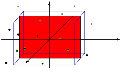
In the three-dimensional space, we have some points and a plane orthogonal to one of the axes; on that plane, there is a single red point. On most of the planes there are no points; the circled points are between the two blue planes
If we would slice by a single value on the orthogonal axis, there would be no values most of the time. For this reason, we select a region (a bin on the orthogonal axis) where we assume that the points would behave similarly when we project them to the plane we selected. (That is the cuboid in the figure; however, that is not limited to the non-orthogonal axis.)
Alright; so, we have these projections, but the points can be in multiple projections. We have to select only a single one to not get confused. To achieve this, we have added two Nominal Value Row Filters (filter by bin one and filter by bin two). (In the current initial configuration, this is not required, but it is usually necessary.)
Now, we add the training class information (class column) as a shape property (the grid does not have this information) with the Shape Manager and add the predicted class (class (prediction) column) as colors with the Color Manager.
Finally, we add the Scatter Plot node to visualize the data.
KNIME has many nodes, not just for visualization, but for classification too. This gives the idea for the next exercise.
One of our problems was that we cannot visualize four dimensions of data (with two dimensions of nominal information) on the screen. Could we use a different approach to approximate this problem? (Previously, we created slices of the space, projected to 2D planes, and visualized the plane.) We are already familiar with the dimension reduction techniques from the previous chapter. Why not use them in this visualization task? We can do that. And it might be interesting to see which one is easier to understand.
Where should we put the MDS or PCA transformation? It has to be somewhere between the data and the visualization. But, should it be before the model learning or after that? Both have advantages. When you reduce the dimensions after model learning, you are creating the model with more available information, so it might get better results and you can use that model without dimension reduction too. On the other hand, when you do the dimension reduction in advance, the resulting model is expressed in the reduced space. It can be simpler, even more accurate (because the dimension reduction could rotate and transform the data to an easier-to-learn form), and faster.
It might be interesting to see the transformed grid too, because the different dimension reduction techniques will give different results. These will give some clue about where the original points were. HiLiting is a great tool to understand these transformations.