
In this section, we will introduce the iris dataset (Frank, A. & Asuncion, A. (2010). UCI Machine Learning Repository (http://archive.ics.uci.edu/ml). Irvine, CA: University of California, School of Information and Computer Science. Iris dataset: http://archive.ics.uci.edu/ml/datasets/Iris) with some screenshots from the views (without their controls).
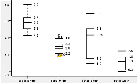
Box plot for the numeric columns
The Conditional Box Plot and the Box Plot nodes' views look similar. These are also sometimes called box-and-whisker diagrams. The Box Plot node visualizes the values of different columns, while the Conditional Box Plot view shows one column's values grouped by a nominal column's values. As you can see in the screenshot, the HiLite information is visible for the outliers (but only for those values). You can also select the outliers and HiLite them.
The shape of the outlier points is not influenced by the shape property.
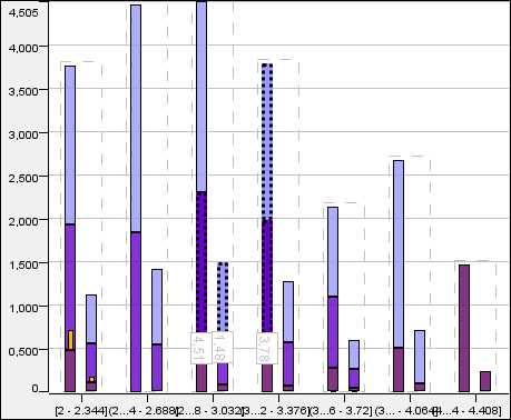
Histogram with a few columns selected, HiLited rows and colored values based on class attribute
As the screenshot shows, the Histogram node's view is capable of handling the color properties. It also supports the aggregation of different values, and the option to show the values for the selected (or all) columns. The adjacent columns within the dashed lines represent the different columns for each binning column value. This way, you can compare their distributions for certain aggregations. The interactive and the normal versions look quite similar, but they differ in configuration and view options.
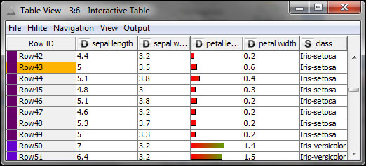
The Interactive Table view with changed renderer for petal length and color codes for class, Row43 is HiLited
The Interactive Table view first looks and works like a normal port view for a data table (such as the options on the context menu for the column header: Available Renderers, Show Possible Values, and sorting by Ctrl + clicking on the header; the latter can be done from the menu with a normal click, too), although it offers HiLiting and a few other options.
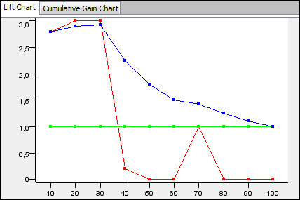
Lift chart of a model predicted by a decision tree, the colors are: red – lift, green – baseline, cumulative lift – blue
The Lift Chart view can help evaluate a models' performance. The Cumulative Gain Chart tab looks similar, although it has only two lines.
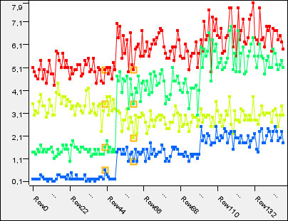
Line plot with some two HiLited rows and the four numeric columns: red – sepal length, yellowish – sepal width, green – petal length, blue – petal width
The Line Plot view can be used to compare the different columns of the same rows. The rows are along the x axis, while their values for different columns are along the y axis. The adjacent row's values for the same column are connected with a line.
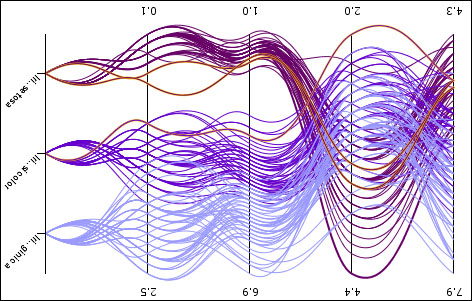
Parallel coordinates with colored curvy lines, the columns are: sepal length, sepal width, petal length, petal width and class
The Parallel Coordinates view can also visualize the individual rows, but in this case, the row values for the different columns are connected (with lines or with curves). In this case, the columns are along the x axis, while the values are along the y axis.
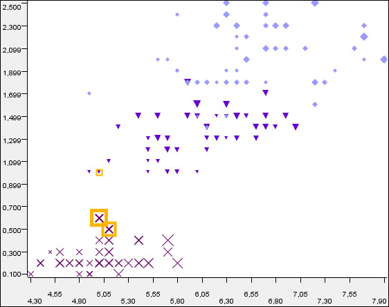
Scatterplot of sepal length vs. petal width with size information from sepal width
The Scatter Plot views can be used efficiently to visualize the two dimensions. Although, with the properties, the number of dimensions from which information is presented can grow to five.
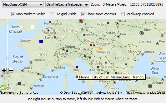
The Open Street Map integration offers many ways to visualize spatial data; it supports color, shape, and size properties and also works with HiLiting. Selected information from the input table is also available as a tooltip.
The OSM Map View and OSM Map to Image nodes are designed to show data on maps. They are very flexible, and can show many details, but they can also hide the distracting layers.
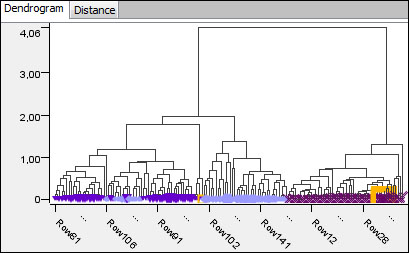
Hierarchical clustering dendrogram (average linkage with Euclidean distance using the numeric columns)
The best way to visualize a clustering is by using a dendrogram, because the distances between the clusters are visible in this way. The Hierarchical Cluster view offers this kind of model visualization. To show the similarity between the rows, first you have to compute the cluster model using the Hierarchical Clustering (DistMatrix) node from the KNIME Distance Matrix extension, available on the KNIME update site.
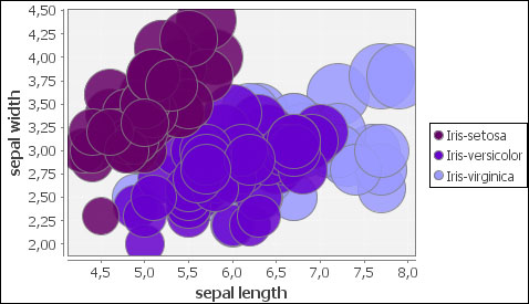
JFreeChart bubble chart
The Bubble Chart (JFreeChart) node can offer an alternative to the scatter plots; however, in this case, the dimension of the size is also mandatory.
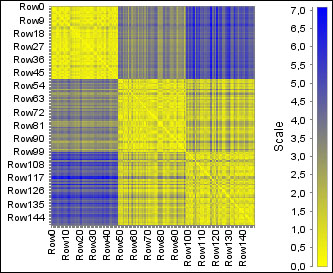
JFreeChart heatmap with Euclidean distance of numeric columns
The HeatMap (JFreeChart) node provides a way to visualize not just the collection columns, but also the distances, as shown in the previous screenshot. To use the regular tables, you might require a preprocessing step which uses the Create Collection Column or the GroupBy node to compute the distances, but it also works fine for displaying the values.
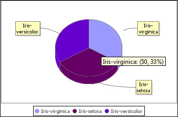
JFreeChart pie chart
The Pie Chart (JFreeChart) node also offers a visualization with a pie, and unlike the Pie chart and the Pie chart (interactive) nodes, this can create three-dimensional pies.
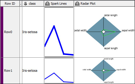
The spark lines and radar plot for numeric columns
The results of the Spark Lines Appender and the Radar Plot Appender nodes are not the individual views, but are the new columns with the SVG images generated for each row. We can use this in the next chapter.