
There is a good introduction to BIRT at http://www.eclipse.org/birt/phoenix/tutorial/—although the KNIME version is slightly different, it still offers information on few other options. Some of the views are not visible by default, so we will explain how you can create report designs for your workflow.
You might realize that when you installed the reporting extension, a new button appeared on the toolbar. The icon looks like four yellow/orange stripes and a line plot with four points. Also, it is on the right-hand side of the zooming factor. When you have saved your workflow, click it and apply the changes, so that the data from KNIME will be available as a data set.
Then, you open the KNIME report designer perspective, and you should get a dialog about the new data being available. It is recommended to apply the changes so that you will get the updated data in the designer, the preview, and in the reports.
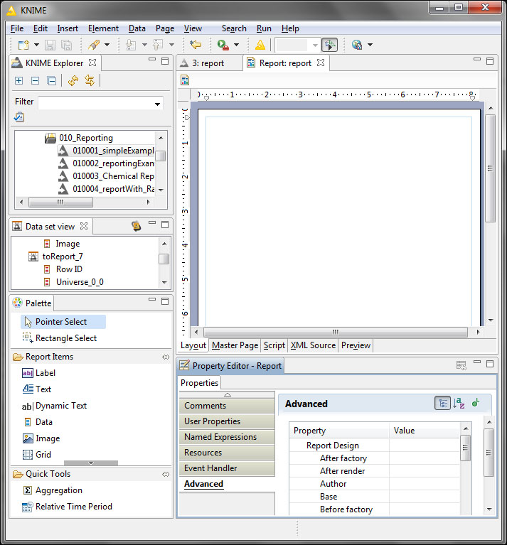
KNIME report designer perspective
You can immediately see that this is quite different from the normal KNIME perspective, although there are familiar views, such as KNIME Explorer; also, the toolbar contains the buttons that were discussed previously.
The KNIME Explorer view can be safely closed or minimized to quick views, or hidden as a sibling tab, because opening a workflow from it will leave the reporting perspective. You can also leave and go back to the workflow belonging to the report using the button with the KNIME symbol or by selecting the workflow tab in the editor area.
On the toolbar, you can find two more buttons; one of them toggles between the breadcrumb path of the actual element, while the other opens the report in the report viewer (or in the external browser of your choice). From the latter's menu, you can select the generation of the report in a different format too.
There is a view named Data set view, which allows you to check the contents of the tables you imported and synchronize the content of the view with the associated workflow—if there was a change and was not applied, you can apply that change any time. The report parameters are also available in this view.
The Palette view is similar to Node Repository in the basic KNIME perspective; however, here you are not selecting nodes, but report items, and quick tools are available (and you can specify the mouse selection behavior). Similarly, you can grab an item from the Palette and place it on the editor area. When you edit master pages, quick tools will be replaced with auto-text items.
The Property Editor view is an important part of the perspective, where you can adjust and change the properties of the selected item. These properties are arranged in categories, making it easier to find the appropriate one.
The Report editor has five tabs: Layout, Master Page, Script, XML Source, and Preview. You can also use the Page menu to switch between the tabs.
The Layout tab is usually used most often when you want to edit. It is almost like a what-you-see-is-what-you-get editor; although, because it is not practical to see the actual data, you see only the editable version, along with the skeleton showing how the data will be generated.
To see what you would get in a report, you should check the Preview tab. It does not show the entire data, but shows the data as it will appear in the report and hides the way the report is generated (from the layout and the master page). There are some parts that do not get properly rendered, for example, the SVG images (although those will be rendered when the report is generated with an emitter supporting SVG).
On the Master Page tab, you can specify the header and footer for the report. By default, a KNIME-specific footer is there; you can remove/replace it if you want to use that space for a different purpose. You can also change the report page's size and orientation via its properties.
Tip
Multiple master pages
You can create different master pages for the same report design to format different sections of the document with the corresponding header and footer, page size, margin, and orientation. To switch between the master pages, select one of the report items' properties in General | Page Break.
In the XML Source tab, you can fine tune the report design or check how it appears in a low-level description; however, the most important use case might be that of pasting parts from other designs so you do not have to go through all the options to change an element. You can also use this to correct misspellings and similar tasks with the Find/Replace dialog (Ctrl + F).
We already mentioned that keeping the KNIME Explorer view is not so efficient. Here, you will get some tips on what should be visible to be more effective using the report editor.
The Data Explorer view gives an overview on not just data sources, sets, and cubes, but also on report parameters and variables. From its context menu, you can open dialogs to create and edit different entities of the tree.
There is an even more detailed view of the report design, the Outline view in General. It is so useful to navigate between the different parts of the report design and find out the parent/child relationships, that it is highly recommended to make it visible at least as a quick view.
The Problems view in General can also be useful for easily navigating to the errors and getting detailed information about them.
The Report and Chart Design category in the Other... view contains examples for more complex charts and reports with preview images. These views are Chart Examples and Report Examples. Unfortunately, neither of them supports an easy copy and paste or simple dragging option in this version of BIRT, although you can export the charts as an XML (using the icon with the arrow pointing upwards); add a new chart to your layout and replace its content in the XML Source tab of the editor with the content of the example chart.
With Report Examples, you can open or export the report design using the context menu, but neither of them is really a good option. If you select Open, you will get an error message because the generated project is not a workflow—so KNIME cannot handle it properly—but you can explore the different settings and check the XML version of it to copy the relevant parts. When you export, you can only use the XML version and select parts that are interesting for you blindly. A good compromise would be to have a separate Eclipse workspace with BIRT installed; open the reports you want to use for inspiration from there and copy the parts you find useful in the XML form from that instance. This way you will not get errors; you do not have to worry about potentially selecting something that you do not want.
The report has some properties that should be introduced to be able to work efficiently with the designer. You can select a part of the page with no report item, and the properties view will show the available options.
The most common options are also available from the context menu, for example, the layout preference (fixed or auto), theme selection, or style handling.
The title, author, and other parameters can also be set in properties. To access them, you can use a code similar to the following statement from scripts:
reportContext.getDesignHandle().getProperty("title")Let's go through what we have. The reportContext value holds the content associated with the report, and its design handle (getDesignHandle()) is responsible for the design time context. It has a getProperty method which can be used to get the values of a named property. How do we know how the properties are named? You can check the Javadoc of the associated class at the link:
On the other hand, to access the user properties or named expressions, you need the following object:
reportContext.getReportRunnable().getDesignInstance()
This is similar to the design handle discussed previously, but this is more like its runtime view. From this design instance, you can get not just the named expressions (the getNamedExpression method), the user properties (with the getUserPropertyExpression or the deprecated getUserProperty methods) but also the report items, styles, theme, and so on.
We will discuss the report items in this section in a bit more detail, because they have an important role on how the resulting report will look. We will only cover the items available in the default installation, but you can install others too.
You can insert report items either from Palette or from the Insert menu.
Each report item has properties, and most of them have the Highlights options for conditional formatting of texts. Only the Chart items miss this option. For Image items, only the alternative text can be formatted this way. You can apply a predefined style or use custom formatting.
The user properties and the named expressions are common properties for report items.
The comment and the visualization-related options (padding, margin, border,page break, visibility, localization, bookmark, and table of contents) are also common properties, just like the event handler, where you can specify a Java class from the libraries.
The Text report item is quite similar to the Label item, although you can use formatting inside the item too. So, you do not need to break the text to multiple Label items.
To use dynamic text (result of a script), you can use the <value-of>…</value-of> tags.
When there are other report items or data set bind, you can use the expression builder's Available Column Bindings item.
This is the first report item in our list that has binding options, so we will introduce these options now.
You can bind certain report elements to either other report items or to data sets, although both have to be named (for data sets naming is usually done automatically). After binding, you can refer to the columns associated with the data set or the report item in the expressions.
Without bindings, you should use global variables and custom code, so it's worth using bindings when applicable.
When you need to generate a single text, you should use the Dynamic Text report item. It allows you to execute scripts to get the preferred content, not just to highlight the content on certain conditions. It also supports formatting within text, so it is more like the Text item and not like Label. However you can select the content type to be Plain (instead of HTML) to prevent further processing or adding text effects.
The main difference between Text and Dynamic Text is that the former requires to have <value-of> … </value-of> blocks around the dynamic content, and the latter works the opposite way—you have to concatenate the static text to the dynamic content.
Using the Data report items is a bit tricky. The following statement is a quote from its description:
Insert a Data Set column or expression result.
These are two different ways to represent data. When you grab it from Palette to a report design area, no bindings will be set by default, so you can only use other expressions. Although when you grab a column from Data Explorer, Data set view, or from the Outline view, you get the data to bind.
The binding options in the Data report item are the same as in other items. Although here you also have a Map tab in the Property Editor view where you can change the displayed values based on certain conditions—you can also use localization and use keys for translations.
You can show images from four different sources: from a URI, from a shared resource folder (be careful when you export because you can select images from any KNIME project, not just the opened ones), from an embedded (in the report design xml) image, or a dynamic image.
You can also set the binding, so each row in a table can have the correct image displayed.
It is important to set the mime type of the image properly, such as image/png or image/svg+xml. This should be set in Type Expression (between quotes, as that expression is a JavaScript expression) in the Advanced property.
It is always a good habit to set a meaningful alternative text (Alt Text) to them, so the screen readers and potential robots can have an idea of what is on the image.
This is just a tool to arrange certain report items visually. It does not support binding, but you can format the grid lines.
When you want to represent the data in a single column, the List report item is a good choice. You can specify what should be in the header, footer, and detail. You can also define grouping of the data; this way, you can have something like tables in a table.
The column/group headers are typically the name of the content, but the detail is the actual data. The footer (and the group footer) can be used to show aggregate data, such as totals.
You can also change the values and their style based on conditions in the Map and Highlights tabs.
Because you can use grouping, you have a new tab named Groups in Property Editor for List, and you have an Add Aggregation... button below the Add... button on the Binding tab.
With groups, you can embed a range of values in the table, based on certain key values.
There are various options to set for each group; here is a screenshot of the new group dialog:
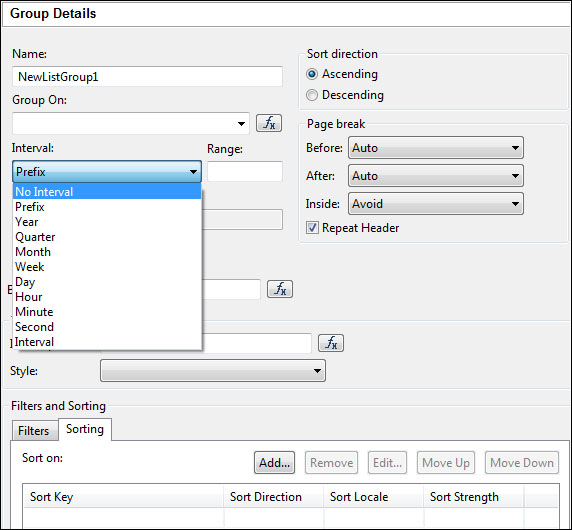
Grouping has many options
As you can see, you can sort the group values and the details within the group, but you can filter certain values too.
The interesting options are time-related grouping settings. It is not so easy to group data by time intervals within KNIME but in the report, you have a lot of options to do that.
When you get the data, you do not necessarily have it in the right order, or you might not want to pass the same data with multiple sorting. For this reason you can sort the data based on the columns you prefer. This can be done by setting the preferences available on the Sorting tab. You can sort by multiple columns, and you can specify the locale and the strength. For details about the strength parameter, you should check the following page:
http://docs.oracle.com/javase/7/docs/api/java/text/Collator.html#PRIMARY
The Table report items work similarly to the List items; the main difference is that it can handle multiple columns. You can set the headers, footers, the data, and the groups just like in the List item. All the other options available for them are available for Table items as well.
When you grab a data set from one of the contained views, you will get a Table with its content prefilled with the data set values.
As the adage says, "A picture is worth a thousand words," so it worth adding some figures and charts to the report to make it easier to understand it.
The following screenshot shows the available chart types:
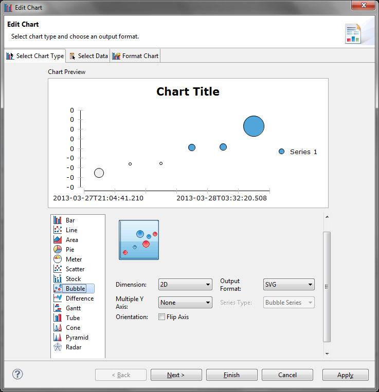
The possible chart types with preview and basic options
As you can see, some of the chart types have properties like that of subtype (this example has no other subtypes), dimension (2D or 2D With Depth—parallel projection—or 3D—perspective projection), and the output format. You can also specify the behavior of the series, and flip the axis.
New chart types can be added by using extensions. Most of the available chart types in the default installation might be familiar to you, although the Gantt and the Meter types are different from the previous options. The usual chart types also offer other subtypes that might be interesting for you.
When it comes to customization of charts, it gets as detailed as what the JFreeChart nodes offer. You can set each series and axis, just like the text and the background.
With a chart, you also have the option to highlight it on certain conditions, and to bind, filter, sort, or group the data in that chart.
The last report item available in the default install is Cross Tab. It is designed to be used with a data cube, so you will need a data cube, although the designer can automatically generate it for you based on the data set you selected.
The Cross Tab report item looks similar to the Table/Grid items, analogous to the tables. When you drag a data cube to the report design area, a Cross Tab will be generated, not a Table.
Property Editor has some new tabs, the Row Area and the Column Area. These can be used to generate grand totals of the summarized values or subtotals when the splitting dimension is hierarchical. You can also influence the page breaks in these tabs.
The Binding, Map, Highlights, Sorting, and Filters tabs are similar in function and their appearance to the options similar in Table.
It is a bit hard to change the settings after the construction, so it is worth taking care when you create it. We will give you some help on how to change them if you are not satisfied with the results.
Let's see how we can configure an empty Cross Tab. First, the group dimension of the cube should go to the rows or to the columns. You can select a different group to the other dimension if you prefer, but it is optional—both directions support hierarchical groups too.
Note
Use the rows when the group dimension has many different values, because usually the vertical space is less limited than the horizontal; although, the language of the report might prefer the other option. It is worth noting that there are the birt-controls-lib (https://code.google.com/a/eclipselabs.org/p/birt-controls-lib/) report items, where one of them is a rotated text. It might be useful for the columns.
When you are not using a predefined cube (for example, when you drag columns there from a data set), a cube creation wizard will open, where you can specify the groups and summary fields.
Next, you should add the summarized values to the Drop data fields to be summarized here cell by dragging them there from the Data Explorer or the Outline view.
Now, it is time to show the options to change the Cross Tab report items. Look at this simple Cross Tab:
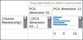
Design view of a Cross Tab report item
As you can see, the rows are showing the Cluster Membership values (this cube was created from a table generated by the KNIME Data Generator node and PCA transformed), but the columns do not split the data into groups.
In the summarized data section, there are two dimensions, one of them is created from PCA dimension 0 and the other is from PCA dimension 1. The latter is represented by a chart, and the former is printed as text.
As you can see, all the row values and the summarized data cells have a gray bar with an icon to the right of them—the columns would also have one. The context menu of these areas gives you the option to change the preferences.
In the row or column, you have the following options (in the context menu): Show/Hide Group Levels, Totals, and Remove. Because only a single cube dimension can be selected (for each row or column split area), the last one is most important from the modification point of view. Once you have removed the group, you can drag another group there just like we described in the previous section.
When you have hierarchical (typically time related) dimensions in the groups, the other two options will be useful too. By default, only the outer hierarchy is selected for the groups, but you can show the inner dimensions too with the Show/Hide Group Levels option.
Now, you might have an idea of what Totals might do. You can define the subtotals (based on inner dimensions) and the grand totals for each dimension (either rows or columns). You can do this on a well-designed interface. The former and later positions refer to the position relative to the summarized data.
In the summarized field, you have other options in the context menu. These are Show as Text, Show as Chart, Add Relative Time Period, Add Derived Measure, Show/Hide Measures, and Remove.
You can switch between the text and chart representation for each summarization separately. When you select a chart view, you can configure that chart from its context menu. The available chart types are: Bar, Line, Area, Scatter, Tube, Cone, and Pyramid. Each of these is represented by a single subtype.
Add Relative Time Period will be covered in the Quick Tools section soon.
With the Add Derived Measure menu item, the cube will not be affected; you can compute additional summarized values, but that is only visible in the Cross Tab.
The Show/Hide Measures allows you to select the summarized values you want to show, while the Remove item removes all the summarized values so you can drag other fields there.
Finally you can change the data cube you bind in the Binding tab in Property Editor of Cross Tab, which will clear all the previous bindings.
You might already have cubes if you tried to grab a column from a data set to a Cross Tab report item; however, if you do not have a cube, you can create one from the context menu of the Data Cubes tree item in the Data Explorer or the Outline view.
In the data cube's context menu, you can select the Edit option, or simply double-clicking on it will bring up the configuration dialog. Here you can change the associated data set, and add, change, or remove summary fields or groups. For dates, you have two group options: the first is creating regular groups or time groups, and the latter is the recommended option, because a hierarchy will be automatically created for the date/time.
There is also an option to link to other data sets and set the dimensions that should be used to join them in the Link Groups tab.
The Quick Tools option offers shortcuts to common tasks.
In the Aggregation dialog, you can easily add aggregated data to the footers of a Table. For example, there is no need to calculate a new column and bind to that; just drag the Aggregation item to the place where you need a single value generated from a data set, and use the dialog to set the parameters.
The Aggregation items do not support data cubes, and you cannot use another data set for computation. This reduces the chance to show something unrelated to the data set.
The Relative Time Period item is applicable only if at least one of the group dimensions is temporal. Just drag it to the summary data area, and the dialog will guide you through the new column configuration. Alternatively, you can select the Add Relative Time Period option from a summarized column's context menu.
The cube will not get changed, but you will be able to show the data in Cross Tab compared to historical data, for example.
Configuring the time period is straightforward. You have to select the expression (usually a measure) to summarize by the selected time period (it has many options, such as previous n years, current year, month to-date, last year, and so on) and select the aggregation function. You can also select a reference date and filter the data, the time dimension, and the aggregation dimensions.
This way, you can create complex tables without the need to do a lot of scripting.