
Designing a window display

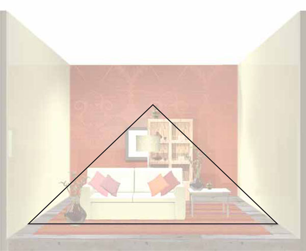
A simple, hand-drawn sketch that can then incorporate color and texture will give you an idea of the overall look of your window design. This particular layout is an example of pyramid grouping (see page 70).
Having chosen the merchandise, the theme, and the props, there are a few simple preparations a visual merchandiser needs to make to ensure that the window installation process goes smoothly.
Sketch
The first stage in designing a window is to sketch a proposed layout. Professionals will make a rough plan of how they want the finished window to look. These rough drawings are often not to scale, but they reassure the designer that the overall completed window presentation will work. Many visual merchandisers who are required to present their window schemes to third parties may need a detailed diagram drawn to scale. These two-dimensional visuals are usually created with the help of a computer-aided design program (CAD). An experienced CAD user can produce a realistic suggestion of the window design. For beginners, a Photoshop program will suffice. Only the most experienced visual merchandisers can confidently enter a window and produce a work of art without a detailed diagram. The more hands-on experience gained, the less detailed the sketches will need to be. Tried-and-tested windows will always succeed.

1 The merchandise is grouped together to reflect the form of a pyramid.
2 A large vase helps to anchor the pyramid on the left-hand side.
3 This vase sits at the top of the pyramid.
4 A table on the right-hand side of the display creates optical balance with the vase on the left-hand side.
5 The use of two colors in the display helps to create a more dramatic image.
6 Eye level, also the focal point, as the window would be viewed by a passerby in the street, is slightly off-center.
7 The display faces the street and is positioned in the center of the window to gain maximum attention.
8 CAD allows experimentation with different textures in the design, here allowing selection of the best wallpaper.
A CAD version can be made to scale and used as a more professional means of presenting your window-display ideas to colleagues.
Erwan and Ronan Bouroullec’s design for the window of Issey Miyake’s Apoc store in Paris shows how CAD can be used to organize products in a window.
A typical pyramid grouping that can be used for both housewares and fashion. The focal point is the dark red vase on the second shelf of the unit at the back, just off-center. It is important to make the focal point eye-catching.
Layout
There are a series of rules and standards that the visual merchandiser should consider when laying out a window. However, like many professionals who rely on guidelines, experienced visual merchandisers often break them, either because they wish to be controversial or because they have the skill to know exactly how and when to leave tradition behind. Before novices bite off more than they can chew, however, it is always wise to understand the basic rules. Once this valuable knowledge is instilled in them, they will have a deeper understanding of the ethics behind designing a window and of how best to capture the public’s attention.
Focal point
Large or small, a window needs to have a focal point on which, when viewed from the street, the eye will instinctively rest. Larger windows may need more than one. The focal point is best placed just below eye level, just off-center. The eye may then be guided around the window display to other products. Remember: if a window is higher than the pavement, the focal point will have to be lower. It is always best to view the window from outside to ascertain where the main focus should be. Customer flow will also affect the way the window is viewed. If the majority of pedestrians approach the window from the left, then the grouping should be aimed to the left; it would be a shame to spend valuable time planning and dressing a window only for the bulk of customers to notice the back of the mannequins, merchandise, or props.

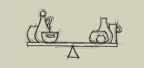
The first group in the illustration (top) shows two identical vases, which clearly balance. The second group (bottom), however, shows products that are different on each side of the shelf, but optically their weight is the same and so they also balance.
It is unwise to position the main products or props on the side walls, leaving a large void in the center of the window, just as it is foolish to hang key items too high in the window, as the eye may be guided to the ceiling and thus out of the window.
Deep windows can be problematic. The visual merchandiser often positions product groupings toward the front of the glass, hoping that they will get the maximum exposure from the display. However, by placing some items at the front with more behind leading back to the wall, a customer’s eye can be encouraged to follow the carefully positioned objects back into the window. This also applies to center displays with product trailing out toward the side walls.
Optical balance
Understanding the term “balance” when designing and installing a window display is essential. To a visual merchandiser, the composition of the window display relates to how the product is aesthetically balanced. Correct balance is achieved when the presentation shares equal optical weight. There are two main compositions: informal balance, known as asymmetrical, and formal balance, known as symmetrical. Both can be effective if executed correctly. Formal balance is easier to comprehend because the same objects are used to create a mirror image. Informal balance relies on the visual merchandiser using various objects but still creating an even distribution of the optical weight.
Using odd numbers is also a general rule when grouping products or mannequins. Three mannequins positioned tightly together will appear stronger than two.
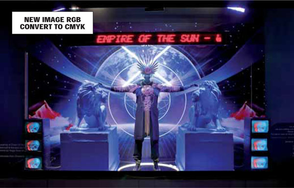
This window at Selfridges, London, was designed by pop group Empire of the Sun. The striking mannequin strokes two lions positioned on a lower level than him, creating a pyramid.

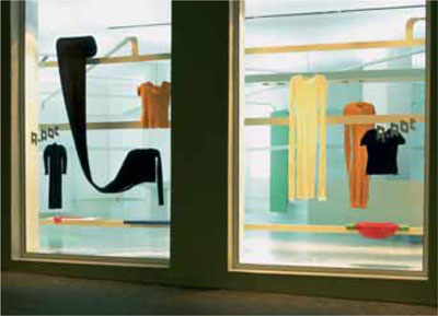
In this pyramid grouping, the focal point is at the left-hand side of the second-largest box.
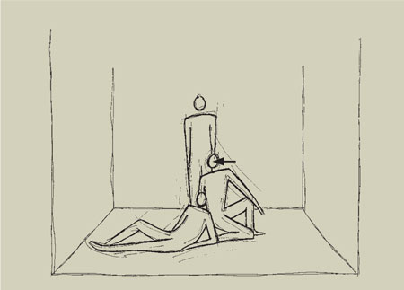
In the pyramid grouping, the focal point in this group of mannequins is the head of the central figure.
Groupings
Arranging products in an aesthetic way is referred to as “grouping.” There are two styles of grouping commonly used: pyramid and repetition groupings.
Pyramid grouping
Any noted visual merchandiser who has been trained in the art of window display will be aware of “pyramid” grouping. For years, both in-store and in windows, this common rule has been practiced around the world. The idea is that both props and products create pyramids. Aesthetically, it is a proven way to group products together so that the eye focuses on one main point first and is then led on to other focal points around it. The pyramid also enables the eye to remain for longer on the key product that is being emphasized.
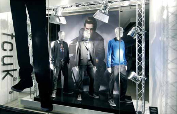
Three male mannequins stand rigidly together to create a strong repetition grouping in this French Connection window in London.
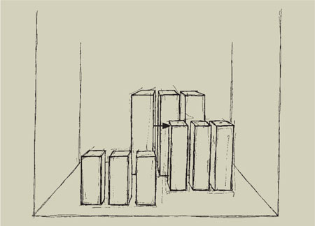
It is harder to find the focal point in a repetition grouping. The different heights employed in this window by the three staggered blocks means that the focal point naturally falls off-center on the left-hand side of the medium-sized blocks.
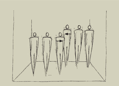
In this window, six mannequins are split into two groups, with three at the back and three at the front. Depending on whether you stand on the left or the right of the window, the focal point could change. From the left, it will fall on the third mannequin from the left in the front row; this is because the second row will be hidden behind the first. From the right, the focal point would be on the third mannequin in from the right in the back row. Both focal points need to be planned when dressing the window.
Repetition grouping
Repetition grouping is another interesting way of arranging products. This style of dressing sounds straightforward and simple; however, only the most talented of visual merchandisers can produce outstanding repetition groupings. It is easy to lose the focal point within a window with repetition; never assume that the center prop will be the focal point, since if it does not stand out enough it will not gain attention. A line of three mannequins may not have an obvious focal point, so sometimes you might have to work hard to create it using merchandise; thus, the jacket on the center mannequin could be brighter or bolder and be used to navigate your eye into the window. Placing the bold jacket on the end of the run of five mannequins may lead your eye to the side of the window and out. The aim is to use multiples of the same products to create a stronger presentation. Three perfume bottles will have more authority than one; 30 will undoubtedly have more impact.
On occasion, repetition groupings can be built up to create pyramids. Pyramid and repetition groupings generally do not work well together; the overall effect can look messy, with no main focus or design aesthetic.