
Color

The use of red and gold in this window from Printemps in Paris gives a rich, warm feel to the window. Note how the rich pattern of the background is in harmony with the theme.
The use of color can create drama and atmosphere. Most retailers rely on color as an inexpensive tool to change the window’s look and image. Color can be added in many ways, the most obvious being paint. Lighting, fabric, and graphics can also create impact.
Colors can be extremely personal; not everyone’s tastes and preferences are the same. In different cultures, colors may mean different things. For example, pink is seen as the navy blue of India. Some colors have an almost global reference. Red is seen by many as a warning color, known to get one’s heart racing; this is possibly why it is also the color used by most retailers at sale times, when they encourage a shopping frenzy by ensuring their customers literally “see red.” The mint-green aprons that British surgeons wear are by no means a fashion statement; they are in fact colored that way because the eye will settle more easily looking at them after focusing on the color of blood—light green is calming. Many mental-health institutions color their walls with the same shade. With this in mind, it is worth considering the impact that color can have on a customer looking at a window display.
Using the wrong colors can, of course, be detrimental to a retailer. The fall/winter 2006 fashion collections, into which the major British chains bought heavily, struggled to sell because of their color: gray. Many women especially felt that the color was drab and hard to wear without looking dull. The visual merchandiser could have tackled this problem by complementing it with accessories, backdrop colors, or an imaginative display.
It is useful for visual merchandisers to understand the basic principles of color and what effects different colors may have on their customers. The color wheel is certainly the most effective way of understanding how colors work.
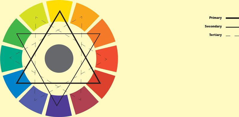
The 12 colors of this color wheel consist of the three primaries, the secondary colors, and the tertiary colors.
The color wheel
In the late seventeenth and early eighteenth centuries, Sir Isaac Newton created the very first color wheel. By use of a prism, he split sunlight into colors to create a color spectrum. A century later, the German writer Johann Wolfgang von Goethe produced his own version of a color wheel based on the psychological effect of colors, where reds and oranges were positive and greens to blues more unsettling.
The color wheel that is used today is based on three primary colors: yellow, red, and blue. When mixed together, these three colors produce every other color. By blending two of the primary colors, a secondary color is created: yellow and red mixed together will make orange, for instance. A primary color mixed with a secondary color will form a tertiary color: yellow and green, for example, create yellow-green.
Color terms
Chromatic
High color density: red, blue, and yellow.
Achromatic
The opposite of chromatic: gray, white, and black.
Shade
Adding black to a color will alter the appearance of the color and make it darker: a different shade of the original color.
Tint
Adding white to a color will brighten the color, creating different tints of the original color.
Hue
Another name for the pure color: red, blue, etc.
Value
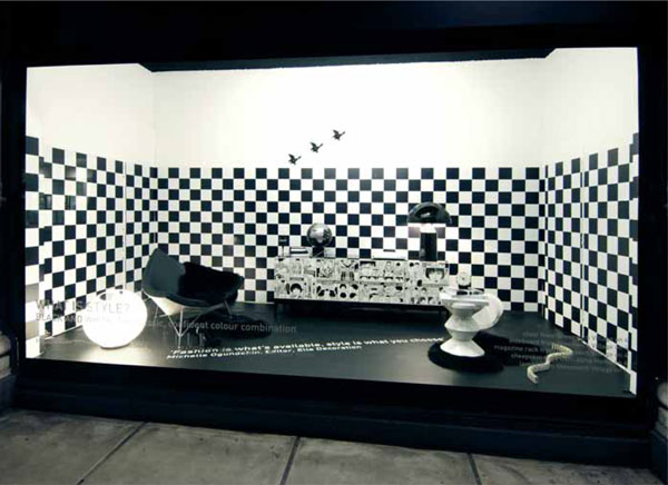
An achromatic window can be very effective and easy to design. Here at Selfridges, London, a solid black floor and checked wall help complement the contemporary furniture display in collaboration with Elle Decoration.
Color schemes
To a novice visual merchandiser, exploring the use of color and determining what effects it can have in a display may at first be daunting. Co-ordinating colors so that they are effective should be considered thoroughly before designing or installing a display. The most common color schemes are based on just six variations (see opposite).
By painting the walls and floor in different colors, each will stand out to frame the product. It is also the perfect way to create a realistic room set.
One of the most effective window schemes that has been used by visual merchandisers worldwide is the use of only one color. Various shades of the same color used in the same display can create impact. A window based on the color blue, for example, can add an emotional value; it could be perceived as cold, sad, or—depending on the hue—warm. By using the relatively inexpensive medium of paint on the walls in one shade of blue and adding mannequins in another shade and the product in different shades again, the window will look striking and will be cost-effective, too. Depending on the dressing and styling, color can also promote a trend: pink for Valentine’s Day, for example; red for Christmas; or black for a more luxurious fashion look.

The use of color in a window display is paramount in its success. These examples demonstrate how color can be used as a tool for attracting the customer’s attention.

The mask in this window from Printemps in Paris appears to be floating against the black background, giving the complete window a real sense of drama. Painting a large window black will make it appear smaller and create great atmosphere.
Painting stripes on a wall will make the window appear taller as well as create an interesting and economical wall treatment, seen here for the “Spring Beauty” display at Selfridges in London.

A neutral window scheme made entirely from light wood set against a white backdrop is brought to life with just one desirable Céline handbag in red at Selfridges, London.
Color really is the most magnificent tool for capturing the attention of passersby and creating atmosphere. If in doubt, always go for the brighter or darker option. Taking the soft option will not be as effective and will be perceived as predictable by the customer who may overlook the color scheme—cream instead of crisp white will appear weak, and the wrong shade of red may look like a sale window.
When using color, it also pays to consider the color associations behind the product itself. Whereas a window promoting eco-friendly products would benefit from the window being colored in neutral tones associated with natural products—ecru, cream, and off-white—a butcher would never use red as a backdrop for his products; instead he uses white because it will always appear hygienic and show off the cuts of meat. A jeweler specializing in diamonds will, of course, rely on a rich, dark color that will offset the gems and make them sparkle.
There are also tricks you can use with color to change the look of the window. A darker color such as black will make a large window appear smaller. White, on the other hand, will create the effect of space. Painting or applying vertical stripes to the window walls will visually stretch it.