
Signage and tagging
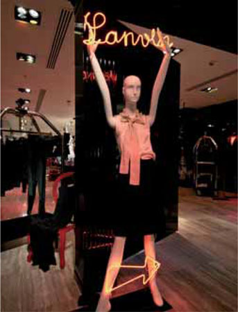
A simple neon light sign becomes a prop in itself in the hands of a mannequin at Lane Crawford inHong Kong.
Twenty-first-century technology is used in the Prada store in Los Angeles to communicate with customers, informing them of current social and political stories with the aim of creating a talking point.
Nowadays, signage is not just limited to handwritten or printed information. Neon, plasma, and LED displays are some of the more modern innovative ways of communicating with the customer. Whichever style of signage a retailer chooses, it is important to understand that, whether the store is large or small, customers need to have explanations, directions, and information made clear to them.
Store guides and other navigational signs
Before customers begin a shopping experience, they often wish to orient themselves. A large store with many floors needs to have detailed store guides and product locations. Often, this information is posted just inside the main entrance or at an information desk so that the customer has time to study the store’s layout before entering. Complicated store guides will only confuse consumers; it is advisable to keep the directions simple but informative. A scaled-down plan of each of the floors with key destination points such as elevators and escalators will best aid the customer. Highlighting entrances, fire exits, restaurants, and restrooms can also orient and reassure the shopper. A printed leaflet of the store guide can also be either handed to customers on entering or placed close to each entrance for shoppers to pick up themselves.

Quirky but effective, Topshop’s visual merchandisers in London have used original 45-rpm records to spell out the name of the vintage department.
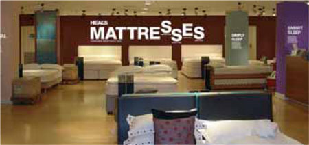
The success of this sign in Heal’s store in London lies in its simplicity. The size of the lettering means that it is easily spotted across the shop, enabling customers to find the department easily and also drawing them across the floor.
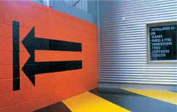
Two bold arrows direct the customer around this Halfords car-maintenance, customizing, and travel-solutions store. The use of color and graphics is also reminiscent of road signs, in order to relate to the motoring aspirations of its customers.

Strong graphics have been employed at Sainsbury’s, London Colney, not only to promote its collection of flowers but also to remind the public that Mother’s Day is approaching.
Once inside, the customer may need extra help to navigate the store. Often, signs—commonly referred to as banners—are hung above walkways. Banners are usually screen-printed or have vinyl text applied to them. They can either be cut from foam board or wood or made from coated fabric. Freestanding signposts placed at the beginning of walkways, escalators, and elevators are an effective way of telling customers where they are and what else is available in-store.
Departmental signage will help the customer plot a course around and through the merchandise. A strong supplier brand can act as an anchor to reinforce the department’s product category. Used correctly and as a focal point, a strong brand on a wall will pull the customer into the heart of the department. Wall signage is an integral part of store design and visual merchandising. When used correctly, it not only directs but also attracts the customer. Plasma screens and neon are a quirky way of creating theater, yet confirming a message; they both can be used to add movement to bland wall fixtures.
Freestanding signs that are used to inform the customer of promotions, events, or prices should always be printed on card and ideally be displayed in a Perspex holder. Sign-holders can be made to any size, but one universal size is usually more effective. Where the sign may be viewed from both sides, two can be placed back to back, or the sign may be printed on both sides. Signs in Perspex holders should sit with the product and be an integral part of the presentation, not an afterthought. Customers often move freestanding signs, and an easy solution is to fit the sign-holder to flat surfaces with double-sided tape.

At the Gap, a tag is attached to the garment so that it is visible to the customer.
Checklist for tags:
Handwritten tags will look sloppy and unprofessional.
Always check for spelling mistakes.
Ensure the text is not too long.
Use a clear, simple typeface that is easy and large enough to read.
Use one size of tag.
Different-colored tags for different departments can be effective.
Perspex tag-holders will collect dust; they will need to be cleaned regularly.
Hanging signs must be secure; an air vent may cause them to sway.

The store guide for a department store needs to be simple and easy to read because of the amount of information that it has to carry, given that such stores will have many floors to describe. Peter Jones in London is a good example, as shown here.
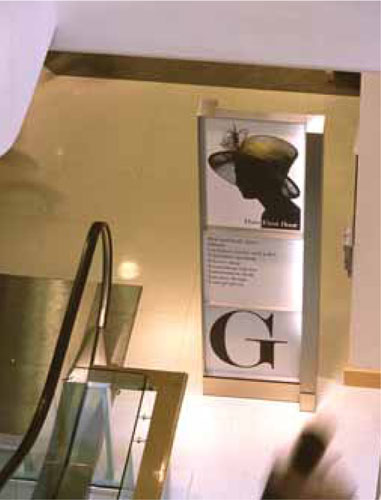
On arriving at the foot of the escalator on the ground floor of Peter Jones in London, customers learn more detail of what they will find on the floor. The large “G” and fashion graphic add instant information as customers descend, with the detail listed beneath.
Text and color
Directional in-store signs should have an identity of their own so that they do not blend in or clash with other graphics; a unique color or style will help them stand out. Text should be clear and simple to read and in a contrasting color to the background. It is worth noting that lowercase letters are easier to read than capitals.
As much as written information is critical to inform the customer, too much can confuse. A customer will not often have the time or patience to stop and read numerous lines of text. Short, punchy statements can be more effective.
Price tags
Pricing individual products can be executed in two ways. Some retailers may wish for the price to dominate the product; discount stores and sale items will definitely benefit from this technique. Large stickers or “hang tags” are placed on the items and stacked high to encourage high-turnover sales. Price stickers, although in a prominent location on the packaging, should not cover the brand name. All prices should be in the same place on each item, ideally to the left at either the top or the bottom. A table with multiples of just one product may require only a freestanding sign showing the price.
Retailers who may wish their products to appear more exclusive will benefit from placing price stickers either on the back or bottom of the merchandise. A small, boxed item can easily be picked up and examined for the price; placing the sticker out of sight means the customer has to engage with the product. However, larger or fragile items, such as vases, are best priced at the back toward the bottom; it is unwise and risky to suggest that the customer handles expensive items.
Garments should have their price tags securely attached, either with a safety pin or by using a kimble gun, which forces a small plastic tag through the fabric with a thin needle. Care should always be taken to ensure that the needle does not destroy or mark the garment. The seam or label is the most appropriate place for the tag to be attached. Retailing regulations vary in each country: some require that the price is visible on the garment; others are happy for the price to be positioned discreetly inside. It is always worth researching the local trading laws before pricing products.

Large-scale graphics give the appearance that they have fallen at Lane Crawford, Hong Kong. The result is an interesting display with unusual angles created on the store floor.
Printed graphics
The use of printed images will free up a lot of time for a visual merchandiser. Hanging a printed banner with a picture or design on it where a product display is usually housed—or even behind a collection of mannequins—to form a backdrop will create an instant focal point. A major benefit of a printed graphic is that text can easily be added to it, so that not only will customers be aware of the image, they may also be informed by the message.
A graphic refers to a printed image that can be either a photograph, drawing, or a piece of artwork incorporating an image and text. Many graphics that appear either in store windows or in-store are connected to a brand’s advertising campaign (the brand being that of the store or of the individual designer placed in a store, for example). They are often supplied in a large format that can be incorporated with the brand’s shop fit. They are removed and updated seasonally. Modern graphics are usually digitally printed at high resolution by photographic technicians. The cost of printing large banners digitally is minimal compared to the old screen-printing methods. Images can be any size and in full color, black-and-white, or sepia. Printed graphics, when used correctly, can change the appearance of a department or shop dramatically. They are easy to use and easy to store. Adding text to graphics will also send a message as well as look appealing.
A simple collection of photographs showing Neil Barrett’s menswear collection is attached to the wall to highlight the clothing in front, at the Lane Crawford store.
There are many reasons why retailers rely so heavily on graphics in-store and in windows. The major rationale is cost. During the 1980s, the cost of producing in-store displays to the same standard and quality as the windows escalated, sometimes way over the set budgets. A simple solution was to use printed backdrops to create the same drama as a display. Often they never matched the more traditional methods. Today, however, they are a much-appreciated tool that is often used with the more conventional techniques of visual merchandising.

An installation for Costume National in the atrium of Lane Crawford, Hong Kong. It was loosely based on its showroom and lasted only one month.
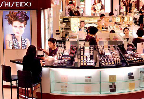
Universally, cosmetic counters utilize backlit transparencies to promote their brand and product range, as shown here in a department store in Tokyo.
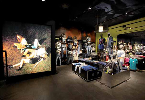
A large backlit transparency acts as a focal point to attract customers at Bershka in Tel Aviv.
Backlit transparencies
Most perfumery counters around the world prove how effective backlit transparencies can be. Simply put, the box that houses the transparency consists of a lightbox with four sides and a row of fluorescent lamps at the back. A Perspex or glass sheet at the front supports the transparency. More often than not, the frame supporting the Perspex or glass will unclip, making it easy for the image to be replaced. The image is produced as a transparency by a photographer and, like the digital graphic, can come in various sizes. Often brands will supply their own transparencies.
Backlit transparencies are cost-effective and very low-maintenance. Once the unit is fixed to a wall or fixture, it needs little attention. They are a great tool to brighten up a dull corner of a store as well as send an important message to the consumer.