Chapter 2 : Using the typeface
In this chapter we will discuss considerations in using type, such as the choice of typeface, and explore creative approaches to typographic issues. Typefaces will be considered in the light of legibility, readability, their use in layout, and their relationship with any images used. Alongside this, we will introduce type terminology and the use of such devices as ligatures and dashes. These will be supported by successful examples of screen- and print-based work.
Type is a means of communicating the written word and therefore legibility and readability are important. Broadly, type is legible if individual letterforms can be readily deciphered; it is readable if it is presented in an accessible and/or engaging way. A shorter line length, for example, is more readable than a longer line length, with 50–80 characters per line, including spaces, thought to be a good column measure.
We’ve all come across sections of text that have not engaged us even though the content of the text itself may well have been of interest. Used for body text, a dark, heavy typeface may be less legible than a lighter version, because the shapes of the letters are harder to distinguish in a small size compared with regular letterforms.
There are many factors that can affect legibility and readability, such as choice of upper- or lowercase letterforms, length of line, letter and word spacing, size of type, and color or tone of text. We will cover the main issues here.
This design by Renato Forster uses a short line length for the body text to aid readability.
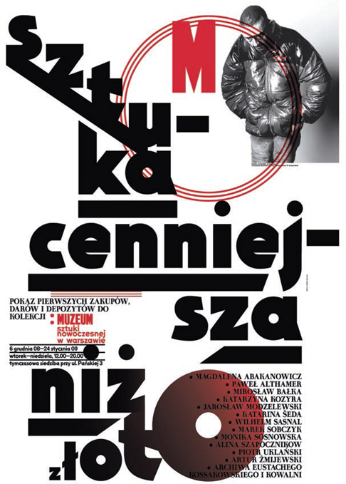
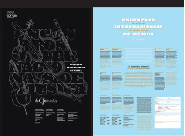
Ludovic Balland has used short line lengths for readability on this engaging poster, where information needs to be communicated quickly and concisely.
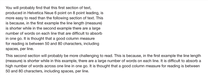
In this example the first section of text is easily read, whereas the second section is more challenging. The reader finds it more difficult to absorb the larger number of words perline, and may have to reread more often.
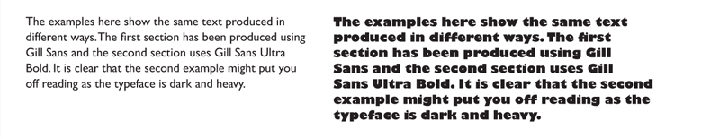
A heavy version of a typeface may affect legibility because the heavier typeface is less easy to decipher in sections of body text than the regular typeface that people are accustomed to reading. In this instance Gill Sans Regular has been used on the left column and Gill Sans Ultra Bold on the right.
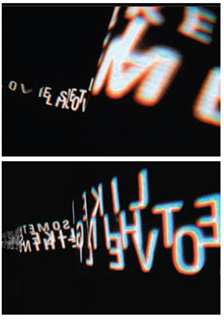
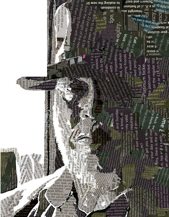
Alex Cornell has experimented creatively with deliberate illegibility and unreadability here. The extreme difficulty of reading this text draws the reader’s attention.
Care needs to be taken in the setting of text in upper case rather than in the normal mixture of upper- and lowercase letters. You may have noticed, while being immersed in a novel or other large body of text, that you are not consciously reading each letter, word, or even sentence. The same text set in capital letters would require much more concentration to avoid losing the overall meaning of the text. When we read, we read the word shapes that letters combine to form rather than the individual letters: lowercase letterforms have a variety of shapes and profiles whereas capital, or uppercase ones have similar profiles, which makes them more difficult to distinguish between. So, text in all capital letters is often more difficult to read than that in lower case or a combination of upper and lower case.
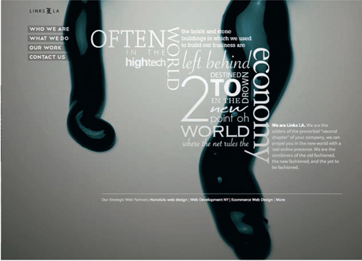
This website by Ravi Vora for Links LA uses all caps combined with upper and lower case for a lively design where a combination of upper and lower case has been used for titles and the main text is in lower case for reading.
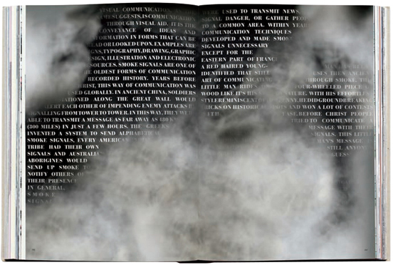
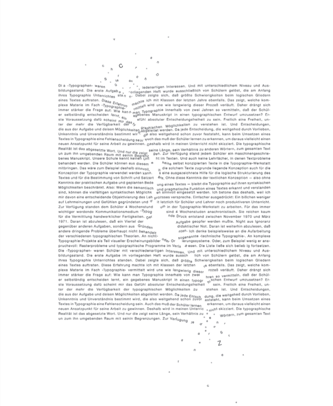
Vijf890 ontwerpers have deliberately used all caps rather than a mixture of upper and lower case as the text is intended to be a background texture to complement the cloud images in this double-page spread rather than to be readable.
design@Typographic have used all caps to create strong moving shapes in this multimedia design. The words are only legible for short periods and are intended to draw attention to the content.
Investigate how much of a letterform needs to be seen for it to be legible. Render the letters “a,” “e,” “g,” “k,” and “q” in lower case at a large size, such as 120 point. Experiment with subtracting parts of the letterform until it is no longer recognizable. Try this activity with a serif and sans serif typeface, as in the example below, where Cooper and Century Gothic have been used.
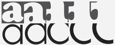
In the experiment using Cooper, the letterform is recognizable until the third crop, whereas using Century Gothic the letterform becomes difficult to recognize after the second crop.

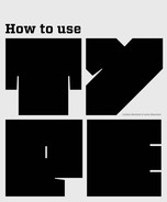
In this design, Claudia Pereira has sliced the word “DYSTOPIA” and reformed it to visually reference its meaning.
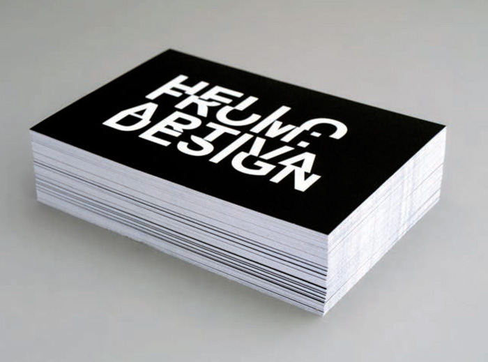
Artiva have sliced the capital letters and reformed them to make an image for their business card. You will notice that the words are not as easy to read when you do not have the complete letterform.
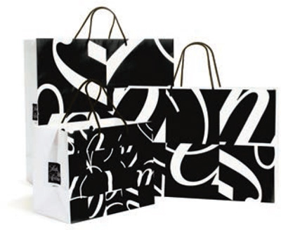
Pentagram have used sections of letterforms in this effective package design for Saks.
As discussed earlier, another issue relating to the way we see text is line measure. We find it difficult to read lines of text over a certain length or number of words because of the way our eyes take in information. You will notice that the majority of books and magazines do not use a long line measure except occasionally in small amounts.
Not only the length of line but also the distance between two lines of text may affect legibility and readability. If, at the end of a line, your eye is not easily drawn to the beginning of the next one, the text may be difficult to read. This can happen if the leading (linespacing) is too great or too small.
Spaces between letters and words
The distance between letters and words is another aspect of spacing that may affect legibility and readability. The adjustment of space between individual letterforms is usually referred to as kerning, and the spacing between letters across a section of text is known as tracking. A good example of the need for kerning is where a capital “A” and “V” are adjacent (see below). If the space between the two letterforms is not decreased, they look too far apart. Tracking may affect the density of a section of text, making it easier or more difficult to read. This is particularly noticeable when you use a light text on a dark background, which is referred to as reversed-out text. Some reversed-out text may be difficult to read unless the designer adds a little more space than normal between characters.
On the reverse of this poster, Atelier Martino&Jaña have created a dynamic layout where different leadings have been used to help differentiate between sections of text.
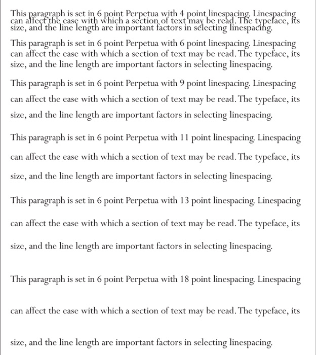
This demonstrates how decreasing and increasing the spacing between lines of text can affect readability.
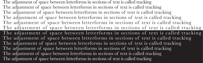
Tracking can have a marked effect on the legibility of a section of type, whether black on white or white reversed out of black.
 | Most typefaces have automatically kerned pairs, which helps to avoid obvious letterspacing problems. |
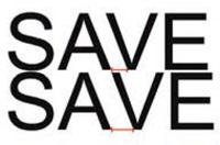
In the top example, the spacing between letterforms has been adjusted, whereas in the bottom example no kerning has been applied.
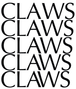
How would you even out the apparent large space where the “W” follows the “A”? Experiment with different kerning between “A” and “W” in the word “CLAWS” (or a similar word). You can do this using software or by tracing a print of the word.
| It helps to work at a high magnification, and you will see the spaces more clearly if you squint at the word or look at it in a mirror. |
Kerning and tracking have many creative applications, such as pattern making or logo design. Experiment with forming shapes and patterns by adjusting the tracking on a word.

The logo for the Victoria & Albert Museum suggests kerning where the ampersand overlaps part of the letter “A” and replaces the bar with kerned space between this and the letter “V.”
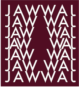
In this example the word “JAW” has been typeset in Futura and then repeated six times with the tracking gradually decreasing and then increasing. The resulting pattern has been duplicated and inverted to form a shape reminiscent of an open jaw.
In this design by Andreas Hidber the large yellow type, partly overlaying the image, does not dominate the page. In a darker color it might have done.
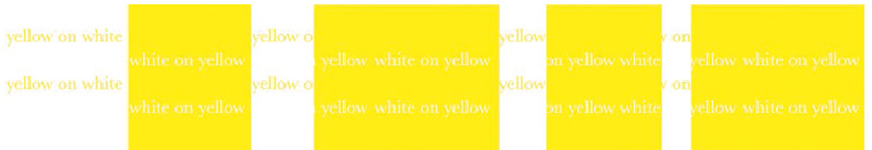
As you can see in this example, yellow text (Baskerville) on a white background is not easy to make out, nor is the reversed-out version of white text on a yellow background.
Color and size
Using colored type or type on a colored background can be an effective way of enhancing communication or attracting attention. Before taking this path, however, it is worth experimenting with different combinations. Some color combinations may be too lacking in contrast to be easily read, particularly at a small size—one example being yellow on a white background. Some combinations of colors may cause problems, such as putting two complementary colors together—for example, green and red. This causes a visual disturbance where the two colors touch and therefore makes reading difficult. There are technical issues relating to use of color in print, such as how the colors fit together, which we will cover later (see page 193).
 | Pitfall: Red and green are the two colors most commonly confused in color blindness, and so this may be a risky pairing. |
A common misconception about legibility of type is that bigger is better. This is not necessarily the case: the appropriateness of the size of type is affected by many factors, such as the line length, the typeface, and the role the text plays in the layout (for example, whether it is a title or a section of body text). Although the chosen size depends on the typeface design and its x-height (see page 37), you rarely find 12-point type used in the body text of editorial and commercial publications.
The visual vibration between the complementary colors blue and orange has been used to dramatic effect in this cover design by Hackenschuh.com design.
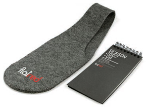
Andrea Bussetti has combined reversed-out and red type to create contrast on this notepad and carrier.
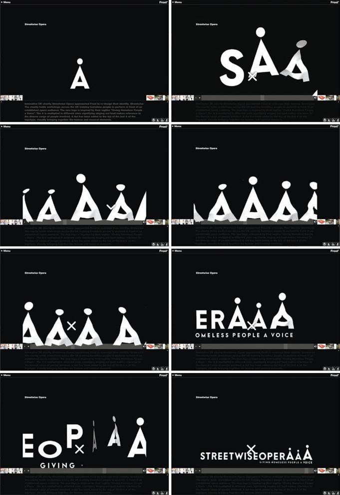
Vince Frost has created this motion sequence using reversed-out letterforms.
This design by Sylvia Aranda demonstrates that type at a small point size can be legible and readable.
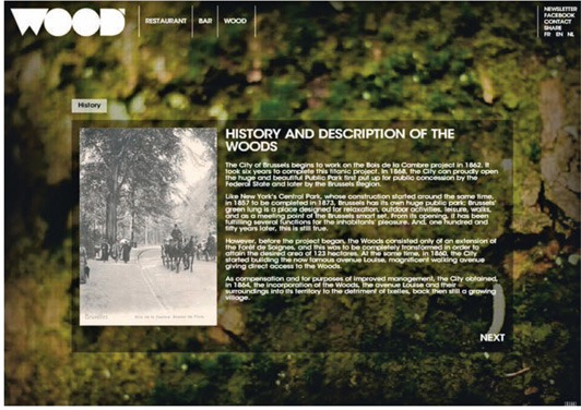
The series of webpages for Wood restaurant and bar uses a small point size for the body text, which still remains legible because there is plenty of space between the lines of text.
The choice of the typeface itself is an obvious but often overlooked factor in legibility and readability. The suitability of a typeface for a specific text is subject to a range of factors, such as whether it is used for print or screen. Some type designers believe that for large chunks of text such as a novel, a serif typeface is easier to read than a sans serif because the serifs help lead the eye across the words. For type on screen the opposite is said to be true, mainly because of screen resolution and the fact that screens are never really static. Other designers don’t subscribe to these fixed views and would rather experiment with a range of typefaces that suit the content and the context.

This webpage shows Artiva’s use of a sans serif typeface to produce a simple, easy-to-read design.
While placing text over a background other than a flat color can produce eye-catching results, there are certain considerations to bear in mind. Beware when laying text over an image that contains many variations of tone, because it is likely that some of the tones will be similar to the color of the text. For example, black text becomes difficult to see when it is placed over a dark tonal area. Texture represented in a background image may cause the same sort of problem, because the different patterns can interfere with the letterforms.
Paper stock
The material, usually paper, on which a design is printed is known as the stock. Sometimes the texture of the stock can cause problems with legibility. If the surface has a rough texture, the printed type may not cover the entire area intended: this is more likely to happen if the typeface is fine or has small counterforms (see page 39). This may also be the case when printing on absorbent stock, which may cause the ink to bleed.
Côme de Bouchony overcomes legibility issues in text over image by using a heavy typeface and strong transparent color.
An experiment with the effect created by print on porous paper.
When working on a design for screen, the range of screens that are out there, both in terms of size and quality, may affect legibility and/or readability. The different screen resolutions will change the way the type appears on the screen. For example, a low or poor screen resolution such as 640x480ppi (pixels per inch) will produce a larger but less distinct image than a high resolution such as 1920x1200ppi.
| If you normally work on a screen set at high resolution, check how your design appears at a lower resolution. |
When designing for the Web, the appearance size of your design will vary according to the size of the viewer’s screen and/or the size of the window/s. It is advisable to work at the minimum size a screen will be viewed at to counteract any problems with legibility. This can result in some type looking larger than intended but at least it should be legible for all users.
Although we have discussed these issues as barriers to legibility and readability, when designing you can use most of them to make something visually exciting. For example, a textured stock that causes parts of letterforms to misprint can create a distressed or handmade quality. Some typefaces, such as Tapeworm (see below), have been designed to appear distressed. Distressing may be simulated for use in screen- or Web-based design to add texture and interest.
This webpage, designed by Lauren Burke, uses simulated misprinted type and image to give a feeling of immediacy. The hand-produced effect also contrasts well with the more controlled digital typeface used in the body text.

Ryan Spacey has used a traditional printing effect to produce this poster. As with Lauren Burke’s website design (top), the misprinted letterforms give a sense of immediacy and a bespoke feel to the design.
Tapeworm Regular, designed by Lloyd Springer of TypeArt Foundry Inc., simulates the effect created when letterpress is either under-inked or has insufficient pressure applied in press.
Design a poster either for screen or for print that incorporates hand-carved and printed letterforms together with digital printing, as shown here. In our example, the student has carved a letterform into half a raw potato and then used thick acrylic paint as the ink. The letterform has been overprinted on a section of body text produced on an ordinary desktop printer. When the paint was dry, the entire image was scanned so that it could be viewed on screen. Using a potato print is a fun and easy way of producing this effect and also provides plenty of opportunity to experiment with shape, color, and texture (you don’t have to use a potato—lots of other root vegetables, such as turnips, are just as easy to use). Please remember to take care when using sharp instruments.
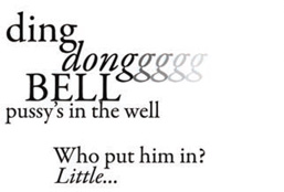
In the first stage of this exercise the student identifies a section of a nursery rhyme and produces a typographic design in Garamond using a design software program, then prints it out on an inkjet printer.
Next she assembles her tools. They include a pen to draw the shape, a sharp kitchen knife and craft knife to carve it out, acrylic paint, a brush, a cutting board to work on, a small piece of cardboard to squeeze the paint onto, and, of course, half a potato.
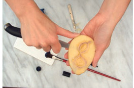
Having incised around the outline of the letterform and the counters with the craft knife, the student uses a kitchen knife to cut away the large nonprinting areas of potato from around the letterform and to dig out the counters. She then goes round the shape again with a craft knife to tidy up the edges.
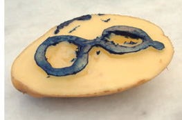
With carving now complete, the student brushes paint onto the small piece of card and dips the letterform into it ready for printing.
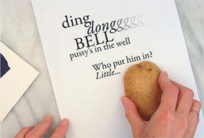
The letterform is printed for the fi rst time.
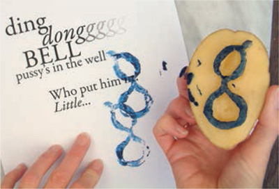
The student is trying to echo the fading out of the letter “g” on the inkjet print by repeatedly printing without re-inking the potato.
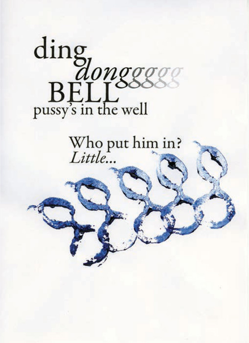
She experiments on several printouts of the nursery rhyme before deciding on a final design. The letterform is printed for the first time.
This double-page spread by Atelier Martino&Jaña makes use of the contrast between justified, ranged-left, and centered text to give variety.
Ranged-right text is commonly used for languages that read right to left, such as Hebrew—as in this double-page spread by Dan Alexander & Co.
As we discussed earlier in this chapter, leading, kerning, and tracking can affect how type performs on a page. There are other factors relating to paragraphs or sections of body text that may have an impact on legibility and/or readability. Such factors can determine how the type looks and therefore how it is interpreted. One of the most important is paragraph alignment: whether text is aligned (or ranged) left or right, justified, or centered. The most commonly used alignments in Western design are left aligned (also referred to as ragged right because of the way the right-hand line endings do not align with the column edge) and justified. Justified text is spread across the column measure so that it aligns with both sides of the column. Right alignment (ragged left—the opposite of left aligned) and centering are less frequently used in body text, for reasons of readability. The eye finds it difficult to cope with the fact that in each of these two alignments the starting points of lines of text are not aligned vertically.
There are many examples where different alignments are combined to create emphasis and visual effect. One is in movie titles where right- and left-aligned text are butted up against each other to differentiate between two sections of information (for example, role and actor) and give a mirrored effect.
There are some who hold the view that justified text can never be justified. Because the spacings between words can be quite wide in justified text, it takes a lot of skill and experience (or just plain luck) to ensure that a block of text does not contain “rivers.” Rivers are formed when a series of large gaps between words link together into a trickle-like pattern down the page. They can be visually distracting and therefore affect readability, particularly for those with dyslexia or visual impairments and, in our view, look ugly anyway unless designed for a specific effect as in the example shown on page 60. Rivers can be seen more clearly if you squint at text, hold it upside down, or view it in a mirror.
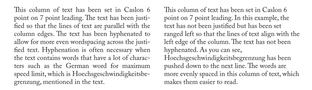
Justified text throws up a decision relating to hyphenation of words at the ends of lines. It is generally considered that hyphenation is a bad thing, mainly because it can cause visual disturbance and it looks ugly. However, it may be a necessary evil to achieve the visual uniformity that is the main reason for choosing justified alignment. There are some occasions when hyphenation is unavoidable, such as in scientific or legal texts where long technical or subject-specific words are common. Some foreign languages also have a higher-than-average proportion of long words. For example, the German for maximum speed limit is “Hoechsgeschwindigkeitsbegrenzung,” which would probably need to be hyphenated even if it began in the middle of a line. Ragged-right or ragged-left body text usually looks ugly when words at the ends of lines are hyphenated and it doesn’t help with readability.
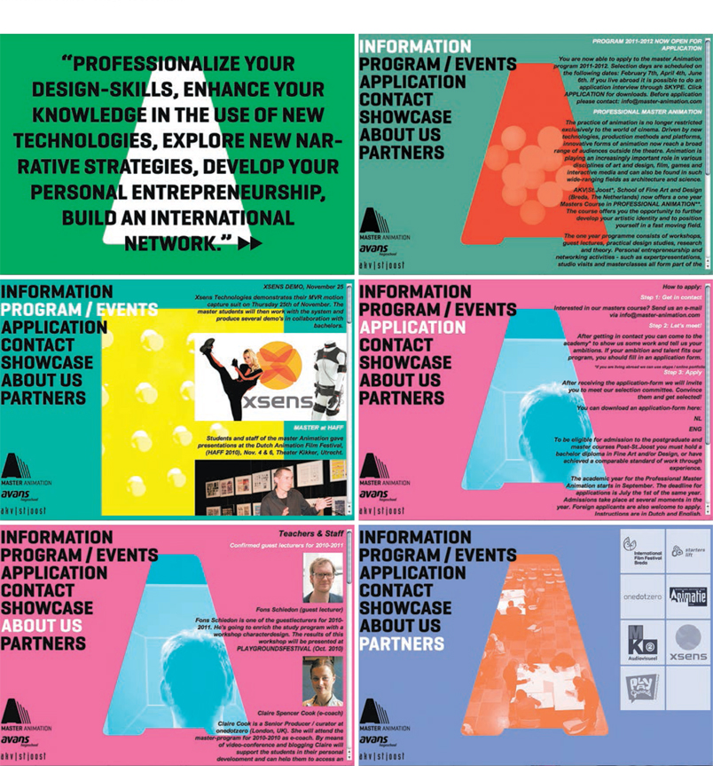
These webpage designs by Staynice use a variety of text alignments to aid navigation and differentiate between categories of content.
| Pitfall: Do not use forced justification, where short lines at the ends of paragraphs are forced to spread across the column measure, unless you are deliberately trying to achieve an unusual effect. |
| Pitfall: Unless you want to include hyphenation, check that auto-hyphenation is disabled before you set body text. It is the default setting in most design programs. |
While on the subject of paragraph endings, other obstacles to readability include widows and orphans. A widow is one short word on the line at the end of a paragraph. This has the distracting effect of seeming to increase the amount of space between paragraphs. An orphan can be either the first line of a paragraph falling at the bottom of a column of text or the last line falling at the top of a column. Like widows, orphans stand alone, looking abandoned, which is distracting to the reader.
Transitions between paragraphs of text are usually indicated by an increased linespace or a space before the first word of the new paragraph, known as an indent. As with widows and orphans, these spaces may cause visual disturbance but they may also be used to good effect.
This example contrasts hyphenated justified text with unhyphenated ranged-left text. Many designers would argue that the left alignment without hyphenation is easier to read than the justified type with hyphenation. However, this is a subjective matter and often depends on what looks right in individual circumstances.
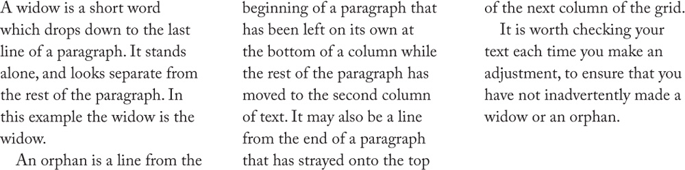
Typographic widows and orphans, as shown in this example, should be avoided.
KalleGraphics have indicated paragraph breaks by an indent on the first line of each paragraph.
There are specific issues relating to using text in layout, such as structure, tone, white space, balance, and the relationship between type and image.
Grids
Columns of text form grids and these define the structure of a layout. All the factors relating to paragraphs are important when designing a grid. You should also have a typeface, or range of typefaces, and size of type in mind. It is difficult to visualize how a typeface will perform in a grid unless you have already tried it, so it is useful to collect examples of different typefaces used in a variety of grid structures. For example, try a serif (e.g. Palatino) and a sans serif (e.g. Univers) typeface at 9 point in a range of leadings in a two-, three-, and four-column grid on a letter-size layout.
Shades of gray
Decisions such as the choice of typeface and grid and the amount of leading and tracking to be applied affect the density of body text on the page. Density is also referred to as the color of the text and can affect the layout as well as emphasis and relationship with any images. The color of the text needs to be considered in relation to the tone of any images incorporated in the layout. The diagram right shows the way that the color of body text can be affected by different linespacing and how this property can be harnessed to create layers or hierarchies of information (see also chapter 5).
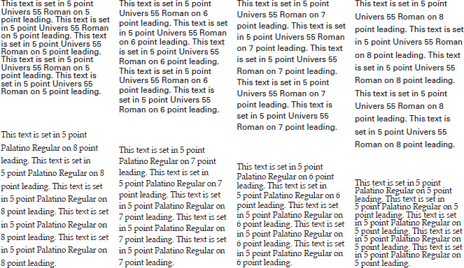
Palatino and Univers typefaces at 5-, 6-, 7-, and 8-point leadings on a four-column grid. Different typefaces and paragraph formats look very different in contrasting grid structures.
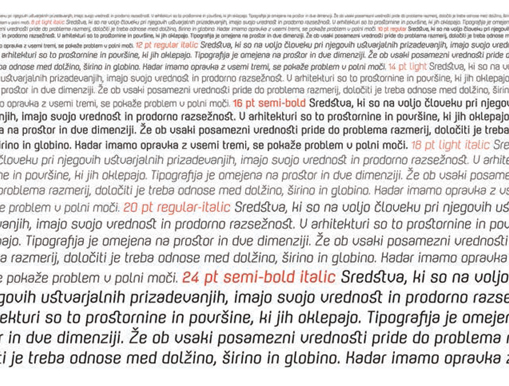
Mina Arko demonstrates the difference in text color that may be achieved with variations in linespacing and point size.
Select sections of body text from newspapers and magazines— choose examples that have different leading, type weight, etc. so that you have a range of body-text colors. Cut the examples into blocks approximately 1–1½ inches high and 2–3 inches wide. Arrange the sections so that they go from a light tone to a dark one. Next, experiment with tonal difference by making a “type face” using sections of found body text. To do this, either take a photo of a face or find an existing portrait and trace around the different tonal areas then replace these with sections of body text of similar tonal value (color). Having experimented with found text, try drawing the portrait using individual letterforms to create the tonal variations.
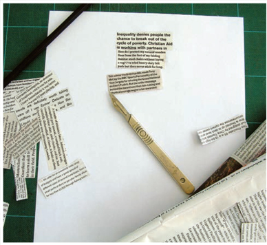
A student selects different sections of printed text to demonstrate the range of tones achieved with different settings such as leading.
Having collected snippets displaying a wide range of body-text colors, the student arranges them, cutting to shape where necessary, to create the tone in this portrait.
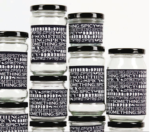
Default Bangkok have filled all available space with type to make a strong visual impact for this label design.
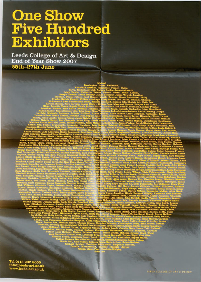
Inksurge have created an asymmetrical but well-balanced composition for this poster. The small colored blocks of text at the bottom right are surrounded with white space, which balances the heavier text and slabs of color at the top left.
White space
White space, the portion of the page left unmarked, is an important consideration in design. It provides breathing space for information, separates sections of information, and can give a feeling of opulence and sophistication because it demonstrates an unconstrained use of materials. A good example of this is the use of generous margins and/or leading in some upscale magazines and webpages. Lack of white space can cause a design to look compacted and, in some circumstances, low in quality. It is therefore important to bear in mind the content to be communicated when making decisions about white space. (N.B. if the plain background on a page is in a color other than white it is still referred to as white space.)
Symmetry and asymmetry
The overall shape that blocks of text, titles, and images form on the page can be used as a design feature or as an aid to communication. Deciding what kind of message you want your layout to deliver can be a useful point of departure in design. A symmetrical layout is one where, if you drew a vertical line down the center of the layout, the portion on the right-hand side of the line would be, roughly speaking, a mirror image of the left-hand portion. Asymmetry occurs when the two sides of the layout contrast with each other. When using asymmetry you may choose to balance the weight of each side equally or have an imbalance, which can make a design look quite edgy. A symmetrical layout can be used to convey a message of stability and reassurance, whereas an asymmetrical layout might communicate dynamism or controversy.
Letman used hand lettering for this symmetrical poster design that reflects the symmetry of the body.
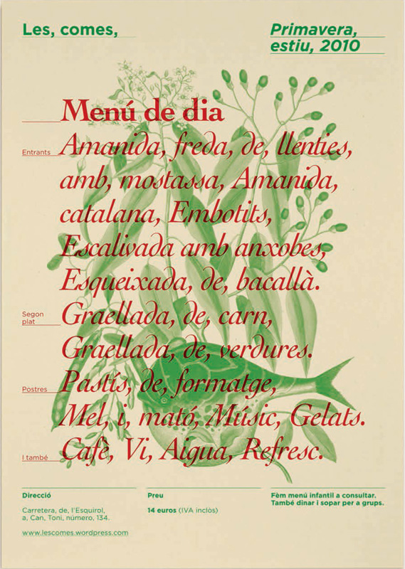
Jordi Serra Santano has laid lines of text over images that relate to the culinary theme of this menu.
Type and image
Although this book primarily discusses the use of type, images cannot be ignored because they form an integral part of many layouts. Where blocks of type and images are combined in a layout, it is important to consider how they sit together visually. For example, an image on the right-hand page of a double-page spread that indicates some sort of visual leftward direction can help to lead the reader to the beginning of the text on the left-hand page.
| Pitfall: When placing images with text, it is important to position an image on the same page as the text it relates to or, if this isn’t possible, ensure that the link is clearly signposted. |
Type, or sections of type, may be treated as image and may be custom-made for a specific design or taken from special typefaces known as ornaments, dingbats, symbols, or borders. There is a large range of these available, some of which are traditional, based on those created by 18th-century type designers such as Pierre Simon Fournier (le Jeune).
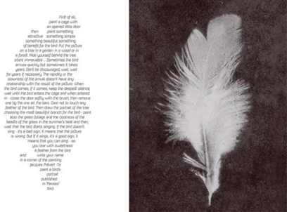
Mina Arko has replicated the shape of the feather, on the right, in the shape of the body text to give a balanced feel to the layout for this double-page spread.
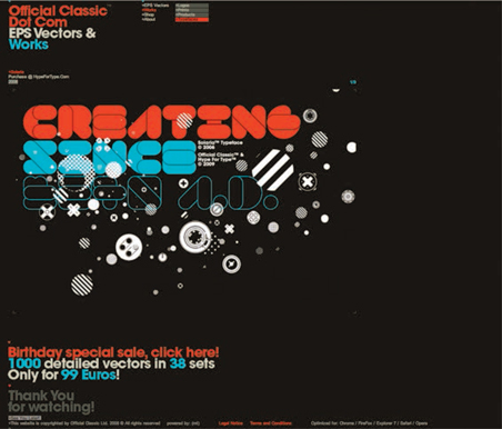
Official Classic Ltd. have used ornaments and symbols as decoration on the advertisement for their typeface Solaria.
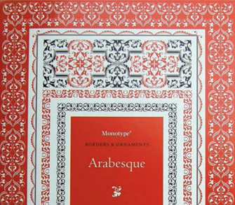
Monotype have produced an Arabicinfluenced set of type ornaments, Arabesque.
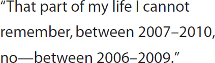
In this example, an en-dash has been used to indicate ranges of dates and an em-dash has been used to indicate a pause.
Graphic elements
There are other graphic devices in the type designer’s toolbox. These include various styles of rules (lines), graphic symbols, and ornaments such as arrows and stars, initial and drop caps, and punctuation such as exclamation marks and dashes. Dashes are not the same as hyphens. They have various functions, such as indicating a pause, a parenthesis, or a range of numbers, and they come in two forms: em-dashes, which are the width of a capital “M,” and en-dashes, which are traditionally half the width of an em-dash (but nowadays tend to be slightly wider than this). When indicating a pause or parenthesis, the usual style for US English is an unspaced em-dash, and for UK English, an en-dash with a space either side.
Many other languages feature special characters, such as umlauts (ü) in German and cedillas (ç) in French, which may be exploited as design features. Some special characters have been appropriated for use on website addresses such as the symbol for at (@) and the tilde (~). Another graphic device that appears regularly on e-mails and blogs is the emoticon, which may be produced either using punctuation (;-o) or by importing a customized symbol such as  .
.
Ligatures
Needing slightly more explanation are ligatures. These are where two letterforms are conjoined to form a distinctive shape, such as the Icelandic æ. Ligatures developed from the need to condense text in early hand-produced manuscripts to save on labor and materials.
Livius Dietzel and HVD Fonts produced a set of ligatures for the typeface Livory, some of which are demonstrated in this promotional piece.
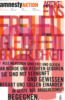
Amnesty Aktion magazine
by Fons Hickmann m23, Berlin
Amnesty Aktion communicates information about selected Amnesty International activities. Each issue contains a double-page spread that displays statistics, illustrates the international significance of certain processes, and calls for active participation. The magazine needs to be cost-efficient and quick to produce, but still make an impact. The art direction was by Prof. Fons Hickmann and Gesine Grotrian-Steinweg. The magazine was produced in four-color offset litho across eight pages.
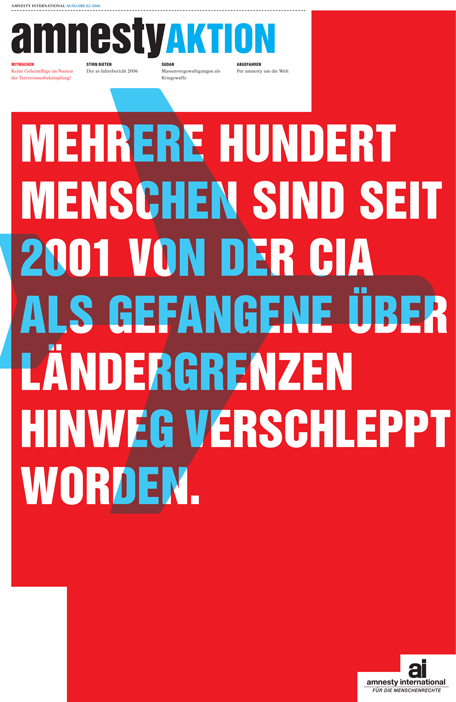
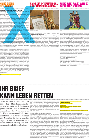
Fons Hickmann used capital letters with deep linespacing to give this design a more spacious feel incorporating white space. The design is asymmetrical, with the logo at the bottom right helping to balance the layout.
This cover design uses all capital letters, but in different sizes to provide hierarchy in a predominantly symmetrical layout.
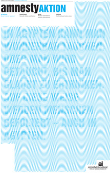
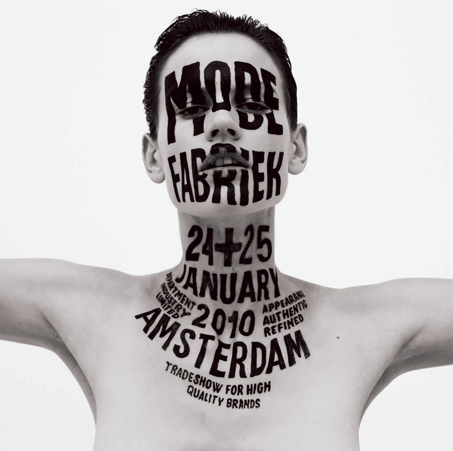
On this cover Fons Hickmann experiment with legibility, with the wavy background pattern integrated into the type. The text is still legible even though some elements, such as umlauts, are nearly obscured.
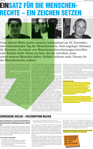
In this double-page spread, hierarchy has been established using different sizes of type as well as different colors for headings and highlighted sections of text. This is reinforced by the use of justified and ranged left alignment to distinguish between types of information. The strong grid, good use of white space, and careful alignment of images with the type gives an organized, clean feel. This contrasts with a dynamic use of large graphic symbols across the double-page spread.
This design by Tomato incorporates hierarchy, distinguishing sections of information, and experiments with balance and white space.