Chapter 7 : Production considerations
Having completed your experimentation and research, you will need to draw together the various design elements toward the finished product. At various stages during this process you will have evaluated the work in terms of its effectiveness, visual appropriateness, and suitability for purpose. The final stage will be the preflight check to ensure that you have specified and supplied everything needed for production. Production factors include printing method, choice of stock, binding, paper size and format, size of screen and resolution, finishing processes, and software compatibility.
When you feel that your design is complete, it is important to stand back from it to ensure that what you have is what you want to go to production. In most cases, the work will be handed over to someone else, such as a printer or Web-developer, at this stage. Before this handover, it is a good idea to leave your design for a while and return to see it afresh. If you don’t have time to do this, look at it in a mirror, reverse the image on the computer, or squint at it. This will give a new perspective and help you identify problems or anything that may need adjustment. As we have already discussed (see page 93), the text will need a final check. Mistakes in text are expensive—sometimes impossible— to remedy once the design has gone to production.
 | If your design has to accommodate text translated into different languages, make sure that you have allowed for some flexibility in text length, as different languages take up different amounts of space. |
 | Pitfall: Do not use spellcheck in place of a proofread, as it will miss all kinds of mistakes that would be obvious to the human eye. Beware automatic word substitution in word-processing packages, where a word may be replaced with something inappropriate without your knowledge. Check your settings! |
An important aspect of the evaluation is checking that your design matches the original criteria and that all of the requirements of the brief have been met. Part of this process is ensuring that any technical requirements are achievable—for example, making sure that the stock you have chosen is suitable for the finish you envisage.
| Always keep a reference copy of your work file exactly as it was when you handed it over for production (and keep copies of any relevant files and images). |
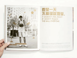
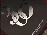
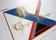
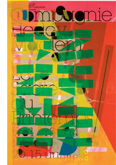
This design by Driv takes into account the space taken up by different languages.
Preflight
Preflight is a term borrowed from the safety checks on airplanes prior to takeoff and refers to preparation before publication. Many software packages include a preflight facility, but you will need to check that all your images are in the correct format and that you have specified the correct screen resolution in dots per inch (dpi) or pixels per inch (ppi). If you’re working in a program that doesn’t have a preflight check system, ensure that you have collected fonts, images, and any other items needed for output. Organization is important here: make sure that all items are identified correctly and you know where to find them (or that the software can find them).
| Check that the producer’s systems are compatible with yours and that they will be able to read your files. This also applies to typefaces, which are not always the same across platforms. |
Once you have prepared your files for production, it is worthwhile providing a printout of the finished work to the printer or other producer for reference and to prevent misunderstandings. Any special instructions, such as nonstandard finishes, stock, etc. should be clearly indicated on the printout.
Keep a photocopy of this mark-up for your own records in case the finished version is not as you intended. Usually the printer will supply a proof so that the designer and client can check for color and quality. Check typefaces carefully, to ensure that the printer has not used a different version. If a different version has been used, this may also affect text flow.
| Pitfall: Don’t be tempted to make any adjustments to your design after the final proof has been produced. Printers charge extra for amendments post-proofing and it can cause delays in production. |
When working with a Web- or screen-based design developer it is important that they know what your intentions are for the final design. Screenshots or flowcharts are useful methods of specifying how the final design should appear. You can use screenshots (or pdfs) as reference for individual webpages, and a flowchart or wireframe (a diagram showing positioning of pages, information, and links) will provide a visual guide to the site’s overall structure.
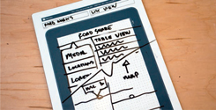
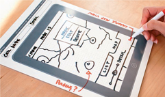
The design process, using an iPad-sized dry whiteboard, for an app.
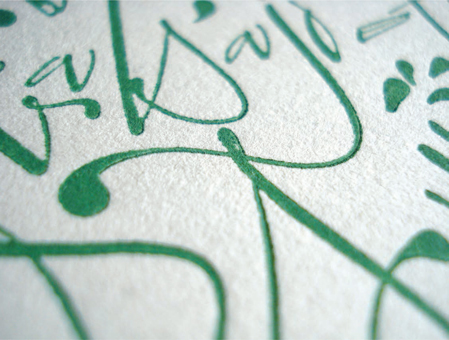
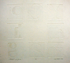
This close-up of a Yani Arabena design shows the indentation made by printing calligraphic letterforms onto textured stock.
You will have considered stock at the outset of your design and it may be essential to the creative solution—for example, using a textured stock to give a rough, hand-produced feel to a printed design. There is a wide range of stock and substrates to consider when you are designing. A semi-opaque stock, for example, will give a sense of layering and will usually have a hard finish, which will give a sharp edge to any type printed on it; you could even print on the reverse of it, giving real depth and interest. Textured or absorbent stock may be used to create a more bespoke feel, but sometimes it can have an adverse effect on legibility and readability if the printing plate does not make good contact with the paper, causing areas of print to be missed. Typefaces with fine lines or serifs are particularly susceptible to such problems.
Weight
The overall feel of a printed publication may be affected by the weight of the stock used. A heavy or thick stock, for example, does not allow show-through of print from the reverse of the paper and can give a sense of quality, whereas a finer paper may suggest something more throwaway, especially if the printing on the reverse shows through. Difference in weight can be used as a navigational device; you might, for example, use a heavier stock for chapter openers so that readers can physically feel the divisions between chapters as they flick through a book. Paper weight is usually defined in pounds per ream (500 sheets) of uncut paper or in grams per square meter (gsm) and is an important consideration, particularly when designing for packaging as a certain weight may be required for strength and stability.
| Most paper companies will supply samples and color and weight swatches for their product range together with information on the qualities of the stock with reference to print and handling. It is worth keeping files of these samples for future reference and ideas generation. |
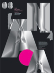
Music have used a heavy, textured stock to give presence to this design.
This booklet by Benjamin Koh takes advantage of the transparent quality of the paper so that the following page forms part of the cover design.
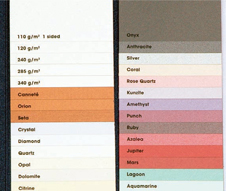
A section of the Robert Horne swatch book, Stardream, showing a range of paper and board with finishes such as metallic, pearlescent, and iridescent.
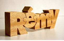
John Christenson has modeled his Nuzzles®, interlinking letterforms in three dimensions, as stand-alone objects but they could work well if photographed and used in two-dimensional work.
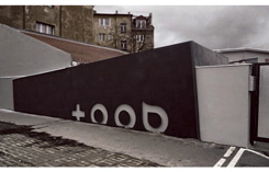
Kiss have used incised lettering to provide interest and texture in an architectural context.
Maciej Mizer has used complex modeling and photomontage techniques to produce this simulated three-dimensional design, used on a T-shirt.
Finish
The finish on a stock can make a significant difference to a design. Coated papers with a less absorbent surface, for example, will reproduce small-sized or delicate typefaces well and are therefore suitable for fine detail. Uncoated stocks, in contrast, are often more absorbent and therefore more suitable for softer, less detailed work. If you want the best of both worlds, you can apply a coating to certain areas of uncoated stock, which gives scope for many creative design opportunities. Not all coated stock has a shiny, flat surface; some coatings may give a matte or textured finish. Coatings may be referred to in different terms, such as gloss, luster, satin, or silk. Other specialist print finishes include lamination and foil blocking. Lamination can protect stock and make it stronger, or it can be used as a spot effect—for example, to give a different finish to title type. This is also a way in which foil blocking is often used (see opposite, center right).
There is a view that glossy or coated stock is more damaging to the environment than uncoated stock, as the coating process uses more chemicals, but this is not always the case; check a stock’s environmental credentials where possible. An uncoated, matte stock may appear more environmentally friendly than a coated one, but consider this in the context of the whole design, as your choice of typeface, color, and other factors will also affect perceptions.
There is now a huge range of materials that may be used for producing designs incorporating type. Modern production technology allows you to apply type to surfaces such as metals, plastics, and glass. It also provides opportunities to experiment with three-dimensional forms, such as store signage and architecture. These three-dimensional artifacts may be real objects that have been digitized and used in screen-based format, possibly even in virtual reality. Of course, three-dimensional effects may also be created from scratch digitally.
Type may also be put onto the surfaces of three-dimensional letterforms, perhaps as decoration or texture, to help interpretation. Further processes may be used to enhance the design: finishes such as lamination, foil blocking, and varnishing may be applied to a variety of surfaces and offer creative opportunities as well as solutions to practical concerns such as waterproofing and durability.

The cover for this brochure by The Consult has a high-gloss finish for impact and tactile quality.
This is a sophisticated use of metallic ink on matte stock by The Consult.
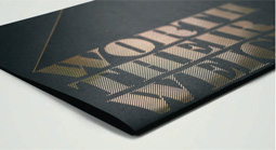
Ambush use foil block to give a sophisticated and luxurious look to this design.
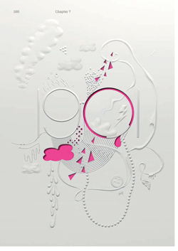
Toko use simulated raised shapes to add texture and depth to this poster.
Fluid Design have incorporated embossing and die-cutting into this complex design, which attracts attention as well as giving a tactile quality.
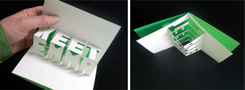
To create impact, Martin Pyper has used laser-cut heavy white card in this pop-up design.
Marian Bantjes uses gold metallic ink on the lettering to illuminate this design.
Me Studio use photographs of people interacting with 3-D letterforms to create movement in this brochure design.
UV (Ultra Violet) varnish, foil blocking, embossing, thermography (chemically raised ink surface), and flocking are examples of print finishes that can add value to your design. They can be used individually or in combination: for example, a foil-blocked and embossed detail may often be found on popular fiction books to attract attention when displayed for sale. Other finishes include fluorescent and metallic inks, debossing (see page 165), and die-cutting, which involves cutting out an area of a design. All these finishes add to the cost of production but offer opportunities for experimentation and communication and may be achieved within a variety of printing methods.
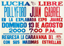
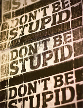
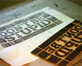
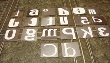
This is a poster that Hans Gremmen found at a letterpress printer in Mexico City. Posters for ephemeral events such as this “lucha libre” (freestyle wrestling) competition have to be produced quickly and cheaply: the printer assembles the typefaces, logos, etc. from items already available in his workshop.
Print processes
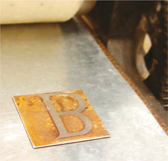
There are various specialist methods of producing type, including lithography, letterpress, silkscreen, lino print, woodblock, copperplate engraving, and etching—as well as, of course, more basic methods such as potato prints (see page 57). These processes are usually identified with short print runs or fine print (limited edition), as they often require skilled craftsmanship and specialist equipment; you may find subtle differences between each print, which conveys a sense of exclusivity. It is useful to understand the idiosyncrasies of these processes, so that you can exploit them to good effect. For example, letterpress printing makes an indentation on the surface of the stock, which produces a tactile quality (see below left).
Many of the effects associated with craft processes may be replicated using software so that they can be incorporated into design for both screen and commercial print. Offset lithography is currently the most commonly used commercial printing process. It is based on traditional lithography in which the design is transferred to a plate that takes up the printing ink and deposits it on the stock.
Inkjet and laser printing are commonplace in everyday business and domestic situations. They are the printing processes that you are most likely to use for proofing your work or for printing one-offs or small runs at standard sizes such as letter and ledger. These technologies, which enable you to print more or less directly from software, are now being adopted by some commercial printers.
This poster was produced on a Vandercook letterpress by John Magnifico. Traditional processes such as these can result in a bespoke, hand-produced finish.
Printing can involve a certain amount of trial and error—a fact of life that Hans Gremmen recognizes and celebrates in this silkscreen-printed poster, which is derived from testprints that the designer found at an Amsterdam printworks.
Daniel Muntean makes prints from a plywood woodblock—an experimental production technique that would not be suitable for mass production.
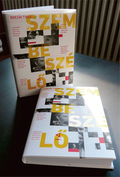
Marton Borzak used a UV varnish on a silk stock to emphasize the title of this book.
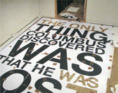
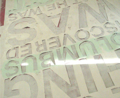
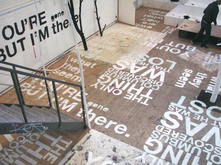
Kasper Pyndt created a typographic design to be printed on the floor and walls of a room. The design was printed in sections and a stencil was made from each of these in order to reproduce the design faithfully.
A process used by Szabó Balázs to produce embossed lettering. The letters are applied onto individual squares of metal using an acid-resist material. The squares are then etched in acid to leave the letterform proud of the rest of the square. The resulting forms are pressed into soft paper to produce embossed letterforms. This work experiments with production techniques, both in the making of the letterforms themselves and the way they are applied to the stock.
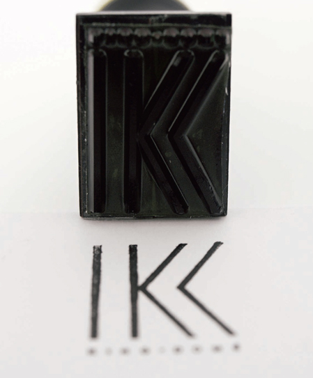
Artiva had this rubber stamp produced as part of a brand identity. This idea gives the client the flexibility to print their logotype wherever they like.
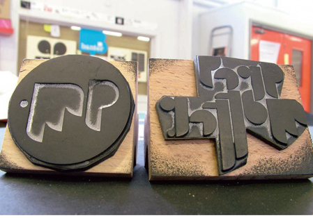
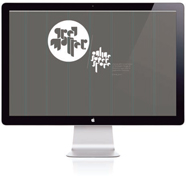
From his original lino prints (above), Andy Cooke has been able to transfer this logo design into a variety of digital and print formats, including a webpage (below).
Color in production
Although it is possible to send your design direct to the commercial printer or producer, you will need to ensure that their software is compatible with yours and that what you send is what the final product will look like. It is disappointing to receive a finished piece of work from the printer only to discover, for example, that the contrast is much darker or lighter than it appeared on screen. It is normal practice, when designing for print, to make desktop printouts of your work to ensure that the printed piece resembles the screen version, but this is not a failsafe precaution. To get as close a color match as possible, calibrate your monitor and software with your desktop printer. However, it is not usually possible to perform this kind of calibration between your equipment and that of a commercial printer. Instead, you should receive a printer’s proof, which will allow you to check, among other things, registration (see page 194) and color.
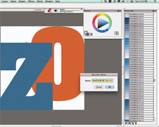
When designing on screen, colors are rendered in RGB (red, green, blue) format. However, RGB is not suitable for print work, so, for commercial printing, files will need to be converted to the four process colors: C (cyan), M (magenta), Y (yellow), and K (black) (CMYK). When matching specific colors, such as those used for corporate identities or brands, you would normally use a colormatching system, such as PANTONE® (see page 132). Digital versions of these color systems are often provided within design software.
The four-color process allows most colors to be reproduced by combining the four process colors in varying proportions. These are approximations of the real colors and, as stated before, if you want a particular color to be accurate, you would need to use an extra, specified color (see page 132). This only applies to conventional print methods: emerging print technologies, such as Print on Demand (POD), blend the colors through the technical process rather than breaking colors down into CMYK screens.
This screenshot shows a menu for the PANTONE® color-reference system provided within a graphics software package.
Although print- and screen-based projects may start out in a similar way, by the time they reach the production stage principles and processes differ dramatically. Key issues relating specifically to print-based production include registration and binding. Another thing to bear in mind is that the file formats for print will often be different from those for screen.
Registration and trapping
In color printing, each of the four process colors is printed on a separate plate. These plates need to be correctly aligned to ensure a clear and accurate reproduction. Correctly aligned plates are described as being “in register.” You sometimes see examples of misaligned, or misregistered, printing in newspapers where one color is offset from another, creating a sort of ghost image. Misregistration can cause legibility problems, but can also be used creatively in a design. Deliberate misregistration, sometimes combined with different opacities of inks, can add depth and texture to a design. You can use software to reproduce such effects quite easily but, as with most effects, overuse may lessen the impact.
When two colors are misregistered, a gap appears where the colors meet (see left). Trapping is a method of compensating for this problem by printing small areas of overlapping color. Software programs usually add trapping automatically, but you should check your preferences in case you need to enable trapping or apply it manually.
Related to trapping, and often treated as the same, is knock out, which involves the first, or underlying, color being completely obliterated where the two colors overlap.
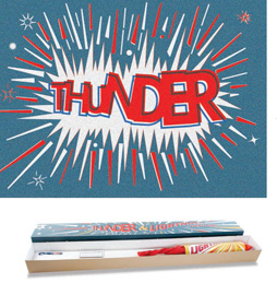
This packaging project by Aaron Alexander shows a creative use of misregistration.
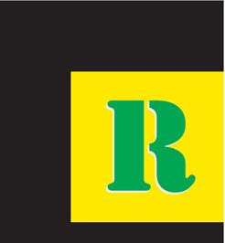
This letterform is misregistered with the background, leaving a white edge exposed.
Select a heavy typeface such as Souvenir (or a bold version of any typeface) and use this to produce a simple word of no more than five letters. Unless you want to create extra challenges, use letterforms such as “u” and “s” that do not have fully enclosed counters. Render this word in a fairly large point size (e.g. 150 point) on a piece of thin card (we used 180gsm smooth card). Cut out the letterforms to create a stencil. Place the stencil on a fresh sheet of paper and dab ink or paint through with a soft rag or brush. Remove the stencil and allow the ink or paint to dry before placing the stencil back on the paper but slightly offset from the first print. Repeat the inking process using a paint or ink in a different color or a different tint of the original color. You can repeat this as many times as you like to achieve a variety of effects.
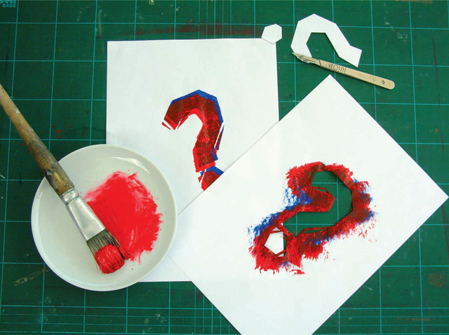
Here a student cut out the stencil and inked through it, first in blue and then in red, using a large brush to produce a stippled effect.
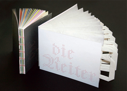
The binding for this publication by Livius Dietzel uses innovative techniques. The spine of the book is exposed, showing the binding, and Dietzel has used paper bags as pages, embellished with embossing and die-cutting.
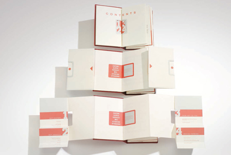
Tristan O’Shannessy’s use of binding for this book is novel and quirky, using foldouts (which fold out again) and die-cuts to draw attention to the content.
Binding
Although predominantly a practical consideration, the binding of a book or any other multipage document can also present opportunities for creative experiment. Various methods are used for binding, the most common being stitching, where the pages are stapled or stitched together across the center; perfect binding, where the pages are collected into sections and then glued across the spine; and case binding, where pages are stitched in sections that are then stitched together across the spine. Less common bindings include stab binding, where the spine side of the pages is pierced and then bound.
Decisions about binding are integral to the book as a whole. For example, a tight binding can make the center of the publication difficult to see, as the pages will not open flat. The number of pages, thickness of stock, ergonomics, size and format of the publication, and budget are all factors that need to be taken into account when selecting the binding. Large or thick books may need a hardback binding to give them strength; such binding also carries associations of quality and durability.
Design considerations relating to binding include the width of margins, because a book with many pages may need a wider inner margin to ensure that the content toward the spine is visible and readable. Running text or even large titles across the center of a publication always presents the risk, even in expensive books, of misalignment. Of course, such problems can create opportunities for creative use of type and lettering.
Trapped in Suburbia disguise the spine using large letterforms with bright colors and shapes.