4
Chapter 4 : Communication
This chapter is concerned with how the designer can control type to convey a certain message, emotion, or idea. It will explore the meanings that can be communicated through variables such as appropriate or inappropriate typefaces, balance and imbalance, harmony and discord, symmetry and asymmetry. It discusses how to make a type design suitable for its likely audience, taking into consideration differences in scale and context, for example, between a poster and a design for a touch-screen icon. Also covered is the potential for subversive approaches, such as creating edginess by inappropriate use of everyday type or objects or deliberate flouting of conventions.
Forms of communication
Type is found in most areas of visual communication and falls into two main categories: persuasion (rhetoric) and information (non-rhetoric). Persuasion includes areas of advertising, such as posters, websites, TV advertisements, and packaging. Information relates to most editorial matter, such as magazines, books, newspapers, comics, information booklets, and brochures. Many of these genres have completely different functions: an instruction booklet, for example, needs to provide clear explanation, whereas an advertisement has to attract attention and create a perception of the product being promoted. The use of type in each case will differ accordingly.
Even predominantly image- or sound-based media need interpretation through use of type in order to ensure accessibility. This includes subtitling for foreign languages and for the deaf and hard of hearing.
The boundaries between information- and persuasion-based type can be blurred. Some websites, for example, are purely advertising-based and others are information-based, but most fall somewhere in between and combine aspects of both.
Whichever area, or combination of areas, of visual communication you are working in, your type design should engage the reader with the message. You will need to consider how you direct your audience to the message, help them navigate around the message, and guide them to an understanding of the overall meaning of the communication.
Unlike images, which communicate quickly and directly, type delivers its meaning invisibly and subtly: the viewer is not conscious of the process. This is linked to readability issues that we discussed in chapter 2. Persuasion is considered all the more powerful when people are unaware of it. There are many factors involved in this subliminal process, such as choice of typeface, and style, color, and weight of type, but one of the most important is the use of hierarchy. This helps to draw readers in and enables you to deliver the message and aid interpretation of meaning by guiding them around the information.
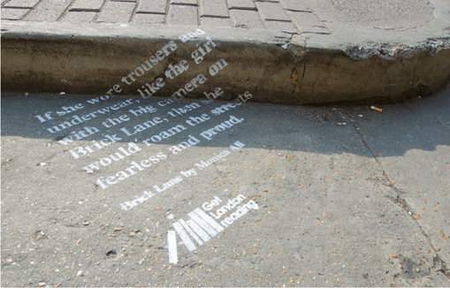
KentLyons have taken an innovative approach to persuading people to use their local library.
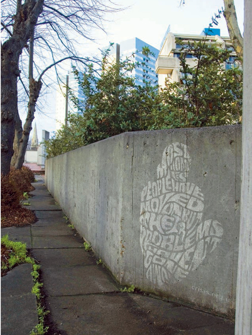
Studio Oscar fitted text to the outline of an image to reinforce the message about homelessness.
On Hila Ben-Navat’s intriguing poster individual words are emphasized in red to persuade the viewer to engage with the subject of genocide.
Choice of typeface is one of the most fundamental factors in conveying the meaning of a type design. We have seen how a classic typeface works well for a serious publication and a sans serif, modern typeface can indicate a lighter touch (see page 27). An article on period furniture in a lifestyle magazine may call for a retro typeface, whereas a children’s story will probably require something more dynamic. In the latter context, a calligraphic typeface might convey the desired qualities of spontaneity and immediacy, as well as giving a hand-produced look, but it could also leave the overall impression of something unfinished, too casual, or frivolous. This is another time when you need to step back and evaluate your work before making final decisions.
 | Key to helping people interpret meaning is having an understanding of it yourself. Ideally you should read the text you are designing, but at the very least you should have a clear idea of the content. Often editors will provide a synopsis or outline of content if you are working on a book or other lengthy editorial matter, so you may not have to read the whole text. |
Symmetry and asymmetry, and the closely related balance and imbalance, can also be exploited to communicate meaning. A symmetrical design, where both sides are similar, will tend to give a formal feel to a layout, whereas an asymmetrical design could suggest a lighter ambience. A symmetrical layout will always be balanced: if you drew a line down the middle, the right side would mirror the left. An asymmetrical design may also appear balanced if the various components are evenly, though irregularly, distributed across the layout, but it will look unbalanced if, for example, there is a large area of type on the right side and only a small image to the top or bottom left of the layout. A balanced design can be interpreted as calm, stable, structured, and formal, whereas an unbalanced design will usually make the viewer feel slightly edgy and uncomfortable; it might also give an active, informal feel to the design. Although symmetrical in form, centered type can share the lively, energetic qualities of an asymmetrical design. This is linked to the readability issues discussed in chapter 2; centered type is not that easy to read and this can cause visual disturbance.
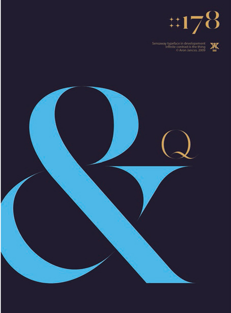
This design by Áron Jancsó achieves a fine balance in an asymmetrical layout.
Dimitris Kanellopoulos has used asymmetry in this poster to give it an edgy feel.
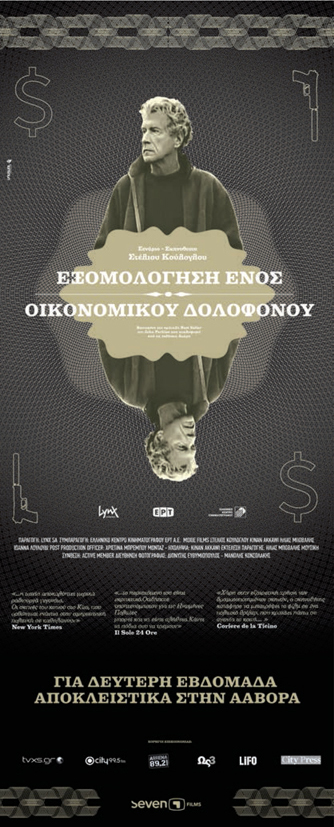
The balanced, symmetrical layout of this movie poster by Unusual Design Group contrasts with the playing-card metaphor and the dollar and revolver icons. This opposition suggests a game of high stakes taking place beneath a calm surface.
Futuretainment use symmetry to create balance and draw the viewer into this website.
Often, designs will incorporate multiple meanings that work on many levels. Some may be obvious, but others could be hidden or complex, underpinning messages intended to reach the audience subliminally. An example would be the use of particular imagery and type to generate a feeling of fear or insecurity in propaganda or a feeling of warmth and familiarity in advertising.
The relationship between a typeface and its meaning may be obvious—for example, using a handmade style of typeface in a brochure for a craft fair—or it may be more subtle.
For example, traditional serif typefaces such as Bembo derive from handwriting, so choosing such a typeface for an autobiography would reinforce the personal nature of the text.
Harmony and contrast may be incorporated in designs to help convey meaning. Harmonious typefaces, such as those belonging to the same family, can deliver a message of comfort and familiarity, whereas discordant typefaces, such as two different but similar sans serifs, can make a design feel unsettling. Similarly, a static arrangement will make a design feel stable and sensible, whereas a design that has plenty of movement will appear active and exciting.
Another way of creating harmony or contrast is through the relationship between text and image. For example, an image of an elephant would contrast with a section of text about nanotechnology but be in harmony with an article about wildlife. Similarly, typefaces themselves can provide contrast —for example, a soft, delicate script typeface for a text about the dangers of ignoring crime. The comforting typeface might be used to set up a sense of complacency in the reader that would be undermined by the theme of the text.
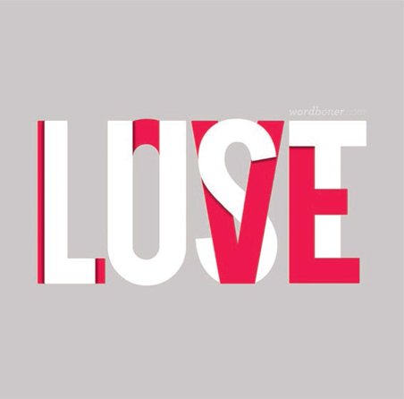
Peter Kowalski of Wordboner.com cleverly combines two different, but related words by overlaying colored type. This makes the design difficult to read, playing a visual game with the viewer to reinforce the message.
This poster by Hassan Haider achieves a harmonious feel with its subtle use of type.
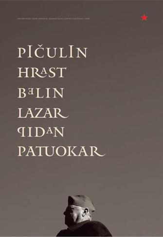
Faced with an influx of new homeowners from across Europe, the Slovenian village of Ciginj conducted a project to research and preserve traditional house names. On this poster design for the project, TipoBrda have chosen a suitably conservative serif typeface.
This typeface has been designed by Ale Paul to look as if it has been hand written, which would make it a good choice to communicate a sense of friendship or informality.
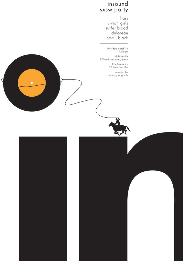
Bleed has been used to good effect in this design by Small Stakes, where the last part of the word disappears offthe edge of the page but the eye is drawn back in by the cowboy lassoing the dot of the letter “i.” The bleed suggests that there is more than meets the eye—a suitably intriguing message for a party invitation.
Good use of type, particularly in terms of hierarchy, can even help in clarifying difficult-to-understand texts or concepts. An example of this would be a complex form, such as a tax return, which can daunt and confuse many people. A clear, easily read typeface together with well-organized layering of information and signposting can make all the difference.
Meaning may be enhanced by the use of the techniques of closure and bleed. Closure is accomplished by capitalizing on the tendency for the human brain to complete partial forms, such as making a “C” into an “O.” Bleed is a mechanism for extending the boundaries of a section or page (see page 88). You will often find this used in print design where images are bled offthe edge of the page but it is also a good way of using missing type or sections of type to extend the page visually. It is also useful to indicate the feeling that there is more there than is obvious, like making something appear bigger than it actually is.
Comparison may be used as a way of enhancing meaning. We have talked about experimenting with different combinations of typefaces, scales, and weights in chapter 3, and these may help to convey a message. A good example of this is the use of two distinctly different typefaces, perhaps Fette Fraktur (a heavy, Germanic typeface of the sort found in early manuscripts) with Frutiger (a spacious, light sans serif typeface), to indicate two opposing points of view.
There are many different approaches to interpreting a feel or style in order to convey meaning so that the content or context of a communication is understood more easily. To help you develop your own methods, you should analyze the effectiveness of others’ attempts as well as trying your own experiments. You will learn an enormous amount from others’ successes (and failures) as well as your own.
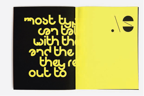
This design by Magma makes use of both closure and text bleed to focus the reader’s attention on the quotation. By forcing us to work harder than normal to decipher the text, the design slows us down and makes us think about the content.
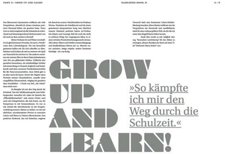
In this double-page spread Harry Seifert uses contrasting typefaces to indicate not just two different voices but two different languages.
Context
Designers with strong identities are often chosen for projects that fit within their personal style. Whether this is the case or not, the context should be the first consideration in terms of style and feel to ensure effective communication. Certain contexts are strongly associated with a particular style. For example, science-fiction book covers often feature sans serif or modern-looking display typefaces. When designing for a context that has a distinctive style, ask yourself whether you intend to be faithful to the style or whether you intend to subvert it by experimenting with alternatives. Conversely, if you are designing a product for a wide audience, for example, a general-fiction book cover, be careful about using a style closely associated with a subgenre, because the specific cues may not resonate with anyone who is not familiar with them. You can quote from styles and genres to good effect as a way of communicating ideas in the form of pastiche, much as Roy Lichtenstein uses comic-book lettering in his paintings to evoke the popular culture associated with pulp fiction and the comic.
Not all designs are one-offs; there are many occasions when a design is produced as a multiple or as a series—an example being a print or Web magazine. If this is the case, it is important to retain the style and continuity but ensure that each iteration has its own identity or flavor.
Whatever style is adopted, there are advantages in avoiding fussy, complicated approaches and keeping things as simple as possible. There is an increasing amount of visual, verbal, and written noise in our lives; it is useful sometimes to cut through the interference with a clear, straightforward solution. Neutrality is another way of achieving this effect: choosing a bland, familiar typeface, such as Arial, can make a message speak for itself, without encouraging inference or partiality.
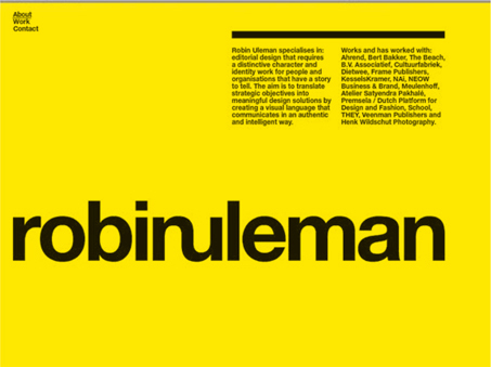
Robin Uleman’s website design is clean and simple, leaving space around information.
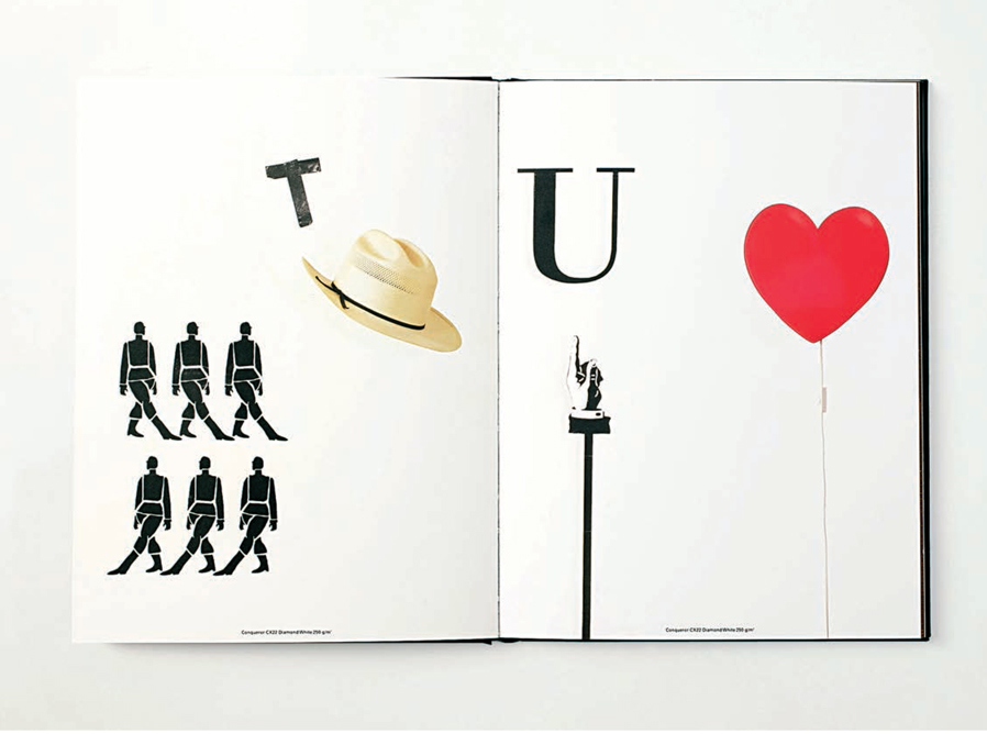
Select two books from contrasting genres, such as crime thriller and chick lit. Produce two book covers for each book, one in the accepted style and one in the style of the other genre. To carry out this activity, you will need to research the sort of typography that usually features on book covers in your two chosen genres.
These two designs by Cabin demonstrate the use of type style appropriate to the content: the crime novel uses a sober, uncompromising serif typeface, whereas the chick lit book’s title is in hand-drawn lettering that suggests warmth and “kookiness.”
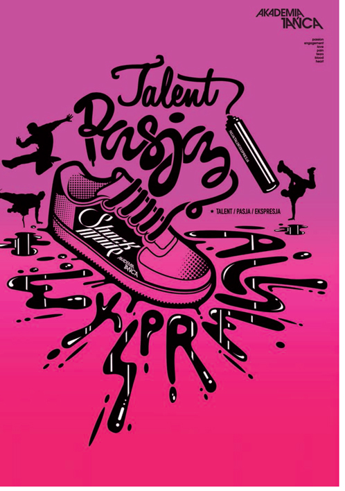
Michal Bialogrzywy has taken the concept of a splash page literally for this Dance Academy website.
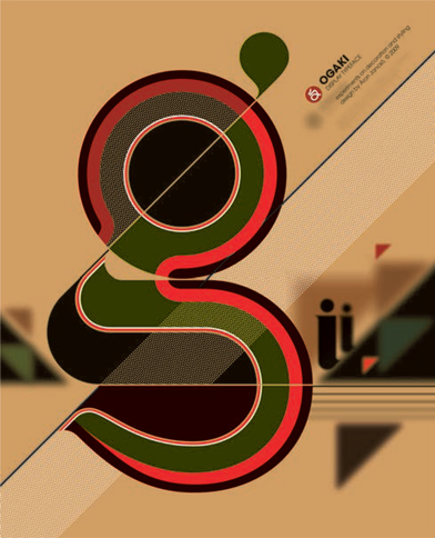
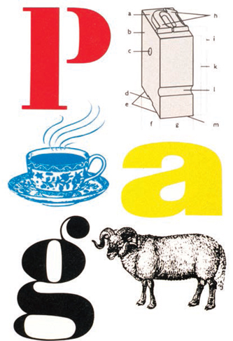
The strong contrast in scale between the letter “g” and the rest of the type in this design by Áron Jancsó immediately draws the viewer’s eye.
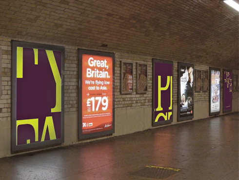
When designing for an audience on the move, clarity is normally paramount. However, in this series of posters Huda Abdul Aziz uses cropped letterforms to create a sense of intrigue as travelers walk along the station concourse.
Any design that stands out from its rivals in some way will have an impact. Sometimes, as we have seen, even a bland, neutral design can provide impact if the audience has become jaded by more lively designs that jostle for attention. The use of an incongruous typeface can make a design memorable. An element of surprise may also be achieved by use of type in an unusual or uncomfortable style, size, positioning, or color.
There are many other ways of providing impact, such as contrast in scale (for example, a small capital letter beginning a long lowercase word). Other methods include isolating a small section of type from the rest of the text, drastic cropping of letterforms, interrupting the rhythm of a sentence or passage of text, and choosing unusual or discordant typefaces that cause the reader/viewer to pause.
Impact may be used dramatically in website design, where a splash or opening page will be designed to invite you into the site rather than bounce off elsewhere. People need little excuse to navigate away from websites, whereas the turning of the pages of a physical book or magazine creates a natural flow, so the creation of impact is arguably even more important in Web design than in print.
Posters lining an escalator shaft are read when the audience is moving. The type, therefore, needs to be easy to read for an audience with little time to absorb information, and able to create an impact to attract attention in the first place. The audience needs to be able to interpret the message, which may in itself provide the shock, quickly and efficiently. It is important to know, if possible, the context in which a design is to be situated so that you have an idea of what it will be competing against. For example, if you are designing a poster that is going to end up on a bulletin board vying for attention with lots of other, well-designed posters, what can you do to make yours stand out?
Fons Hickmann m23 use type as image to shock and/or amuse the viewer in this risqué poster for a clothing collection.
Rhythm and repetition
Rhythm and repetition are important ways of establishing continuity in a design, which helps to ensure the message is conveyed. It is natural for people to tune in to visual rhythm or repetition in the same way that they respond to poetry or music.
In design terms, repetition is the direct replication of a certain word, phrase, or motif, perhaps with a different typographic treatment, and so is usually easy to spot. Rhythm tends to be less obvious; it may occur at the structural level of the design—for example, in the use of hierarchy—rather than in individual components.
Because rhythm is subtler, there is less danger of it being overused. Repetition, however, can become, well, repetitive. For example, if you were to use the same emphasized word throughout a section of text, for example, it could cause the reader to lose interest, or, at worst, become irritated.
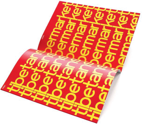
Rishi Sodha uses repetition to imprint the phrase “Tibetan supermarket” in the minds of the audience.
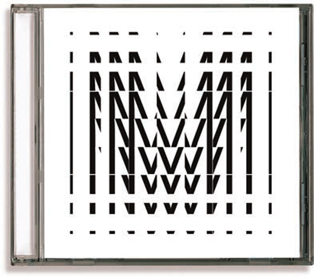
Corey Holmes’s music CD cover conveys rhythm through the fragmentation of the letterforms.
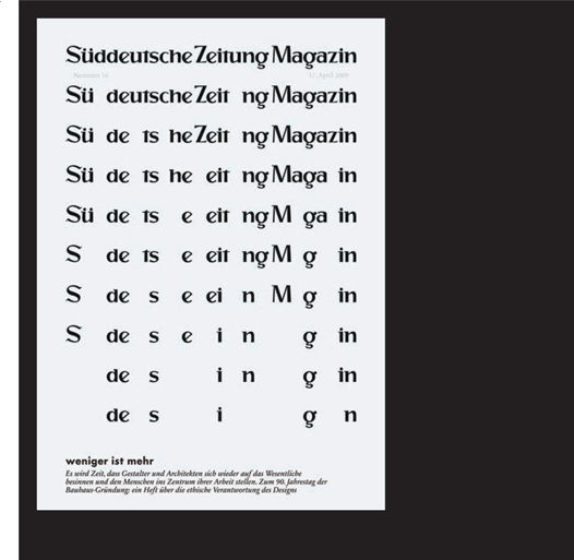
In this advertisement by Heye & Partner for a German newspaper supplement, a rhythm is established in which each line of text sees two more letterforms in the title of the magazine being removed to leave the word “design.”
Visual continuity
Visual continuity is a way of leading the reader/viewer through the design and the message it conveys, making clear where parts of the design relate to each other, and thus enhancing the communication. This may be achieved by using the same typefaces for certain functions, such as chapter openings, color-coding, and consistent use of hierarchy.
There are various devices that can help visual continuity, support hierarchy, or draw attention to an aspect of the design. Examples are frames and tables, which may differentiate an area of type from the main body or create a visual link between two or more sections of text. Borders can be distracting, creating unnecessary visual noise, particularly if they are heavy or elaborate. Frames, however, may not necessarily have a border; they may simply consist of a background tint to give a more subtle effect. The same applies to tables, where too heavy a frame can almost obliterate the information the table is intended to convey. To overcome this problem, use very lightweight frames or tints. This is particularly pertinent when designing a form, whether for print or screen. Avoiding heavy borders can make the form seem less intimidating, which should encourage people to fill it in.
 | Pitfall: When designing forms, remember to ensure that the frame will accommodate the maximum number of characters likely to be used. |
Tools such as frames can provide opportunities for experimentation, such as the framing of decorated initial or drop caps.
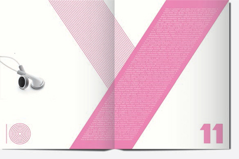
Miklos Kiss has used part of the Y shape as a frame for the text in this double-page spread for a fashion magazine. It provides a clean, modern, and fresh feel.
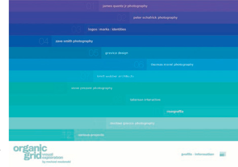
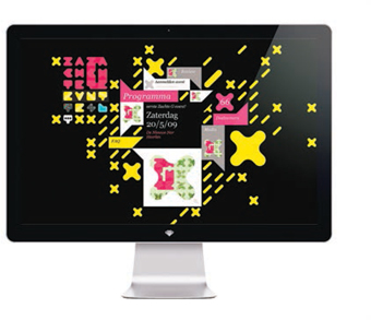
Organic Grid’s site uses subtle graduations of color to separate the different sections of information and content.
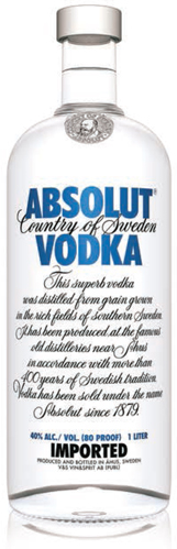
Absolut Vodka’s logo may be identified as an image rather than words because it is so familiar.
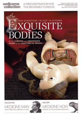
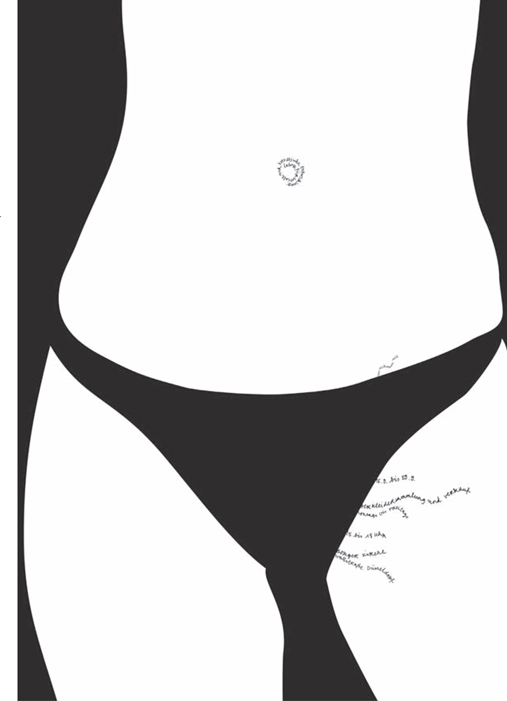
The initial cap of this title is framed by a decorative surround, which provides a contrast to the rather gruesome main image. This juxtaposition helps to convey the spirit of the exhibition, which explores “the curiosities and grotesque story of the anatomical model.”
Type as image
People have always played with language and letterforms for various reasons—to communicate in secret, to save time, or just for the fun of it. New technologies have led to a whole new language of acronyms and phonetic abbreviations. In texting, words are often replaced by numbers and letters that make the same sounds—for example, C U L8R for “see you later.” Going one step further is the device known as a rebus, which uses a combination of images, symbols, and characters to replicate the sounds of a word or phrase. Both “textspeak” and rebuses may be used to attract attention or to give an informal feel to a design. They can also provide an opportunity for pause, as they are not always instantly decipherable.
Emoticons are another form of shorthand that uses type as image by combining punctuation and letterforms to convey meaning.
Onomatopoeia, where the sound of a word matches its meaning (for example, “buzz” or “screech”), can be extended into the visual realm, so that the typographic presentation of a word suggests its meaning. Another example of type as image, visual onomatopoeia is used extensively in cartoons and in packaging.
When text is interpreted as an image it becomes understood quickly and easily. Letterforms or sections of text may be used as objects/images in their own right or may form part of an image. These devices are often used to reinforce a message—for example, in the LG logo the “L,” the “G,” and a period form a friendly face. Many logotypes, such as the Absolut Vodka logo (opposite), have become identified as an image rather than words and, once established, are easily identified. Symbols and other graphic devices may also be used to replace or supplement text.
Pentagram have used a combination of letterforms and images to form this rebus of their name.
Using a short poem, nursery rhyme, or other text, replace as many words or parts of words as you can with phonetically equivalent letterforms and symbols. Make sure that you distinguish in some way between the phonetic substitutes and any words remaining from the original text.
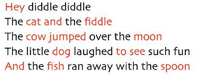
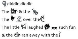
In this nursery rhyme, the text to be replaced with images or symbols has been highlighted in red. For the final design, Lester Meachem provided illustrations to replace the words hey, fiddle, and jumped. He drew a shock of hay, which sounds like “hey,” and a jumping frog as an ideogram for “jumped.” Other images were taken from typefaces that include ornaments: Greymantle has been used for the cat and fish; the cow is from Giddyup Thangs; the moon is from Linotype Astrology; the dog and spoon from Linotype Holiday. Also from Linotype Holiday is the symbol for “sea,” which sounds like “see.” The picture of a die with two dots, taken from Linotype Game, replaces the word “to,” which sounds like “two,” and an ampersand has been used instead of the word “and.”
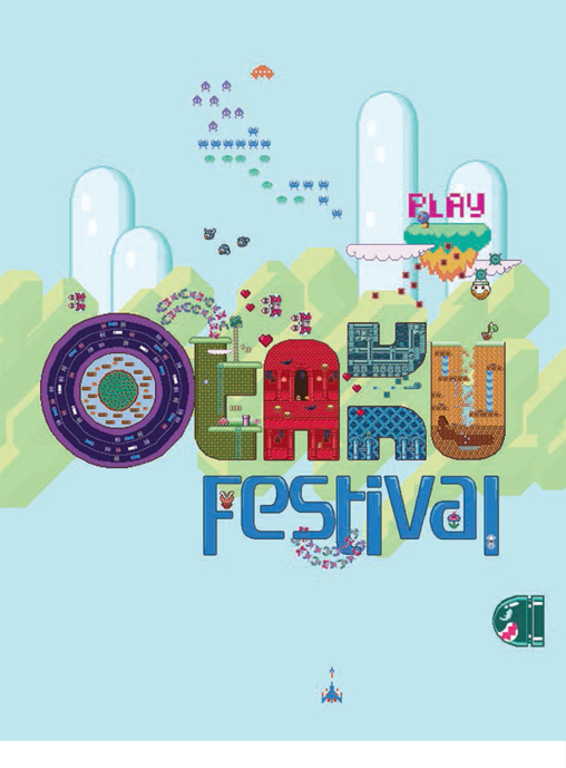
Each of the letterforms in the title of this poster by Inkamon is derived from a classic video game—a great way to promote this festival for fans of anime, manga, and gaming.
Hourieh Nouri has drawn from the idea of emoticons to produce this poster of a smiley face made from type.
This logo for the Twins Foundation, designed by Malcolm Grear Designers, abstracts the letterforms to make an image that both represents the initials TF and conveys the idea of twins.
Bunch have used a rebus for the phrase “people that you like” to draw attention to this double-page spread.
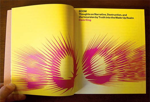
Garrett Niksch’s use of visual onomatopoeia gets the message across —“BOOM.”
Designers frequently make use of navigational symbols and graphic devices to help understanding of information and meaning. These may include pointing fingers or arrows, ornaments, symbol typefaces such as Zapf Dingbats or Wingdings, rules, borders, and items specific to the content of the design, such as individual letterforms and fragments of images. The list may also include standard punctuation, such as exclamation marks and asterisks, and even glyphs or special characters can be used in this way. Sometimes, logos or parts of logos are used in this manner, reinforcing the brand identity.
Graphic devices do not necessarily have a navigational function. Ornaments have been incorporated into graphic designs since illuminated manuscripts, when they were often used as marginalia to decorate the page or act as reminders for the person reading the text to an audience.
| Pitfall: Although symbols and graphic devices may add to a design, they can also detract from the message or content if used inappropriately or excessively. As with much design, you do not want to create noise that distracts the viewer and hinders communication of the intended message. |
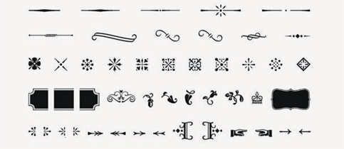
These two images show a set of ornaments that HVD Fonts have developed for the typeface Opal Pro.
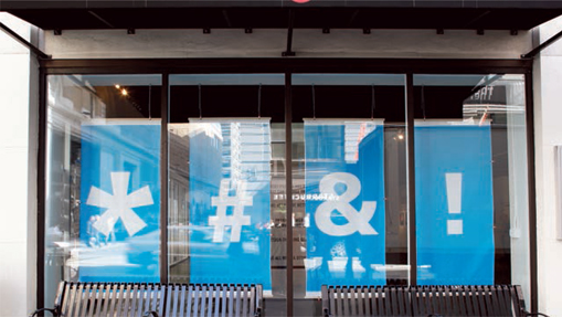
Him have used graphic symbols in this innovative window display, which arouses curiosity as to what’s on sale inside the store.
Si Scott has produced customized ornaments and symbols for this store branding.
| Create your own library of ornaments, symbols, frames, etc. It could contain both digital and hand-produced examples. |
Printing processes such as woodcut and, later, copperplate engraving and letterpress formalized many of these devices. Known as fleurons or printer’s flowers, they ended up being produced as specific sets. More recently, digital typefaces incorporating a wide selection of ornaments and designs have been developed. You can also design your own ornaments either from scratch or by adapting existing images or shapes using software such as Adobe Illustrator. These can give your design a more bespoke feel and offer a contrast, particularly in Web design, to digitally produced type. There are extensive libraries of ornaments and shapes available with standard software programs such as Microsoft Word, from the Internet, or in clip-art packages.
Ornaments and graphic symbols are used on Web and print pages to create impact, to help orientation and direction, and sometimes, of course, purely for decoration.
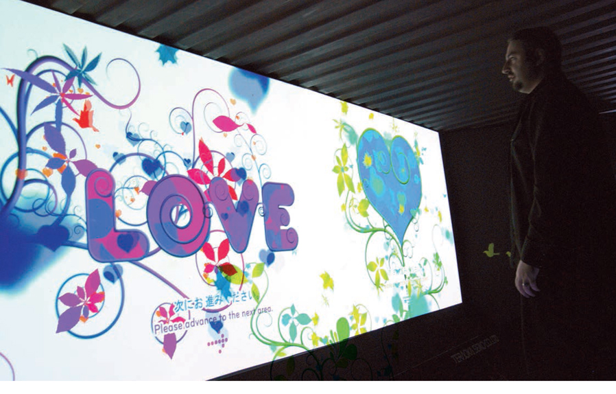
TomTor and MEF designed this engaging interactive installation for Teraoka Seiko as part of the Tokyo Designers Week “container exhibition.” Volunteers were weighed and then their weight was translated into a projected motion graphics experience.
Tom Bogman incorporates various graphic symbols and ornaments as decorative elements in this design for use on the Web.
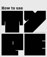
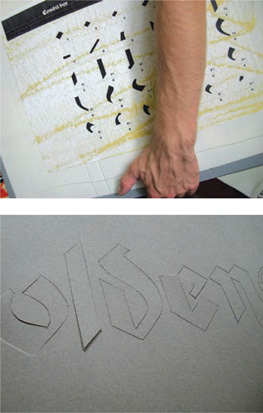
Combinebox letterform system
by André Apel and Jan Schöttler, Austria
André Apel and Jan Schöttler have created a textual tool to complement the mainly pictographic work of street artists in urban environments, to enrich and advance their means of expression and communication.
They wanted to experiment with the typeface Schwabacher, which was used extensively from the 16th century, for example in the Lutheran Bible. They compared different versions of the typeface in order to produce an interpretation that would be suitable for use in stencil letterform.
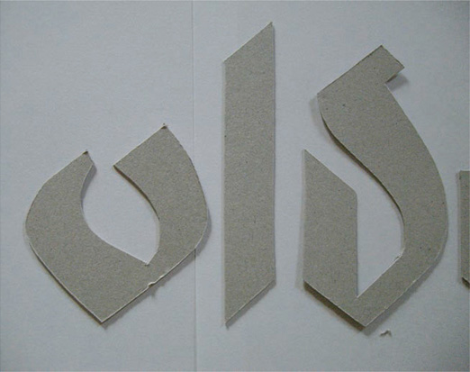
They abstracted and sliced the letterforms to make simple shapes that harmonized with each other, creating a modular system of thirty elements that could be used in a variety of combinations but still retain their distinctive identity.
Combinebox was the master thesis of André Apel at the HfG Zürich, Switzerland, Institute Design2Context.
The individual elements of the Combinebox and how they make recognizable letterforms when used together. The elements can create both static and lively letterforms, providing opportunities for rhythm and repetition.
The Combinebox website, www.combinebox.com, explains the process. Visitors to the site are invited to download the toolbox, which contains the single elements as vector files. Anyone can make their own interpretation of Combinebox, and therefore continue the work.
The Combinebox system used to make stencils for street art, as below.
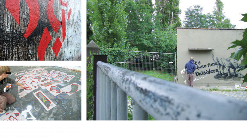
The system used with stencils in street art. The strong red type makes a shocking statement, particularly when it is used over a distressed surface.
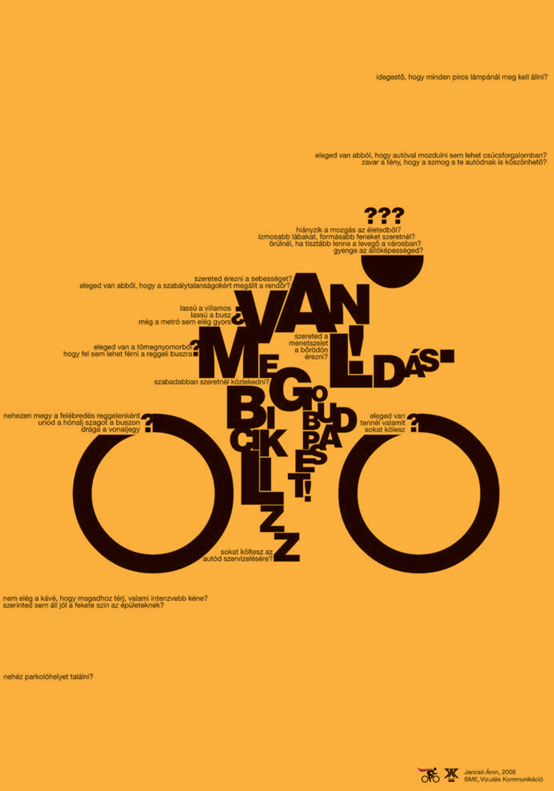
In this poster design Áron Jancsó uses black on yellow to create impact, and he indicates wind rushing past a speeding cyclist by skillful placement of type.