1
This chapter looks at fundamental principles related to the use of type and identifies the terminology used. We will consider the different categories of typeface, such as serif and sans serif, and the main differences between them. Alongside this, we will examine families of type, which include styles such as bold and italic, the structure of letterforms, and how these properties may be used in an experimental and adventurous way both for print and screen.
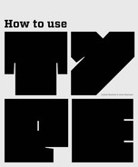
When we talk about a set of letterforms of a particular design, we refer to it as a typeface or, as it has become a term in everyday use, a font. Each letterform consists of one or more of the following parts: serif, ascender, descender, counter, bar, and stem.
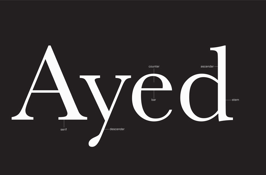
This diagram shows the essential parts of a letterform referred to in this book. Further diagrams focusing on individual components will be included later in the chapter.
Typefaces may be divided into two main categories: serif and sans serif. The difference between these is basically that serif typefaces are based on Roman incised lettering, which features small strokes at the ends of letterforms, as seen in the diagram opposite. Sans serif letterforms do not have these strokes—hence “sans,” which means “without.”
Variations
There are many other sorts of letterform, most of which sit within these broad categories. Examples include block, or slab, serif (which has a large slab rather than a stroke at the ends of the letterform), headline, and script typefaces.
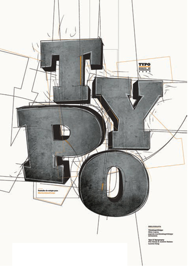
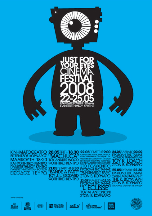
Headline, or display, typefaces are usually intended to draw attention to isolated words, phrases, or short sentences. Such typefaces tend to be eye-catching and attractive but would prove difficult to read in a large block because they often incorporate complex or quirky designs. Display faces may be hand drawn from scratch or be hand- or digitally manipulated variants of an existing typeface. Such typefaces are often available from websites as free downloads. A word of caution: you usually get what you pay for, but there is some excellent experimental work out there—for example, HVD Fonts’ Square Pants typeface (see next page).
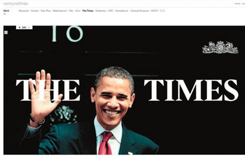
This website by Venture 3/CHI & Partners shows the classic serif typeface designed specifically for The Times newspaper and called Times New Roman. You can clearly see the small strokes that form the serifs.
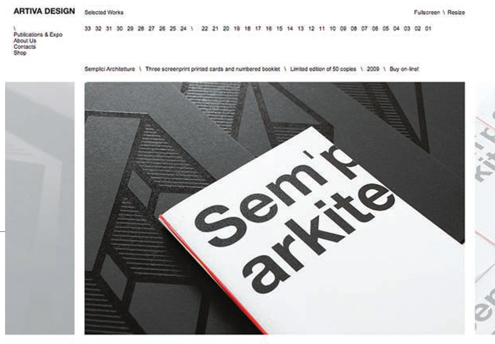
A sans serif typeface has been used by Artiva for their logotype at the head of this website page and also in the print example displayed on the website.

This playful identity by Doink uses a typeface with a prominent serif. The serifs provide a foundation for the uprights that make the letter A look as if it is standing up, with the button balanced halfway down to form the crossbar.
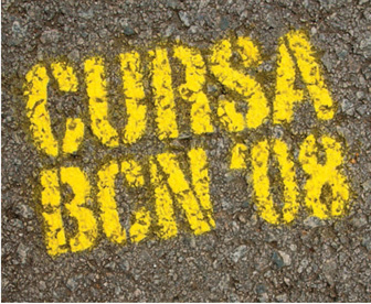
This poster, designed by Eurico Sá Fernandes, shows a slab serif typeface used to give a chunky and solid feel to the letterforms, bringing impact to the design.
Script typefaces are usually intended to replicate handwriting or calligraphy. As with display or headline typefaces, script typefaces are often difficult to read if used in body text. Because they replicate handwriting, script typefaces work best as a combination of upper and lower case, rather than as all capital letters. You will probably be familiar with one of the most common applications of script typefaces: the invitation card.
Atelier Martino&Jaña have used different typefaces to complement each other and the collaged background image, which includes different letterforms.
This display typeface, Square Pants by HVD Fonts, is quirky and attracts attention.
Insane have used a headline/display typeface in this logotype. The typeface draws on the structure of early hand-drawn letterforms like those produced by monks for medieval manuscripts. Although the typeface is well designed, it is not appropriate for continuous reading as it is quite complex and some of the letterforms do not form instantly recognizable letter shapes.
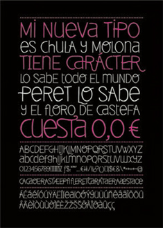
These hand-constructed letterforms by Eva Blanes illustrate how effective such typefaces can be when used selectively, such as for a single word. But imagine trying to read a paragraph or whole page in this …
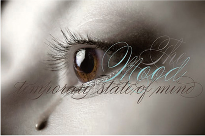
Alejandro Paul’s typeface Compendium complements the sophisticated feel of the photograph and text.
Distinctive headline type has been used by Pablo Abad for the heading on this double-page spread.
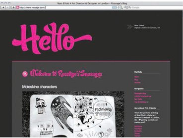
Ross Elliott has used a script typeface in a bright color on a gray background to produce an attention-grabbing introductory page for his website.
Many typographic designs call for a combination of typefaces. The way in which different typefaces are used together can have a considerable bearing on the message they communicate and can also affect legibility. For example, you might set the main text on a menu card for a chic bistro in a sans serif typeface to help communicate a modern, pared-down theme, but this effect would be nullified if the titles were set in an elaborate script typeface. Also, combining two display faces may halve rather than double their impact: the typefaces may end up competing for attention and cancel each other out.
However, typeface combination can work very well. Designers will often use contrasting typefaces to show the difference between pieces of information or to emphasize an item. An example of this could be a poster where the name of the event is in one typeface and information such as venue, times, and dates is in another typeface. It is a commonly held principle that two typefaces from the same category, such as sans serifs, do not work well together because they can look too similar. However, as with most rules, there are exceptions. There are a large variety of typefaces that have strong individual characteristics and these may work together.
You will find many examples of combinations of headline or script typefaces used as titles. A headline or script typeface is often used for titles and other short sections. This is in order to differentiate between the sections of information and/or to highlight the importance of the title. Serif and sans serif typefaces lend themselves to body text as they are easier to read.
Some typefaces have a variety of uses (serif fonts tend to be among the most versatile), but some, such as scripts and headline/display faces, have more limited applications—you wouldn’t set a novel in a script typeface as it would make it extremely difficult to read.
As you become familiar with the different typefaces, you will find ones that you consider work well together. This is all part of developing your own style.
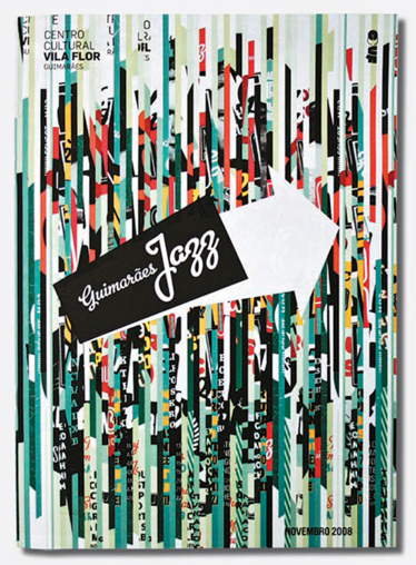
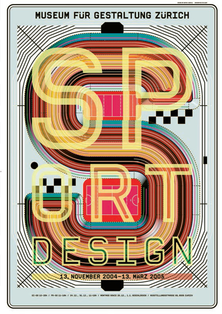
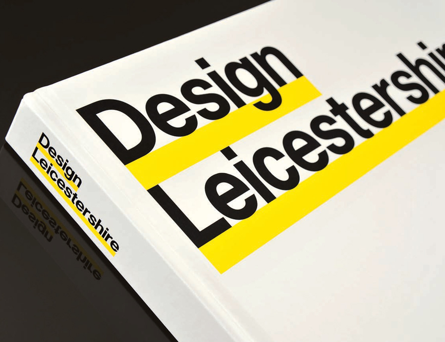
In this poster design Dimitris Kanellopoulos has juxtaposed two different sans serif typefaces to good effect.
Find an example of each of the following categories of typeface in use in both print and screen: serif, sans serif, slab serif, script, display. When you have found examples, experiment with making up words using individual letterforms from the different typefaces to see how they do, or don’t, go together.
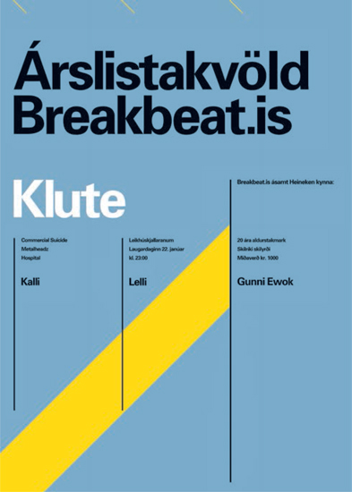
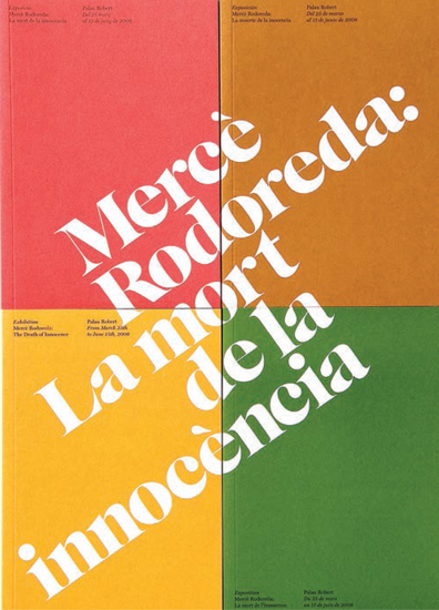
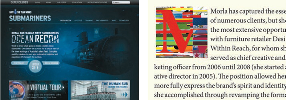
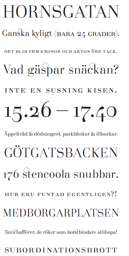
These are some examples of different sorts of typeface used in print and screen design. Kelsey Allen has used a serif typeface in this quirky design, whereas the sans serif on the Submariners website gives a straightforward feel. The two print designs above contrast a poster for an exhibition about a Catalan novelist, for which Astrid Stavro has chosen a serif typeface, with Ragnar Freyr’s poster for a breakbeat concert (above left), which deploys a sans serif typeface for a more modern feel.
There are a range of considerations when selecting a typeface. These include the genre of text it is to be used for, whether it is to be used on its own or combined with others, what size it will be, whether it is for body text or headlines, whether it is to appear in print or on screen, and what “personality” it needs to convey (see page 31). Lastly, the designer’s personal preference should not be overlooked.
When choosing a typeface for body type, it is often useful to have a range of tried-and-true typefaces to draw on. These may be types that you have experimented with yourself or they could be ones you have seen in magazines, books, etc. Some publishers are helpful enough to include on the imprint page the name of the typeface used in the book. The reason behind having a group of typefaces you are familiar with is that you will be accustomed to how they work in a variety of settings, taking into account such factors as size, column measure, and type of paper to be printed on (see chapter 7).
The choice of typeface will also depend on the alphabet that is used. Most typefaces for European alphabets use letterforms based on Roman characters, but these would be unsuitable for other alphabets such as Russian (Cyrillic) or Japanese, because the letterforms are different and the text may also be read in a different direction, such as from right to left or from top to bottom. Braille, which uses texture to communicate the message, is different again. It is interesting to see two or more quite different alphabets used together, as in many webpages, which demonstrate this point. The different features of different alphabets provide creative and experimental opportunities that are facilitated by technological advances.
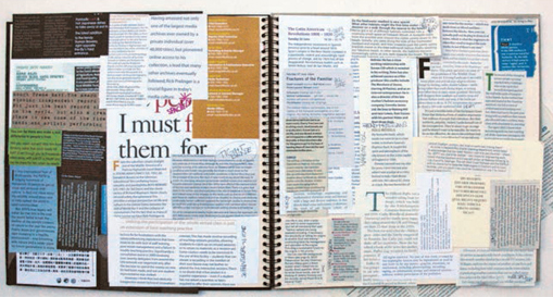
A variety of sections of body text, including serif and sans serif typefaces at different sizes and settings, have been collected in this scrapbook.
 | Keep a scrapbook for examples of good use of particular typefaces in various situations for future reference. These could be your own experiments or work, or cutouts or photocopies from a variety of editorial matter such as newspapers and magazines. Rather than printing out screen- or Web-based work, create a folder of screenshots or use bookmarks. |
Amerili Ghasemi has combined two languages to produce this innovative design. The Arabic and Roman letterforms complement each other and form shapes that work with the image.
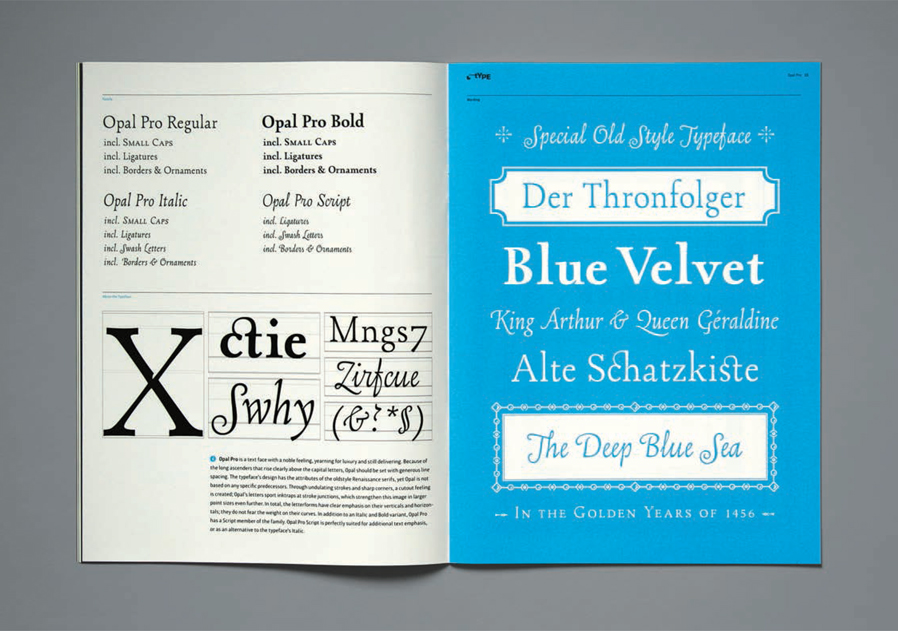
In this brochure HVD Fonts show the family range for the typeface Opal Pro together with some examples of the special characters available and the typeface in use.
Families of type
Some typefaces have been designed with a range of variations on the basic or standard design. These are referred to as families and can incorporate a variety of different styles, such as bold, italic, wide, condensed, light, outline, etc. Such typefaces are intended to give the designer the opportunity to combine variants of a typeface that work well together.
 | Pitfall: When we talk about typeface families, we are referring to typefaces that have been designed in these formats. This is not to be confused with the facility, on most software programs, to select an area of type and click a button to change its style to, for example, italic. Try producing a word using an italic or bold typeface and compare this with the same word produced in a regular typeface that has been italicized using software. It is even possible to use the italic button to further italicize an italic typeface—the same applies to bold versions. Such facilities, however, can be useful as a last resort when there is no italic or bold version of a typeface available. |
Families of typefaces can be particularly useful when you want to show the difference between two sections of text in a subtle manner rather than using a completely different typeface. Many examples of this use of typeface families can be found in book indexes and dictionaries.
Type families are designed in sets to complement each other. Families are not always constrained to bold, italic, etc. Some typefaces have serif and sans serif subfamilies, which have been designed to work well in conjunction with each other. Examples include Stone and Rotis.
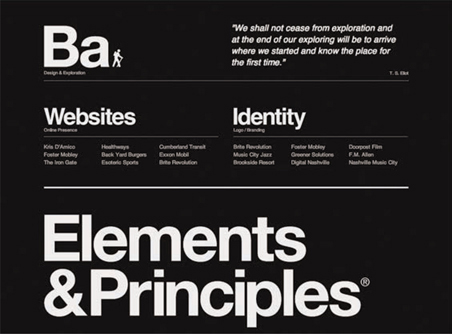
Blake Allen’s website uses a sans serif family of type to differentiate between sections of information.
Expert sets
Another variation that comes under the umbrella of typeface families is the expert set, an extended set of characters required for various specialist purposes. These include, for example: ligatures for joining certain neighboring letterforms; foreign-language glyphs such as German umlauts and French cedillas; and small caps, which are exactly as described—smaller capital letterforms that are designed specifically rather than just reduced in size. Small caps may be used in sections of text that contain acronyms to make them less prominent— if they are in full caps they tend to stand out from the rest of the text. Not all typefaces have expert sets, as each supplementary character has to be designed individually.
This promotion for Wete’s free typeface, Deibi, shows the range of glyphs and ligatures available.
Johan Skybäck demonstrates some of the ligatures and small caps available in the expert set of his typeface Södermalm.
Activity
To understand the different ways of using members of a typeface family to emphasize a section of text or just one word, choose a short text or poem that has meaning for you. Set this in a typeface that you consider appropriate (it needs to be a typeface that has a good range of family members, such as in the example below). Select words that you think need emphasis and put each of these words into one of the family members of your typeface—for example, light/bold/ wide/italic.
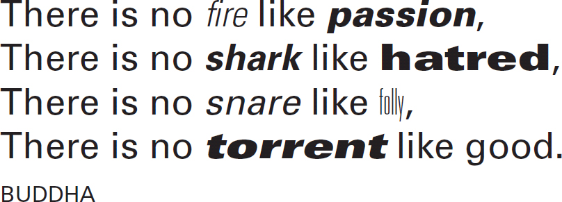
Members of the Univers family, from Thin Ultra Condensed to Extra Black Extended Oblique, have been used to create emphasis in this Buddhist quotation.
These designs by Martin Woodtli demonstrate one of his typefaces in different point sizes, both upper and lower case, as well as its application within a design where the different sizes have been used to create hierarchy as well as interest.
When discussing specifications with printers, Web developers, or clients, it is useful to be able to communicate exactly what size type you want and, when working on a design, you need to know what type sizes look like in order to select the one you want.
It is difficult to give an accurate method for measuring an individual letterform in a specific typeface and, although there are various measurement units for type in different countries, the point measurement that is used in software packages today has become universal. Point measurements derive from the height of the metal block that the letterforms were originally cast on rather than from the height of the letterforms themselves. You cannot say that because a capital letter “A” of a typeface is 12 points that it measures, for example, ![]() inch (4 mm) from the base of the type to the top. This measurement is defined by other factors such as the height of ascenders, appearing size, etc.
inch (4 mm) from the base of the type to the top. This measurement is defined by other factors such as the height of ascenders, appearing size, etc.
For guidance, 72 points is equivalent to 1 inch (25.4 mm). In the same way that imperial units (yards, feet, inches) developed over time, relating to such physical measurements as the length of an average human foot and the distance from your nose to the tip of your middle finger (a yard), type measurements mainly relate to the physical use of metal type developed by Gutenberg. Metric measurements have replaced many of these methods of measurement, but the terminology is often still in use and may be used simultaneously. For example, type size is referred to in points, but other measurements are often referred to in millimeters.
Varied sizes of type may be used to create different effects, such as to define the hierarchy of headings, emphasize key sections of text, or indicate a lively layout. An everyday example of hierarchy in action is the magazine article, where the title is usually the most important item and therefore in the largest point size. Pull quotes, intended to draw your attention to the article, need to be emphasized in order to be effective. This continues throughout the layout, so subheadings (crossheads) will be smaller than the title but larger than the body text and so on.
It is useful to understand how some typefaces can look larger or smaller than others even though they are the same point size. This is related to the design of different typefaces and the ratio of the various parts of the letterforms.
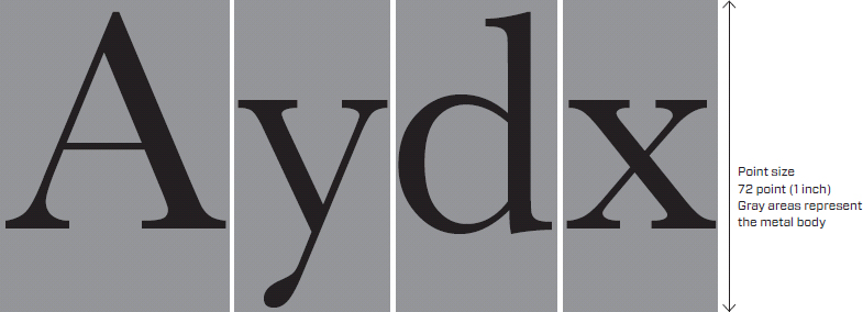
As illustrated in this enlarged diagram, point size relates to the metal body that type was originally produced on rather than to the letterform itself.
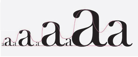
There are many creative possibilities in using different point sizes, such as pattern and repetition. Draw a wavy line across the width of a letter-size page. Pick a typeface and try to follow the line using the same letterform at different sizes, as in the example shown right, which uses Baskerville Old Face to follow the shape of the line.
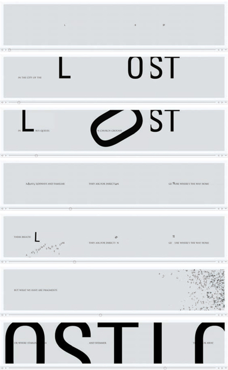
This visual poem, “Lost,” has been designed by Re*Nascent to be exhibited across three plasma screens. The animation relies on the juxtaposition and combinations of different sizes of type to attract the audience and communicate the meaning of the poem.
The way a letterform is structured will affect how it works both on its own and combined with other typefaces. It is useful to understand the differences in structure as this helps with identification—it is often difficult to tell one typeface from another if they are similar in style or from the same period.

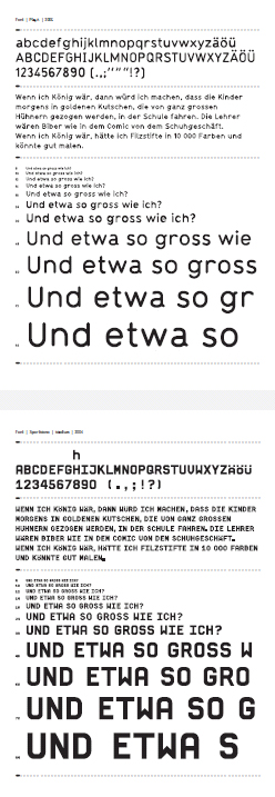
This diagram demonstrates how different in size two different typefaces can appear at the same point size. The factor that makes the difference is known as the x-height, the height of a lowercase “x” in each typeface.
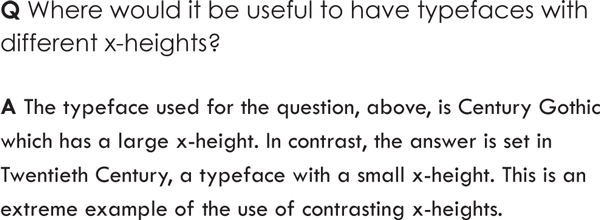
This question-and-answer text is an extreme example of the use of contrast in x-height.
As shown in the diagram above, the x-height is the distance from the top of a lowercase “x” to its base. This may vary depending on the design of the typeface: for example, Century Gothic has a large x-height whereas Twentieth Century has a small x-height. This is often referred to as the appearing size of a typeface because it affects how it appears in print or on screen—a letterform with a large x-height will usually look larger at the same point size than one with a smaller x-height. A good way of seeing the difference x-height can make is to print a page of type in two columns and use a typeface with a small x-height in the first column and one with a large x-height in the second. As with other combinations of letterforms/ typefaces, this difference may be used to advantage when designing, for example, a question-and-answer section of a magazine where you wish to differentiate between two voices, as in the example left.
The x-height relates to the baseline of a section of type: this is the invisible line that the type sits on. The baseline is important as it is used to define the distance between two lines of text, which is referred to as linespacing or leading (pronounced “ledding”). This distance may be increased or decreased depending on the typeface and the effect you are trying to achieve. This issue is covered in more depth in chapter 2.
It is worth noting that letterforms that have a rounded base, such as “s” or “a,” do not sit exactly on the baseline but curve slightly below it. The reason for this is that if they did sit exactly on the baseline, they would appear to be higher than the rest of the text. Try it out and see for yourself. This highlights the need to use your experience and “eye” in typography, rather than relying on measurements alone.
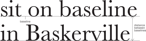
Lines of type sit on a baseline. The distance between two neighboring lines of text is defined as the distance between their respective baselines.
In this design by Untitled, the yellow rule underneath the baseline highlights the way that rounded letterforms drop slightly below this line whereas flat ones sit exactly on it.
| Pitfall: Printed type, and often that on screen, may be much smaller than you think. When we are typing letters, the default size for most programs is 12 point, but if this were used as body text in magazines, books, or websites, it would look too big. This relates to the appearing size mentioned before. Many publications use type as small as 8.5 point and yet this does not necessarily look small to the reader. |
You will have seen in the diagram at the beginning of this chapter (see page 22) that one of the essential parts of a letterform is known as a counter. A counter, or counterform, is the part left behind by the shape of the letterform—such as the space within the letter “O.” This is often referred to as negative space. Counterforms can be used to good effect when designing. For example, the counterforms of the letter “B” may be filled with a different color to form positive shapes. Counterforms do not necessarily have to be totally enclosed: for example, the partially open space inside the letter “U” is still a counterform.
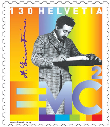
In this design for a postage stamp, Jean-Benoît Lévy has emphasized the counterforms in the letter “E” of the E=mc2 equation, blending them with the equals sign for further impact.
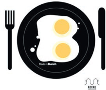
This humorous response, by KO:KE, to a call for designs on the letter “B” by the branding and design agency Bunch has the yolks of two fried eggs as counterforms.
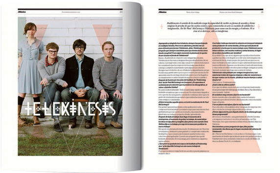
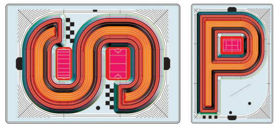
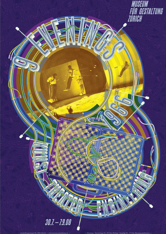
“Theater and Engineering” exhibition publicity
by Martin Woodtli, Switzerland
The design was in response to a brief for publicity material for an exhibition, organized in 2008 by the MIT List Visual Arts Center, illustrating the 1966 “9 Evenings: Theater and Engineering” events in New York. These included experiments combining diverse genres such as music, theater, dance, film, and video, and put the prominent artists involved—including John Cage, Deborah Hay, Steve Paxton, Robert Rauschenberg, and David Tudor—in contact with experienced engineers. Initiated by Billy Klüver from Bell Telephone Laboratories, it was hoped that this interdisciplinary collaboration would lead to specially designed equipment.
Martin’s work attempts to convey the relationship between art and technology that the exhibition promoted. He used typefaces that reflected the feel of 1960s and ’70s New York and created new typeface forms to suggest three-dimensional neon signage. The white type stands out from the strong colors of the imagery and background.
Martin has contrasted the sans serif elongated typeface used in the main heading with a serif typeface for subheadings and body text. The subheadings are highlighted in blue, echoing the color used in the striped part of the three-dimensional letterforms. He uses a combination of all capital letters and upper- and lowercase type, and different sizes of type, to differentiate between sections of text.
Photo included in poster by Peter Moore © Estate of Peter Moore/ VAGA, NYC
Eva Blanes uses reversed-out and red type as contrast, as well as reflection in the image, to create a striking poster design.