Chapter 3 : Designing with type
This chapter discusses the various issues raised when designing with type. It will look at the design process, for both print- and screen-based work, from ideas generation and design considerations to artwork and preproduction. It will explore the techniques available (traditional and digital), tools, design issues in relation to various products, and situations where type forms an integral part of a design. It will look at examples of experimentation and risk-taking in the context of the design.
There are various stages to design, including research and analysis, ideas development, evaluation, and production. This implies that the process has to be linear and logical. However, an individual chooses how to work; it may be methodically, but is just as likely to be spontaneously and messily. It is when you need to communicate with others about your design that logical development may be necessary to help them understand where you are going with it.
The design process
Type and letterforms feature in most visual communication design. Many of the processes related to this discipline, for example concept and ideas generation, sketchbook and development work, reflection, evaluation, and production planning, will be similar for different applications. An important aspect of all design work is experimentation with materials, techniques, and processes. There may be certain differences in approach depending on the product to be designed, so, for example, type design for packaging might be tackled somewhat differently from that for a website, as the way people view and consume each product varies.
Whatever the final product, when confronted with a design brief, project, or problem many of us will form initial responses in our minds before committing anything to paper or screen. It is important to record those first ideas as spontaneously as possible before going on to more formal concept generation.
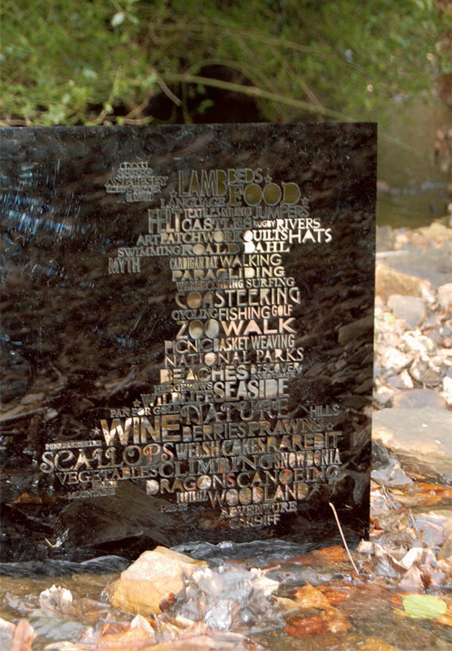
A playful and decorative design by Hannah Rummery uses a fusion of traditional and modern styles of typeface for this innovative tourist information poster where the type forms the outline of Wales.
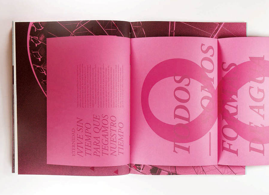
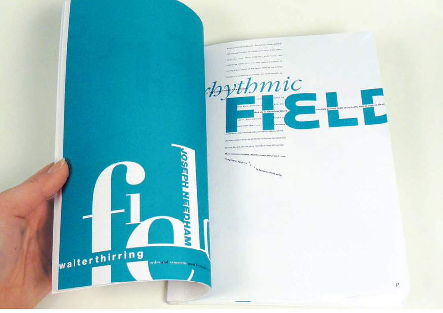
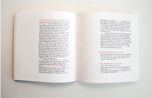
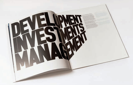
Ferran Valverde Garcia has chosen a traditional typeface, Garamond Italic, for this editorial design foldout.
Ideas can come from anywhere, but influences can be roughly divided into two categories: those that stem from your own preferences, experiences, and personality and those that derive from external sources, such as fashion, trends, and historical examples. Inspiration can be triggered by research on what has gone before or what others are doing, experiments with various aspects of the design, and brainstorming.
Most people absorb visual stimuli without realizing it, which can be dangerous if you end up unwittingly reproducing an existing design. There are many examples of this, and some cases even get as far as legal actions for infringement of intellectual copyright. However, a lot of design borrows from the past and being influenced by something is not the same as copying it: a fusion of different historical and cultural references can be a good starting point for innovative design. It is normal to be affected by contemporary trends, but innovative work usually breaks away from what is currently fashionable and makes its own mark.
When looking at others’ work, try to identify what has been successful and what hasn’t. A good area to focus on is the choice of typeface: many typefaces that were originally designed in the 17th and 18th centuries, such as Caslon and Garamond, are tried and tested and still used today. Classics of the 20th century include Frutiger and Helvetica.
When recording ideas, put down everything you think of, even if it comes to mind when you haven’t got a notebook with you: make a note on your phone, scrap of paper, beer mat—anything that comes to hand. You don’t want to miss landing the big one—the idea that’s better than all the others. We often forget ideas that come to us at difficult times: you say to yourself, “I’ll put that one down in the morning,” but it rarely happens. The enemy of creativity is self-censorship—no idea is too stupid or obvious to ignore. It’s better to have too many ideas and have to sift through them than to struggle with too few. These records of ideas are a valuable resource, which can be revisited for other projects or just browsed through as a reminder of your creative abilities when you experience writer’s block or blank-page panic.
As these thumbnail sketches by Sherrie Thai of Shaire Productions illustrate, it is more important to record your ideas quickly before they evaporate than to produce carefully crafted artworks.
The way you record ideas is up to you, but if you need to explain them to someone, such as a client or a tutor, small, quick sketches (thumbnails) are a useful tool. Remember that you will need to translate these to a larger scale to realize the design, which means that the format, i.e. whether it is to be landscape or portrait, needs to be considered at this stage.
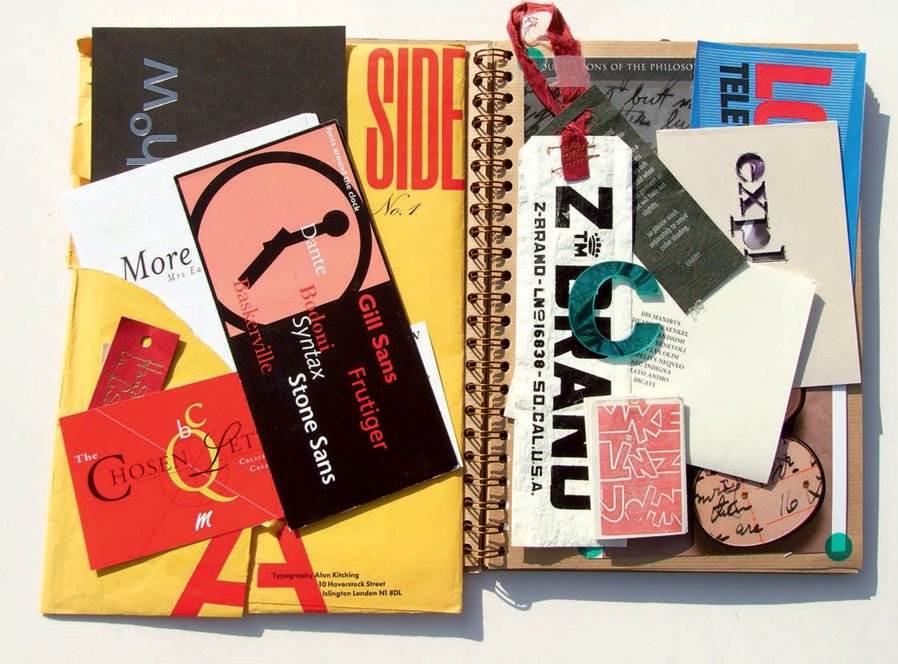
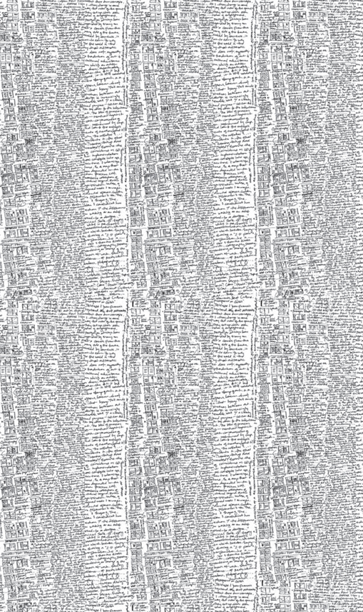
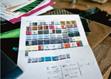
This is a good example of a page from a sketchbook collection of type ephemera.
 | It’s best not to spend too much time on thumbnails. Keep them rough, because you may be reluctant to discard something that you have invested time and effort in. |
As we are primarily concerned with type and lettering, make sure that you have an idea of how typefaces perform (remembering that the same typeface may work differently in print and on screen). As suggested in chapter 2, it is worth recording experiments with different typefaces, but introduce other factors such as family variations, scale, color, texture, etc. Collect samples of type—these may be physical artifacts, such as plastic lettering or Letraset, photographs, ephemera, pictures from magazines, snippets of type, and so on.
Creativity within a house style
Sometimes, particularly when working on magazines or newspapers, you are more likely to design a section or double-page spread within an existing publication than to create something completely from scratch. This will mean that your design is constrained by the defined style of that publication. For example, the typeface for body text may be predetermined. However, there may be more flexibility in the choice of typeface for other aspects of the design, such as title and pull quotes. This allows the designer some scope to reinforce the communication through choice of typeface, an aspect of the use of type and lettering that is covered in more depth in chapter 4. When recurring aspects of a design, such as body text typeface, have been chosen, you can set up style sheets or templates that act as the basis for each page, which may then be customized for different articles and sections of the publication. When setting up style sheets or templates, you can also define where and how columns of text link to each other. Text may run throughout the publication, in sections, or just in a couple of columns on a page: this is referred to as text linking, flowing, or threading.
This series of webpages by Petra Sell demonstrates continuity—although the kind of information on the right-hand side is different on each page, the overall feel is similar. This is brought about through consistent layout, typeface, color, and size of type.
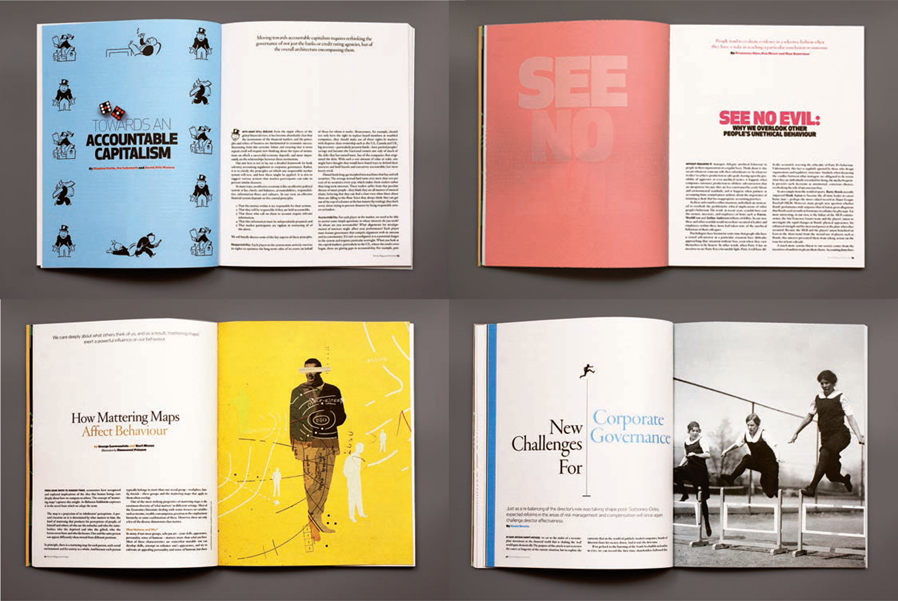
In these double-page spreads for Rotman magazine, Brian Banton and Clea Forkert demonstrate the variety that can be achieved within a predetermined style.
Once you have homed in on an idea, there are various methods of working through how the design will be realized. Much depends on the application you are working within. For example, flatplans are used for editorial design, storyboards for animation, graphic novels, etc., flowcharts for websites and multimedia artifacts, dummies for book covers, and maquettes for packaging and point-of-purchase materials. Such templates help the designer to visualize even the most adventurous concepts. They may also be useful for testing practical considerations such as visibility, stackability, and constructability.
| During the design process, it is useful to step back and reflect on your work in progress. Walking away from the work for a while helps you to see it with fresh eyes. There are many techniques to help you see your work as others might see it, such as squinting at it, looking at it in a mirror, or, if it is on screen, flipping it vertically or horizontally (if the program you are using has this facility). |
When working ideas up from thumbnails or flatplans to full-size prototypes, it is important to ensure that the typeface(s) used will work in that context. Type may look fine at the thumbnail stage but when taken to full size can look entirely different. Try a range of typefaces in different sizes, combinations, colors, etc. Don’t be afraid to experiment. Many typographers will say that putting serifs with serifs and sans serifs with sans serifs is not a good idea because the two typefaces will not provide enough contrast and will tend to cancel each other out, but try it and see what happens.
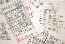
Todd Moy of Viget Labs has produced detailed working drawings for the design and coding of a website.
Luis Mendo has used color-coding on this flatplan to identify the various categories of spread within the publication he is designing.
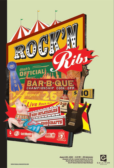
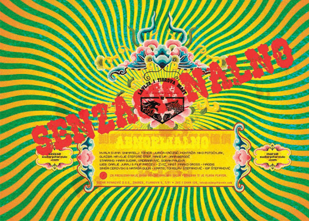
Fluid Studio have used a mix of typefaces to produce this poster.
Using a short word that includes at least one ascender and one descender (e.g. “lazy,” “paddle,” “quick”), experiment with producing the word in a variety of typefaces, sizes, weights, widths, and styles. Try serif and sans serif typefaces as well as display and ornamental fonts. Keep a note of which typefaces are which, in case you want to refer to them again. When you have gathered several different typographic versions of your word, put them in pairs to see how they work in combination with each other. For example, match a serif with a sans serif, an ornamental with a simple sans serif.
This activity may be carried out on screen or by tracing letterforms. Alternatively, you can look for examples of different typefaces in magazines or on websites, but, if you do this, you may not find enough examples of the same word, so you may need to use different words to compare typefaces.
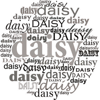
A student has experimented with several different typefaces to get a feel for the variety available.
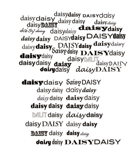
In the upper part of this example, a student has experimented with typefaces by putting them together in random pairs. In the lower part, she has made more studied pairings, considering such factors as contrast or similarity in tone, weight, x-height, and shape.
This student has collected versions of the same word in different typefaces and sizes. She has pasted them together in different categories and started to label some of the typefaces.
The larger the range of experiments you make with type and lettering, the more you will come to understand the differences between typefaces, their strengths, and limitations. You will also become familiar with how a typeface performs in different settings, at different weights and widths, sizes and colors, and how it reacts with other typefaces and other elements such as images, symbols, and rules. As part of this process, you will develop your own preferences and get to know which typefaces work best for which circumstances and how they sit within the design.
 | Pitfall: Experimentation does not necessarily mean throwing stuffaround; it may be quite systematic and controlled—it depends on your method of working. |
The other aspect of experimentation is the use of a variety of different techniques, materials, and media. If you are designing for screen, try to develop your ideas using the technology rather than letting the technology define your ideas. Come up with an idea that may not be practical and then try to find a way of realizing it, which may lead along other interesting avenues, rather than being limited by what the software instructions tell you is possible.
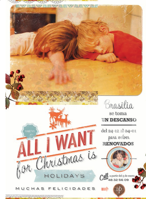
Brasilia Prima have used a combination of typefaces that complement the images to give a retro feel to this poster design.
In this double-page spread Li Mei Tan has taken a creative approach, but it is clear that he understands balance and other typographic principles such as readability.
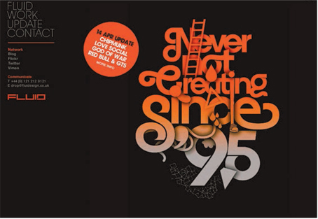
Fluid Design have chosen an unusual combination of typefaces for this visually strong website design.
The rules and breaking the rules
Although experimentation is important in developing a creative approach to design, it is useful to have a good understanding of the principles behind good typography and design because adventurous work often develops from a sound knowledge of typographic conventions.
We’ve already discussed issues such as legibility, readability, symmetry, text color, choice of typeface, background, texture of stock, screen resolution, white space, and alignment. There are many other considerations, such as the need to take into account the more fluid nature of design for screen where text and images may be added, subtracted, or altered in some way postproduction. This flexibility may become an essential part of your design— for example, you may leave virtual space for additions.
Other issues that could have a strong impact on your design include hierarchy, emphasis, contrast, bleed, and text runaround. These need to be considered early on in the design and in relation to the content of the text and the interpretation you are trying to achieve. You would not want to make a serious article look too light or humorous, or vice versa.
Hierarchy
If you analyze the way the information has been structured in this book, you will see that there is a hierarchy common to all chapters. This consists of chapter title, headings, subheads, captions, and tips and other ancillaries. In this publication, the hierarchy is standardized throughout the chapters, but sometimes a flexible hierarchy can be established. This is useful in magazine, brochure, and Web design where there is a need to have consistency but also variety to maintain the viewer’s interest. As long as the reader can follow what’s happening, hierarchical systems may be unconventional—for example, placing a title part way down a block of text rather than at the top.
Establishing hierarchy will not necessarily mean that the most important piece of information (usually the title) is the biggest or boldest. As with all aspects of design, you can approach this creatively and experiment with using, for example, a smaller and perhaps different typeface or a lighter/different color for the title in a way that draws attention to it.
Robert Ferrell has used a serif typeface in a simple single-column layout for this piece of work based on soldiers’ experiences of war.
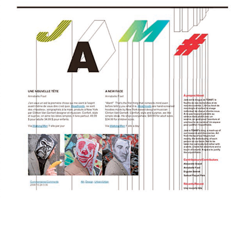
Annabelle Fiset has used a combination of drawn letterforms, type, and images for this webpage, which has a lively context.
There is a simple hierarchy, with the most important information at the base of the layout, in this poster design by Kim.
Tomato Košir has used a larger type size, different color, and heavier typeface for emphasis in this design.
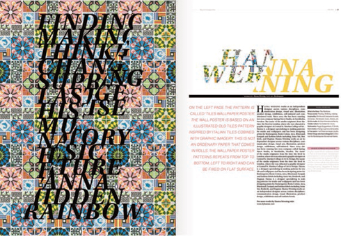
This double-page spread designed by Moa Nordahl uses contrast in a wide variety of ways. The title has been split between patterned and plain text, the column measure varies, and there are different weights and sizes of text—all of which provides interest through contrast. Also, the patterned background of the left-hand page contrasts strongly with the white space on the right-hand page.
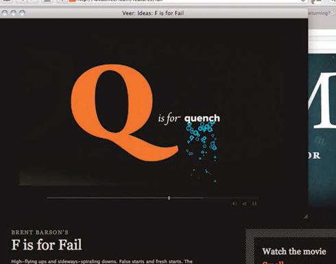
Brent Barson’s “F is for Fail” multimedia project demonstrates contrast in a series of words associated with the letters of the alphabet. For the letter “Q,” he juxtaposes different sizes of type, colors, typefaces, and still and moving type.
Emphasis
One of the ways to define a hierarchy of heading levels is through emphasis—using different styles of type to signal different levels of heading. A simple example would be a bold title, italic subhead, and standard body text. However, emphasis can also be used to introduce hierarchy within the body text. It is often used to draw attention to a particular word or phrase by highlighting it in some way: often in italic or bold versions of the typeface.
Contrast
Contrast can also help to establish hierarchy, as well as making the design more interesting and exciting. Contrast may be achieved in various ways: between typefaces (the most obvious being serif vs. sans serif); between large and small type or hand-rendered and mass-produced type; between different colors, tones, textures, weights, or densities of type. All of these techniques, and many others, will establish the tone of a design and enable you to guide the viewer.
Bleed and runaround
Bleed is the term used to describe when a layout element, usually an image, runs offthe edge of a page or screen. It is not used as much with text, but it is a useful trick to help the page seem bigger than it is or to give the impression that there is more to the page than meets the eye.
Text may also be wrapped around an image or other object, which may give the design a more fluid appearance. Known as text wrap or runaround, this device can also be used to draw attention to key information or to relate type to an image by copying its shape. To maximize its impact, runaround should be carefully considered and not overused. This need for restraint applies to many aspects of design that can now be implemented in design software at the click of a mouse.
| Pitfall: When wrapping text around an object, don’t rely on the default settings—take the time to consider the distance between the text and the object as well as its relationship to column width and other elements of the design. |

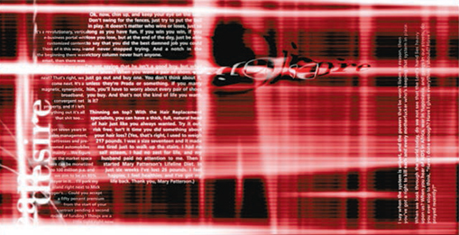
This powerful double-page spread by Roman Krikheli bleeds type into the gutter and off the top of the page to emphasize the diagonal composition, but the type has been carefully positioned to ensure that it is still legible.
In this double-page spread Attak have used text runaround to emphasize the curved shapes in the images and give cohesion to the design.
design@Typographic use text runaround to give this Web design a dynamic feel.
Manipulating text
Many software programs provide facilities to, for example, distort, skew, stretch, or reverse/mirror text, or to bend it on a curve or other shape. As with runarounds, these forms of text manipulation require care and fine-tuning both in execution and in consideration of the context of the overall design.
When stretching text, or manipulating it in any way, look at the structure of the typeface and ask a few questions. Does it need altering? Why was it designed in this form? Could it be that the designer has spent a long time getting it right in terms of its shape, balance, proportions, etc., and that you are just tinkering with something that works well as it is? Would it be better to look at alternative typefaces or members of the type family? Will distortion add to the design? What message are you trying to convey by making a distortion? Will the type be readable/legible? Does the type need to be readable/legible?
Manipulating type can enhance a design and help with communication. A good example is running type onto a curve for the design of a badge, CD, or other circular product where the format constrains the design.
Software packages feature all sorts of tricks and tools for altering type—but just because they are there doesn’t mean you have to use them. Having said this, just like more traditional tools, they are interesting to explore, as long as you think carefully about why you are using them.
| Pitfall: When setting type on a curve or circle, remember to adjust the spaces between letterforms and take care that vertical lines do not crash into each other. |
Aleksander Blücher has distorted the letterforms to draw the reader toward the body text.
Jiansheng Cui has combined type on a curve with type radiating from the circle to give a dynamic feel to this complex design.
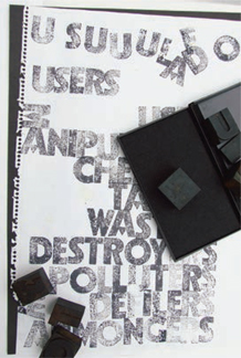
You can achieve some great effects using old wooden type found in a flea market, thrift store, or swap meet and an ordinary ink stamp pad.
This website by Sudar Pitarevic, although digital by necessity, has a hand-produced appearance. It uses a range of textures and shapes to produce a visually exciting splash page.
This design by Abel Martínez Foronda incorporates digital type and type that has been digitally constructed or altered to form strong shapes and images.
In this poster designed by Fons Hickmann the type has been manipulated so that it appears to be entering from the right-hand side.
There are many different tools available to use in designing with or creating letterforms, ranging from traditional letterpress and word-processed type to the handmade. You may also decide to use a combination of any or many of these.
If you want to use traditional letterpress, you will either have to source a printer who can provide this specialist service (and probably pay for it) or you could acquire some metal or wooden type and experiment with it yourself (see opposite left).
Computer-generated type may range from something very simple created using a word-processing program to an individually designed letterform produced in a specialist package such as Adobe Illustrator.
Programs such as Adobe Illustrator are also used by many designers to manipulate or adjust existing letterforms. Good examples of this may be found in logo design and illustrated capital letters. If you decide to manipulate an existing typeface, it is worth remembering that many commercial typefaces are copyrighted and therefore you will need to check with the designer before publishing your adaptation.
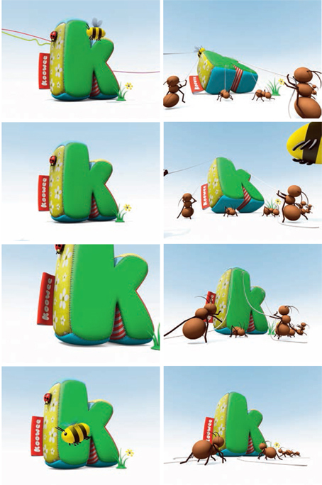
This animation by Kim Pinto, Craig Hunter Parker, and Matthew Stephen features a digitally produced three-dimensional sequence of insects moving a letter “k,” which has been designed to appear as if made from patchwork fabric.
Activity
Experiment with creating individual letterforms using a variety of materials in order to understand the different shapes and effects produced by different media and techniques. These may range from vegetable matter to steel and glass and may be produced at different scales depending on the materials and then photographed for use in print or on screen.
At the simplest level, a letterform may be created by hand using pencils, paint, or potatoes (see page 57). You may also consider more sophisticated methods such as silkscreen or linoprint. The resulting letterforms may be digitally photographed or scanned and manipulated by, for example, adding texture, changing or adding colors, altering scale, distressing, and distorting.
This logo design by Luxury of Protest is a good example of manipulated type.
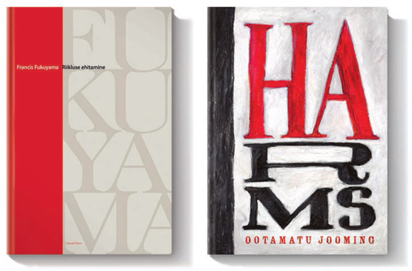
Dan Mikkin, at the Estonian design agency The Brand Manual, adopts two completely different approaches to these book covers. The first design, using digital type, is clean and formal; the second, featuring hand-drawn type for the title and digital type just for the author’s name, is far more textural.
Having generated and developed ideas, experimented, tested, and worked ideas up to full size, you need to refine the design before preparing for production.
This is the stage where it is good to walk away from the design for a while in order to return to it afresh. It is important to look out for problems and inconsistencies before finalizing for production. This process might include, for example: ensuring that the images relate to the text they are closest to; assessing how the body text balances with any images used; and checking consistency of typefaces, style, etc. Stylistic inconsistencies can occur if text is pasted in at a late stage. You may also need to check spellings in titles and subheadings (usually the body text will be the responsibility of the proofreader).
| Make sure that you have a dated signature to certify that the text has been proofread and approved—this is called signing off. |
This part of the design process is also your last opportunity, before production planning, to reflect on what you have done and check for fine detail such as widows and orphans, hyphenation, and awkward/dislocated text linking.
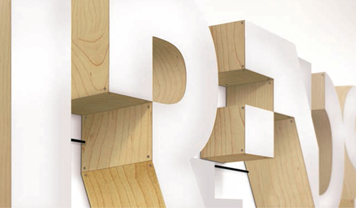
Paul Hollingworth has created this dynamic logo for a band and produced it in wood and Plexiglas. Once physical letterforms have been created, they can be adapted in all kinds of ways—for example, by adding an illumination effect, as in this case.
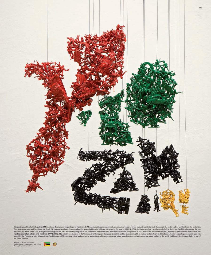
Mozambique Toy Soldier Typography
by Happy Centro, Italy
Happy Centro produced this type for a poster for the Imagining Mozambique exhibition, a showcase for thought-provoking art bringing attention to the day-to-day life of the children of Mozambique.
The designer, Federico Galvani, did not initially know a lot about the issues in Mozambique, so the first thing he did was to turn to the Internet. He found it interesting that such a superficial approach can sometimes suggest creative avenues to explore. He discovered that the country experienced civil war between 1977 and 1992. This information resonated with the designer, who was born in 1977 and therefore would have been a child at the same time as children in Mozambique were experiencing a bloody conflict. The thought that these children had not been able to enjoy childhood games sparked offthe idea of war as a game, which inspired Galvani to use toy soldiers as a visual metaphor.
Designed by Federico Galvani; photographed by Federico Padovani; with the support of Jamie N Kim, Mo Manager, and Wieden+KennedyWork.
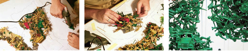
Working within his paper template, the designer constructs three-dimensional letterforms from toy soldiers using a glue gun.
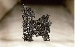
Once constructed, the letterforms are colored in the green, black, yellow, and red of the Mozambique flag.
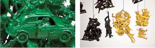
Galvani has attached wire letterforms to the larger constructions made from toy soldiers and cars.
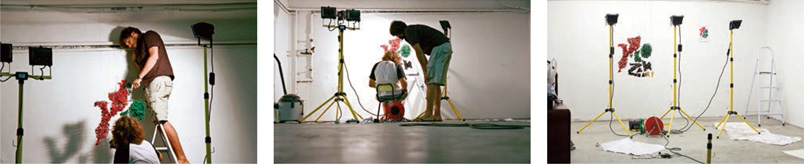
The designer completes the construction by wallmounting the components ready for photographing.
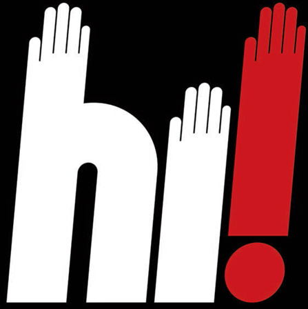
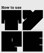
Craig Redman’s simple but effective use of type as image clearly reinforces the message.