Chapter 6 : Experiments with type
In this chapter we will investigate the creative and expressive potential of type. This will include experimental techniques for print and screen, such as calligraphy, embossing, and printmaking. It will also cover the use of a range of media and experiments with, for example, surface treatment, texture, and modeling. We will explore these experimental approaches and techniques in the context of applications such as store signage, webpages, packaging, and public art.
Experimenting with type has been discussed throughout this book: this section looks at some different approaches to experimenting with type. Expressive letterforms may be used to convey meaning or add emphasis. For example, you might use a large heavy typeface, such as Impact, to reinforce a sense of gravity. Having settled on the typeface itself, you might also try out family variations, such as bold to indicate strength or italic to indicate movement. These are obvious choices, but it is worth experimenting with a large range of typefaces and families, and also thinking unconventionally to make the audience look twice; a simple example would be using a delicate script face for a word that conveys weight, such as “elephant.”
As well as experimenting with existing typefaces and families to reinforce a message, you can also play with meaning in different ways. Typograms, which use type as a visual way of encapsulating an idea, have been around in the form of logos and trademarks for many years. They provide an opportunity to experiment with interpretation of words. A typogram can be used to convey a lot of information in a small space. As a simple example, a logo for a fish market could be the name of the market produced in the shape of a fish (see above left).
Another way of communicating quickly is to replace one letter of a word or phrase with an image that helps to reinforce the message: this is often referred to as “the missing letter.” As with typograms, these provide lots of opportunities to experiment, take risks, and investigate the potential offered by different media. For example, the “o” in the word “roll” (as in bread roll) could be replaced by a bread roll and then be photographed and digitally modeled, or it could be produced with a facsimile bread roll as a three-dimensional sign.
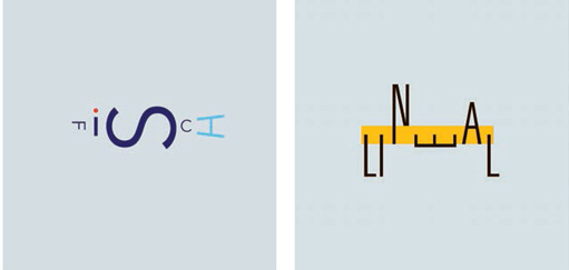
In these two typograms, Ralph Burkhardt has chosen the typeface and arranged the letterforms to evoke the meaning of the words “lineal” (ruler) and “fisch” (fish).
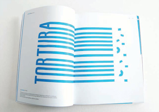
Dario Verrengia has chopped off the ends of these letterforms to reinforce the message of torture.
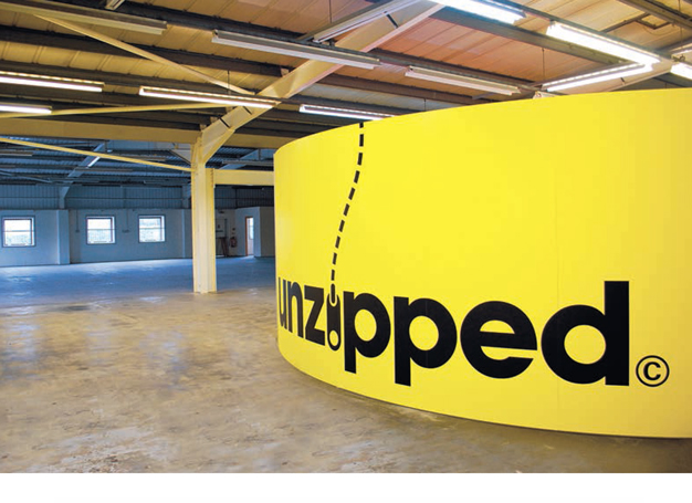
The use of an image of a zipper to replace the letter “i” in the word “unzipped” reinforces the message and has resulted in a strong display piece by The Consult.
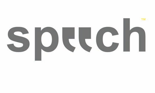
Even with two missing letters (replaced by quotation marks), Lee Stokes’s clever treatment of the word “speech” is still legible and conveys the message.
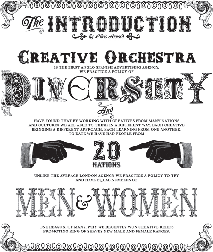
Creative Orchestra evoke the era of Victorian showmanship by simulating the style of letterpress type used in Victorian poster design. It is as if they are inviting us to “roll up, roll up” and marvel at this diverse creative department.
Experiment with missing-letter designs: choose a word and devise an effective, meaningful way of replacing one letter with an image. This may be done digitally or manually or by a combination of the two.
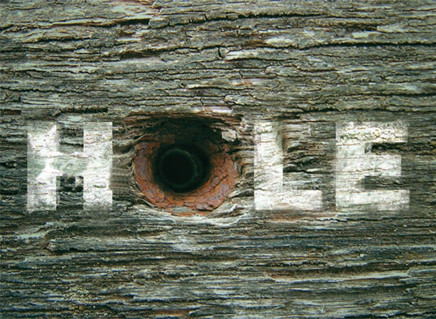
In this piece Petar Pavlov has replaced the letter “o” with a drilled hole to exemplify the meaning of the word “hole.”
Pastiche, the quoting of a particular style or look, can be an effective way to make a historical, cultural, or contextual reference. The technique relies on your ability to identify and recreate visual reference points, of which typefaces are a particularly evocative example. For example, if you wanted to evoke the Art Deco era, you might use a typical typeface of the period such as Bifur. Depending on the context and the relationship between typography and content, a pastiche may be interpreted as a homage to a particular style, person, or period, or it may be satirical in intention, or even have deliberate negative connotations. Applying a “retro” style to a modern-day communication can be an effective way of associating your message with the spirit of the period you are quoting. Again, this is worth experimenting with, as sometimes an obscure reference will make an audience pay more attention than an obvious one.
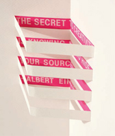
 | Pitfall: If using pastiche, take care not simply to copy or replicate the past. Pastiche is a way of referencing the past by using relevant styles, techniques, or even cultural icons. |
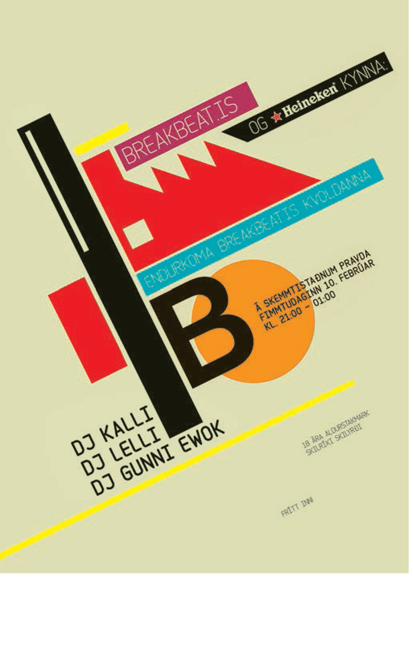
Ragnar Freyr has drawn on the clean, stylish geometric lines of 1920s/’30s type design for this poster advertising a dance-music event.
Joan Ot Comellas has taken an illustrative approach to the logo on the banner of this outdoor pursuits webpage, replacing the letter “i” with a graphic of a climber on a rope.
Type out there
As you make your way through any 21st-century town or city, you will find type, or things that look like letterforms, all around you. The most obvious category is signage, of which there is so much, particularly in built-up areas, that often we don’t register it or its message. Just think of how many times you try to pull open a door despite the sign that clearly says “push,” or vice versa. Next time you’re in a town center, make a conscious effort to focus on all the type around you that you normally ignore (taking care not to get run over!), as this exercise will help develop your visual awareness and your instinct for experimentation.
Signage has to compete with so much other information and therefore, as with advertising, its message may be diluted or even negated. However, signs can be a rich source of inspiration. Even examples you consider to be poor can suggest alternative approaches or, at the very least, how not to do it. Signage is, or should be, site-specific and functional. For example, a freeway road sign has to convey sometimes quite complex information within a matter of seconds as cars speed past it. It is interesting to study the sorts of typefaces that make effective signs, the most obvious being the ubiquitous Helvetica, and to experiment with size, shape, and color in relation to the location of the sign. For example, a green, leaf-shaped sign might not be the most eye-catching choice for a wooded setting. Consider all kinds of examples: store signage, public signage, or even “beware of the dog” or “please shut the gate” signs.
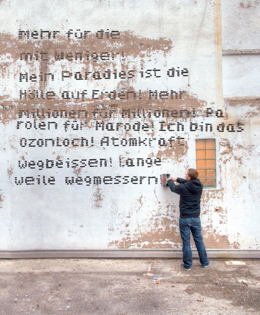
Another form of type in the environment is graffiti, which can range from vandalism to art. At its most basic, graffiti is a scrawl on a wall but it has developed, particularly in urban areas, into a method of using type creatively. Graffiti style has been replicated and refined for use in many typefaces, such as Scrawler produced by Graffitifonts, and has inspired many designs. Its association with youth culture and urban style makes graffiti-like typography ideal for communicating with, or advertising to, young, urban audiences. Examples may be found in the music, fashion, and club industries, particularly hip-hop music, which is synonymous with graffiti-style type.
Many tattoos have similar cultural links but tattooing is usually more personal than graffiti, and certainly more permanent (and painful). Although there are traditional letterforms used in tattooing, it has a strong calligraphic influence and the stylus allows the tattooist to follow a creative idea or experiment with line and shade (with the recipient’s agreement). It is a rich source of inspiration and has been used extensively in advertising and media.
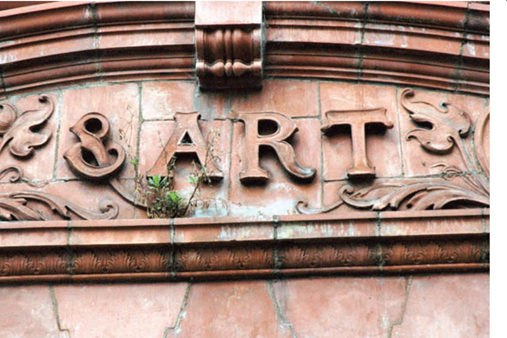
These examples of architectural signage show the contrast in style and approaches between a Victorian façade and a modern sign by Fons Hickmann m23.
Thirst have employed strong color and distinctive materials to provide contrast in an urban environment where concrete and glass predominate.
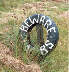
Always be on the alert for inspiration. Hand-produced, impromptu lettering, as seen on this “Beware Lambs” sign, can provide a refreshing alternative to “designed” signage.
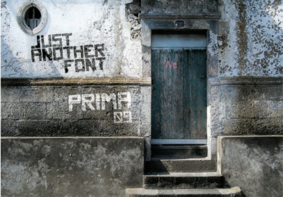
Prima 09 is a typeface by Welab Designers intended to look like graffiti.
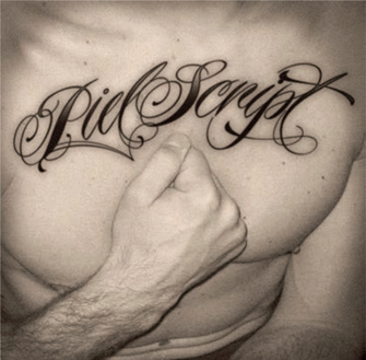
Ale Paul’s typeface was inspired by traditional tattoos and he uses this link to advertise it and show how it works in a setting.
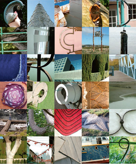
Type is found in many shapes and forms on most ephemera: the stuffof everyday life can provide surprises and ideas for the creative use of type. Ephemera can range from a bus ticket or postage stamp to a movie poster or piece of packaging and can be in different languages, alphabets, printed on different materials, or hand produced. Nowadays, there is also digital ephemera, which you can collect as bookmarks or screenshots. A collection of ephemera can be a rich resource for generating concepts, evaluating materials, or just appreciating different ways of using type.
Letterforms are not only to be found in type: viewed imaginatively, the tines of a fork could become a letter “E”; a pointed tower could transform itself into an “A”; or the branches of a tree could make a “Y” shape. Train your antennae to pick up this accidental alphabet all around you. These letterforms may appear whole or be formed by cropping or manipulating a photograph of an object or shape. Such forms could be used individually as part of a design, as in the “missing letter” (see page 155), developed into phrases or full alphabets, or just collected for inspiration.

Grouping ephemera by letter, as in this collection of found three-dimensional representations of the letter “u,” can provide a focus for your research and a stimulus for experiment.
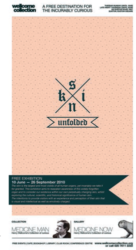
Ivan Khmelevsky uses a tattooinspired design to promote an exhibition on the theme of skin.
Activity
Collect examples of images from the environment that look like letterforms. You can use found images from magazines, or take your own photographs or use other people’s (with permission). When you have examples for each letter of the alphabet, assemble them into a poster either for print or screen.
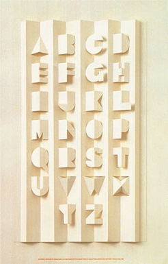
Because there are four more squares in this grid than there are letters in the Latin/ Roman alphabet, this alphabet drawn from nature and the built environment begins and ends with a single quotation mark. It also includes an extra Z and an ellipsis (…) to complete the grid.
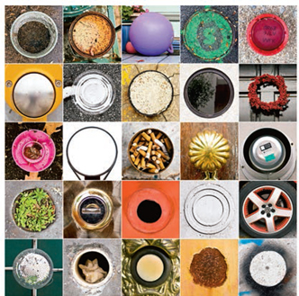
This series of photographs, by Jim Lind, records the designer’s search for everyday objects that resemble the letter “O.”
As well as finding shapes that indicate letterforms, you can also modify existing letterforms or create your own —either by hand or digitally, or by a combination of the two. A wide range of media, tools, skills, and techniques can be applied to letterforms and type. For example, graffiti is often produced using spray paint, but there are many examples of instant graffiti produced in chalk or marker pen. The surface texture plays an important role in the appearance of the letterforms: a brick or concrete wall will have a more prominent texture than a metal panel.
Derived from the Greek for “beautiful writing,” calligraphy is a traditional method of producing letterforms that is still widely used today, both formally and experimentally. There are typefaces designed to replicate or suggest calligraphy or at least handwriting. Some cultures have a strong relationship with calligraphy. For example, beautiful typography is particularly valued in the Arab world because Islam prohibits the use of images. There is also a strong calligraphic tradition in Asia, which has informed the development of other art forms in other cultures; Picasso and Matisse both acknowledged the influence of Chinese calligraphy in their work. Calligraphy can be produced using the simplest of tools, such as a quill or even a stick. Try out a range of writing implements, inks, and other media and materials to write on. The absorbency and texture of the surface, the density of the ink, and the scale of the work will all affect the result.
Another traditional method for rendering type is engraving, where letterforms are cut into a surface. The engraving may be the finished product in its own right or serve as a template to be inked up and printed from.
The opposite of engraving is relief printing, where the background is cut away to leave the letterforms raised. Traditional letterpress printing (see page 10) is an example of this technique. Letterpress printers still exist, but you can also use the type in a freer way. A quick and fun approach is to experiment with children’s printing sets or rubber stamps. Alternatively, design your own letterforms for relief printing by means of the simple potato print (see page 57) or by creating linocut or woodblock prints.
Felix Vorreiter has developed a handheld tool that generates automated graffiti text.
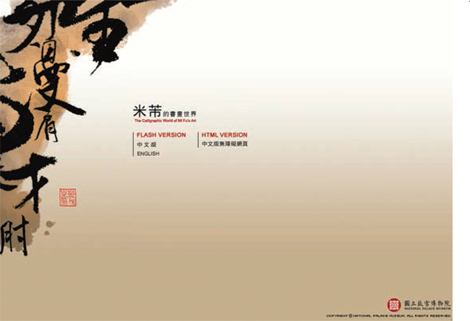
The calligraphy of Mi Fu gives a traditional but dynamic feel to this website by the National Palace Museum, Taiwan.
Letman has used a formal style of calligraphy to add a decorative element to this interior space.
Stencils, where ink is pushed through a mask, can create interesting effects; again the surface texture and the medium used will play an important part in the end result. Stenciling can vary in complexity and scale, from dabbing paint through a simple shape cut out of paper to commercial silkscreen printing operations.
Letraset® sheets or other transfer systems provide another interesting area for experiment. Try using them to form new letter shapes or combining letterforms to exploit the way the transfers often break up or deteriorate. Although superseded by digital publishing technologies, some transfer-lettering systems are still available in a limited range of typefaces.
Photocopying is a great way to reproduce letterforms in different sizes, so that you can cut them up and reposition them. Repeated photocopying leads to distressing, which can yield unexpected results and give an immediate, hand-produced feel to a design. Scanning can be used in a similar way, with greater scope for digital manipulation.
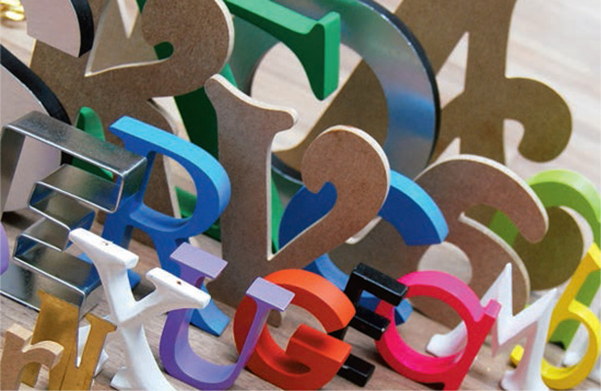
Remember that type design doesn’t have to be two-dimensional. Physical modeling and the digital equivalent allow you to add substance to a design. This may be an actual or virtual presence or it could be a photograph of a model. There are all kinds of ways of modeling physical type: try squeezing toothpaste or paint from a tube, forming trails of sand or salt, or building structures out of cardboard or foam. Screen-based modeling can be as simple as applying a shadow to give a letterform depth or as complex as creating intricate matrices for computer games or virtual worlds. Combining the physical and the virtual, or the three-dimensional and the two-dimensional, can work well. For example, you might project holographic type onto a three-dimensional form.
The advantage of using physical materials is that the nature of the media can produce unexpected results. A misalignment in stencil printing, for example, can throw up all sorts of creative opportunities. Materials themselves, and the actions on them, such as the friction of pencil on paper, can dictate the range of marks possible and can impose boundaries on what you do; but sometimes it is the need to overcome a limitation that leads to the most inventive outcomes.
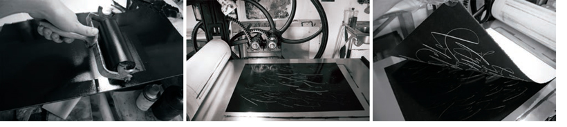
Yani Arabena uses a traditional relief-printing process to produce a calligraphic poster.
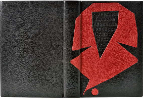
Paolo Taddeo has used traditional leather tooling techniques to produce this stylish contemporary book cover.

Eurico Sá Fernandes uses experimental relief printing to give an individual feel to business cards.
NB Studio employ letterpress design to produce strong typographic shapes.
Kelly Mark has used old transfer lettering to produce this experimental piece.
Barbara Brownie creates typographic patterns using images of three-dimensional letterforms.
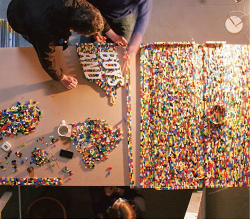
abgc have formed text using white Lego® blocks set on a background of different colored pieces. By using a much-loved medium in an unusual context, the designers immediately create interest.
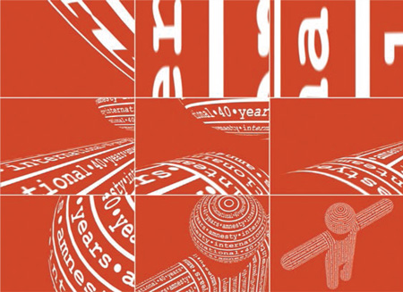
Stormhand modeled letterforms into three-dimensional shapes and animated them to create an exciting moving image for the 40th anniversary of Amnesty International.
The surface of the material on which lettering is produced can make a massive difference to the finished product. Sometimes the way that you apply lettering to a surface can physically change that surface. Examples of this kind of transformative process include embossing and debossing.
When you emboss a section of a design, the area is raised above the surface of the stock. A deboss has the opposite effect; the area is impressed into the stock. Both techniques create texture in a design and can make as much of an impression on the audience as on the stock. They are most commonly performed industrially, but you can also manage them yourself, with a little practice, on a variety of materials. Paper folding and cutting, often seen in pop-up books, can be used in a similar way to embossing to raise the surface texture. Again, this requires some practice and research into techniques.
Raised areas may also be achieved by incorporating different materials, such as fabrics, and different techniques, such as stitching and collage. Be adventurous with materials: there are all sorts of alternatives to traditional stock, such as plastic, glass, ceramic, textile, wood, metal, foam—there’s no limit as long as you can work with it. If you want to use type produced on an unconventional surface, you could photograph or scan it and then import it into a design for print or screen.
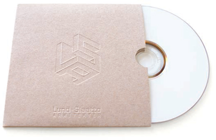
Mission Design used debossing to create this logotype on a packaging sleeve. The debossing reinforces the illusion of three-dimensionality.
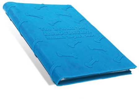
Aaron Alexander’s design for the British Dog Association’s Annual Report incorporates an embossed bone motif, which provides a tactile quality as well as using gentle humor to attract attention.
This pop-up alphabet by Ron King gives an effect similar to embossing in the way it reflects light and shade.
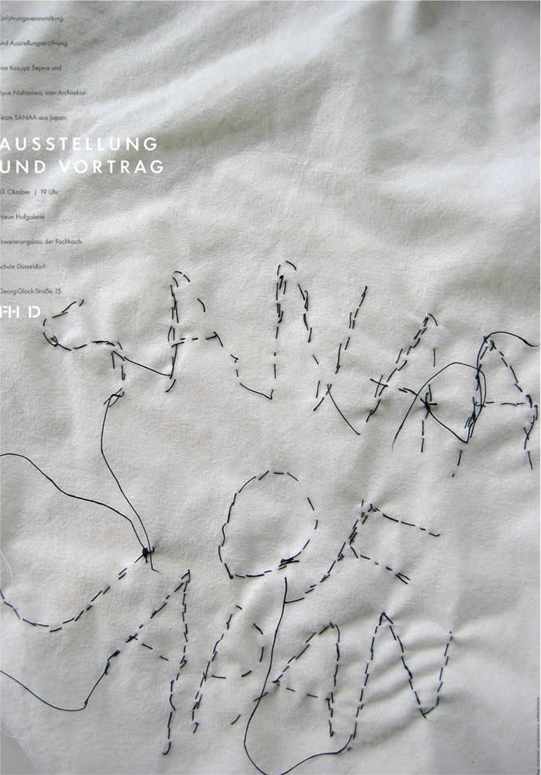
Daniel Taubert uses handstitched lettering to provide contrast in this poster design.
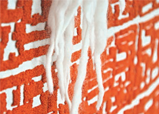
Part of the Instant Hutong art project, this large sheet, a detail of which is shown here, carries a stylized map of a densely populated district of old Beijing. The tufting technique used here would lend itself to letterforms and could work well in a variety of contexts, including advertising banners.
A distressed typeface has been used for the opening pages of Kerve’s website to give it a rough, immediate quality.
 | If you produce three-dimensional type for use in a two-dimensional design, it is usually better to take a carefully lit digital photograph and import the photograph directly, rather than to make a scan, as scanning can have a flattening effect. |
As discussed in relation to photocopying, distressing can change the surface of a design. This may be achieved by many different means, including smudging, scratching, beating, applying a corrosive material, or by exposing it to the elements to produce weathering effects such as fading, rot, or rust. All these processes may be simulated using digital technology. Another interesting digital effect is solarization (see below), which appears to change the surface by reversing tones—making dark areas light and vice versa.
Light can have an impact on how texture or surface is perceived. For example, a subtle embossing technique such as blind embossing may not be obvious without a directional light to throw some shadow and therefore define the shape. Some software packages provide simulated embossing with adjustable light sources to give different effects. Light may also affect highly reflective materials such as glass and chrome. This needs to be taken into account when designing with such materials, and can often be exploited to produce interesting effects.
Alejandra Román has used the qualities of distressed photocopying to create a textural and sophisticated book design.
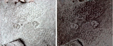
When a straightforward black-and-white photograph of boot- and paw-prints in sand (far left) is manipulated using a digital solarize filter (left), the tonal values are reversed and the image made to look quite different.
Type in three dimensions
Letterforms may be produced in three-dimensional format for a variety of reasons; one of the most ubiquitous is signage, particularly for storefronts and business premises. Such letterforms may be produced individually or as bas-relief (elements are carved or sculpted in low relief or in some way raised from a flat background).
Other everyday examples of three-dimensional letterforms include fridge magnets, letter-shaped pasta, badges, and logos on items such as cars or white goods. Such examples provide opportunities for experimentation and reinterpretation, inviting your audience to see commonplace things in new ways.
There are many examples of three-dimensional type used in sculpture. You can see examples in public art or in galleries and museums. Neon lettering has been used for art by contemporary artists such as Jenny Holzer and Tracey Emin, as well as for signage on buildings—nowhere more so than in Las Vegas. In many instances, neon tubing is now being superseded by LED and plasma screens, which have the advantage of being more energy-efficient and cheaper to produce, as well as being more versatile in that they can carry moving as well as static type.
An example of a more functional usage is signagelettering systems such as the ones used in large hotels to direct delegates to the right conference room. These provide a readable, easy-to-update alternative to a handwritten list on a whiteboard.
Three-dimensional lettering offers great potential for creative approaches and hands-on experimentation. This may be through the quoting of existing letterforms, or by creating your own letterforms from almost anything. A wide range of materials and media can be manipulated and used to create customized typefaces, words, or just individual letterforms to be used for emphasis or to draw attention to the content.
Pop-up books and other forms of paper engineering such as origami offer opportunities for experimentation in three-dimensional form and allow a transition from two to three dimensions. Such artifacts can engage an audience through their novelty and interactivity.
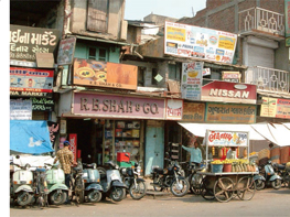
This traditional three-dimensional store signage for R.B. Shah & Co. stands out among the many other signs and distractions in this busy Ahmedabad street.
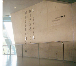
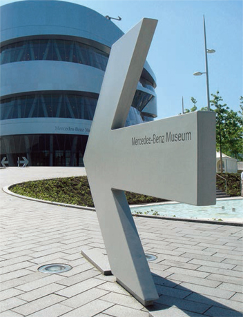
Fons Hickmann m23 exploited the contrast between bas-relief and engraving in this signage system for the Mercedes-Benz Museum in Stuttgart. The numberforms that indicate location are raised and made out of polished metal, which makes them stand out dramatically from the unused numberforms, which are incised.
Matt Forrester assembles different combinations of parts of letterforms made from transparent colored plastic to produce unique shapes and designs.

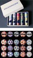
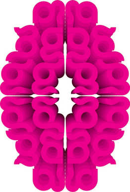
These four images show an exciting and experimental kinetic use of three-dimensional lettering by Katerina Orlikova. Taking the principle of the classic toy kaleidoscope, she used plastic molded three-dimensional letterforms in different colors and typefaces (serif, sans serif, ornamental, etc.) to form patterns as the kaleidoscope is shaken and gyrated. As you can see above, the different typeface forms produce radically different shapes and patterns.
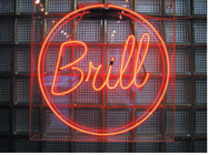
This sign by Studio Oscar is formed by neon lighting. It uses the luminous qualities of neon to reinforce the word “Brill.”
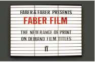
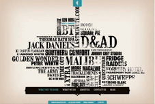
This response by Stewart Walker and Alasdair Griffiths to a D&AD competition brief to promote a series of printon-demand film books for Faber & Faber subverts classic cinema signage to humorous and intriguing effect.
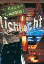
Martin Woodtli has combined images of text in the environment to create movement and immediacy in this design. The brightness of the main word, “lichtecht,” evokes its meaning: “non-fade.”
In this piece by Juan Camilo Rojas, the letterforms themselves are integral to the sculpture. They are formed from rusted nails, which stand out from the shorter, shinier nails of the background to produce an innovative bas-relief effect.
Amandine Alessandra has used the human body as the basis for a typeface, which she has applied in print- and Web-based design.
Brian Banton takes a novel approach to pop-ups, using the pop-up strips to reveal hidden text.

Plastic pop-out lettering is often used for temporary signage in hotels and conference venues.
This double-page spread by Benja Harney shows how pop-up technology can be applied to type.
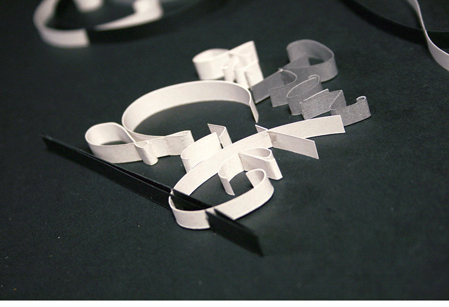
Zim and Zou manipulated strips of paper to form three-dimensional calligraphic shapes.
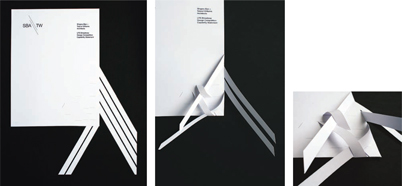
Benja Harney and Gregory Anderson used a sophisticated piece of paper engineering to produce this visually dynamic letterhead.
We have discussed various ways of using type as image in chapter 4: emoticons, rebuses, textspeak, closure, and visual onomatopoeia (see pages 113–115). Calligrams and concrete poetry are another, engaging example of type as image, in which the shape of the layout of a poem is as important as the content in conveying meaning. Calligrams and concrete poetry can also be combined with other techniques such as rhythm and repetition to aid communication.
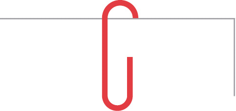
Thirst have used the shape of a paperclip to represent the letter G here.
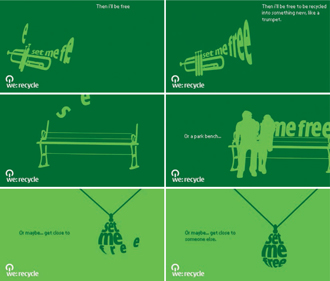
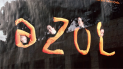
Lost in Space show how calligrams can translate from art into advertising in their animated screen-based design for a phonerecycling campaign.
Experimentation can result in accidental patterns derived from individual letterforms or combinations of letterforms. Patterns can establish a visual rhythm that draws the viewer into a design (see page 110). Letterforms, which are usually regular in shape, lend themselves to this sort of manipulation.
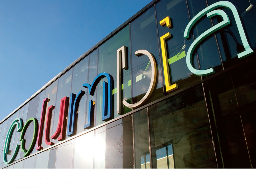
This kind of patterning technique can transform letterforms into abstract shapes. It can add layers of meaning, particularly when used to create logotypes (see page 113). Some packaging is designed so that the individual products form a pattern when they are stacked on supermarket shelves or other point-of-purchase displays.
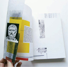
Letterforms have been used decoratively at least since the ornate initial capitals seen in medieval manuscripts (see below). Even with such a long tradition, decorated initials can still be incorporated in novel ways to lend impact to a design. Developments in illustration software make the construction of complex illustrated forms more accessible and open up a range of creative opportunities for expressing ideas. This sort of abstraction and imagemaking blurs the boundaries between type and image.
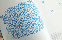
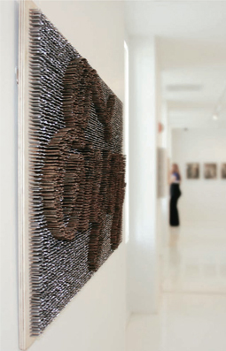
In this design by Dario Verrengia, a complex pattern has been produced by repeating a single word.
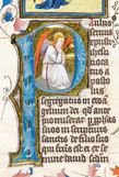
The beautiful initial capitals in this illuminated manuscript that would have taken many hours to produce can be emulated in a fraction of the time using modern digital technology.

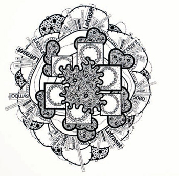
Paul Grabowski has created this highly decorative and complex poster using patterns formed from type.
Take one letterform in a specific typeface. (Choose any letterform you like, but the “g” in Minion Pro lends itself well.) Form patterns with it using any of the techniques discussed in this book. You could repeat it, rotate it, or invert it, combine different sizes or weights, produce it in different colors or tints—anything that comes to mind.
Aidan Nolan Design have used the “g” from the typeface Agostina to produce this decorative design based on imagery of the human brain.
Site-specific work at Casa FOA exhibition
by Yani Arabena and Guille Vizzari, Buenos Aires
This project was commissioned in 2009 by the Argentinean architecture studio PLAN, through Brasilia Prima, a graphic design studio based in Buenos Aires. It took place at Casa FOA, the interior and architectural design exhibition held every year in that city.
Yani Arabena and Guille Vizzari were asked to be part of a live intervention at PLAN, where artists developed site-specific work, responding to the environment. The concept involved wandering around the space, using the “table” as a place to share where people think, eat, work, play, and often create.
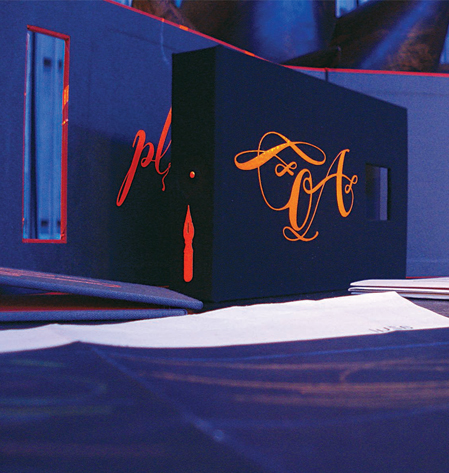
Yani and Guille developed an idea for five handmade book covers of different sizes and colors, which would contain large folded paper sheets incorporating illustrations and calligraphy.
They used a series of lettered phrases (decided prior to the event), which were cut in fluorescent orange self-adhesive vinyl, the kind often used for street signs.
These cut vinyl phrases were applied to the handmade covers and to other compositions including drawings, letters, and calligraphy. Other materials used in this process were markers, ink, calligraphy pens, paper-cut techniques, and papers of different textures and colors.
After the lettering, calligraphy, and other design work was completed, the resulting paper sheets were folded to fit within the book covers, resulting in five individual handmade books.
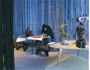
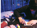
The space at PLAN where the site-specific work was undertaken.

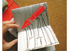
One of the phrases cut out of a vinyl sheet.
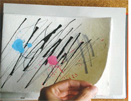
The variety of materials, colors, and techniques used in this experimental project.
A decorated page.
Folding one of the inserts ready for binding.

The five finished books, showing an example of the vinyl lettering applied to a cover.
A display of the finished works.

Dimitris Kanellopoulos overprints semitransparent inks to create this strong typographic image.