
This book is intended as an introduction to the use of, and experimentation with, type in design for print and screen. It aims to provide creative, informative, and practical guidance in this essential aspect of visual communication. In order to achieve this objective, there will be a strong visual element drawing on a range of sources, which will reflect cultural diversity. After using this guide, the reader will have a grasp of how to use and—more importantly in the context of the book—experiment with type for a range of applications and contexts, both in print- and screen-based work. As well as giving clear instruction, the book is also intended to be a source of inspiration and a reference handbook.
The various chapters incorporate the fundamental principles and terminology relating to type, before examining how to select appropriate typefaces and lay them out effectively, and how to approach the design process: generating ideas, handling traditional and digital tools, communicating the message, using color and movement, and tackling production issues. There is a section specifically devoted to experiments with type, but this theme will be woven through the book supported by case studies, projects, and exercises.
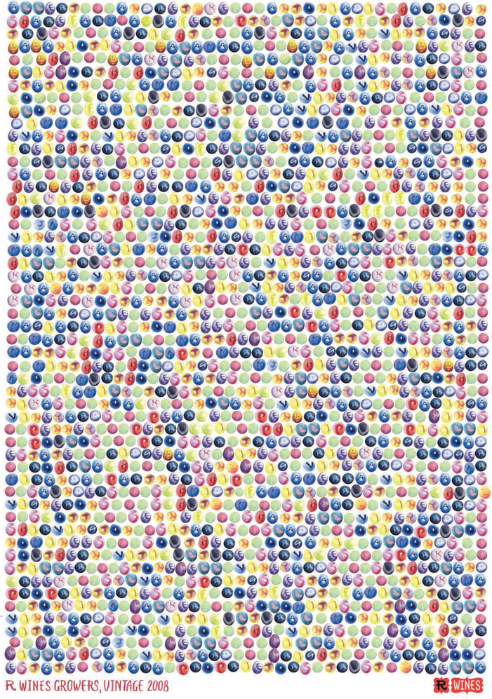
Marian Bantjes has taken a playful approach to this poster design for an Australian winery. The names of all the winery’s growers have been rendered in hand-drawn lettering on a dot matrix composed of different varieties of grapes, again drawn by hand.