
|
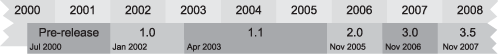
The .NET framework has been around for a while now—the first pre-beta release was in July 2000. You can see the major milestones in the life of the framework in figure 9.1.
The most prevalent installed version of .NET (and the minimum requirement for running IronPython) is version 2.0, which dates back to 2005. It includes dramatic improvements to the C# language (including support for generics), the runtime, and numerous class libraries.
.NET 3.0 and 3.5 build on the 2.0 version of the CLR. Although they add many new assemblies and improvements, they don’t include a new version of the CLR. .NET 3.0 is a standard part of Windows Vista and Windows Server 2008, and is available as an add-on for Windows XP and Windows Server 2003.
Note
Most of .NET 3.0 hasn’t yet been ported to Mono. You can see the status of the Mono implementation, called Olive, at http://www.mono-project.com/Olive.
The four major components in .NET 3.0 are listed in table 9.1.
Table 9.1. The major new APIs of .NET 3.0
Name | Purpose |
|---|---|
Windows Presentation Foundation | A new user interface library |
Windows Communications Foundation | Library for working with web services |
Windows Workflow Foundation | For creating, managing, and working with workflows |
Windows CardSpace | For managing digital identities. |
These are all large libraries in their own right. We’ll be taking a closer look at WPF and using it from IronPython.
WPF (the library formerly known as Avalon) is a new user interface library. Windows Forms, although mature and widely used, is starting to show its age in some areas; it’s built on top of User32, for creating the standard interface components, and GDI/GDI+, for rendering shapes, text, and images.
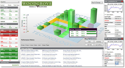
WPF is an entirely new library built on DirectX. DirectX started life as a games technology and is able to use the hardware acceleration provided by modern graphics cards. WPF is not only a more modern and flexible toolkit; but, by offloading rendering to the GPU on the video card, it can also be massively richer without bogging down your processor. WPF includes a standard set of controls and enables the integration of powerful effects such as transparency, vector graphics, animation, and 3D content. Figure 9.2 shows an attractive user interface created with WPF.
Because WPF handles all the drawing of controls, you’re free to implement entirely new controls and apply transformations with the minimum of code. To do the same with Windows Forms, you’d have to paint every aspect of the control yourself.
In this chapter, we use WPF from IronPython, exploring some of the new controls it offers. WPF is a large library, going wider than just user interface design. As well as using controls, we work with some of the other features that WPF provides, such as document support. WPF can be used entirely from code, but UIs can also be created from an XML dialect called the eXtensible Application Markup Language, or XAML. We work with WPF from both code and XAML.
XAML allows interface design to be decoupled from application implementation. Interfaces can be created by designers with tools like Expression Blend or the Mono alternative, Lunar Eclipse. These interfaces can then be delivered to developers in the form of XAML for use directly in projects.
Developers may be more comfortable with producing the basic elements of an application from code, but complex elements like gradients and animations are easier to describe with XAML.
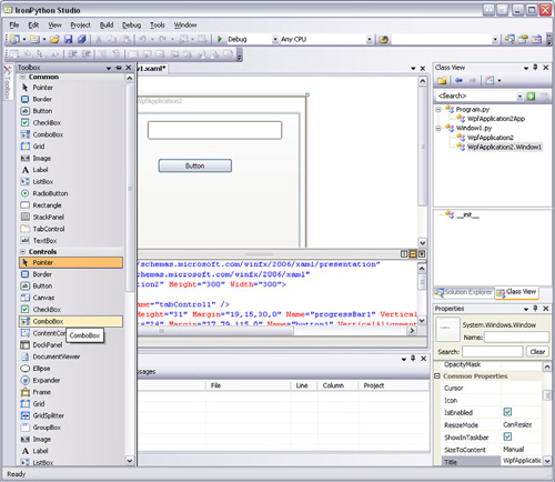
Designer support for creating WPF user interfaces in IronPython is built into Visual Studio 2008 and the IronPython Studio. The IronPython Studio WPF designer is shown in figure 9.3.
Windows Forms is a great user interface library. This may seem like an odd way to introduce an alternative library, but bear with us. Windows Forms has been around for a long time and, as a result, is stable with a rich set of controls. WPF opens up new opportunities for creating attractive and innovative interfaces, but it doesn’t yet provide as many controls as WinForms. The one you use should depend on your priorities. The great strength of WPF is ultimately flexibility, but it does have some great tricks up its sleeves even with its standard controls. These tricks include better high-level controls for layout, particularly for interfaces that behave well when resized. This tackles a weakness of Windows Forms—creating forms with a consistent resizable layout is notoriously difficult.
We start with a traditional Hello World example, but first let’s look at the assemblies that contain WPF, and the namespaces they make available.
To use WPF, you’ll need to install .NET 3.0. If you’re running Vista, then you already have .NET 3.0 installed.
Installing .NET 3 installs the following key WPF assemblies:
PresentationFramework.dll—. Holds the high-level WPF controls and types, such as windows and panels.
PresentationCore.dll—. Holds base types from which all the controls and display elements derive, including the core classes
UIElementandVisual.WindowsBase.dll—. Contains lower-level objects that still need to be publicly exposed, such as
DispatcherObjectandDependencyObject. We use one or two classes, likePoint, provided by this assembly.milcore.dll—. The WPF rendering engine (and an essential part of Windows Vista).
WindowsCodecs.dll—. A low-level imaging support library.
We can get a long way using only the first two of these assemblies, PresentationFramework and PresentationCore. These assemblies contain the namespace used by WPF, all of which start with System.Windows.[1] (System.Windows.Forms is the only namespace in this hierarchy which isn’t part of WPF.) Table 9.2 shows the important WPF namespaces, all of which we use in this chapter.
Table 9.2. Important WPF namespaces
Namespace | Purpose |
|---|---|
| Provides important classes and base element classes used in WPF applications. This includes |
| Provides the standard WPF controls, plus the classes used to create user controls. |
| Types for supporting |
| For integrating rich media, including drawings, text, and audio and video content in WPF applications. |
| Types for applying visual effects to bitmaps. |
| Provides classes for working with images (bitmaps). |
| Various shapes (such as ellipse, line, path, and polygon, plus the base class |
| Classes for working with XAML, including serialization and extensions to XAML. |
There’s an enormous variety of classes in WPF, but the basics are easy to start with. We begin with a traditional Hello World example.
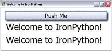
We’ve talked enough about WPF—it’s time to see it in action. Listing 9.1[2] creates a Window, and an attractive-looking button, contained in a StackPanel. Figure 9.4 is the result of running the code.
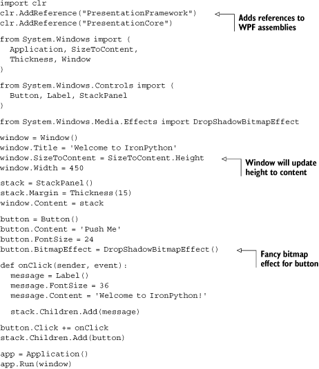
Most of this listing is simple enough that it should mainly speak for itself. One thing you’ll notice straightaway is that the API is different than the one in Windows Forms. This is hardly surprising because WPF is an entirely new library; but, although some patterns are familiar, you need to learn a lot of new details.
One obvious difference is at the end of the code. Instead of starting the event loop with a static method on Application class, you create an instance. Because you can’t have multiple event loops within the same AppDomain, Application is a singleton. Instantiating it multiple times is not such a hot idea, but it will always return the same instance. Like Windows Forms, WPF has single thread affinity, so interaction with interface components must be on the same thread that Application is instantiated on—which must be a single-threaded apartment (STA) thread. For single-threaded applications, you don’t need to worry about this; for multithreaded applications, you can use the WPF Dispatcher.[3]
The WPF Button is also similar to its WinForms equivalent. You set up the button click handler using our old friend, the Click event. But instead of setting the Text property, you use Content. For setting the text on a button, you use a string, but you could host any element in it (like an image or a TextBlock for more control over text wrapping and providing an access key).
Setting the Content on UI elements is one of the new patterns that comes with WPF. This is how you set the contained elements in the Window (the new and improved Form of a bygone era).
Setting Content isn’t the only way that contained elements are set, though. The star of this example is the StackPanel, one of the new layout classes provided by WPF. Child controls are set on the stack panel by adding them to the Children container. The StackPanel is a great way of stacking elements vertically or horizontally. In this example, you add a new message to the panel every time the button is clicked. Other WPF container classes[4] include Grid, DockPanel, WrapPanel, and the Canvas.
Most of the online examples for WPF start by showing you XAML, so let’s see how our Hello World example looks in XAML.
XAML is a declarative way of representing user interfaces in XML. XAML itself is extensible; following are several XAML variants:
WPF XAML—. Used to describe WPF content
XPS XAML—. A subset of WPF XAML for creating formatted electronic documents
Silverlight XAML—. Another subset of WPF XAML supported by the Silverlight browser plugin
WF XAML—. Windows Workflow Foundation XAML
Binary Application Markup Language (BAML)—. A compiled form of XAML
There’s a straightforward correspondence between XAML and WPF classes. Any XAML can be replaced by code that does the same job.
When XAML is read in, a type converter turns the XML tree into an object tree using the classes, structures, and enumerations contained in the System.Windows namespaces. XAML is an abstraction; and, before using an abstraction, we like to understand what’s going on under the hood.
You can see the correspondence between the classes we’ve used and XAML in listing 9.2, which is the XAML for Hello World.
Example 9.2. Hello World user interface in XAML
<Window
   xmlns="http://schemas.microsoft.com/winfx/2006/xaml/presentation"
   xmlns:x="http://schemas.microsoft.com/winfx/2006/xaml"
   Title="Welcome to IronPython" Width="450"
   SizeToContent="Height">
  <StackPanel Margin="15" x:Name="stackPanel">
    <Button FontSize="24" x:Name="button">
      <Button.BitmapEffect>
        <DropShadowBitmapEffect />
      </Button.BitmapEffect>
      Push Me
    </Button>
  </StackPanel>
</Window>
We’d show you a screenshot, but this is identical to the code written in the last section. The top-level element has two XML namespaces, declared as attributes—which is necessary for the text to be valid XML and valid XAML.
The XML tree defines the layout of the user interface. Child elements are nested in their parent elements.
The attributes of the elements set properties. For example, the Title, Width, and SizeToContent properties on the window are set with attributes on the Window tag.
More complex properties (usually objects that have their own properties) are set using property-element syntax. You add a child element that specifies the parent and the property being set. In our example, you set the BitmapEffect property of the button with the following:
<Button.BitmapEffect>
  <DropShadowBitmapEffect />
</Button.BitmapEffect>
If you were creating an interface with C# and a WPF designer, then you could also hook up events in the XAML. This creates a partial class in compiled XAML (BAML) that will be associated with a C# class: the code-behind. Because of the differences between IronPython classes and classes created with C#, you can’t hook up IronPython event handlers in IronPython.[5] Instead, you have to load the XAML and turn it into a WPF object tree using the XamlReader, so you need programmatic access to the elements in the object tree.
In this XAML example, you get access to the Button and the StackPanel by giving them a name using the x:Name attribute. They’re then retrieved from the object tree returned by XamlReader.Load using the FindName method. Listing 9.3 is the code that reads in the XAML and sets up the button event handler.
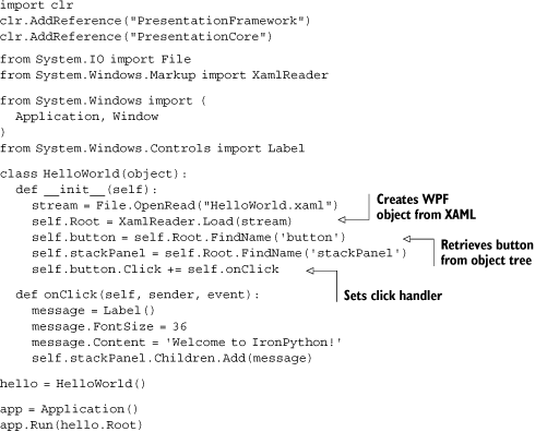
Because the XAML creates a Window, our HelloWorld class is no longer a window subclass itself. In fact, there’s no reason that the top-level element needs to be a window. You could make the StackPanel the top-level element and set the return value from XamlReader.Load as the Content on a Window subclass.
Given that you’re probably a programmer, why should you use XAML instead of code? One reason for considering XAML is for dynamic user interface creation. By using the XamlReader, you can read in interface definitions at runtime. Alternative layouts could be loaded in and swapped out in response to user actions, or even created dynamically through text manipulation.
There are other reasons for preferring XAML, as the following fragment illustrates:
<LinearGradientBrush>
 <LinearGradientBrush.GradientStops>
   <GradientStop Offset="0.00" Color="Yellow" />
   <GradientStop Offset="0.25" Color="Tomato" />
   <GradientStop Offset="0.75" Color="DeepSkyBlue" />
   <GradientStop Offset="1.00" Color="LimeGreen" />
 </LinearGradientBrush.GradientStops>
</LinearGradientBrush>
This XAML fragment creates a colored gradient brush used to create colorful backgrounds. The XAML is less verbose than the equivalent in code, even more so if you factor in the imports (and the time it takes to find the right namespaces to import everything from). More importantly, although XAML is quite easy to read and to write by hand, this kind of element is much easier to create with tools like Expression Blend.
Expression Blend allows you (or your designers) to create extremely rich interfaces with transitions, gradients, and animations. If Expression Blend is a designer’s tool, why is it of interest to developers? As well as designing full interfaces, you can also design individual components. You can copy and paste XAML from an Expression project into your code, and vice versa.
XAML generated by Expression Blend, or by the Visual Studio WPF designer, is intended to be compiled and used with code-behind. It will include an x:Class attribute valid only in compiled XAML. To make the XAML valid for consumption by the XamlReader, you’ll need to remove this attribute from the top-level element.
A free trial of Expression Blend is available for download,[6] and Mono has a fledgling equivalent tool (free and open source) called Lunar Eclipse.
As well as creating sophisticated interfaces with Expression, WPF comes with a range of standard controls sufficient for creating attractive, modern-looking applications.
Although WPF doesn’t have as many controls as Windows Forms, it includes standard controls such as check boxes, drop-down lists, and radio buttons. It also includes a range of new controls, both for advanced layout and entirely new user interface components. WPF also covers a wide range of areas beyond traditional user interfaces, including document support and 3D drawing. Even though it doesn’t have all the controls that Windows Forms does, it still does an awful lot. It’s extremely useful for developing Windows applications from IronPython if you’re prepared to target .NET 3.0.[7] Although most of the documentation and online tutorials focus on XAML, which often isn’t the best way of working with WPF from IronPython, most of the features are as straightforward to use from code as the last example.
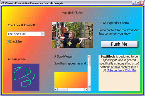
In this section, you’ll create a WPF application using a selection of controls, both new and old. Although this application itself won’t win any design awards, it does show you how to use a useful range of WPF controls. The finished application looks like figure 9.5. You can see that the controls are laid out in a grid. The code for each of the controls is covered in its own section, starting with the basic framework of the application.
The most important component in this user interface is the Grid. This is contained in a border with curved edges, purely for visual effect, and has visible grid lines so that you can see how the controls are contained within it. Listing 9.4 is the constructor for ControlsExample[8] and the methods it calls to create the main window. ControlsExample itself is a subclass of Window.
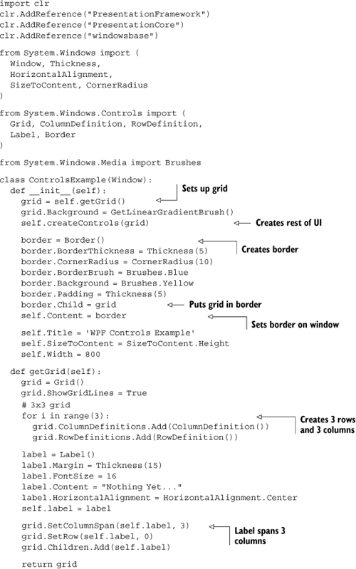
This code initializes the grid and then calls down to createControls to create the rest of the controls. Note that the grid is contained in the border by setting the Child attribute of the border. Along the way, this code uses a helper function to set a colorful background gradient and another function to place the controls in the grid. These functions, along with the additional imports that they use, are shown in listing 9.5.
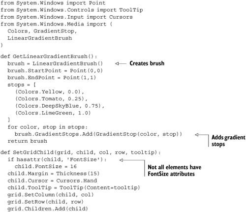
GetLinearGradientBrush returns a brush (a LinearGradientBrush), which is set as the Background property on the grid. The start and end points of the gradient are set using the Point structure. This isn’t the Point from the System.Drawing namespace that we’ve used before, but a new one. (In fact, if you attempt to use that one, you get the wonderful error message expected Point, got Point.) Although this Point lives in the System.Windows namespace, it’s defined in the WindowsBase assembly. This structure is the only reason you need to explicitly add a reference to this assembly at the start of the application.
SetGridChild is used to set the controls in the grid. Let’s look at how the grid is used.
The grid in this application is three-by-three: three rows and three columns. The rows and columns are created by adding RowDefinition and ColumnDefinition to their respective collections on the grid object.
grid = Grid()
grid.ShowGridLines = True

for i in range(3):
   grid.ColumnDefinitions.Add(ColumnDefinition())
   grid.RowDefinitions.Add(RowDefinition())
The first row (row zero) contains the top label, spanning across all three columns. The label has to be set in position in the grid and added to the Children collection on the grid.
grid.SetColumnSpan(self.label, 3)
grid.SetRow(self.label, 0)
grid.Children.Add(self.label)
Later controls are added to the grid by SetGridChild.
grid.SetColumn(child, col)
grid.SetRow(child, row)
grid.Children.Add(child)
SetGridChild also does a couple of other neat things. It sets a cursor and a tooltip on all the objects it places in the grid. If you move the mouse pointer over the controls, then the mouse pointer becomes a hand and a tooltip for the control is shown.
It’s time to look at some of the controls used in this application, starting with a couple of standard controls available in Windows Forms, but have a new implementation for WPF.
Figure 9.6 shows the WPF CheckBox and ComboBox.
They’re contained in a StackPanel and created by the createComboAndCheck method (listing 9.6).

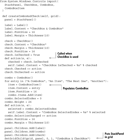
This code is all straightforward. It creates the CheckBox and adds an event handler, called action, to be called when it’s checked or unchecked. When action is called, it sets the text on the top label.
Next, the ComboBox is created and populated with ComboBoxItems. Another action event handler is added to the SelectionChanged event, and sets the text on the label when the selection is changed.
Finally, these components are placed in the StackPanel, which is added to the grid in the first column and second row. A StackPanel has no FontSize property, so the FontSize is set on the individual controls. SetGridChild checks for the presence of the FontSize property using hasattr, and won’t attempt to set the FontSize on the StackPanel.
The ComboBox and CheckBox are basic components in any user interface. WPF also includes other standard controls such as the RadioButton, ListBox, TabControl, TextBox, RichTextBox, TreeView, Slider, ToolBar, and ProgressBar. Although the API is different than the one in Windows Forms, you can see that the controls are just as easy to use. The best way to start using them is to experiment and read the documentation that provides simple examples. All these controls live in the System.Windows.Controls namespace, and you can find the documentation at http://msdn2.microsoft.com/en-us/library/system.windows.controls.aspx.
Another old friend is the Image control, which also has its place in the WPF library.
One of the reasons we’ve chosen to show the Image control is to show that, although everything may be shiny and new, it isn’t without warts. The first wart is that Image is awkward to use from code. This is largely mitigated by creating the image from XAML, but it doesn’t help with the second problem: how you specify the location of the image to be shown. In fact, it makes this problem worse. Before we discuss this, let’s look at the code (listing 9.7).
Example 9.7. Image control
import os from System import Uri, UriKind from System.Windows.Controls import Image from System.Windows.Media.Imaging import BitmapImage def createImage(self, grid): image = Image()bi = BitmapImage() bi.BeginInit() image_uri = os.path.join(os.path.dirname(__file__), 'image.jpg')
bi.UriSource = Uri(image_uri, UriKind.RelativeOrAbsolute)
bi.EndInit() image.Source = bi
SetGridChild(grid, image, 1, 1, "Image")
You can see that this code is verbose. You have to create both a BitmapImage and an Image instance . You specify the location of the image file using a Uri , which can be done only inside a BeginInit/EndInit block.[9] The BitmapImage is set as the Source on the Image instance .
It’s in specifying the location of the image that the real fun begins. You specify an absolute location on the filesystem . This is fine, if a little ugly, from code because you can construct it dynamically. From XAML, it’s impossible—unless your application is always going to run from the same location or you dynamically insert the location into the XAML.
One possible alternative is to use the pack URI syntax.[10] It’s slightly odd, but easy enough to use.
pack://siteoforigin:,,,/directory_name/image.jpg
Unfortunately, this specifies a location relative to the executing assembly of the current application. If you’re running the script with IronPython, this means relative to the location of ipy.exe. But creating a custom executable for your own applications is simple, and we explore this topic in chapter 15. If your XAML documents and resources are distributed with your application, then this solution would work. For reference, the equivalent XAML for the image is the following:
<Image Source="pack://siteoforigin:,,,/directory_name/image.jpg" />
Which is a lot simpler than the code in listing 9.7. Later in this chapter, we look at how to use XAML documents from WPF with a high-level document reading control, including fetching images from arbitrary locations.
After the annoying complexity of working with images, let’s take a look at one of the new controls, the Expander.
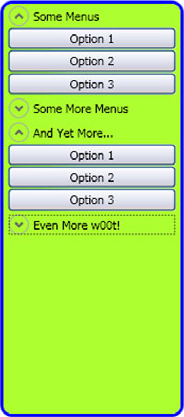
The Expander is one of our favorite controls. It can contain other controls, which the user can expand or hide. One use for the Expander is to provide menus as sidebars, as shown in figure 9.7.
The Expander is easy to use; the code from our example application is in listing 9.8.
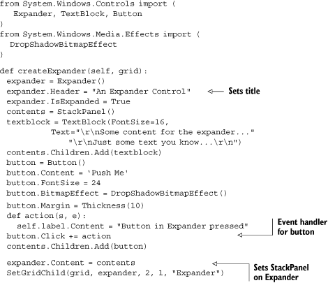
The Expander is created and populated with a StackPanel, which contains a TextBlock and a Button. We’ll take a closer look at the TextBlock in a moment. The Button has a Click event handler that changes the label, just to prove that it works. Clicking the header hides and shows the contents of the Expander.
Note
The source code for this application includes another control, which we don’t have space to cover here. The InkCanvas is a control that can be drawn on. You can use it to add user annotations, or diagramming capabilities to an application. It’s particularly useful on tablet PCs and can be used in conjunction with the InkAnalyzer,[11] which provides handwriting recognition.[12]
Another new WPF component is the ScrollViewer.
The ScrollViewer is a container element. When the children it contains are bigger than the visible area, it provides horizontal and vertical scrollbars as necessary. Figure 9.8 shows it in action.
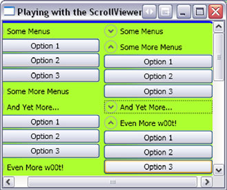
Listing 9.9 is the code from our example application that uses the ScrollViewer to contain a control and one of the WPF basic shapes with a colored gradient fill. (We thought it looked too good to only use once.)
The ScrollViewer contains a StackPanel populated with a TextBlock and a Rectangle. By default, the horizontal scrollbar is disabled, so you enable it by setting HorizontalScrollBarVisibility to ScrollBarVisibility.Auto. So that the ScrollViewer fills the available space, you also set the HorizontalAlignment and VerticalAlignment to the appropriate enumeration member.
It’s also worth noting that this code segment sets the margin on the TextBlock, using Thickness created with four arguments rather than a single number (technically doubles—but IronPython casts the integers for you).
text.Margin = Thickness(0, 0, 0, 20)
The four numbers specify the margins on the left, top, right, and bottom. (The Thickness structure represents a rectangle.) Here you’re specifying a bottom margin of 20 pixels.
The last detail from this code is that the colored gradient is set on the rectangle with the Fill attribute. Other brushes are available, like image and tiled drawing brushes,[13] and you can add effects like opacity, reflection, and magnification.
One of the most useful features of WPF is its support for text, in both large and small amounts. The next section covers the TextBlock, which is a way of including small amounts of text within your applications.
The TextBlock is designed for displaying small amounts of flow content. Flow content is formatted text that will be automatically reflowed as the container control is resized. As well as the TextBlock, there are other controls for incorporating whole documents into applications.
You’ve already used the TextBlock in the ScrollViewer example. There you set the content by setting the Text property, using it as little more than a glorified label. We used a TextBlock rather than a Label so that you could control the TextWrapping.
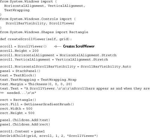
In listing 9.10, you’ll create a TextBlock with flow content, using the programmatic API.[14] This example uses classes from the System.Windows.Documents namespace.
Documents are another place where XAML is significantly more concise than code. The equivalent XAML for this TextBlock is as follows:
<TextBlock Background="AntiqueWhite" TextWrapping="Wrap"
   TextAlignment="Center">
   <Bold>TextBlock</Bold> is designed to be
   <Italic>lightweight,</Italic>
   and is geared specifically at integrating
   <Italic>small</Italic> portions of flow content
   into a UI.
   <Hyperlink>A Hyperlink - Click Me</Hyperlink>
</TextBlock>
Not only is this less work than the code; but, if you’re used to creating documents using HTML (or other markups), it’s reasonably intuitive. You’ll notice that the code has to wrap straight runs of text in the Run class, but this is done automatically in the XAML. The only thing the XAML doesn’t do for you is set up the Click handler on the hyperlink. This is the same problem that we’ve already encountered with using XAML from IronPython, and you could solve it using the same trick of setting an x:Name attribute in the XAML. Shortly we’ll explore a more general solution to this problem when working with XAML documents from IronPython.
Before we do that, let’s look at the other side of the coin—turning WPF objects back into XAML.
In the Hello World example, we also looked at the equivalent XAML. The full XAML for the example application we’ve been using to look at WPF controls would be painful to create by hand. Fortunately, there’s an easier way. Listing 9.11 uses a XamlWriter to turn our ControlsExample into XAML.
Example 9.11. Creating XAML from WPF objects with XamlWriter
from System.IO import File
from System.Windows.Markup import XamlWriter

window = ControlsExample()
text = XamlWriter.Save(window.Content)
File.WriteAllText('out.xaml', text)
The XamlWriter does have some limitations. For example, it can’t handle creating XAML for subclasses of WPF objects.[15] Our main ControlsExample class is a subclass of Window, so you can only serialize the object tree below the top-level window. This is why you call XamlWriter.Save (a static method) on the window’s Content property.
We’ve already looked at including small amounts of flow content in user interfaces. WPF also provides a powerful way of incorporating whole documents through XPS documents.
XML Paper Specification (XPS) is a combination of a document markup language, which is a subset of XAML, and code support for viewing and printing documents. Although you won’t read this in the Microsoft documentation, many see XPS as Microsoft’s answer to Adobe’s Portable Document Format (PDF) for creating print-ready documents. Fortunately, that debate is irrelevant to us because the classes that provide XPS support are a fantastic way of incorporating documents within WPF applications.
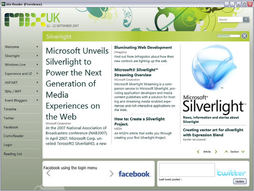
One use for XPS documents is incorporating highly readable content within desktop applications, blurring the line between online and offline applications. One such application is the Mix Reader (figure 9.9) created by Conchango for the Mix UK 2007 conference. It combines offline document reading with online capabilities including RSS reading and Facebook and Twitter integration.
Applications with dynamic content and features are particularly suited to IronPython. You can dynamically create (and manipulate) XAML and then load it at runtime using the XamlReader. In this section, we play with XAML while exploring document integration.
XPS documents are packages that can contain one or more fixed documents along with their dependencies such as images and fonts. This format is most similar to PDF, and Microsoft provides an XPS Viewer application[16] and printing support. In fact, XPS is now the native Windows Vista print spool file format.
Fixed documents are a relatively low-level format that contains FixedPage elements. They’re used when an application needs to control the layout of the document—for example, for printing—and they’re the type of document stored in XPS files. Fixed documents must contain certain elements that make up the page, such as width, height, and language.
More interesting, from an application programmer’s point of view, are FlowDocuments. Flow documents can be viewed with some high-level reader controls and reflow dynamically as the control size changes. They also offer advanced document features such as pagination and columns. Of course, these features are better demonstrated than explained.
WPF includes several controls for viewing flow content. You’ve already used the TextBlock for including small amounts of formatted text; now it’s the turn of the classes for viewing whole documents.
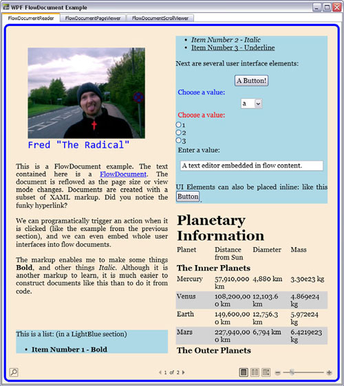
There are three basic classes for viewing flow documents: FlowDocumentReader, FlowDocumentPageViewer, and FlowDocumentScrollViewer. They’re all similar, but have slightly different features for different uses.
Figure 9.10 shows FlowDocumentExample.py,[17] which embeds these three document viewers in a TabControl. They all show the same document so that you can see the differences.
Like the other WPF controls you’ve used, you can populate these readers directly from XAML or with an object tree created from code. For documents, it makes much more sense to use XAML, but there’s a bit of work to be done from code. Let’s look at how you use the viewers and what the differences are.
The FlowDocumentReader is the most capable of the viewer controls. It has features that allow the user to switch the display mode between single page, two pages side by side, and continuous scrolling. It also has find and magnification built-in. Listing 9.12 shows the basic code to read in a XAML file and create the viewer.
Example 9.12. Creating FlowDocumentReader
from System.IO import File
from System.Windows.Controls import (
   FlowDocumentReader, FlowDocumentReaderViewingMode
)

from System.Windows.Markup import XamlReader

xamlStream = File.OpenRead("FlowDocument.xaml")
reader = FlowDocumentReader()
flowDocument = XamlReader.Load(xamlStream)
reader.Document = flowDocument
reader.ViewingMode = FlowDocumentReaderViewingMode.Page
Because the viewers are controls, they live in the System.Windows.Controls namespace.
The default viewing mode is Page; so, strictly speaking, the last line of the code is unnecessary, but it demonstrates how you configure the viewing mode. The other enumeration members, for the alternative viewing modes, are Scroll and TwoPage.
The other two viewer controls are used in exactly the same way, but present the document in a fixed viewing mode instead of allowing the user to choose. In consequence, they’re lighter weight and should be used when different viewing modes aren’t needed.
The FlowDocumentPageViewer shows documents in page-at-a-time mode and includes the magnification toolbar.
The FlowDocumentScrollViewer shows documents in single-page view mode, with a vertical scrollbar. A horizontal scrollbar is only shown if necessary. By default, this viewer has no toolbar, but you can switch it on by setting the IsToolBarVisible property to True.
So what sort of markup do you use to create flow documents?
You’ve already seen a simple example of the XAML flow document markup when creating the TextBlock. But that only scratches the surface of what’s possible.
The document displayed by FlowDocumentExample.py is FlowDocument.xaml. This shows off most of the document markup available.
When creating a viewer control, you need to set the Document property with a FlowDocument, which must be the top-level element of the document. The basic markup elements of flow content are easy to use. This short document contains text in a paragraph, with bold and italic sections and a line break.
<FlowDocument xmlns="... >
   <Paragraph>
      The markup enables me to make some things
      <Bold>Bold</Bold>, and other things
      <Italic>Italic</Italic>. Although it is another
      markup to learn, it is much easier to
      construct documents like this
      than to do it from code.
      <LineBreak />
      This text follows a line break.
   </Paragraph>
</FlowDocument>
All these elements have corresponding classes in the System.Windows.Documents namespace, but constructing a document from code would be extremely tedious.
As well as for dividing documents into paragraphs, you can use sections as container elements. They can be useful ways of forcing a page break or applying styling attributes to all contained elements. Children of a section must be block-level elements, which include the following:
ParagraphListTableBlockUIContainer
Following are two section declarations. The first ensures a page break; the second adds a light blue background to everything within the section.
<Section BreakPageBefore="True"/>
<Section Background="LightBlue"> </Section>
Lists are also easy to construct.
<List>
   <ListItem>
      <Paragraph><Italic>Item Number 1 - Italic</Italic></Paragraph>
   </ListItem>
   <ListItem>
      <Paragraph><Underline>Item Number 2 - Underline</Underline></Paragraph>
   </ListItem>
</List>
Flow content can contain many other elements including figures, typography elements, and embedded user interfaces. You can find examples of these in FlowDocument.xaml. We haven’t yet covered images and hyperlinks because both of these elements have problems that we need to solve.
XAML is essentially an XML tree used to represent documents and user interfaces. If you need to apply transformations or changes to the tree, you have two choices. You can either process the XAML before loading, or apply changes directly to the object tree after loading. So far, we’ve encountered two reasons why you might want to do that. The first is to resolve the difficulty with specifying the location of images.
For an image element to be properly displayed, you need to provide an absolute location for the image file. This is inconvenient, and it would be much better to specify the location relative to the document file. We’ve already solved this problem when creating images from code, but you need to do something different when working with XAML.
Because we’re working with an XML tree, you could use an XML parser or apply XSLT transformations. But for specifying a location on the filesystem relative to the document, all you need is a placeholder representing the directory of the document. You can then do a string replace to insert that location into the XAML at runtime. Because you haven’t yet used regular expressions (regex), we create a simple regex to do the job.
For regular expressions, you have the choice of working with the .NET or the Python libraries. Because we’re more familiar with Python regular expressions, we use Python’s re module[18] (listing 9.13)
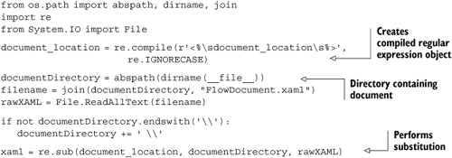
This code takes an image tag, <Image Source="<% document_location %>image2.jpg"/>, and replaces <% document_location %> with the path to the directory containing the document. The advantage of using a regular expression is that the replacement can be case insensitive and also insensitive to whitespace inside the tag.
This leaves a further problem. You now have the XAML, with the correct image paths, as a string, but the XamlReader expects a stream. You get around this problem by using a MemoryStream to wrap the string (listing 9.14).
Example 9.14. Wrapping a string as a stream
from System.IO import MemoryStream
from System.Text import Encoding

bytes = Encoding.UTF8.GetBytes(xaml)
stream = MemoryStream(bytes)

flowDocument = XamlReader.Load(stream)
XAML files must be in the UTF-8 encoding—which is why you use Encoding.UTF8 to get a byte array from the XAML string.
The next problem we have to solve is working with links in documents.
Constructing hyperlinks in XAML is easy; but, unfortunately, they don’t work quite how you might expect.
<Hyperlink NavigateUri="http://example.com">A Link</Hyperlink>
The NavigateUri isn’t intended for linking to arbitrary URLs, but for navigating to XAML files. If these were created with code-behind, then the associated code would be loaded with the XAML, and you could construct Page[19]-based user interfaces (for both desktop applications and WPF applications hosted in a browser) that navigate like a web application. Because you can’t use code-behind with IronPython, it isn’t useful for our purposes, and hyperlinks in our XAML documents don’t do anything.
But you can load the XAML and then find all the links in the object tree. You can then attach click handlers to the links that launch the default system browser with the URL specified in the NavigateUri.
To do this, you need a way of walking the WPF object tree after you’ve created it. Fortunately, there’s a convenient helper class for doing this. Listing 9.15 shows a recursive generator function that uses LogicalTreeHelper to extract a list of objects. You specify the objects you’re interested in by name, and FindChildren examines the class name of all the objects in the WPF tree to find them. Using a generator means that you don’t have to build up a list, but can yield matching objects as you find them.
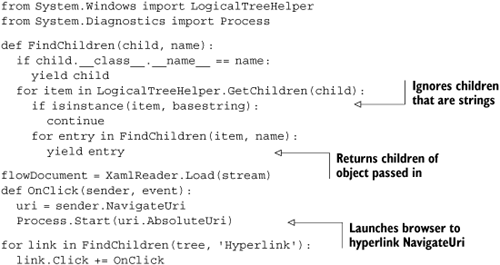
It would be simple to evolve this system to automatically hook up user interface elements embedded in documents. You could create a declarative naming scheme and hook events up to handlers based on names declared in XAML elements. For example, an object named Click_onClick would have its Click event hooked up to the onClick method.
Although this section has focused on using LogicalTreeHelper in the context of documents, there’s no need to restrict its use to this. XAML is just text, and Python is a particularly good language for text processing; even if you prefer working with code, the possibilities for dynamically generating XAML are interesting (especially for complex effects like animations and transitions).
WPF is a huge subject. Whole books have been written on WPF (quite a few of them), so we’ve only scratched the surface. The aim of this chapter was to familiarize you with the basic principles of working with WPF, and equip you to explore it yourself. If you want to learn more, you can begin with the following topics:
Dependency properties and routed events
Data binding
Creating custom controls
3D drawing and animations
Hosting Windows Forms controls in WPF
We’ve covered how to create WPF applications from IronPython and how to find your way around the WPF namespaces and standard controls. Perhaps more importantly, at least from the point of view of reading WPF documentation, is understanding XAML. Even if you prefer working with objects from code (which we do), you need to be able to read XAML to look up anything related to WPF! When you do work with XAML, you have lots of options with IronPython. The XamlReader, XamlWriter, and LogicalTreeHelper classes are particularly powerful tools.
In the next chapter, we look at how IronPython can help with system administration tasks, ranging from simple scripts to remote monitoring of system resources. Along the way, you’ll get a chance to see how you can use some of the libraries provided with PowerShell from IronPython.
[1] The MSDN documentation for this namespace is at http://msdn2.microsoft.com/en-us/library/system.windows.aspx.
[2] Adapted from code originally created by Steve Gilham. See http://stevegilham.blogspot.com/2007/07/hello-wpf-in-ironpython.html.
[3] For more details, see the documentation on the WPF threading model at http://msdn2.microsoft.com/enus/library/ms741870.aspx.
[4] A useful reference on the WPF layout system can be found at http://msdn2.microsoft.com/en-us/library/ms745058.aspx.
[5] In fact, you can do it with the WPF designer in IronPython Studio. This generates code that uses a technique similar to listing 9.3.
[6] From Microsoft product page: http://www.microsoft.com/expression/products/overview.aspx?key=blend.
[7] Which will be an extra dependency on platforms older than Vista.
[8] This listing is not the full code. The following section works through more of the code for ControlsExample.
[9] For more detail on the use of images with WPF, this page is a helpful reference: http://msdn2.microsoft.com/en-us/library/ms748873.aspx.
[10] See this page for all the gory details: http://msdn2.microsoft.com/en-us/library/aa970069.aspx.
[12] To use handwriting recognition, you need to install the tablet PC SDK. We’d include a URL, but it’s horrifically long and easy to find.
[13] As usual, there’s a useful page on MSDN providing examples of the different brushes. See http://msdn2.microsoft.com/en-us/library/aa970904.aspx.
[14] For a reference to the TextBlock content model, see http://msdn2.microsoft.com/en-us/library/bb613554.aspx.
[15] Not just a restriction when working from IronPython. The XamlWriter serialization is explicitly runtime and can’t access design-time information.
[17] Available in the downloadable source code, under Chapter 9, from http://www.ironpythoninaction.com/.