
Excel’s charting feature lets you create a wide variety of charts using data that’s stored in a worksheet. In this chapter, I discuss the following:
Essential background information on Excel charts
The difference between embedded charts and chart sheets
Understanding the
Chartobject modelUsing methods other than the macro recorder to help you learn about
ChartobjectsExamples of common charting tasks that use VBA
Examples of more complex charting macros
Some interesting (and useful) chart-making tricks
Excel supports a wide variety of chart types, and you have a great deal of control over nearly every aspect of each chart. In Excel 2007, charts look better than ever.
An Excel chart is simply packed with objects, each of which has its own properties and methods. Because of this, manipulating charts with Visual Basic for Applications (VBA) can be a bit of a challenge — and, unfortunately, the macro recorder isn’t much help in Excel 2007. In this chapter, I discuss the key concepts that you need to understand in order to write VBA code that generates or manipulates charts. The secret, as you’ll see, is a good understanding of the object hierarchy for charts. But first, a bit of background about Excel charts.
In Excel, a chart can be located in either of two places within a workbook:
As an embedded object on a worksheet: A worksheet can contain any number of embedded charts.
In a separate chart sheet: A chart sheet normally holds a single chart.
Most charts are created manually by using the commands in the Insert ![]() Charts group. But you can also create charts by using VBA. And, of course, you can use VBA to modify existing charts.
Charts group. But you can also create charts by using VBA. And, of course, you can use VBA to modify existing charts.
Tip
The fastest way to create a chart is to select your data and then press Alt+F1. Excel creates an embedded chart and uses the default chart type. To create a new default chart on a chart sheet, select the data and press F11.
A key concept when working with charts is the active chart — that is, the chart that’s currently selected. When the user clicks an embedded chart or activates a chart sheet, a Chart object is activated. In VBA, the ActiveChart property returns the activated Chart object (if any). You can write code to work with this Chart object, much like you can write code to work with the Workbook object returned by the ActiveWorkbook property.
Here’s an example: If a chart is activated, the following statement will display the Name property for the Chart object:
MsgBox ActiveChart.Name
If a chart is not activated, the preceding statement generates an error.
If you’ve read other chapters in the book, you know that I often recommend using the macro recorder to learn about objects, properties, and methods. Unfortunately, Microsoft took a major step backward in Excel 2007 when it comes to recording chart actions. Although it’s possible to record a macro while you create and customize a chart, there’s a pretty good chance that the recorded macro will not produce the same result when you execute it.
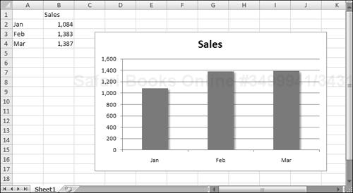
Following is a macro that I recorded while I created a column chart, deleted the legend, and then added a shadow effect to the column series.
Sub RecordedMacro()
    ActiveSheet.Shapes.AddChart.Select
    ActiveChart.SetSourceData Source:=Range("Sheet1!$A$2:$B$4")
    ActiveChart.ChartType = xlColumnClustered
    ActiveChart.Legend.Select
    Selection.Delete
    ActiveSheet.ChartObjects("Chart 1").Activate
    ActiveChart.SeriesCollection(1).Select
End Sub
The chart is shown in Figure 18-1.
Notice the following points:
Even though I selected the range before I turned on the macro recorder, the source data range is hard-coded in the macro. In other words, the recorded macro does not use the
Selectionobject, which is typical of other recorded macros. In other words, it’s not possible to record a macro that creates a chart from the selected range.The macro also hard-codes the chart’s name. When this macro is played back, it’s very unlikely that the newly-created chart will be named Chart 1, so the macro will either select the wrong chart or end with an error if a chart with that name does not exist.
Although selecting the data series was recorded, the formatting command was not. So, if you would like to find out which objects and properties are used to format a data series, the macro recorder is of no help at all.
Bottom line? In Excel 2007, Microsoft downgraded macro recording for charts to the point where it’s virtually useless. I don’t know why this happened, but it’s likely that they just didn’t have the time, and meeting the product ship date was deemed a higher priority.
Despite the flaws, recording a chart-related macro can still be of some assistance. For example, you can use a recorded macro to figure out how to insert a chart, change the chart type, add a series, and so on. But when it comes to learning about formatting, you’re on your own. More than ever, you’ll need to rely on the object browser and the Auto List Members feature.
When you first start exploring the object model for a Chart object, you’ll probably be very confused — which is not surprising; the object model is very confusing. It’s also very deep.
For example, assume that you want to change the title displayed in an embedded chart. The top-level object, of course, is the Application object (Excel). The Application object contains a Workbook object, and the Workbook object contains a Worksheet object. The Worksheet object contains a ChartObject object, which contains a Chart object. The Chart object has a ChartTitle object, and the ChartTitle object has a Text property that stores the text that’s displayed as the chart’s title.
Here’s another way to look at this hierarchy for an embedded chart:
Application
    Workbook
        Worksheet
            ChartObject
                Chart
                    ChartTitle
Your VBA code must, of course, follow this object model precisely. For example, to set a chart’s title to YTD Sales, you can write a VBA instruction like this:
WorkSheets("Sheet1").ChartObjects(1).Chart.ChartTitle. _
  .Text = "YTD Sales"
This statement assumes the active workbook as the Workbook object. The statement works with the first item in the ChartObjects collection on the worksheet named Sheet1. The Chart property returns the actual Chart object, and the ChartTitle property returns the ChartTitle object. Finally, you get to the Text property.
For a chart sheet, the object hierarchy is a bit different because it doesn’t involve the Worksheet object or the ChartObject object. For example, here’s the hierarchy for the ChartTitle object for a chart in a chart sheet:
Application
    Workbook
        Chart
             ChartTitle
In terms of VBA, you could use this statement to set the chart title in a chart sheet to YTD Sales:
Sheets("Chart1").ChartTitle.Text = "YTD Sales"A chart sheet is essentially a Chart object, and it has no containing ChartObject object. Put another way, the parent object for an embedded chart is a ChartObject object, and the parent object for a chart on a separate chart sheet is a Workbook object.
Both of the following statements will display a message box with the word Chart in it:
MsgBox TypeName(Sheets("Sheet1").ChartObjects(1).Chart)
Msgbox TypeName(Sheets("Chart1"))
Note

When you create a new embedded chart, you’re adding to the ChartObjects collection and the Shapes collection contained in a particular worksheet. (There is no Charts collection for a worksheet.) When you create a new chart sheet, you’re adding to the Charts collection and the Sheets collection for a particular workbook.
In this section, I describe how to use VBA to perform some common tasks that involve charts.
In Excel 2007, a ChartObject is a special type of Shape object. Therefore, it’s a member of the Shapes collection. To create a new chart, use the AddChart method of the Shapes collection. The following statement creates an empty embedded chart:
ActiveSheet.Shapes.AddChart
The AddChart method can use five arguments (all are optional):
Type: The type of chart. If omitted, the default chart type is used. Constants for all of the chart types are provided (for example,
xlArea, xlColumnClustered, and so on).Left: The left position of the chart, in points. If omitted, Excel centers the chart horizontally.
Top: The top position of the chart, in points. If omitted, Excel centers the chart vertically.
Width: The width of the chart, in points. If omitted, Excel uses 354.
Height: The height of the chart, in points. If omitted, Excel uses 210.
In many cases, you may find it efficient to create an object variable when the chart is created. The following procedure creates a line chart that can be referenced in code by using the MyChart object variable:
Sub CreateChart()
    Dim MyChart As Chart
    Set MyChart = ActiveSheet.Shapes.AddChart(xlLineMarkers).Chart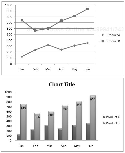
End SubA chart without data is not very useful, so you’ll want to use the SetSourceData method to add data to a newly-created chart. The procedure that follows demonstrates the SetSourceData method. This procedure creates the chart shown in Figure 18-2.
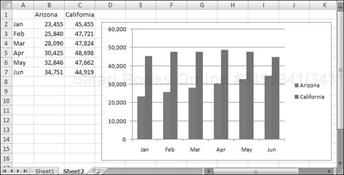
Sub CreateChart()
    Dim MyChart As Chart
    Dim DataRange As Range
    Set DataRange = ActiveSheet.Range("A1:C7")
    Set MyChart = ActiveSheet.Shapes.AddChart.Chart
    MyChart.SetSourceData Source:=DataRange
End SubThe preceding section describes the basic procedures for creating an embedded chart. To create a chart on a chart sheet, use the Add method of the Charts collection. The Add method of the Charts collection uses several optional arguments, but these arguments specify the position of the chart sheet — not chart-related information.
The example that follows creates a chart on a chart sheet and specifies the data range and chart type:
Sub CreateChartSheet()
    Dim MyChart As Chart
    Dim DataRange As Range
    Set DataRange = ActiveSheet.Range("A1:C7")
    Set MyChart = Charts.Add
    MyChart.SetSourceData Source:=DataRange
    ActiveChart.ChartType = xlColumnClustered
End SubWhen a user clicks any area of an embedded chart, the chart is activated. Your VBA code can activate an embedded chart with the Activate method. Here’s a VBA statement that’s the equivalent of Ctrl+clicking an embedded chart:
ActiveSheet.ChartObjects("Chart 1").ActivateIf the chart is on a chart sheet, use a statement like this:
Sheets("Chart1").ActivateAlternatively, you can activate a chart by selecting its containing Shape:
ActiveSheet.Shapes("Chart 1").SelectWhen a chart is activated, you can refer to it in your code by using the ActiveChart property (which returns a Chart object). For example, the following instruction displays the name of the active chart. If there is no active chart, the statement generates an error:
MsgBox ActiveChart.Name
To modify a chart with VBA, it’s not necessary to activate it. The two procedures that follow have exactly the same effect. That is, they change the embedded chart named Chart 1 to an area chart. The first procedure activates the chart before performing the manipulations; the second one doesn’t:
Sub ModifyChart1()
    ActiveSheet.ChartObjects("Chart 1").Activate
    ActiveChart.ChartType = xlArea
End Sub

Sub ModifyChart2()
    ActiveSheet.ChartObjects("Chart 1").Chart.ChartType = xlArea
End SubA chart embedded on a worksheet can be converted to a chart sheet. To do so manually, just activate the embedded chart and choose Chart Tools ![]() Design
Design ![]() Location
Location ![]() Move Chart. In the Move Chart dialog box, select the New Sheet option and specify a name.
Move Chart. In the Move Chart dialog box, select the New Sheet option and specify a name.
You can also convert an embedded chart to a chart sheet by using VBA. Here’s an example that converts the first ChartObject on a worksheet named Sheet1 to a chart sheet named MyChart:
Sub MoveChart1()
    Sheets("Sheet1").ChartObjects(1).Chart. _
      Location xlLocationAsNewSheet, "MyChart"
End Sub
The following example does just the opposite of the preceding procedure: It converts the chart on a chart sheet named MyChart to an embedded chart on the worksheet named Sheet1.
Sub MoveChart2()
    Charts("MyChart") _
      .Location xlLocationAsObject, "Sheet1"
End Sub
What’s Your Name?
Every ChartObject object has a name, and every Chart contained in a ChartObject has a name. That certainly seems straightforward enough, but it can be confusing. Create a new chart on Sheet1 and activate it. Then activate the VBA Immediate window and type a few commands:
? ActiveSheet.Shapes(1).Name
Chart 1
? ActiveSheet.ChartObjects(1).Name
Chart 1
? ActiveChart.Name
Sheet1 Chart 1
? Activesheet.ChartObjects(1).Chart.Name
Sheet1 Chart 1
If you change the name of the worksheet, the name of the Chart also changes. However, you can’t change the name of a Chart that’s contained in a ChartObject. If you try to do so using VBA, you get an inexplicable “out of memory” error.
What about changing the name of a ChartObject? The logical place to do that is in the Name box (to the left of the Formula bar). Although you can rename a shape by using the Name box, you can’t rename a chart (even though a chart is actually a shape). To rename an embedded chart, use the Chart Name control in the Chart Tools ![]() Layout
Layout ![]() Properties group. This control displays the name of the active chart (which is actually the name of the
Properties group. This control displays the name of the active chart (which is actually the name of the ChartObject), and you can use this control to change the name of the ChartObject. Oddly, Excel allows you to use the name of an existing ChartObject. In other words, you could have a dozen embedded charts on a worksheet, and every one of them can be named Chart 1.
Bottom line? Be aware of this quirk. If you find that your VBA charting macro isn’t working, make sure that you don’t have two identically named charts.
You can use the Activate method to activate a chart, but how do you deactivate (that is, unselect) a chart? According to the Help System, you can use the Deselect method to deactivate a chart:
ActiveChart.Deselect
However, this statement simply doesn’t work — at least in the initial release of Excel 2007.
As far as I can tell, the only way to deactivate a chart by using VBA is to select something other than the chart. For an embedded chart, you can use the RangeSelection property of the ActiveWindow object to deactivate the chart and select the range that was selected before the chart was activated:
ActiveWindow.RangeSelection.Select
A common type of macro performs some manipulations on the active chart (the chart selected by a user). For example, a macro might change the chart’s type, apply a style, or export the chart to a graphics file.
The question is, how can your VBA code determine whether the user has actually selected a chart? By selecting a chart, I mean either activating a chart sheet or activating an embedded chart by clicking it. Your first inclination might be to check the TypeName property of the Selection, as in this expression:
TypeName(Selection) = "Chart"
In fact, this expression never evaluates to True. When a chart is activated, the actual selection will be an object within the Chart object. For example, the selection might be a Series object, a ChartTitle object, a Legend object, a PlotArea object, and so on.
The solution is to determine whether ActiveChart is Nothing. If so, then a chart is not active. The following code checks to ensure that a chart is active. If not, the user sees a message and the procedure ends:
If ActiveChart Is Nothing Then
    MsgBox "Select a chart."
    Exit Sub
Else
    'other code goes here
End If
You may find it convenient to use a VBA function procedure to determine whether a chart is activated. The ChartIsSelected function, which follows, returns True if a chart sheet is active or if an embedded chart is activated, but returns False if a chart is not activated:
Private Function ChartIsSelected() As Boolean
    ChartIsSelected = Not ActiveChart Is Nothing
End FunctionTo delete a chart on a worksheet, you must know the name or index of the ChartObject. This statement deletes the ChartObject named Chart 1 on the active worksheet:
ActiveSheet.ChartObjects("Chart 1").DeleteTo delete all ChartObject objects on a worksheet, use the Delete method of the ChartObjects collection:
ActiveSheet.ChartObjects.Delete
You can also delete embedded charts by accessing the Shapes collection. The following statement deletes Chart 1 on the active worksheet:
ActiveSheet.Shapes("Chart 1").DeleteAnd this statement deletes all embedded charts (and all other shapes):
ActiveSheet.Shapes.Delete
To delete a single chart sheet, you must know the chart sheet’s name or index. The following statement deletes the chart sheet named Chart1:
Charts("Chart1").DeleteTo delete all chart sheets in the active workbook, use the following statement:
ActiveWorkbook.Charts.Delete
Deleting sheets causes Excel to display a warning like the one shown in Figure 18-3. The user must reply to this prompt in order for the macro to continue. If you are deleting a sheet with a macro, you probably won’t want this warning prompt to appear. To eliminate the prompt, use the following series of statements:
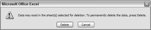
Application.DisplayAlerts = False
ActiveWorkbook.Charts.Delete
Application.DisplayAlerts = True
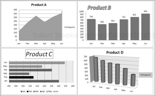
In some cases, you may need to perform an operation on all charts. The following example applies changes to every embedded chart on the active worksheet. The procedure uses a loop to cycle through each object in the ChartObjects collection and then accesses the Chart object in each and changes several properties.
Sub FormatAllCharts()
    Dim ChtObj As ChartObject
    For Each ChtObj In ActiveSheet.ChartObjects
      With ChtObj.Chart
        .ChartType = xlLineMarkers
        .ApplyLayout 3
        .ChartStyle = 12
        .ClearToMatchStyle
        .SetElement msoElementChartTitleAboveChart
        .SetElement msoElementLegendNone
        .SetElement msoElementPrimaryValueAxisTitleNone
        .SetElement msoElementPrimaryCategoryAxisTitleNone
        .Axes(xlValue).MinimumScale = 0
        .Axes(xlValue).MaximumScale = 1000
      End With
    Next ChtObj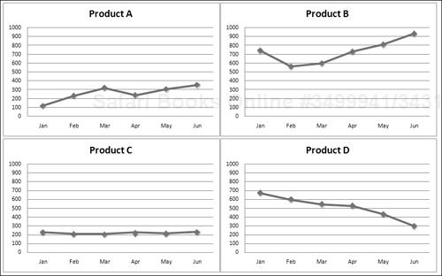
End SubFigure 18-4 shows four charts that use a variety of different formatting; Figure 18-5 shows the same charts after running the FormatAllCharts macro.
The following macro performs the same operation as the preceding FormatAllCharts procedure but works on all the chart sheets in the active workbook:
Sub FormatAllCharts2()
    Dim cht as Chart
    For Each cht In ActiveWorkbook.Charts
      With cht
        .ChartType = xlLineMarkers
        .ApplyLayout 3
        .ChartStyle = 12
        .ClearToMatchStyle
        .SetElement msoElementChartTitleAboveChart
        .SetElement msoElementLegendNone
        .SetElement msoElementPrimaryValueAxisTitleNone
        .SetElement msoElementPrimaryCategoryAxisTitleNone
        .Axes(xlValue).MinimumScale = 0
        .Axes(xlValue).MaximumScale = 1000
      End With
    Next cht
End SubA ChartObject object has standard positional (Top and Left) and sizing (Width and Height) properties that you can access with your VBA code. Oddly, the Excel 2007 Ribbon has controls (in the Chart Tools ![]() Format
Format ![]() Size group) to set the
Size group) to set the Height and Width, but not the Top and Left.
The following example resizes all ChartObject objects on a sheet so that they match the dimensions of the active chart. It also arranges the ChartObject objects into a user-specified number of columns.
Sub SizeAndAlignCharts()
    Dim W As Long, H As Long
    Dim TopPosition As Long, LeftPosition As Long
    Dim ChtObj As ChartObject
    Dim i As Long, NumCols As Long

    If ActiveChart Is Nothing Then
        MsgBox "Select a chart to be used as the base for the sizing"
        Exit Sub
    End If

    'Get columns
    On Error Resume Next
    NumCols = InputBox("How many columns of charts?")
    If Err.Number <> 0 Then Exit Sub
    If NumCols < 1 Then Exit Sub
    On Error GoTo 0


    'Get size of active chart
    W = ActiveChart.Parent.Width
    H = ActiveChart.Parent.Height

    'Change starting positions, if necessary
    TopPosition = 100
    LeftPosition = 20
    For i = 1 To ActiveSheet.ChartObjects.Count
        With ActiveSheet.ChartObjects(i)
            .Width = W
            .Height = H
            .Left = LeftPosition + ((i - 1) Mod NumCols) * W
            .Top = TopPosition + Int((i - 1) / NumCols) * H
        End With
    Next i
End Sub
If no chart is active, the user is prompted to activate a chart that will be used as the basis for sizing the other charts. I use an InputBox function to get the number of columns. The values for the Left and Top properties are calculated within the loop.
In some cases, you may need an Excel chart in the form of a graphics file. For example, you may want to post the chart on a Web site. One option is to use a screen capture program and copy the pixels directly from the screen. Another choice is to write a simple VBA macro.
The procedure that follows uses the Export method of the Chart object to save the active chart as a GIF file.
Sub SaveChartAsGIF ()
  Dim Fname as String
  If ActiveChart Is Nothing Then Exit Sub
  Fname = ThisWorkbook.Path & "" & ActiveChart.Name & ".gif"
  ActiveChart.Export FileName:=Fname, FilterName:="GIF"
End Sub
Other choices for the FilterName argument are “JPEG” and “PNG”. Usually, GIF and PNG files look better. Keep in mind that the Export method will fail if the user doesn’t have the specified graphics export filter installed. These filters are installed in the Office (or Excel) setup program.
One way to export all graphic images from a workbook is to save the file in HTML format. Doing so creates a directory that contains GIF and PNG images of the charts, shapes, clipart, and even copied range images (created with Home ![]() Clipboard
Clipboard ![]() Paste
Paste ![]() As Picture
As Picture ![]() Paste As Picture).
Paste As Picture).
Here’s a VBA procedure that automates the process. It works with the active workbook:
Sub SaveAllGraphics()
    Dim FileName As String
    Dim TempName As String
    Dim DirName As String
    Dim gFile As String

    FileName = ActiveWorkbook.FullName
    TempName = ActiveWorkbook.Path & "" & _
       ActiveWorkbook.Name & "graphics.htm"
    DirName = Left(TempName, Len(TempName) - 4) & "_files"

'   Save active workbookbook as HTML, then reopen original
    ActiveWorkbook.Save
    ActiveWorkbook.SaveAs FileName:=TempName, FileFormat:=xlHtml
    Application.DisplayAlerts = False
    ActiveWorkbook.Close
    Workbooks.Open FileName

'   Delete the HTML file
    Kill TempName

'   Delete all but *.PNG files in the HTML folder
    gFile = Dir(DirName & "*.*")
    Do While gFile <> ""
        If Right(gFile, 3) <> "png" Then Kill DirName & "" & gFile
        gFile = Dir
    Loop

'   Show the exported graphics
    Shell "explorer.exe " & DirName, vbNormalFocus
End Sub
The procedure starts by saving the active workbook. Then it saves the workbook as an HTML file, closes the file, and re-opens the original workbook. Next, it deletes the HTML file because we’re just interested in the folder that it creates (that’s where the images are). The code then loops through the folder and deletes everything except the PNG files. Finally, it uses the Shell function to display the folder.
A common type of chart macro applies formatting to one or more charts. For example, you may create a macro that applies consistent formatting to all charts on a worksheet. If you experiment with the macro recorder, you’ll find that commands in the following Ribbon groups are recorded:
Chart Tools
 Design Chart Layouts
Chart Tools
Design Chart StylesChart Tools
Layout LabelsChart Tools
Layout AxesChart Tools
Layout Background
Unfortunately, formatting any individual chart element (for example, changing the color of a chart series) is not recorded by the macro recorder. Therefore, you’ll need to figure out the objects and properties on your own.
I used output from the macro recorder as the basis for the FormatChart procedure shown here, which converts the active chart to a clustered column chart (using Chart Tools ![]() Design
Design ![]() Type
Type ![]() Change Chart Type), applies a particular layout (using Chart Tools
Change Chart Type), applies a particular layout (using Chart Tools ![]() Design
Design ![]() Chart Layouts), applies a chart style (using Chart Tools
Chart Layouts), applies a chart style (using Chart Tools ![]() Design
Design ![]() Chart Styles), and removes the gridlines (using Chart Tools
Chart Styles), and removes the gridlines (using Chart Tools ![]() Layout
Layout ![]() Axes
Axes ![]() Gridlines):
Gridlines):
Sub FormatChart()
If ActiveChart Is Nothing Then Exit Sub
With ActiveChart
.ChartType = xlColumnClustered
.ApplyLayout 10
.ChartStyle = 30
.SetElement msoElementPrimaryValueGridLinesNone
.ClearToMatchStyle
End With
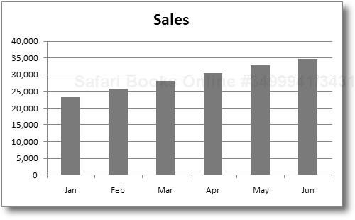
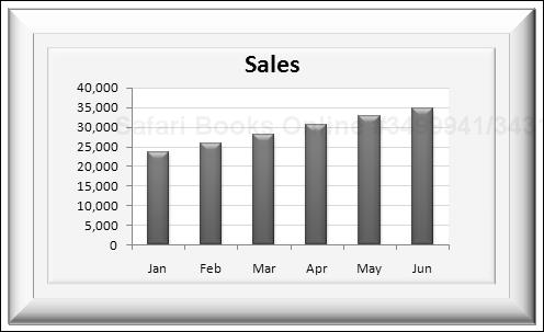
End SubFigure 18-6 shows a chart before and after executing the FormatChart macro.
Note
Keep in mind that, after executing this macro, the actual appearance of the chart depends on the document theme that’s in effect.
CD-ROM
A workbook with this example is available on the companion CD-ROM as a file named format a chart.xlsm.
The
ChartTypeproperty is straightforward enough, and VBA provides constants for the various chart types.The
ApplyLayoutmethod uses a number to represent the layout, and the numbers vary with the chart type. These numbers appear as ToolTips when you hover the mouse over an icon in the Chart Tools Design Chart Layouts gallery. The ApplyLayoutmethod can also specify a chart type as its second argument. Therefore, I could have eliminated the statement that changes theChartTypeproperty and used this statement:.ApplyLayout 10, xlColumnClustered
The
ChartStyleproperty also uses a nondescriptive number (from 1 to 48) for its argument. These numbers appear as ToolTips when you hover the mouse over an icon in the Chart Tools Design Chart Styles gallery.The
SetElementmethod controls the visibility of just about every aspect of the chart. It accepts more than 120 descriptive constants. For example, the constantmsoElementChartTitleNonehides the chart’s title.The
ClearToMatchStylemethod clears all user-applied formatting in the chart. This method is usually used in conjunction with theChartStyleproperty to ensure that the applied style does not contain any formatting that’s not part of the style.
As I noted earlier, the macro recorder in Excel 2007 ignores many formatting commands when working with a chart. This deficiency is especially irksome if you’re trying to figure out how to apply some of the new formatting options such as shadows, beveling, and gradient fills.
In this section, I provide some examples of chart formatting. I certainly don’t cover all of the options, but it should be sufficient to help you get started so you can explore these features on your own. These examples assume an object variable named MyChart, created as follows:
Dim MyChart As Chart
Set MyChart = ActiveSheet.ChartObjects(1).Chart
If you apply these examples to your own charts, you need to make the necessary modifications so MyChart points to the correct Chart object.
Tip
To delete all user-applied (or VBA-applied) formatting from a chart, use the ClearToMatchStyle method of the Chart object. For example:
MyChart.ClearToMatchStyle
One of the most interesting formatting effects in Excel 2007 is shadows. A shadow can give a chart a three-dimensional look and make it appear as if it’s floating above your worksheet.
The following statement adds a default shadow to the chart area of the chart:
MyChart.ChartArea.Format.Shadow.Visible = msoTrue
In this statement, the Format property returns a ChartFormat object, and the Shadow property returns a ShadowFormat object. Therefore, this statement sets the Visible property of the ShadowFormat object, which is contained in the ChartFormat object, which is contained in the ChartArea object, which is contained in the Chart object.
Not surprisingly, the ShadowFormat object has some properties that determine the appearance of the shadow. Here’s an example of setting five properties of the ShadowFormat object, contained in a ChartArea object, and Figure 18-7 shows the effect:
With MyChart.ChartArea.Format.Shadow
    .Visible = msoTrue
    .Blur = 10
    .Transparency = 0.4
    .OffsetX = 6
    .OffsetY = 6
End With
The example that follows adds a subtle shadow to the plot area of the chart:
With MyChart.PlotArea.Format.Shadow
    .Visible = msoTrue
    .Blur = 3
    .Transparency = 0.6
    .OffsetX = 1
    .OffsetY = 1
End With
If an object has no fill, applying a shadow to the object has no visible effect. For example, a chart’s title usually has a transparent background (no fill color). To apply a shadow to an object that has no fill, you must first add a fill color. This example applies a white fill to the chart’s title and then adds a shadow:
MyChart.ChartTitle.Format.Fill.BackColor.RGB = RGB(255, 255, 255)
With MyChart.ChartTitle.Format.Shadow
    .Visible = msoTrue
    .Blur = 3
    .Transparency = 0.3
    .OffsetX = 2
    .OffsetY = 2
End With
Adding a bevel to a chart can provide an interesting 3-D effect. Figure 18-8 shows a chart with a beveled chart area. To add the bevel, I used the ThreeD property to access the ThreeDFormat object. The code that added the bevel effect is:
With MyChart.ChartArea.Format.ThreeD
    .Visible = msoTrue
    .BevelTopType = msoBevelDivot
    .BevelTopDepth = 12
    .BevelTopInset = 32
End WithThe examples so far in this chapter have used the SourceData property to specify the complete data range for a chart. In many cases, you’ll want to adjust the data used by a particular chart series. To do so, access the Values property of the Series object. The Series object also has an XValues property that stores the category axis values.
Note
The Values property corresponds to the third argument of the SERIES formula, and the XValues property corresponds to the second argument of the SERIES formula. See the sidebar, “Understanding a Chart’s SERIES Formula.”
Figure 18-9 shows a chart that’s based on the data in the row of the active cell. When the user moves the cell pointer, the chart is updated automatically.
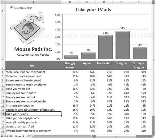
This example uses an event handler for the Sheet1 object. The SelectionChange event occurs whenever the user changes the selection by moving the cell pointer. The event handler procedure for this event (which is located in the code module for the Sheet1 object) is as follows:
Private Sub Worksheet_SelectionChange(ByVal Target _
 As Excel.Range)
    If CheckBox1 Then Call UpdateChart
End Sub
In other words, every time the user moves the cell cursor, the Worksheet_SelectionChange procedure is executed. If the Auto Update Chart check box (an ActiveX control on the sheet) is checked, this procedure calls the UpdateChart procedure, which follows:
Sub UpdateChart()
    Dim ChtObj As ChartObject
    Dim UserRow As Long
    Set ChtObj = ActiveSheet.ChartObjects(1)
    UserRow = ActiveCell.Row
    If UserRow < 4 Or IsEmpty(Cells(UserRow, 1)) Then
        ChtObj.Visible = False
    Else
        ChtObj.Chart.SeriesCollection(1).Values = _
           Range(Cells(UserRow, 2), Cells(UserRow, 6))
        ChtObj.Chart.ChartTitle.Text = Cells(UserRow, 1).Text
        ChtObj.Visible = True
    End If
End Sub
The UserRow variable contains the row number of the active cell. The If statement checks that the active cell is in a row that contains data. (The data starts in row 4.) If the cell cursor is in a row that doesn’t have data, the ChartObject object is hidden, and the underlying text is visible (“Cannot display chart”). Otherwise, the code sets the Values property for the Series object to the range in columns 2–6 of the active row. It also sets the ChartTitle object to correspond to the text in column A.
The previous example demonstrated how to use the Values property of a Series object to specify the data used by a chart series. This section discusses using VBA macros to identify the ranges used by a series in a chart. For example, you might want to increase the size of each series by adding a new cell to the range.
Following is a description of three properties that are relevant to this task:
Formulaproperty: Returns or sets the SERIES formula for theSeries. When you select a series in a chart, its SERIES formula is displayed in the formula bar. TheFormulaproperty returns this formula as a string.Valuesproperty: Returns or sets a collection of all the values in the series. This can be a range on a worksheet or an array of constant values, but not a combination of both.XValuesproperty: Returns or sets an array of X values for a chart series. TheXValuesproperty can be set to a range on a worksheet or to an array of values, but it can’t be a combination of both. TheXValuesproperty can also be empty.
If you create a VBA macro that needs to determine the data range used by a particular chart series, you might think that the Values property of the Series object is just the ticket. Similarly, the XValues property seems to be the way to get the range that contains the X values (or category labels). In theory, that certainly seems correct. But, in practice, it doesn’t work.
When you set the Values property for a Series object, you can specify a Range object or an array. But when you read this property, an array is always returned. Unfortunately, the object model provides no way to get a Range object used by a Series object.
One possible solution is to write code to parse the SERIES formula and extract the range addresses. This sounds simple, but it’s actually a difficult task because a SERIES formula can be very complex. Following are a few examples of valid SERIES formulas.
=SERIES(Sheet1!$B$1,Sheet1!$A$2:$A$4,Sheet1!$B$2:$B$4,1)
=SERIES(,,Sheet1!$B$2:$B$4,1)
=SERIES(,Sheet1!$A$2:$A$4,Sheet1!$B$2:$B$4,1)
=SERIES("Sales Summary",,Sheet1!$B$2:$B$4,1)
=SERIES(,{"Jan","Feb","Mar"},Sheet1!$B$2:$B$4,1)
=SERIES(,(Sheet1!$A$2,Sheet1!$A$4),(Sheet1!$B$2,Sheet1!$B$4),1)
=SERIES(Sheet1!$B$1,Sheet1!$A$2:$A$4,Sheet1!$B$2:$B$4,1,Sheet1!$C$2:$C$4)
As you can see, a SERIES formula can have missing arguments, use arrays, and even use noncontiguous range addresses. And, to confuse the issue even more, a bubble chart has an additional argument (for example, the last SERIES formula in the preceding list). Attempting to parse the arguments is certainly not a trivial programming task.
I spent a lot of time working on this problem, and I eventually arrived at a solution. The trick involves evaluating the SERIES formula by using a dummy function. This function accepts the same arguments as a SERIES formula and returns a 2 x 5 element array that contains all the information in the SERIES formula.
I simplified the solution by creating four custom VBA functions, each of which accepts one argument (a reference to a Series object) and returns a two-element array. These functions are the following:
SERIESNAME_FROM_SERIES:The first array element contains a string that describes the data type of the first SERIES argument (Range, Empty, orString). The second array element contains a range address, an empty string, or a string.XVALUES_FROM_SERIES:The first array element contains a string that describes the data type of the second SERIES argument (Range, Array, Empty, orString). The second array element contains a range address, an array, an empty string, or a string.VALUES_FROM_SERIES:The first array element contains a string that describes the data type of the third SERIES argument (RangeorArray). The second array element contains a range address or an array.BUBBLESIZE_FROM_SERIES:The first array element contains a string that describes the data type of the fifth SERIES argument (Range, Array, orEmpty). The second array element contains a range address, an array, or an empty string. This function is relevant only for bubble charts.
Note that I did not create a function to get the fourth SERIES argument (plot order). This argument can be obtained directly by using the PlotOrder property of the Series object.
CD-ROM
The VBA code for these functions is too lengthy to be listed here, but the code is available on the companion CD-ROM in a file named get series ranges.xlsm. These functions are documented in such a way that they can be easily adapted to other situations.
The following example demonstrates the VALUES_FROM_SERIES function. It displays the address of the values range for the first series in the active chart.
Sub ShowValueRange()
    Dim Ser As Series
    Dim x As Variant
    Set Ser = ActiveChart.SeriesCollection(1)
    x = VALUES_FROM_SERIES(Ser)
    If x(1) = "Range" Then
        MsgBox Range(x(2)).Address
    End If
End Sub
The variable x is defined as a variant and will hold the two-element array that’s returned by the VALUES_FROM_SERIES function. The first element of the x array contains a string that describes the data type. If the string is Range, the message box displays the address of the range contained in the second element of the x array.
Figure 18-10 shows another example. The chart has three data series. Buttons on the sheet execute macros that expand and contract each of the data ranges.
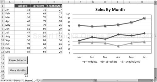
Figure 18-10. This workbook demonstrates how to expand and contract the chart series by using VBA macros.
The ContractAllSeries procedure is listed below. This procedure loops through the SeriesCollection collection and uses the XVALUE_FROM_SERIES and the VALUES_FROM_SERIES functions to retrieve the current ranges. It then uses the Resize method to decrease the size of the ranges.
Sub ContractAllSeries()
    Dim s As Series
    Dim Result As Variant
    Dim DRange As Range
    For Each s In ActiveSheet.ChartObjects(1).Chart.SeriesCollection
        Result = XVALUES_FROM_SERIES(s)
        If Result(1) = "Range" Then
            Set DRange = Range(Result(2))
            If DRange.Rows.Count > 1 Then
                Set DRange = DRange.Resize(DRange.Rows.Count - 1)
                s.XValues = DRange
            End If
        End If
        Result = VALUES_FROM_SERIES(s)
        If Result(1) = "Range" Then
            Set DRange = Range(Result(2))
            If DRange.Rows.Count > 1 Then
                Set DRange = DRange.Resize(DRange.Rows.Count - 1)
                s.Values = DRange
            End If
        End If
    Next s
End Sub
The ExpandAllSeries procedure is very similar. When executed, it expands each range by one cell.
One of the most frequent complaints about Excel’s charting is its inflexible data labeling feature. For example, consider the XY chart in Figure 18-11. It would be useful to display the associated name for each data point. However, you can search all day, and you’ll never find the Excel command that lets you do this automatically. Such a command doesn’t exist. Data labels are limited to the data values only — unless you want to edit each data label manually and replace it with text (or a formula) of your choice.
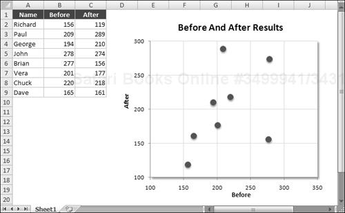
The DataLabelsFromRange procedure works with the first chart on the active sheet. It prompts the user for a range and then loops through the Points collection and changes the Text property to the values found in the range.
Sub DataLabelsFromRange()
    Dim DLRange As Range
    Dim Cht As Chart
    Dim i As Integer, Pts As Integer

'   Specify chart
    Set Cht = ActiveSheet.ChartObjects(1).Chart

'   Prompt for a range
    On Error Resume Next
    Set DLRange = Application.InputBox _
      (prompt:="Range for data labels?", Type:=8)
    If DLRange Is Nothing Then Exit Sub
    On Error GoTo 0

'   Add data labels
    Cht.SeriesCollection(1).ApplyDataLabels _
      Type:=xlDataLabelsShowValue, _
      AutoText:=True, _
      LegendKey:=False

'   Loop through the Points, and set the data labels
    Pts = Cht.SeriesCollection(1).Points.Count
    For i = 1 To Pts
        Cht.SeriesCollection(1). _
          Points(i).DataLabel.Text = DLRange(i)
    Next i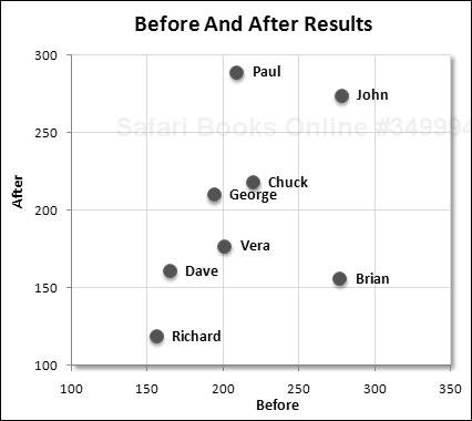
End SubFigure 18-12 shows the chart after running the DataLabelsFromRange procedure and specifying A2:A9 as the data range.
A data label in a chart can also consist of a link to a cell. To modify the DataLabelsFromRange procedure so it creates cell links, just change the statement within the For-Next loop to:
        Cht.SeriesCollection(1).Points(i).DataLabel.Text = _
          "=" & "'" & DLRange.Parent.Name & "'!" & _
DLRange(i).Address(ReferenceStyle:=xlR1C1)In Chapter 15, I describe a way to display a chart in a UserForm. The technique saves the chart as a GIF file and then loads the GIF file into an Image control on the UserForm.
The example in this section uses that same technique but adds a new twist: The chart is created on the fly and uses the data in the row of the active cell. Figure 18-13 shows an example.
The UserForm for this example is very simple. It contains an Image control and a CommandButton (Close). The worksheet that contains the data has a button that executes the following procedure:
Sub ShowChart()
    Dim UserRow As Long
    UserRow = ActiveCell.Row
    If UserRow < 2 Or IsEmpty(Cells(UserRow, 1)) Then
        MsgBox "Move the cell pointer to a row that contains data."
        Exit Sub
    End If
    CreateChart (UserRow)
    UserForm1.Show
End Sub
Because the chart is based on the data in the row of the active cell, the procedure warns the user if the cell pointer is in an invalid row. If the active cell is appropriate, ShowChart calls the CreateChart procedure to create the chart and then displays the UserForm.
The CreateChart procedure accepts one argument, which represents the row of the active cell. This procedure originated from a macro recording that I cleaned up to make more general.
Sub CreateChart(r)
    Dim TempChart As Chart
    Dim CatTitles As Range
    Dim SrcRange As Range, SourceData As Range
    Dim FName As String

    Set CatTitles = ActiveSheet.Range("A2:F2")
    Set SrcRange = ActiveSheet.Range(Cells(r, 1), Cells(r, 6))
    Set SourceData = Union(CatTitles, SrcRange)

'   Add a chart
    Application.ScreenUpdating = False
    Set TempChart = ActiveSheet.Shapes.AddChart.Chart
    TempChart.SetSourceData Source:=SourceData

'   Fix it up
    With TempChart
        .ChartType = xlColumnClustered
        .SetSourceData Source:=SourceData, PlotBy:=xlRows
        .HasLegend = False
        .PlotArea.Interior.ColorIndex = xlNone
        .Axes(xlValue).MajorGridlines.Delete
        .ApplyDataLabels Type:=xlDataLabelsShowValue, LegendKey:=False
        .Axes(xlValue).MaximumScale = 0.6
        .ChartArea.Format.Line.Visible = False
    End With

'   Adjust the ChartObject's size size
    With ActiveSheet.ChartObjects(1)
        .Width = 300
        .Height = 200
    End With

'   Save chart as GIF
    FName = ThisWorkbook.Path & Application.PathSeparator & "temp.gif"
    TempChart.Export Filename:=FName, filterName:="GIF"
    ActiveSheet.ChartObjects(1).Delete
    Application.ScreenUpdating = True
End Sub
When the CreateChart procedure ends, the worksheet contains a ChartObject with a chart of the data in the row of the active cell. However, the ChartObject is not visible because ScreenUpdating is turned off. The chart is exported and deleted, and ScreenUpdating is turned back on.
The final instruction of the ShowChart procedure loads the UserForm. Following is the UserForm_Initialize procedure. This procedure simply loads the GIF file into the Image control.
Private Sub UserForm_Initialize()
    Dim FName As String
    FName = ThisWorkbook.Path & Application.PathSeparator & "temp.gif"
    UserForm1.Image1.Picture = LoadPicture(FName)
End SubExcel supports several events associated with charts. For example, when a chart is activated, it generates an Activate event. The Calculate event occurs after the chart receives new or changed data. You can, of course, write VBA code that gets executed when a particular event occurs.
Table 18-1 lists all the chart events.
Table 18.1. Events Recognized by the Chart Object
Event | Action That Triggers the Event |
|---|---|
| A chart sheet or embedded chart is activated. |
| An embedded chart is double-clicked. This event occurs before the default double-click action. |
| An embedded chart is right-clicked. The event occurs before the default right-click action. |
| New or changed data is plotted on a chart. |
| A chart is deactivated. |
| A range of cells is dragged over a chart. |
| A range of cells is dragged and dropped onto a chart. |
| A mouse button is pressed while the pointer is over a chart. |
| The position of the mouse pointer changes over a chart. |
| A mouse button is released while the pointer is over a chart. |
| A chart is resized. |
| A chart element is selected. |
| The value of a chart data point is changed. |
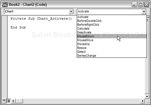
To program an event handler for an event taking place on a chart sheet, your VBA code must reside in the code module for the Chart object. To activate this code module, double-click the Chart item in the Project window. Then, in the code module, select Chart from the Object drop-down list on the left and select the event from the Procedure drop-down list on the right (see Figure 18-14).
Note
Because an embedded chart doesn’t have its own code module, the procedure that I describe in this section works only for chart sheets. You can also handle events for embedded charts, but you must do some initial setup work that involves creating a class module. This procedure is described later in “Enabling events for an embedded chart.”
The example that follows simply displays a message when the user activates a chart sheet, deactivates a chart sheet, or selects any element on the chart. I created a workbook with a chart sheet; then I wrote three event handler procedures named as follows:
Chart_Activate: Executed when the chart sheet is activated.Chart_Deactivate: Executed when the chart sheet is deactivated.Chart_Select: Executed when an element on the chart sheet is selected.
The Chart_Activate procedure follows:
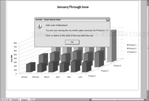
Private Sub Chart_Activate()
    Dim msg As String
    msg = "Hello " & Application.UserName & vbCrLf & vbCrLf
    msg = msg & "You are now viewing the six-month sales "
    msg = msg & "summary for Products 1-3." & vbCrLf & vbCrLf
    msg = msg & _
     "Click an item in the chart to find out what it is."
    MsgBox msg, vbInformation, ActiveWorkbook.Name
End Sub
This procedure simply displays a message whenever the chart is activated. See Figure 18-15.
The Chart_Deactivate procedure that follows also displays a message, but only when the chart sheet is deactivated:
Private Sub Chart_Deactivate()
    Dim msg As String
    msg = "Thanks for viewing the chart."
    MsgBox msg, , ActiveWorkbook.Name
End Sub
The Chart_Select procedure that follows is executed whenever an item on the chart is selected:
Private Sub Chart_Select(ByVal ElementID As Long, _
  ByVal Arg1 As Long, ByVal Arg2 As Long)
    Dim Id As String
    Select Case ElementID
        Case xlAxis: Id = "Axis"
        Case xlAxisTitle: Id = "AxisTitle"
        Case xlChartArea: Id = "ChartArea"
        Case xlChartTitle: Id = "ChartTitle"
        Case xlCorners: Id = "Corners"
        Case xlDataLabel: Id = "DataLabel"
        Case xlDataTable: Id = "DataTable"
        Case xlDownBars: Id = "DownBars"
        Case xlDropLines: Id = "DropLines"
        Case xlErrorBars: Id = "ErrorBars"
        Case xlFloor: Id = "Floor"
        Case xlHiLoLines: Id = "HiLoLines"
        Case xlLegend: Id = "Legend"
        Case xlLegendEntry: Id = "LegendEntry"
        Case xlLegendKey: Id = "LegendKey"
        Case xlMajorGridlines: Id = "MajorGridlines"
        Case xlMinorGridlines: Id = "MinorGridlines"
        Case xlNothing: Id = "Nothing"
        Case xlPlotArea: Id = "PlotArea"
        Case xlRadarAxisLabels: Id = "RadarAxisLabels"
        Case xlSeries: Id = "Series"
        Case xlSeriesLines: Id = "SeriesLines"
        Case xlShape: Id = "Shape"
        Case xlTrendline: Id = "Trendline"
        Case xlUpBars: Id = "UpBars"
        Case xlWalls: Id = "Walls"
        Case xlXErrorBars: Id = "XErrorBars"
        Case xlYErrorBars: Id = "YErrorBars"
        Case Else:: Id = "Some unknown thing"
    End Select
    MsgBox "Selection type: " & Id
End Sub
This procedure displays a message box that contains a description of the selected item. When the Select event occurs, the ElementID argument contains an integer that corresponds to what was selected. The Arg1 and Arg2 arguments provide additional information about the selected item (see the Help system for details). The Select Case structure converts the built-in constants to descriptive strings.
As I note in the preceding section, Chart events are automatically enabled for chart sheets but not for charts embedded in a worksheet. To use events with an embedded chart, you need to perform the following steps.
In the Visual Basic Editor (VBE) window, select your project in the Project window and choose Insert ![]() Class Module. This will add a new (empty) class module to your project. Then use the Properties window to give the class module a more descriptive name (such as
Class Module. This will add a new (empty) class module to your project. Then use the Properties window to give the class module a more descriptive name (such as clsChart). Renaming the class module isn’t necessary, but it’s a good practice.
The next step is to declare a Public variable that will represent the chart. The variable should be of type Chart, and it must be declared in the class module by using the WithEvents keyword. If you omit the WithEvents keyword, the object will not respond to events. Following is an example of such a declaration:
Public WithEvents clsChart As Chart
Before your event handler procedures will run, you must connect the declared object in the class module with your embedded chart. You do this by declaring an object of type clsChart (or whatever your class module is named). This should be a module-level object variable, declared in a regular VBA module (not in the class module). Here’s an example:
Dim MyChart As New clsChart
Then you must write code to associate the clsChart object with a particular chart. The statement below accomplishes this.
Set MyChart.clsChart = ActiveSheet.ChartObjects(1).Chart
After the preceding statement is executed, the clsChart object in the class module points to the first embedded chart on the active sheet. Consequently, the event handler procedures in the class module will execute when the events occur.
In this section, I describe how to write event handler procedures in the class module. Recall that the class module must contain a declaration such as the following:
Public WithEvents clsChart As Chart
After this new object has been declared with the WithEvents keyword, it appears in the Object drop-down list box in the class module. When you select the new object in the Object box, the valid events for that object are listed in the Procedure drop-down box on the right.
The following example is a simple event handler procedure that is executed when the embedded chart is activated. This procedure simply pops up a message box that displays the name of the Chart object’s parent (which is a ChartObject object).
Private Sub clsChart_Activate()
    MsgBox clsChart.Parent.Name & " was activated!"
End SubThe example in this section provides a practical demonstration of the information presented in the previous section. The example shown in Figure 18-16 consists of an embedded chart that functions as a clickable image map. When chart events are enabled, clicking one of the chart columns activates a worksheet that shows detailed data for the region.
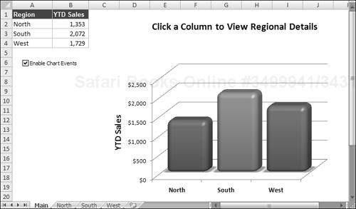
The workbook is set up with four worksheets. The sheet named Main contains the embedded chart. The other sheets are named North, South, and West. Formulas in B1:B4 sum the data in the respective sheets, and this summary data is plotted in the chart. Clicking a column in the chart triggers an event, and the event handler procedure activates the appropriate sheet so that the user can view the details for the desired region.
The workbook contains both a class module named EmbChartClass and a normal VBA module named Module1. For demonstration purposes, the Main worksheet also contains a check box control (for the Forms group). Clicking the check box executes the CheckBox1_Click procedure, which turns event monitoring on and off:
In addition, each of the other worksheets contains a button that executes the ReturntoMain macro that reactivates the Main sheet.
The complete listing of Module1 follows:
Dim SummaryChart As New EmbChartClass


Sub CheckBox1_Click()
    If Worksheets("Main").CheckBoxes("Check Box 1") = xlOn Then
        'Enable chart events
        Range("A1").Select
        Set SummaryChart.myChartClass = _
          Worksheets(1).ChartObjects(1).Chart
    Else
         'Disable chart events
         Set SummaryChart.myChartClass = Nothing
         Range("A1").Select
     End If
End Sub


Sub ReturnToMain()
'   Called by worksheet button
    Sheets("Main").Activate
End Sub
The first instruction declares a new object variable SummaryChart to be of type EmbChartClass — which, as you recall, is the name of the class module. When the user clicks the Enable Chart Events button, the embedded chart is assigned to the SummaryChart object, which, in effect, enables the events for the chart. The contents of the class module for EmbChartClass follow:
Public WithEvents myChartClass As Chart

Private Sub myChartClass_MouseDown(ByVal Button As Long, _
  ByVal Shift As Long, ByVal X As Long, ByVal Y As Long)

    Dim IDnum As Long
    Dim a As Long, b As Long

'   The next statement returns values for
'   IDnum, a, and b
    myChartClass.GetChartElement X, Y, IDnum, a, b

'   Was a series clicked?
    If IDnum = xlSeries Then
        Select Case b
            Case 1
                Sheets("North").Activate
            Case 2
                Sheets("South").Activate
            Case 3
                Sheets("West").Activate
        End Select
    End If
    Range("A1").Select
End Sub
Clicking the chart generates a MouseDown event, which executes the myChartClass_MouseDown procedure. This procedure uses the GetChartElement method to determine what element of the chart was clicked. The GetChartElement method returns information about the chart element at specified X and Y coordinates (information that is available via the arguments for the myChartClass_MouseDown procedure).
This section contains a few charting tricks that I’ve discovered over the years. Some of these techniques might be useful in your applications, and others are simply for fun. At the very least, studying them could give you some new insights into the object model for charts.
When an embedded chart is selected, you can print the chart by choosing Office ![]() Print. The embedded chart will be printed on a full page by itself (just as if it were on a chart sheet), yet it will remain an embedded chart.
Print. The embedded chart will be printed on a full page by itself (just as if it were on a chart sheet), yet it will remain an embedded chart.
The following macro prints all embedded charts on the active sheet, and each chart is printed on a full page:
Sub PrintEmbeddedCharts()
    Dim ChtObj As ChartObject
    For Each ChtObj In ActiveSheet.ChartObjects
        ChtObj.Chart.Print
    Next ChtObj
End SubThe procedure listed below serves as a quick-and-dirty slide show. It displays each embedded chart on the active worksheet in Excel’s Print Preview mode. Press Esc or Enter to view the next chart.
Sub ChartSlideShow()
    Dim ChtObj As ChartObject
    Application.DisplayFullScreen = True
    For Each ChtObj In ActiveSheet.ChartObjects
        Application.ScreenUpdating = False
        ChtObj.Chart.PrintPreview
    Next ChtObj
    Application.DisplayFullScreen = False
End Sub
The version below is similar, but it displays all chart sheets in the active workbook.
Sub ChartSlideShow2()
    Dim Cht As Chart
    Application.DisplayFullScreen = True
    For Each Cht In ActiveWorkbook.Charts
        Application.ScreenUpdating = False
        Cht.PrintPreview
    Next Cht
    Application.DisplayFullScreen = False
End SubBy default, Excel charts don’t display data contained in hidden rows or columns. The workbook shown in Figure 18-17 demonstrates an easy way to allow the user to hide and unhide particular chart series. The chart has seven data series, and it’s a confusing mess. A few simple macros allow the user to use the ActiveX CheckBox to indicate which series they’d like to view. Figure 18-18 shows the chart with only three series displayed.
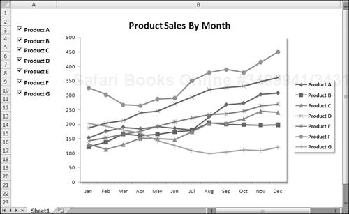
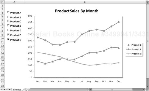
Each series is in a named range: Product_A, Product_B, and so on. Each check box has its own Click event procedure. For example, the procedure that’s executed when the user clicks the Product A check box is:
Private Sub CheckBox1_Click()
    ActiveSheet.Range("Product_A").EntireColumn.Hidden = _
      Not ActiveSheet.OLEObjects(1).Object.Value
End SubNormally, an Excel chart uses data stored in a range. Change the data in the range, and the chart is updated automatically. In some cases, you might want to unlink the chart from its data ranges and produce a dead chart (a chart that never changes). For example, if you plot data generated by various what-if scenarios, you might want to save a chart that represents some baseline so that you can compare it with other scenarios.
The three ways to create such a chart are:
Copy the chart as a picture. Activate the chart and choose Home
Clipboard Paste As Picture Copy Picture (accept the defaults in the Copy Picture dialog box). Then click a cell and choose Home Clipboard Paste. The result will be a picture of the copied chart.Convert the range references to arrays. Click a chart series and then click the formula bar. Press F9 to convert the ranges to an array. Repeat this for each series in the chart.
Use VBA to assign an array rather than a range to the
XValuesorValuesproperties of theSeriesobject.
The procedure below creates a chart (see Figure 18-19) by using arrays. The data is not stored in the worksheet. As you can see, the SERIES formula contains arrays and not range references.
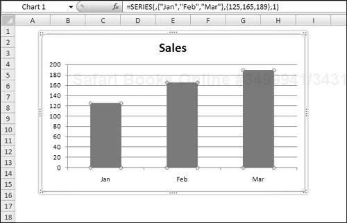
Sub CreateUnlinkedChart()
    Dim MyChart As Chart
    Set MyChart = ActiveSheet.Shapes.AddChart.Chart
    With MyChart
        .SeriesCollection.NewSeries
        .SeriesCollection(1).Name = "Sales"
        .SeriesCollection(1).XValues = Array("Jan", "Feb", "Mar")
        .SeriesCollection(1).Values = Array(125, 165, 189)
        .ChartType = xlColumnClustered
        .SetElement msoElementLegendNone
    End With
End Sub
Because Excel imposes a limit to the length of a chart’s SERIES formula, this technique works only for relatively small data sets.
The procedure below creates a picture of the active chart (the original chart is not deleted). It works only with embedded charts.
Sub ConvertChartToPicture()
    Dim Cht As Chart
    If ActiveChart Is Nothing Then Exit Sub
    If TypeName(ActiveSheet) = "Chart" Then Exit Sub
    Set Cht = ActiveChart
    Cht.CopyPicture Appearance:=xlPrinter, _
      Size:=xlScreen, Format:=xlPicture
    ActiveWindow.RangeSelection.Select
    ActiveSheet.Paste
End Sub
When a chart is converted to a picture, you can create some interesting displays by using the Picture Tools ![]() Format
Format ![]() Picture Styles commands (see Figure 18-20 for an example).
Picture Styles commands (see Figure 18-20 for an example).
A common charting question deals with modifying chart tips. A chart tip is the small message that appears next to the mouse pointer when you move the mouse over an activated chart. The chart tip displays the chart element name and (for series) the value of the data point. The Chart object model does not expose these chart tips, so there is no way to modify them.
Tip
To turn chart tips on or off, choose Office ![]() Excel Options to display the Excel Options dialog box. Click the Advanced tab and locate the Display section. The options are labeled Show Chart Element Names on Hover and Show Data Point Values on Hover.
Excel Options to display the Excel Options dialog box. Click the Advanced tab and locate the Display section. The options are labeled Show Chart Element Names on Hover and Show Data Point Values on Hover.
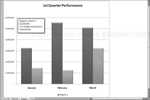
This section describes an alternative to chart tips. Figure 18-21 shows a column chart that uses the MouseOver event. When the mouse pointer is positioned over a column, the text box (a Shape object) in the upper-left displays information about the data point. The information is stored in a range and can consist of anything you like.
The event procedure that follows is located in the code module for the Chart sheet that contains the chart.
Private Sub Chart_MouseMove(ByVal Button As Long, ByVal Shift As Long, _
  ByVal X As Long, ByVal Y As Long)
    Dim ElementId As Long
    Dim arg1 As Long, arg2 As Long
    Dim NewText As String
    On Error Resume Next


    ActiveChart.GetChartElement X, Y, ElementId, arg1, arg2
    If ElementId = xlSeries Then
        NewText = Sheets("Sheet1").Range("Comments").Offset(arg2, arg1)
    Else
        NewText = ""
    End If
    ActiveChart.Shapes(1).TextFrame.Characters.Text = NewText
End Sub
This procedure monitors all mouse movements on the Chart sheet. The mouse coordinates are contained in the X and Y variables, which are passed to the procedure. The Button and Shift arguments are not used in this procedure.
As in the previous example, the key component in this procedure is the GetChartElement method. If ElementId is xlSeries, the mouse pointer is over a series. The NewText variable then is assigned the text in a particular cell. This text contains descriptive information about the data point (see Figure 18-22). If the mouse pointer is not over a series, the text box is empty. Otherwise, it displays the contents of NewText.
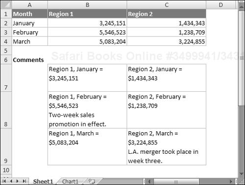
Figure 18-22. Range B7:C9 contains data point information that’s displayed in the text box on the chart.
The example workbook also contains a Workbook_Open procedure that turns off the normal ChartTip display, and a Workbook_BeforeClose procedure that turns the settings back on. The Workbook_Open procedure is:
Private Sub Workbook_Open()
    Application.ShowChartTipNames = False
    Application.ShowChartTipValues = False
End SubMost people don’t realize it, but Excel is capable of performing simple animations. For example, you can animate shapes and charts. Consider the XY chart shown in Figure 18-23.
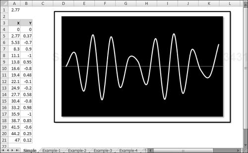
The X values (column A) depend on the value in cell A1. The value in each row is the previous row’s value plus the value in A1. Column B contains formulas that calculate the SIN of the corresponding value in column A. The following simple procedure produces an interesting animation. It uses a loop to continually change the value in cell A1, which causes the values in the X and Y ranges to change. The effect is an animated chart.
Sub AnimateChart()
    Dim i As Long
    Range("A1") = 0
    For i = 1 To 150
        DoEvents
        Range("A1") = Range("A1") + 0.035
        DoEvents
    Next i
    Range("A1") = 0
End Sub
The key to chart animation is to use one or more DoEvents statements. This statement passes control to the operating system, which (apparently) causes the chart to be updated when control is passed back to Excel. Without the DoEvents statements the chart’s changes would not be displayed inside of the loop.
CD-ROM
The companion CD-ROM contains a workbook that includes this animated chart, plus several other animation examples. The filename is animated charts.xlsm.
Figure 18-24 shows a chart with 5,218 data points in each series. The workbook contains six names:
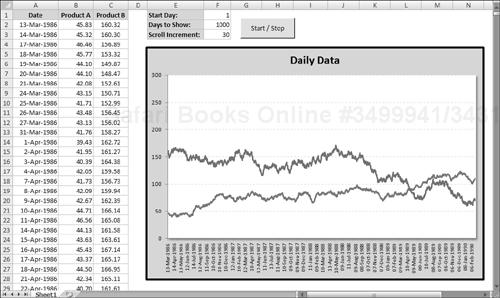
StartDay: A name for cell F1.NumDays: A name for cell F2.Increment: A name for cell F3 (used for automatic scrolling).Date: A named formula:=OFFSET(Sheet1!$A$1,StartDay,0,NumDays,1)ProdA: A named formula:=OFFSET(Sheet1!$B$1,StartDay,0,NumDays,1)ProdB: A named formula:=OFFSET(Sheet1!$C$1,StartDay,0,NumDays,1)
Each of the SERIES formulas in the chart uses names for the category values and the data. The SERIES formula for the Product A series is as follows (I deleted the sheet name and workbook name for clarity):
=SERIES($B$1,Date,ProdA,1)
The SERIES formula for the Product B series is:
=SERIES($C$1,Date,ProdB,2)
Using these names enables the user to specify a value for StartDay and NumDays, and the chart will display a subset of the data. Figure 18-25 shows the chart when StartRow is 700 and NumDays is 365. In other words, the chart display begins with the 700th row, and shows 365 days of data.
CD-ROM
The companion CD-ROM contains a workbook that includes this animated chart, plus several other animation examples. The filename is scrolling chart.xlsm.
A relatively simple macro makes the chart scroll. The button in the worksheet executes the following macro that scrolls (or stops scrolling) the chart:
Public AnimationInProgress As Boolean

Sub AnimateChart()
    Dim StartVal As Long, r As Long
    If AnimationInProgress Then
        AnimationInProgress = False
        End
    End If
    AnimationInProgress = True
    StartVal = Range("StartDay")
    For r = StartVal To 5219 - Range("NumDays") _
       Step Range("Increment")
        Range("StartDay") = r
        DoEvents
    Next r
    AnimationInProgress = False
End Sub
The AnimateChart procedure uses a public variable (AnimationInProgress) to keep track of the animation status. The animation results from a loop that changes the value in the StartDay cell. Because the two chart series use this value, the chart is continually updated with a new starting value. The Scroll Increment setting determines how quickly the chart scrolls.
To stop the animation, I use an End statement rather than an Exit Sub statement. For some reason, Exit Sub doesn’t work reliably and may even crash Excel.
Even if you hated your high school trigonometry class, you’ll probably like the example in this section — which relies heavily on trigonometric functions. The workbook shown in Figure 18-26 contains an XY chart that displays a nearly infinite number of dazzling hypocycloid curves. A hypocycloid curve is the path formed by a point on a circle that rolls inside of another circle. This, as you might recall from your childhood, is the same technique used in Hasbro’s popular Spirograph toy.
CD-ROM
This workbook is available on the companion CD-ROM. The filename is hypocycloid - animate.xlsm.
The chart is an XY chart, with everything hidden except the data series. The X and Y data are generated by using formulas stored in columns A and B. The scroll bar controls at the top let you adjust the three parameters that determine the look of the chart. In addition, clicking the Random button generates random values for the three parameters.
The chart itself is interesting enough, but it gets really interesting when it’s animated. The animation occurs by changing the starting value for the series within a loop.
Figure 18-27 shows an XY chart formatted to look like a clock. It not only looks like a clock, but it also functions as a clock. I can’t think of a single reason why anyone would need to display a clock like this on a worksheet, but creating the workbook was challenging, and you might find it instructive.
Besides the clock chart, the workbook contains a text box that displays the time as a normal string, as shown in Figure 18-28. Normally this is hidden, but it can be displayed by deselecting the Analog Clock check box.
Figure 18-28. Displaying a digital clock in a worksheet is much easier but not as much fun to create.
As you explore this workbook from the CD-ROM, here are a few things to keep in mind:
The
ChartObjectis namedClockChart, and it covers up a range namedDigitalClock, which is used to display the time digitally.The two buttons on the worksheet are from the Forms toolbar, and each has a macro assigned (
StartClockandStopClock).The
CheckBoxcontrol (namedcbClockType) on the worksheet is from the Forms toolbar — not from the Control Toolbox toolbar. Clicking the object executes a procedure namedcbClockType_Click, which simply toggles theVisibleproperty of theChartObject. When it’s invisible, the digital clock is revealed.The chart is an XY chart with four
Seriesobjects. These series represent the hour hand, the minute hand, the second hand, and the 12 numbers.The
UpdateClockprocedure is executed when the Start Clock button is clicked. It also uses theOnTimemethod of theApplicationobject to set up a newOnTimeevent that will occur in one second. In other words, theUpdateClockprocedure is called every second.Unlike most charts, this one does not use any worksheet ranges for its data. Rather, the values are calculated in VBA and transferred directly to the
ValuesandXValuesproperties of the chart’sSeriesobject.
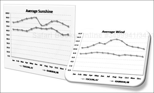
The final example, shown in Figure 18-29, is a useful application that allows the user to choose two U.S. cities (from a list of 284 cities) and view a chart that compares the cities by month in any of the following categories: average precipitation, average temperature, percent sunshine, and average wind speed.
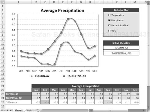
Figure 18-29. This application uses a variety of techniques to plot monthly climate data for two selected U.S. cities.
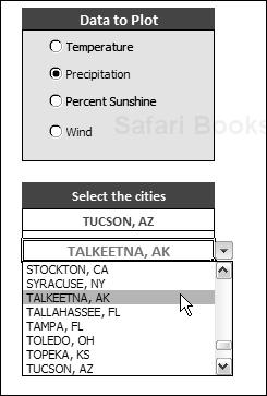
The most interesting aspect of this application is that it uses no VBA macros. The interactivity is a result of using Excel’s built-in features. The cities are chosen from a drop-down list, using Excel’s Data Validation feature, and the data option is selected using four Option Button controls, which are linked to a cell. The pieces are all connected using a few formulas.
This example demonstrates that it is indeed possible to create a user-friendly, interactive application without the assistance of macros.
The following sections describe the steps I took to set up this application.
I did a Web search and spent about five minutes locating the data I needed at the National Climatic Data Center. I copied the data from my browser window, pasted it to an Excel worksheet, and did a bit of clean-up work. The result was four 13-column tables of data, which I named PrecipitationData, TemperatureData, SunshineData, and WindData. To keep the interface as clean as possible, I put the data on a separate sheet (named Data).
I needed a way to allow the user to select the data to plot and decided to use OptionButton controls from the Forms toolbar. Because option buttons work as a group, the four OptionButton controls are all linked to the same cell: cell O3. Cell O3, therefore, contains a value from 1 to 4, depending on which option button is selected.
I needed a way to obtain the name of the data table based on the numeric value in cell O3. The solution was to write a formula (in cell O4) that uses Excel’s CHOOSE function:
=CHOOSE(O3,"TemperatureData","PrecipitationData","SunshineData","WindData")
Therefore, cell O4 displays the name of one of the four named data tables. I then did some cell formatting behind the OptionButton controls to make them more visible.
The next step is setting up the application: creating drop-down lists to enable the user to choose the cities to be compared in the chart. Excel’s Data Validation feature makes creating a drop-down list in a cell very easy. First, I did some cell merging to create a wider field. I merged cells J11:M11 for the first city list and gave them the name City1. I merged cells J13:M13 for the second city list and gave them the name City2.
To make working with the list of cities easier, I created a named range, CityList, which refers to the first column in the PrecipitationData table.
Following are the steps that I used to create the drop-down lists:
Select J11:M11. (Remember, these are merged cells.)
Choose Data
Data Validation to display Excel’s Data Validation dialog box.Select the Settings tab in the Data Validation dialog box.
In the Source field, enter =CityList.
Click OK.
Copy J11:M11 to J13:M13. This duplicates the Data Validation settings for the second city.
Figure 18-30 shows the result.
The key to this application is that the chart uses data in a specific range. The data in this range is retrieved from the appropriate data table by using formulas that utilize the VLOOKUP function. (See Figure 18-31.)
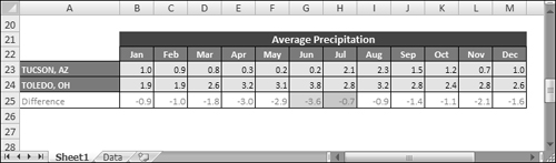
The formula in cell A23, which looks up data based on the contents of City1, is:
=VLOOKUP(City1,INDIRECT(DataTable),COLUMN(),FALSE)
The formula in cell A24 is the same except that it looks up data based on the contents of City2:
=VLOOKUP(City2,INDIRECT(DataTable),COLUMN(),FALSE)
After entering these formulas, I simply copied them across to the next 12 columns.
Note
You may be wondering about the use of the COLUMN function for the third argument of the VLOOKUP function. This function returns the column number of the cell that contains the formula. This is a convenient way to avoid hard-coding the column to be retrieved and allows the same formula to be used in each column.
Below the two city rows is another row of formulas that calculate the difference between the two cities for each month. I used Conditional Formatting to apply a different color background for the largest difference and the smallest difference.
The label above the month names is generated by a formula that refers to the DataTable cell and constructs a descriptive title: The formula is:
="Average " & LEFT(DataTable,LEN(DataTable)-4)
After completing the previous tasks, the final step — creating the actual chart — is a breeze. The line chart has two data series and uses the data in A22:M24. The chart title is linked to cell A21. The data in A22:M24 changes, of course, whenever an OptionButton control is selected or a new city is selected from either of the Data Validation lists.