
CHAPTER 16
Visualization and Graphical User Interfaces
GUI applications revolve around events, and F# provides a natural way to process events with functions. Graphical interfaces are often developed using visual editors, in particular to build GUIs by assembling controls. Applications, however, often need drawing capabilities for displaying and manipulating data, which requires custom programming to augment available controls. This chapter discusses how to develop graphical applications with F# and why the functional traits of the language suit the event-driven programming paradigm typical of GUIs.
In this chapter, you use the Windows Forms library. The Windows Presentation Foundation (WPF) is the presentation framework for the Windows, Silverlight, and Windows Phone platforms; it’s discussed later in this chapter. You may wonder why it’s useful to know about the old-fashioned Windows Forms toolkit. The answer is twofold: on one hand, the framework structure is shaped after a consolidated model that dominated graphical programming for decades and is still used in many other frameworks for programming GUIs, such as GTK#, a managed library for writing applications based on the GTK toolkit.
Writing “Hello, World!” in a Click
It’s traditional to start with a “Hello, World!” application, so let’s honor that and begin with a simple program that provides a button to display the magic phrase when clicked:
open System.Windows.Forms


let form = new Form(Text = "Hello World WinForms")

let button = new Button(Text = "Click Me!", Dock = DockStyle.Fill)


button.Click.Add(fun _ -> MessageBox.Show("Hello, World!", "Hey!") |> ignore)

form.Controls.Add(button)

form.Show()
Even in its simplicity, the application captures many traits typical of GUI applications. After opening the namespace associated with Windows Forms, you create the form form that contains the button button, set the form and button captions by assigning their Text properties, and tell the button that it should fill the entire form.
Most GUI programming is devoted to handling events through callbacks from the graphical interface. Events are described in Chapter 11. To display a message box containing the "Hello, World!" string, you have to configure the button so that when its Click event is fired, a function is called. In the example, you pass a function to the Add method for the button’s Click event, which adds an event handler to an event source. You then add the button to the form and call the form’s Show method to display it.
Note that this code should be executed using fsi.exe. It won’t run as a stand-alone application unless you add the following line at the end:Application.Run(form)
This line relates to the event loop of a GUI application, and it’s required to handle events such as button clicks. Moreover, if you execute the compiled program, notice that the window uses the classic Windows look and feel rather than the more fashionable look and feels featured by Windows versions since Windows XP. This can be easily addressed by adding the following call to the EnableVisualStyles static method, right after the open statement:Application.EnableVisualStyles()
If you use fsi.exe, both visual styles and the event loop are handled by F# Interactive.
Understanding the Anatomy of a Graphical Application
Graphical applications are built on the abstractions provided by the graphical environment hosting them. The application must interact with its environment and process input in an unstructured way. User input isn’t the only kind of input received from a windowing system. Window management often involves requests to or from the application itself, such as painting or erasing a form.
Windowing systems provide a common and abstract way to interact with a graphical application: the notion of an event. When an event occurs, the application receives a message in the message queue with information about the event.
The graphical application is responsible for delivering messages from the message queue to the control for which they’re meant. A set of functions provided by the API of the windowing system supports this. This activity of reading messages from the message queue and dispatching them is known as the event loop of the application. If the loop fails for any reason, the GUI components cease to work, the application hangs, and Windows may eventually inform you that the application isn’t responding.
It’s rare for an application to program the event loop explicitly. Programming toolkits encapsulate this functionality, because it’s basically always the same. The Run method of the Application class is responsible for handling the event loop, and it ensures that messages related to events are delivered to targets within the application.
GUI programs often involve multiple threads of execution. Chapter 11 discusses threading and concurrency in more detail; for this chapter, it’s important to remember that event dispatching is a single-threaded activity, even if it may seem to be the opposite. The thread executing the event loop calls the functions and methods registered for handling the various events. In the “Hello, World!” example, for instance, you told the button to call back the function to show the message box when clicked.
An Explicit Event Loop
Software reuse has always been a priority in the world of graphical applications, because of the many details involved in realizing even simple behaviors. It’s not surprising that programming techniques favoring software reuse have always flourished in this context. You can develop a GUI application without writing a single line of code by combining existing controls into a new interface.
Articulated frameworks, such as Windows Forms, provide a significant number of reusable controls so that you can develop entire applications without needing to use drawing facilities provided by the interface. For this reason, frameworks have started to support two kinds of customers: those composing interfaces with controls and those who need to develop new controls or explicitly use drawing primitives. The following sections explore the Windows Forms framework from both perspectives: the functional nature of F# is very effective for using controls, and the ability to define objects helps you to develop new ones.
Composing User Interfaces
A control is represented by an object inheriting, either directly or indirectly, from the Control class in the System.Windows.Forms namespace. Building interfaces using controls involves two tasks: placing controls into containers (that are themselves a particular type of control) such as panels or forms, and registering controls with event handlers to be notified of relevant events.
As an example, let’s develop a simple Web browser based on the Internet Explorer control, which is a control that allows wrapping the HTML renderer (the interior of an Internet Explorer window) into an application. This example shows how to develop the application interactively using fsi.exe. Start by opening the libraries required for using Windows Forms:
open System

open System.Drawing

open System.Windows.Forms
Then, enable the Windows visual styles, declaring through the custom attribute STAThread that the application adopts the single thread apartment model, which is a COM legacy often required for Windows Forms applications to interact with COM components:
[<STAThread>]

do Application.EnableVisualStyles()
You need this in the example because Internet Explorer is a COM component accessible through a .NET wrapped type named WebBrowser in the System.Windows.Forms namespace, as are all the base controls offered by Windows Forms (assume that types are from this namespace unless otherwise specified).
Now you have to decide what the browser application should look like (see Figure 16-1). The bare minimum is a toolbar featuring the address bar and the classic Go button, a status bar with a progress bar shown during page loading, and the browser control in the middle of the form.
Figure 16-1. A simple Web browser application
Next, configure the elements, starting from the status bar, as shown in the following code. Add the progress bar to the status bar and configure both. The Dock property of the status bar is set to Bottom, meaning that the status bar should fill the bottom part of the form. The progress bar is resized, and then its Style property is set to Marquee, meaning that you don’t want to show any specific progress but just something moving during download:
let statusProgress =

    new ToolStripProgressBar(Size = new Size(200, 16),

                             Style = ProgressBarStyle.Marquee,

                             Visible = false)

let status = new StatusStrip(Dock = DockStyle.Bottom)

status.Items.Add(statusProgress) |> ignore
You can now set up the browser’s toolbar, as shown in the following code. The toolbar should be in the top area of the form, so set its Dock property to Top. First add a label, the text box for typing the URL, and the button. Then, stretch the address text box and associate an event handler with its KeyPress event. This way, you can catch the Enter key and start browsing the typed URL without having to wait for the Go button. Finally, configure the Go button by setting its label and associating an event handler with the Click event:
let toolbar = new ToolStrip(Dock = DockStyle.Top)

let address = new ToolStripTextBox(Size = new Size(400, 25))

let browser = new WebBrowser(Dock = DockStyle.Fill)

let go = new ToolStripButton(DisplayStyle = ToolStripItemDisplayStyle.Text,
                             Text = "Go")

address.KeyPress.Add(fun arg ->

    if (arg.KeyChar = '
') then browser.Url <- new Uri(address.Text))

go.Click.Add(fun arg -> browser.Url <- new Uri(address.Text))

toolbar.Items.Add(new ToolStripLabel("Address:")) |> ignore

toolbar.Items.Add(address) |> ignore

toolbar.Items.Add(go) |>ignore
Both event handlers set the Url property of the browser object, causing the WebBrowser control to load the given Uri. Notice how nicely and compactly F# lets you specify event handlers. This is possible because F# lets you use functions directly as arguments to Add.
You can now take care of the browser control and set its properties. Tell the browser to occupy all of the remaining area in the form left over after the toolbar and the status bar are docked, by setting the Dock property to Fill. Then subscribe to two events, Navigating and DocumentCompleted, in order to be notified by the browser when document loading starts and completes. When the browser begins fetching a URL, you show the progress bar in the status bar, setting its Visible property to true. After the document is loaded, hide the progress bar, and update the address bar so that if the user follows a link, the address shown remains consistent with the current document:
browser.Navigating.Add(fun args ->

    statusProgress.Visible <- true)

browser.DocumentCompleted.Add(fun args ->

    statusProgress.Visible <- false;

    address.Text <- browser.Url.AbsoluteUri)
You’re almost finished with the interface. You have to tell Windows Forms that the controls are contained in the form form. Then, configure the form by setting its caption with the Text property and its size with the Size property. You call PerformLayout to update the current layout of the form, and then you can call Show to display the browser:
let form = new Form(Text = "Web Browser", Size = new Size(800, 600))

form.Controls.Add(browser)

form.Controls.Add(toolbar)

form.Controls.Add(status)

form.PerformLayout()

form.Show()
To compile the application rather than execute it interactively, add the following at the end, as mentioned previously:
Application.Run(form)
WATCH THE APPLICATION GROW
What have you learned by developing this application? It’s clear that building interfaces based on controls requires a significant amount of code to configure controls by setting their properties. The form’s layout is also set by defining properties of controls, as you did in the browser. Moreover, an ever-increasing number of controls are available, and each provides a large number of properties. F# syntax supports this process by letting you set initial values for control properties within the call to the control constructor, and adding functions as event handlers, leading to very compact programs that are easier to understand.
CONTROL LAYOUT
Visual designers are graphical applications that allow you to design interfaces using a visual metaphor. Controls are dragged and dropped onto forms and then configured through a property window. Visual Studio provides a visual designer, although it isn’t available for all programming languages. The F# project system doesn’t feature visual design of GUIs within Visual Studio for Windows Forms or for WPF frameworks. Using the Visual Studio designer is still a useful way to explore controls and to play with their properties, however, and the generated C# fragments can be examined and used in F# code. To understand how the Visual Studio designer works, let’s design the same browser application in C#, as shown in Figure 16-2. The Visual Studio designer generates, for the form Browser, a C# file named Browser.Designer.cs containing all the C# code required to set up the interface. If you look at that file, you can see that it contains mainly the assignments of control properties similar to those you manually used to prepare the browser form.
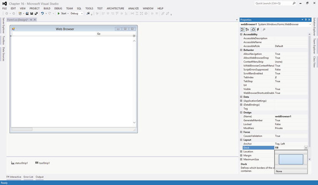
Figure 16-2. The Visual Studio form designer
Without a visual designer for F#, there are essentially four options for building graphical interfaces in the language:
- Write the interface code by hand, as you did for the browser sample.
- Develop a visual designer that outputs F# code (although it’s a hard job), and use it.
- Use the C# visual designer, and then convert the assignments in
file.Designer.csinto F#.- Exploit the interoperability of the .NET platform by designing the interface with the designer, generating C# or another supported language and using the F# code as a library.
Leverage on existing designers and .NET interoperatibility suits many graphical applications scenarios, allowing programmers to exploit the F# data-processing expressivity and power to fuel the UI created using productivity tools. You can easily define simple interfaces with F# code, however, and the rest of this chapter shows you how to do so. You now focus on the more important part of designing graphical applications: drawing and control development.
Drawing Applications
So far, you’ve developed graphical applications based on the composition of predeveloped graphical controls, but what do you do if no graphical control suits your needs? You need to learn how to draw using the drawing primitives provided by the graphical system.
To understand how drawing works, you need to review the model behind the rendering process of a graphical application. This model really distinguishes Windows Forms from WPF; later, this chapter reviews the traditional paint-based model that still dominates the presentation systems panorama. You know already that the event-driven programming paradigm best suits graphical applications; so far, you’ve associated event handlers with user actions, but events are used by the graphical system as a general mechanism to communicate with the graphical application.
An application uses resources provided by the graphical system, and these resources are mostly windows. A window is a rectangular area on the screen, not necessarily a top-level window with buttons, a title bar, and all the amenities you usually associate with it. Windows can be nested, and they are the unit of traditional windowing systems. Windows can contain other windows, and the windowing system is responsible for ensuring that events are routed to the callbacks registered for handling the events for each window.
Windows are allowed to draw in their own client areas, and the drawing is performed through the device context, an object provided by the graphical system and used to perform the graphic primitives to draw the content. The graphic primitives issued to the graphics system aren’t retained by it; therefore, when the window is covered for some reason, the portion that becomes hidden must be repainted when it’s uncovered. Because the information required to redraw the hidden portion is held by the application owning the window, the graphical system sends a paint message to the window.
To better understand the drawing model, consider a simple graphical application that shows how to draw a curved line using the Bézier curve and canonical splines, given four control points. Start by opening your namespaces and telling Windows Forms that your form can use the current Windows look rather than the classic Windows 95 style; also, set a global flag to tell standard controls to use the new GDI+ text-rendering primitives rather than those of the traditional GDI (this code is omitted from now on, but remember to use it later; also, remember that this must be done before windows are created—otherwise, an exception is thrown):
open System

open System.Drawing

open System.Windows.Forms


Application.EnableVisualStyles()

Application.SetCompatibleTextRenderingDefault(false)
Next, create the form and define the initial values of the control points. The movingPoint variable keeps track of the point the user is dragging, to adjust the curve:
let form = new Form(Text = "Curves")

let cpt = [|Point(20, 60); Point(40, 50); Point(130, 60); Point(200, 200)|]

let mutable movingPoint = -1
Let’s introduce three menus to configure the application. They’re used to check features to be drawn:
let newMenu (s : string) = new ToolStripMenuItem(s,Checked = true,CheckOnClick = true)

let menuBezier = newMenu "Show &Bézier"

let menuCanonical = newMenu "Show &Canonical spline"

let menuControlPoints = newMenu "Show control &points"
Use a scrollbar to define different values for the tension parameter of the canonical spline curve:
let scrollbar = new VScrollBar(Dock = DockStyle.Right, LargeChange = 2, Maximum = 10)
Control points are drawn if required, and an ellipse is used to mark each of them. The function receives the device context in the form of a Graphics object; draw the ellipse by invoking the DrawEllipse primitive on it. Use a Pen to draw the ellipse—in this case, a red pen:
let drawPoint (g : Graphics) (p : Point) =

    g.DrawEllipse(Pens.Red, p.X - 2, p.Y - 2, 4, 4)
You’re now ready to define the function responsible for drawing in your window. You can’t assume anything about the current state of the window; thus, the paint function always draws the visible primitives1 depending on the state of menu entries:
let paint (g : Graphics) =

    if (menuBezier.Checked) then

        g.DrawLine(Pens.Red, cpt.[0], cpt.[1])

        g.DrawLine(Pens.Red, cpt.[2], cpt.[3])

        g.DrawBeziers(Pens.Black, cpt)

    if (menuCanonical.Checked) then

        g.DrawCurve(Pens.Blue, cpt, float32 scrollbar.Value)

    if (menuControlPoints.Checked) then

        for i = 0 to cpt.Length - 1 do

            drawPoint g cpt.[i]
Figure 16-3 shows the result of the drawing all the elements. The Bézier curve, widely used in image-processing and vector applications, uses the four control points to define the start and end points of the curve and the two segments tangent to the curve at its ends. The cubic parametric curve is calculated from these points and produces the lines shown in Figure 16-3. The canonical spline, on the other hand, is a curve that traverses all the control points; the tension parameter controls how curvy the curve is.
You now want to allow users to move control points by dragging and dropping. You’re interested in mouse events—in particular, when the mouse button is pressed, when it moves, and when the button is released. Thanks to the well-defined model for rendering the application, you can update the state of your variables and ask the graphical system to issue a paint message that causes the window to receive a paint message and update the current frame.
__________
1If primitives fall out of the area allowed for drawing, they’re clipped in part or entirely.
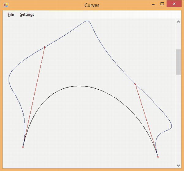
Figure 16-3. Output of the Curves application
BACKGROUND PAINTING
You define a helper function to define a circular area around a point that is sensible to your interaction. This is required in order to not require the user to pick the exact pixel corresponding to the control point:
let isClose (p : Point) (l : Point) =

    let dx = p.X - l.X

    let dy = p.Y - l.Y

    (dx * dx + dy * dy) < 6
When the mouse button is pressed, you check whether the click is over any control point. In this case, you store its index in the movingPoint variable; otherwise, the event is ignored:
let mouseDown (p : Point) =

    try

      let idx = cpt |> Array.findIndex (isClose p)

      movingPoint <- idx

    with _ -> ()
When the mouse moves over the client area of the window, the mouse move event is generated. If the movingPoint member has a value other than –1, you have to update the corresponding control point with the current position of the mouse defined by the variable p:
let mouseMove (p : Point) =

    if (movingPoint <> -1) then

        cpt.[movingPoint] <- p

        form.Invalidate()
Next, define for the window a File menu and a Settings submenu. The first features the classic Exit option, and the second shows the three checked menu items that control what the paint method should draw. You define menus by composing objects that correspond to the various menu entries. You also define the event handlers associated with each menu item. When Exit is clicked, the form is disposed. In all the other cases, you rely on the menu item’s ability to change its checked state, and you invalidate the form content to force the redraw of the window:
let setupMenu () =

    let menu = new MenuStrip()

    let fileMenuItem = new ToolStripMenuItem("&File")

    let settMenuItem = new ToolStripMenuItem("&Settings")

    let exitMenuItem = new ToolStripMenuItem("&Exit")

    menu.Items.Add(fileMenuItem) |> ignore

    menu.Items.Add(settMenuItem) |> ignore

    fileMenuItem.DropDownItems.Add(exitMenuItem) |> ignore

    settMenuItem.DropDownItems.Add(menuBezier) |> ignore

    settMenuItem.DropDownItems.Add(menuCanonical) |> ignore

    settMenuItem.DropDownItems.Add(menuControlPoints) |> ignore

    exitMenuItem.Click.Add(fun _ -> form.Close ())

    menuBezier.Click.Add(fun _ -> form.Invalidate())

    menuCanonical.Click.Add(fun _ -> form.Invalidate())

    menuControlPoints.Click.Add(fun _ -> form.Invalidate())

    menu
You’re now ready to use the functions you defined to configure the controls. Set up the scrollbar and register the controls in the form and the event handlers for the various events. Finally, start the application’s event loop and play with it:
scrollbar.ValueChanged.Add(fun _ -> form.Invalidate())

form.Controls.Add(scrollbar)

form.MainMenuStrip <- setupMenu()

form.Controls.Add(form.MainMenuStrip)

form.Paint.Add(fun e -> paint(e.Graphics))

form.MouseDown.Add(fun e -> mouseDown(e.Location))

form.MouseMove.Add(fun e -> mouseMove(e.Location))

form.MouseUp.Add(fun e -> movingPoint <- -1)

form.Show()
If you’re not using F# Interactive, don’t forget to add:
Writing Your Own Controls
The Curves example from the previous section draws inside a form by handling events. This is a rare way to draw things in graphical applications, because the resulting code is scarcely reusable, and drawing on the surface of a form raises issues when additional controls have to be placed in its client area.
User controls are the abstraction provided by the Windows Forms framework to program custom controls. If delegation is used to handle events generated from controls, inheritance and method overriding are the tools used to handle them in controls.
Developing a Custom Control
To make this discussion concrete, consider a control that implements a simple button. You can use the control from C# inside the Visual Studio designer like the native button, as shown in Figure 16-4.
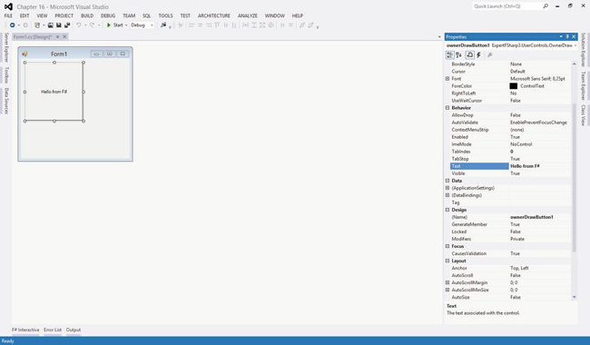
Figure 16-4. The F# button control used in a C# application and the Visual Studio designer
You start your control by inheriting from the UserControl class:2namespace ExpertFSharp3.UserControls
open System
open System.Drawing
open System.Windows.Forms
open System.ComponentModel
type OwnerDrawButton() =
inherit UserControl()
__________
2Note that this example hasn’t been designed to be entered using F# Interactive.
You then define the state of the control in terms of the class’s fields:
let mutable text = ""
let mutable pressed = false
The text field contains the button’s label. As with the movingPoint variable in the Curves example, the pressed field is responsible for remembering whether the button is currently pressed, allowing the paint handler to behave appropriately. You override the OnPaint method to handle the paint event. You allocate the pens and the brush required to draw and invert the role of the border colors in order to achieve the raised effect when the button isn’t pressed and the depressed look otherwise. You also measure the size of the label string, because you’re interested in drawing the string in the center of the button. You can then draw the lines on the borders, playing with colors to obtain a 3D effect. The pens and brushes are disposed of at the end of the function:
override x.OnPaint (e : PaintEventArgs) =
let g = e.Graphics
use pll = new Pen(SystemColors.ControlLightLight)
use pl = new Pen(SystemColors.ControlLight)
use pd = new Pen(SystemColors.ControlDark)
use pdd = new Pen(SystemColors.ControlDarkDark)
use bfg = new SolidBrush(x.ForeColor)
let szf = g.MeasureString(text, x.Font)
let spt = PointF((float32(x.Width) - szf.Width) / 2.0f,
(float32(x.Height) - szf.Height) / 2.0f)
let ptt, pt, pb, pbb =
if pressed then pdd, pd, pl, pll
else pll, pl, pd, pdd
g.Clear(SystemColors.Control)
g.DrawLine(ptt, 0, 0, x.Width - 1, 0)
g.DrawLine(ptt, 0, 0, 0, x.Height - 1)
g.DrawLine(pt, 1, 1, x.Width - 2, 1)
g.DrawLine(pt, 1, 1, 1, x.Height - 2)
g.DrawLine(pbb, 0, x.Height - 1, x.Width - 1, x.Height - 1)
g.DrawLine(pbb, x.Width - 1, 0, x.Width - 1, x.Height - 1)
g.DrawLine(pb, 1, x.Height - 2, x.Width - 2, x.Height - 2)
g.DrawLine(pb, x.Width - 2, 1, x.Width - 2, x.Height - 2)
g.DrawString(text, x.Font, bfg, spt)
Note the use of the colors defined in the SystemColors class: you use the system definition of colors so that the button uses the colors set by the user as display settings. Configuration is an important aspect of a user control, because it’s normally performed through a visual editor, such as Visual Studio. Well-defined controls are those that can be highly customized without having to extend the control programmatically or, even worse, to change its source code.
Now that you’ve defined the drawing procedure, you can define the behavior of the control by handling mouse events. You restrict the implementation to mouse events, although a key event handler should be provided in order to react to a press of the Enter key:
override x.OnMouseUp (e : MouseEventArgs) =
pressed <- false
x.Invalidate()
override x.OnMouseDown (e : MouseEventArgs) =
pressed <- true
x.Invalidate()
The OnMouseDown event sets the pressed member and asks the control to repaint by invalidating its content. When the mouse is released, the OnMouseUp is called, and you reset the flag and ask for repaint.
Controls are usually configured through the assignment of properties. If you annotate a property with an attribute of type Category and one of type Browsable, the property is displayed by Visual Studio in the control property box. To show this, you define the Text property, which exposes the button’s label to users of the control:
[<Category("Behavior")>]
[<Browsable(true)>]
override x.Text
with get() = text
and set(t : string) = text <- t; x.Invalidate()
You’re now ready to test your new control by writing a few lines of F# code as:
let form = new Form(Visible = true)
let c = new OwnerDrawButton(Text = "Hello button")
c.Click.Add(fun _ -> MessageBox.Show("Clicked!") |> ignore)
form.Controls.Add(c)
To see your control at work in the Visual Studio designer, you must create a Windows Forms application C# project. With the default form created by the application wizard opened, right-click the Toolbox window and select the Choose Items option; then, browse for the OwnerDrawButton.dll file obtained by compiling the F# control. Now you can visually drag your F# control into the form and configure its properties using the Properties window.
VSLAB VIEWLETS
Custom controls are seen as black-box objects by the applications that host them. Several hacks are possible to handle the behavior of controls from outside (subclassing is often used on Windows), but none of them are really satisfactory. Later, this chapter discusses how this constraint is overcome by the retention-based rendering process feature in WPF.
Anatomy of a Control
As illustrated by the OwnerDrawButton control example, the structure of a graphic control tends to assume the form of a finite state automaton. Events received by the control make the automaton change its internal state, usually causing an update of its actual display.
A well-known model that describes this structure is the Model-View-Controller design pattern. As shown in Figure 16-5, the model organizes a graphical element (either an application or a single control) into three parts: the model, the view, and the controller.
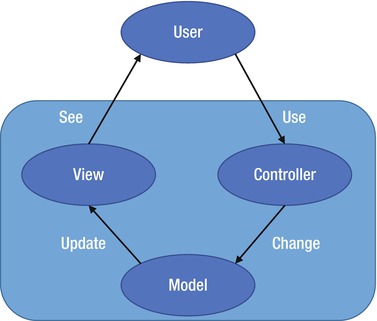
Figure 16-5. The structure of the Model-View-Controller design pattern
The model constitutes the internal representation of the information displayed by the control. A word processor, for instance, stores a document in memory as part of the model, even though the entire text doesn’t fit the current visible area. In your simple button, the model is defined by the pressed and text values.
When the model changes, the view must be updated, and a rendering of the information kept in memory should be performed. Usually, the paint method corresponds to the view portion of the control. Event handlers triggered by the user form the controller of the control. The controller defines how these elements affect the model.
The Model-View-Controller pattern isn’t the only model developed to describe graphical interfaces. It captures the intrinsic nature of the problem, however, providing a good framework for classifying the elements of an interface or a control. The rest of this chapter refers to this pattern to indicate the various elements of the applications you learn how to develop.
Displaying Samples from Sensors
Now that you have reviewed the essential concepts behind programming graphical interfaces, you’re ready to work on some applications. They’re full of details typical of real graphical applications. This section presents a graphic control whose purpose is to plot samples acquired over time—for instance, from a sensor. The control has been designed to be reusable and highly configurable, providing a rich set of properties that can be set even at runtime by the application hosting it, as shown in Figure 16-6.
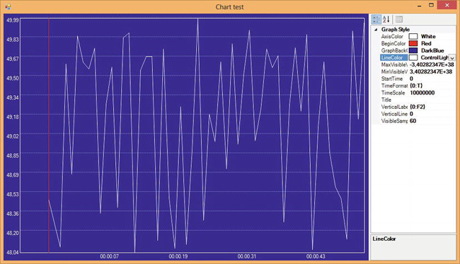
Figure 16-6. The GraphControl used in a test application that lets the user to change its appearance at runtime
The basic function of the control is to receive and store samples labeled with time. If c is the variable that refers to an instance of the control, the application feeds data through an AddSample method that adds a new sample to the data set, causing the control to update the displayed chart:
c.AddSample(t, v)
The next section shows how to define the control and the AddSample method.
Despite the simple interface provided by GraphControl to update the data set, the control isn’t easy to implement, because it must hold a large number of samples and provide a means to navigate through a view that doesn’t fit all the samples. Another area important to controls is configuration: users of the control want to customize its appearance to fit the needs of their application. To support these needs, you must adopt the coding conventions required to integrate the control in the Windows Forms framework so that it integrates with all the tools used to design applications.
USING FSHARPCHART
Building the GraphControl: The Model
According to the Model-View-Controller paradigm, you first define the control’s model, which should contain all the information needed to draw the control when required. You first define the type of a sample:
type Sample = {Time : int64; Value : float32}
Samples are pairs (t, v), with t being the time at which the sample v has been read. Samples are collected in a data structure named DataSamples, whose purpose is to provide a uniform view of data; the class definition is reported in Listing 16-1. Assume that the data set is always small enough to stay in memory; this limitation can be overcome in the future by changing this class. Samples are collected into a ResizeArray and kept in the field named data. Also, use a form of run-length-encoding (RLE) compression to optimize memory usage, and use linear interpolation to make data appear continuous in order to simplify the implementation of the zoom feature. Because not all the samples are recorded, the count field is used to keep track of the number of added samples.
The AddSample method is used to add a new sample to the data set. It assumes that data come sorted with respect to time; if a sample preceding the last added is detected, it’s discarded. The Last property returns the last-added sample; you may have discarded it because it’s equal to the previous, so rebuild the sample using the lastTime field that records the time value of the last sample added.
Interpolation is done by the GetValue method, which, given a time value, calculates the corresponding value. The list of samples is searched using a binary search. If a sample matches the given time, it’s returned; otherwise, the interpolation is performed.
The last operation implemented by DataSamples is FindMinMax, a method that computes the minimum and maximum values of the data in a given interval. You can initialize the values for minimum and maximum, as well as a stride to use to do the search. The stride is useful in conjunction with zoom, because the number of samples that can be displayed is finite, and the rendering procedure must subsample when zooming out.
Listing 16-1. The DataSamples class definition
open System
type Sample = {Time : int64; Value : float32}
type DataSamples() =
let data = new ResizeArray<Sample>()
let mutable count = 0
let mutable lastTime = 0L
member x.Last = {Time = lastTime; Value = data.[data.Count - 1].Value}
member x.AddSample(t, v) =
let s = {Time = t; Value = v}
let last = if (data.Count = 0) then s else x.Last
count <- count + 1
lastTime <- max last.Time s.Time
if data.Count = 0 then data.Add(s)
elif last.Time < s.Time && last.Value <> s.Value then
if data.[data.Count - 1].Time <> last.Time then data.Add(last)
data.Add(s)
member x.Count = count
// The model is continuous: missing samples are obtained by interpolation
member x.GetValue(time : int64) =
// Find the relevant point via a binary search
let rec search (lo, hi) =
let mid = (lo + hi) / 2
if hi - lo <= 1 then (lo, hi)
elif data.[mid].Time = time then (mid, mid)
elif data.[mid].Time < time then search (mid, hi)
else search (lo, mid)
if (data.Count = 0) then failwith "No data samples"
if (lastTime < time) then failwith "Wrong time!"
let lo, hi = search (0, data.Count - 1)
if (data.[lo].Time = time || hi = lo) then data.[lo].Value
elif (data.[hi].Time = time) then data.[hi].Value
else
// interpolate
let p = if data.[hi].Time < time then hi else lo
let next = data.[min (p+1) (data.Count-1)]
let curr = data.[p]
let spant = next.Time - curr.Time
let spanv = next.Value - curr.Value
curr.Value + float32(time-curr.Time) *(spanv / float32 spant)
// This method finds the minimum and the maximum values given
// a sampling frequency and an interval of time
member x.FindMinMax(sampleFreq : int64, start : int64, finish : int64,
minval : float32, maxval : float32) =
if (data.Count = 0) then (minval, maxval) else
let start = max start 0L
let finish = min finish lastTime
let minv, maxv =
seq {start .. sampleFreq .. finish}
|> Seq.map x.GetValue
|> Seq.fold (fun (minv, maxv) v -> (min v minv, max v maxv))
(minval, maxval)
if (minv = maxv) then
let delta = if (minv = 0.0f) then 0.01f else 0.01f * abs minv
(minv - delta, maxv + delta)
else (minv, maxv)
Building the GraphControl: Style Properties and Controller
Listing 16-2 shows the code for the GraphControl class except for the OnPaint drawing method, which is shown in the next section. This control exhibits the typical structure of a graphic control; it features a large number of constants and fields that serve configuration purposes. The class inherits from UserControl, which is the base class of Windows Forms controls, and it contains a field named data of type DataSamples that represents the data shown by the control. The appearance is controlled through properties, fields, and constant values; for instance, the axis color is controlled by the pattern:
let mutable axisColor:Color = Color.White
[<Category("Graph Style"); Browsable(true)>]
member x.AxisColor
with get() = x.axisColor
and set(v:Color) = x.axisColor <- v; x.Invalidate()
The AxisColor property lets the control’s host change the color of the axis color displayed by the control, because properties are part of the controller of the control; thus, when the setter is invoked, you call the Invalidate method to ensure that a paint message is sent to the control so that the view is updated. Note that a fully fledged control might read defaults from a store of user-specific configuration properties.
Listing 16-2. The GraphControl class
open System
open System.Drawing
open System.Drawing.Drawing2D
open System.Windows.Forms
open System.ComponentModel
type GraphControl() as x =
inherit UserControl()
let data = new DataSamples()
let mutable minVisibleValue = Single.MaxValue
let mutable maxVisibleValue = Single.MinValue
let mutable absMax = Single.MinValue
let mutable absMin = Single.MaxValue
let mutable lastMin = minVisibleValue
let mutable lastMax = maxVisibleValue
let mutable axisColor = Color.White
let mutable beginColor = Color.Red
let mutable verticalLabelFormat = "{0:F2}"
let mutable startTime = 0L
let mutable visibleSamples = 10
let mutable initView = startTime - int64(visibleSamples)
let mutable verticalLines = 0
let mutable timeScale = 10000000 // In 100-nanoseconds
let mutable timeFormat = "{0:T}"
let rightBottomMargin = Size(10, 10)
let leftTopMargin = Size(10, 10)
do
x.SetStyle(ControlStyles.AllPaintingInWmPaint, true)
x.SetStyle(ControlStyles.OptimizedDoubleBuffer, true)
base.BackColor <- Color.DarkBlue
[<Category("Graph Style"); Browsable(true)>]
member x.AxisColor
with get() = axisColor
and set(v : Color) = axisColor <- v; x.Invalidate()
[<Category("Graph Style"); Browsable(true)>]
member x.BeginColor
with get() = beginColor
and set(v : Color) = beginColor <- v; x.Invalidate()
[<Category("Graph Style"); Browsable(true)>]
member x.MinVisibleValue
with get() = minVisibleValue
and set(v : float32) =
minVisibleValue <- v; lastMin <- v; x.Invalidate()
[<Category("Graph Style"); Browsable(true)>]
member x.MaxVisibleValue
with get() = maxVisibleValue
and set(v : float32) =
maxVisibleValue <- v; lastMax <- v; x.Invalidate()
[<Category("Graph Style"); Browsable(true)>]
member x.VerticalLines
with get() = verticalLines
and set(v : int) = verticalLines <- v; x.Invalidate()
[<Category("Graph Style"); Browsable(true)>]
member x.GraphBackColor
with get() = x.BackColor
and set(v : Color) = x.BackColor <- v
[<Category("Graph Style"); Browsable(true)>]
member x.LineColor
with get() = x.ForeColor
and set(v : Color) = x.ForeColor <- v
[<Category("Graph Style"); Browsable(true)>]
member x.VerticalLabelFormat
with get() = verticalLabelFormat
and set(v : string) = verticalLabelFormat <- v; x.Invalidate()
[<Category("Graph Style"); Browsable(true)>]
member x.StartTime
with get() = startTime
and set(v : int64) = startTime <- v; x.Invalidate()
[<Category("Graph Style"); Browsable(true)>]
member x.Title
with get() = x.Text
and set(v : string) = x.Text <- v; x.Invalidate()
[<Category("Graph Style"); Browsable(true)>]
member x.VisibleSamples
with get() = visibleSamples
and set(v : int) =
visibleSamples <- v;
initView <- startTime - int64(visibleSamples);
x.Invalidate()
[<Category("Graph Style"); Browsable(true)>]
member x.TimeScale
with get() = timeScale
and set(v : int) = timeScale <- v; x.Invalidate()
[<Category("Graph Style"); Browsable(true)>]
member x.TimeFormat
with get() = timeFormat
and set(v : string) = timeFormat <- v; x.Invalidate()
// ... Further portions of this class shown further below
Listing 16-3 includes the remaining portions of the GraphControl class corresponding to the controller part of the Model-View-Controller paradigm. Samples are added through the AddSample method (AddSampleData generates random samples to display inside the control). This method adds the sample to the inner DataSamples object and updates the values of two fields meant to store the minimum and maximum values recorded for samples; both of these values are used in the display process. Because the model of the control changes, you need to update the view, and you invalidate the control as you did for properties.
OVERRIDING VS. DELEGATION
Let’s look at how to handle the mouse-move events and the use of the mouse wheel. When the wheel of the mouse is scrolled, the control adjusts the scale factor to zoom in or out of the current view. To understand how this method works, you need to know how to decide which portion of the data is made available through the view of the control. You use two fields: initView and visibleSamples. Because you can’t assume that all the samples fit in the control’s display, the former indicates the time (in the time scale of the samples) corresponding to the leftmost visible value, and the latter indicates the number of time units in the unit scale of samples that should be visible. Zooming is performed by changing the density of time units to be displayed inside the viewport.
The last method in Listing 16-3 is GetTime: it converts the time unit of samples in microseconds using a scale factor that is one of the configuration properties made available by the control.
Listing 16-3. Extract of the controller of the GraphControl class
override x.OnMouseWheel (e : MouseEventArgs) =
base.OnMouseWheel(e)
x.Zoom(e.Delta)
override x.OnSizeChanged (e : EventArgs) =
base.OnSizeChanged(e)
x.Invalidate()
member x.Zoom (amount : int) =
let newVisibleSamples = max 5 (visibleSamples + amount)
if (initView - startTime < 0L) then
let e = initView + int64(visibleSamples)
initView <- startTime - int64(newVisibleSamples) + e
visibleSamples <- newVisibleSamples
x.Invalidate()
member x.AddSample (time : int64, value : float32) =
if (value < absMin) then absMin <- value
if (value > absMax) then absMax <- value
if (data.Count > 0) then
initView <- initView + time - data.Last.Time
data.AddSample(time, value)
x.Invalidate()
member x.GetTime (time : int64) =
DateTime(max 0L time * int64(timeScale))
Building the GraphControl: The View
The view of the GraphControl is entirely contained within the OnPaint method, which is invoked when the GUI needs to repaint the content of the control or when an invocation of the Invalidate method occurs. Listing 16-4 shows the full code for this method. Programming graphical controls can get complicated, and often the code is factorized further using functions.
The OnPaint method begins computing some information, such as the rectangles containing the string with the values to be displayed. The dimension of a string depends on the font used for display and the particular device context used to render it. You rely on the MeasureString method of the Graphics object you received from the GUI. You compute the plotBox rectangle, which represents the area where you draw the data; it’s obtained by removing from the dimension of the control that the margins specified in the configuration and the space required by the labels, if visible. Later, set an appropriate coordinate system on the device context so that the drawing primitives render in this new system:
g.TranslateTransform(float32(plotBox.Left), float32(x.Height - plotBox.Top))
g.ScaleTransform(1.0f, -1.0f)
You translate the origin of the coordinate system in the lower-left vertex of the margins rectangle. You also flip the y axis by setting a scale transform that inverts the direction, multiplying y coordinates by –1.0f; in this way, you obtain a coordinate system oriented as in mathematics. Coordinate transformation is supported by Windows Forms on the Graphics object: all the coordinates specified in the drawing primitives are affected by a transformation matrix stored in the device context. Once set, a transformation of the library takes care of the calculations necessary to rotate, translate, and scale all the objects.
After clearing the background using the Background color property, you draw the various lines, such as the axes and the labels, depending on the configuration settings specified by setting the control’s properties. This is the typical structure of a paint method, in which the model is tested to decide what should be drawn and the style to be used.
The drawing of the data samples is controlled by the timePerUnit and pixelsPerUnit variables, and then the inner recursive function drawSamples selects the visible samples and uses the DataSamples object to compute results. You rely on the ability of the DataSamples class to interpolate data and to not have to deal with discrete samples.
The core business of the paint method is often simple (having paid attention when you defined the model and the controller of the control); it quickly becomes entangled in testing all the configuration properties to determine how the control should be rendered.
Listing 16-4. Drawing the control
override x.OnPaint (e : PaintEventArgs) =
let g = e.Graphics
// A helper function to size up strings
let msrstr s = g.MeasureString(s, x.Font)
// Work out the size of the box to show the values
let valBox =
let minbox = msrstr (String.Format(verticalLabelFormat, lastMin))
let maxbox = msrstr (String.Format(verticalLabelFormat, lastMax))
let vbw = max minbox.Width maxbox.Width
let vbh = max minbox.Height maxbox.Height
SizeF(vbw, vbh)
// Work out the size of the box to show the times
let timeBox =
let lasttime = x.GetTime(initView + int64(visibleSamples))
let timelbl = String.Format(timeFormat, lasttime)
msrstr timelbl
// Work out the plot area for the graph
let plotBox =
let ltm = leftTopMargin
let rbm = rightBottomMargin
let ltm, rbm =
let ltm = Size(width = max ltm.Width (int(valBox.Width) + 5),
height = max ltm.Height (int(valBox.Height / 2.0f) + 2))
let rbm = Size(width = rightBottomMargin.Width,
height = max rbm.Height (int(timeBox.Height) + 5))
ltm, rbm
// Since we invert y axis use Top instead of Bottom and vice versa
Rectangle(ltm.Width, rbm.Height,
x.Width - ltm.Width - rbm.Width,
x.Height - ltm.Height - rbm.Height)
// The time interval per visible sample
let timePerUnit =
let samplew = float32(visibleSamples) / float32(plotBox.Width)
max 1.0f samplew
// The pixel interval per visible sample
let pixelsPerUnit =
let pixelspan = float32(plotBox.Width) / float32(visibleSamples)
max 1.0f pixelspan
// Compute the range we need to plot
let (lo, hi) = data.FindMinMax(int64(timePerUnit),
initView,
initView + int64(visibleSamples),
minVisibleValue,
maxVisibleValue)
// Save the range to help with computing sizes next time around
lastMin <- lo; lastMax <- hi
// We use these graphical resources during plotting
use linePen = new Pen(x.ForeColor)
use axisPen = new Pen(axisColor)
use beginPen = new Pen(beginColor)
use gridPen = new Pen(Color.FromArgb(127, axisColor),
DashStyle = DashStyle.Dash)
use fontColor = new SolidBrush(axisColor)
// Draw the title
if (x.Text <> null && x.Text <> String.Empty) then
let sz = msrstr x.Text
let mw = (float32(plotBox.Width) - sz.Width) / 2.0f
let tm = float32(plotBox.Bottom - plotBox.Height)
let p = PointF(float32(plotBox.Left) + mw, tm)
g.DrawString(x.Text, x.Font, new SolidBrush(x.ForeColor), p)
// Draw the labels
let nly = int((float32(plotBox.Height) / valBox.Height) / 3.0f)
let nlx = int((float32(plotBox.Width) / timeBox.Width) / 3.0f)
let pxly = plotBox.Height / max nly 1
let pxlx = plotBox.Width / max nlx 1
let dvy = (hi - lo) / float32(nly)
let dvx = float32(visibleSamples) / float32(nlx)
let drawString (s : string) (xp : float32) (yp : float32) =
g.DrawString(s, x.Font, fontColor, xp, yp)
// Draw the value (y) labels
for i = 0 to nly do
let liney = i * pxly + int(valBox.Height / 2.0f) + 2
let lblfmt = verticalLabelFormat
let posy = float32(x.Height - plotBox.Top - i * pxly)
let label = String.Format(lblfmt, float32(i) * dvy + lo)
drawString label (float32(plotBox.Left) - valBox.Width)
(posy - valBox.Height / 2.0f)
if (i = 0 || ((i > 0) && (i < nly))) then
g.DrawLine(gridPen, plotBox.Left, liney, plotBox.Right, liney)
// Draw the time (x) labels
for i = 0 to nlx do
let linex = i * pxlx + int(timeBox.Width / 2.0f) + 2
let time = int64(float32(i) * dvx + float32(initView))
let label = String.Format(timeFormat, x.GetTime(time))
if (time > 0L) then
drawString label
(float32(plotBox.Left + i * pxlx) + timeBox.Width / 2.0f)
(float32(x.Height - plotBox.Top + 2))
// Set a transform on the graphics state to make drawing in the
// plotBox simpler
g.TranslateTransform(float32(plotBox.Left),
float32(x.Height - plotBox.Top));
g.ScaleTransform(1.0f, -1.0f);
// Draw the plotBox of the plot area
g.DrawLine(axisPen, 0, 0, 0, plotBox.Height)
g.DrawLine(axisPen, 0, 0, plotBox.Width, 0)
g.DrawLine(axisPen, plotBox.Width, 0, plotBox.Width, plotBox.Height)
g.DrawLine(axisPen, 0, plotBox.Height, plotBox.Width, plotBox.Height)
// Draw the vertical lines in the plotBox
let px = plotBox.Width / (verticalLines + 1)
for i = 1 to verticalLines do
g.DrawLine(gridPen, i * px, 0, i * px, plotBox.Height)
// Draw the 'begin' marker that shows where data begins
if (initView - startTime <= 0L) then
let off = float32(Math.Abs(x.StartTime - initView))
let sx = int((off / timePerUnit) * pixelsPerUnit)
g.DrawLine(beginPen, sx, 0, sx, plotBox.Height)
// Draw the 'zero' horizontal line if it's visible
if (hi <> lo && lo < 0.0f) then
let sy = int((float32(plotBox.Height) / (hi - lo)) * (0.0f - lo))
g.DrawLine(axisPen, 0, sy, plotBox.Width, sy)
// Draw the visible data samples
let rec drawSamples i pos =
if (i < (float32(plotBox.Width) / pixelsPerUnit) &&
pos <= (initView + int64 visibleSamples - int64 timePerUnit))
then
if (pos >= 0L) then
let dh = float32(plotBox.Height) / (hi - lo)
let sx = int(pixelsPerUnit * i)
let dx = int(pixelsPerUnit * (i + 1.0f))
let sy = int(dh * (data.GetValue(pos) - lo))
let dy = int(dh * (data.GetValue(pos + int64 timePerUnit)
- lo))
g.DrawLine(linePen, sx, sy, dx, dy);
drawSamples (i + 1.0f) (pos + int64 timePerUnit)
drawSamples 0.0f initView
DOUBLE BUFFERING
Putting It Together
The following code uses the control that defines the application shown in Figure 16-6:
let form = new Form(Text = "Chart test", Size = Size(800, 600), Visible = true, TopMost = true)
let graph = new GraphControl(VisibleSamples = 60, Dock = DockStyle.Fill)
let properties = new PropertyGrid(Dock = DockStyle.Fill)
let timer = new Timer(Interval = 200)
let container = new SplitContainer(Dock = DockStyle.Fill, SplitterDistance = 350)
// We use a split container to divide the area into two parts
container.Panel1.Controls.Add(graph)
container.Panel2.Controls.Add(properties)
// Configure the property grid to display only properties in the
// category "Graph Style"
properties.SelectedObject <- graph
let graphStyleCat = (CategoryAttribute("Graph Style") :> Attribute)
properties.BrowsableAttributes <- AttributeCollection([|graphStyleCat|])
form.Controls.Add(container)
let rnd = new Random()
let time = ref 0
// A timer is used to simulate incoming data
timer.Tick.Add(fun _ ->
incr time
let v = 48.0 + 2.0 * rnd.NextDouble()
graph.AddSample(int64(!time), float32(v)))
timer.Start()
form.Disposed.Add(fun _ -> timer.Stop())
The form uses a SplitContainer control to define two areas, one for GraphControl and the other for a PropertyGrid control. A timer object is used to add samples periodically, and you use the AddSample method to add random samples to the control.
THE PROPERTYGRID CONTROL
Creating a Mandelbrot Viewer
Fractals are one of the diamonds of mathematics. They show the beauty of mathematical structures visually, which allows nonexperts to see something that is often hidden by formulas that few really appreciate. The Mandelbrot set is one of the most famous fractals. This section shows how to develop an application to browse this set. The result is shown in Figure 16-7.
This application adopts the delegation programming style, subscribing to events rather than using inheritance to override the behavior of a component. This allows you to develop the application interactively using fsi.exe. This is a good example of how effectively you can use F# to develop an application interactively while retaining the performance of a compiled language, which is extremely important in such CPU-intensive tasks as computing the points of the Mandelbrot set.
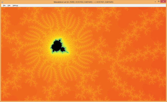
Figure 16-7. The Mandelbrot viewer in action
Computing Mandelbrot
First, you need to be familiar with the math required to generate the Mandelbrot set. The set is defined over the set of complex numbers, which is an extension of the real numbers, allowing computation of square roots over negative numbers. A complex number has the following form, where a and b are real numbers and i is the imaginary unit (by definition, i2 = –1):
c = a + bi
Using standard algebraic calculations, you can define the sum and product of these numbers:
c1 + c2 = (a1 + a2) + (b1 + b2) i
c1 • c2 = (a1 • a2 – b1 • b2) + (a1 • b2 + a2 • b1) i
Because you have two components in the definition of the number, you can graphically represent complex numbers using a plane.
This Mandelbrot viewer shows a portion of the complex plane in which each point in the plane is colored according to a relation that defines the Mandelbrot set. The relation is based on the iterative definition:
A complex number belongs to the Mandelbrot set if zn converges for n. You can test each number c in the complex plane and decide whether the number belongs to the Mandelbrot set. Because it’s not practical to perform an infinite computation to test each number of the complex plane, there is an approximation of the test based on a theorem that if the distance of zi from the origin passes 2, then the sequence will diverge, and the corresponding z0 won’t belong to the set.
The code to compute membership of the Mandelbrot set is:
open System.Numerics
let sqrMod (x : Complex) = x.Real * x.Real + x.Imaginary * x.Imaginary
let rec mandel maxit (z : Complex) (c : Complex) count =
if (sqrMod(z) < 4.0) && (count < maxit) then
mandel maxit ((z * z) + c) c (count + 1)
else count
You can create a simple visual representation of the Mandelbrot set by coloring all the points belonging to the set. In this way, you obtain the black portion of Figure 16-7. How can you obtain the richness of color? The trick is to color points depending on how fast the sequence reaches the distance of 2 from the origin. You use 250 colors and map the [0, maxit] interval to the [0, 250] discrete color interval.
Setting Colors
In order for the Mandelbrot viewer application to have appealing coloring, you need to produce some form of continuity in the color variation in the chosen range. Use an array of colors to store these values, but you need a procedure to fill this array so that colors change continuously.
Colors in the Red Green Blue (RGB) space used in graphics libraries are known to define a color space that isn’t perceived as continuous by human vision. A color space known to be more effective in this respect is the Hue Saturation Value (HSV), in which a color is defined in terms of hue, color saturation, and the value of luminance (see Figure 16-8). This model was inspired by the method used by painters to create colors in oil painting.
Figure 16-8 shows a typical geometric representation of the two color spaces. In the RGB color model, the three axes represent the three base colors varying from black to the full color; in the HSV space, the angle is used to indicate the hue, the distance from the axis of the cone represents the saturation, and the value corresponds to the height of the point inside the cone.
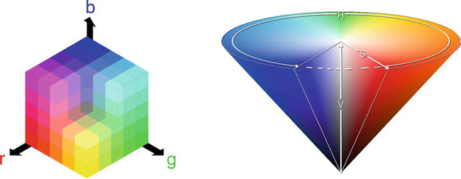
Figure 16-8. The RGB (left) and HSV (right) color spaces and their geometric representation
You can define a conversion from RGB color space to HSV, and vice versa. Listing 16-5 shows the F# functions performing the conversions between the two models. These functions assume the three components R, G, and B are in the interval [0, 1] rather than integers between 0 and 255.
Listing 16-5. Conversion from RGB to HSV, and vice versa
let RGBtoHSV (r, g, b) =
let (m : float) = min r (min g b)
let (M : float) = max r (max g b)
let delta = M - m
let posh (h : float) = if h < 0.0 then h + 360.0 else h
let deltaf (f : float) (s : float) = (f - s) / delta
if M = 0.0 then (-1.0, 0.0, M) else
let s = (M - m) / M
if r = M then (posh(60.0 * (deltaf g b)), s, M)
elif g = M then (posh(60.0 * (2.0 + (deltaf b r))), s, M)
else (posh(60.0 * (4.0 + (deltaf r g))), s, M)
let HSVtoRGB (h, s, v) =
if s = 0.0 then (v, v, v) else
let hs = h / 60.0
let i = floor (hs)
let f = hs - i
let p = v * ( 1.0 - s )
let q = v * ( 1.0 - s * f )
let t = v * ( 1.0 - s * ( 1.0 - f ))
match int i with
| 0 -> (v, t, p)
| 1 -> (q, v, p)
| 2 -> (p, v, t)
| 3 -> (p, q, v)
| 4 -> (t, p, v)
| _ -> (v, p, q)
To let users choose the coloring of the set, you create an array of 10 functions, given an integer between 0 and 250, for a corresponding color. The default color function is based on the HSV color model; it uses the input parameter to set the hue of the color, leaving the saturation and luminance at the maximum values. The other functions use the RGB color space, following directions in the color cube. You use the createPalette function to generate the color palette that is used while drawing fractal points; the palette mutable variable holds this palette. Listing 16-6 shows the code that deals with colors. The pickColor function is responsible for mapping the iteration it, at which the computation of the Mandelbrot set terminates given the maximum number of iterations allowed, maxit.
Listing 16-6. Color-palette definition
let makeColor (r, g, b) =
let f x = int32(x * 255.0)
Color.FromArgb(f(r), f(g), f(b))
let defaultColor i = makeColor(HSVtoRGB(360.0 * (float i / 250.0), 1.0, 1.0))
let coloring =
[|
defaultColor;
(fun i -> Color.FromArgb(i, i, i));
(fun i -> Color.FromArgb(i, 0, 0));
(fun i -> Color.FromArgb(0, i, 0));
(fun i -> Color.FromArgb(0, 0, i));
(fun i -> Color.FromArgb(i, i, 0));
(fun i -> Color.FromArgb(i, 250 - i, 0));
(fun i -> Color.FromArgb(250 - i, i, i));
(fun i -> if i % 2 = 0 then Color.White else Color.Black);
(fun i -> Color.FromArgb(250 - i, 250 - i, 250 - i))
|]
let createPalette c =
Array.init 253 (function
| 250 -> Color.Black
| 251 -> Color.White
| 252 -> Color.LightGray
| i -> c i)
let mutable palette = createPalette coloring.[0]
let pickColor maxit it =
palette.[int(250.0 * float it / float maxit)]
Creating the Visualization Application
You’re now ready to implement the graphical application. The basic idea is to map a rectangle of the complex plane in the client area of your form. Each point of your window corresponds to a complex number and is colored according to the value computed by the mandel function.
A typical value for maxit is 150 for the initial rendering of the Mandelbrot set, although it should be incremented when zooming into the fractal. The total computation required to generate an entire image is significant; therefore, you can’t rely on the main thread to perform the computation of the various points. It’s important to recall that event handlers are invoked by the graphical interface’s thread, and if this thread is used to perform heavy computations, the application windows won’t respond to other events.
You introduce a thread responsible for performing the computations required by the Mandelbrot set so that the GUI thread can continue to handle events. (Chapter 11 discusses threads in more detail.) Here, you use shared memory to communicate the results between the threads by using a bitmap image in memory, referenced by the bitmap variable, which is updated by the thread performing the computation task and read by the GUI thread when the form must be painted. The bitmap is convenient, because you need a matrix of points to be colored, and the device context is designed to avoid pixel coloring to be device independent (it doesn’t provide a SetColor(x, y) operation). To avoid race conditions, use the lock function to guarantee exclusive access to the bitmap shared between the two threads. Chapter 11 looks at this in more detail. The thread responsible for the set computation executes the function:
// t=top, l=left, r=right, b=bottom, bm=bitmap, p=pixel, w=width, h=height
let run filler (form : #Form) (bitmap : Bitmap) (tlx, tly) (brx, bry) =
let dx = (brx - tlx) / float bmpw
let dy = (tly - bry) / float bmph
let maxit = iterations (tlx, tly) (brx, bry)
let x = 0
let y = 0
let transform x y = new Complex(tlx + (float x)* dx, tly - (float y) * dy)
form.Invoke(new MethodInvoker(fun () ->
form.Text <- sprintf "Mandelbrot set [it: %d] (%f, %f) -> (%f, %f)"
maxit tlx tly brx bry
)) |> ignore
filler maxit transform
timer.Enabled <- false
Use dx and dy variables to map the x and y coordinates of the bitmap into the complex plane. Then invoke the filler function responsible for performing the calculation. There are different possible filling strategies to compute the colors of the set; the straightforward approach is left to right and top to bottom, implemented by the linearFill function:
let linearFill (bw : int) (bh : int) maxit map =
for y = 0 to bh - 1 do
for x = 0 to bw - 1 do
let c = mandel maxit Complex.Zero (map x y) 0
lock bitmap (fun () -> bitmap.SetPixel(x, y, pickColor maxit c))
Another typical filling strategy is to gradually refine the set by computing points in blocks and filling the blocks of the appropriate color; then, the missing points are computed by refining the block size. Using this strategy, you can provide a quick preview of the fractal without having to wait for the entire computation. The blockFill function implements this strategy:
let blockFill (bw : int) (bh : int) maxit map =
let rec fillBlock first sz x y =
if x < bw then
let c = mandel maxit Complex.Zero (map x y) 0
lock bitmap (fun () ->
let g = Graphics.FromImage(bitmap)
g.FillRectangle(new SolidBrush(pickColor maxit c),
x, y, sz, sz)
g.Dispose())
fillBlock first sz
(if first || ((y / sz) % 2 = 1) then x + sz
else x + 2 * sz) y
elif y < bh then
fillBlock first sz
(if first || ((y / sz) % 2 = 0) then 0 else sz) (y + sz)
elif sz > 1 then
fillBlock false (sz / 2) (sz / 2) 0
fillBlock true 64 0 0
The variable fillFun is used to store the current filling function:
let mutable fillFun = blockFill
You clear the bitmap by obtaining a device context to the bitmap and clearing it. The global variable bitmap is used to access the image from the code; this is an effective choice to speed up the development of the application. This technique can be a problem from a software engineering standpoint, however, because the program is less modular, and the mutable state isn’t encapsulated:
let clearOffScreen (b : Bitmap) =
use g = Graphics.FromImage(b)
g.Clear(Color.White)
let mutable bitmap = new Bitmap(form.Width, form.Height)
let mutable bmpw = form.Width
let mutable bmph = form.Height
To refresh the application form while the fractal computation is ongoing, use a timer that triggers a refresh of the form every tenth of a second (the fully qualified name for the Timer class is needed to disambiguate between System.Threading.Timer and System.Windows.Forms.Timer). The paint function draws the bitmap that is updated by the worker thread:
let paint (g : Graphics) =
lock bitmap (fun () -> g.DrawImage(bitmap, 0, 0))
g.DrawRectangle(Pens.Black, rect)
g.FillRectangle(new SolidBrush(Color.FromArgb(128, Color.White)), rect)
let timer = new System.Windows.Forms.Timer(Interval = 100)
timer.Tick.Add(fun _ -> form.Invalidate() )
let stopWorker () =
if worker <> Thread.CurrentThread then
worker.Abort()
worker <- Thread.CurrentThread
The drawMandel function is responsible for starting the rendering process:
let drawMandel () =
let bf = fillFun bmpw bmph
stopWorker()
timer.Enabled <- true
worker <- new Thread(fun () -> run bf form bitmap tl br)
worker.IsBackground <- true
worker.Priority <- ThreadPriority.Lowest
worker.Start()
Creating the Application Plumbing
Now that you’ve defined the architecture of the application, you can define the graphical aspects, the form, and the menus, as well as how users interact with the application. The code is similar to the previous applications, as shown in Listing 16-7. Note two aspects: the rect variable contains the current selection, and it’s drawn as a rectangle filled with transparent white; the application uses the clipboard to store and retrieve the coordinates of a particular fractal view or save the current state of the drawn bitmap. When Ctrl+C is pressed, a small XML document similar to the following is saved to the clipboard:
<Mandel iter="1000">
<topleft>
<re>-7.47421339220139e-001</re>
<im>1.64667039391667e-001</im>
</topleft>
<bottomright>
<re>-7.47082959511805e-001</re>
<im>1.64413254610417e-001</im>
</bottomright>
</Mandel>
The saved parameters are the most compact representation of the current view, and they are loaded back if Ctrl+V is pressed; this way, you can save the state of navigation. You save and read text from the clipboard using the Clipboard class’s SetText and GetText methods. When the Ctrl+Shift+C key sequence is pressed, the current bitmap is copied to the clipboard using the SetDataObject method; the bitmap can be pasted in any program capable of pasting images.
The selection rectangle is updated by the mouse event handlers. You obtain the zoom facility by setting the bounds of the complex plane defined by the variables tl and br.
Listing 16-7. Setup of the application form and event handling
type CanvasForm() as x =
inherit Form()
do x.SetStyle(ControlStyles.OptimizedDoubleBuffer, true)
override x.OnPaintBackground(args) = ()
// Creates the Form
let form = new CanvasForm(Width = 800, Height = 600,Text = "Mandelbrot set")
let timer = new Timer(Interval = 100)
timer.Tick.Add(fun _ -> form.Invalidate() )
let mutable worker = Thread.CurrentThread
let mutable bitmap = new Bitmap(form.Width, form.Height)
let mutable bmpw = form.Width
let mutable bmph = form.Height
let mutable rect = Rectangle.Empty
let mutable tl = (-3.0, 2.0)
let mutable br = (2.0, -2.0)
let mutable menuIterations = 150
let iterations (tlx, tly) (brx, bry) =
menuIterations
let RGBtoHSV (r, g, b) = ...
let HSVtoRGB (h, s, v) = ...
let makeColor (r, g, b) = ...
let defaultColor i = ...
let coloring = ...
let createPalette c = ...
let mutable palette = createPalette coloring.[0]
let pickColor maxit it = ...
let sqrMod (x : Complex) = ...
let run filler (form : #Form) (bitmap : Bitmap) (tlx, tly) (brx, bry) = ...
let linearFill (bw : int) (bh : int) maxit map = ...
let blockFill (bw : int) (bh : int) maxit map = ...
let mutable fillFun = blockFill
let clearOffScreen (b : Bitmap) = ...
let paint (g : Graphics) = ...
let stopWorker () = ...
let drawMandel () = ...
let mutable startsel = Point.Empty
let setCoord (tlx : float, tly : float) (brx : float, bry : float) =
let dx = (brx - tlx) / float bmpw
let dy = (tly - bry) / float bmph
let mapx x = tlx + float x * dx
let mapy y = tly - float y * dy
tl <- (mapx rect.Left, mapy rect.Top)
br <- (mapx rect.Right, mapy rect.Bottom)
let ensureAspectRatio (tlx : float, tly : float) (brx : float, bry : float) =
let ratio = (float bmpw / float bmph)
let w, h = abs(brx - tlx), abs(tly - bry)
if ratio * h > w then
br <- (tlx + h * ratio, bry)
else
br <- (brx, tly - w / ratio)
let updateView () =
if rect <> Rectangle.Empty then setCoord tl br
ensureAspectRatio tl br
rect <- Rectangle.Empty
stopWorker()
clearOffScreen bitmap
drawMandel()
let click (arg : MouseEventArgs) =
if rect.Contains(arg.Location) then
updateView()
else
form.Invalidate()
rect <- Rectangle.Empty
startsel <- arg.Location
let mouseMove (arg : MouseEventArgs) =
if arg.Button = MouseButtons.Left then
let tlx = min startsel.X arg.X
let tly = min startsel.Y arg.Y
let brx = max startsel.X arg.X
let bry = max startsel.Y arg.Y
rect <- new Rectangle(tlx, tly, brx - tlx, bry - tly)
form.Invalidate()
let resize () =
if bmpw <> form.ClientSize.Width ||
bmph <> form.ClientSize.Height then
stopWorker()
rect <- form.ClientRectangle
bitmap <- new Bitmap(form.ClientSize.Width, form.ClientSize.Height)
bmpw <- form.ClientSize.Width
bmph <- form.ClientSize.Height
updateView()
let zoom amount (tlx, tly) (brx, bry) =
let w, h = abs(brx - tlx), abs(tly - bry)
let nw, nh = amount * w, amount * h
tl <- (tlx + (w - nw) / 2., tly - (h - nh) / 2.)
br <- (brx - (w - nw) / 2., bry + (h - nh) / 2.)
rect <- Rectangle.Empty
updateView()
let selectDropDownItem (l : ToolStripMenuItem) (o : ToolStripMenuItem) =
for el in l.DropDownItems do
let item = (el :?> ToolStripMenuItem)
item.Checked <- (o = item)
let setFillMode (p : ToolStripMenuItem) (m : ToolStripMenuItem) filler _ =
if (not m.Checked) then
selectDropDownItem p m
fillFun <- filler
drawMandel()
let setupMenu () =
let m = new MenuStrip()
let f = new ToolStripMenuItem("&File")
let c = new ToolStripMenuItem("&Settings")
let e = new ToolStripMenuItem("&Edit")
let ext = new ToolStripMenuItem("E&xit")
let cols = new ToolStripComboBox("ColorScheme")
let its = new ToolStripComboBox("Iterations")
let copybmp = new ToolStripMenuItem("Copy &bitmap")
let copy = new ToolStripMenuItem("&Copy")
let paste = new ToolStripMenuItem("&Paste")
let zoomin = new ToolStripMenuItem("Zoom &In")
let zoomout = new ToolStripMenuItem("Zoom &Out")
let fillMode = new ToolStripMenuItem("Fill mode")
let fillModeLinear = new ToolStripMenuItem("Line")
let fillModeBlock = new ToolStripMenuItem("Block")
let itchg = fun _ ->
menuIterations <- System.Int32.Parse(its.Text)
stopWorker()
drawMandel()
c.HideDropDown()
ext.Click.Add(fun _ -> form.Dispose()) |> ignore
copybmp.Click.Add(fun _ -> Clipboard.SetDataObject(bitmap))|> ignore
copybmp.ShortcutKeyDisplayString <- "Ctrl+Shift+C"
copybmp.ShortcutKeys <- Keys.Control ||| Keys.Shift ||| Keys.C
copy.Click.Add(fun _ ->
let maxit = (iterations tl br)
let tlx, tly = tl
let brx, bry = br
Clipboard.SetText(sprintf "<Mandel iter="%d"><topleft><re>%.14e</re><im>%.14e</im></
topleft><bottomright><re>%.14e</re><im>%.14e</im></bottomright></Mandel>" maxit tlx tly brx bry)
) |> ignore
copy.ShortcutKeyDisplayString <- "Ctrl+C"
copy.ShortcutKeys <- Keys.Control ||| Keys.C
paste.Click.Add(fun _ ->
if Clipboard.ContainsText() then
let doc = new XmlDocument()
try
doc.LoadXml(Clipboard.GetText())
menuIterations <-
int (doc.SelectSingleNode("/Mandel").Attributes.["iter"].Value)
tl <- (float (doc.SelectSingleNode("//topleft/re").InnerText),
float (doc.SelectSingleNode("//topleft/im").InnerText))
br <- (float (doc.SelectSingleNode("//bottomright/re").InnerText),
float (doc.SelectSingleNode("//bottomright/im").InnerText))
rect <- Rectangle.Empty
updateView()
with _ -> ()
) |> ignore
paste.ShortcutKeyDisplayString <- "Ctrl+V"
paste.ShortcutKeys <- Keys.Control ||| Keys.V
zoomin.Click.Add(fun _ -> zoom 0.9 tl br) |> ignore
zoomin.ShortcutKeyDisplayString <- "Ctrl+T"
zoomin.ShortcutKeys <- Keys.Control ||| Keys.T
zoomout.Click.Add(fun _ -> zoom 1.25 tl br) |> ignore
zoomout.ShortcutKeyDisplayString <- "Ctrl+W"
zoomout.ShortcutKeys <- Keys.Control ||| Keys.W
for x in [f; e; c] do m.Items.Add(x) |> ignore
f.DropDownItems.Add(ext) |> ignore
let tsi x = (x :> ToolStripItem)
for x in [tsi cols; tsi its; tsi fillMode] do c.DropDownItems.Add(x)
|> ignore
for x in [tsi copy; tsi paste; tsi copybmp; tsi zoomin; tsi zoomout] do
e.DropDownItems.Add(x) |> ignore
for x in ["HSL Color"; "Gray"; "Red"; "Green"] do cols.Items.Add(x)
|> ignore
fillMode.DropDownItems.Add(fillModeLinear) |> ignore
fillMode.DropDownItems.Add(fillModeBlock) |> ignore
cols.SelectedIndex <- 0
cols.DropDownStyle <- ComboBoxStyle.DropDownList
cols.SelectedIndexChanged.Add(fun _ ->
palette <- createPalette coloring.[cols.SelectedIndex]
stopWorker()
drawMandel()
c.HideDropDown()
)
its.Text <- string menuIterations
its.DropDownStyle <- ComboBoxStyle.DropDown
for x in ["150"; "250"; "500"; "1000"] do its.Items.Add(x) |> ignore
its.LostFocus.Add(itchg)
its.SelectedIndexChanged.Add(itchg)
fillModeBlock.Checked <- true
fillModeLinear.Click.Add(setFillMode fillMode fillModeLinear linearFill)
fillModeBlock.Click.Add(setFillMode fillMode fillModeBlock blockFill)
m
clearOffScreen bitmap
form.MainMenuStrip <- setupMenu()
form.Controls.Add(form.MainMenuStrip)
form.MainMenuStrip.RenderMode <- ToolStripRenderMode.System
form.Paint.Add(fun arg -> paint arg.Graphics)
form.MouseDown.Add(click)
form.MouseMove.Add(mouseMove)
form.ResizeEnd.Add(fun _ -> resize())
form.Show()
Application.DoEvents()
drawMandel()
[<STAThread>]

do Application.Run(form)
Use the program’s last statement only if the application is compiled; with fsi.exe, it must be omitted. As already noted, the plumbing code is dominated by setting up menus and configuring the application form; the rest contains the event handlers that are registered with the various controls.
Windows Presentation Foundation
Microsoft introduced a new presentation framework called Windows Presentation Foundation (WPF) for programming graphical applications on the Windows platform with Windows Vista. It’s not merely a new framework, such as Windows Forms; rather than another layer on top of the traditional Win32 presentation system, it’s a complete new rendering system that coexists with the traditional one. More recently, Windows 8 introduced a new UI framework, the foundation and architecture of which has its roots in WPF and requires a compiler to output a new binary format called winmd.
 Note: WPF is a .NET framework and thus accessible to F# applications. In Visual Studio, the tight integration with XAML markup language used by WPF isn’t supported by the F# project system, and you should instead add your XAML files to your Visual Studio solution. You can also use F# to develop Silverlight code, because Silverlight is a Web plug-in featuring a subset of WPF capabilities. It is possible, however, to use the XAML type provider available in the
 FSharpx.TypeProviders package, obtainable with NuGet, to access XAML defined objects within F# source code. With this clever type provider, it is possible to use any XAML visual designer, including Blend and Visual Studio, and bind to XAML elements F# code in a way similar to what happens to WPF applications developed using C#. Also, note that the F# compiler is not able to generate winmd format yet, though F# assemblies can be used from C# Windows 8 UI projects.
At first sight, a WPF application doesn’t differ much from a Windows Forms application. Here are few lines of code to open a window from F# Interactive:
#r "WindowsBase"

#r "PresentationCore"

#r "PresentationFramework"

#r "System.Xaml"


open System.Windows

open System.Windows.Controls


let w = new Window()


let b = new Button(Content = "Hello from WPF!")

b.Click.Add(fun _ -> w.Close())


w.Content <- b

w.Show()
The application has an event loop (see the sidebar “WPF Event Loop”) hosted by F# Interactive. With a few (very important) differences, you’ve created a window hosting a huge button that closes it when clicked.
WPF EVENT LOOP
It’s reassuring that events are still there, even within a framework based on a different programming paradigm. Moreover, you still create user interfaces by composing graphical controls and attaching to their event handlers. The button is the only control hosted by the window! You don’t access a Controls property of the window to add the button to a list of children controls. Instead, you set all the window content with a button, resulting in a huge button that occupies the window’s entire client area.
WPF’s layout model is completely different from what you’ve grown accustomed to using Windows Forms: objects are positioned by the container and don’t have Top and Left properties to explicitly set a control position.
Layout is only one of many aspects of WPF that diverge from the traditional structure of graphic toolkits; this section introduces the most relevant. Look for more information about the framework in dedicated publications. The most important changes introduced by WPF are:
- Retention-based, device-independent rendering
- XML-based composition language
- Dependency properties and animations
When GUIs Meet the Web
The long-established model of GUI toolkits has its roots in a world very different from today’s. Several assumptions made by these programming models are still true, but others no longer hold. This is an important point that you must always consider when working with WPF after any other graphical toolkit.
One of the authors was introduced to graphical programming during the 1980s, using Turbo Pascal, and was surprised that drawing primitives weren’t retained by the system like console characters. The situation, however, was better than it had been a few years before, on a MS-DOS PC with graphics: the screen buffer was owned by a single application, so redrawing was needed to remove a primitive and restore its background. With windowing systems, the user experience improved significantly for the user, but the situation worsened for the application programmer: the application’s main control must be delegated to the graphical toolkit, and everything becomes an event. Events significantly optimize resource usage, because applications are notified only when needed so that a user can execute multiple applications simultaneously, but events are also used to optimize drawing resources through the paint architecture discussed previously. As you’ve seen, the GUI system sends the paint message to a window whenever its content needs to be updated; therefore, primitives aren’t retained by the windowing system. It’s up to you to issue them as necessary.
In essence, the familiar paint-event-based paradigm you’re used to exists because of the need to save memory when it’s scarce; this is a form of Kolmogorov-style compression, in which a program generates information instead of storing it. As illustrated by Web browsers, today’s computers have enough memory to change this underlying assumption and revise the original decision of who is responsible for retaining graphics primitives. With WPF, Microsoft decided to radically change the toolkit model and define a foundation based on the notion of graphics-primitive retention.
This example shows how a typical drawing is performed by a WPF application:
#r "WindowsBase"

#r "PresentationCore"

#r "PresentationFramework"


open System.Windows

open System.Windows.Controls

open System.Windows.Shapes

open System.Windows.Media


let c = new Canvas()

let w = new Window(Topmost = true, Content = c)

w.Show()


let r = new Rectangle(Width = 100., Height = 100.,

                      RadiusX = 5., RadiusY = 5.,

                      Stroke = Brushes.Black)

c.Children.Add(r)


let e = new Ellipse(Width = 150., Height = 150.,

                    Stroke = Brushes.Black)

c.Children.Add(e)

Canvas.SetLeft(e, 100.)

Canvas.SetTop(e, 100.)


e.MouseLeftButtonUp.Add(fun _ ->

    e.Fill <-

        if e.Fill = (Brushes.Yellow :> Brush) then Brushes.Red

        else Brushes.Yellow)
At first, this example doesn’t differ much from the one showing a button in a window: you create a Canvas object, which is a container for multiple UI elements, and add two graphic objects. In the Windows Form world, you’d think of two graphic controls used for drawing, although they wouldn’t blend, because each traditional window is opaque. In fact, these two graphics primitives are represented by two objects and are retained by the presentation system; pick correlation and event dispatching are guaranteed by the graphical toolkit.
Note that the ellipse is an outline, so the click event is raised only by clicking the outline; when the fill brush is specified, you can change the fill color by clicking inside the ellipse. Another relevant aspect is the positioning of an element: there is no Left or Top property, because it’s the responsibility of the container (in this case, the canvas) to lay out contained objects.
Drawing
An application can draw any shape by adding graphics primitives to a WPF window’s visual tree. Because the system retains these primitives, you don’t need to implement an event handler for the paint message: it’s up to the graphical toolkit to render the tree in the appropriate way whenever needed. Problems such as visible primitives and efficient drawing fade away quickly and are dealt with by the system; nevertheless, you’re still responsible for using the visual tree.
Because graphics primitives are organized in a tree structure, it’s natural to use an XML-based language to initialize this tree with the window’s initial state. WPF introduced the XAML language for this purpose; it recalls HTML, though it was designed for defining rich UIs instead of hypertext. The drawing example shown in the previous section can be expressed using the XAML markup in Listing 16-8.
Listing 16-8. Example of a window definition using XAML.
<Window xmlns="http://schemas.microsoft.com/winfx/2006/xaml/presentation"

        xmlns:x="http://schemas.microsoft.com/winfx/2006/xaml"

        Title="MainWindow" Height="350" Width="525">

    <Canvas>

        <Rectangle Width="100" Height="100" Stroke="Black"

                   RadiusX="5" RadiusY="10"/>

        <Ellipse Name="Circle"

                 Canvas.Left="100" Canvas.Top="100"

                 Width="150" Height="150" Stroke="Black"/>

    </Canvas>

</Window>
The markup syntax is a wonderful tool for compacting several programming-language statements into a single line, because properties can be set as attributes. XAML adopts a well-defined bridge between the XML elements and the corresponding .NET classes and objects. Tag names are mapped onto classes and implicitly define instances, attributes are used to assign objects’ properties, and attributes containing a dot are interpreted as static properties (for example, Canvas.Left and Canvas.Top). Each node may have a name, which is useful for retrieving a reference to the node; in this case, the ellipse element is named Circle.
LOADING XAML INTO F# APPLICATIONS
XAML has been rightly touted as separating the world of business logic from that of UI design, offering direct control to graphic designers through XAML and allowing programmers to rely on names to instrument graphical controls. XAML and the names of graphical elements are the contract between programmers and designers, allowing for concurrent work on GUI-application development. This approach has proven successful for the Web and shows that hardware is powerful enough to shift toward a more programmer-friendly paradigm.
XAML can be generated and manipulated from a number of graphical editors, including Visual Studio and Microsoft Expression Blend. Even though full support isn’t yet available for developing WPF applications using F#, it’s easy to load XAML-based UIs into F# applications; this largely addresses the lack of graphical environments for developing GUIs (see the sidebar “Loading XAML into F# Applications”). Assuming that the XAML in Listing 16-8 is saved in a file named window.xaml, you can use it from F# (assuming the appropriate references and the loadXamlWindow function are defined) as:
let w = loadXamlWindow("window.xaml")

w.Show()


let e = w.FindName("Circle") :?> Ellipse


e.MouseLeftButtonUp.Add(fun _ ->

    e.Fill <-

        if e.Fill = (Brushes.Yellow :> Brush) then Brushes.Red

        else Brushes.Yellow)
You use the FindName method to find a reference to the ellipse object; this is how you can refer from F# code to elements defined in the XAML markup, unless you use the XAML type provider, in which case you simply access the Circle property on the type generated by the provider. Because you can define animations in markup and connect to user actions (for example, sliding or collapsing menus can be defined entirely in XAML), the number of statements needed to connect the F# state to the visual tree is small—drastically smaller than the amount of code needed to do GUIs in Windows Forms. Sometimes it may be useful to navigate the entire visual tree in which WPF stores the graphics primitives; the VisualTreeHelper class features navigation methods useful for doing this.
Drawing primitives refer to the coordinates of some coordinate space. Traditionally, computer programs relied on pixels, even though Win32 API supported different coordinate systems from the beginning. WPF features vector graphics, supporting affine transformations of the coordinate system (translation, rotation, scaling, and skew); the use of a pixel-based system seemed obsolete in a world in which the dots per inch (dpi) of display devices changes significantly. The adopted unit is 1/96th of an inch (in honor of the traditional monitor resolution), whatever the target display device, including printers.
You can apply transformations to any subtree of the visual tree, transforming all the primitives, including those issued by contained controls.
Let’s consider the XAML example shown in Listing 16-9. It uses a container that stacks graphical elements horizontally to lay out three elements: a block of text, a text box, and a line. Nodes may also have explicit names, such as the TextBox node here. The application’s output is shown in Figure 16-9, where the elements are rotated according to the indicated transformations: the container is laid out rotated 45 degrees counterclockwise, and the text box is rotated 90 degrees clockwise.
Listing 16-9. XAML defining the composition of transformed elements
<Window xmlns="http://schemas.microsoft.com/winfx/2006/xaml/presentation"

        xmlns:x="http://schemas.microsoft.com/winfx/2006/xaml"

        Title="MainWindow" Height="350" Width="525">

    <Canvas>

            <StackPanel Orientation="Horizontal" VerticalAlignment="Center">

                <StackPanel.LayoutTransform>

                    <RotateTransform Angle="-45"/>

                </StackPanel.LayoutTransform>

                <TextBlock>This is a test</TextBlock>

                <TextBox Name="Input">

                    <TextBox.LayoutTransform>

                        <RotateTransform Angle="90"/>

                    </TextBox.LayoutTransform>

                        Input here
                </TextBox>

                <Line X1="0" X2="50" Y1="0" Y2="50" Stroke="Black"/>

            </StackPanel>

    </Canvas>

</Window>
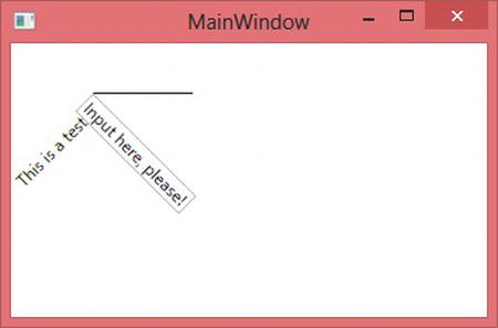
Figure 16-9. F# application demonstrating the XAML
Transformations are implemented using matrices, as already discussed for Windows Forms; you can use them to obtain nontrivial transformations of the coordinate space. These transformations affect the subtree rooted in the node to which they’re applied and can be programmatically accessed through the LayoutTransform and RenderTransform properties. The former affects the layout computation, and the latter affects the final rendering, possibly overflowing the container node.
Drawing involves brushes and pens, which are similar to their Windows Forms counterparts.
Controls
The ability to instantiate and use existing controls is one of the pillars of user interfaces. In the earlier discussion of the difference between writing components and combining them, it was evident that a control in a traditional framework is opaque: the container allocates a rectangle and delegates event handling and drawing to the window procedure coordinated by the event loop.
In WPF, things are less clear-cut, which opens new horizons to graphical developers who appreciate the visual tree and the different role played by controls. To appreciate the extent of this statement, let’s modify the example from Listing 16-9 by enclosing the StackPanel element in a Button element (add a <Button> tag immediately after <Canvas> and </Button> immediately before </Canvas>). The resulting window looks like the one shown in Figure 16-10: you’ve nested two controls, which is an almost impossible task in traditional graphical toolkits.
The designers of the WPF framework must have considered problems that never came up with traditional toolkits, given the system’s ability to retain graphics primitives in the form of a tree. You can think of a button as a background shaped like a button, with the label in the middle; it can be defined as a subtree of the primitives needed to draw its borders and a placeholder in the middle to insert the label. In an opaque system, the content could be another rectangle but nothing more; in a retention-based system, you can replace the label node in the tree with an arbitrary, complicated subtree.
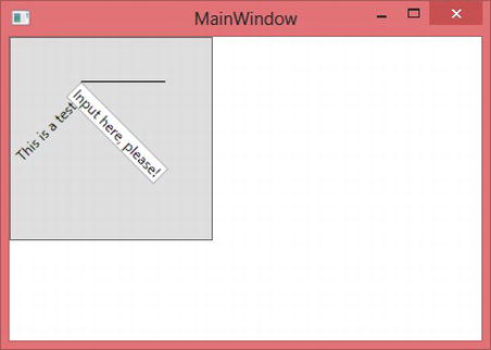
Figure 16-10. Nested controls in WPF
You can display the visual tree of any WPF element using the static methods of the VisualTreeHelper class. The following F# function prints to the console (or in the F# Interactive tool window) the visual tree associated with a WPF element:
let ShowVisualTree(obj : DependencyObject) =

    let rec browse indentlvl node =

        let indent n = for i = 0 to (n - 1) do printf "  "

        let n = VisualTreeHelper.GetChildrenCount(node)


        indent indentlvl

        printfn "<%s%s>" (node.GetType().Name) (if n = 0 then "/" else "")

        for i = 0 to (n - 1) do

            browse (indentlvl + 1) (VisualTreeHelper.GetChild(node, i))

        if n > 0 then

            indent indentlvl

            printfn "</%s>" (node.GetType().Name)


    browse 0 obj
Note: WPF also defines the logical tree, which is a simplified version of the visual tree that hides formatting nodes. The logical tree makes it easier to find relevant controls without having to deal with unneeded nodes. Logical tree is not available on lighter versions of WPF, such as Silverlight.
The function implements a recursive visit to the visual tree rooted in the given element. If you pass the instance returned by loadXamlWindow, you get an idea of how many primitives are issued by the various controls you’re using in the window. If you pass the instance of a button, perhaps found using the FindName method as you did earlier, you obtain output similar to:
<Button>

  <ButtonChrome>

    <ContentPresenter>

      <TextBlock/>
    </ContentPresenter>

  </ButtonChrome>

</Button>
ContentPresenter is the root of the subtree dedicated to the button content; the rest defines the graphics primitives surrounding the node. The ButtonChrome node refers to a class used to implement a specific theme; it’s even possible to change the definition of the button without affecting its logic or its content. You can find more information about this ability of WPF in textbooks or online.
EVENTS AND WPF
The type expected by the ShowVisualTree function is DependencyObject, which returns to the notion of dependency—a pervasive concept deeply entrenched within the framework. Dependency is a relation among two or more elements; in its asymmetry, it expresses something whose nature depends on something else. Dependency properties are a programming pattern used across WPF to define properties that you can listen to for change. If w is a Window object obtained from parsing the XAML contained in Listing 16-9, you can read and set the Text property of the TextBox object from F# as:
let t = w.FindName("Input") :?> TextBox

MessageBox.Show(sprintf "Input value is %s " t.Text) |> ignore

t.Text <- "Hello"

MessageBox.Show(sprintf "Input value now is %s " t.Text) |> ignore
The Text property behaves as a standard property, and you can use it programmatically as you’re used to doing with all properties. Text is a dependency property, and any observer in the code can listen for changes. You can detect its change as:
open System.ComponentModel


let desc =

    DependencyPropertyDescriptor.FromProperty(TextBox.TextProperty, typeof<TextBox>)

desc.AddValueChanged(t, fun _ _ -> MessageBox.Show("Text changed!") |> ignore)
You use the conventions used by TextBox implementers to access the descriptor of the Text dependency property called TextProperty and rely on appropriate data structures to register your callback. Whenever the text-box value changes, a message box is displayed.
Implementing a dependency property is easy: in the class, you define a static field describing the property; then, the property must be registered in a global structure hosted by the DependencyProperty class. You then add a standard .NET property using the GetValue and SetValue methods—inherited from the DependencyObject class, which must be an ancestor of the class defining the property—hiding the implementation details. Supported callbacks are registered to inform the framework about the observable events on the property (such as the property-value change).
At first, this may seem unnecessarily verbose: why is it useful to be able to observe when a property changes its value? The answer lies in WPF’s ability to support the animation of virtually any element property and the fact that dependency properties are the building blocks of the animation engine. Animations often correlate properties of different visual objects. For instance, think of an object and its shadow: whenever the object’s position changes, its shadow must follow. Dependency properties provide a pervasive infrastructure to propagate property changes across visual tree nodes in a consistent way. To exemplify this idea, let’s change Listing 16-9 again by replacing the TextBox element definition with:
<TextBlock Text="{Binding Path=Text, ElementName=Input}"></TextBlock>
The expression in curly braces is a data-binding expression, which is an expression evaluated by WPF engine to set the Text property of the TextBlock node. If you run the example, the text block updates its content when the text box changes its value. WPF defines several forms of data binding to declare how dependency properties must be updated without explicit coding; you can define several automatic actions using these mechanisms.
In WPF, controls are a way to instantiate subtrees and attach predefined behaviors to nodes and properties. They’re less opaque in WPF than before; nevertheless, if a change in the visual tree disrupts the assumptions made by a control’s logic, a control may fail. For this reason, controls in WPF offer placeholders for inserting content, as you’ve seen with buttons, as well as a means to change the control’s appearance while preserving the essential traits of the visual subtree that make its inner code work.
Bitmaps and Images
Vector graphics, after being abandoned in favor of raster graphics, have again become popular, because they let you define graphics that can be scaled without the annoying pixelated effects typical of raster graphics. Vector primitives are exact, and the rendering engine can compute the value of any number of pixels affected by the primitive. If you zoom a line, you can compute all the pixels of the line without any loss in detail. If the line is contained in a bitmap, this isn’t possible: the zoomed line contains artifacts introduced by the algorithm that resized the image.
It’s impossible to imagine a user interface without images. What, however, does it means to work with pixels in a world of abstract coordinates where points are considered sizeless entities, as in geometry? An image’s size is defined in the application space, and WPF is responsible for the rastering process and for generating enough pixels at a given resolution. A 100×100 image at 96dpi uses the same number of pixels on a standard monitor, or more pixels if the device has a higher dpi resolution. This concept isn’t unfamiliar: in the Mandelbrot example, you used a bitmap to set pixel colors, because of the lack of a SetPixel method on the Graphics object representing the device context for drawing. WPF, however, defines its own set of classes to deal with images, featuring a slightly different set of properties and capabilities.
To exemplify the use of images with WPF, let’s consider a simple but useful application: a batch-size conversion for JPEG images. The application is a command-line tool that converts a directory containing hi-res pictures into a mirrored version containing resized versions of the same pictures for a specific resolution. With this tool, it’s easy to convert thousands of photos into versions suitable for a photo frame, thus saving space. The conversion process preserves JPEG metadata information such as tags, which may be useful after conversion.
The two main functions are shown in Listing 16-10. transformFile is responsible for transforming a single JPEG image and saving it into a new file; transformDir performs a recursive visit to a directory tree and builds a mirror tree in the destination directory, relying on the first function to convert the image files.
The image transformation relies on JpegBitmapDecoder and JpegBitmapEncoder, two classes dealing with the JPEG format. These classes support a streaming model for decoding and encoding images, so you read information about the first frame (an image may contain more than a single frame) to ensure that all the metadata is read from the source image. The desired output size is passed in the form of a screen resolution through the width and height arguments, and a best-fit policy is used to define the size of an in-memory bitmap instance of the class BitmapImage. The image resize is performed by asking the in-memory image to load data from the source file and fit the desired size; this way, you avoid allocating the full image in memory and performing the resize operation while reading pixels from disk. You then use the encoder to save the image, with the desired quality, in the new file, along with the metadata and the creation-time and change-time information.
Listing 16-10. A function to resize all the images in a directory
open System

open System.IO

open System.Windows.Media.Imaging


let transformFile quality width height srcFileName outFileName =

    let dec = new JpegBitmapDecoder(

                Uri(srcFileName),

                BitmapCreateOptions.PreservePixelFormat,

                BitmapCacheOption.Default)

    let w = dec.Frames.[0].Width

    let h = dec.Frames.[0].Height


    let b = new BitmapImage()

    b.BeginInit()

    b.UriSource <- new Uri(srcFileName)

    if width > 0 then

        if w >= h then b.DecodePixelWidth <- width

        else b.DecodePixelHeight <- height

    b.EndInit()


    let metadata = dec.Frames.[0].Metadata


    let enc = new JpegBitmapEncoder()

    enc.Frames.Add(BitmapFrame.Create(b, null,

                                      metadata :?> BitmapMetadata, null))

    let fs = new FileStream(outFileName, FileMode.OpenOrCreate)

    enc.QualityLevel <- quality

    enc.Save(fs)

    fs.Close()

    let fin = new FileInfo(srcFileName)

    let fout = new FileInfo(outFileName)

    fout.CreationTime <- fin.CreationTime

    fout.LastWriteTime <- fin.LastWriteTime


let transformDir quality width height src dest =

    let rec visit (dirIn : DirectoryInfo) (dirOut : DirectoryInfo) =

        for f in dirIn.EnumerateFiles() do

            if f.Extension.ToUpper() = ".JPG" then

                printfn "Processing file %s..." f.FullName

                transformFile

                    quality width height f.FullName

                    (dirOut.FullName + "\" + f.Name)
        for d in dirIn.EnumerateDirectories() do

            visit d (dirOut.CreateSubdirectory(d.Name))


    let dirIn = new DirectoryInfo(src)

    let dirOut =

        if not(Directory.Exists(dest)) then Directory.CreateDirectory dest

        else new DirectoryInfo(dest)

    visit dirIn dirOut
Start the transformation process by invoking the transformDir function with the JPEG compression quality, the target screen size, and the input and output folders. The following lines assume that you’re converting summer photos for a frame supporting 1024×768 resolution:
let dn = @"C:UsersSomeUserPicturesSummer 2010"

let dno = @"e:Summer PhotoFrame 2010"


transformDir 75 1027 768 dn dno
Bitmap manipulation can be very tricky using WPF, and some tasks are more difficult than they are using Windows Forms. In particular, it’s easy to obtain a device context to a bitmap and draw using GDI functions. You can raster WPF primitives into a bitmap, but many programmers prefer to refer to both libraries and to convert images from one framework to the other, in an attempt to benefit from both worlds.
Final Considerations
WPF isn’t just another framework built on top of the traditional Win32 and GDI rastering engine: it’s a new presentation system designed with a different programming paradigm in mind. This section introduced some important ideas behind this new presentation system and how you can use it from F# applications. The content is far from exhaustive, and several topics have been left out or only mentioned in an attempt to convey the core ideas as a starting point for further investigation. The literature about WPF is very rich, and we encourage you to read more specific material.
Summary
Event-driven programming is the dominant paradigm of graphical applications. Although object-oriented programming is used to build the infrastructure for graphical frameworks, events are naturally expressed in terms of calling back a given function. F# is effective in GUI programming, because it supports both paradigms and provides access to full-featured frameworks, such as Windows Forms.
This chapter covered the basics of GUI programming. It introduced controls and applications, including details typical of real-world applications. The presentation was based on the Windows Forms framework, but many of the ideas discussed can be easily transposed to other graphical frameworks: the fundamental structure of this class of applications is mostly unchanged. Finally, we introduced WPF and discussed differences between it and Windows Forms.