
- Force.com Enterprise Architecture - Second Edition
- Table of Contents
- Force.com Enterprise Architecture - Second Edition
- Credits
- Foreword
- About the Author
- Acknowledgements
- About the Reviewers
- www.PacktPub.com
- Customer Feedback
- Preface
- 1. Building, Publishing, and Supporting Your Application
- Required organizations
- Introducing the book's sample application
- Package types and benefits
- Creating your first managed package
- Package dependencies and uploading
- Becoming a Salesforce partner and benefits
- Introduction to AppExchange and listings
- Installing and testing your package
- Licensing
- Providing support
- Customer metrics
- Trialforce and Test Drive
- Summary
- 2. Leveraging Platform Features
- Packaging and upgradable components
- Understanding the custom field features
- Understanding the available security features
- Platform APIs
- Localization and translation
- Building customizable user interfaces
- E-mail customization with e-mail templates
- Process Builder, Workflow and Flow
- Social features and mobile
- Summary
- 3. Application Storage
- Mapping out end user storage requirements
- Understanding the different storage types
- Reusing the existing Standard Objects
- Importing and exporting data
- Options for replicating and archiving data
- External data sources
- Summary
- 4. Apex Execution and Separation of Concerns
- 5. Application Service Layer
- 6. Application Domain Layer
- Introducing the Domain layer pattern
- Implementation design guidelines
- Domain class template
- Implementing Domain Trigger logic
- Implementing custom Domain logic
- Object-oriented programming
- Creating a compliance application framework
- An Apex interface example
- Testing the Domain layer
- Calling the Domain layer
- Updating the FormulaForce package
- Summary
- 7. Application Selector Layer
- 8. User Interface
- Which devices should you target?
- Introducing Salesforce Standard UIs and Lightning
- Leveraging the Salesforce standard UIs
- Generating downloadable content
- Generating printable content
- Client server communication
- Managing limits
- Object and field-level security
- Managing performance and response times
- Using the Service layer and database access
- Considerations for using JavaScript libraries
- Custom Publisher Actions
- Creating websites and communities
- Mobile application strategy
- Custom reporting and the Analytics API
- Updating the FormulaForce package
- Summary
- 9. Lightning
- Building a basic Lightning user interface
- Lightning architecture
- FormulaForce Lightning Components
- Making components customizable
- Integrating with Lightning Experience
- Lightning Out and Visualforce
- Integrating with communities
- Testing
- Updating the FormulaForce package
- Summary
- 10. Providing Integration and Extensibility
- Reviewing your integration and extensibility needs
- Force.com platform APIs for integration
- Application integration APIs
- Exposing Lightning Components
- Extending Process Builder and Visualflow
- Alignment with Force.com extensibility features
- Extending the application logic with Apex interfaces
- Summary
- 11. Asynchronous Processing and Big Data Volumes
- 12. Unit Testing
- 13. Source Control and Continuous Integration
- Development workflow and infrastructure
- Developing with Source Control
- Hooking up Continuous Integration
- Releasing from Source Control
- Automated regression testing
- Summary
- Index
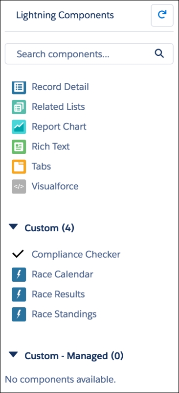
The components included in this chapter will appear in Lightning App Builder and are thus available for the developer and consumers of the package to drag and drop them onto pages. Because they are global they can also use them in their own component code:
This is due to the following aspects:
- The
accessattribute on the components is set to global. - They implement applicable
flexipageandforceinterfaces. - Though not required, the
.designfiles specify a component label:<design:component label="Race Calendar"> </design:component>
- The
.svgfile for thec:CheckCompliancecomponent defines a custom icon that is displayed next to the component in the Lightning App Builder. - Though not required, the Race Result component also includes additional markup to indicate to Lightning App Builder, the component is only relevant to the
Race__ccustom object:<design:component label="Race Results"> <sfdc:objects> <sfdc:object>Race__c</sfdc:object> </sfdc:objects> </design:component>
Tip
The components can also declare attributes that appear in the configuration panel to the right of the Lightning App Builder design surface. These are expressed using the design:attribute element within the .design file. These must match those expressed in the component markup. Any attributes exposed this way must also have an access level of global.
-
No Comment
..................Content has been hidden....................
You can't read the all page of ebook, please click here login for view all page.